|
| Group |
Round |
C/R |
Comment |
Date |
Image |
| 79 |
Jun 23 |
Comment |
Karl
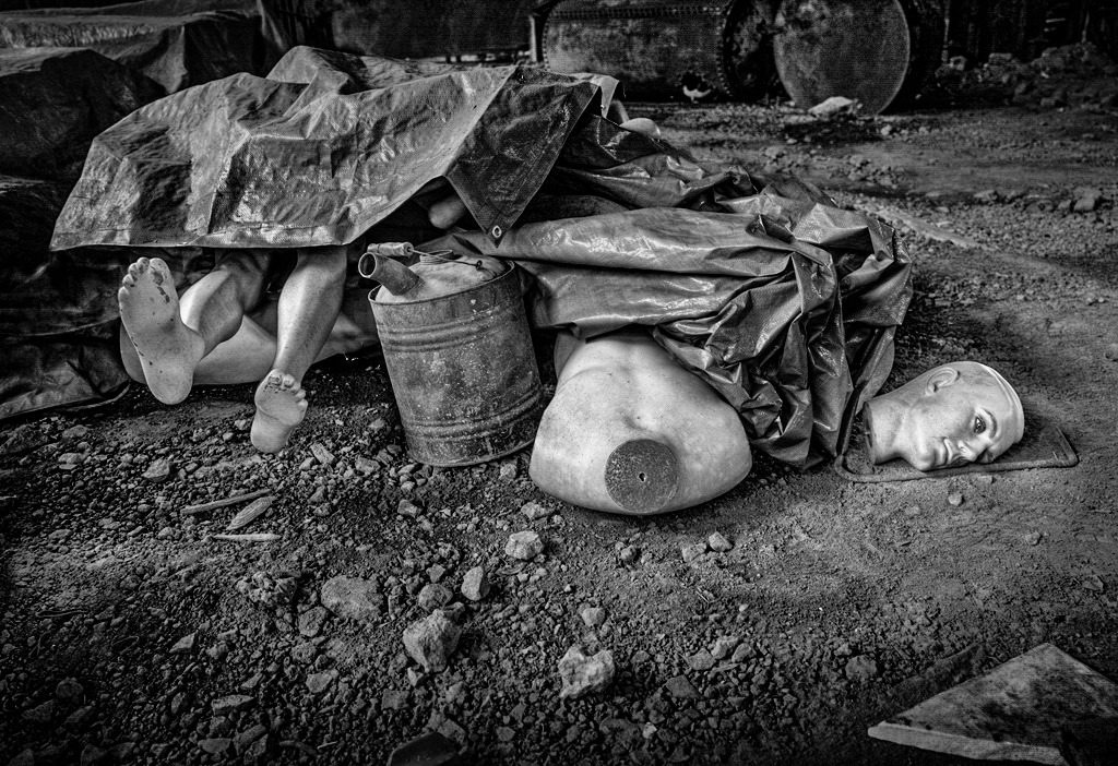
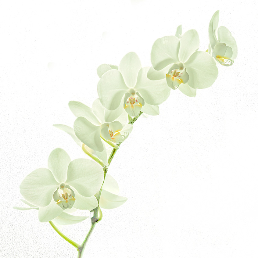
First of all the image - which I think is curious (in a the sense of engaging the viewer). I am a little confused by the angle or distortion of the foreground, but this adds to the sence of surrealism which I see as the strength in the image. I wonder if the dark vignette (particularly at the top) works, for me I would prefer to see the distance and I do not expect that it would detract focus from the chaos in the center.
For me the 911 reference is a distraction. Not as Peter seems to have found it because to the distress of that day, but rather because I do not see anything in the image that particularly relates. I suggest that your image could support more general narratives of dystopia or destruction - and would therefore be more powerful if the title was not seeming to invite the viewer to find associations to that one event.
For me, your image is a powerful composition, mostly empty in the lower half, detail in the center and crumpled tarp in the top: it is not I think traditional and so it creates the tension that resonates with the dismembered body.
I offer my personal processing - just to share, rather than to pretend it is better. |
Jun 23rd |
 |
| 79 |
Jun 23 |
Comment |
Liz
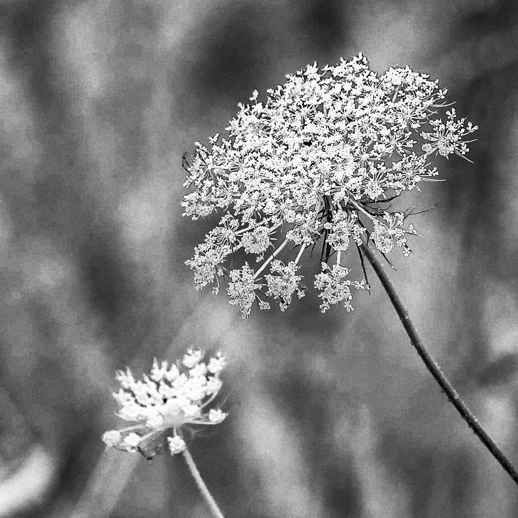
I feel this is a lovely composition. I agree with Karl as to the lightness of the background - though I would not go quite as dark as he.
My experience has been that f5.6 makes it hard to capture multiple stems in the same frame with sufficient sharpness. I would suggest raising that even at the expense of shutter speed. One talk I attended convinced me that ISO 100 was not necessarily the "least noisy" setting for most digital cameras (it is a film convention and not directly mapped into silicon behavior) - and so one could raise the ISO without any loss. Personally I shoot at ISO320 as the "best" quality for my camera's sensor - and that translates into several stops in raising the f number. |
Jun 23rd |
 |
| 79 |
Jun 23 |
Comment |
Peter
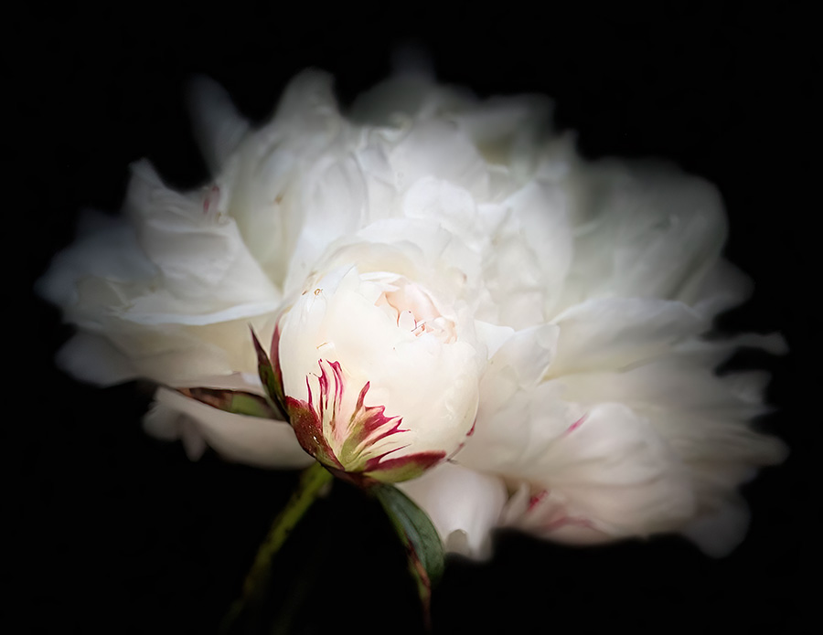
I do like it - especially the negative space (I might add a little more on the right for balance). "Painting" a photograph like this obviously becomes a personal expression - and I do commend your result.
From this outcome, I would try a further experiment, overlaying with the original image and using a mask to bring the the center of the flower alone back into the image. I am thinking here of combining a real core with the painted exterior, nature fades to art - just an idea. |
Jun 23rd |
| 79 |
Jun 23 |
Comment |
Judith
I agree that the strength/differentiation of this image is in the soft ethereal backdrop of the petals.
I recently attended a talk on macro photography. One aspect that surprised me is that the speaker advocated shooting with ISO 1000+ and f32 and then relying on software to make the image crisp. With that in mind I ran you image through topaz to see what wound happen.
To my eyes - the outcome retains the beauty of the backdrop petals: they are so soft that the software does no harm. But the core and the front, for me, seems to benefit from the sharpening that is achieved. See whether you like it or not. |
Jun 23rd |
 |
| 79 |
Jun 23 |
Reply |
Liz - thanks for adding comments. I do take them on board - and below I have tried to remove the distraction. The "angle" was my attempt to be "edgy" but perhaps it does not appeal as I had hoped. |
Jun 4th |
 |
| 79 |
Jun 23 |
Comment |
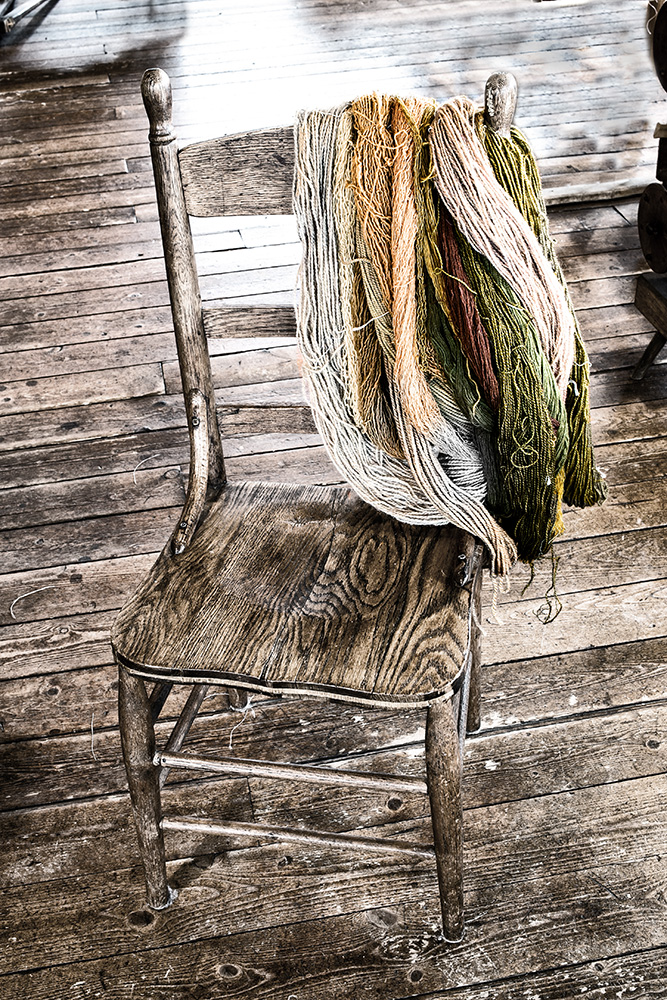
Lauren - frankly amazed that you managed to extract this beautiful image from the starting point. Before reading your description I was already taken with it, particularly the minimalism of the detail and contrast which I think work wonderfully here imparting an air of calm.
My only suggestion is to cut it slightly differently to exploit the diagonal. |
Jun 1st |
 |
5 comments - 1 reply for Group 79
|
| 99 |
Jun 23 |
Comment |
Tom
First of all: welcome! Nice to see you joining the group.
I enjoyed this image greatly as is made me struggle to find the artists of which it reminds me. I ended up deciding that it was a sort of minimalist cross between a Bruegel and a Lowry.
Put another way, I like the simplicity of the subject and the processing you choose to create what I see as a piece of art.
I was particularly taken by what I see as negative space to the left of the image which seems to me to give breathing space, and I wondered if you might consider adding some to the top also. |
Jun 3rd |
| 99 |
Jun 23 |
Comment |
Kathleen
(pun alert) I like the crispness of the chips
Sorry, had to do that - let me start again
I find the sharpness of the foreground elements to be key to this image because it makes concrete the subject within her environment. The baskets of produce catch my eye first and then lead me to discover the shopper.
The contrast between her head and foot wear is a lovely detail: style vs need.
I suspect your crop was chosen to retain as much as possible of the shop (once the bad glare was cut out) but this leaves the women dead-center. Since she is looking to looking to the right, I feel that this is therefore imbalanced. My instinct is to cut the left leaving only 4-5 bottles on the top shelf.
|
Jun 3rd |
| 99 |
Jun 23 |
Comment |
Linda
This strikes me immediately for it composition which as I see it is an horizontal V from the left with the road as center and the building and water bank forming symmetric expansion across to the right I know little of ND techniques, but it seems you timed the exposure perfectly to gain, but not be swamped by, the street light brightest.
My only suggestion is that more contrast applied selectively to the water and then to the benches (?) might add drama. |
Jun 3rd |
| 99 |
Jun 23 |
Comment |
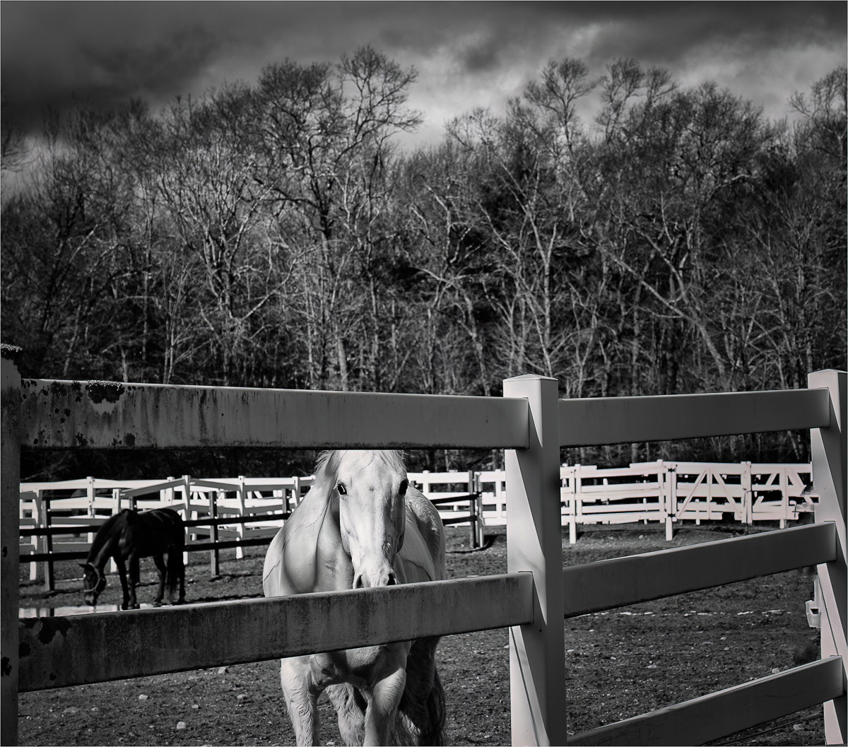
Barbara
I think it is a good shot - and I like the idea of street photography with animals.
The crop appeals to me: it does not have the subject on the rule of thirds, and I think that works well here because it seem to add a feeling of an "unstaged" or natural event, perhaps even a little furtiveness as the horse looks out from its enclosure.
My suggest below stems is because I find the white rails at the back to be too bright. So in camera raw, I took your image and dropped the highlights, and then used two radial filters to retune and to add emphasis to the white-horse's face and to the sky. See if you like this manipulation. |
Jun 3rd |
 |
| 99 |
Jun 23 |
Comment |
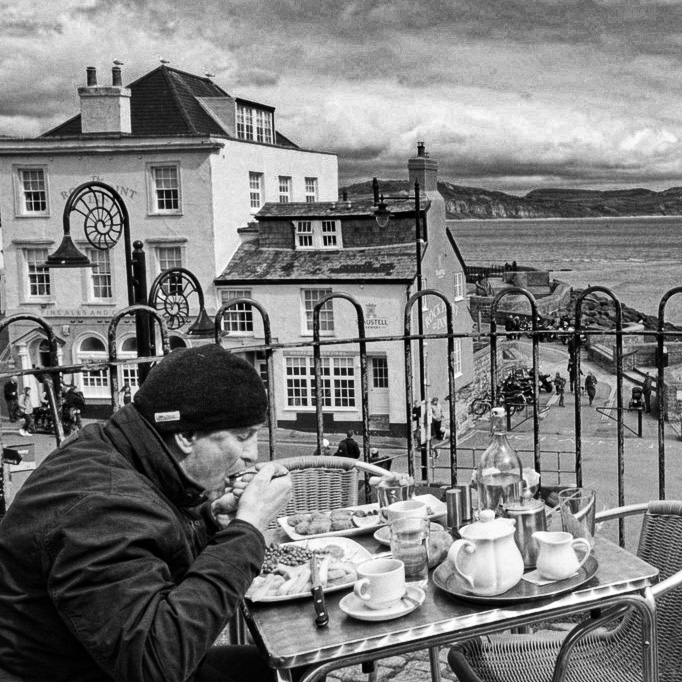
Great location - and I enjoy the man eating lunch. The contrast between his clothing and his eating outdoors really captures a determination to be "at the seaside". I agree though with your reservation about the image being busy. I think the background is most interesting as context for the diner, and so he needs a greater portion to establish him more clearly as the subject ... and so : |
Jun 1st |
 |
5 comments - 0 replies for Group 99
|
10 comments - 1 reply Total
|


