|
| Group |
Round |
C/R |
Comment |
Date |
Image |
| 79 |
Apr 23 |
Comment |
Thank you all for your input - the cutting was done - at the cost of negative space (?) and I opted for Freddie's suggestion since I like the reflections of the feet. |
Apr 21st |
 |
| 79 |
Apr 23 |
Comment |
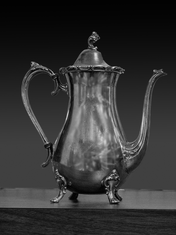
I was most taken by how well you eliminated the distraction of the overhead lights from the reflexion. I wonder though about the background. My first thought was that solid black is too severe in that it does not seem in harmony with the tones of the subject: I lowered it to 50/50/50 R/G/B. My second thought was a gradient, which I attach for your consideration. I probably overdid it, but it shows the idea. |
Apr 21st |
 |
| 79 |
Apr 23 |
Comment |
First thought was of middle earth and the task of crossing this chasm.
By lightening the mid tones, I see that the rock face becomes a frame to point the eye inward to the middle. I think that the off-center (vertical) light offers a goal, a hope for the journey ahead. The image enables a powerful story.
|
Apr 21st |
| 79 |
Apr 23 |
Comment |
I am not seeing a fish. Possibly a Kraken but then only because I was prejudiced by looking for a fish. For me this image stands as an intriguing mystery, possibly sci-fi, definitely ominous.I think its success is rooted in the variety of line textures: straight and parallel, jagged, curvy, even rippled, a sort of atonal symphony of variation. |
Apr 21st |
| 79 |
Apr 23 |
Comment |
An interesting journey and reminds me also of lace work, though I see tadpoles. For me the color of the solid background does not work well with the image; perhaps a ruddy brown? |
Apr 21st |
| 79 |
Apr 23 |
Comment |
For me there is a strong tension captured by the distortion at the convergence of the wheel and the front teeth. One feels the grip.
I think this is powerful - but I expect that my reaction is unrelated to your memories of your father: but that is often the way with interesting images, the viewer generates their own interpretations.
Looking forward to seeing more. |
Apr 21st |
6 comments - 0 replies for Group 79
|
| 99 |
Apr 23 |
Comment |
Kathleen
I see whimsey in this image.
The lines of the platform, they grabbed my eye and hurl me at the tree trunk almost with the force of an assault. I feel it is almost comic-book, missing only a giant WHAAMM!
And then my eye finds the gal on the cell-phone with a bag of guide books, a tug to a return to reality. She looks so small, off in the corner, and yet once seen, she owns the picture.
I did play around with contrast and tones - but I think your conversion works well in that it has kept the platform and the tree in a closely similar tone so that they act as one, and the rays from the "gaps" between the plank seem to me to be well able to drive the focus inwards. I was able to get more strength in the rays by emphasizing the difference between the blanks, but I lost the whimsey and so I do prefer your outcome to any from my games. |
Apr 3rd |
| 99 |
Apr 23 |
Reply |
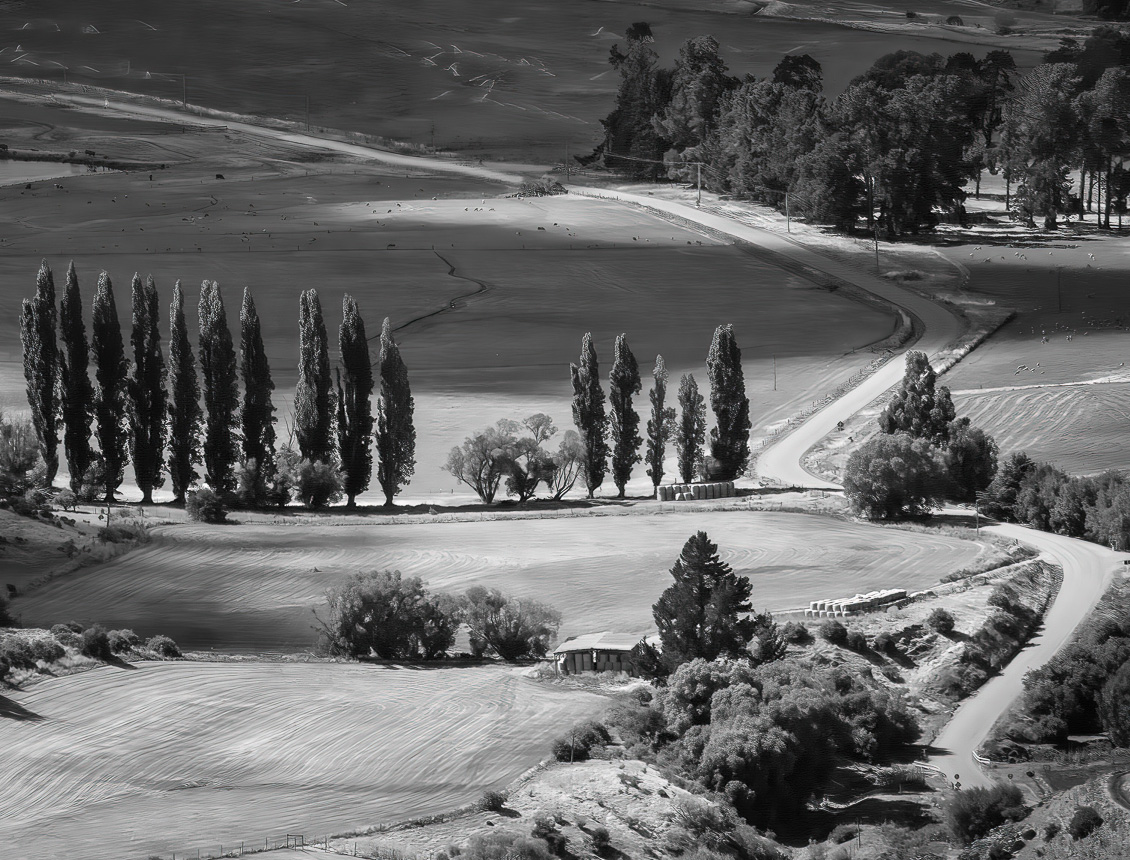
My second reaction was to look at the composition. I see several elements which are attractive in their own right: the snaking road from the bottom left the dash across the top to the right, the diagonal of the small building and the track with hay bales with the same stroke echoed in the fencing to it and in the tree line behind it, and the parallel lines in the field. I like these resonant sweeps so much I would prefer to give them more emphasis through a tighter crop. |
Apr 3rd |
 |
| 99 |
Apr 23 |
Comment |
Michael
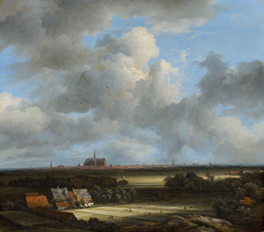
My first reaction was "Jacob von Riesdail" who was a Dutch landscape artist who specialized in using alternating regions of light and dark to bring depth to his paintings. I like this effect in your image particularly. Also those trees in the center; do you notice how they are light at the top (against a shadowed landscape) and dark below (against light). |
Apr 3rd |
 |
| 99 |
Apr 23 |
Comment |
So - Peter - yes it is good
I look at your image in envy and so rather that praise it I prefer to focus on what I think would be difficult for me to replicate: imitation being the sincerest form of flattery. For me the highlights are the model's cheeks and her shirt, in both cases because you have maintained their form and depths yet with such small tonal variation in each (despite that they are at the tonal opposites ones from each other). I think that being able to retain that subtle definition at both ends of the range is an enormous achievement. |
Apr 3rd |
| 99 |
Apr 23 |
Comment |
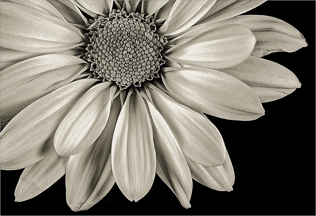
Barbara , lovely details and clarity, and I like the gentle tonality that for me defines the surface of the petals without detracting from the smoothness. And the strong darkness around the center seems to acts as a frame.
I think it is a beautiful capture of the flower.
My one suggestion is that you might leave a little more room so that the lower petals are not cut just at their edge. A portrait guy once told me that you can cut the head at the forehead - but not through the crown - and I think this might apply here too. I have mocked-up a small adjustment as illustration below. |
Apr 2nd |
 |
| 99 |
Apr 23 |
Comment |
Linda,
independent from the circumstances of the image, I am struck by its sheer force which I think is created first in its clarity, but most profoundly in the diagonal sweep across the images which is corrupted on the right by a slight upward sweep of the trailer, off the line and into the sky (I think assisted by the narrowing outcome of the receding perspective) taking ones eye off to the infinite. Overall, for me, this composition is as powerful as the wreckage itself. |
Apr 2nd |
5 comments - 1 reply for Group 99
|
11 comments - 1 reply Total
|


