|
| Group |
Round |
C/R |
Comment |
Date |
Image |
| 79 |
Feb 23 |
Reply |
I think it is fair to say that the graphic nature of Mapplethorpe's images was intended to shock - and you also write that you chose to use breasts because they were "in-your-face". So I am surprised that you are surprised that it caused offense, because if you seek to make people examine their hang-ups, then you have to shock by affronting those beliefs. So, if that was your intent, then well done.
But if you are surprised, let me explain my point of view a little better.
I am not afraid of the beauty of the female form; I just do not think that isolating and enlarging this girl's breasts speaks of that beauty. In my opinion, they, and she, have been reduced to just a pair of tits - and that is why I think it offensive. |
Feb 22nd |
| 79 |
Feb 23 |
Comment |
Freddie - I think sanity is over-rated - I lost mine several years ago and frankly I have never missed it (which is both a consequence and a benefit).
But - talking about the image ...
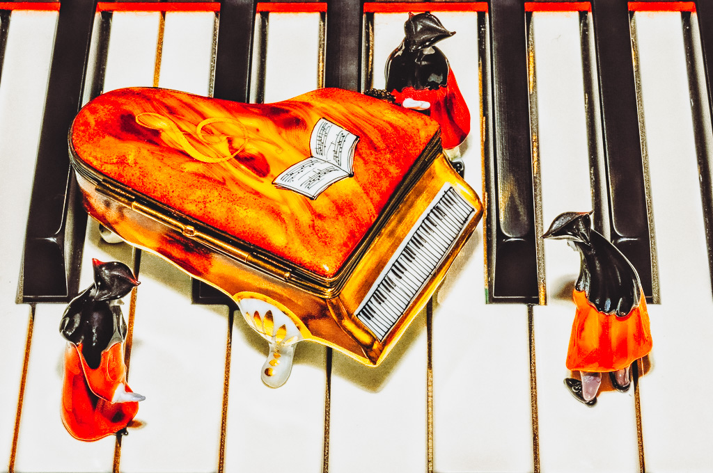
I like the whimsy - and the contrast in size (the piano on a piano). I know it is an old photo (so likely no not change to redo) but I would have considered placing the noblemen to be examining the large black keys in puzzlement.
For me the original resonates more than the lightroom version in that it seems brighter both on the white keys and in the color of the piano top. The image is I think partially comic, and for that reason I think it safe to accentuate rather than to mute the colors perhaps making the piano top "the feature" with the real piano keys as backdrop. Below is my attempt - and I did it "only" in camera raw so as not to alarm. |
Feb 19th |
 |
| 79 |
Feb 23 |
Comment |
Judith - the image for me is dominated by the security guard and as such I am not convinced that it reflects 2022 in particular; he seems relatively benign with no gun that I see and even a happy American flag to offset the threat of broad shoulders and bare arms. For me the narrative is more about exclusion, those seen in reflection on the outside looking into a store that has wealth requiring a gate-keeper. This is helped by the fast that inside seems only to be employees, unused, and outside is somewhat more crowded.
With that in mind - do applaud the reflection enhanced in B&W.
|
Feb 19th |
| 79 |
Feb 23 |
Comment |
Karl - yes, well. I hope you will forgive the abruptness of the following but ...
If this were an ironic piece commenting upon the objectification of women or the smutty dream world of the male adolescent , then I could perhaps acknowledge some potential. Otherwise I am sorry to say that I see it as simply the gratuitous use of female breasts in a manner that borders on the offensive.
I should probably add that I said something similar about the recent Matisse exhibition at the NY Metropolitan. |
Feb 19th |
| 79 |
Feb 23 |
Comment |
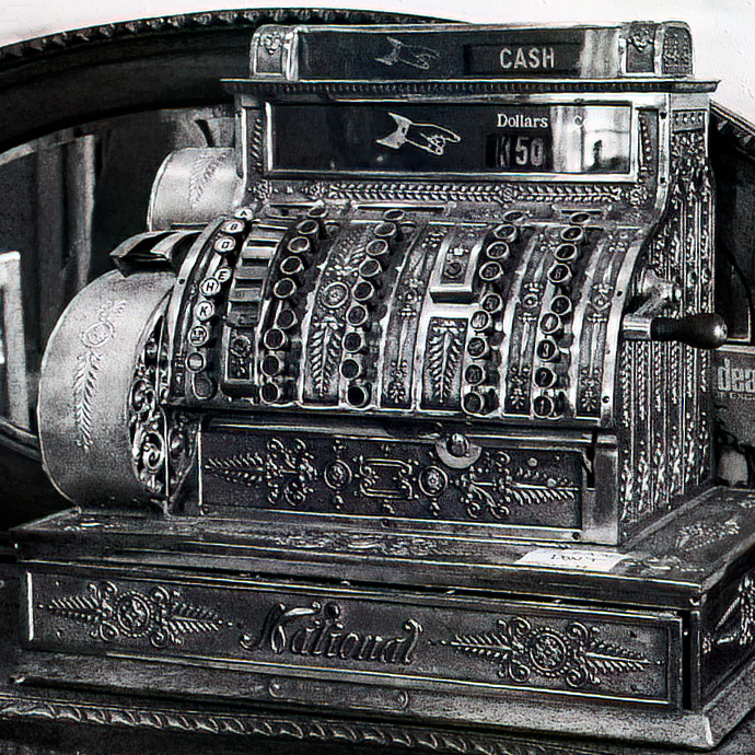
Lauren, I like the idea of a series in the shop - it gives you so many opportunities , and I think that he cash register is a well chosen example of an arresting subject.
It survived the high ISO and long shutter speed - I wonder if you would consider a longer exposure and a tripod.
My one thought about B&W though is that one can exploit it a little more to bring out tonal variation. For instance, the color version has clear vertical bands formed by the register keys, and this seems muted in the B&W. The image below is a suggestion. Of course for a series you would be limited to a "look" that works across all of the images you take - so this shinny style might not be appropriate for other, less-metallic subjects. |
Feb 19th |
 |
| 79 |
Feb 23 |
Comment |
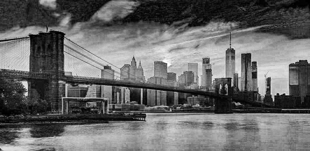
Peter - I thing this an excellent image of the city. The colors in the original are stunning but I agree with your discussion to move to monochrome as I think it adds emphasis to the form. The framing by the clouds I think is particularly effective. Unlike Freddie, I do like the buildings: I think they speak strongly to the subject. My one thought though is that the bridge and buildings do share the same tone and I would suggest that the image could be preconditioned in the photoshop B&W layer using the sliders so that their different colors return a different tone. |
Feb 19th |
 |
| 79 |
Feb 23 |
Comment |
yes Peter, I think I do prefer this orientation - the horizontal line in the background seems to form a floor, and the diagonal dashes become more apparent to my eyes, thank you |
Feb 10th |
6 comments - 1 reply for Group 79
|
| 99 |
Feb 23 |
Comment |
Oh Kathleen, such life and vitality - and I think it is marvelous that you captured the bubble as it framed the shop title so perfectly.
I am curious to know where you focused. The image looks sharp to me - but f.4 seems like it should have lead to a narrow depth of field ... perhaps I do not understand this properly (?). |
Feb 1st |
| 99 |
Feb 23 |
Comment |
Peter, the light bulb is a triumph - especially the penumbra of light below (forgive the oxymoron).
I like the subject for his lined skin and tuft of hair, and I agree that the library and monochrome both resonate with the model's clothing. I wish the jacket had not ridden-up so much at the back of his neck.
The composite work seems to me to be very well executed.
My only suggestion is that right crop lines up directly with the edge if his shoulder and I prefer myself to avoid such alignments: I would take it in a smidge.
|
Feb 1st |
| 99 |
Feb 23 |
Comment |
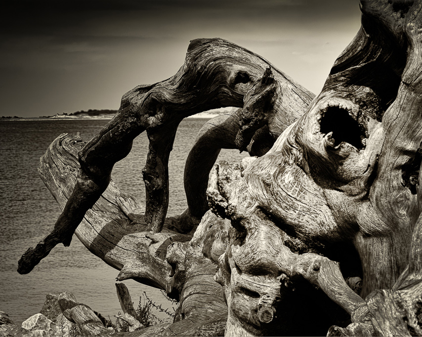
Barbara, my answer to this Rorschach test is that I see a leg on the left and a finger pointing at the face's nose.
I think the wood is very interesting in the textures that you have brought out, particularly the parallel curves. The variety of directions seem to me to provide interest and movement for the eye.
I find the background a little distracting - perhaps because I already see negative space within the wood itself and so do not seek it in outside. For this reason I offer the following crop to isolate this sculpture and to center its peak in the image.
|
Feb 1st |
 |
| 99 |
Feb 23 |
Comment |
Michael, this seems delightfully whimsical to me, and made all the more accessible to the viewer by the simplicity of your starting image. I like the unusual "interpretation" of tryptic, and I hope you let us know how the judges take to it.
I think this image would appeal to a wider audience than simply those interested in photography, because it does read like a puzzle.
Of course, with such an interesting idea, there has to be imitation :-) - below would be the outcome of the original "/" original-rotated (where divide is a photoshop merge function).
|
Feb 1st |
 |
| 99 |
Feb 23 |
Comment |
Linda, I think you have managed to capture a moment in the chaos that stands out. For me the key is the single , center bird at the top which seems to be pulling the whole canopy upwards. F9 seems brave to me for a scene that might have been much deeper, but you caught it when there was a wall of bodies, so depth was not needed, and you therefore managed such a high shutter speed that the image is so very crisp.
My one suggestion is to remove the wing in the sky at the top left, so that the center bird is alone at that level.
|
Feb 1st |
5 comments - 0 replies for Group 99
|
11 comments - 1 reply Total
|


