|
| Group |
Round |
C/R |
Comment |
Date |
Image |
| 79 |
Jan 23 |
Comment |
Karl - a question on technique
Is there a difference in outcome between panning in the field, and motion blur in photoshop. I ask because I have been trying to replicate your image from the original in software and have not succeeded in terms of the apparent sharpness you retain. It could simply be that I have not found a post-processing formula to match yours or it could be that because in an inherent difference between real and simulated motion.
Can you enlighten me? Have you done such a comparison? |
Jan 19th |
| 79 |
Jan 23 |
Comment |
Judith - thank you for the questions
The light was a daylight LED use horizontal to the first image and above in the second (I was aiming for the shadow to be seen only with the drawn flower).
The paper was matte - to mimic an artist's sketch pad.
The two flowers were taken from the same supermarket bunch - I had thought them similar but perhaps my tonal adjustment was a little harsh on the final one - and the color for the first was an overlay on white paper ... so reduced in saturation I suppose. The B&W is attached.
I would love to hear your thoughts on how I could describe this approach - though I agree that mixed media in not sufficient. |
Jan 18th |
 |
| 79 |
Jan 23 |
Comment |
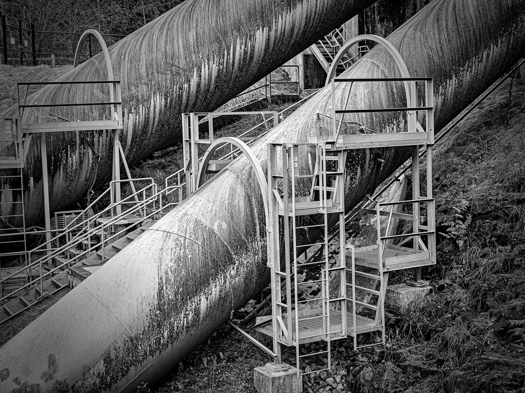
Lauren
For me the composition is strong in that I see a strong central diagonal with its "echo" in the parallel above it, and contrast in the verticals that form the inspection platforms. The markings (dirt?) on the pipe surface provide texture.
Since therefore I take the primary subject to be the one pipe, I would suggest a vignette of low opacity to draw the eye into the center of the image. |
Jan 18th |
 |
| 79 |
Jan 23 |
Comment |
Karl - I have to look a long time to understand the way in which that static image arrives at your final shot - because there is such richness in the transformation. What strikes me most is the shapes that result: the oval wheels in yellow and the triangles of the shell spokes. Am I correct in thinking that the apparently uniform smoothness and color is a consequence of your "steady" motion?
I find this a fascinating outcome: a very arresting image. |
Jan 18th |
| 79 |
Jan 23 |
Reply |
the results may not be to everybody's taste :-) |
Jan 18th |
 |
| 79 |
Jan 23 |
Comment |
Freddie it does have the feel to me of a monster exiting the hell-scape. My favorite way of cooking the colors is to use B&W to get the lightness manipulation (so much can be made of the color->lightness specific transitions) and then to merge that layer with the color image using luminosity, and possibly desaturating a little. |
Jan 18th |
 |
| 79 |
Jan 23 |
Comment |
A nicely muted image - officer a sense of aged calm. The reduced opacity seems to me to help blend the flower with the background. One thought would be the leaf upon which the flower seems to rest; might you have left it perhaps with the same strength of the flower as a sort of platform? |
Jan 18th |
| 79 |
Jan 23 |
Comment |
Peter I like the outcome - I think it would look well upon a bar wall at the race track. The treatment seems to me to add emphasis to speed and to the motion - which is so well captured.
The title seems oddly static compared to the image
The one element that distracts for me from the image is the light area in front of the lead horse. The rail is appropriate but the shite above it seems to be a "swoosh" that precedes rather than follows the motion. In the original, I selected the white using "quick select" (tidied it a little) and then used the clone tool to draw within that selected boundary from background outside it. Below is the outcome. |
Jan 18th |
 |
| 79 |
Jan 23 |
Comment |
Judith, before reading of your film noir filter, I was struck by what I see as a charcoal effect (except perhaps the sleeve in the center). I particularly like the outcome which seems to be a silhouette defined agains a background of white streaks .
I think the dark edge, framed in white works well will this.
One thought is that you did lose a little headroom and an attractive sweep of white at on the foot with this framing; perhaps you could recapture that by extending the canvas before adding that effect. |
Jan 18th |
| 79 |
Jan 23 |
Reply |
Karl - thank you for your feedback, it made me review with more critical eyes where I had been blinded by enthusiasm. I do agree with your assessment. It was just in time to help me rethink my selection for a competition so it was an immediate help.
I like the idea of the same image in multiple interpretations, but I think I will first rework the idea of mixing media in the same image (though not of the same element); just with better attention to shadows and blending. I think next I will draw the bowl in which will be placed elements that overhang it. |
Jan 18th |
8 comments - 2 replies for Group 79
|
| 99 |
Jan 23 |
Comment |
Peter - sorry for repeating but I just wanted to illustrate. In my view, these are two characters that would be better seen in the context of some "location" rather than posing in a studio. Thus I think you should lighten the background to match their tonality so that they look more as though they are part of the real world - or at least on a film set - otherwise the narrative will suffer. |
Jan 9th |
 |
| 99 |
Jan 23 |
Reply |
I agree that the whitening I suggest does make the cigarette more prominent - however if I look at the color image, I do see it as a significant feature which contrasts strongly with the face in shadow. In my opinion, it is as much a part of this subject as his clothes and his hat; and I do prefer it less muted. |
Jan 8th |
| 99 |
Jan 23 |
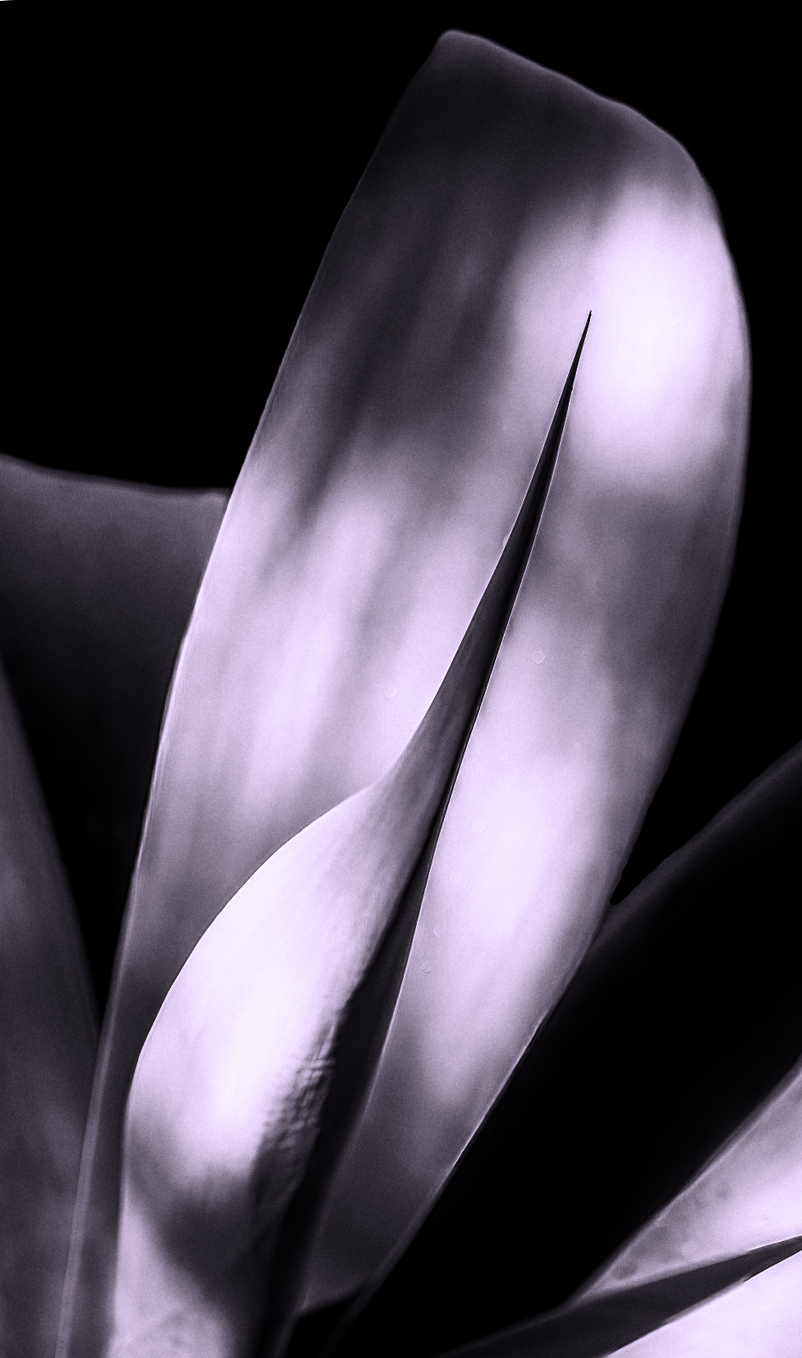
Comment |
Michael - the composition is stunning: I love the framing of the center fronds. the points repeated in the shadows, and the overall simplicity. The color is good but the B&W helps us to focus on the form which is I think the strength of this image.
It seems to me that your transformation has kept the gentle muted tonality of the original; I wonder if, without the color helping, this might flatten the image a little (more 2D) and I would suggest that some more contrast might compensate. I offer an extreme example to illustrate this idea.
|
Jan 6th |
 |
| 99 |
Jan 23 |
Comment |
Linda, a powerful image.
I particularly like the way you have managed to draw the details out from the face despite it being originally in shadow. The focus/detail seems to me to be spot on - which I think was helped by your high shutter speed enabled by your choice of iso 650.
You removed the backpack. I had tried for a while to re-crop your original (I had wanted to include the cup) but I gave up because the backpack always seems to spoil my image ... and then I noticed that you had already removed it :-)
One suggestion I might offer is the cigarette. I think it is hard to see - and if you were to selectively lighten it, that could offer a balance with the lightness on the left. |
Jan 6th |
| 99 |
Jan 23 |
Comment |
Peter another fine portrait - what I notice most here is that you seem to have crouched down to take the shot and I think this adds an effective emphasis on the belly and hat (perfect for these characters).
My one suggestion is that the brightness of the subjects and their background is too different to be convincing: perhaps you could compromise? |
Jan 6th |
| 99 |
Jan 23 |
Comment |
Barbara, to me this coveys the impression of a domination, an imposing structure - just not sure if I find it a comfort or a concern - but I know it is powerful. The fading (?) vignette seems to add a mystery, ghostly aspect; I think I see this as a book cover for a 19thC spine-chiller. Nicely done. |
Jan 6th |
5 comments - 1 reply for Group 99
|
13 comments - 3 replies Total
|


