|
| Group |
Round |
C/R |
Comment |
Date |
Image |
| 79 |
Dec 22 |
Comment |
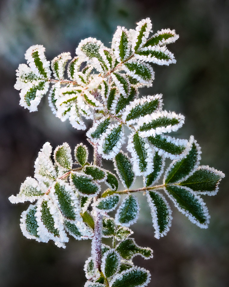
Lauren, you found a great subject and did it proud. What strikes me is that even with f2.8 you were able to capture all the leaves in such clear focus - I guess you were very careful with the angle.
In playing with your image, I darkened the background a little and changed the orientation - see if you like it. |
Dec 8th |
 |
| 79 |
Dec 22 |
Comment |
I disagree, "realistically" I find this a striking image for three reasons. 1) the strong colors at the top and the leaf seem to jump out of the screen, 2) the cascade of bubbles from sparse to dense, and 3) the big leaf and the little leaf make a "V" which I see as a strong compositional element - with only one of them I think this would be flat and imbalanced, but together, despite their different sizes, I think it really works. |
Dec 8th |
 |
| 79 |
Dec 22 |
Comment |
Freddie, I am again surprised at how much interest a little "movement" can generate: in this case I think it helps to remove the specificity of the individual child, and so makes them more as representatives for many which generalizes the narrative from the "not my friend" part of the title which is clearly sounded in the image.
My only question is the color. I played with adding different filters for a while, giving myself varying degrees of pleasure. |
Dec 8th |
| 79 |
Dec 22 |
Comment |
I think you start with a beautiful subject and then captured its essence. For me the contrast between the detail of the front and the softness of the back works well: a journey from safety into the less known.
My only suggestion is that you might darken the distant petals (a curves with a gradient in its mask perhaps) to further that contrast. |
Dec 8th |
| 79 |
Dec 22 |
Comment |
This image appears to me to have wonderful clarity and I really like the square aspect ration that focuses so directly on the face: the tilt of the head seems to help with the hint of menace. Yes I like the eye color.
Below, I took the image a little into the comic - adding more contrast and a dark vignette to add even more threat. |
Dec 8th |
 |
| 79 |
Dec 22 |
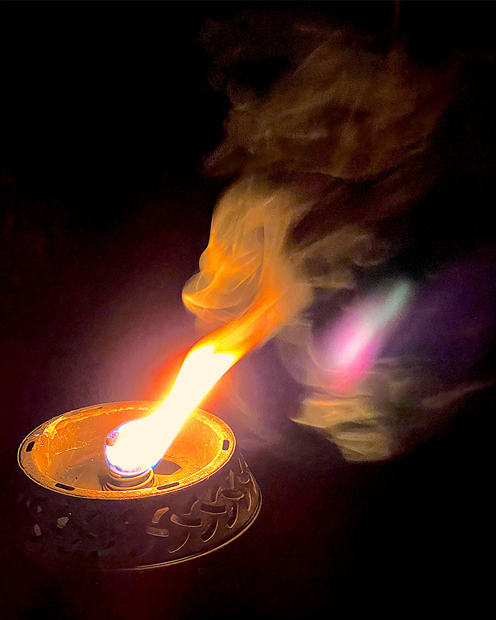
Comment |
A lovely way to spend an evening. For me the range of colors is particularly striking. I cannot account for what seems like a reflection of the flame in the smoke, perhaps there was glass beyond (?), but I think this adds to the composition in providing a parallel resonance of the original.
Personally I would have cropped the black from the bottom and not flipped - because I like the resulting upward diagonal sweep. |
Dec 8th |
 |
6 comments - 0 replies for Group 79
|
| 99 |
Dec 22 |
Comment |
Ah yes, London in the summer :-)
Randy, I enjoyed the narrative but I fear that it is not in the image because one would really have to know the geography of London to make that connection.
However, I think that as an unusual perspective on London Bridge it works very well. The framing of the two towers in two panes of the window - history at the top - and then a street scene of modern Londoners, all in dark clothing, in the bleak afternoon ... in the lower panes ... I think makes a great temporal contrast. |
Dec 9th |
| 99 |
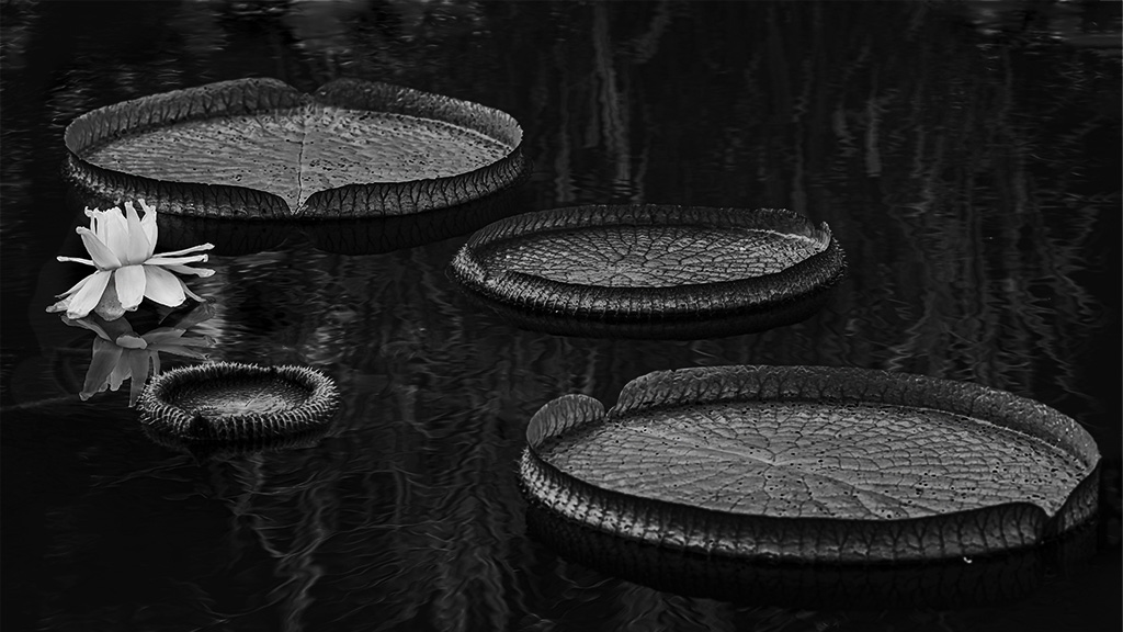
Dec 22 |
Comment |
Linda, the detail on the surface of the pads is particularly striking for me especially in contrast to the pond surface, and also the lily white on the pond dark. I think the composition was very well chosen.
I agree with Barbara about possibly lightening the pads ... and was surprised to find that a curves layer could implement this idea (a lucky consequence of the tonal differences between water and pads). |
Dec 9th |
 |
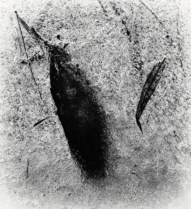
| 99 |
Dec 22 |
Comment |
Barbara, I really like that the shadow is centered in the image because for me it adds strength to it that might be missing as the man's clothing is so much darker. I also note as Michael does that the framing by the horizontal and vertical lines is very effective. |
Dec 9th |
| 99 |
Dec 22 |
Comment |
To the other positive comments I can only add that I was especially drawn to the cloth both in the clarity of the mother's and the tactility (?) of the child's. OK, it is a photo, but I think that your exposure and tonal variation were key to displaying the creases and folds.
I have one suggestion. I think that the two bodies, if considered as one mass, are centered in the image; but I also think this is imbalanced because they are of different sizes. Below I have brought the mother to the left by cropping from the far left a little so that their center of mass is centered. So if you think it matters. |
Dec 9th |
 |
| 99 |
Dec 22 |
Comment |
Maybe it is the Catholic education, but no, I would not add another face. Individually they are beautifully shot, and obviously tied together with the web. The gate alone would not, I think, be as strong as the other two ... but at the center it stands out because of the contrast, and that gives it meaning.
What meaning you might ask?
Well, the beatific boy, Christ in thorns, both looking inward and upward to the as-yet unopened gates, all marked by the passage of too-long time ... here for me is the narrative of redemption, the sacrifice (Christ) so that mankind (boy) could again enter Heaven once those gates are re-opened.
See - I told you it would be Catholic.
Michael - it is lovely. |
Dec 8th |
5 comments - 0 replies for Group 99
|
11 comments - 0 replies Total
|


