|
| Group |
Round |
C/R |
Comment |
Date |
Image |
| 79 |
Oct 22 |
Comment |
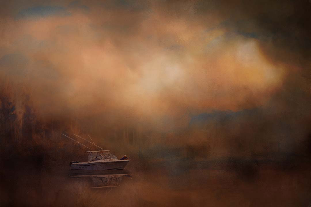
Linda - I find that the texture is beautiful (was it one you took?) and reminds me of a Turner painting. The isolation of the boat looks perfect and I suspect hard to achieve.
In my opinion the texture supports the crop you have performed and I would not change it. Particularly, it supports the size of the boat - leaving it looking small and vulnerable.
My one suggestion is that you might engineer a reflection for the boat. Below I used a simple lasso, flip, move, perspective warp, curve to reduce brightness, and a reduced opacity. See if you like it. |
Oct 14th |
 |
| 79 |
Oct 22 |
Comment |
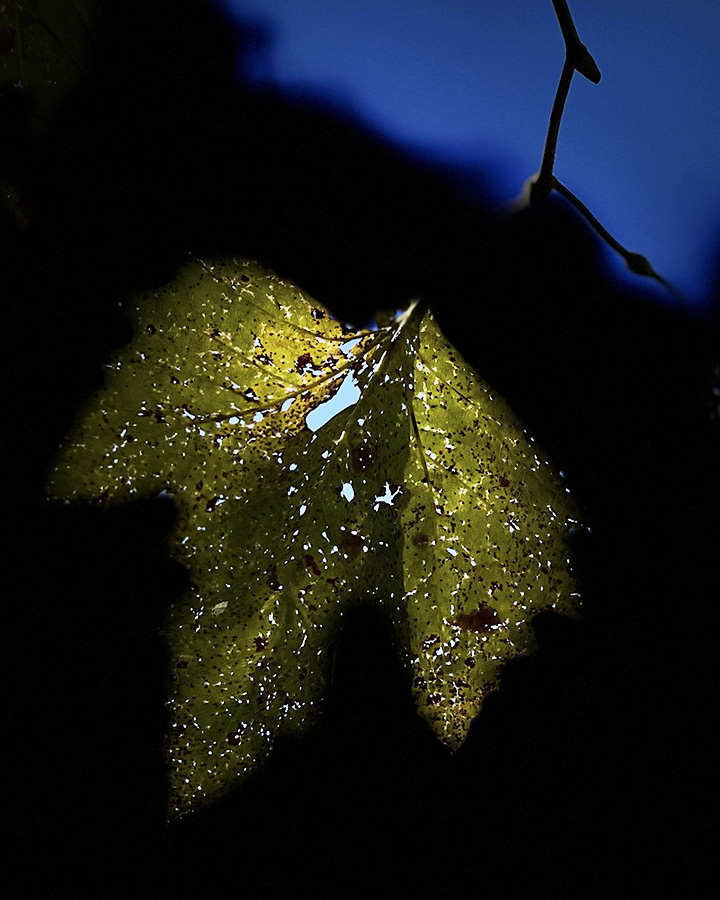
Judith - I am really taken by the colors you have drawn from this simple leaf and the detail on its surface. I think the central brightness of the leaf in contrast to the background and its edges is key to the success of this image.
Since you ask about crops, my preference would be the orig 2 perhaps because I think the leaf looks more interesting which as though standing on two feet, or more like and ascending bat. Having explored the possibilities, I think I would cut close as you did except to leave a hint of the blue sky and to retain the line sculpture of the stem. |
Oct 6th |
 |
| 79 |
Oct 22 |
Comment |
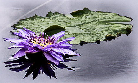
Peter, I like the flip very much as it seems to me to make the image flow so much better. The reflection of the petal color into the water is tricky and I had to look hard to realize what your had done.
For me, the colors are too saturated - a question of personal taste I know. In terms of composition, I would suggest leaving the whole leaf: the flower is definitely the star attraction, but I think the texture and less showy surface of the fronds adds a helpful contrast.
My approach was similar to yours in terms of software, except I added a B&W layer blended with luminosity at 50%. |
Oct 6th |
 |
| 79 |
Oct 22 |
Comment |
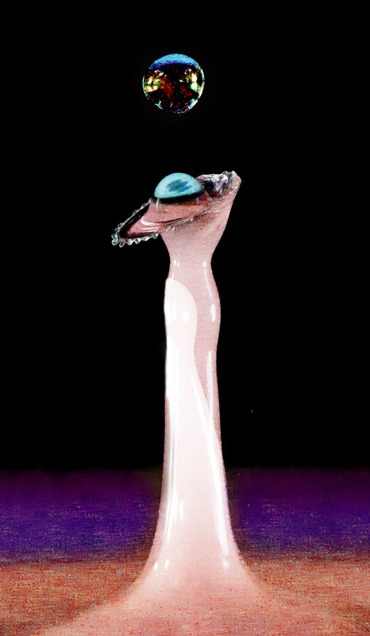
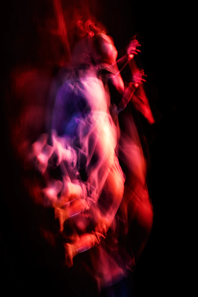
Karl - I am in awe of your technique and patience; I think the result is stunning both for the forms and in the color, and I like the balance within the composition. The left figure in particular is so complex and reminds me of an Arabian dancer.
I hesitate to make a suggestion - and I do so only because this is a discussion group so the adulation you deserve is not sufficient.
I am not sure about the double exposure in the center both because it is not seen in the reflection and because I think it makes the costume a little ungainly. I offer the following in which I smoothed out the "dress" a little. |
Oct 6th |
 |
| 79 |
Oct 22 |
Comment |
Freddie your image makes me think of a Midsummer Night's dream.
I gather you are using the image as a starting point and then creating art through manipulation - and I see this as a deeply personal approach as one guides and reacts to the digital software. In this approach I see how the camera movement can capture a rich templates as starting points.
Interesting.
For me, your image retains the motion and yet leaves only the impression of form while also blending color. The latter is particularly attractive to my eyes.
Inspired to experiment in the software myself, I offer a different (rather than better) version.
|
Oct 5th |
 |
5 comments - 0 replies for Group 79
|
| 99 |
Oct 22 |
Reply |
I think the flip provides a more conventional view, which is why I would not do it: I think your original is far more arresting |
Oct 8th |
| 99 |
Oct 22 |
Reply |
woof |
Oct 5th |
| 99 |
Oct 22 |
Comment |
Randy - I sense a portfolio of narrow streets emerging - and I think this could work very well (though it might take a while to compile).
I agree with Peter in that the exposure is well chosen: it also captures features in the darker side of the street. I note that the left sides are reds and yellows which would be handy if you wanted to control their brightness during a photoshop conversion.
For me, the stand-out feature is the line from the maintenance hole, right down the center of the street. It seems to infer motion, direction, a path to follow. I would be tempted to dodge it a little. |
Oct 5th |
| 99 |
Oct 22 |
Comment |
Kathleen, I like the inclusion of the two boats as it enriches the description of Venetian gondolas - though I do not think the gondolier himself looks very Venetian, just a fine specimen anyway (by which I mean he makes a good portrait).
I would crop a little off the right though to bring more balance to the two boats in the image.
My one doubt is that I think (at least on by computer) that you have lost definition on the trousers which have gone to pure black. Perhaps a lighter touch on the sliders (?). |
Oct 5th |
| 99 |
Oct 22 |
Comment |
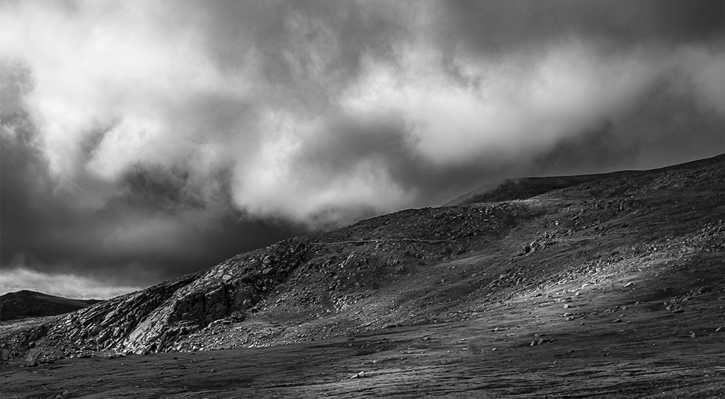
Linda, I like the texture you have elevated in the surface of the hills: it really conveys for me a sense of a hard, barren struggle against nature (I would not want to be there after dark). My feeling is that the clouds are uneven in terms of interest an my instinct would be to crop out the top quarter to give the lower clouds more chance to sing.
Your image also reminded me of one I saw on a course, where the instructor had an image of a bridge with remarkable bursts of light as though from reflections off a river. It turned out to be a trick, the use of radial filters in the raw editor (though filters in photoshop). Just to illustrate, I added a ray of sunshine to your hills. |
Oct 5th |
 |
| 99 |
Oct 22 |
Reply |
|
Oct 5th |
 |
| 99 |
Oct 22 |
Comment |
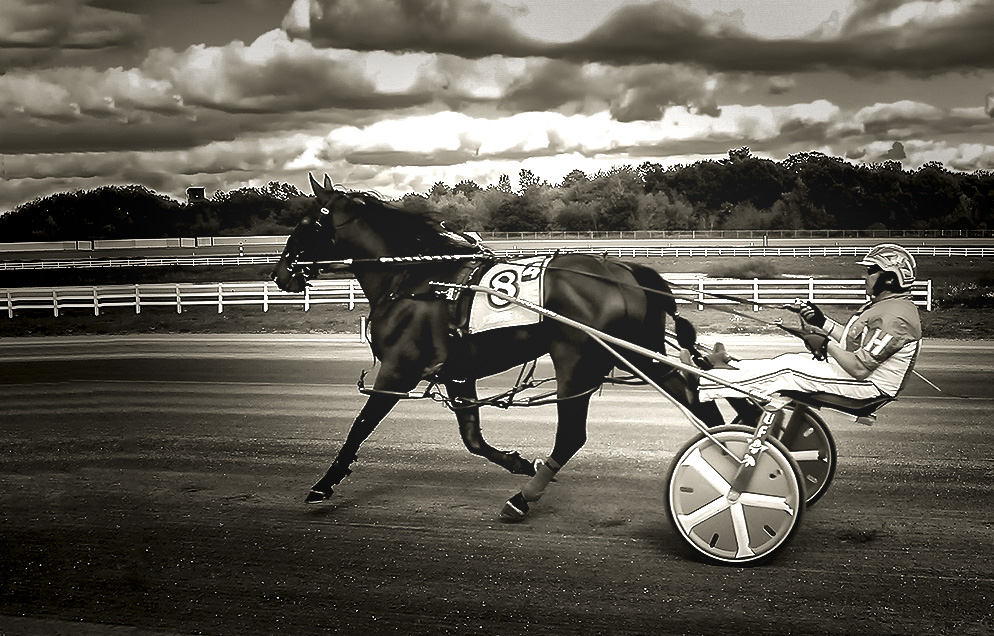
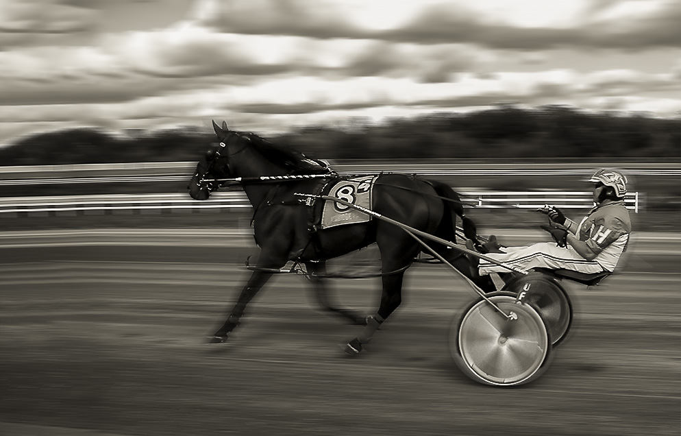
Barbara
I rather like the "frozen in time" effect of the shutter speed and I think the clarity/focus is remarkable. I took the image in two directions: to add some motion blur (hard to get right), and secondly to further isolate the horse and rider which I think makes their "freeze" more of a feature. |
Oct 5th |
 |
| 99 |
Oct 22 |
Comment |
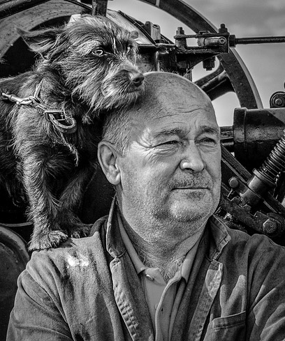
Peter - for me the combination of dog and master is wonderful in drawing out the character of them both - the black and white treatment reminds me of an old movie set: the captain and friend against the elements/pirates.
The original is a little soft on focus (f/5.6 may be a little tight?) but I think the sharpening is a little too heavy.
That being said, I think this is a striking portrait.
My very small changes are: 1) to crop even closer on the left, and 2) I dodged/burned to bring out the dog's eyes, and to add emphasis to the paint on the model's shirt because I was drawn to that detail as a key element in the narrative (for me) |
Oct 2nd |
 |
| 99 |
Oct 22 |
Comment |
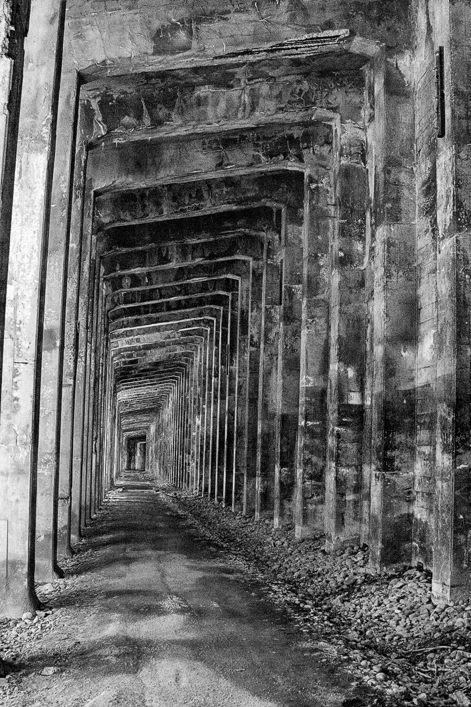
Michael - I think this is a great picture - particularly the composition. It must have been tempting to center the passage, but I think your choice is perfect skewing left as it plays off the incline of the (not quite) horizontal crossbeams.
The color image works well also.
I had to play and my version differs in two respects: I did not correct the verticals as I see the distortion as an element of chaos appropriate to the long tunnel of my nightmares .. (but maybe that is for another forum), and I used the color sliders within the photoshop B&W conversion to create different strokes on the tonal variation.
But this was just playing - I would be proud of your original. |
Oct 2nd |
 |
6 comments - 3 replies for Group 99
|
11 comments - 3 replies Total
|


