|
| Group |
Round |
C/R |
Comment |
Date |
Image |
| 79 |
Sep 22 |
Comment |
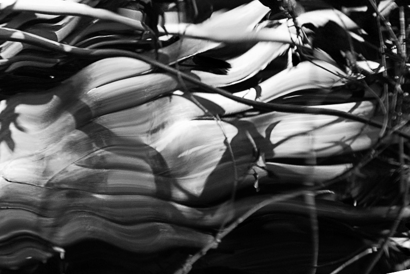
I clearly have failed to impress with my paper background in the light table. In less "lit" images - it aims to provide a texture to mimic a sort of old parchment upon which the image might be thought drawn; in this month's image it is only seen in the vignette ... and I have learnt that it is seen as noise/dirt. Thank you - a useful lesson. |
Sep 18th |
| 79 |
Sep 22 |
Comment |
Karl _ I must start by confessing that light patterns are not my cup of tea.
That said ... I do admire the way your "strokes" resonate the arch of the bridge and wonder if the sweeps had been more staccato, could it have also mimicked the vertical struts. |
Sep 18th |
| 79 |
Sep 22 |
Comment |
Freddie - definitely a feast of color to my eyes. In terms of orientation, I am not sure that either vertical or horizontal work best as the flow seems to traverse between edges very directly. Below is my suggestion of a slightly angled crop. I have cast in in B&W not because I think this is better than color, but simply to focus on the direction/lines. In my view, the image then starts with a horizontal and then bends into a diagonal - just an idea. |
Sep 18th |
 |
| 79 |
Sep 22 |
Comment |
Lynne - I am late this month so find I can only repeat what is said in admiration for this image. OK I can add, It makes me think if an early Renaissance exercise as artists began to display their prowess in the new techniques of perspective.
I find the texture of the "center" to be intriguing: like something out of chaos beyond the edge of the structure |
Sep 17th |
| 79 |
Sep 22 |
Comment |
Judith - I also find it surprising that you were able to envisage this image from such a humble beginning. For me the interplay of lines and curves (drawn in nature) is so striking and attractive. My only thought is the tint - and this is purely a personal taste I know - I would favor something a little stronger such as selenium. |
Sep 17th |
 |
| 79 |
Sep 22 |
Reply |
Groot is a fictional character appearing in books published by Marvel Comics. I first saw him in the movie Guardians of the Galaxy. He is kind of a walking tree with no vocabulary; like an Ent from Tolkien. |
Sep 17th |
| 79 |
Sep 22 |
Comment |
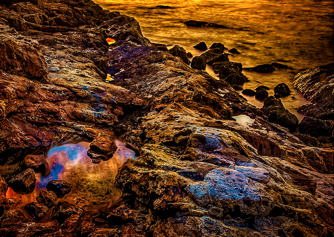
Peter - so glad you are still alive - otherwise we would not have seen this image :-)
The timing in the day for the colors is truly amazing - and I like the detail in the rocks. The movement of the sea has made it appear smoother to me and it looks as though it is beyond the depth of field - so I guess I do wonder what would have been the image without the filter and with a faster shutter speed.
I have two suggestions. The first that the natural colors while beautiful might benefit from a little enhancement in (say) Nik software (color and tonal contrast). The second is that the I would favor a tighter crop so that the beautiful pool in particular is given more prominence. I have attempted to illustrate these ideas - see if you like the outcome |
Sep 17th |
 |
6 comments - 1 reply for Group 79
|
| 99 |
Sep 22 |
Comment |
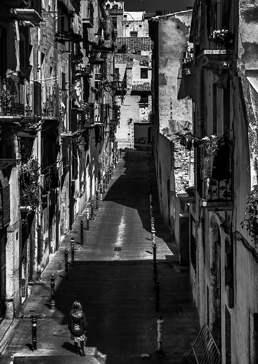
Did anyone else see the face in the top floor at the end of the street - as though the building is laughing at us and our fears? |
Sep 12th |
| 99 |
Sep 22 |
Comment |
Randy - a lovely scene so evocative of the somewhere else (you did not say where?). The flowers on the balcony speak of rural pride constrained by urban living. I love the left side of the street since there is so much to be seen and the details are rendered so clearly for me.
I share Kathleen's concern about the shadows. for me they are not so my ominous as simply blank> I believe though that there is information within and I have applied a curves layer with a mask exposing only the shadows and the darker walls on the right. Then I added a little more contrast to from the following ... I hope it still has the angst you were intending. |
Sep 12th |
 |
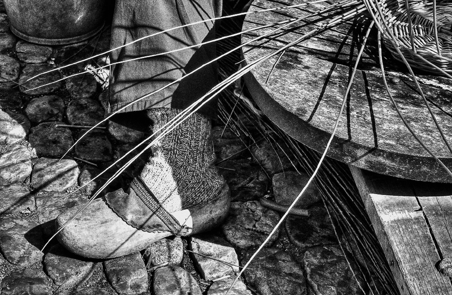
| 99 |
Sep 22 |
Comment |
Kathleen - I share your interest in the foot - and having it slightly hidden by the basket reeds makes it in my opinion even more interesting. I do share the other opinions above that the hand is problematic, but my solution would not be to ask for more context, but rather simply to eliminate the hand: it distracts us from the foot which is your intended subject.
Below is that crop - without sepia and with a little more constrast. |
Sep 12th |
 |
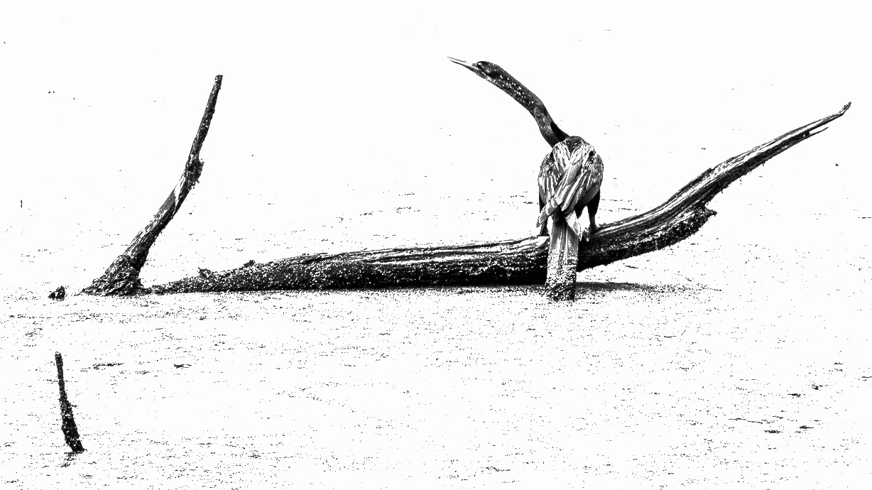
| 99 |
Sep 22 |
Comment |
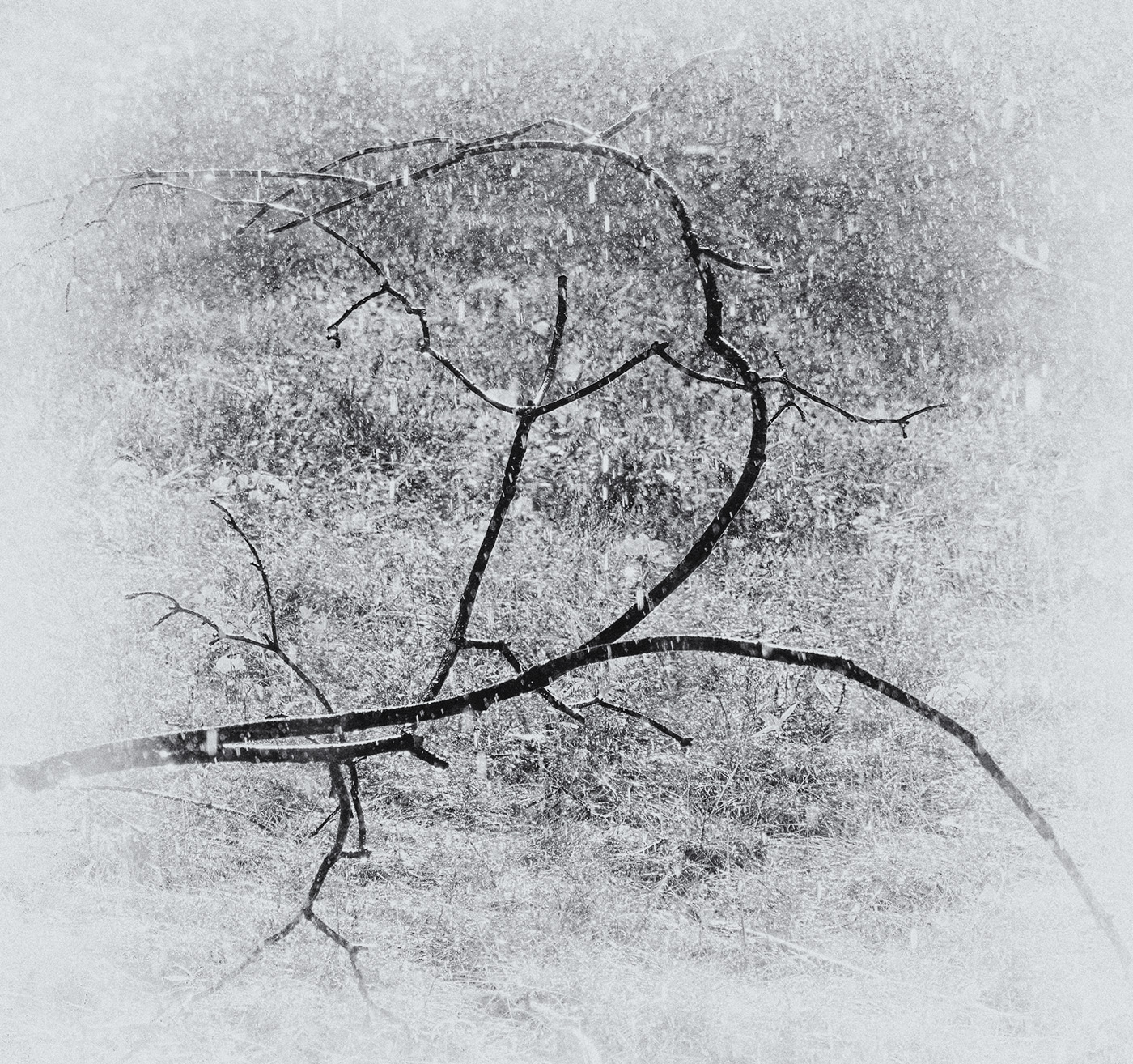
A story of curves - the branch twice to the right and the bird's neck in opposition to the left forming both convex and concave regions. This is such a strong "stroke" that I think the high key works well by eliminating most other elements.
I wonder though if a little negative space below would add further emphasis, particularly as you already have a feature (a left echo of the bird's neck) that would justify it in the original. |
Sep 12th |
 |
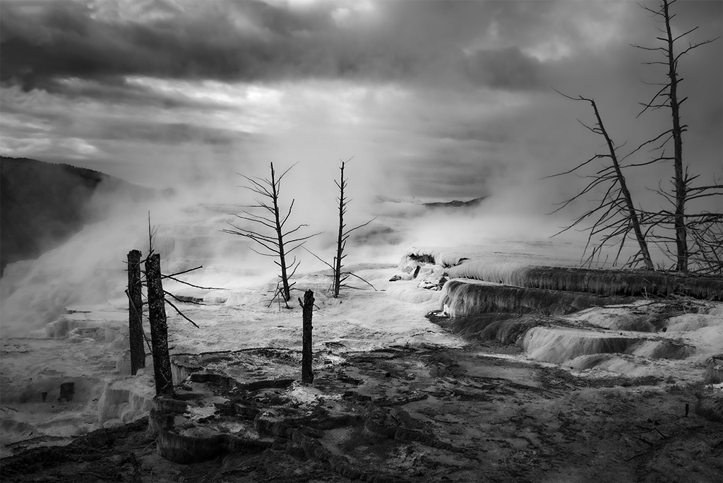
| 99 |
Sep 22 |
Comment |
Linda - I love the desolation that you have captured in the sweep of the water. Congrats on your intrepid adventures.
My personal impulse is always to add contrast and so I tried the following in the camera raw filter in photoshop using a radial filter with the intent of adding light to the center of the image. See if you think this was worth trying. |
Sep 12th |
 |
| 99 |
Sep 22 |
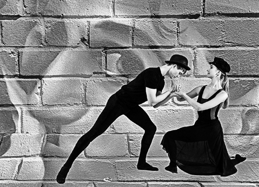
Comment |
Peter - I started playing with your originals at the beginning of the month and never quite got to where I wanted. However, I will inflict it upon you all anyhow :-), simply to illustrate what I was trying to do.
I like the idea of combining the dancers with film stock from their costume - essentially a projection of their inspiration. I would suggest three changes: 1) the film edges seem inappropriate to me since these are not projected on the screen and so not in the dancer's memory, 2) I would give stronger weight to dancers than to their dream, 3) I would distort the wall so that the base becomes ground. Below is close to this - but not complete. |
Sep 12th |
 |
| 99 |
Sep 22 |
Comment |
Barbara - coming in last to this discussion I find I can only echo the appreciation of this image, except to add that I enjoy the care with which you staged the "shoot".
Two thoughts about the center of the flower occurred as I played with the original. I think I would have made it lighter rather than darker that the other two layers (easily effected in the black and white layer in photoshop. I also wondered if it was somehow less sharp than the rest of the flower; since there was a tripod involved, I might consider a higher f stop. |
Sep 12th |
7 comments - 0 replies for Group 99
|
13 comments - 1 reply Total
|


