|
| Group |
Round |
C/R |
Comment |
Date |
Image |
| 3 |
Aug 22 |
Comment |
I think it a work of art. I like the paper-like background particularly the hints of color. It seems to me that you have stylized the flowers towards a watercolor finish; I would love to know how? |
Aug 2nd |
1 comment - 0 replies for Group 3
|
| 79 |
Aug 22 |
Reply |
Judith - thank you , I love our story telling |
Aug 13th |
| 79 |
Aug 22 |
Reply |
Thank you for your suggestion - I will certainly consider other fruits and vegetables. But it is odd that I cannot think a painting featuring tomatoes - perhaps because they only reached Europe from the New World in the 16th century. |
Aug 13th |
| 79 |
Aug 22 |
Reply |
Lauren - you found what I remembered being taught, though I had misplaced it between the testaments. Thank you for that. |
Aug 13th |
| 79 |
Aug 22 |
Comment |
Judith,
This is for me a great example of the "artistry" that is possible through post-processing. What surprised me is that you managed to make for my eyes the texture of the flower to match that of the stone wall, to discover a communality between the brick and the life.
I think that placing the subject in the lower half of the image is unusual and that, in so doing, you convey the stress of that day.
Personally I prefer the image without the horizontal flip as the flower then seems to me to provide an initial diagonal to draw the (western) eye into the center. |
Aug 13th |
| 79 |
Aug 22 |
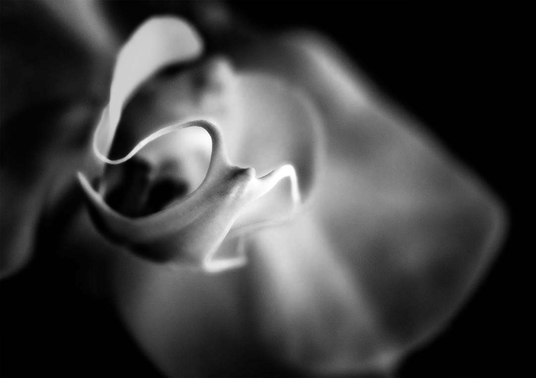
Comment |
Lynne - I have taken many orchids and had never considered B&W; yet I now see in your image the advantage this affords in focusing the viewer on the form and shape in this flower.
I see a spectre floating toward me: whooooo!
I like this image as you have presented it - but I did play with it a little and the one idea I liked was to darken the unfocused background to add contrast with the defined structure.
|
Aug 13th |
 |
| 79 |
Aug 22 |
Comment |
Lauren
I do like the detail of this image with all the lines radiating from the central block. Particularly I like that the "chip" is off-center, to the right matching the direction of the lower connections. It almost looks as though it is walking.
The lines of the fabric below (and above) are, I think, a relevant metaphor for other connections and wires, and I would suggest that this be retained; the unfocused cloth on the left however I would eliminate. |
Aug 6th |
| 79 |
Aug 22 |
Comment |
Freddie, I love the colors, I love the curves and I think inverting the image was the right decision.
I am less content with the bottom right which seems to me to be of a less interesting palette, and to dominate what I feel are the better features elsewhere. I apologize in advance for the severity of this but ... I think I would retain only the left half because it has examples of all the best elements and this would focus the viewer better on the "snake". |
Aug 6th |
 |
| 79 |
Aug 22 |
Comment |
Karl - thanks for the re-arrangement - I had missed the tonal difference entirely and will certainly be more careful in future. I thought I had a B&W filter on it all (apart from the tomatoes) but I must have applied it before adding the third hand. I think your arrangement is more kind than my own - but after the last two years I am feeling more old testament than new. (oh and less with the "aged" please - my hands are still young at heart :-) ) |
Aug 1st |
| 79 |
Aug 22 |
Comment |
Karl
So creative - and I think so well done, I am stuck by the care you have put into selecting and combining the elements to realize this "concept".
I do think it is great - I have couple of thoughts. First I love the color and chaos of the background but I would reduce its saturation to leave a little more room for the main subject. Second, the table top looked to me like a canvas wanting to join the party ... |
Aug 1st |
 |
6 comments - 3 replies for Group 79
|
| 99 |
Aug 22 |
Reply |
Michael - instinctively I am with you all the way, but I am trying so hard to be soft this month. I see so many images in other settings that seem to eschew definition and contrast, and I hope to learn by imitation. Fear not - I will be more focused next month. |
Aug 13th |
| 99 |
Aug 22 |
Reply |
Peter - I like the picture - I hate Marmite
All others - it is made from yeast, from by-products of beer brewing, even more strident than Vegemite
|
Aug 7th |
| 99 |
Aug 22 |
Comment |
Kathleen - just to explain ...
That term "flipped" is a reference the orientation change from your original to your final image. Perhaps you actually did a 180 degree rotation, but that is the same as flipping in both the horizontal and the vertical axis: what was up is now down, what was left is now right, and Michael first realized this when he saw that citsym reads from right to left because of the vertical flip swapping right for left (in the reflection alone it is just upside down ... and the horizontal flip puts it right side up again). You have to love or hate this stuff. |
Aug 7th |
| 99 |
Aug 22 |
Comment |
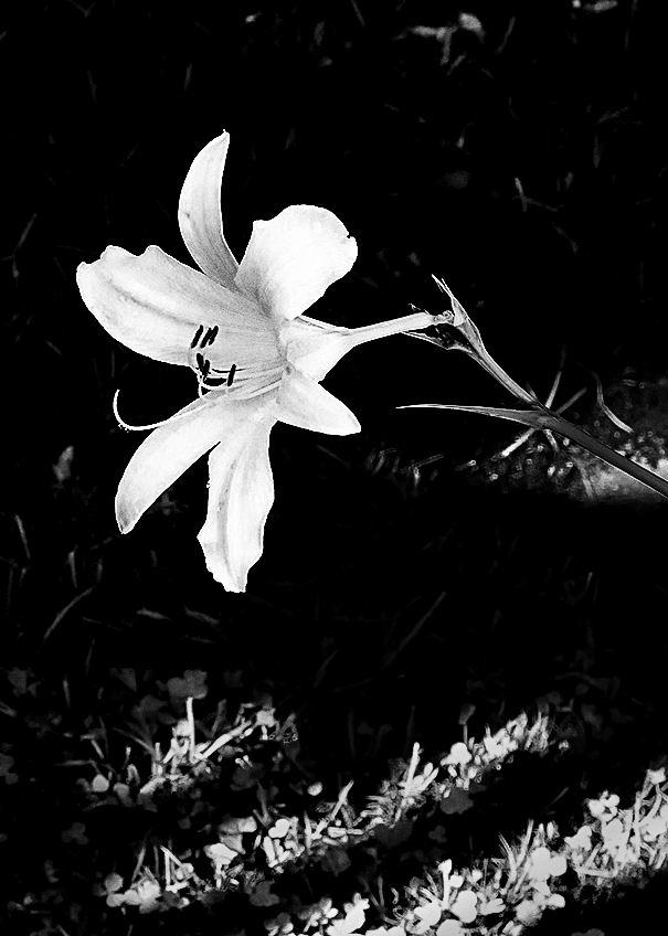
Thank you all for the feedback: I find this group so rewarding.
On the question of sharpness. Yes and no. Below is the flower at 100% and I see the front of the image as being sharp and the back as being way soft. Given the f/7.1 I am surprised by this rapid fall-off but I recall now that I once did an experiment which showed that 1 inch was as much as one could hope for (with this lens) at f/8.
Admitting that softness, however, I am not sure that I would change it in this "flatter tonality" approach: the brief sharpness of the front seems to me to be sufficient - though I am sure it would not pass muster in a PSA contest :-) . |
Aug 6th |
 |
| 99 |
Aug 22 |
Comment |
Barbara
I am learning from your intent to identify and incorporate a second element into a flower picture: it might help me in selecting my own subjects.
To my eyes, your flower is not balanced with the brightness of the sunlight and so the ground is overwhelming the petals. My suggestion would be to use the sliders in a photoshop B&W conversion to change the balance the elements before the manipulation. |
Aug 6th |
 |
| 99 |
Aug 22 |
Comment |
Linda
I think this amazingly sharp - and I have to applaud your initiative in recruiting these subjects. What strikes me most is how you managed to capture the subject against the empty sky ... just :-) which must have helped when isolating the subject.
My only suggestion is that the background is very uniform; perhaps a vignette might enhance the boy. Below I used a solid grey and a gradient tool on its mask. |
Aug 6th |
 |
| 99 |
Aug 22 |
Comment |
Peter, I think this is a very effective great of light and shadow and yes others have used this before but I think your shot does it well. I love the lips - not the usual pose.
At this resolution, the blemishes on the face are not so obvious but with more definition I would suggest that since the whole scene is so clearly staged that not touching up the face seems a little cruel; I would consider the "spot healer" in photoshop (no pun intended). |
Aug 6th |
| 99 |
Aug 22 |
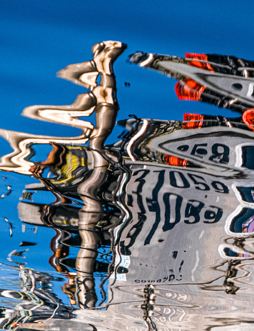
Comment |
Kathleen
First of all: welcome: it will be lovely to hear from a new pair of eyes.
I found your image to be very cinematic which I think comes partly from the tone you have added. It seems to me remarkably clear focused despite being a reflection. The overall impression for me is one of fascination as the distortions both explain the image but also render an air of mystery, of the twilight zone, do not adjust your set.
I have a cropping suggestion I wanted to share - just a personal preference - and which I have illustrated below. I would cut in two directions: from the bottom because I think the cut-off legs distract from the initial illusion and I want to add to the "challenge", and from the right because �� well .. because that guy looks to me like he is adding to the water (I know he is not but, again, it did distract me).
|
Aug 1st |
 |
| 99 |
Aug 22 |
Comment |
Randy
I think that is an interesting technique - and I think it works for this over exposed image �� I suppose because you have relatively little dark areas one which to "draw". The outcome does remind me of charcoal sketching I never mastered when I was young. It strikes me as a sort of minimalism in that you have enough features to convey the scene yet you do so without the clutter of detail.
One suggestion is that I think the woman is the strongest element - and that this strength would be increased if she were not centered. I would sacrifice half a car by cutting from the right: try it with your hand and see what you think.
|
Aug 1st |
| 99 |
Aug 22 |
Comment |
Michael
I love the smoothness of the images that you produce: like pearls. In terms of composition, it seems to me that you have two halves: the contiguous crowded rocks on the right contrasting with the sparse, isolated rocks on the left, it feels harmonious to me. I think that the reflections nicely retain the tonal contrast from the rocks (I mean, not washed out as mine were).
I played with the image a little and have two observations. First, I would clone (lighten) out the dark patch in the top right corner. Second, I find that that slight transparency of the water at the very bottom of the image shows subtle features which I think detract from the smoothness of the whole. I would crop out a small strip from the bottom - just a little.
As to the land or sea horizon - I have no preference: there is so much else to attract.
|
Aug 1st |
8 comments - 2 replies for Group 99
|
15 comments - 5 replies Total
|


