|
| Group |
Round |
C/R |
Comment |
Date |
Image |
| 79 |
Jul 22 |
Comment |
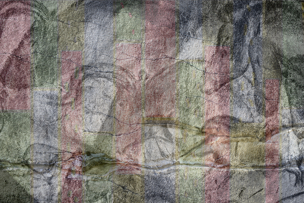
I think that caveman came back |
Jul 14th |
 |
| 79 |
Jul 22 |
Comment |
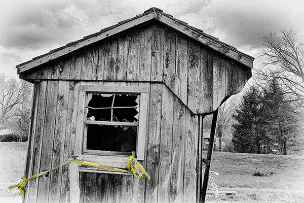
Judith - glad you saw this shed - and stopped to capture it. I like the frankness of the broken glass and the sideways slant.
The attached is more for fun than a serious suggestion - I was just taken by the way the tape was assuming importance as the comments progressed: I wanted to make it a star! |
Jul 14th |
 |
| 79 |
Jul 22 |
Comment |
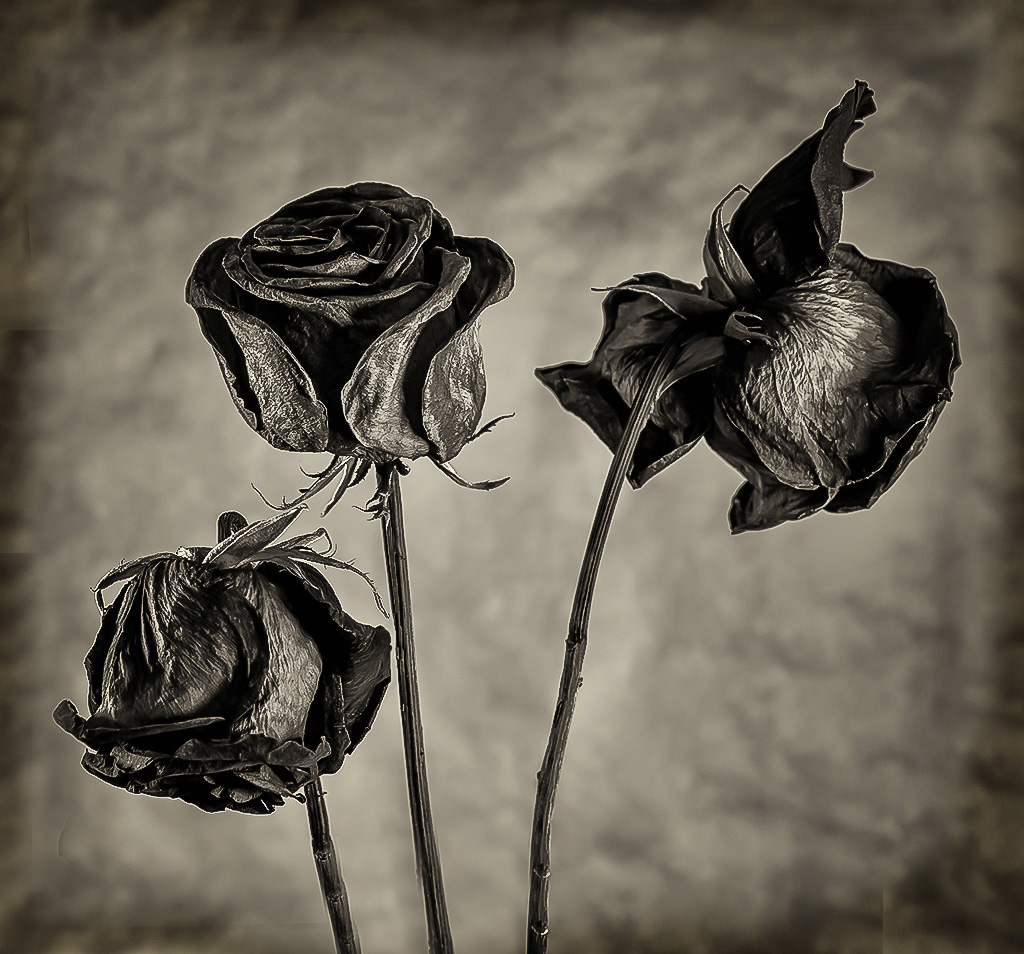
Lynne, a lovely transformation. I particularly like the way in which you have retained the dimples on some of the petals giving us a feeling of texture on the center contrasting with the soft focus on the lower elements. The use of a slightly imperfect rose appeals to me. |
Jul 14th |
| 79 |
Jul 22 |
Comment |
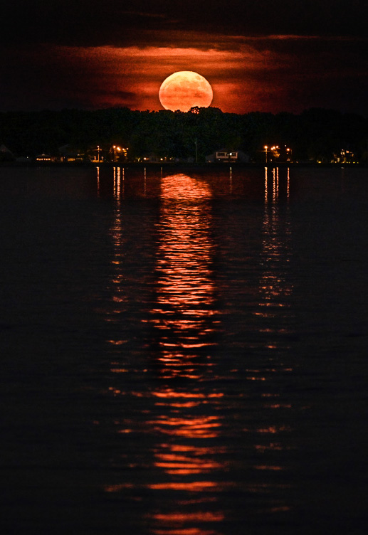
Karl I think the creation of a symmetric image was really well executed: it certainly grabbed my attention and made me pause. The detail of the small tree in from of the moon is a happy inclusion.
I wonder if may suggest a different crop. For me the moon and its reflection are themselves worth the viewer's focus and I worry that the symmetry you added may detract from that simpler beauty. |
Jul 14th |
 |
| 79 |
Jul 22 |
Comment |
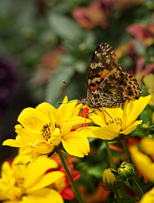
Lauren, lovely butterfly - and to my eyes well placed in contrast to the yellow flowers. I agree with the thrust of the previous comments in that I feel that the background is too dominant in color and so distracts from the patterning in the subjects wings.
However, I do like you crop in that the butter fly falls nicely on the rule of thirds and the background provides a little negative space.
My suggestion is to 1) select subject, 2) invert the selection, 3) create a hue/saturation layer, 4) mask out the bottom of the image (where the yellow flowers bloom) 5) desaturate and darken to taste the remaining background.
I think this removes the color distraction while retaining the blurred effect I think you were seeking. |
Jul 14th |
 |
5 comments - 0 replies for Group 79
|
| 99 |
Jul 22 |
Reply |
I tried my parchment idea and could not make it work - so I wanted to suggest instead a simple darkening. I cloned out the frame - and then used a curves with a mask to apply it to the new edges. See if you like it. |
Jul 13th |
 |
| 99 |
Jul 22 |
Reply |
"You have said it thrice. What you tell me three times is true." (Adapted: the hunting of the Snark) |
Jul 13th |
| 99 |
Jul 22 |
Comment |
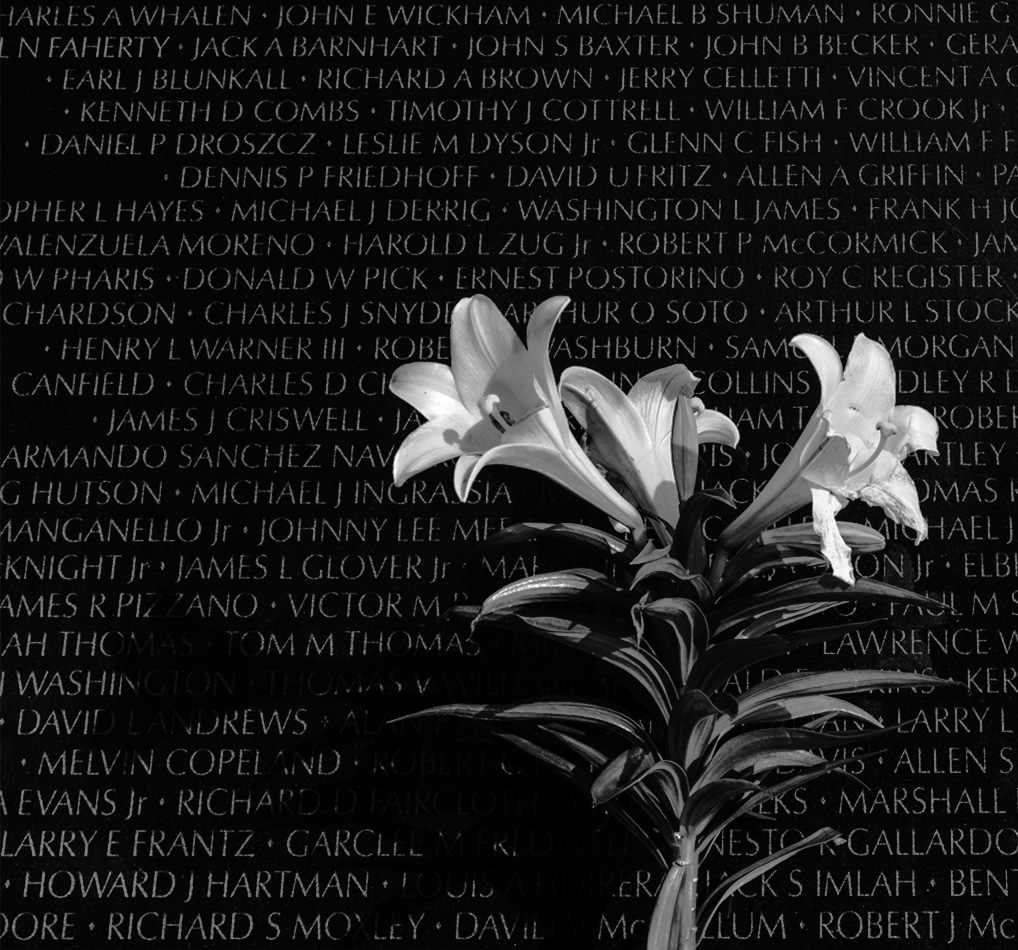
Randy - a very well conceived image - the black and white of the wall and flower seem to me to provide a perfect subject for a B&W image since it focuses on the contrast, devoid of color.
Like Peter, I was wondering if the flower's shadow could be given a higher role, since a shadow over the fallen has its own narrative. My approach would be to cut from the right so that the flower and shadow are given emphasis, and more equal weight. |
Jul 10th |
 |
| 99 |
Jul 22 |
Comment |
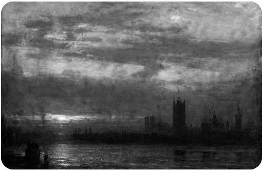
Michael
and I forgot to include this ... which is a Turner (made B&W by me) and what I thought of when I first saw your image |
Jul 10th |
 |
| 99 |
Jul 22 |
Comment |
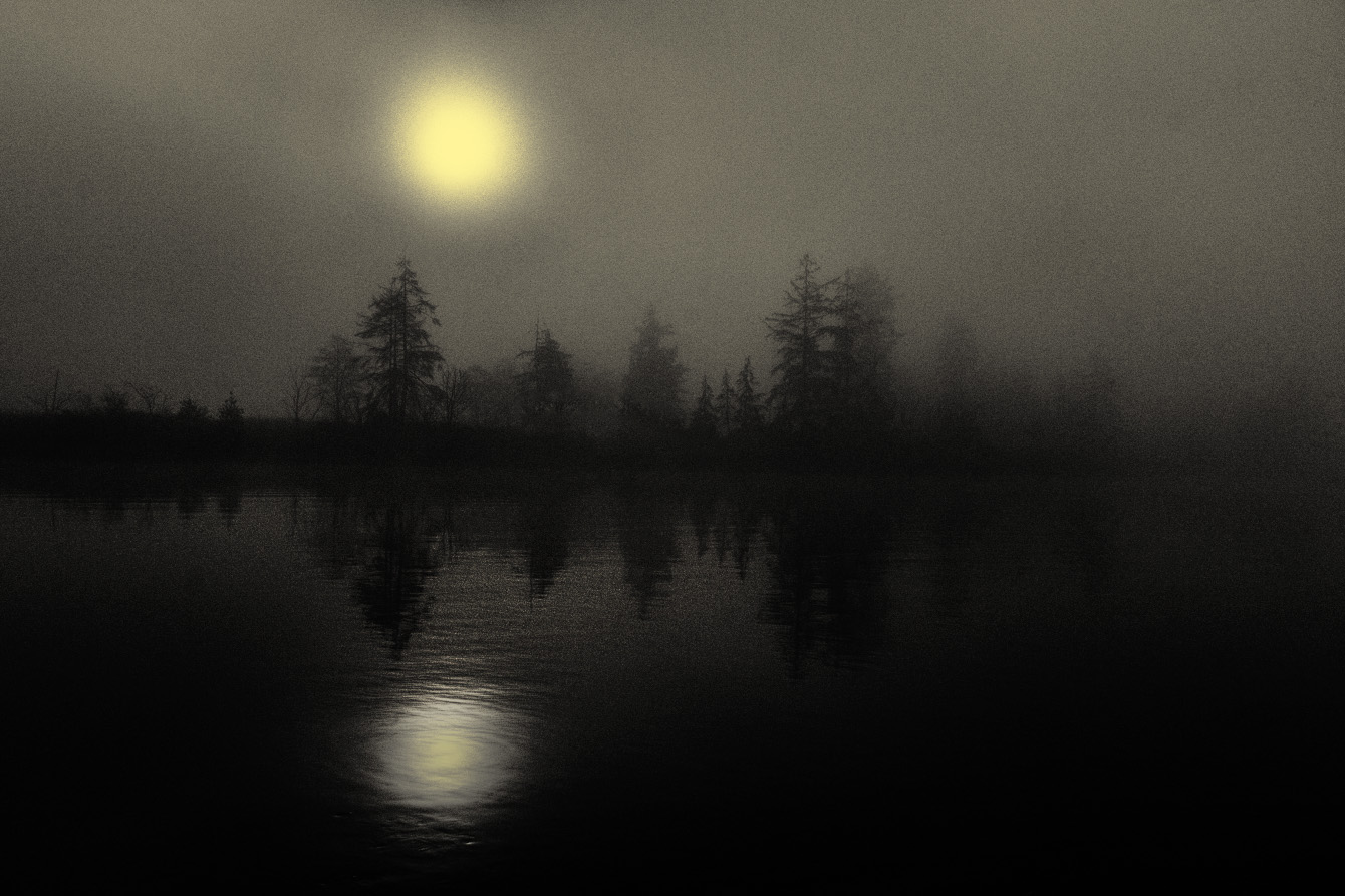
Michael, there is no right or wrong way - but there is always "my" way :-) - and I want to thank you for posting such an interesting challenge for us all. I think your original image is charming (and I mean that in a positive sense). A foggy sunrise -and for this I expect and appreciate a lack of definition - a loss of the concrete - a mystery of shapes not quite seen. For this reason - I like the way in which the right side of the image seems to me to blur into indistinction.
The one observation I have for "your" way is that it seems that the reflection is brighter than the sky ... and I am not sure that is natural. |
Jul 10th |
 |
| 99 |
Jul 22 |
Comment |
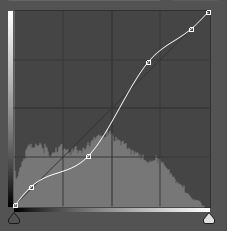
Linda - the high contrast I love - and the clouds seem to me to be so dramatic because of it. It is an image I would like to have made myself.
I agree that there is part of the sky where it is burnt too much in the post processing, and I would like to offer two suggestions based upon my own attempts to process your image. 1) the most bright spot in the sky, I cloned it out ... not a complete copy, just at a 50% flow. I feel this just gave me a little wiggle room, 2) my final contrast was using curves in photoshop and below is the "curve". The key point is that I protect the top and bottom of the ranges and add contrast to the center. These are just ideas - an example from my work flow. |
Jul 10th |
 |
| 99 |
Jul 22 |
Comment |
Striking indeed - for me it is like the cover of a graphic novel, something to do with tales of magic and danger. I see the veined texture of the petals as the strongest feature
I agree with Peter in part, that the frame does not enhance, but I do like the inner un-straight border which makes the image look to me as though it were on parchment. I wonder if it is possible to eliminate the border beyond and keep only that?
|
Jul 10th |
| 99 |
Jul 22 |
Comment |
Peter - another good portrait. I particularly am drawn to the texture of the clothing.
I think you have a general "dark halo" around the image which is effective in drawing in the eye - however, in this case I would suggest that you might have taken steps to protect the model's left hand. Perhaps a version without the halo - and the hand area blended with a mask to preserve its brightness.
As to the "dirt" that Michael is seeing - I think it is a result of the model's ruddy complexion. Or put another way - in the transformation to B&W, I think you have darkened the reds (for instance the wood of the shed) and this has resulted in a darkening in the model's face. Again - one might consider transforming different parts of the image separately and then blend them with masks. |
Jul 10th |
6 comments - 2 replies for Group 99
|
11 comments - 2 replies Total
|


