|
| Group |
Round |
C/R |
Comment |
Date |
Image |
| 99 |
May 22 |
Reply |
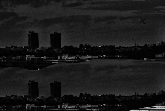
I just wanted to share a photoshop trick that I was taught last year. It addresses the "halo" that sometimes surrounds dark objects after they are manipulated: the tower building in the skyline. The idea is to use the "clone tool" but set to darken and the flow set to about 20%. Then you anchor the clone in the middle of the sky (X below) and then paint around the halos; because the buildings are darker than the sky, they are not affected but the light halo becomes darkened to match rest of the sky and so the halo vanishes. Below is a before and after picture of the horizon. This has saved a few of my picture before. |
May 7th |
 |
| 99 |
May 22 |
Reply |
Peter I like it |
May 7th |
| 99 |
May 22 |
Reply |
I totally understand about the window. In my mind I was watching a movie and in the next scene we would zoom in to that window to see what nefarious deeds would be in perpetrated within; this probably doesn't work for a still photograph. |
May 7th |
| 99 |
May 22 |
Reply |
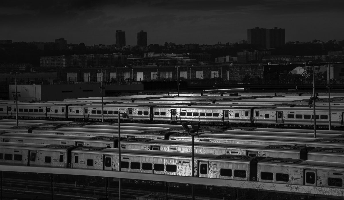
Michael - Thanks for the comments - yes the stacks are a little strong.
I have to confess that my editing is totally dependent upon Nik software - it changed my life, well at least my style. In general I tend to pass images through both the color and silver tools and then to merge the two in photoshop producing a semi-saturated chimera. For B&W of course I stop at one - and then dodge selectively. |
May 6th |
| 99 |
May 22 |
Comment |
Randy - I think this is very "film noir", particularly with the lighter, highlighting of the carriages in the mid-ground compared to the dull city buildings beyond. The detail on the mottled reflection nicely draws my eye.
I have played a little with the image (such a great one to doctor) to try out two changes: 1) I removed most of the fore-ground because I think the carriages deserve to own it, 2) dodge and burn, to make the sky more ominous, to take down the highlights at the front so that the second layers of carriages are balance with the highlights of the first, and to add brightness to just one of the large windows in the middle (off center).
|
May 6th |
 |
| 99 |
May 22 |
Comment |
Linda, I concur about the benefit if the texture of the hairs resonating with the grass, and I particularly like that they seem to be on opposite diagonals which helps to make the donkey stand out. The flat horizon (with elements removed) strikes me as a good choice.
I played a little with the crop and some dodge and bur (particularly in the clouds above the donkey's head). See if you like the changes. |
May 1st |
 |
| 99 |
May 22 |
Comment |
Barbara
I like the composition: several elements and yet it seems to me to retain a pleasing simplicity. For me the inclusion of the buds on the left, with flowers leaving on the right lends to a story of birth and growth and maturing. I think this is enhanced by your use of only the "backs" of the flowers: they are not here for us, they have other places to be. |
May 1st |
| 99 |
May 22 |
Comment |
Peter - overall I think it is a great image and I like the way you added this background to tell the story of an entrance guarded by thus young thug: very peaky blinders. You have really captured a personality here.
For the image itself I have two suggestions: I think the white under his eyes is too intense and is therefore distracting. I do see some of it in the original - but I cannot understand its source even there. Second, I see this setting as conveying menace - and for that I would suggest that the background be darker (which might elevate the subject as well).
I have a couple of problems with the model: the jacket is too big (glad you cut out his right hand which seems to me to be ill at ease as well as lost in the sleeve), and he stands resting with his finger on the trigger which is too foolish to be credible. |
May 1st |
| 99 |
May 22 |
Comment |
Michael, the project is going well. I am struck by the pin-sharp focus across the whole array of elements in the center - and the absence of noise is remarkable. I particularly like the tilt of the flower and the use a petal to provide the textured background. Lovely image.
I would darken the shadows for greater contrast - but I think we have established that our tastes diverge on this point. |
May 1st |
5 comments - 4 replies for Group 99
|
5 comments - 4 replies Total
|


