|
| Group |
Round |
C/R |
Comment |
Date |
Image |
| 99 |
Apr 22 |
Comment |
Randy - I have little experience with street photography since I always think it so hard to work in such an uncontrolled environment.
I do like the idea here, and the nostalgic reference. I think the image itself is well captured in terms of lighting and focus; the latter surprised me in that I thought f/4 would have been too narrow a depth of field - it worked for you but I myself would fear being below f/8.
I understand Peter's distraction - but for me the woman in the right, foreground poses a larger distraction in that her back, square-on, seems to block my eyes initially from taking in the rest of the scene. I guess it is a question of timing.
Or you could go crazy with the aspect ratio and just crop her out.
|
Apr 18th |
 |
| 99 |
Apr 22 |
Comment |
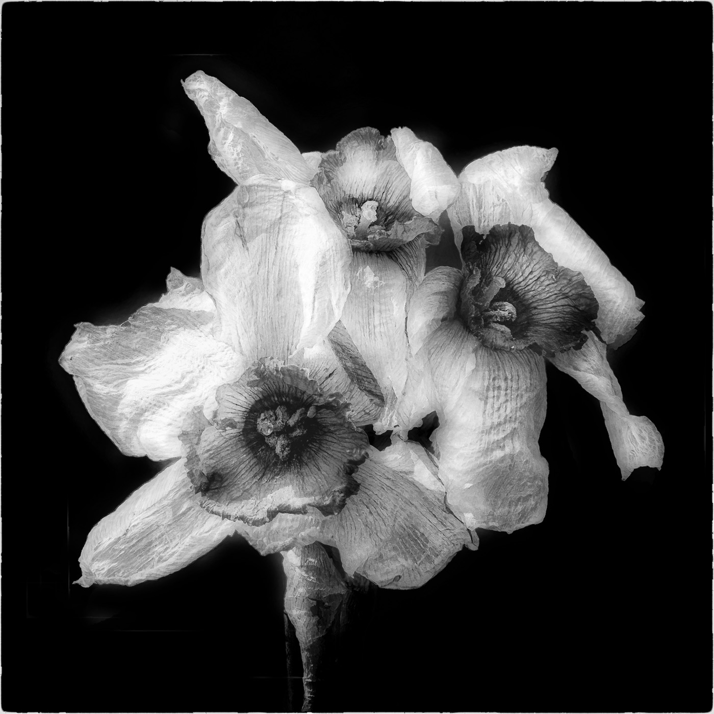
Michael - so I think it is a great subject (I admit I love dying flowers - not something I ever thought I would write). I think your two options here are extreme - and I would look for a middle ground. My version is your two images : ghosting around the edges removed and a 30% blend. Perhaps more crumpled bedsheets than ectoplasm, but I think a little more definition adds to the fragility. |
Apr 18th |
 |
| 99 |
Apr 22 |
Comment |
Linda - I too think this a well composed scene. I especially like the treatment you gave to the pavement surface making it so "shiny" in the rain water: well accentuated from the original. I cannot improve on Michael's suggestions.
To my eyes, your image seemed a little inconsistent in that the spire and the pavement might have been from different photographs. I think this is due to a difference in post-processing between the two regions - and with Michael's global changes (as well as his local treatments) this dissimilarity was removed.
Good luck with the exhibit. |
Apr 18th |
| 99 |
Apr 22 |
Comment |
Peter - a nicely quiet picture for me, that seems to convey a strength or determination in the model's expression and eyes. Contrary to other suggestions I would darken the background as much as possible as a means to bring out the highlights in the model's face. In attempting this I had trouble with the hair on our left since the background can be seen through the strands and so I fear I had to darken the hair there as well - but, again through contrast, I think this adds emphasis to the hair textures on the other side. |
Apr 11th |
 |
| 99 |
Apr 22 |
Reply |
Both you and Linda want the right tree removed. I did consider that myself but kept it to stop the eye wandering out at the top; I will revisit that decision. |
Apr 11th |
| 99 |
Apr 22 |
Reply |
thank you Michael for you observations - the lens is my most recent and indeed my most extravagant self-indulgence: but it does have a problem which is no stabilization - and so in the dull light did not want to use a slower shutter speed: little stacking rather that a larger shake. |
Apr 11th |
| 99 |
Apr 22 |
Comment |
Barbara - I think this image is quite beautiful, and I believe that some of its impact comes from the way you have incorporated such a full range overall from white to black - while managing to keep the contrast gentle in any small region. Nicely done. |
Apr 11th |
5 comments - 2 replies for Group 99
|
5 comments - 2 replies Total
|