|
| Group |
Round |
C/R |
Comment |
Date |
Image |
| 31 |
Mar 22 |
Reply |
If cropped at all, I would crop from the left because the bridge and brickwork add more for me to the central topic than the hills across the lock.
Peter, it is superb and a great lesson for me personally as I have stood there and have nothing like this to show. |
Mar 13th |
0 comments - 1 reply for Group 31
|
| 47 |
Mar 22 |
Reply |
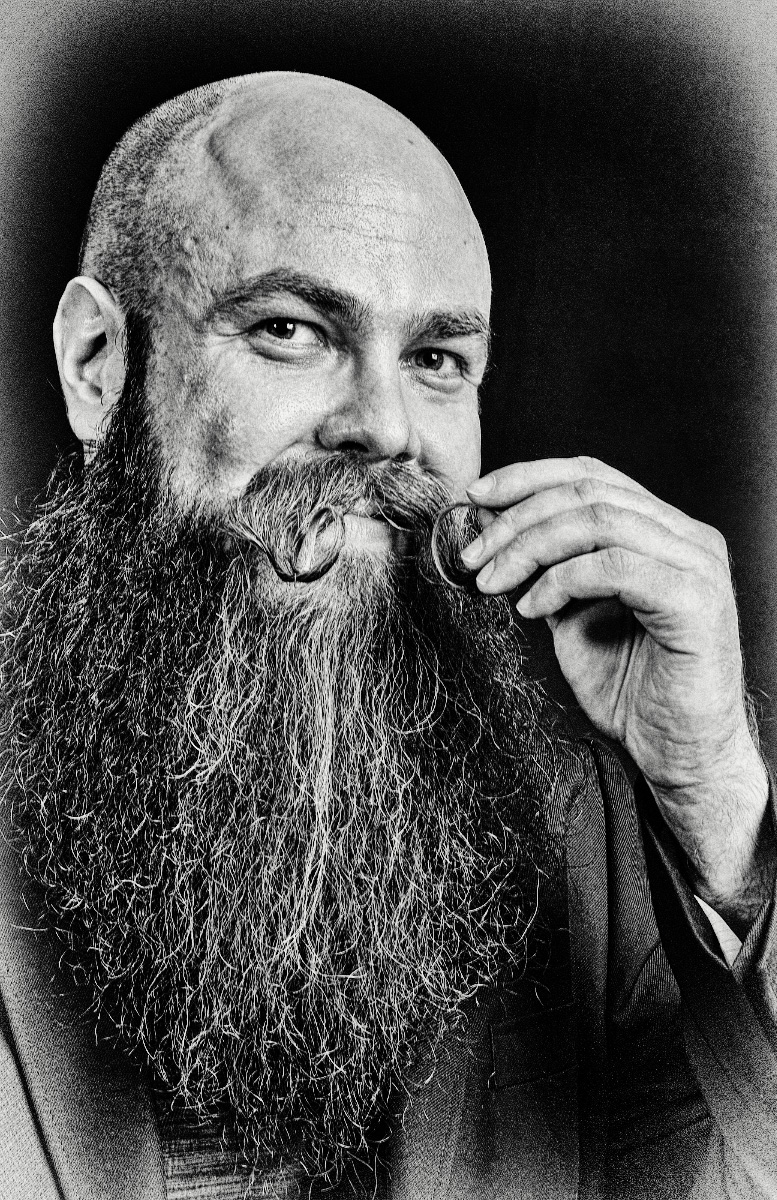
Yes, I do think it worth. submitting. One more aspect I would suggest you address though is what seems to me to be an abrupt vertical transition on the forehead. I see it in most of the variation I tried in Silver e-fax. I do not know capture one. In photoshop I used the clone tool set to lighten and just broke up that line so that it does not stand out, pushing the light over half a centimeter here and there.
Good luck with the contest, I"ll look for you there. |
Mar 15th |
| 47 |
Mar 22 |
Comment |
Kirsti
I was taken by this image when browsing the "mono" groups: I think you have captured a great picture with direct eye contact, clarity and good tonal variation. I have one suggestion and one bit of fun.
I would narrow the crop: for me there is too much space on both sides where my eye wanders.
I went into Silver Efex Pro also and come out with another style ... which I offer as something not better, but different.
|
Mar 13th |
 |
1 comment - 1 reply for Group 47
|
| 83 |
Mar 22 |
Reply |
Thank you for you detailed response. I applaud any attempts at comforting theses days. On the one hand I agree that we should rebel against training and habit, on the other hand I personally feel that realism is not necessarily a virtue: I feel it is a base from which to create. A choice. For me, photography replaces painting as I lacked dexterity but loved the image. |
Mar 13th |
| 83 |
Mar 22 |
Comment |
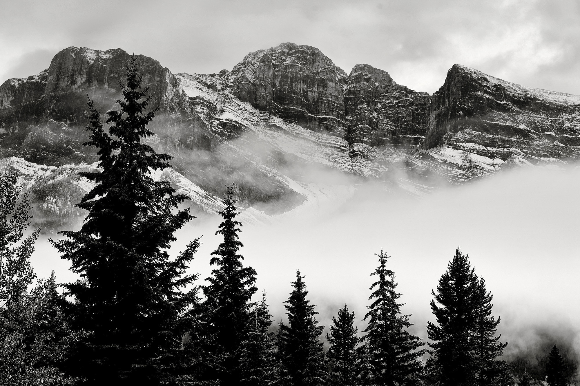
Yes - beautiful and I think you have achieved the silhouetting goal. I wonder if you might add to this by darkening the mountains so as to add emphasis to the mist midground by darkening the far ground ... alternating bands of dark light dark light to accentuate the depth. |
Mar 12th |
 |
1 comment - 1 reply for Group 83
|
| 99 |
Mar 22 |
Reply |
I once fell in love with a postcard of Donatello's Mary Magdalene - it was wonderful and the biggest surprise was when I saw the actual sculpture because it was not nearly so striking. In my opinion, the photographer can bring their vision, their angle to any image whether it is a landscape or a sculpture which makes it distinct from the original. For years I had a picture of a single panel by Rodin which I had isolated, dodged, burned, "polished" from within a 40*20 foot gates of hell and I have not doubt that it was a better and more striking image than any reproduced by the museum. My interpretation was, in my opinion, a distinct (distinguishable) variation from the original; no one would have thought that the sculpture was my art, but I think anyone would have recognized my content, my contribution in the image I produced.
And what is the alternative? We see a beautiful sculpture and yet I can never capture an image of it to transport/share that beauty?
I think it comes down to money. If we photograph for pleasure, then we should enjoy; if we photograph for profit, then we should not exploit another's art. |
Mar 13th |
| 99 |
Mar 22 |
Reply |
Which, for your amusements, only goes to show how colorblind I am �� I never noticed the color at all. |
Mar 11th |
| 99 |
Mar 22 |
Reply |
thank you for the demonstration
I see the difference between your first and my main which I am taking to be noise vs grain ... and your second, is that noise plus grain?
Now that I have starred at these images for so long I am beginning (to go blind) to wonder if my noise is actually condensation on the glass. |
Mar 11th |
| 99 |
Mar 22 |
Reply |
A useful distinction And since I shot in iso 100 I was surprised to see noise�� Michael can you say whether you think my picture is noisy or just grainy? |
Mar 9th |
| 99 |
Mar 22 |
Reply |
Thank you Peter, I am taking the "slightly less interesting" as my answer. |
Mar 5th |
| 99 |
Mar 22 |
Comment |
Barbara
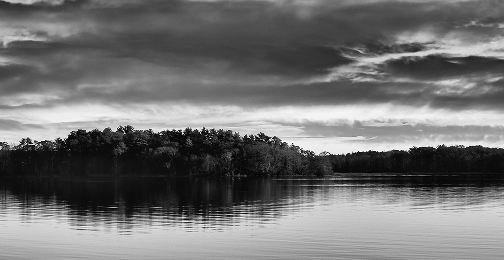
I love reflection pictures particularly like yours where the water ripples to cut lines through the dark shapes. I applaud your crop, removing the left; I think it results is a good balance with a larger punch on the left, and a softer almost receding response on the right. I would be tempted to lose the brighter sky at the top; if I hide it with my hand, the picture seems to become more somber, tranquil.
One suggests comes because I think that some of the trees are too dark, but they do have information in them. I entered photoshop, filter -> camera raw, and used a radial filter to isolate the dark areas - and then raised the shadow and black cursors slightly to bring that information forward - just a hint of light to remove the blackness. See if you think it makes a difference. |
Mar 4th |
 |
| 99 |
Mar 22 |
Comment |
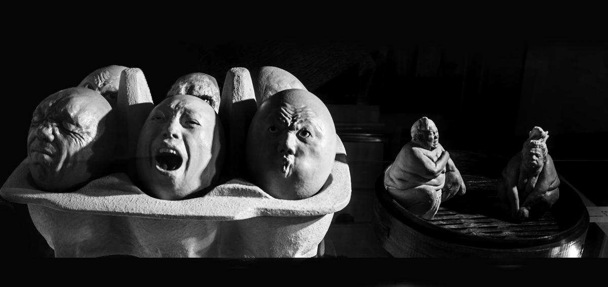
Randy, a great subject and so well spotted. Oddly I had just finished listening to a speaker at my camera club showing several images he had also taken of store-front displays. I had never thought of it but you clearly found a great example. I like the grouping pf the egg faces with the two figures - I think the variety makes both more interesting.
As to the reflections - at first I tried to be subtle with the cloning tool set to darken ... but then I just took a paintbrush and went crazy. See what you think. |
Mar 4th |
 |
| 99 |
Mar 22 |
Comment |
Michael, I see strong curves indeed with lovely contracts between the dark and light surfaces. I find the "internal" curves on the surface of the light surface to be very attractive - adding to the sweep. The lower, right half, I see you have aligned two opposite curves so that they just kiss, I suspect that resulted from very careful positioning for the shot.
My one suggestion is that there seems to be some smudge, or fingerprints on the central ascending light surface; I would be tempted to clone these out. |
Mar 4th |
| 99 |
Mar 22 |
Comment |
I think this is a very interesting subject and that he make a great portrait. I particularly like the way you blurred the background without losing any of the integrity of the hair. It seems to me that the final is over-sharpened, particularly on the skin. My suggestion would be work on the eyes only and to leave the skin "soft". |
Mar 4th |
| 99 |
Mar 22 |
Comment |
Peter
I am struck by the way in which the subject's head an shoulders seem so much closer - it looks like a wide-angle lens to me but I do not know mirrorless cameras at all. Any how I like the effect since it seem to add to to the "tough" boy narrative ... along with the simple clothes, the absence of a smile (though a hint of amusement in the eyes) - I think this very well posed especially with the side-lighting which seems to emphasize the definition on the arms and the rather unique forehead.
I would be tempted to try other tones : a little blue might make him "colder" - again the tough boy idea.
This is perhaps my favorite of your portraits so far. |
Mar 4th |
5 comments - 5 replies for Group 99
|
7 comments - 8 replies Total
|


