|
| Group |
Round |
C/R |
Comment |
Date |
Image |
| 99 |
Feb 22 |
Reply |
I think half way in between |
Feb 13th |
| 99 |
Feb 22 |
Comment |
Leanne,
I like you image especially for the narrative it has capture and the texture on the sandbags. Personally I would have dialed back on the sepia - but that is my taste. |
Feb 13th |
| 99 |
Feb 22 |
Comment |
And now for the big reveal ------ drum roll ------ my shot was the detail from a deer's skull found a decade ago in the small woods behind my house
Well done Peter for homing in on "bones"
To my eyes - the image looked like a large statue, in the right-half, of some deity with a ram's head like some ruins that Indian Jones might pass on one of his adventures. |
Feb 13th |
 |
| 99 |
Feb 22 |
Reply |
This would be my version with that strategy |
Feb 6th |
 |
| 99 |
Feb 22 |
Reply |
I am not sure we can or indeed should - perhaps instead we should build on the high contrast that the subject has with his own clothing and therefore lighten the background so that his natural dark tones are offset more strongly. |
Feb 6th |
| 99 |
Feb 22 |
Comment |
Michael I see this image as a collection of regions each contrasting with the others by both tone and texture, all plain except one which for further contrast has the only horizontal or vertical lines. I think it a triumph. |
Feb 5th |
| 99 |
Feb 22 |
Reply |
Stephen, if I compare the color image to yours, I think your change to the skin tones has greatly reduced the fidelity of the image |
Feb 5th |
| 99 |
Feb 22 |
Comment |
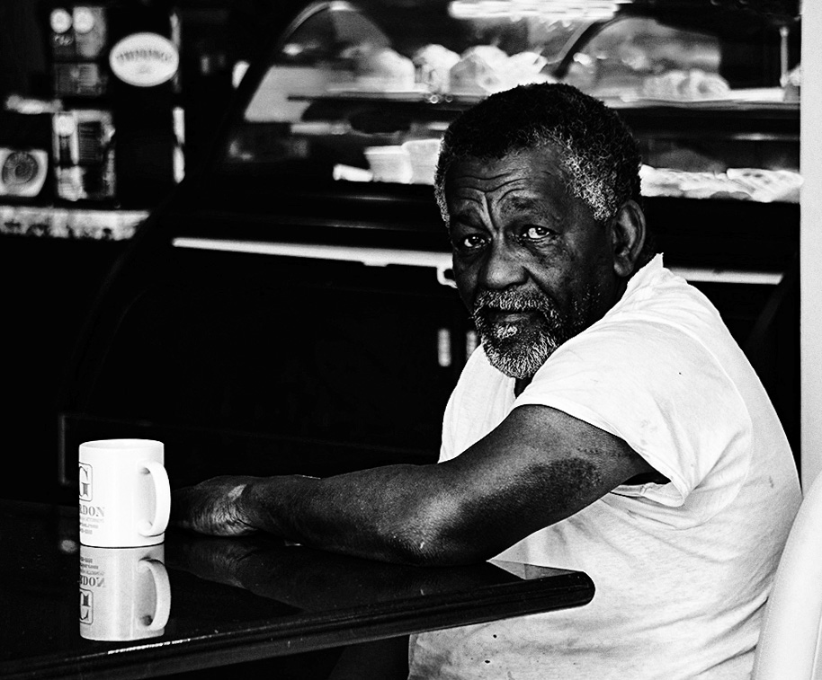
Linda, a nice piece of informal portraiture, I think you have captured this subject well in context,
In my opinion this image is better in color. I see the foreground as a contract between the dark skin tones and the so white T-shirt and mug, and I think the yellow wall and the not-white light in background help both these to stand out. |
Feb 5th |
| 99 |
Feb 22 |
Comment |
Randy, plenty of interest in these shots in the brick patterns and the fractured wooden frames. I am intrigued by the top horizontal in the foreground window in two of the image, but not the third. Did you clone these? If so, I think it is very well done and useful for the composition.
Your three crops are intriguing to me in that I see them as a great example of the struggle between isolating the subject while retaining its context. For me the Original-2 version is the Goldilocks choice, tight enough to guide the viewer into the diverse textures through the window, but wide enough to render the foreground frame as a feature rather than, in my eyes, a possible obstruction as in the tighter crop.
|
Feb 5th |
| 99 |
Feb 22 |
Comment |
Peter, I like the idea of a vignette to stylize the image - and I think it could have been stronger, perhaps with a sepia tone also to hint at age.
I love the shot above the waist: two attractive models seen unusually from behind seems to me to imbue a sense of quiet intimacy. And the contrast between his and her shoulders is particularly striking.
Below the waste I have trouble. Yes I know men wear tights in the ballet but I am finding that tight definition of the buttocks to be distracting, an unfortunate wardrobe in a static shot. |
Feb 5th |
| 99 |
Feb 22 |
Comment |
Barbara - I agree with the above - but for me the most distinctive element is the positioning of the branch in the image. I love the way it starts in the bottom left and ends on the other side - it avoids the center and I see a bold "here am I"! |
Feb 4th |
| 99 |
Feb 22 |
Reply |
yes - I had wanted to keep the tonal variations "down" as I tend to head for high contrast and I wanted to push myself out of that habit - but I must agree, it does look better after some dodge and burn. |
Feb 4th |
7 comments - 5 replies for Group 99
|
7 comments - 5 replies Total
|


