|
| Group |
Round |
C/R |
Comment |
Date |
Image |
| 99 |
Dec 21 |
Comment |
Barbara, I am most struck by the sharpness of the sides of the tower which you have brought out so well beyond the original image. The "windows" in particular are attractive, I think, because of the precise white lines against the black opening. This seems to add for me a strength and assertiveness to the building, again beyond the original. It is as though you were able to chip away at the marble to reveal an inner form.
The rising horizontal left-to-right of the roof was to my mind the better choice, especially for a subject that is already so high above the viewers' horizon. |
Dec 12th |
| 99 |
Dec 21 |
Comment |
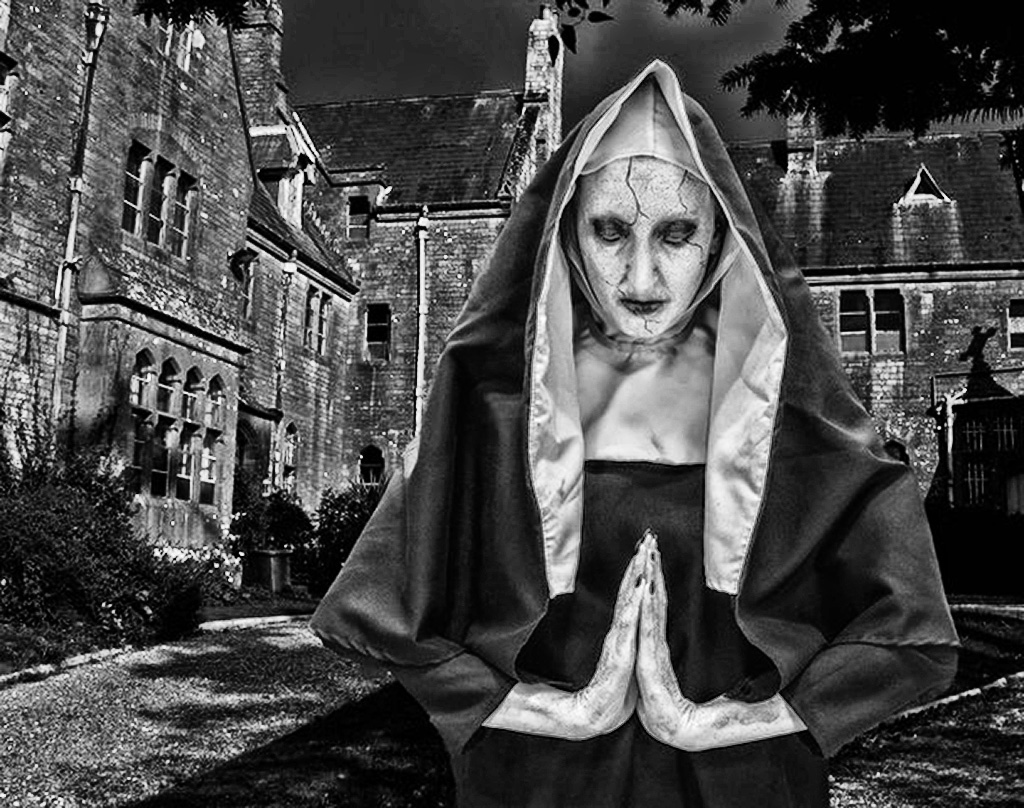
Peter, love the idea and the combination - who knew Birmingham could be so exciting?
I personally feel that the image is too dark - this woman would be scary in daylight. Specifically there is a shadow of a cross on the wall to the right which would add to the narrative, and I think that brick facing deserves a role. |
Dec 12th |
 |
| 99 |
Dec 21 |
Comment |
Great portrait - great subject. And I especially like the handling of the background and you removed a lot that would have been distracting. I think your clarity and focus is bang on, which I assume was helped your choice of ISO 400 even on a sunny day to enable the 1/500 shutter speed. I always forget that myself and end up with shaky images as ISO 100.
I find the face a little too much in shadow for this subject who has much to say. I took the image into Nik's Silver Efex Pro to brighten and isolate the face a little - and to add a historically appropriate tone. |
Dec 12th |
 |
| 99 |
Dec 21 |
Reply |
|
Dec 12th |
 |
| 99 |
Dec 21 |
Comment |
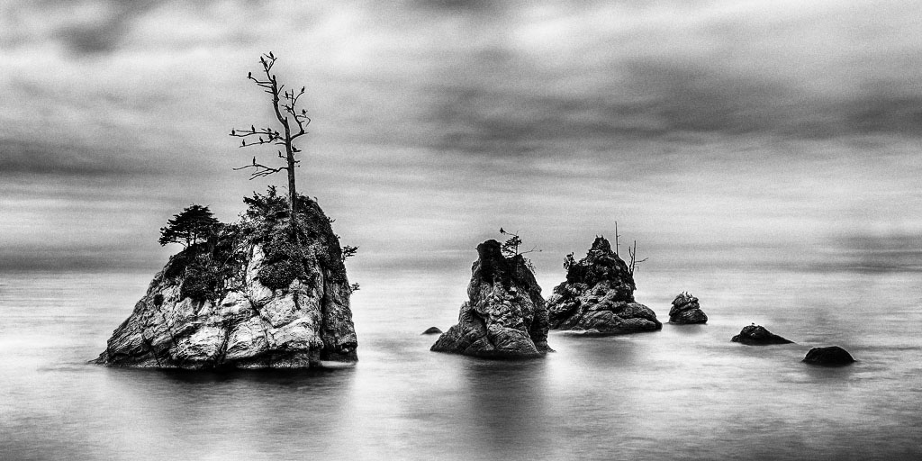
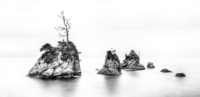
First I have to share that when I read your title I heard a tune in my head : "nights in white satin", just the resonance in the rhythm.
The image ... is again a lovely example your ND approach , and I think removing the horizon was the right idea. The composition is very attractive - though ideally I would have wanted to move to the left a little so that the second and third islands did not overlap.
As regards to Lance's comments - I think I would put it this way: the color's aren't that interesting, realism is not always worth capturing and in my opinion the virtue of this image is in the shape and positioning of its elements which are better represented without the distraction of color. Therefore I acclaim your B&W transformation (but then this prejudice is why I joined this group).
In terms of tonality, for my personal esthetic, I think this image lies halfway between the two directions I would have taken the image: higher key, or higher contrast. Purely a matter of personal taste - offered only as examples for discussion. |
Dec 12th |
 |
| 99 |
Dec 21 |
Comment |
To my eyes, the image is dominated by a lack of detail, of texture which provides that ethereal quality you were seeking. By this I mean I see the grass as merged into a carpet, the bales of hay as smooth (dark and light) - it definitely projects a somber mood.
I see the lines of bales in the right half as leading the eye (in two lines) directly to the sides of the building, and I think this takes us there, to the homestead. For that reason I would crop the right edge a little to eliminate the stray, rightmost bale as I think it distracts from this "pointing". |
Dec 12th |
5 comments - 1 reply for Group 99
|
5 comments - 1 reply Total
|


