|
| Group |
Round |
C/R |
Comment |
Date |
Image |
| 99 |
Oct 21 |
Reply |
It does indeed draw the eye in - a useful addition to so stylized an image |
Oct 12th |
| 99 |
Oct 21 |
Comment |
Linda - I think that the use of a low viewpoint and a wide angle lens were inspired and produced a great image. I also like the selection of sky for the replacement since it looks frenetic to me which adds to the almost ominous impression I get from the car. Actually I like the car so much, I think it deserves more of the picture. |
Oct 11th |
 |
| 99 |
Oct 21 |
Comment |
Randy - I like the subject and I think the image captures the sentiments you intended. I agree with Peter that it is a little dark but I would suggest lightening the mid range generally. Also, I wonder if 1/80 is a little slow for handheld: I think I would have bumped the ISO even more to allow a faster shutter speed. |
Oct 11th |
| 99 |
Oct 21 |
Comment |
Peter - I do think this a striking portrait - the act of smoking a pipe seems to me to be a great way of avoiding a too posed subject because I offers constrained action as well as the interest in the smoke itself.
There is a "but" though (although I am taught not to say "but" in these comments). I think the "exhaled" smoke becomes a problem found in the B&W image: over the subject's right chest and raised hand I think I see the lingering smoke of the last breath - and it seems for me to muddy the jacket and the hand itself. This does not seem to be a problem in color because I can more readily identify it as smoke - but in B&W I was wondering about the texture on that hand long before I understood the cause.
I think it is therefor a question of timing - or asking the subject not to breathe. |
Oct 11th |
| 99 |
Oct 21 |
Comment |
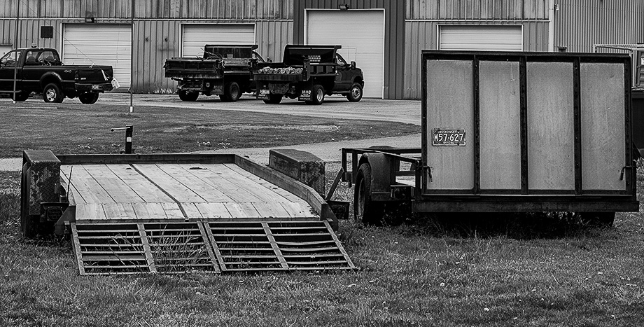
Barbara, I like the clear definition of line details and the contrast (which I think aids that definition). The subject does not work for me and I have been trying to think about "why?". I have one theory and one suggestion.
My theory is that my eye does not settle: not because I seek a single subject (I applaud complexity) but because all the major lines seem to lead out of the picture (off to the left top). This is based on my understanding of another's critique of one of my photos - but I may not have grasped it completely :-)
My suggestion is a crop (below) that removes a lot of the environment. My intent is to focus attention more strongly on the flatbeds, leaving the vehicles and garaging as a contextual accent. My hope is that this elevates the "horizontal" lines in the flatbeds so that they form an anchor to the viewer's gaze. |
Oct 11th |
 |
| 99 |
Oct 21 |
Reply |
Thanks Barbara - in fact I took several shots of the bee and only one was in focus on the face: even at f/8.0 it is so hard to catch a moving target in macro :-( |
Oct 5th |
| 99 |
Oct 21 |
Comment |
Peter - I know this is a little off the topic of your photo but I wanted to point out a set of portraits of Daniel Craig (007) in the NY Times https://www.nytimes.com/2021/09/30/movies/daniel-craig-no-time-to-die.html The first image actually showed the "set" for the photo shoot - and I was taken with its simplicity. Knowing that you have friends that are willing to dress up (e.g. the guy in the railway carriage) I wondered if this might interest you. For instance, the "smoke" would be easily retained against a black background when you added another image (by choosing the appropriate layer blend mode). |
Oct 3rd |
 |
| 99 |
Oct 21 |
Comment |
|
Oct 3rd |
 |
| 99 |
Oct 21 |
Comment |
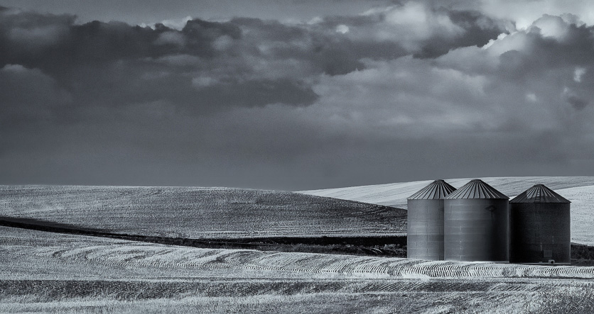
Michael
There is so much to like in this image - and well spotted despite the road. I think the lines in the grass are what really match this to B&W, helped by the contrast with the smooth surface of the silos. Then my eye turns to the contrast of the dark shadow crossing the light field (the sun must have been really low) which I see as creating a sharply defined midground.
Your cloning seems masterful - and I cannot spot the join.
Just as an exercise, I have taken a slightly different crop - and moved the clouds down a little, aiming perhaps to emphasize the space, the emptiness by throwing the silos off to the side. |
Oct 3rd |
 |
| 99 |
Oct 21 |
Comment |
Thanks for visiting and commenting. I do recognize that the background is distracting, but for this image I was hoping for the sort of monster, nightmare, 1920's horror film appeal - and so I actually liked the background shapes which to my eyes were repeating the shape of the visible legs as though there were more beyond. In color it is a picture of a bee on a flower, in using B&W I was going for ominous and foreboding ... whether I achieved that though is up to the viewer. |
Oct 3rd |
8 comments - 2 replies for Group 99
|
8 comments - 2 replies Total
|


