|
| Group |
Round |
C/R |
Comment |
Date |
Image |
| 99 |
Sep 21 |
Comment |
Returning to the scene of the crime - and trying to incorporate some of the feedback - I have the following ... |
Sep 24th |
 |
| 99 |
Sep 21 |
Reply |
Linda, I love it |
Sep 8th |
| 99 |
Sep 21 |
Reply |
Barbara, I had no intention to speak out of turn. I had thought that you and Peter had missed the reference to the workshop and I was hoping to point it out, because I thought it answered your question. I did intend it as help, I am sorry if I misunderstood your question. |
Sep 8th |
| 99 |
Sep 21 |
Reply |
Why the long exposure �� because he was taking the course ( with Thibault Roland) Personally I think it seems like a great experience and I look forward to seeing more examples of what you learnt. |
Sep 8th |
| 99 |
Sep 21 |
Reply |
Indeed - that does reduce the clutter nicely. |
Sep 5th |
| 99 |
Sep 21 |
Reply |
ah yes - of course |
Sep 5th |
| 99 |
Sep 21 |
Reply |
Thank you Stephen - always nice to see you visit this group. The background? Are you suggesting that I could improve the image by de-emphasizing the background (which might be hard to achieve without adding other problems), or is it just one of those circumstances that hinders the search for that so great image? |
Sep 5th |
| 99 |
Sep 21 |
Reply |
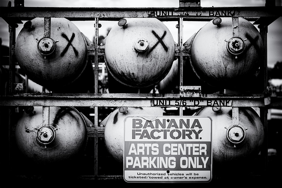
Banana factory is an Arts center on 3rd street Bethlehem - not that that helps the photo :-). It used to be a banana warehouse before it fell on hard times.
I should have added a title. The intended juxtaposition in this image was in the idea of "parking" beside these cylinders. Since I knew what was a banana factory, I did not recognize that viewers would focus on these words: that was a mistake, although Stephen below makes a good story out of it. |
Sep 5th |
| 99 |
Sep 21 |
Reply |
I should be careful not to sound negative about PSA. I have only been a member for about 18 months and by taking courses and using feedback opportunities and entering exhibitions (both in PSA and then outside) - I feel I have learnt so much in a very short space of time. There is though a perspective, repeated by many of the speakers who I have heard at my local club, that clubs and PSA can lead to a certain uniformity. Again, I believe I am a better photographer because of PSA, I just like to remind myself that it is not the only arbiter of merit ... and I think your shattered dog is good, it is just in my opinion more "LensWork" than "PSA" material. |
Sep 5th |
| 99 |
Sep 21 |
Comment |
Randy - this image seems to be to be like a lesson plan for perspective drawing (in a good way) with all those straight lines homing in onto a single vanishing point down at the bottom of the street. The tower vanishing into the cloud is particularly effective for me. My problem (and it is "my" problem) is that I do not like people, particularly random strangers whom I find distracting and unattractive. I like the buildings in your image, I love the lines, even in the letters, and I enjoy the distortion of the 28mm lens as it seems to add to this race to the distance - I would just cut out the people and make that tower the central focus. |
Sep 5th |
 |
| 99 |
Sep 21 |
Comment |
Michael, I particularly like the almost central vertical which is darker than the wall at the bottom and lighter than the shadow at its top. For me the blurring has the interesting effect that it is hard to distinguish between stalk and shadow, reality and reflection: I feel that it is this uncertainty that causes the ominous feelings you note. But despite these ambiguities, the wall itself is precise and clear and anchors the scene. Finally, for me, the dense shadows on the back wall add a third element which completes the complexity. |
Sep 5th |
| 99 |
Sep 21 |
Comment |
Linda - to my eyes the most striking aspect of this image is the way the tones vary so much to define the fur so clearly. Actually I am surprised you achieved such clarity with f/2.8; were you a long distance away? Anyhow, the focus on the face (including the eyes) seems bang on and I guess the focus does fall off a bit towards the far shoulder (not to the detriment of the image). I think this animal image is great.
The background did bother me as Randy said, particularly above the hand on the head since the lines seemed to imply a shwoosh of motion. The other aspect is that I feel that the tonality of the background blends too much for my taste with subject; I think I would be tempted to lighten (dodge) the background following the contours of the subject, to brighten the areas directly beside him (her?) so as to add contrast as well as framing.
|
Sep 5th |
| 99 |
Sep 21 |
Comment |
Barbara - I think the texture and focus/detail are lovely, and the subject is really worth the taking.
I too love to take flowers and birds in my garden - and when I present them I am often told that the background is distracting. I am not sure I always agree but I have taken to either putting a card behind the subject, or using select->subject in photoshop to isolate the image using that selection (with a little tidy-up) to form a mask for an adjustment layer. Your flower works well for that - some do not. And I sometimes ignore these comments entirely :-)
Below is an extreme example of isolation - but there are always sliders to allow one to blend layers and hence to moderate the effect.
|
Sep 5th |
 |
| 99 |
Sep 21 |
Comment |
Peter - first of all, I like the image - though I think I would have left the dog a little sharper. I do not think it is a PSA image, it is more a rebel image: interesting but breaking lots of rules (clarity, single subject, rule of thirds etc etc). Again - let me say I like it - but I do not think it is an abstract which I understand to be something that you do not necessarily recognize but which is interesting (hopefully) due to form or color or perhaps oddity. I think this is "conceptual"; I suggest that once one sees the dog, it is a picture of a dog in a broken mirror and then you spark narratives.
I personally got drawn by the fact that I saw a skull before I saw the dog: the dog is the nose, with two dark eye-sockets on either side of the dog's head and then the white around to form the read of the head. Thus I ended up casting the dog, the driver's faithful companion, being left abandoned after the foolish driver's demise: drive carefully, your friend needs you.
All in all, I think this an unusually intriguing image - and one that really does need to be in B&W. |
Sep 4th |
6 comments - 8 replies for Group 99
|
6 comments - 8 replies Total
|


