|
| Group |
Round |
C/R |
Comment |
Date |
Image |
| 99 |
Aug 21 |
Comment |
I find this very instructive in that I would have shrugged at the original scene and walked on - however, your B&W adaption results in a strong impression for me of structure and form. It sort of reminds me of propaganda images of the strength of Soviet industry. I especially like that you have drawn out information from the beams (?) so much darker in the color image, and I love the long shadows against the brick.
I have two minor suggestions which are to straighten the image using the central vertical as a reference (I am not sure that is a true vertical but the image would support it), and to lose the white on the right edge. |
Aug 7th |
| 99 |
Aug 21 |
Reply |
But the new one "is" growing on me |
Aug 6th |
| 99 |
Aug 21 |
Reply |
Thanks for the suggestion - always happy to play.
First, my setup is cramped, but helped by a Canon app on the iPhone so that I can see the image and adjust all the setting remotely ... only the manual focus needs me to be close.
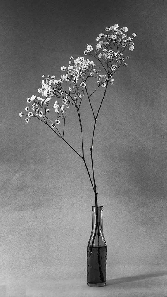
The shadows were not intentional: the natural light comes from the left, the other light was hand-held LED to even out the brightness along the flowers, and some of that fell on the table. Below is the edit you suggested - and I am interested to hear what you'all think. Again, the original was an accident, not by design, but I see there what I think of as "balance". |
Aug 6th |
 |
| 99 |
Aug 21 |
Comment |
Peter - oh those country roads where we wouldst wander
Clearly a wonderful use of both camera and software: I am particularly impressed that you retained the top of the window on the left (I would probably have pretended the window was full open) and the fact that the model's hair seems to echo the grass with which you chose to surround him.
My son suggests this is an Austin Healey.
I definitely prefer the B&W - it seems to me to have added texture, a roughness that changes the character of both model and vehicle making the image more interesting, even edgy (?)
And that pole? well the image may resonate the past but the pole offers a promise for the present: that our salad days are not quite gone, that cars and adventure still exist even along side transformers and the electricity bills waiting back home on the kitchen table. |
Aug 5th |
| 99 |
Aug 21 |
Comment |
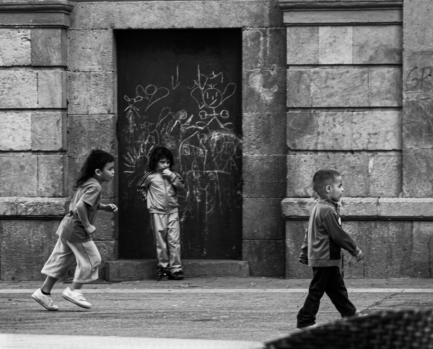
Randy, I think this is a lovely capture of personalities, and contrasts as well: running, slouching, striding all. The slight blur on the left girl's front foot nicely conveys her motion and I like that choice (rather than using a faster shutter speed). The background of graffiti might convey a sense of poverty except in your image their markings are playful and look child-like, to match you subject.
The chairs and table seem to me to be a distraction and I would remove them as in the image below. I also think that the streak of sunlight is blown-out and I would mask this with a clone stamp, darken only, and a low "flow" number just to add in some texture from the sidewalk.
|
Aug 2nd |
 |
| 99 |
Aug 21 |
Comment |
Michael - the image is se evocative of a rose and so for me it becomes more interesting as it is not: the texture of the surface in particular distinguishes it and this you have caught well. I like your use of a dark background to isolate the single element.
Since this was a staged setting, I do wonder if you have other images with different lighting. I might have tried side-lighting (a card for shade and a mirror to the side perhaps) but I am not sure if the shadows of each petal would have reduced the overall clarity that you achieved. |
Aug 2nd |
| 99 |
Aug 21 |
Comment |
Linda - the tangle of the roots at the base of the tree makes me nervous (in a good way) - I find the image to be dramatic and foreboding. The tree off to the left adds to this atmosphere for me, though I think I might have cloned out the human.
I do agree with Alan, except I would have cut slightly more. He left the stump on a line of thirds and I would suggest moving it the right of that to maintain the edginess you have achieved, and a little off the top so that the stump really dominates.
One idea you could play with is to make the sky a little brighter, I think this might increase its contrast with the land and the stump. |
Aug 2nd |
| 99 |
Aug 21 |
Comment |
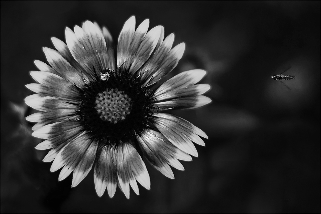
Barbara, I love the crispness around the petals of the flower, and the fact that it is off center in the image; this may have been a consequence of the flying inset (1/640 - good choice) but even without that element, I think the flower is well placed, I like the space.
I think you dodged around the flying insect to brighten the background and so to make the body more obvious - if so that was well done.
The center of the flower is a little weak to my eyes, so I am not sure about f/1.8 and the consequent DoF.
One idea I would like to share is the alternative to Nik in the B&W layer in photoshop (the old way). It might work well in this particular flower because you can control the brightness according to color - which gives you options in tuning the photo - if you do not mind straying from reality. Below I used the Magenta slider to add another ring of light. |
Aug 2nd |
 |
6 comments - 2 replies for Group 99
|
6 comments - 2 replies Total
|


