|
| Group |
Round |
C/R |
Comment |
Date |
Image |
| 99 |
Jul 21 |
Comment |
Thank you all for the suggestions; putting much of this together ... |
Jul 10th |
 |
| 99 |
Jul 21 |
Comment |
Not wishing to enter into a debate on animals in captivity - but I do not see despair but rather playfulness. With that in mind, I might suggest a larger crop (also to help with the softness). I have placed the face dead-center - normally considered a no-no but we are being naughty here and saying look at me - and the other monkey's back and tail now become in my view a target for mischief. I also raised the "structure" slider in Nik which seems to have removed some of the softness (I think(?)). |
Jul 10th |
 |
| 99 |
Jul 21 |
Comment |
I love the detail of the hairs and the slightly alien look: I can see this attacking the crew of the Enterprise.
I have to confess that I have had so much trouble with DoF in macro photography that I tend to either accept deliberate blurring for effect or (and this is not very eco-minded) I cut off a sample, and bring it into the house with an North facing window and a little LED, use a tripod, f/16 or more, a slow shutter-speed (with a remote release - a cell-phone app) and a black card from the Dollar store. Drastic but true.
The LED would also help outside - and you could always put the card behind the subject there too. |
Jul 10th |
| 99 |
Jul 21 |
Comment |
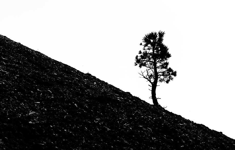
The contrast here, for me, is in the so steep angle of the hillside and the determined vertical of the tree: it lends to a narrative of struggle and grit .. and for this reason I like the original orientation because the tree seems to be standing up to prevent my eyes falling down the hill (rather than climbing up it).
I am not a fan of grain. I do not see it in your original image so I think it is an artifact of the software and if I meet that, I tend to adjust the slider of "grains per something".
I really like your direction to emphasize the silhouette and with that I see the central decision/problem as being how much of the ground texture to retain. I struggled with this and ended up thus - with a crop moving the tree into one of those lines of thirds. |
Jul 10th |
 |
| 99 |
Jul 21 |
Comment |
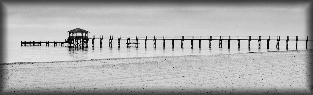
Linda - It is a lovely picture. To my eyes, the success of the flip depends upon the introduction of the sun - because without it there would be a very long wait before the eye stops (if we assume the left to right prejudice).
I do wonder though whether you might have milked the original image a little more rather than moving to sky replacement: I see a lot of lines in the sand which call out to me begging for a greater role "we could be a star, we could stand up with the pier and make a V and then who needs clouds and such, Go Minimilism! yay". So I thought I would try ... |
Jul 10th |
 |
| 99 |
Jul 21 |
Reply |
To my eyes, the cars are the main players and the sky alone is less interesting |
Jul 8th |
| 99 |
Jul 21 |
Reply |
The one suggestion I would offer is that I might have dodged a little to darken the tree tops over the groups of cars. A little extra contrast in the middle of the image might I think strengthen it. |
Jul 8th |
| 99 |
Jul 21 |
Comment |
Barbara,
I agree with Randy that the image looks sinister, and would go further by saying that I think that for me its success depends upon this sense of menace that the 1CAR exudes.
On the subject of flipping: I was thinking about what if the 1CAR was on the left. This would draw us into the picture and lead us off into the cluster of cars ... and I think that would be gentle and placid and dull. The dominance of the 1CAR is for me dependent upon it blocking our eye, asserting itself in the image. Even flipping just the clouds would reduce the intensity because in your image the dark foreboding, storm cloud hangs over the 1CAR (where it should be).
The cropping near the center of a wide-angled image seems to me to add distortion to the remaining side, no longer balanced by the same on the other side: in this image I think that plays into the narrative (does the backend of the 1CAR seem larger on its right rather than its left?) because it hints at the grotesque (in a good way :-) ).
Now I do realize that this analysis depends upon the narrative I have constructed - but it is this interpretation that gives me enjoyment and is why I like this image so much.
|
Jul 8th |
| 99 |
Jul 21 |
Comment |
I favor the original orientation. Just the feel for me is so much better. But in terms of the criteria advanced in earlier posts let me suggest that: lines lead even from right to left, so the radiator points to the subject in either flip; to add emphasis to the TV, it should be on the left so that it is seen first by those used to Western art; and since the subject is staring out of the image, it is better he stares to the right because that too follows the way are eyes would go (I really feel that he confronts me when he is looking left).
I like the contracts in the image, little and large, tall and short; I also like the implicit rejection of the TV, since the man has his back to it and is looking elsewhere. If I were to change it, I would remove some extraneous details by cropping from the right slightly to eliminate the skirting board's end behind the radiator, and by lightening the dark ceiling of the alcove on the left: I like the two subjects, and I think that they would be even better if more isolated.
It might also be fun to put the same man's face, from a different shot, on the TV screen - but that would be a wholly different story. |
Jul 7th |
| 99 |
Jul 21 |
Comment |
A quick comment for now _ I think you were very lucky (or was it design) in the number plate of the car: 1CAR96 stood in isolation overlooking (over-lording?) the crowd. |
Jul 2nd |
8 comments - 2 replies for Group 99
|
8 comments - 2 replies Total
|


