|
| Group |
Round |
C/R |
Comment |
Date |
Image |
| 96 |
Jun 21 |
Comment |
well I certainly look forward to reading how you did it: it is beautiful. The colors in the foreground in particular are amazing and I like the way the cracks end seemingly at the brow of a hill in the stark verticals.
Personally, I like the drama so much I would crop the more placid top down roughly so that the horizon is in the center - I am just using the scroll bar to try it out as I type
|
Jun 3rd |
1 comment - 0 replies for Group 96
|
| 99 |
Jun 21 |
Comment |
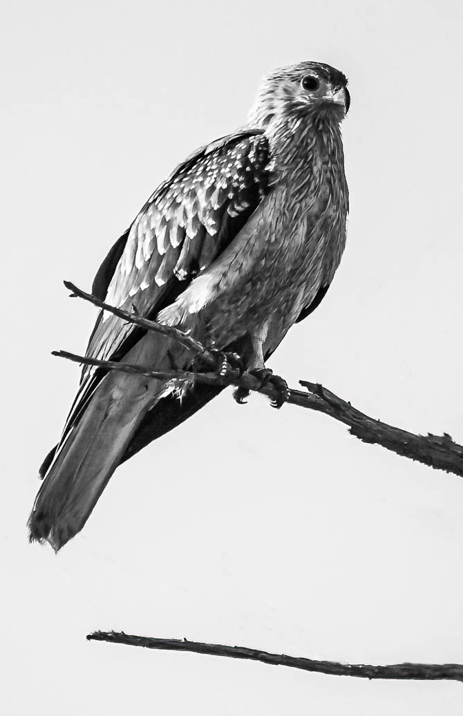
Leanne - I think the key element in this image is the detail you have captured on the birds feathers - quite brave of you to use f/5.6 on birds that might move around in and out of your depth of field, but you still managed to capture the subject with great clarity.
For me the branch on the right is less clear. I see the attraction of the V of the branch - and I also like the flip that Barbara suggests in that it makes the lower branch seem to me to almost be a shadow of the upper. However, I would simply cut out the right side to bring emphasis to the bird's texture and I would keep the lower branch since it seems here to add height to the "watcher" which for me adds to the narrative. |
Jun 9th |
 |
| 99 |
Jun 21 |
Comment |
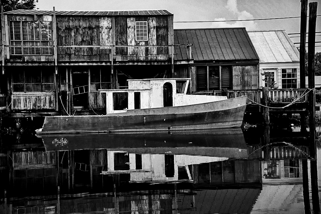
Linda - I agree on the composition and choice of subject - and I love that fact that the reflection is so clear (either the water is very still or your exposure was really quick?)
To my taste, the image is a little dark - making the scene more somber than I find in the color version. The attached may be a little extreme for your taste but this is where I would have gone. |
Jun 9th |
 |
| 99 |
Jun 21 |
Comment |
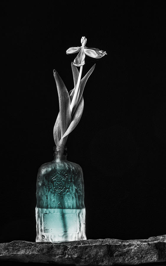
Ok - I hear the group - the light is distracting. Peter I did have a version as you suggest but I do like the bottle. As to the added color - oops - sorry - missed that: did not expect that to happen in the "raw" editor.
But - let me push this s different way and ask what the group thinks of the following in which I am adding "attractors" rather than removing one? Call it "power plant".
Might it be the case that an image should have many focus elements or one - but not a few? |
Jun 5th |
 |
| 99 |
Jun 21 |
Reply |
thank you - but - do either of you think that the reduced brightness in my second image achieves what you are suggesting? |
Jun 4th |
| 99 |
Jun 21 |
Reply |
Like this? |
Jun 3rd |
 |
| 99 |
Jun 21 |
Comment |
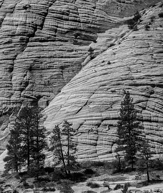
I applaud your instincts, those wavy horizontals hold my attention but more so because of the diagonal cut across them. The right half of the wall seems to me to have clear depth because of the lighter surface in the center of the image. From the shadows of the trees, I am assuming that the sun if overhead and that the light on the wall is because that is the least vertical in the image.
To my eyes, the front row of trees are a bit of a distraction in that they are not as well contrasted against their background as is the back row of trees against the stone wall. I would suggest that cropping them might bring forward the stronger features even more. |
Jun 3rd |
 |
| 99 |
Jun 21 |
Comment |
Randy, I like the way you were able to get so much detail from the bird's body despite the darkness of the original image, it nicely demonstrates how much information is buried in the data file. I see you have spent time to remove the background and so reduce the visual clutter. I would be interested to know what approach you used (?)
Your use of ISO250 was I think a good choice because you captured a sharp image on a relatively small area despite the narrow depth of field - the resulting shutter speed was I suspect key to this (I assume it was hand-held?)
One suggestion, for an experiment, would be to retain the reed (cattail) that is just below the bird - sort of putting the lady on a pedestal. The plant looks to me to have interesting tonal variations that might lead to a good B&W feature. |
Jun 3rd |
| 99 |
Jun 21 |
Comment |
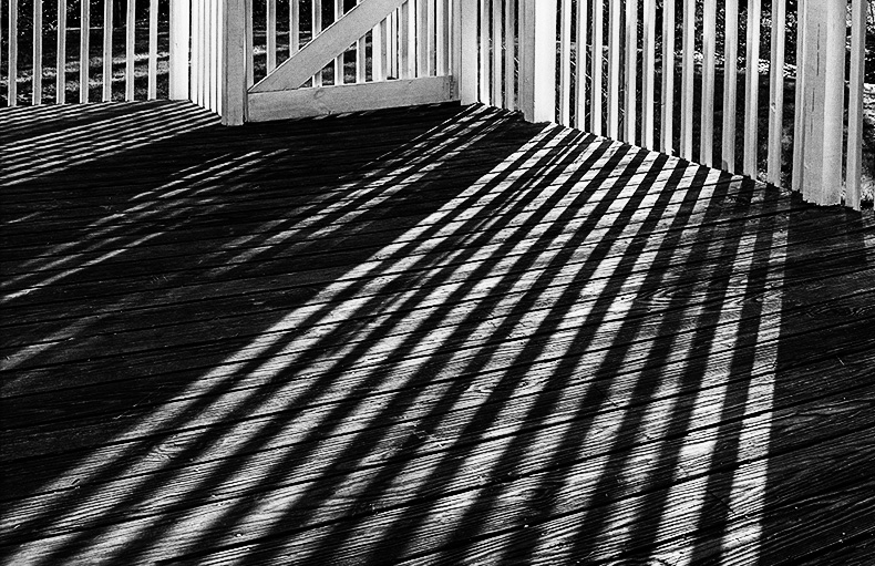
Lines by shadow: I think this is a well chosen, classic B&W subject improved to my way of thinking by the intersection of the shadows by the lines of the textured boards of the deck. Then to complete the picture, the shadow lines transform in both direction and tone as they extend into the bars of the fence.
Personally I would stop there. These bold contrasting lines seem so effective to me, that I regret that they stop at the top of the fence. In color, I think the trees beyond work because they contrast in color with the sunlight on the fence, but in B&W I think they detract from the linear form that makes the image so appealing. So, I suggest a tighter crop ... |
Jun 2nd |
 |
| 99 |
Jun 21 |
Comment |
I think the lighting works well for B&W with a useful degree of contrast from the centre of his face to the sides. Also the short depth of field is to my eyes effective as it leaves only his face in focus in this crop yet establishes a sort of internal fame with the window and cupboard without them becoming a distraction. His face is well sharp.
I think Tony would also suit a French beret and a string of onions for the next shoot; just a thought.
I also wonder, even though he is a friend, whether he might like a little bit more space. I am not suggesting that he cannot support the close-up of this B&W, but I do think that the angle of his head and narrative of him "looking out around the corner" might suggest keeping more of the original shot: the cupboard door as negative space to balance his head and to take it off the centre line. As in ... |
Jun 2nd |
 |
| 99 |
Jun 21 |
Comment |
I think it is the female (red winged black bird). |
Jun 1st |
8 comments - 2 replies for Group 99
|
9 comments - 2 replies Total
|


