|
| Group |
Round |
C/R |
Comment |
Date |
Image |
| 96 |
May 21 |
Comment |
Emily
To my eyes, the interplay of light and color along the walkway is fascinating.
I would consider cutting to that - the following gives me vertigo (in a good way :-) ) |
May 9th |
 |
1 comment - 0 replies for Group 96
|
| 99 |
May 21 |
Reply |
Just a personal take - no more. What I saw on the right side was an indistinct image reminiscent of the 30s when cameras and film were not so sharp. I felt that extending that to the left made the image more harmonious. |
May 18th |
| 99 |
May 21 |
Reply |
|
May 10th |
 |
| 99 |
May 21 |
Reply |
"Out, spot!" I wonder about imperfection. My wife is a weaver and relates that in certain Eastern traditions, a cloth is always deliberately woven with a mistake, because only Allah is perfect. My question is this: in a beauty shot I accept that imperfections are to be removed since the image is of an idealized subject - but me? Is it better to leave in the blemishes or to obscure them? Does a portrait of a real person (rather than a magazine cover) improve by disguising the normal? What do you all think? |
May 9th |
| 99 |
May 21 |
Comment |
Michael
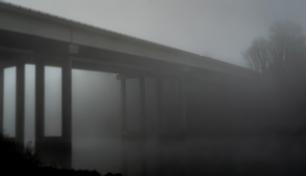
I like the direction you took with this: the use of fog to convey mystery, the lack of definition on the right side of the image, the low light.
To my eyes, this is not completed on the left specifically because of the clarity that is in the railings on the bridge. It seems to me to be a merger of two styles - and I would prefer one. So - something I have never done - I added a blur filter to the left (I did not take it all the way across - so that you can better see the effect) and I added a little brightness under the bridge to (in my eyes) add ominous to your mysterious. |
May 9th |
 |
| 99 |
May 21 |
Comment |
linda - first of all I love the image - I just want to state that first , I am currently working on macro images and I am going out tomorrow to try to shoot some like this myself. The key for me is the texture that is so consistently vertical, lines that follow the stem of the plant and point to the leaf and stem head (?) which are themselves to interesting.
I took your original in a different direction. Yes the second plant is beyond the focal depth - but I think that makes it an impression - as in impressionist - so I kept it. I use Nik - but the "Color" Efex pro and the bleach bypass effect - lowered the saturation to 0 and a little play with curves in photoshop. My version - in case you like it. |
May 9th |
 |
| 99 |
May 21 |
Comment |
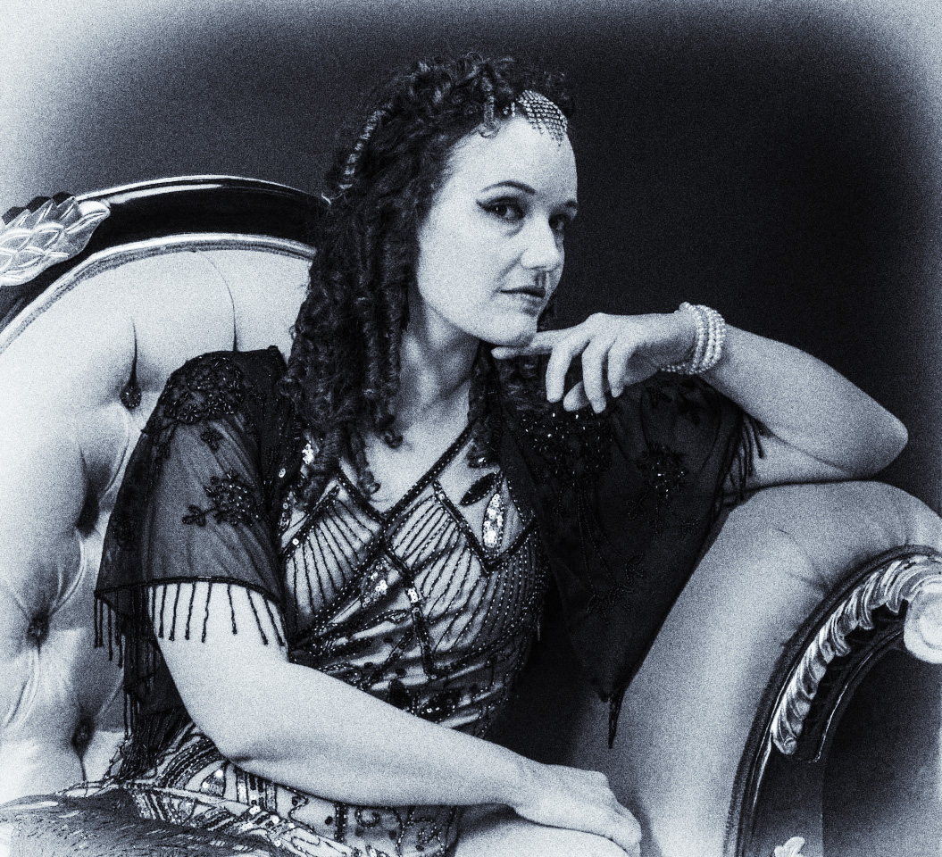
I particularly like the way her hair casts a lattice of shadow on her neck that replicates the crossing in the fabric of her top - and the strands of the hair are replicated in the tassels on her sleeve.
For my taste I would gone with a little more differentiation in the lighting between the left and right side of the face (say a dark reflector on the right) - but it is a question of personal preference [nothing give greater light that the darkness beside].
You were aiming for "faded' movie star - not sure what you meant. If it is "from the old silent movies" which I think goes with the costume - then I would have (in Nik) : used an old film stock Ilford 400, added contrast, reduced structure, and included a white vignette - because it is fun to play :-) |
May 9th |
 |
| 99 |
May 21 |
Comment |
For me, the jetty's texture is exciting and well brought out in the processing: it appears almost as feathers in the far left. The lines of the jetty and the clouds match and take my eyes across the image and then out of it
I am less sure about the clouds in that I fancy that I can see a difference in their contrast from the ground. My instinct would have been to crop out the majority of the sky, and so to add emphasis to the jetty but this results in a different feel which may not have been your intent (and I kept the bird). |
May 9th |
 |
4 comments - 3 replies for Group 99
|
5 comments - 3 replies Total
|


