|
| Group |
Round |
C/R |
Comment |
Date |
Image |
| 96 |
Apr 21 |
Comment |
Emily - before I read your description I was all ready to comment on how much I liked the palette and the muted colors, on how I thought captured so well the shadow of this underpass ... and now that I look, I think that the B&W appears flat in comparison.
My attention is most drawn to the confusion of lines (pun?) formed by the train tubes - and then to the contrast within that convergence between the straight and the curved tubes. This excitement seems to reflect the frenetic motion of the vehicles passing within them.
I did try a perspective warp - to straighten the verticals and was initially pleased with the product (since the image became about the weight of the upper track looming on top of us). But my son disputed its worth and said that the road markings became compressed and the pole on the right became just a pole - rather than a perspective marker as seen in your image. So he and I both now prefer your version to mine. |
Apr 9th |
| 96 |
Apr 21 |
Reply |
Sorry - I should have just posted what I was trying to describe - a picture being a thousand words ... |
Apr 8th |
 |
| 96 |
Apr 21 |
Comment |
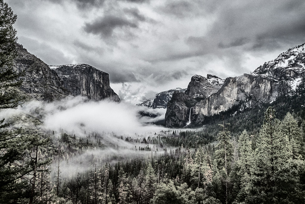
Cheryl - I am thoroughly enjoying your adventures into B&W conversion. For this particular image, I think you choose well since the clouds and trees are so nicely apart in tonality. I like the composition for several aspects: the left tree frame, the descending mountain tops on both sides drawing the eye down to the "tunnel", the sweep of the tree lines on the right that mimic the mountain, and somehow I see balance in the left to right with the low cloud reflected in the hole formed by its absence (does that make sense?).
In case you want to play a slightly different game ... in terms of color vs B&W, I sometimes compromise and use the latter for tonal adjustment, and then to desaturate the color. Below is your original, Nik silver efex, full_range (harsh) overlayed 75% opacity. |
Apr 7th |
 |
| 96 |
Apr 21 |
Comment |
Dan - you have great locations and you certainly make the best use of them. I particularly like the patterns in the middle of the sections of the ground which seem almost to reflect the clouds. I do not find your images repetitive, I think rather that you have a distinctive and recognizable style for which many photographers are striving.
Good title.
It is hard to find ideas for productive feedback ... I wonder if a second shot with a longer exposure might have given you options in filling in some details on the rock faces. |
Apr 7th |
| 96 |
Apr 21 |
Comment |
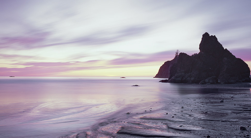
Robert - I too love the colors and the subtle feel they invoke. I find the contrast between the smooth left with the ridged right to be very effective: a crossing between dream and reality, the here and the beyond. The clarity of the foreground is excellent - and I am surprised that was achieved with so long an exposure.
I tried lightening the rock further - but when I was finished I realized that I had practically matched your image ... so I think you were correct. Personally I would shave off a sliver on the right to stop that next rock leading one out of the image - and a sliver from the bottom: so that the transition between the smooth and the shore is cut at a quarter rather than at the corner which I think adds emphasis the oval of light in the water. |
Apr 7th |
| 96 |
Apr 21 |
Comment |
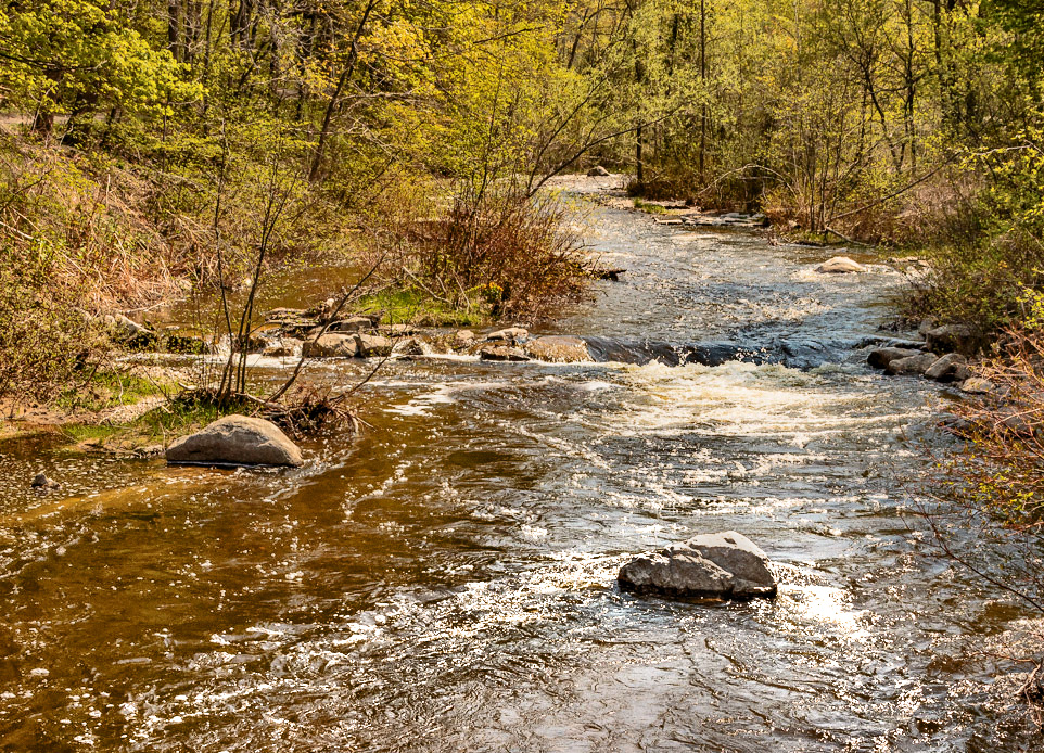
Dale - I see the lines that attracted your eye and can almost feel the pull of your wife hauling you back onto the trail. For me there is the receding S - the half oval at the front of the images from the bottom left, through the rock and back to the front right, and the horizontal drop of the river across the center. I find the variety of water textures intriguing.
I had a few ideas leading to the image below. In emphasizing the lines, I wanted to remove the area to the right which had none, and this puts the river onto a line of thirds. I then took a B&W version so that I could manipulate the tonality and merged this with luminosity only. Finally I dodged over the river to add contrast and to draw the eye to its center even more. I hope it still matches your memories. |
Apr 7th |
 |
| 96 |
Apr 21 |
Comment |
Beverly - thanks for coming by and adding to my image. You have created a very different photo which is certainly brighter. However, it is not the place I visited - which was more intense. The bay is isolated and the steep sand dunes which blanket the background are part of its enclosure. One of my concerns with the limited depth of field is that these dunes can only be inferred by the color and are not obvious to the viewer. |
Apr 4th |
6 comments - 1 reply for Group 96
|
6 comments - 1 reply Total
|