|
| Group |
Round |
C/R |
Comment |
Date |
Image |
| 96 |
Mar 21 |
Comment |
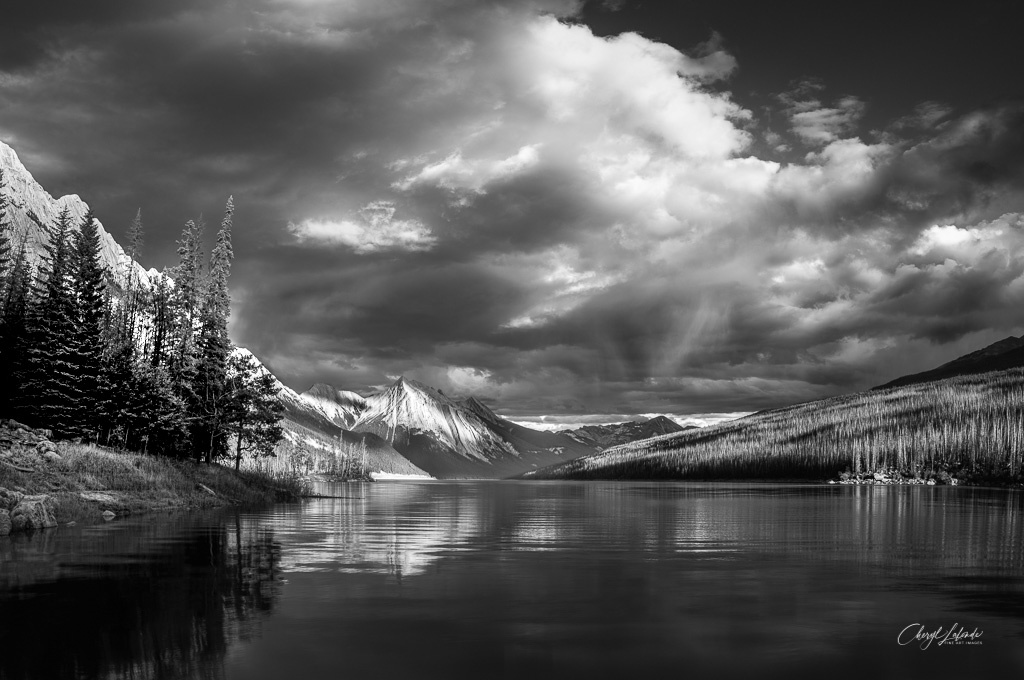
Cheryl - I think you chose very well from you stock of images when you set out to switch into B&W: it is full of sharp tonal contrasts whose ranges match so well in the mountains, the water (the part you retained - though not the part you cropped) and the forest in the right background.
There is one area that I see as being flat which makes it jar for me - and that is the copse of trees on the front left. Might I suggest the following. I took this image into camera raw - and used a radial filter over these trees - and then played with added exposure, contrast, lowering the black slider, etc to bring this area in line with the rest. See if you like it. |
Mar 13th |
 |
| 96 |
Mar 21 |
Comment |
Dan - you can cook for my art any day. The sense of the touchability (OK not a word but still) of the snow mounds beside the river for me is so vivid: smooth rounded, a baby's cheeks. And then above, the sharp angular pines providing a distinct form but connected by the snow while contrasted in the progression from shadow into dark wood.
Personally I would stop there - by which I mean crop above the tops of the center trees |
Mar 13th |
| 96 |
Mar 21 |
Comment |
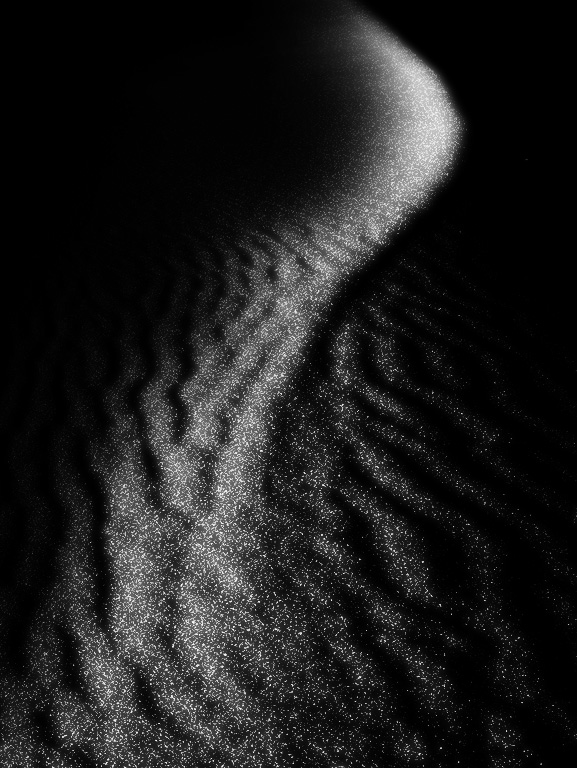
Robert - I see all form and line and love the simplicity. As an abstract, my mind turns to a mermaid's tail - but don't tell my therapist. The monochrome makes me wonder about B&W and one possible direction might be the attached. Of course, this is likely too far removed from the memory you seek to capture. |
Mar 13th |
 |
| 96 |
Mar 21 |
Comment |
Emily, wow I am struck by the clarity of this image, it sort of presents as an art deco (limited palette - in a good way) poster especially in the mid- and back-ground. I have not used a wide-angle lens much - but I will now try harder.
Again - I learn from this image because I do not think I would have taken the shot - finding the foreground buildings uninteresting BUT it works and I am glad you saw it. Does the lens perhaps add curvature to the row of windows?
I particularly enjoy the sunlight on the left background buildings (colors are beautiful) and thence the contrast with the flatter tones on the right.
I do keep putting my hand up over the screen, I would have cut slightly on the right (removing the first tower) to reduce the trees competing with the front building. |
Mar 13th |
| 96 |
Mar 21 |
Comment |
Dale, I am drawn to the sweep of the tree line which is accented by the strong color - for certain, a lovely venue.
I see two pictures here - and I am not convinced that they merge. Removing the right quarter (to the middle of the big tree) I am left with the "sweep" accentuated to my eyes because it now dominates the entire frame. The women - whose inclusion you question - seem to work for me because they are wearing blue which seems to harmonize with the pink blooms.
[yes I see in Google that redbud trees are a "thing" but I see no red and so am distracted by that]
The other picture removes the left quarter up to the bench and this for me brings the structure of the foreground tree into front stage (and also eliminates the trash can). This changes the picture because it loses the sweep (which I regret) but I like then the balance between the bench and the trunk. |
Mar 13th |
5 comments - 0 replies for Group 96
|
5 comments - 0 replies Total
|


