|
| Group |
Round |
C/R |
Comment |
Date |
Image |
| 96 |
Jan 21 |
Reply |
To answer the question - the grain is a result of using the "vintage" effect in the Nik software. I like the old-world look. and the gain comes along with that, and the tint came with the one I liked the most. I guess that is was not a good choice as you'all seem to have been distracted by it.
Similarly the branch - I actually retained the detail on that branch deliberately - possibly a mistake.
|
Jan 9th |
| 96 |
Jan 21 |
Comment |
Cheryl
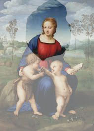
One tries to be measured in giving feedback - to avoid sounding sounding harsh or cruel ... but I cannot help myself today. My answer is no no no!!! The image posted here as "original" is so striking in its entirety that I feel only sadness at seeing you crop it thus. It is as though you have eliminated Jesus and John the Baptist in favour of an image of only the central Madonna.
"Original" is gorgeous: it has balance and extensive tonal progression. There is an image of just the mountain, but you have so much more (in my humble opinion). |
Jan 9th |
 |
| 96 |
Jan 21 |
Comment |
Dan, I was very impressed by the focus - and was about to ask how the heck you had managed it ... and then read the answer in your introduction. Very well done in my opinion. The color is lovely, the shades of blue broken by the island and its trees. I particularly like the island's reflection, which brings me to ...
I understand that you want this image to be about the star, but I see this as interesting and I see the horizon as beautiful. Thus my suggestion would be to crop some of the closer ice so as to de-emphasize the foreground and to accentuate the distant.
|
Jan 9th |
 |
| 96 |
Jan 21 |
Comment |
Robert, my view is that this is beautiful. I'm not sure about the specifics of the narrative - and whether it is flow or just light - but that does not matter: the story can be open even for a single observer and sometimes, I think, ambiguity elevates the viewing experience.
If you want to make the rocks the "subject" then yes you might undertake the crop you suggest, but in my viewing I see the rocks operating as a discontinuity to the flow of color, it emphasizes the harmony by breaking it. I would not want them as the subject - I like their current role as I see it in punctuation of the rest.
I think that this image would be better understood as an "abstract" than as a "scape".
|
Jan 9th |
| 96 |
Jan 21 |
Comment |
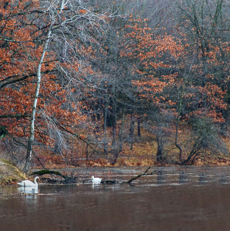
Dale, I am struck by the color harmony between the water and the trees - which I think helps towards the serenity you (we all) seek. The white of the swans and the birch highlights the autumn tones by the sharp contrast.
The birch bifurcates the image - and this time I would not applaud. You may remember it is one of my favourite compositions but here I think that the two halves are too similar. Thus I would re-crop and favour the right side (without those few human structures). Also I think the foliage has greater depth which I have tried to raise using the pro contrast button in my Nik software. anyhow - just some thoughts ... |
Jan 9th |
 |
| 96 |
Jan 21 |
Reply |
OK so one vote for the unmodified (direct from camera) image - great feedback, thanks, anyone else ? |
Jan 3rd |
4 comments - 2 replies for Group 96
|
4 comments - 2 replies Total
|


