|
| Group |
Round |
C/R |
Comment |
Date |
Image |
| 96 |
Sep 20 |
Reply |
I prefer your crop to mine - I lost beauty at the sides |
Sep 29th |
| 96 |
Sep 20 |
Reply |
Glad you liked it. As I think I warned in my bio, I started in photography developing my own B&W images - and there developed a fixation for contrast ... so you are right to dial down the amount I use. I am trying to push back myself, but the old devil keeps whispering in my ear: just a little darker. |
Sep 14th |
| 96 |
Sep 20 |
Comment |
Zolt - I am drawn in by the not-quite circles on the ground and the color of the organisms. The clarity of the foreground is well captured and nicely framed by the tree line. The color contrast is immediately striking.
I think that I would crop out some of the sky - pulling the image top down to just above the tree-line on the right - as this adds emphasis to the blob. |
Sep 13th |
| 96 |
Sep 20 |
Comment |
Cheryl - to address the orange I would start with the patch tool (photoshop) selecting that offending area of the wall and then moving that selection over to the section to the left of it. Then I would use the Clone stamp to tidy up the edges - but not in "normal" mode - but changing the mode to lighten/darken/color as you repair any blemishes
I know nothing about night photography and was amazed at how much information there was in your original-2 - very informative. That said - I think it a lovely image and I think you should be very happy with the outcome of all the effort that must have gone into it |
Sep 13th |
| 96 |
Sep 20 |
Comment |
Dan - I think it stunning - and you have to love the deity that sent you that bird just when you had the shot ready. I particularly like the contrast between the smoothness of the sand and where it is rippled along the inlet - and that these ripples are repeated in the water itself. The composition to my eyes is perfect - the rocks seem a little large but I think that is part of the story: their weight in this seascape.
Again - I would want to take this picture myself one day. If I did I would make two changes:
the base of the rocks is a little too black - is there is a way to bring back some more features (perhaps locally masking with a less contrasted version)
I think you have added a horizontal vignette - for me it is a little heavy - particularly as it is not seen in the reflection in the water. I would pull it back a little.
|
Sep 13th |
| 96 |
Sep 20 |
Reply |
Emily
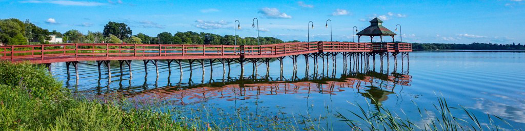
I love the ripples - they are so smooth. Nice location - I wish you could have climbed a tree (a really tall tree) to avoid the coincidence of the land with the pier - but without that tree I think aligning them directly as you did was the right choice.
In my area - there is an annual billboard competition (I've never won) which calls for something like a 4:1 ratio. That would be my preferred option here as it focuses on the water and pier - and emphasis on its length. |
Sep 13th |
 |
| 96 |
Sep 20 |
Comment |
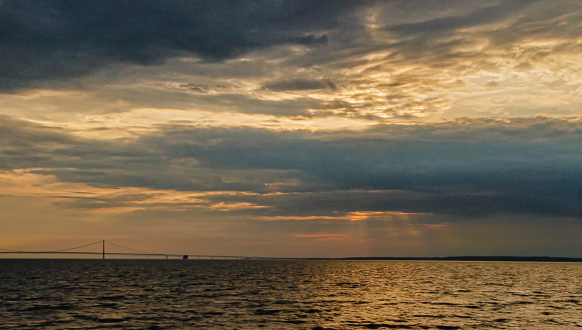
Dale - I think that the tonality and colors are very well balanced and they portray a strong sense of a moment. The inclusion of the bridge seems to me to add a point of secondary interest which I welcome as opposed to a straight sea and sky shot.
For me the primary interest is (as you suggested) the contrasts, particularly in the sky.
My suggestion is that there may be too much in the image that is the same. The sea is locally varied but globally the same - the clouds off to the top left are unchanging. So I have cropped to isolate the contrasts (and put the hidden sun along a vertical rule of thirds). See what you think.
(I also own the Nik software but have never used the noise reduction feature - I will try - thanks for that suggestion). |
Sep 13th |
 |
| 96 |
Sep 20 |
Comment |
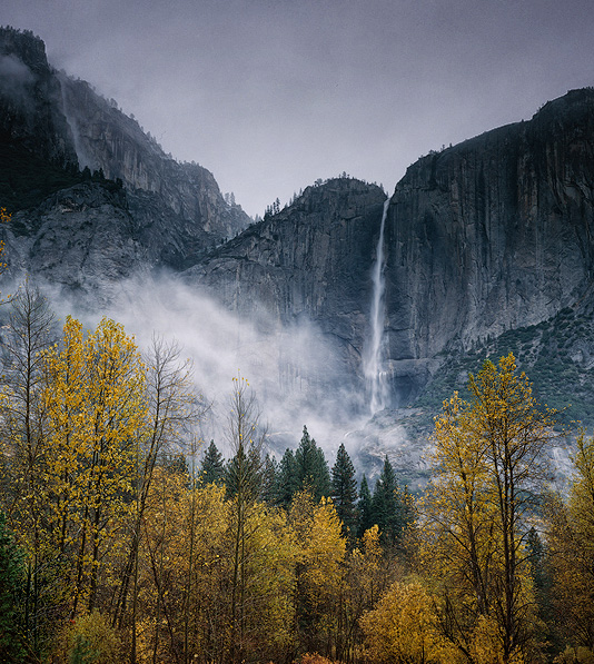
Robert - the clarity, to my eyes, is very good particularly on the (now) foreground trees and I commend your play on the foliage colors. The move to the ethereal is a good response I think to the mist/spray from the waterfall
Unlike Dan, however, I am going to risk presenting my vision and to suggest that the crop is too tight - particularly as the force of the waterfall seems to me to demand more height. I have attached my crop (thanks for the original) with a tonal contrast to separate the rocks from the mist. |
Sep 7th |
 |
5 comments - 3 replies for Group 96
|
5 comments - 3 replies Total
|


