|
| Group |
Round |
C/R |
Comment |
Date |
Image |
| 96 |
Aug 20 |
Reply |
OK- see what you can do with this :-) |
Aug 22nd |
 |
| 96 |
Aug 20 |
Reply |
yes - I like it |
Aug 12th |
| 96 |
Aug 20 |
Comment |
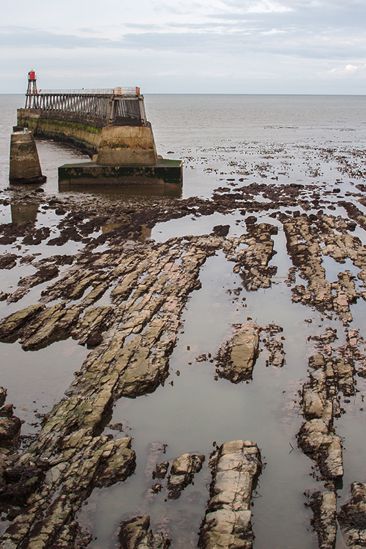
Zolt
I tried to work from your original image and I was unable to match your treatment - which I like. Cheryl did add contrasts - always my instinct - but it leaves a halo that I have learnt to avoid since my image of Skye two months ago :-).
My only suggestion is that you compare the image with less of the foreground rocks on the left (crop out the left side about 1/8). This leads my eye sooner to the distance which is where I think it should go. |
Aug 9th |
| 96 |
Aug 20 |
Comment |
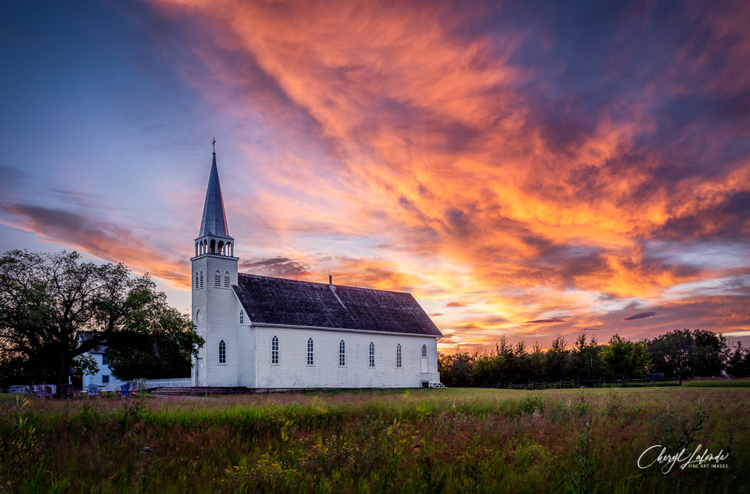
I think it is a beautiful sky and that you have captured it perfectly. So glad you were there. I would not touch that color at all.
For me the church is a little dark - just a little. In my photoshop, I used the quick selection tool on the bottom below the sky (and a lasso to remove some of that from the trees - and used a little of the basic curve tool to brighten the walls, and I think it also brings out the sky colors in the grass ... but that might be just a fancy. |
Aug 9th |
 |
| 96 |
Aug 20 |
Comment |
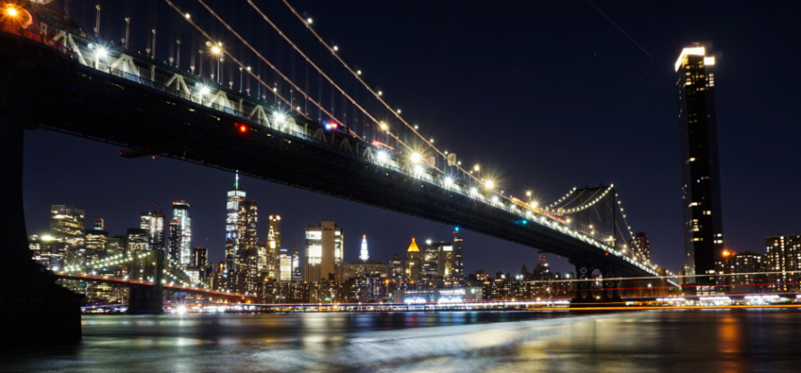
For me, the strength of this image is the diagonal of the bridge: a sweep of both light and structure. I see the tower on the far side as a useful "end" as the eye follows the bridge. If I were cropping, I would want to bring these features out a little more.
To my eyes, the distant features under the bridge are not as sharp - and I wounder if you could have used a higher "f" - or perhaps merged stacked images with different focus points (there is so much darkness that masking would be quite simple). In this scenario - I would suggest that the shot for the top bridge might be a little faster as its lights are so much brighter. |
Aug 9th |
 |
| 96 |
Aug 20 |
Comment |
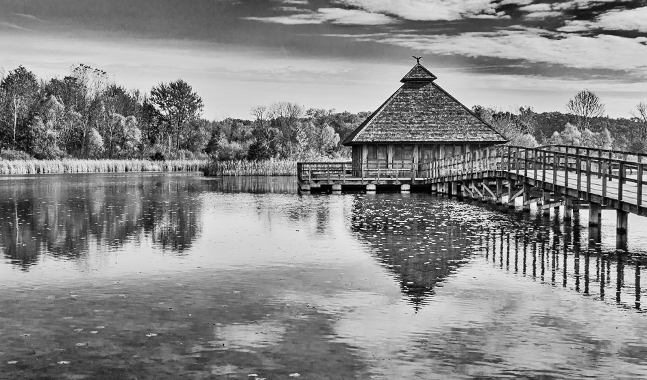
I love the lines in the building and the walkway - and therefore their contrast with the trees on the left. I notice the water in the bottom left looks interesting in terms of the both the surface and (I think) the bed below: it feels like a Monet waiting to emerge ... if the tonality is spread. Because I want to emphasize this feature, I would cut the sky only and forsake the center-line symmetry. This also, in my opinion, adds emphasis to the building which is raised and no longer simply balanced by its reflection. I have used contrast tool that has both soft contrast (which I lowered) and plain contrast which I raised - along with the brightness as I lost some areas to the dark side. |
Aug 9th |
 |
4 comments - 2 replies for Group 96
|
4 comments - 2 replies Total
|


