|
| Group |
Round |
C/R |
Comment |
Date |
Image |
| 96 |
Jun 20 |
Comment |
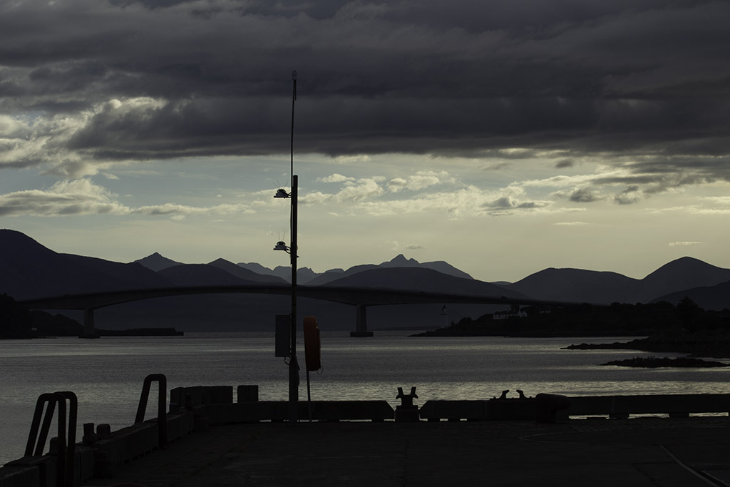
Thanks to both of you for your feedback which I really appreciate - my replies were intended as explanation rather than dispute. In summary, I am hearing that you noticed the halo artifacts from high-contrast post-processing and the foreground in general but particularly the pole. With these points in mind I looked back into my database and walked forward to the front of the quay - and used more restraint while seeking a little more color. |
Jun 14th |
 |
| 96 |
Jun 20 |
Comment |
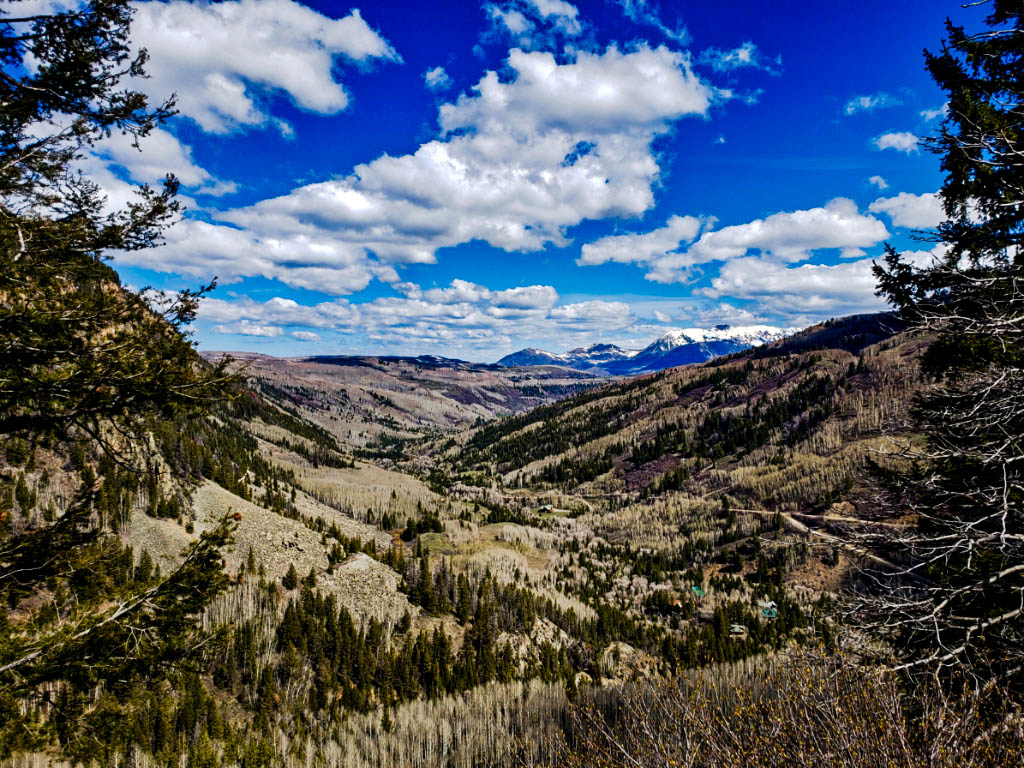
The trees at the sides for me nicely frame this image. I love the distant snow and the patterns if the trees in the middle ground. It makes me think of winding paths into the distance
My thought is that the tonal variation might be accentuated a little more.
|
Jun 7th |
 |
| 96 |
Jun 20 |
Reply |
Robert - a jpg of my raw file without modification. Looking forward to your conclusions. |
Jun 7th |
 |
| 96 |
Jun 20 |
Reply |
My approach makes little difference to your image because your BW had (needed) so little modification from the original. I tend to be more aggressive - and in such cases the addition of a little color softens the outcome. For instance ... |
Jun 7th |
 |
| 96 |
Jun 20 |
Comment |
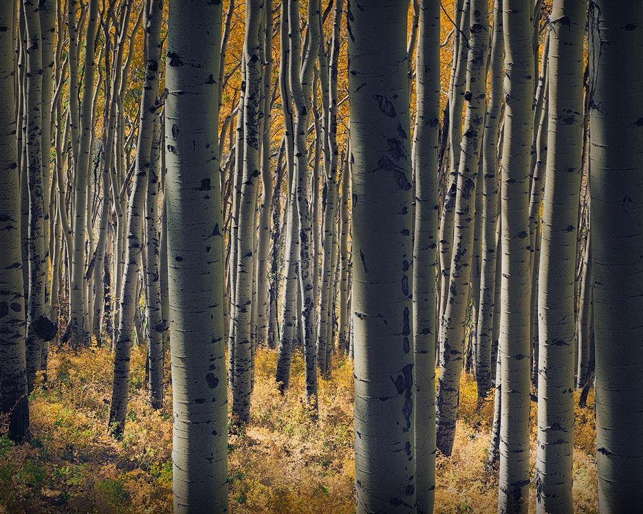
For me this is a beautiful image because of color and brightness of the fern carpet to complement smooth texture of the tree trunks - and I think your capture is unusual for this subject in that it features the two trunks as a solid, distinct foreground rather than relying on a mass of similar verticals. This seems to me to be a consequence of the clarity of the focus on these two in particular.
My view on the crop is that it is just off by a couple of mm on either side: the thin slivers of light on the right and left distract me - where-as I think a small adjustment turns the outer trunks into solid frames and so keeps my eye in the center. |
Jun 7th |
 |
| 96 |
Jun 20 |
Comment |
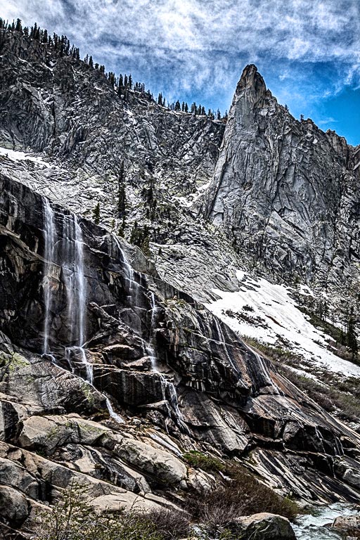
I see a full range of tone: snow to shadow with no loss of detail. I find the repetition of a left to right diagonal to really tie the image together, adding for me to the sense of height (or rather the possibility of falling). The focus seems to me to be spot on - so I wonder how you anchored the camera for this slow exposure, which I think was well selected to give clarity to the waterfall.
There is nothing I would change in this B&W image which I think is beautiful.
If I had this, though, I would play with my latest obsession. If you have photoshop - and feel like playing - would you copy the color layer - and stick this above the B&W - then set the blending mode to "color" and move the opacity slider around. I feel that this allows me to make the emphasis (through B&W tricks) as you mentioned while adding back the color after - and I would be interested to read what you thought. I think if it as kind of like coloring an etching. |
Jun 6th |
 |
| 96 |
Jun 20 |
Comment |
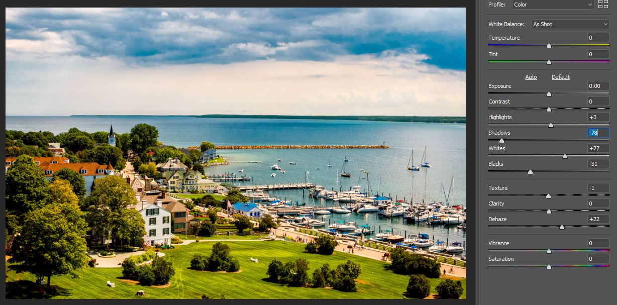
I also like the crop - especially the inclusion of clouds to bracket the top of the image. I do not feel that the white sky area is a problem as it balances the sea below. What I would suggest is that the clouds be darkened a little to form a bracket and to hint at a change in the weather. Attached is the effect I am considering within the raw editor (alone). After this I would lighted by dodging a vertical strip of the sea through the two boats on the right. |
Jun 3rd |
 |
| 96 |
Jun 20 |
Comment |
I love the crop. I too would have included the rocks as foreground when I shot the image but they seem to me on review to be flat in tone compared to the rest - and you were right to drop them.
To my eyes, the trees are too bight and distract from the center of the image - or specifically from the mist and clouds and the reflection itself which I would prefer to be the stronger elements: as they might say of a newspaper, I think you may have killed the lead.
|
Jun 3rd |
| 96 |
Jun 20 |
Comment |
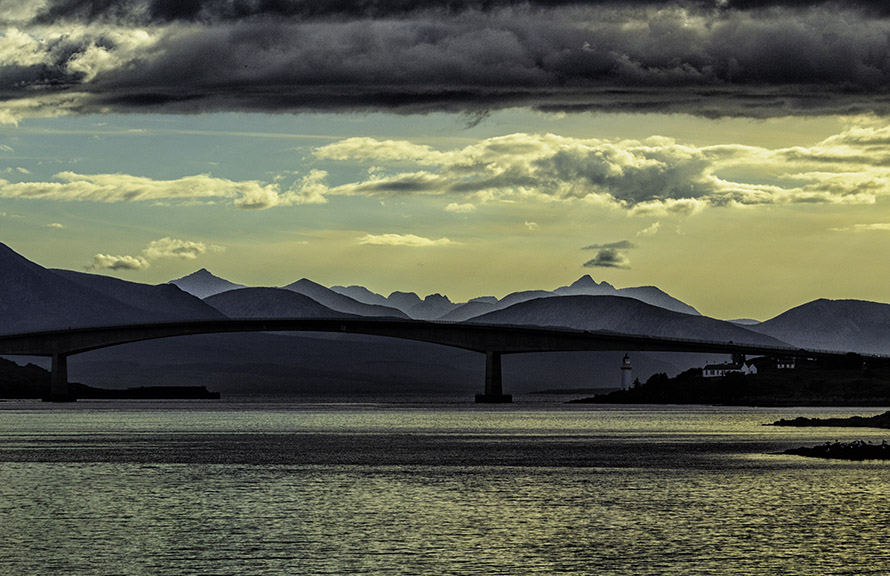
I actually like the image as the "view from the quay": a sort of homage to local culture - but I agree that darkening it and removing the pole does make the background standout.
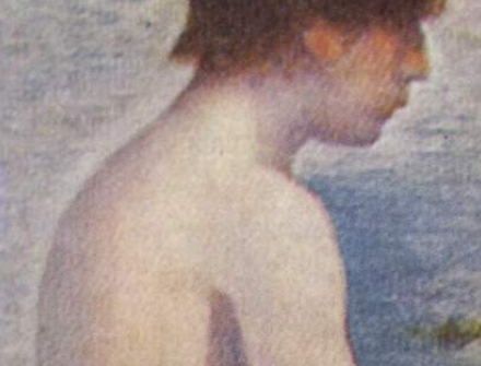
Your comment on the bridge halo seems to me possibly to explain why this image did not win favour with judges (I will look out for that in future). I do think you are correct in terms of competition photography - but I like a little halo sometimes, and this effect reminded me of "tourist art" sold in Edinburgh, Scotland (which feature the same lighting). I also think it is a technique used in painting. George Seurat was all about using colour contrasts for highlighting boundaries - and he used light/dark "effect rather then realism" in the same way (as you see on this bather) |
Jun 3rd |
 |
7 comments - 2 replies for Group 96
|
7 comments - 2 replies Total
|


