|
| Group |
Round |
C/R |
Comment |
Date |
Image |
| 14 |
Apr 26 |
Reply |
Thank you Greg, I do appreciate your comments |
Apr 12th |
| 14 |
Apr 26 |
Comment |
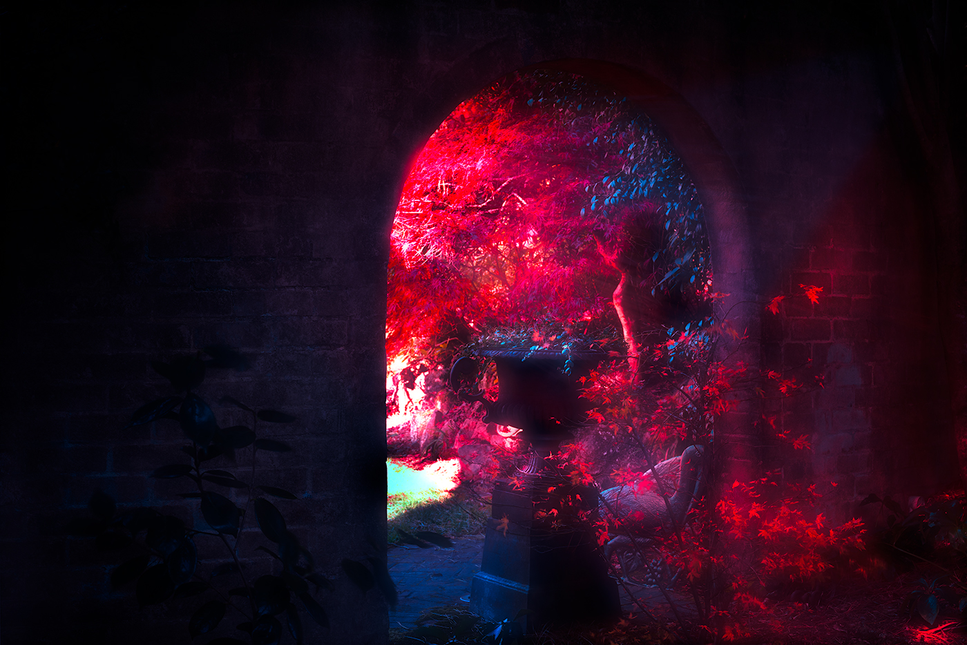
Hi Karen, it's great to see you combining your photographic skills with other people's hobbies, everyone benefits from the collaboration. I agree with Greg's thoughts on the saving options. As for layout, that really is a science of its own when it comes to advertising material. It might be worth looking at some car?show promotional designs online and adapting ideas from there. From my perspective, I'd also consider tilting the lower two images so they echo the angle of the top pair. Enjoy these creative endeavours. |
Apr 12th |
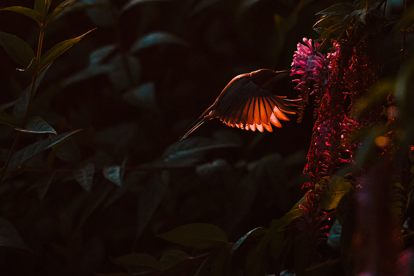
| 14 |
Apr 26 |
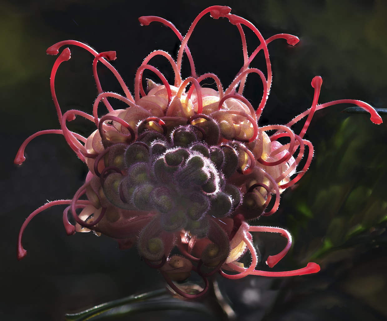
Comment |
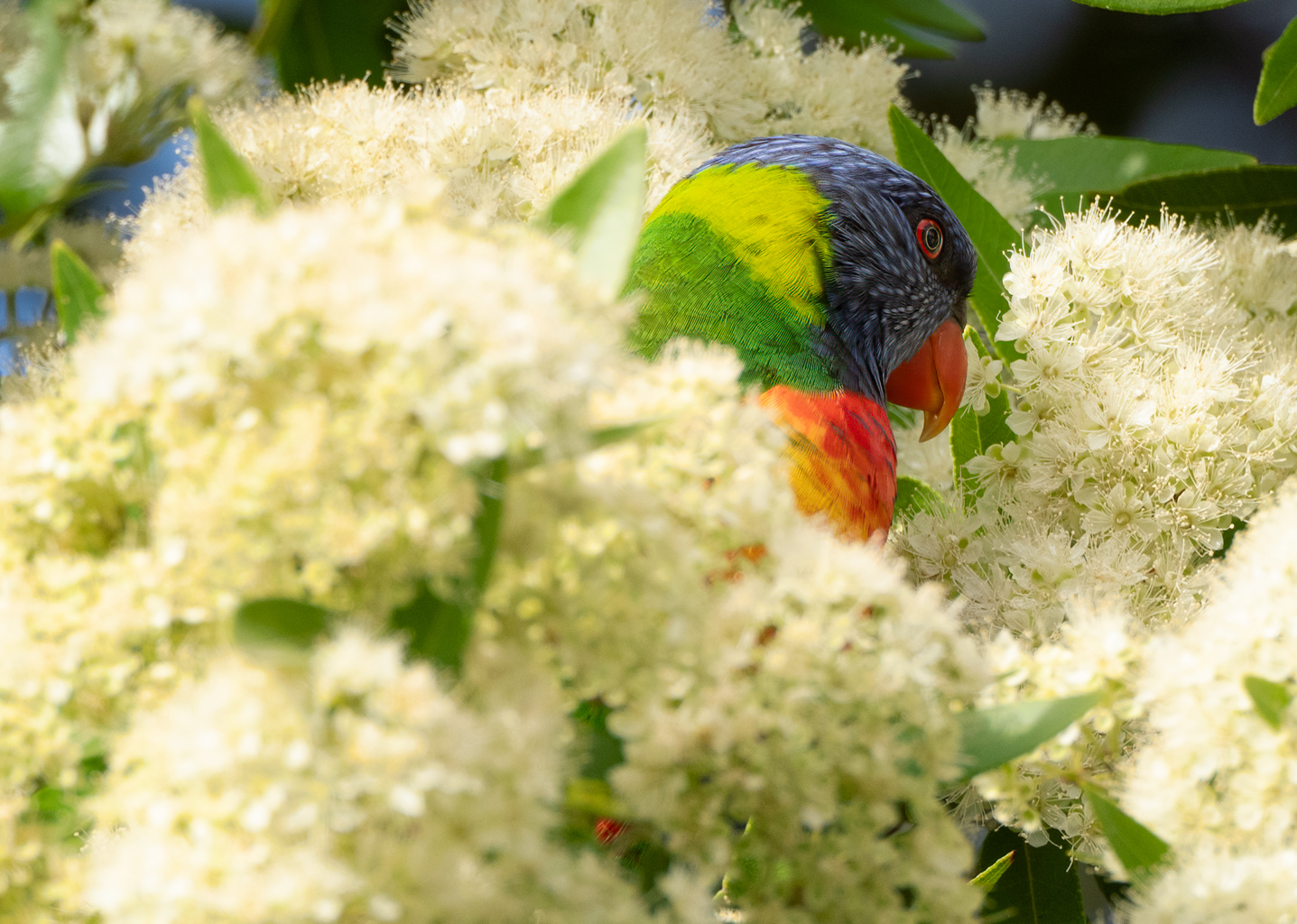
Hi Kamal, a great opportunity presented itself here. It's fun to imagine what the grasshopper must have thought, suddenly flying at a speed and height it had never experienced - and later telling its friends about the easier way of travelling it discovered. The image is handled well, and thanks for sharing it. |
Apr 12th |
| 14 |
Apr 26 |
Comment |
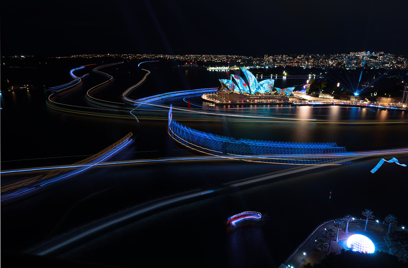
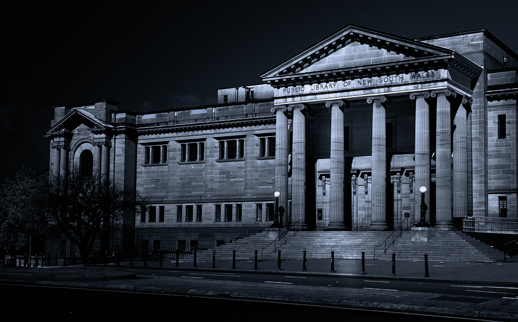
Hi Jacki, it would be hard to pass up the oppertunity to shoot a scene like this, especially presented in a panoramic format. I agree with Greg's suggestion - it sets the image up beautifully. A well?seen and well?captured moment. |
Apr 12th |
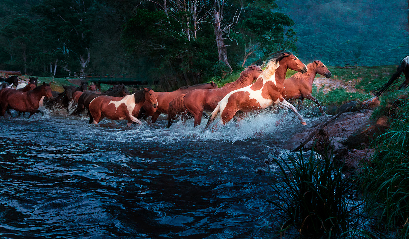
| 14 |
Apr 26 |
Comment |
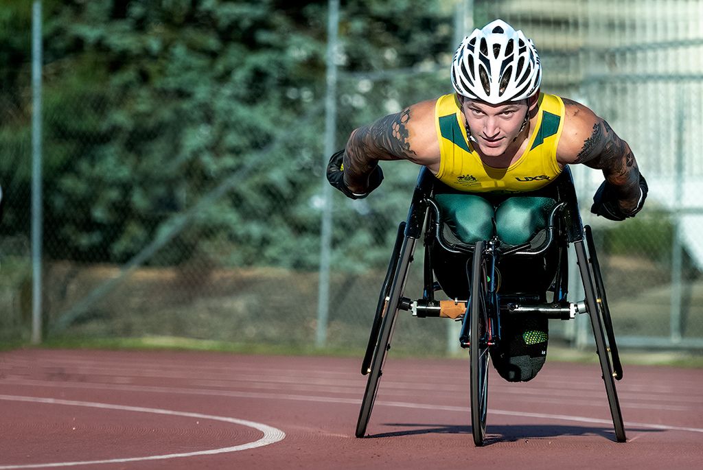
Hi Greg, a very creative way of eliminating the original, less?than?ideal background. I agree that adding a little more space above the rider works well. One small thought, the ground beneath the horse feels a touch abrupt. You might consider extending it slightly and blending it out with a gradual blur so it tapers away more naturally from the horse. nice image well worked. |
Apr 12th |
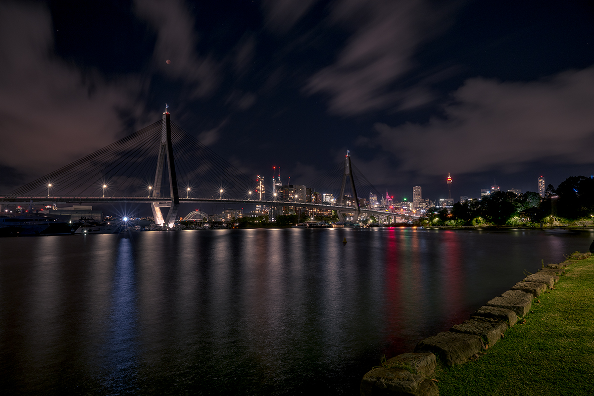
| 14 |
Apr 26 |
Comment |
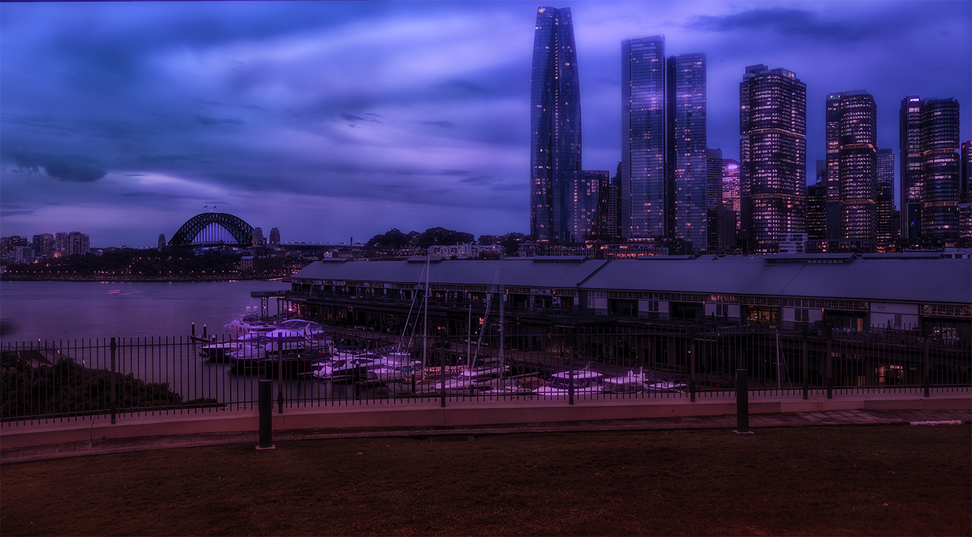
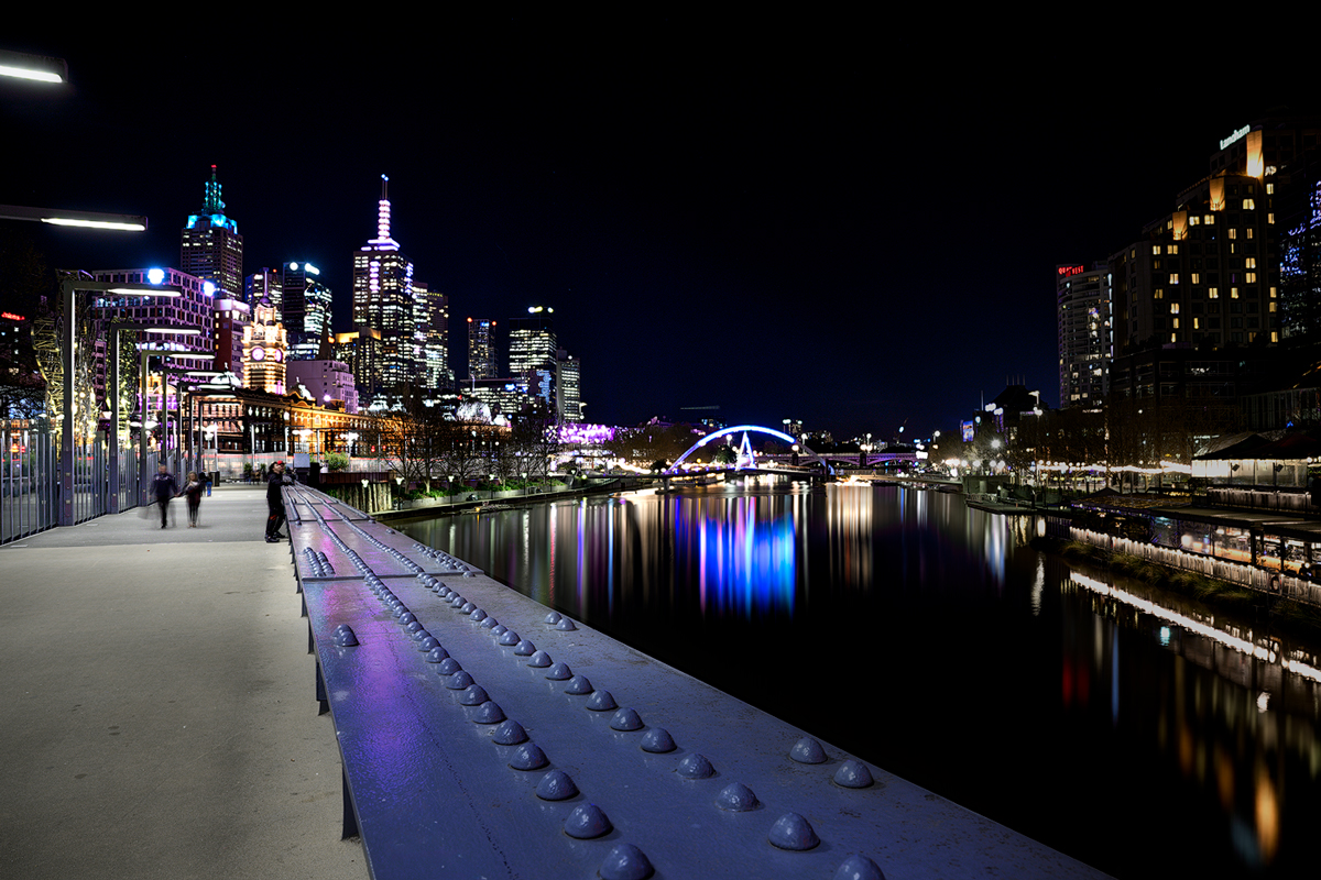
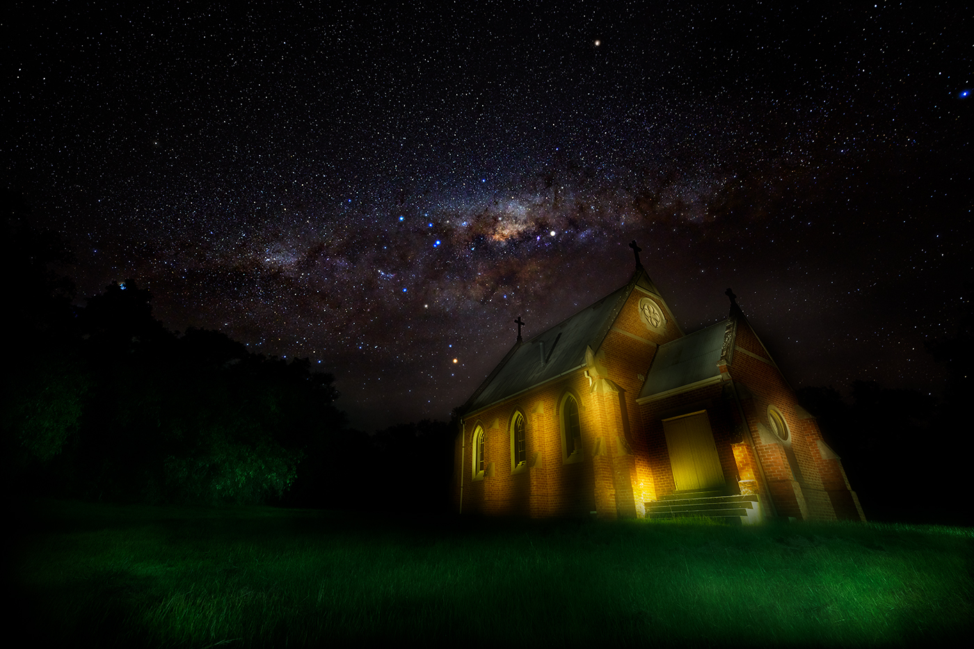
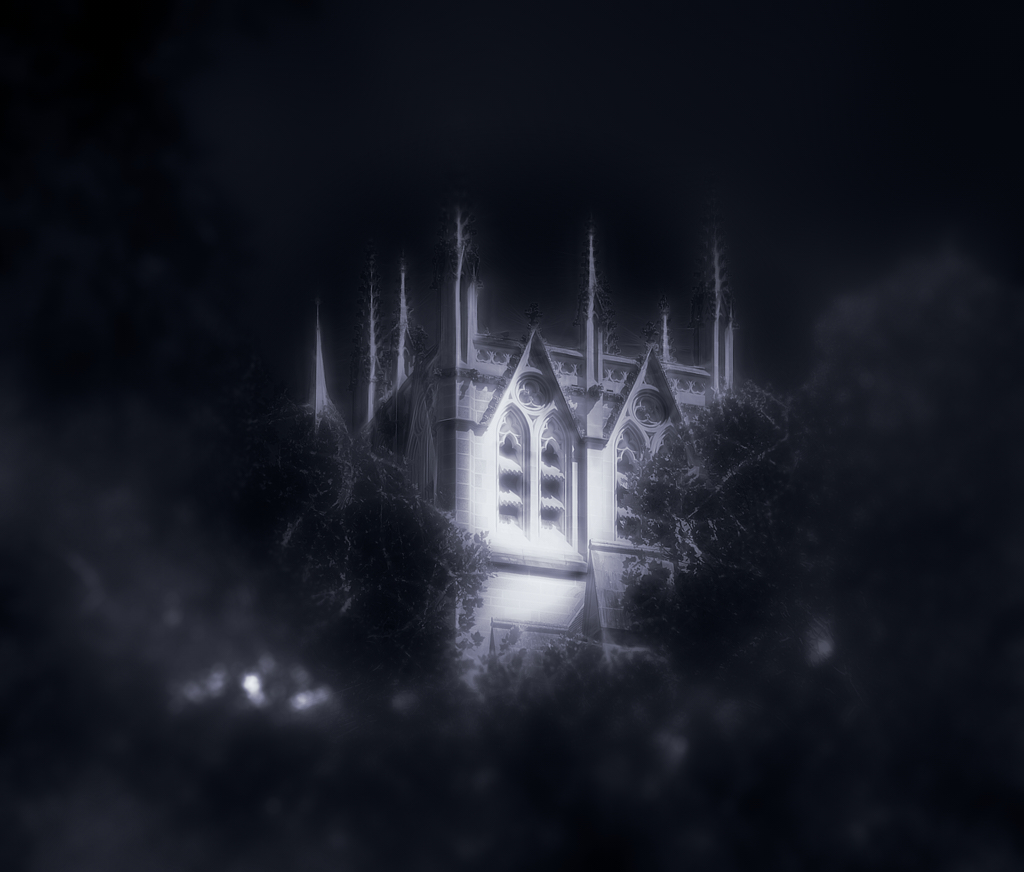
Hi Darcy, great image-and I'm sure it holds great memories too. The buildings on the right frame the scene nicely and help keep the viewer's attention within the shot, with the eye naturally led along the river to the two prominent domes. Colours are handled really well: the turquoise tint of the water, the reds of the mooring poles, and the muted tones of the buildings all work together to define the scene. One suggestion: the white blob on the left near the tree line (I assume it's a ship) could be removed or toned down-once you notice it, it tends to draw the eye. |
Apr 10th |
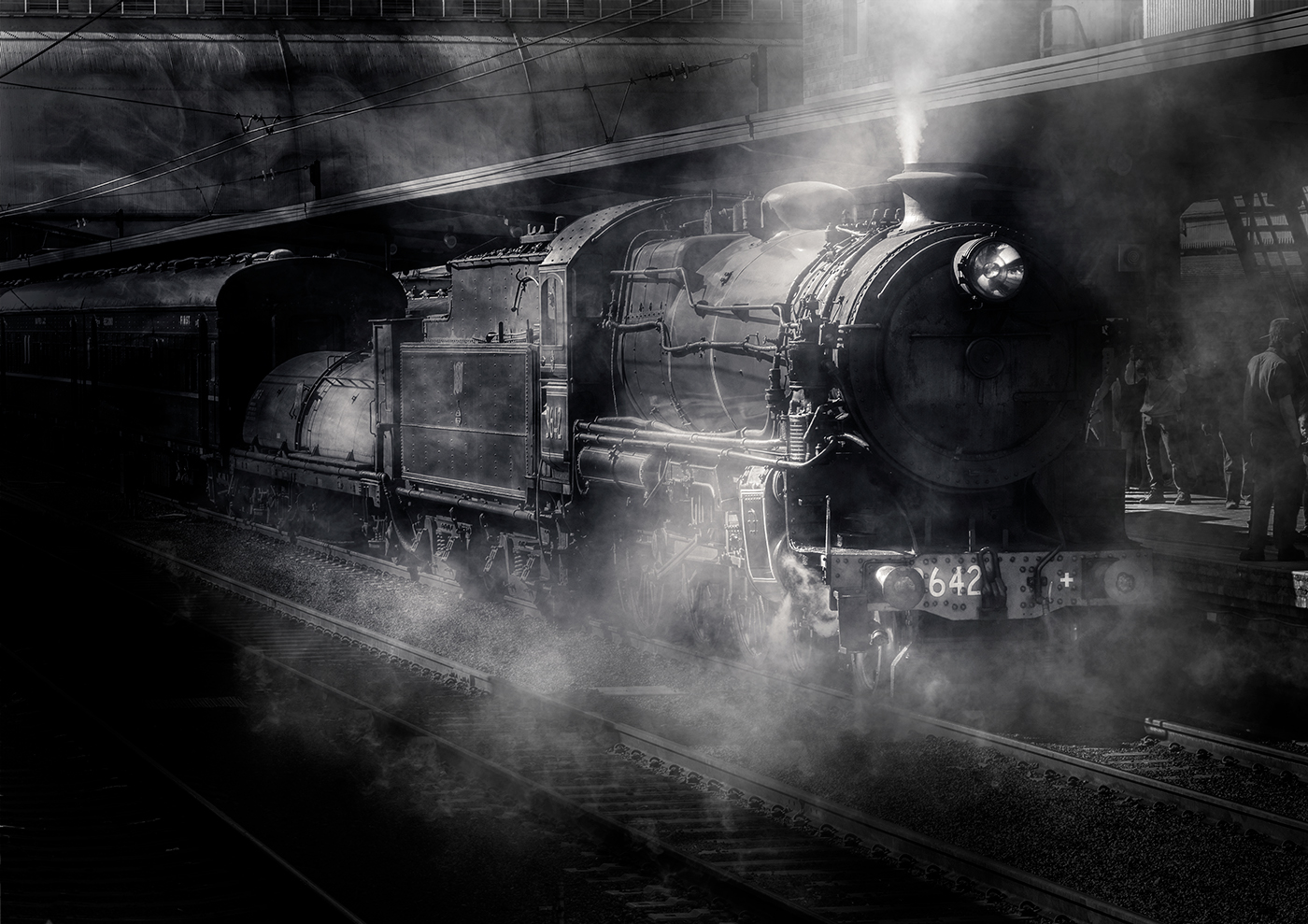
| 14 |
Apr 26 |
Comment |
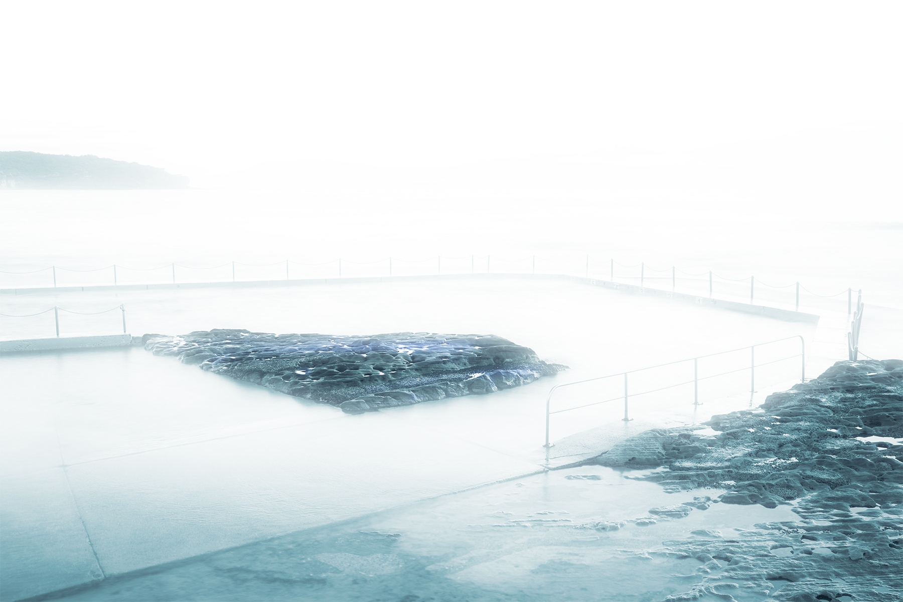
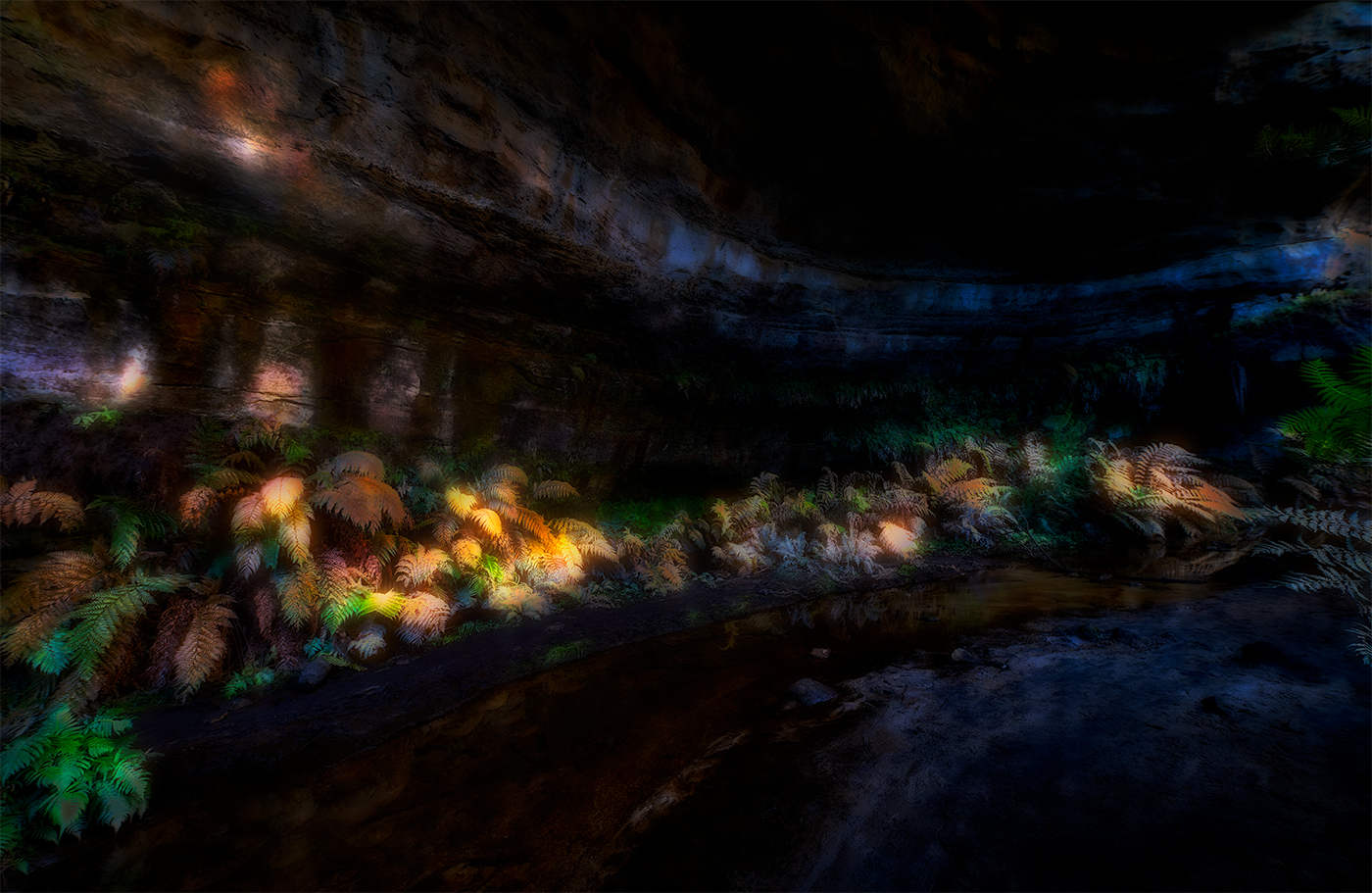
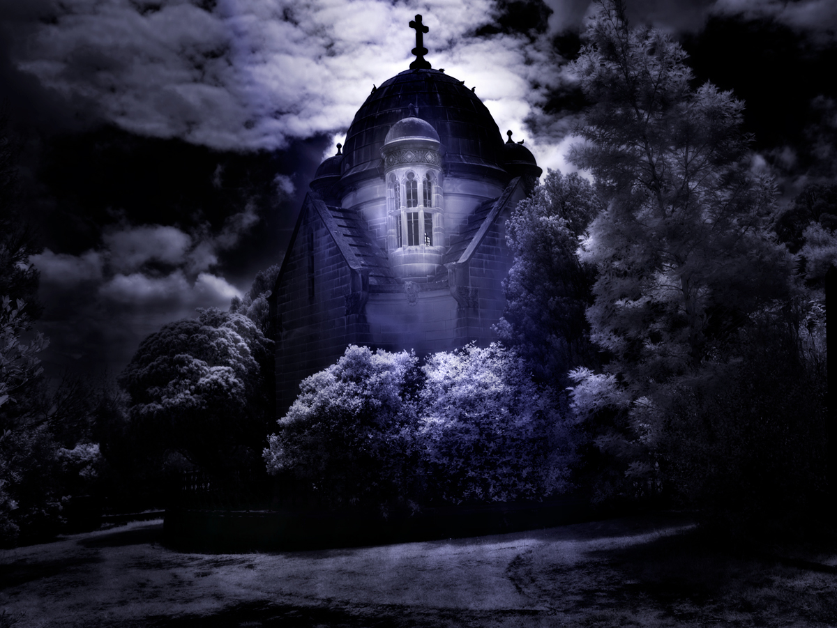
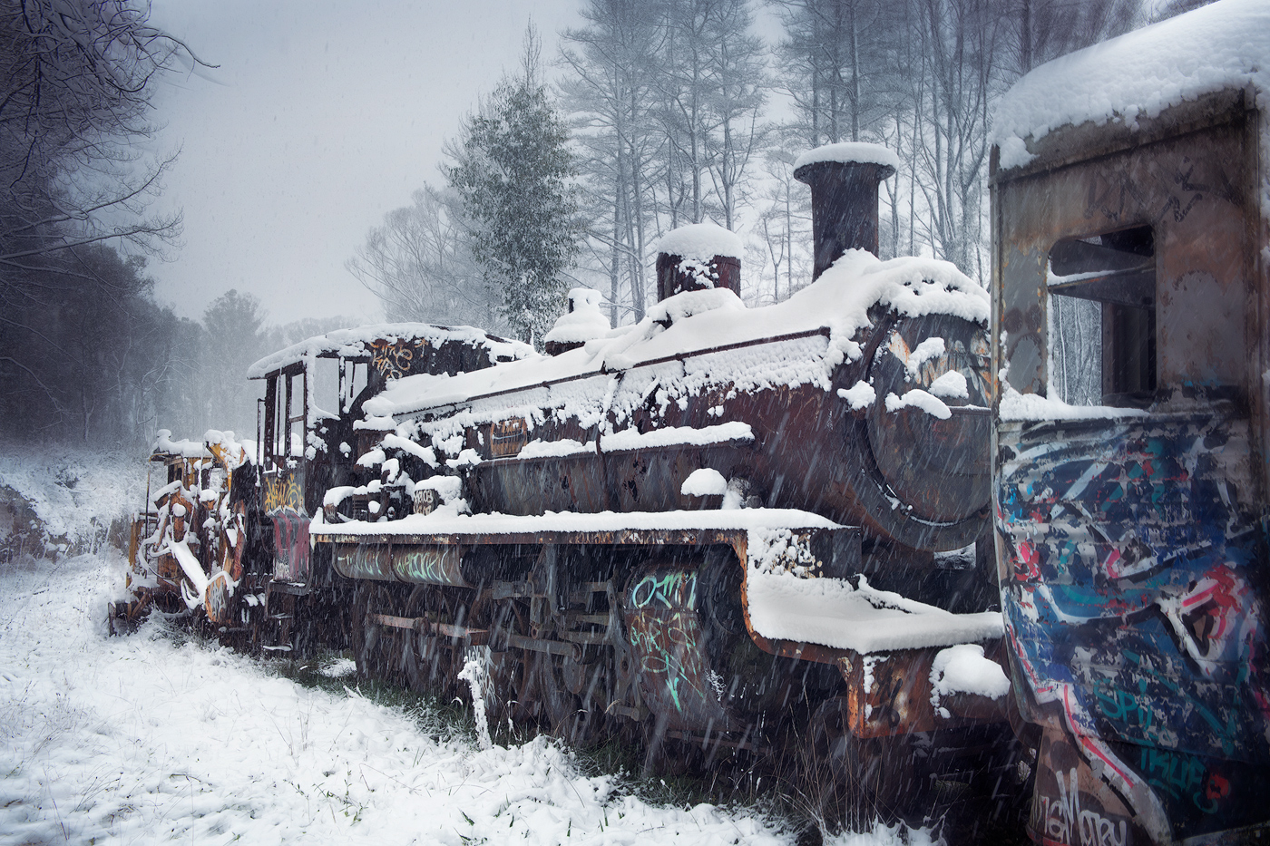
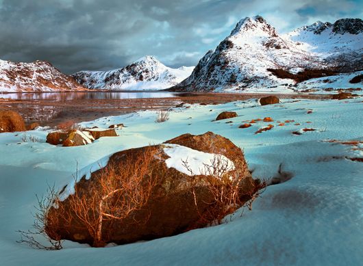
Hi Ingrid, superb image, I particularly like the 3 didtince zones, foreground, middle and back ground with the mist and clouds adding to the story. Black and White processing handled extremely well. I would be proud to have this as part of my portfolio. Minor suggestion, reduce the brightness of the foreground before the trees, it does the attention immediately. |
Apr 10th |
6 comments - 1 reply for Group 14
|
6 comments - 1 reply Total
|