|
| Group |
Round |
C/R |
Comment |
Date |
Image |
| 14 |
Jun 25 |
Reply |
Thanks Greg I appreciate your comments |
Jun 21st |
| 14 |
Jun 25 |
Reply |
Thank you Ingrid, and thank you for the suggestions |
Jun 21st |
| 14 |
Jun 25 |
Reply |
Thank you, Karen for the comment and suggestions.
|
Jun 21st |
| 14 |
Jun 25 |
Comment |
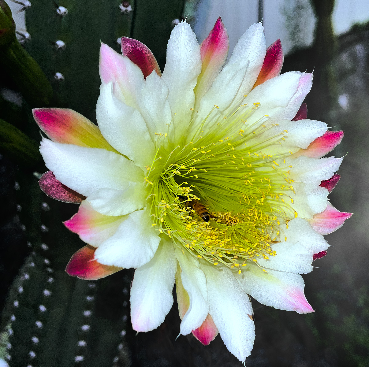
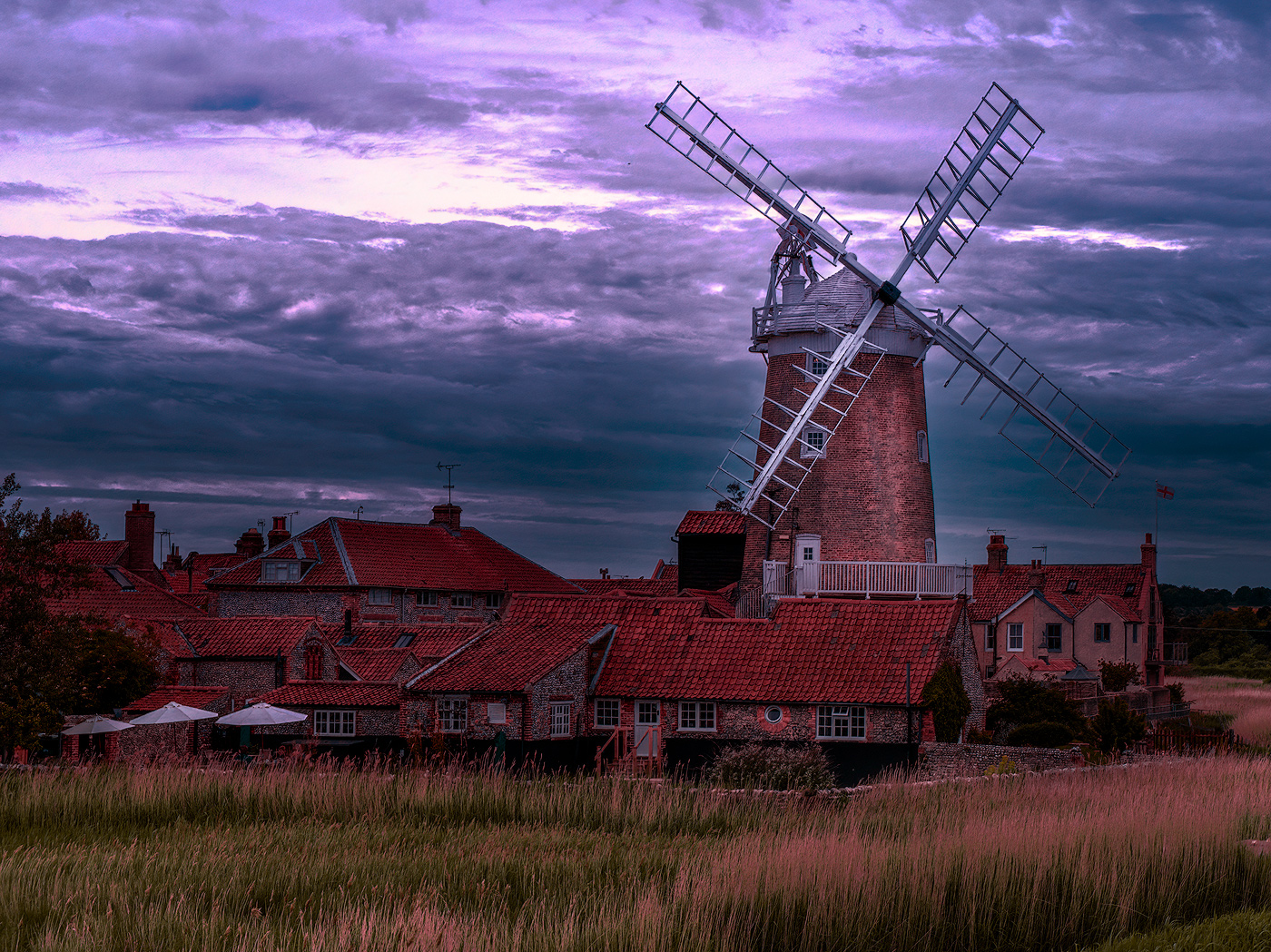
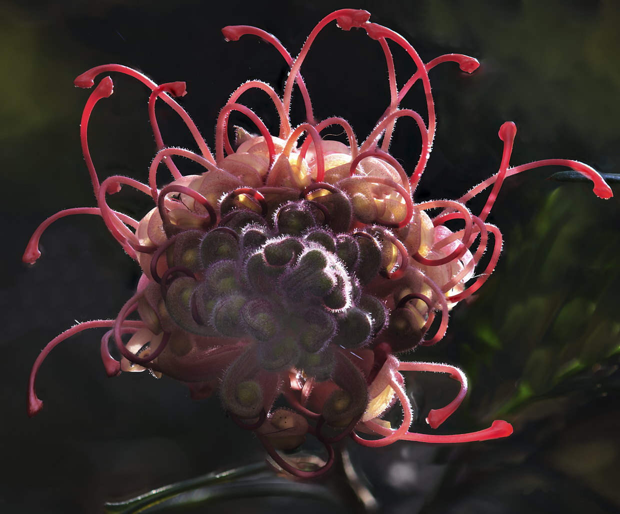
Thank you Darcy, yes it was a good year, not sure why as in other years they are not as numerous. On second viewing the bright area, as per your suggestion, needs addressing, thank you |
Jun 15th |
| 14 |
Jun 25 |
Comment |
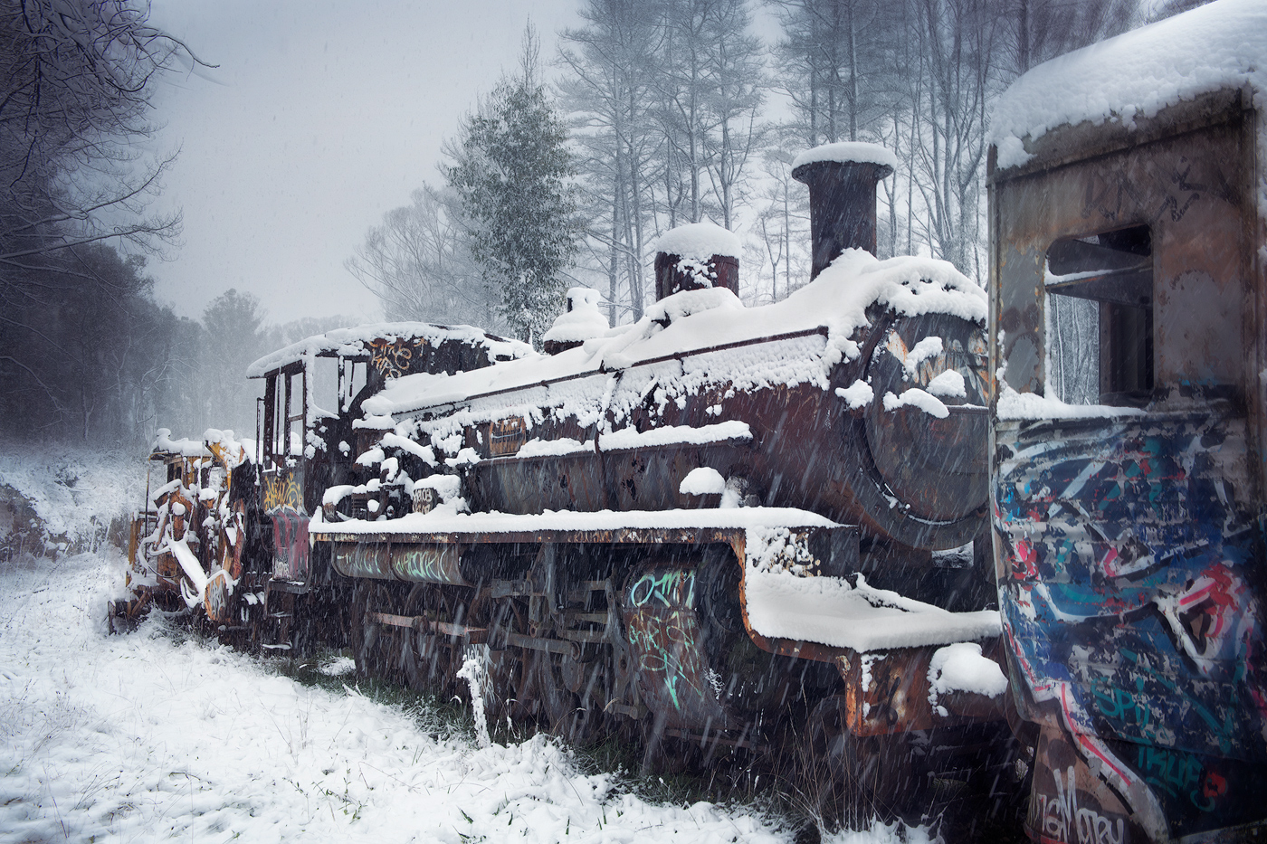
Hi Karen, well caught fire with no major burnt-out sections, not easy to achieve a well-balanced fire scene. The fire pit is handled well, but the tree line is lost on me, other than when you mentioned it. Perhaps increasing the brightness may make this more obvious. I like your idea of the leading lines, however, the portrait presentation doesn't work for me, and I am at a loss as how to explain why this is so (for me). Nice idea and definitely portrays a cosy scene. |
Jun 15th |
| 14 |
Jun 25 |
Comment |
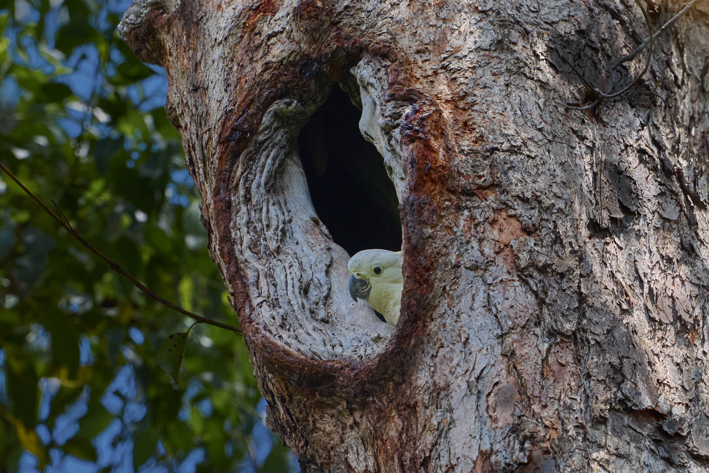
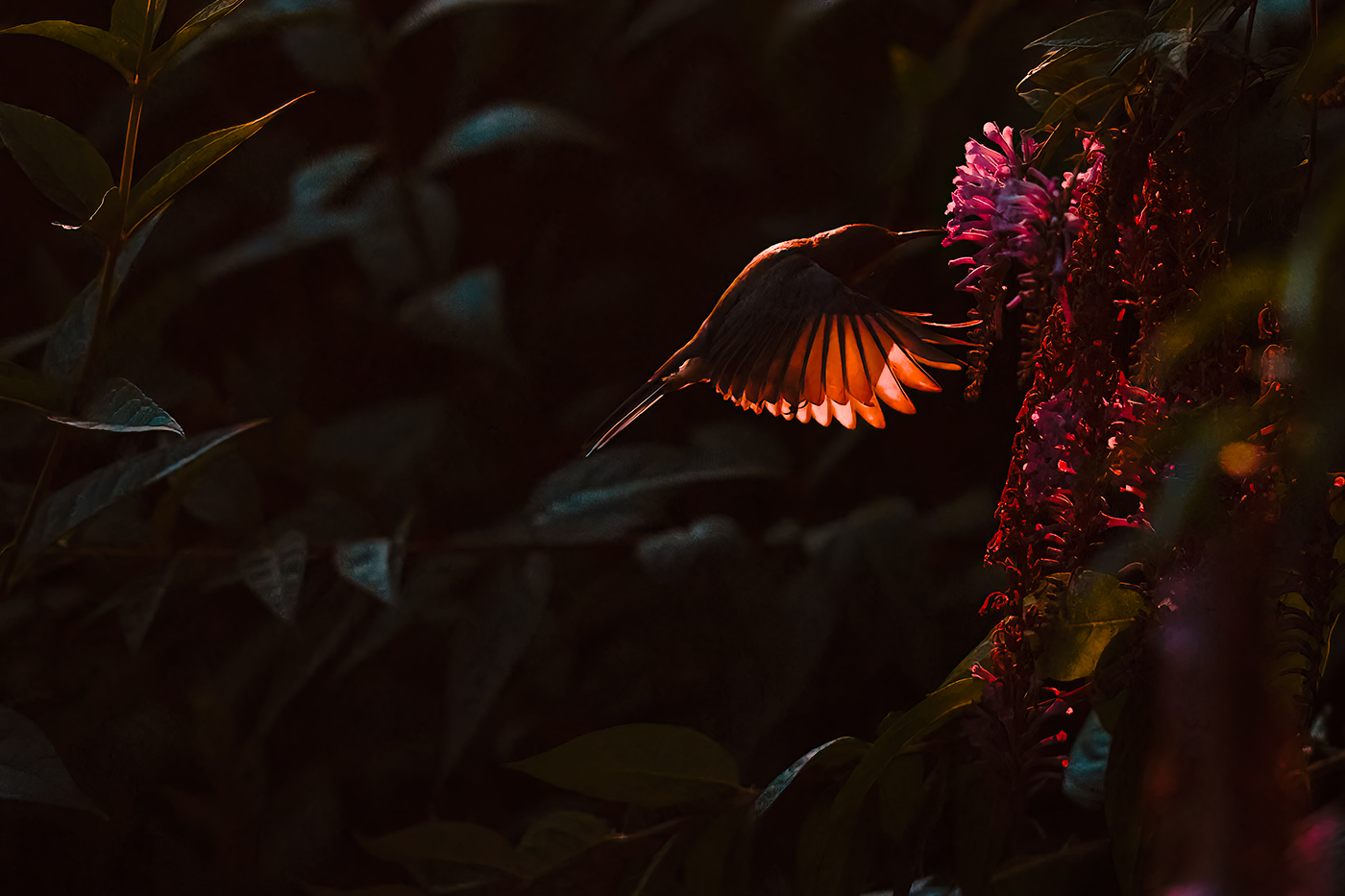
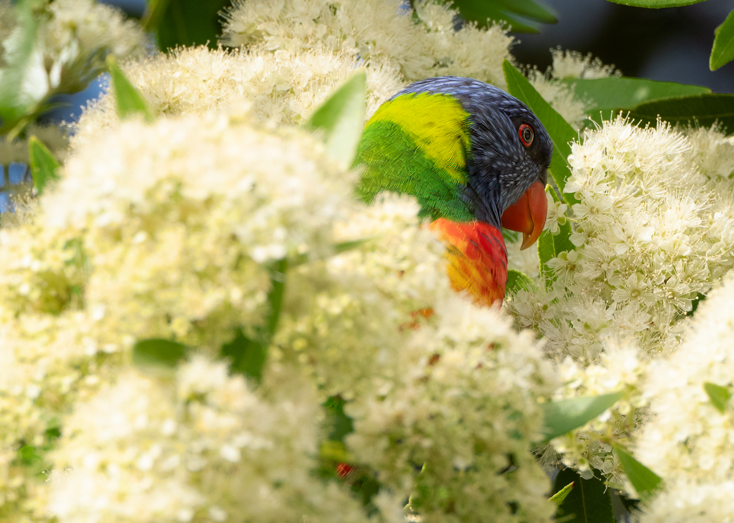
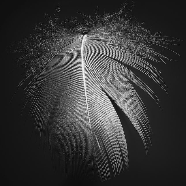
HI Greg, very detailed image with sharpness of the eye drawing the viewer in. Colours are handled very well, particularly in the bird's various colours through the beak and around the eye.
I think the cropping is enough to give a sense of space and environment as is, an alternative might be a tighter crop drawing more into the bird itself. Having said that, I like this presentation.
|
Jun 15th |
| 14 |
Jun 25 |
Comment |
Hi Kamal, well caught, it does look like a toy village taken from this heights, which gives a sense of whimsy. This also gives a good depiction of the area.. I do like the leading line, top left to bottom right, a bit different from expected, but it works well on this. |
Jun 15th |
| 14 |
Jun 25 |
Comment |
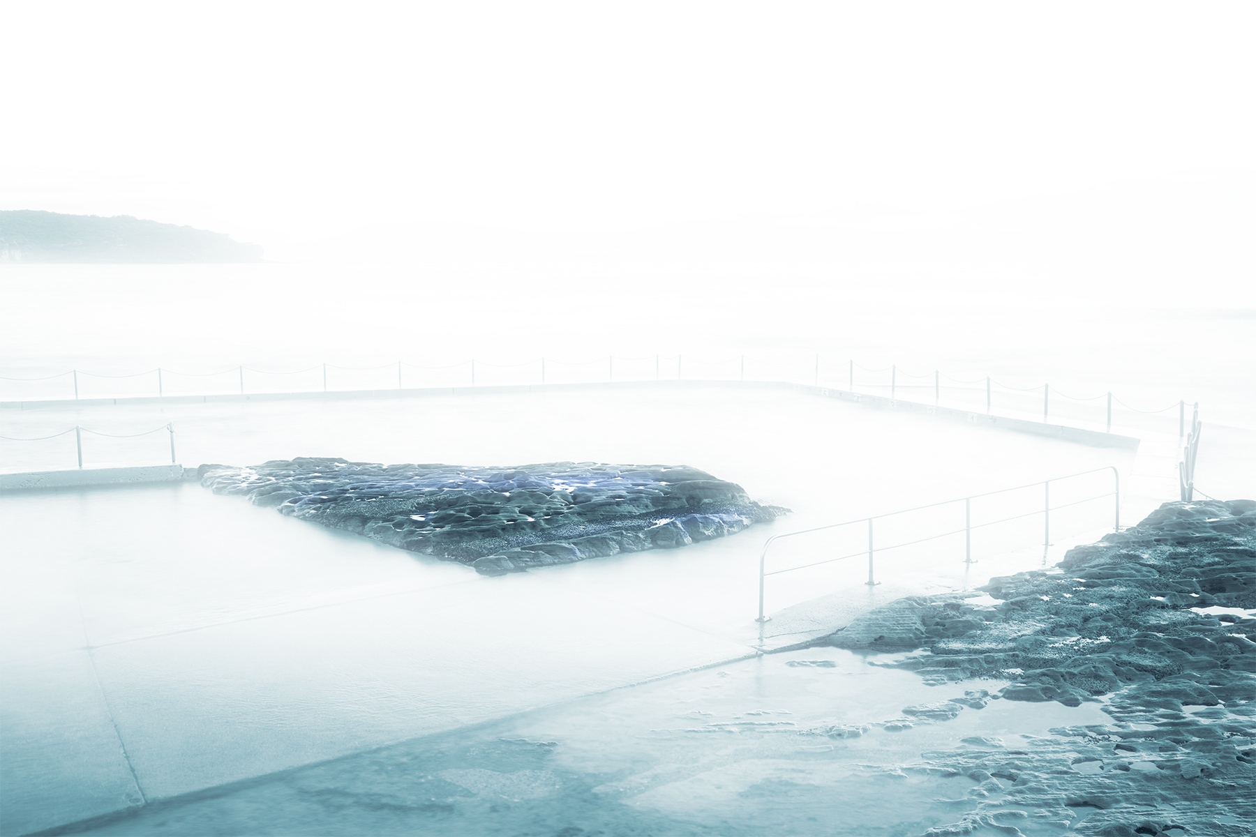
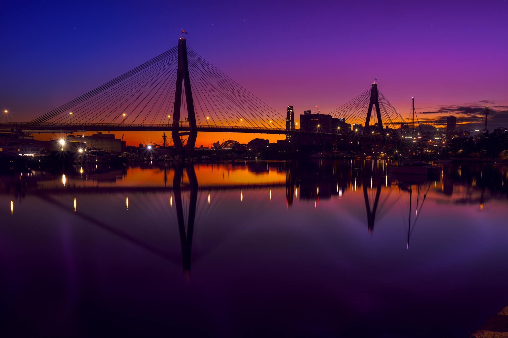
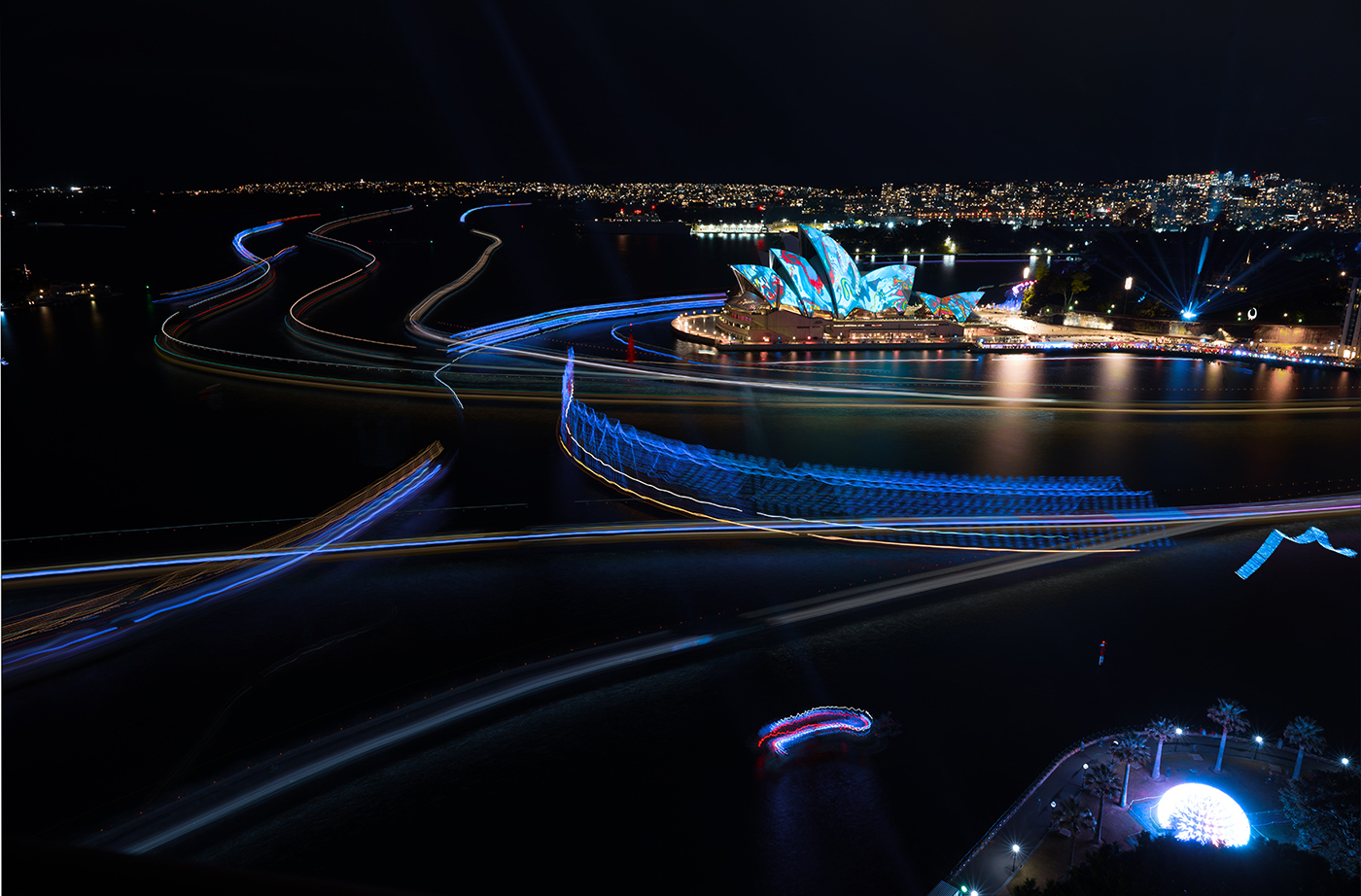
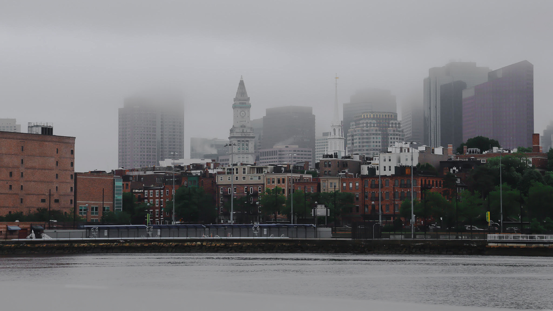
Hi Erin, I love a foggy scene, and this one revealing the skyline gives a sense of a chilly day waking up.
On my screen, it comes across a bit flat, as a suggestion, try a bit more contrast on the middle ground, the buildings, but not the sections in the fog. I hope you don't mind me playing with your image, my edit is attached. I applied a curve, anchored the mid ground, then dragged down the centre of the darks to mid and did the same on the mids to high.
Hope you enjoy or enjoyed the little holiday.
|
Jun 15th |
 |
| 14 |
Jun 25 |
Comment |
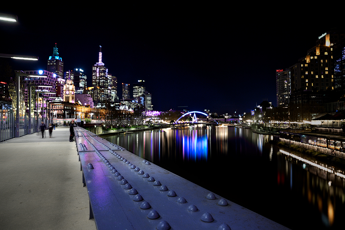
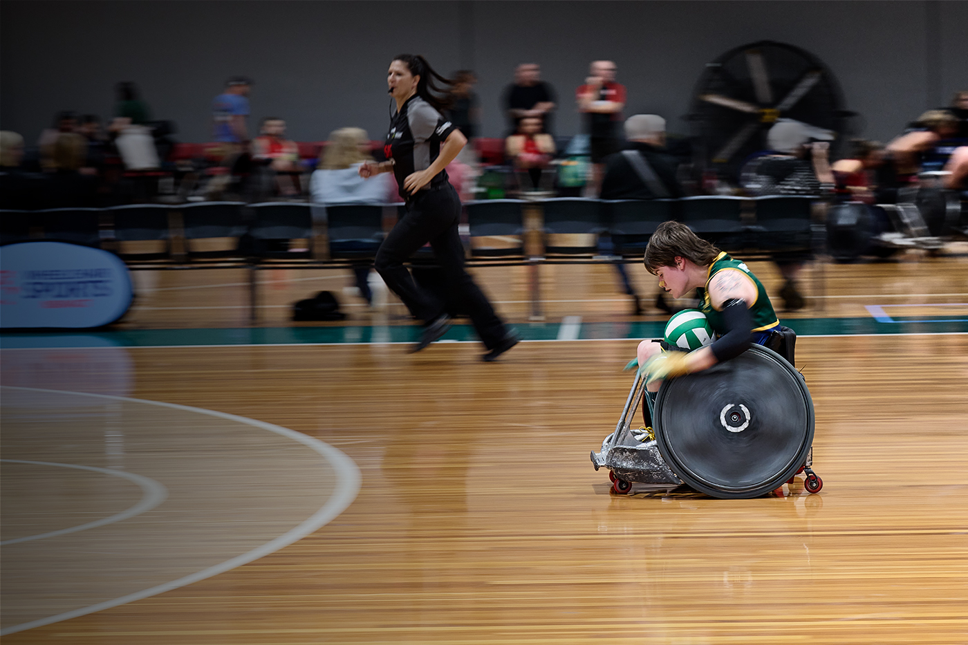
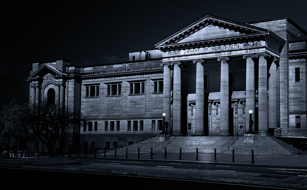
Very interesting composition, the open spaced arches to the compressed area of the arches, the cloudy skies may have done you a favour with the even tones allowing the finer details of the lines to be displayed without blown out are. Colours and tones evenly matched seem to balance the image. The blurred moving figures seems to add life to the image giving another element. Very nice well balanced image, no suggestions from m. |
Jun 12th |
| 14 |
Jun 25 |
Comment |
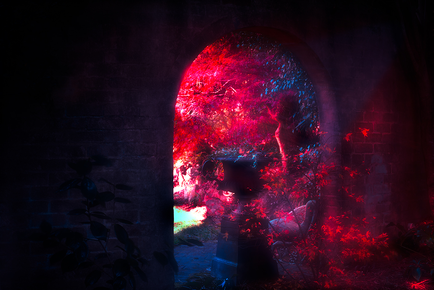
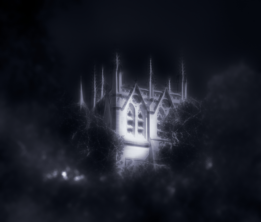
I do like this image Ingrid, the positioning of the tree leads me to the window and making me to wonder what is inside. The colour works well together anchored by the red toned wal, not much I can suggest, it stands well as presented. |
Jun 11th |
7 comments - 3 replies for Group 14
|
7 comments - 3 replies Total
|