|
| Group |
Round |
C/R |
Comment |
Date |
Image |
| 14 |
May 25 |
Reply |
Thank you very much Kamal |
May 28th |
| 14 |
May 25 |
Reply |
hank you Karen, a good idea with the framing option |
May 28th |
| 14 |
May 25 |
Reply |
Thank yopu Greg |
May 28th |
| 14 |
May 25 |
Reply |
Thank yopu Darcy |
May 28th |
| 14 |
May 25 |
Reply |
Thank you for that Ingrid, nice idea for the border |
May 28th |
| 14 |
May 25 |
Comment |
Hi Kamal
This image showing a lot of hard detail of the workers and boats, complemented by the softness of the nets in the water works well.
The complementary tonal and colour variation, boats and workers to the nets and river, adds to the appeal of the image.
Not much I can offer, it works as is for me.
Thanks for sharing |
May 10th |
| 14 |
May 25 |
Comment |
Hi Darcy
Very nice.
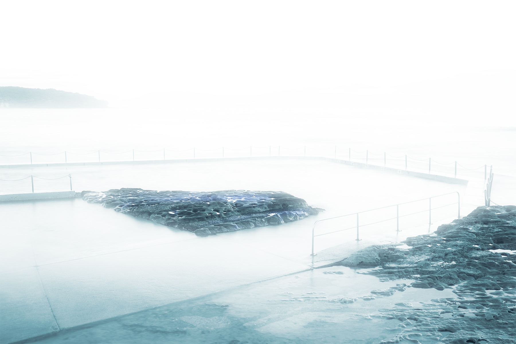
Love this minimal image with three well-proportioned elements, making the whole scene well balanced.
Landscape presentation definitely works well for this image, with the subtle tonal change in the sky and foreground adding texture to the image
As an experiment, try flipping the image on the horizon to see if the viewer is drawn into the image from left to right.
Nice, thanks for sharing
|
May 10th |
| 14 |
May 25 |
Comment |
Hi Greg,
Nice image and good choice to feature the sun rays centring on the boat. The light boat creates a tonal change into the lighter sky from the dark waters.
I do find the intense green of the shack a bit distracting.
Good choice to reposition for the shot |
May 10th |
| 14 |
May 25 |
Comment |
Hi Karen, very emotive image, captured well and respectfully.
Not much for me to say, your image works very well. Your choice to remove the distraction colours was, in my view, a good decision.
We recently celebrated/commemorated our Memorial Day, ANZAC Day (Australian and New Zealand Army Corps)
Thanks for sharing. |
May 10th |
| 14 |
May 25 |
Comment |
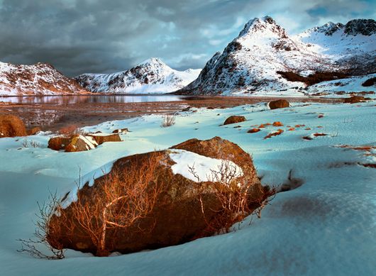
Hi Ingrid, I have always liked images with the layering
of mountains into the distance, your sky looks spectacular. I am not concerned that the is a lack of central subject, just the balance, lights to darks and colour tone make the image work as a whole, for me.
While the mid-range mountains and sky work well, the foreground colours appear distorted and blotchy. I do hope you don't mind, I had a play with your image, only in the foreground element, moved the colour balance more to the blues away from the green and reduced the tones down.
As an alternative, suggest trying B&W and see if that appeals to you.
Well seen and captured. |
May 10th |
 |
5 comments - 5 replies for Group 14
|
5 comments - 5 replies Total
|