|
| Group |
Round |
C/R |
Comment |
Date |
Image |
| 14 |
Apr 24 |
Reply |
Thank you Erin |
Apr 24th |
| 14 |
Apr 24 |
Reply |
Thank you Karen I appreciate that. Red dot will have to go :) |
Apr 21st |
| 14 |
Apr 24 |
Reply |
Thank you very much Kamal |
Apr 21st |
| 14 |
Apr 24 |
Reply |
Thank you Ingrid I appreciate those comments |
Apr 14th |
| 14 |
Apr 24 |
Reply |
Thank you Greg I appreciate that |
Apr 14th |
| 14 |
Apr 24 |
Reply |
Hi Darcy, thank you for that input and for pointing out the red dot, strange that I did not see it originally. Thank you |
Apr 14th |
| 14 |
Apr 24 |
Comment |
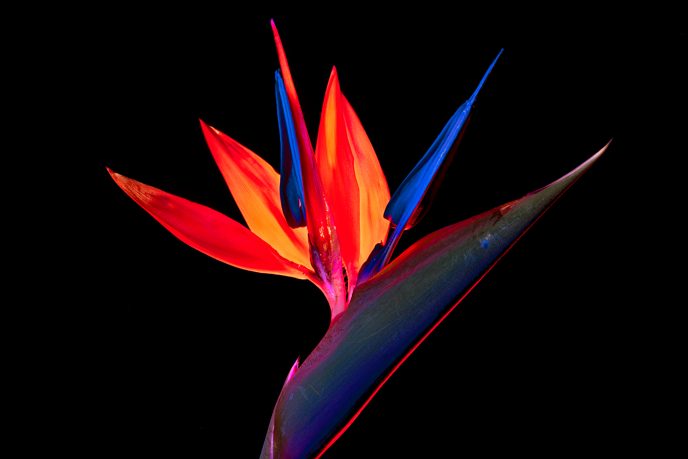
Hi Greg The origing is also an excellent well processed image. Experimenting with other looks and programs I also find to be fun. This look works well for the image, there is not much I can suggest. Well presented image |
Apr 14th |
| 14 |
Apr 24 |
Comment |
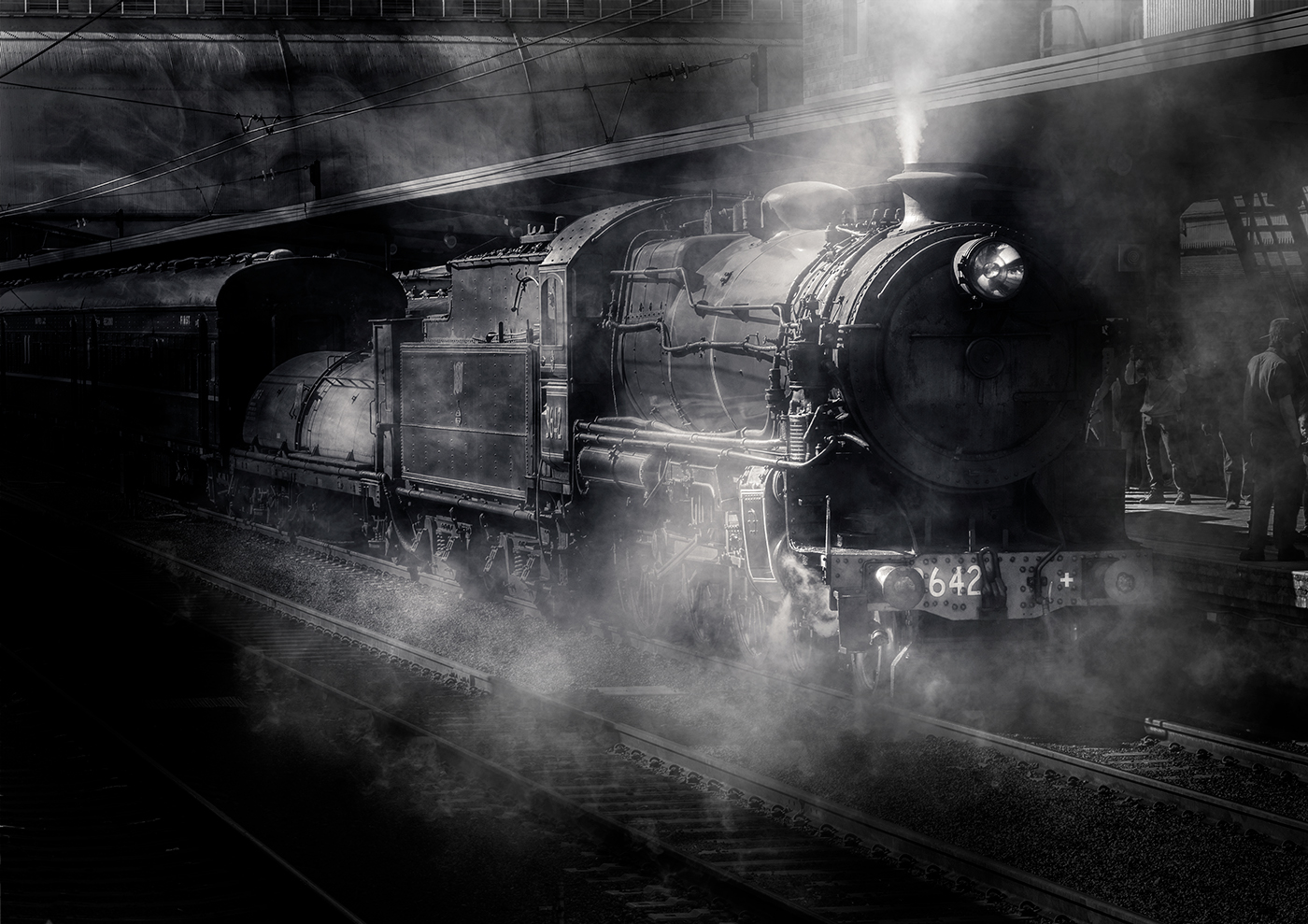
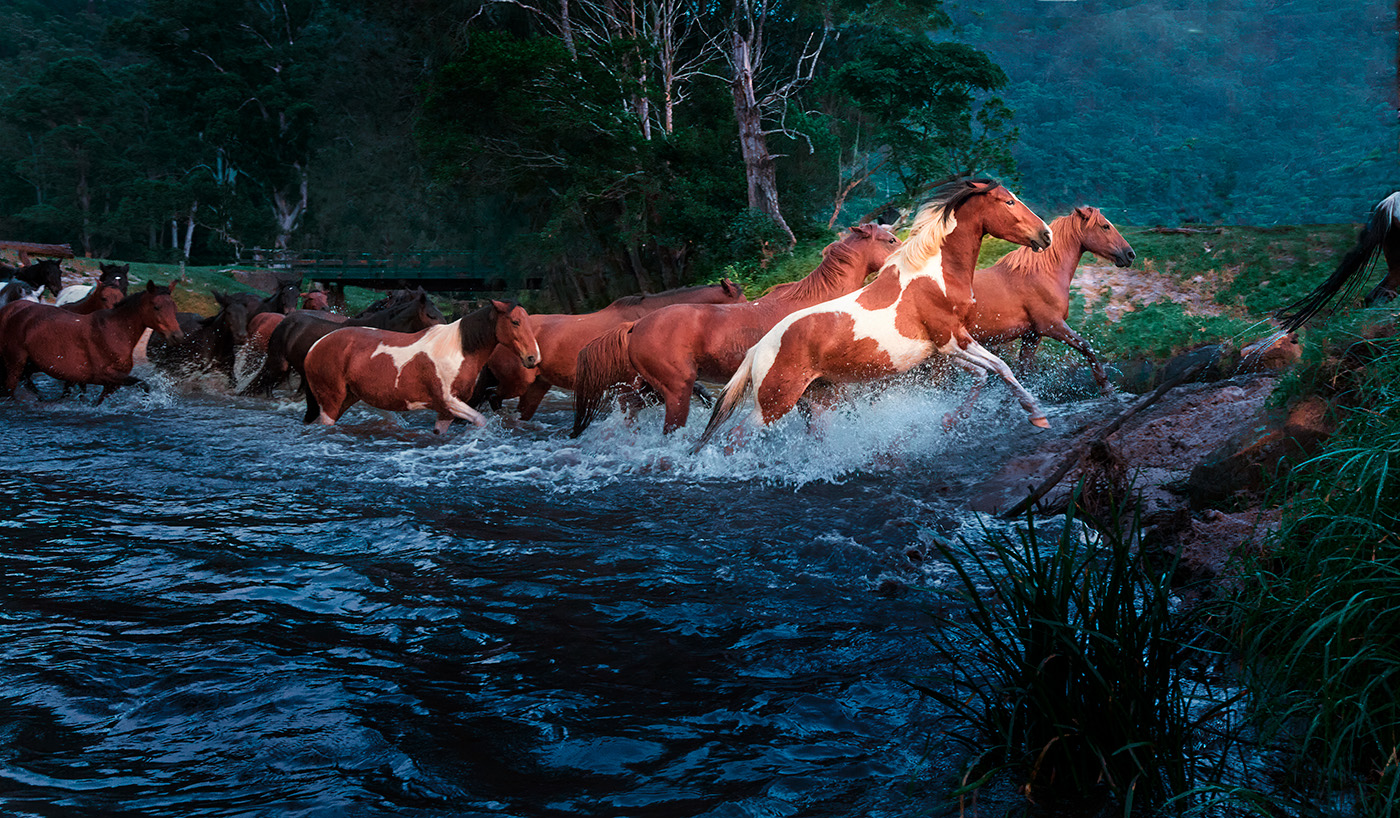
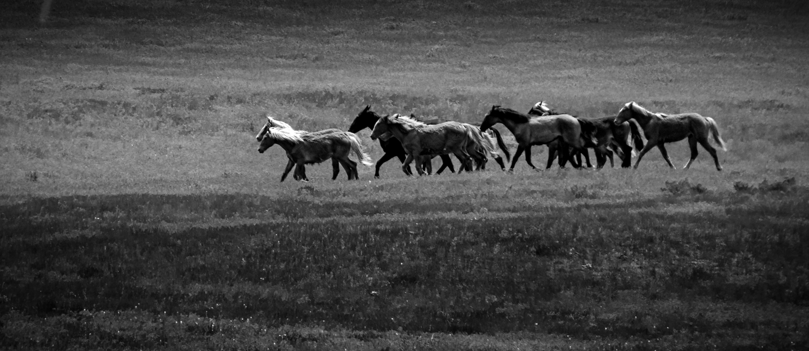
Hi Darcy, a nice sharp image where it should be sharp, I agree with Greg on a crop, I would go for a narrow landscape look. I like the placement of the horses on the frame, it works well. I think the whole image is a bit flat and suggest a selection of the horses, sharpen a bit to increase contrast and darken the forground and background for more contrast. Nice to see the horses running wild. My quick edit hopefully shows better than I explained. |
Apr 14th |
 |
| 14 |
Apr 24 |
Comment |
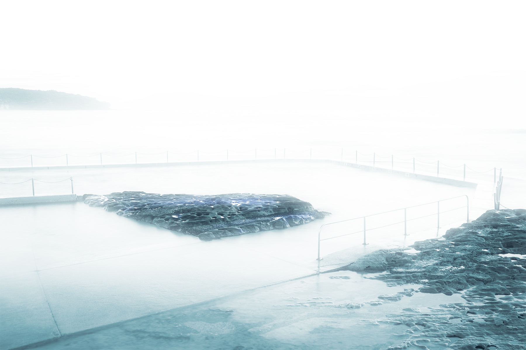
Hi Kamal, well-captured image, I like the contrast of the waters netted area to the outside of the net. I suggest a minor vignette to draw the view into the image a bit more. Well seen and captured. |
Apr 14th |
| 14 |
Apr 24 |
Comment |
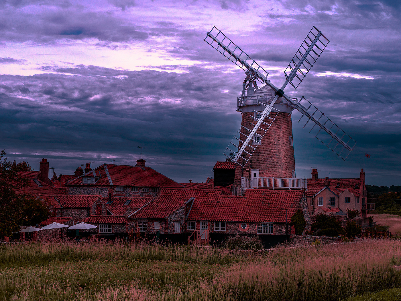
Hi Karen, I agree with the previous comments, however, I would eliminate the sky. It is another element that I do not believe adds anything to the image and is a bit distracting.
I don't believe I would crop (that is an option), but perhaps fill in with other elements from the image. Nice well composed image. |
Apr 14th |
| 14 |
Apr 24 |
Comment |
Hi Ingrid nice image and well-seen composition, I believe you achieved your goal in the image. While I agree with the technicality of Lance's constructive comments on DOF and bracketing. For my taste, I like the slightly blurred background, the texture in the foreground and the colour contrast, wall to steps, drawing the viewer to the extreme texture on the front wall and steps. I believe this makes the front wall the subject with the triangular section, the wall revealing the steps being secondary. If the whole lot was sharp I think the image would lose a focal/main point. Well seen and presented. |
Apr 14th |
| 14 |
Apr 24 |
Comment |
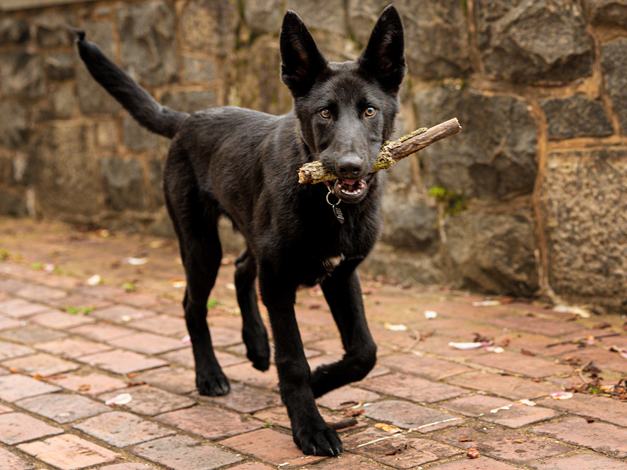
Hi Erin, nice sharp capture on the face of the pup making him stand out from the background. Given the difficulties of any depth of field providing the whole dog sharp, in this environment, I would probably make it very obvious that the face is the subject. I played around with your image, I hope you do not mind, I placed a vignette on the background and the back of the dog with a dark curve, added a second brightening layer, curve, around the face to brighten, and then brightened the eyes. All these are very subtle, I hope you can see the difference. Nice capture and pup |
Apr 14th |
 |
6 comments - 6 replies for Group 14
|
6 comments - 6 replies Total
|