|
| Group |
Round |
C/R |
Comment |
Date |
Image |
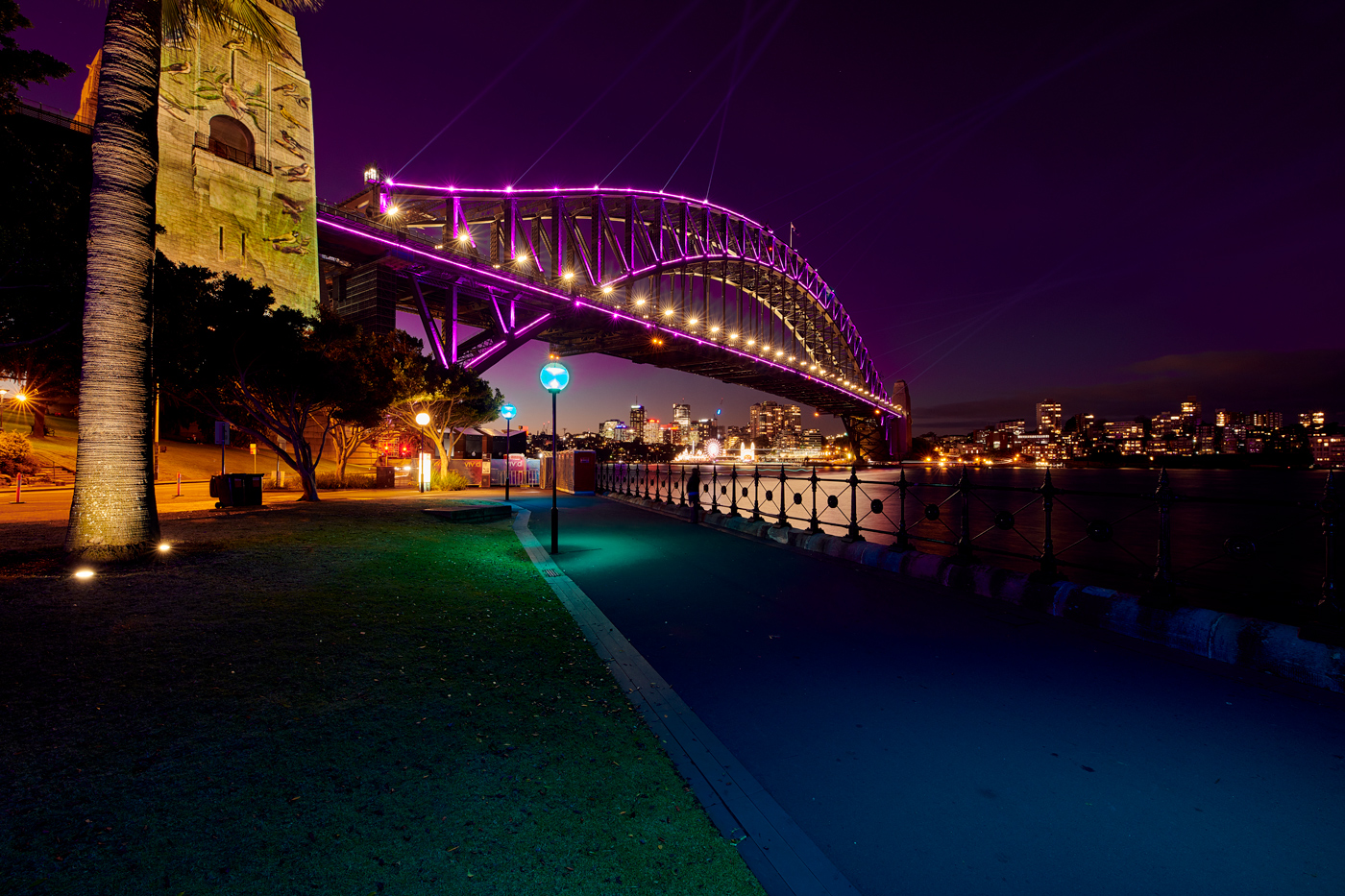
| 14 |
Mar 23 |
Reply |
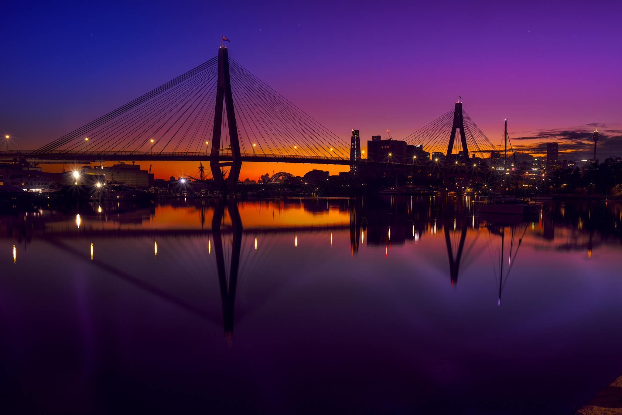
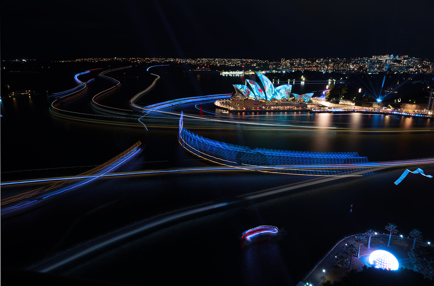
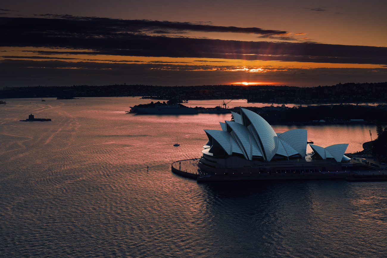
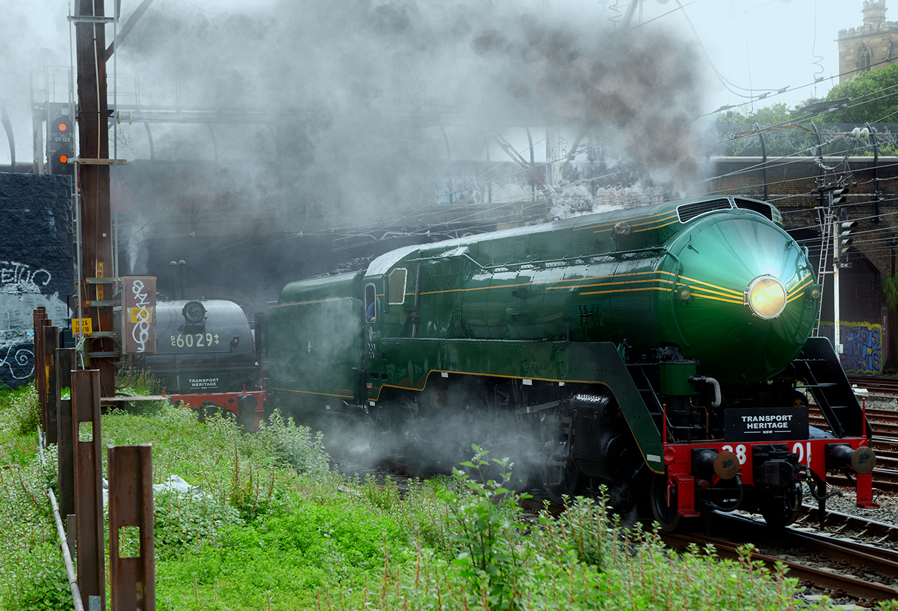
Hi Karen thanks for the comments.
The pole is a light pole, and yes it should go
The windmill thingy is a constructions crane, it can be deleted.
That is another boat on the left, adds nothing so can go as well.
Thanks for these suggestions. |
Mar 21st |
| 14 |
Mar 23 |
Reply |
Hi Ingrid, thank you for the comment, I did debate the crop, but decides to go with an image of the harbor as whole scene not just the Opera House. Albeit the Opera house does dominate |
Mar 21st |
| 14 |
Mar 23 |
Reply |
Thank you Greg, The bridge walk is indeed a good experience and presents the city well.
I did argue with myself on the crop, but as you have indicated the image captures the whole of the harbor and, I believe, is a good representation of the harbor totality, otherwise it is an image of the Opera House. Thank you for those thoughts |
Mar 15th |
| 14 |
Mar 23 |
Reply |
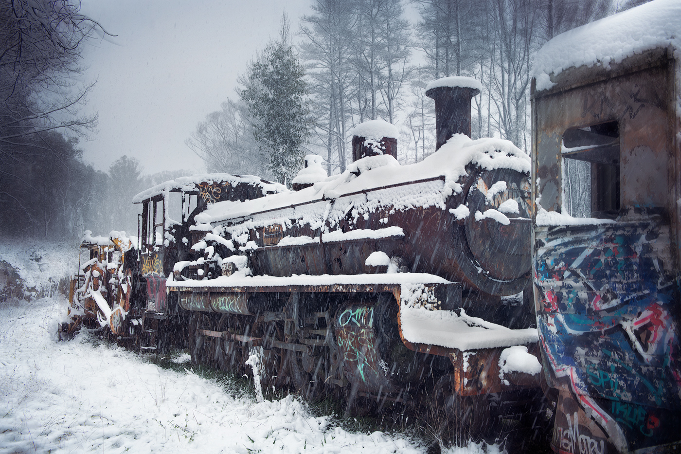
Thank you Darcy, your comments received well and I question why I left the boat in, in the first place, thanks for pointing that out |
Mar 15th |
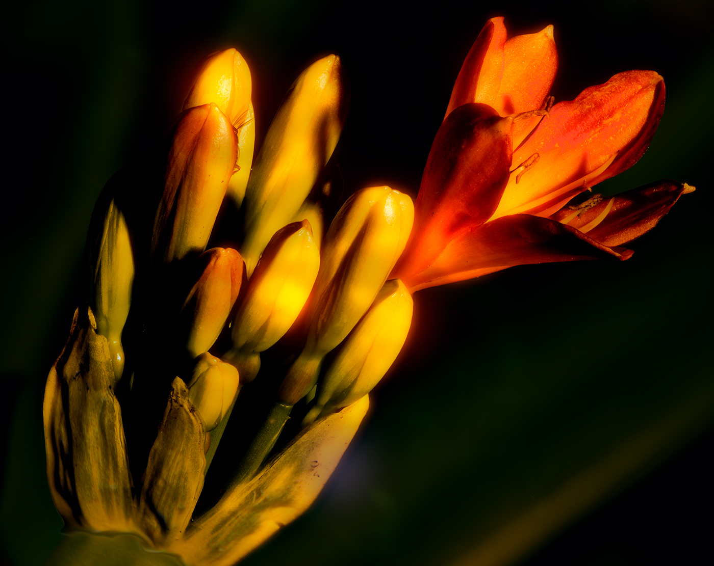
| 14 |
Mar 23 |
Comment |
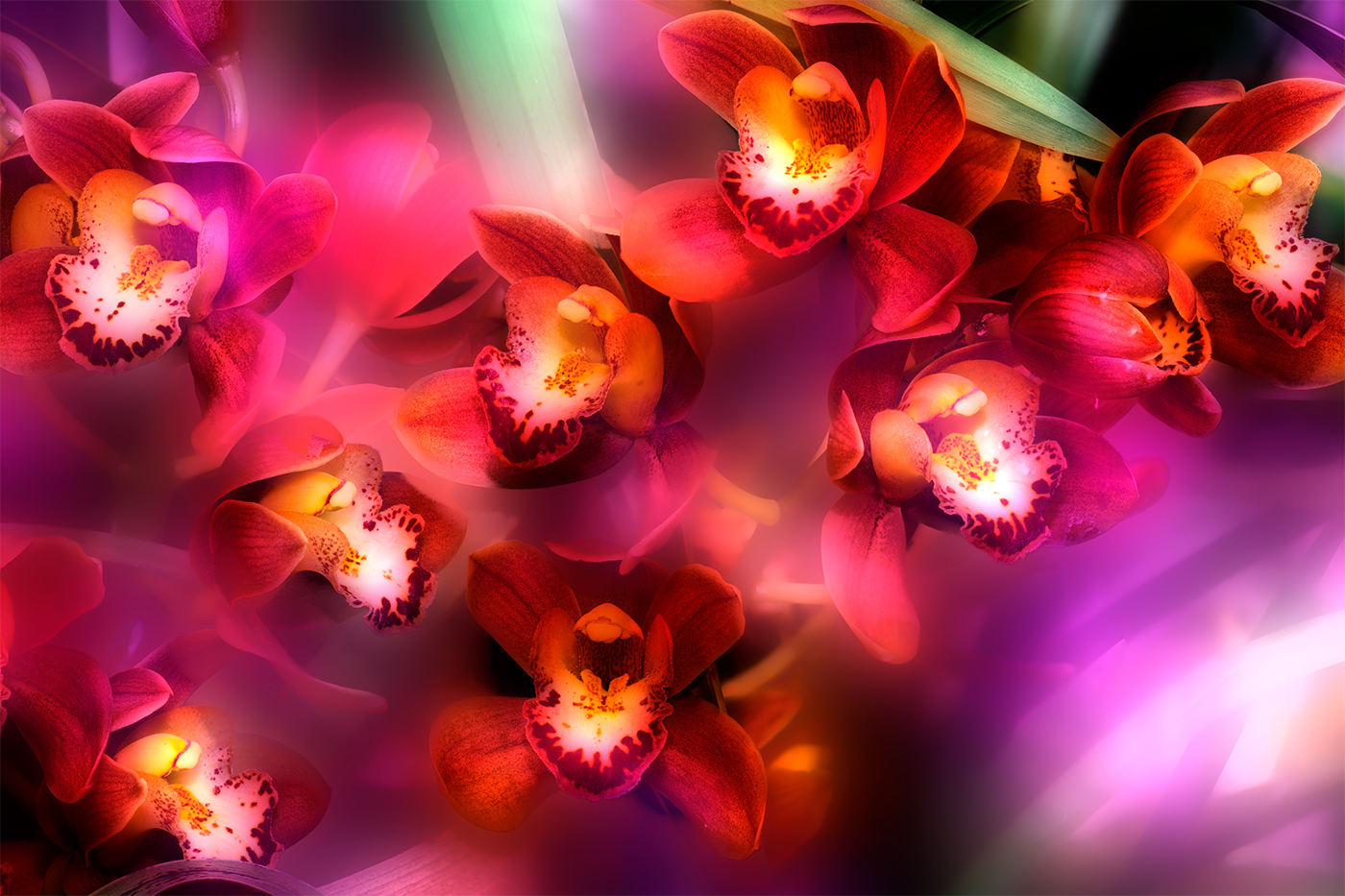
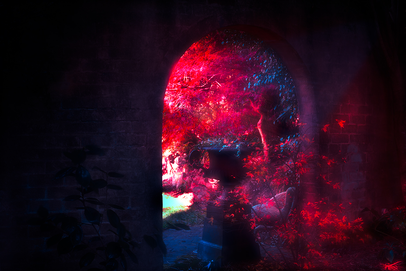
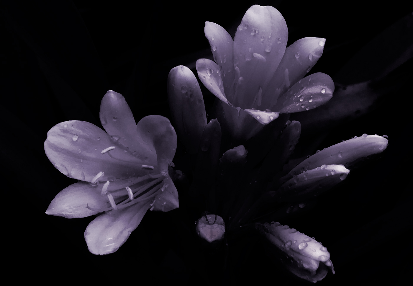
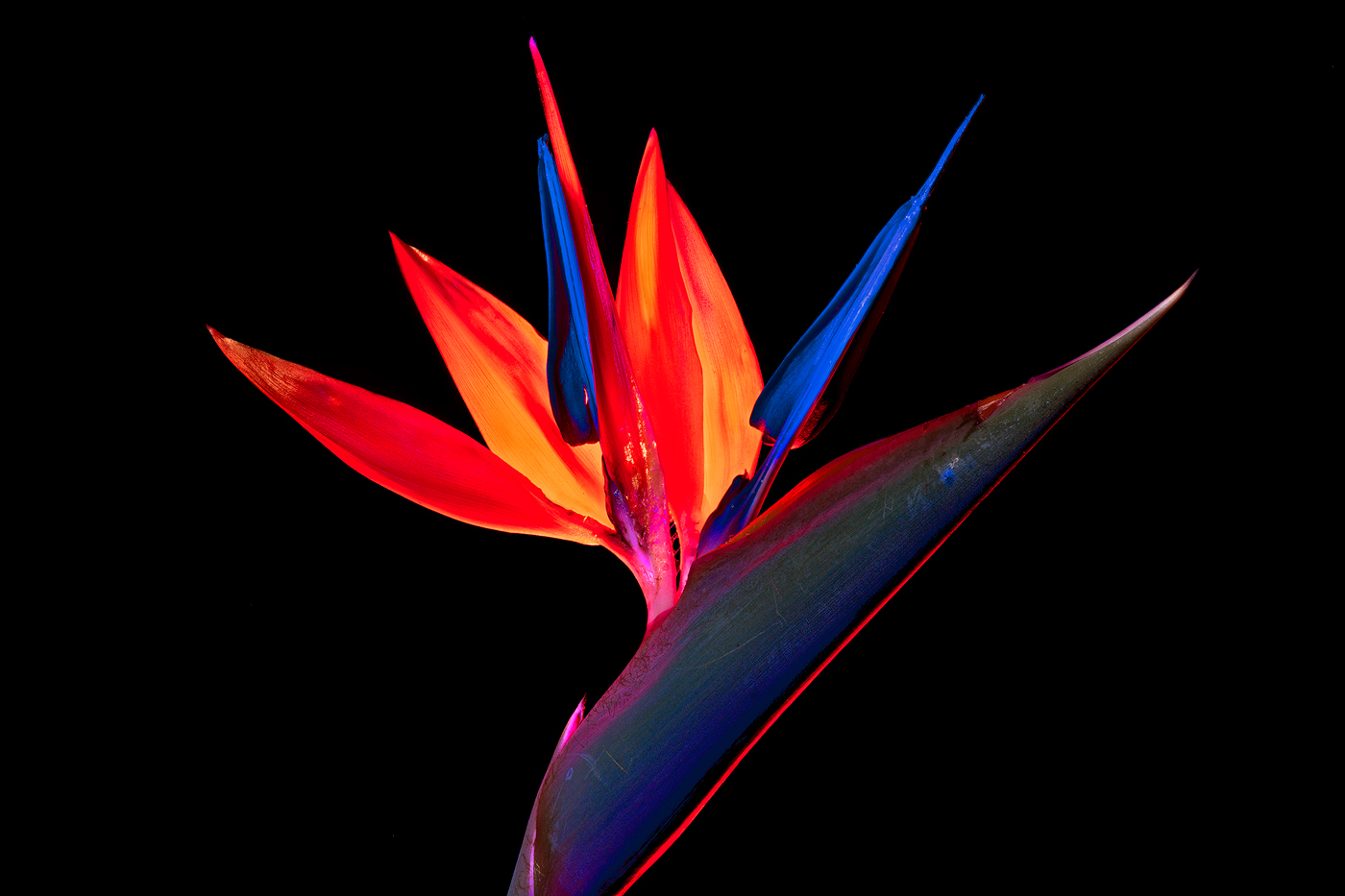
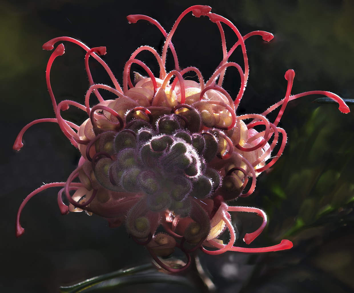
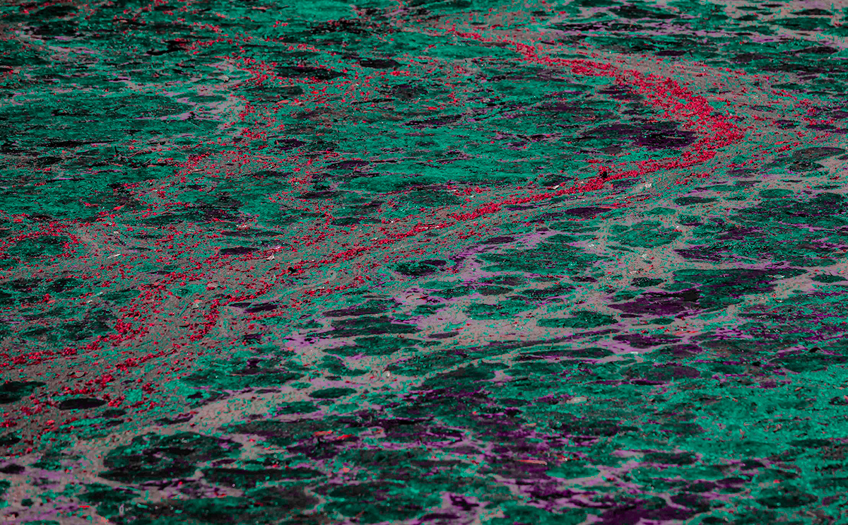
Hi Karen
I believe this meets the criteria of an abstract although abstract is outside my comfort zone as well. So I suppose the question is what would I do to the image for this competition? And again this is extremely subjective and not, as stated, in my comfort zone.
Your image provided a chance to play around with my thoughts on the abstract; my poor attempt is attached.
My aim was to have a central subject the red foliage supported by the other remaining areas. I wasn't comfortable with the color scheme so moved to a triacid scheme with red as the base. To further blend out the reality I blurred the base to further remove reality, leaving the red areas sharp.
So while I haven't really commented on your image or probably answered your question, it did give me some fun playing around with your image and the idea of abstract images.
Good luck in your competition
|
Mar 15th |
 |
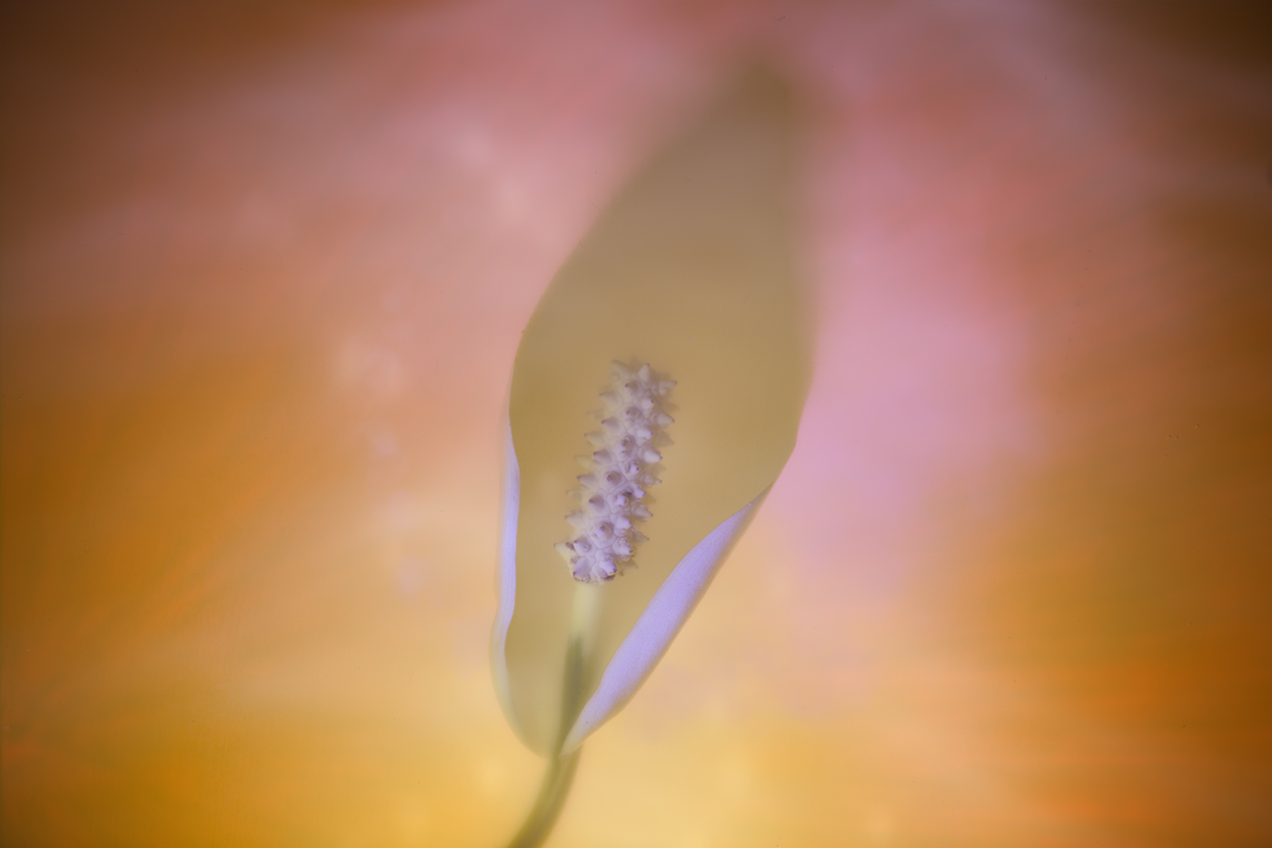
| 14 |
Mar 23 |
Comment |
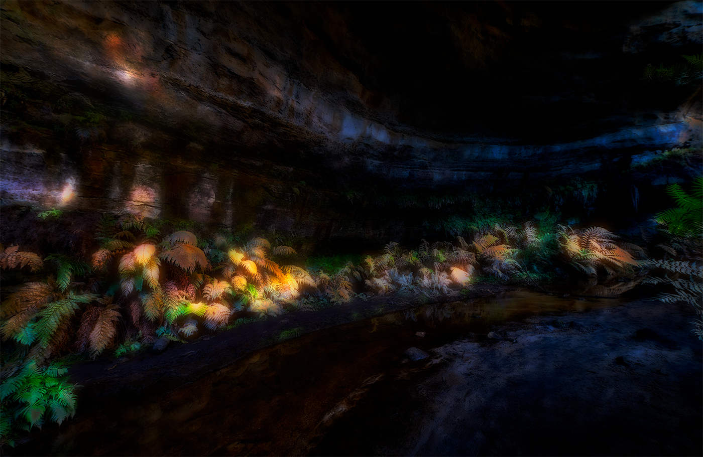
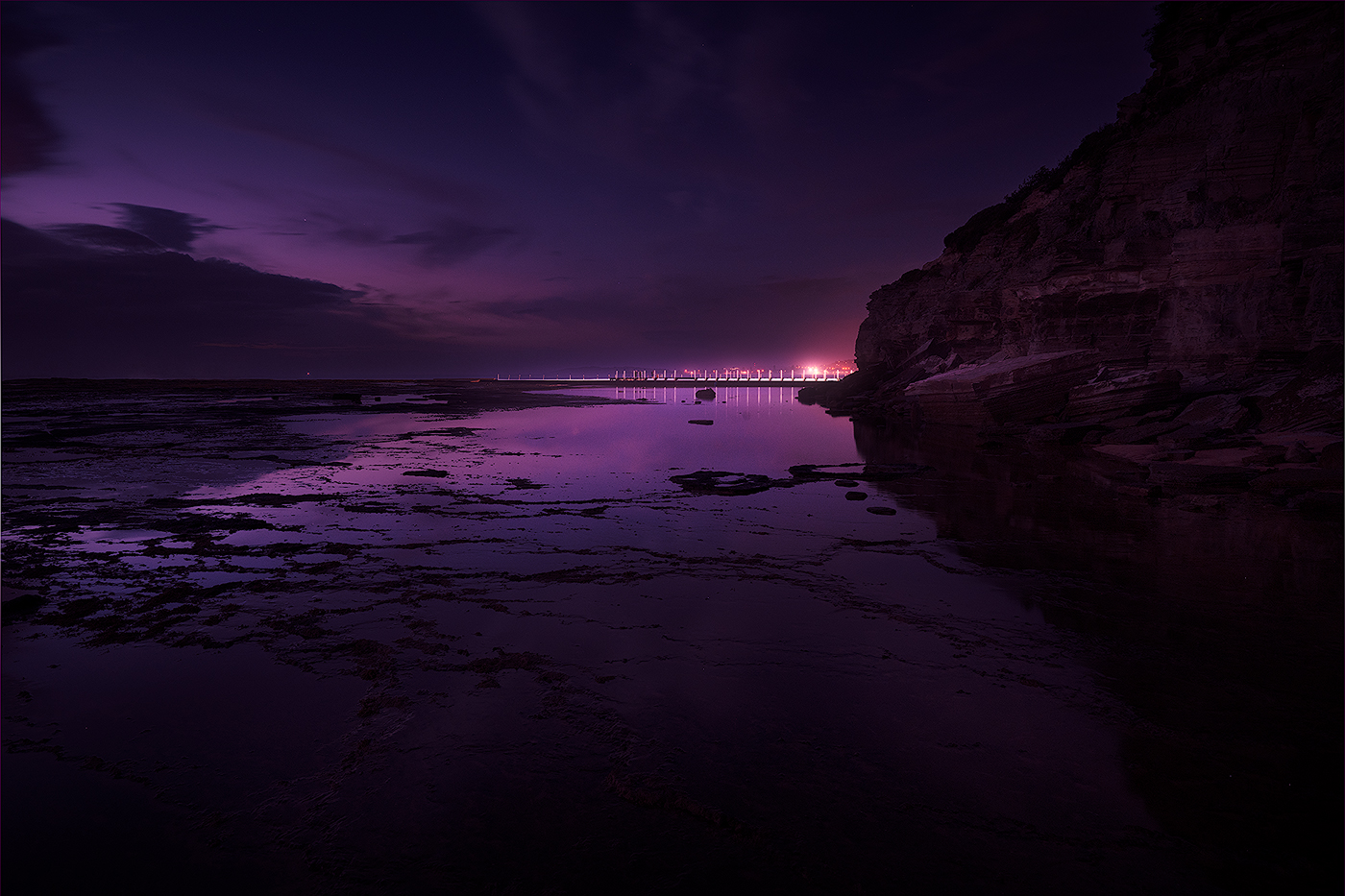
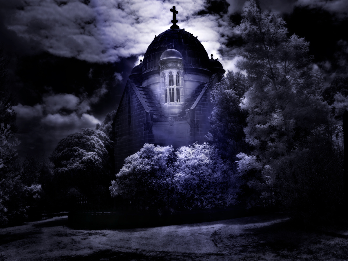
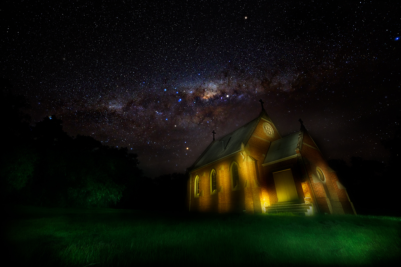
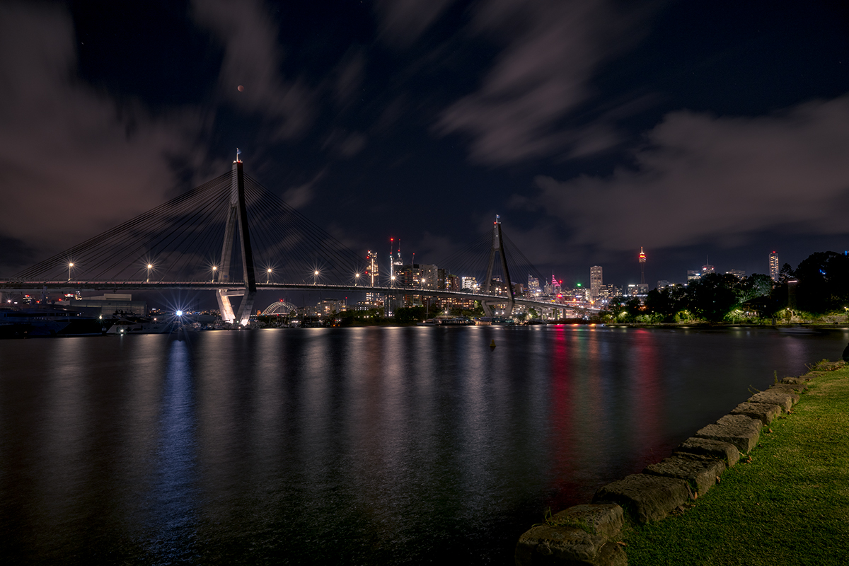
Hi Kamal.
Lovely shot, projecting a very peaceful calm scene, silhouette idea works well together with the reflection in the water giving a degree of balance, positioning the horizon near the centre also gives balance to the scene. Colour graduation works well on my screen. Altogether nicely set up shot.
I do see some halos around the top of the dome probably from your editing which you may choose to address and I agree with Darcy on the reflection of the sun in the water perhaps being toned down a bit. However altogether a very nice calming scene thanks for sharing |
Mar 15th |
| 14 |
Mar 23 |
Comment |
Hi Ingrid
Well captured more so from a moving car.
Well processed and I like the added sky with the sense of disappearing to a point in the distance, placement in the frame works well.
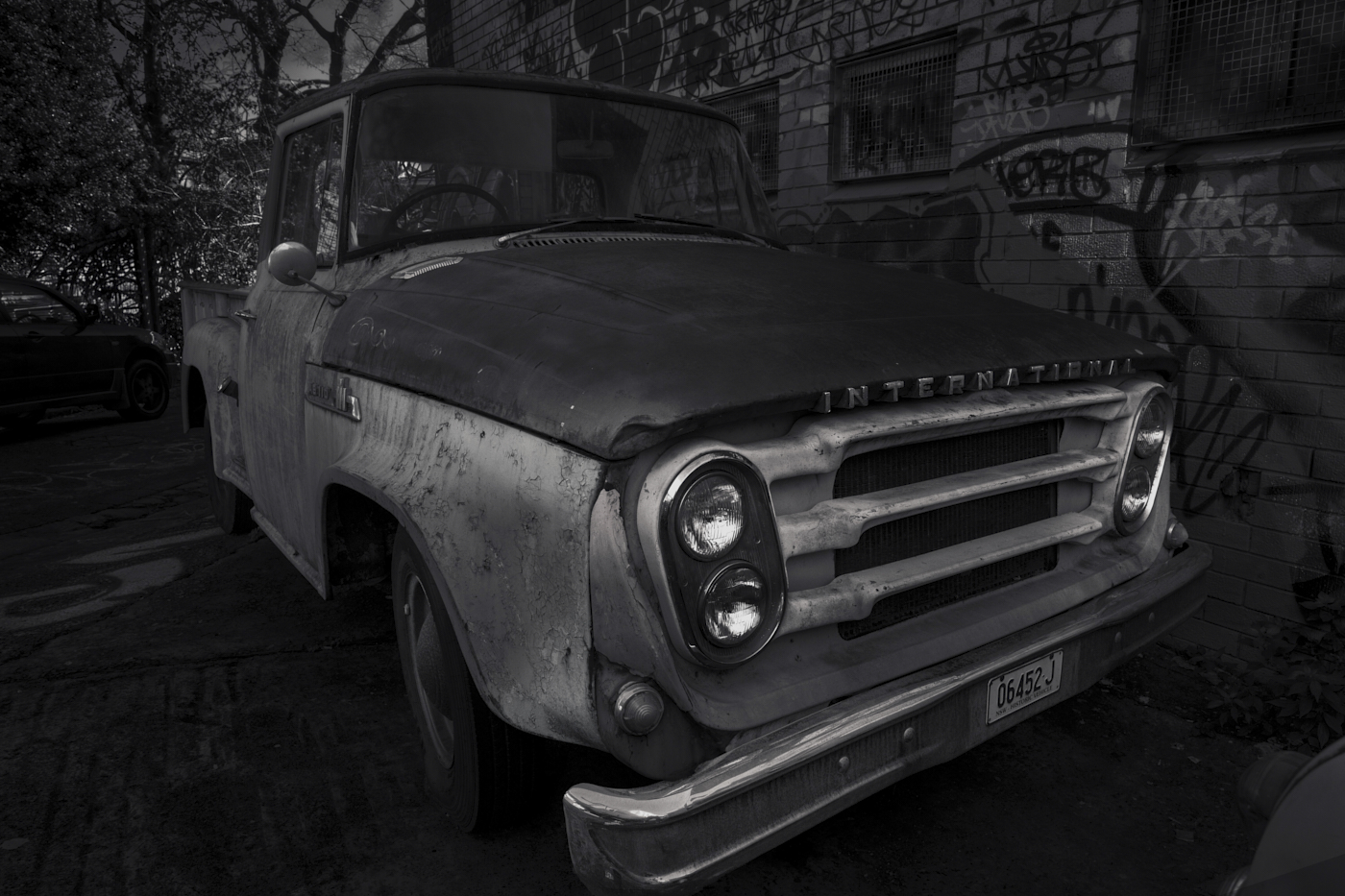
For your consideration, I would bring the blacks out a bit more to me it seems the mid tones are prominent. I took the liberty of playing with your image, attached, I will state that I like dark images so my version may not be to general taste.
You must be considering a book of your Car images soon.
|
Mar 7th |
 |
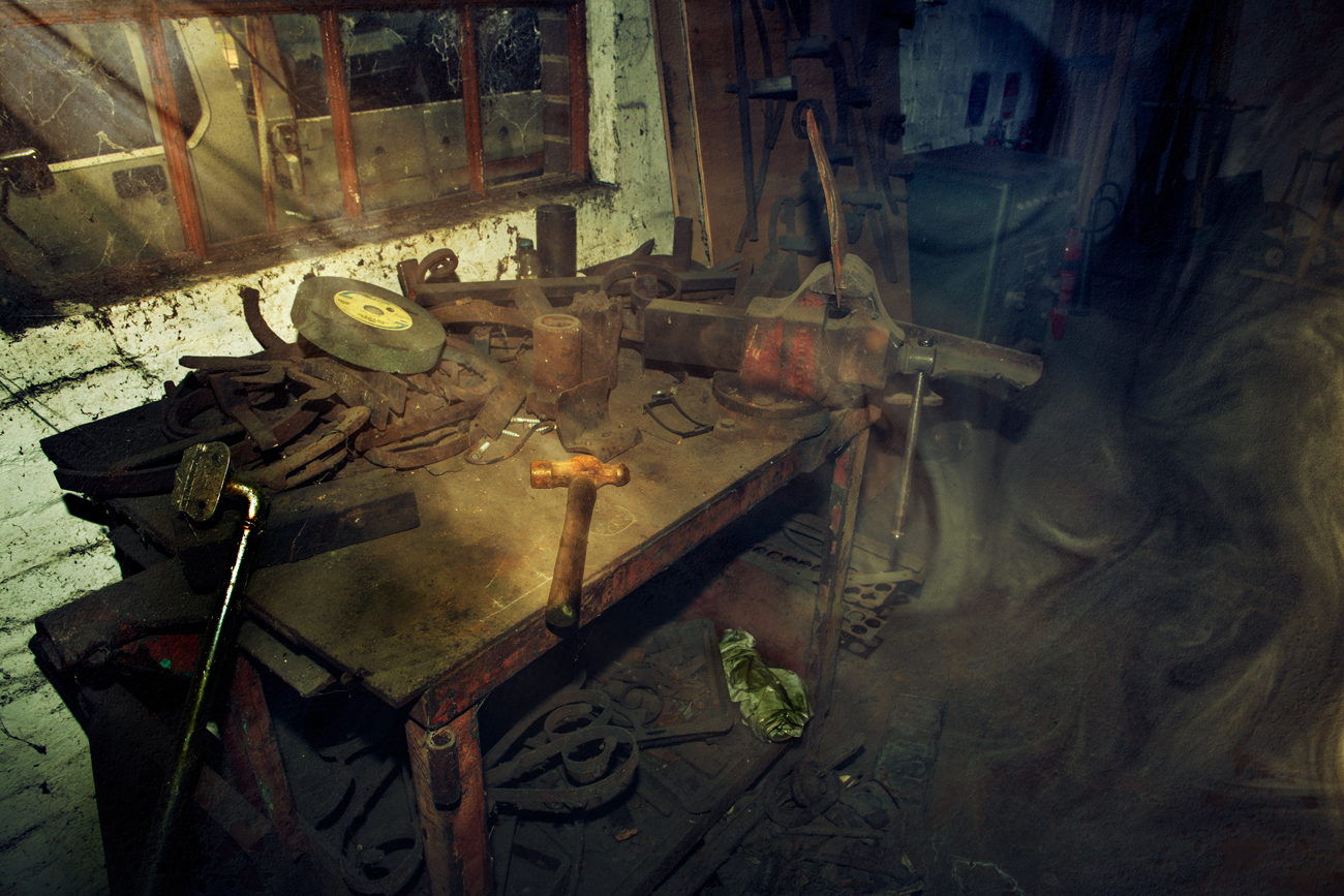
| 14 |
Mar 23 |
Comment |
Hi Darcy.
Well-constructed image. The composite has been put together extremely well with no obvious artefacts to ruin the effect.
Two very minor suggestions for your consideration, on the image left, adjacent to the chap's shoulder there is something there which does not seem to fit the image, on the other side is obviously the sky on the left side something, perhaps cloning this out may help.
While the plane is as sharp as it should be in your original image, I wonder whether it should be a bit softer given the depth of field effect that would be apparent in an image like this, given the father's hat is a bit softer than the boy. Perhaps looking at images online similar to this and checking whether the distant plane would be slightly softer to give a more realistic effect.
Very well put together, congratulations on the new skills. |
Mar 6th |
| 14 |
Mar 23 |
Comment |
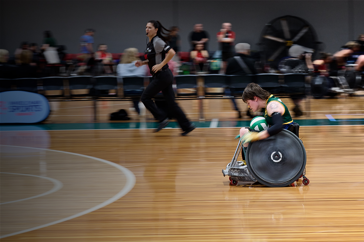
Hi Greg
Nice group seen definitely portraying a happy environment. Foreground and background are blurred enough to draw the attention to the main subjects which are presented well.
There's a number of halos around the participants heads ands head wear. What draws your attention to this mainly is the black hat against the dark background the halos really stand out on that which is quite distracting the other halos not as obvious but still there.
Well captured happy groups group seen with the participants obviously enjoying themselves. thanks for sharing |
Mar 6th |
| 14 |
Mar 23 |
Comment |
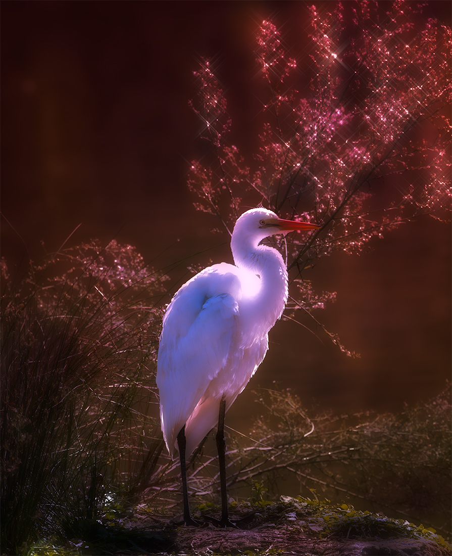
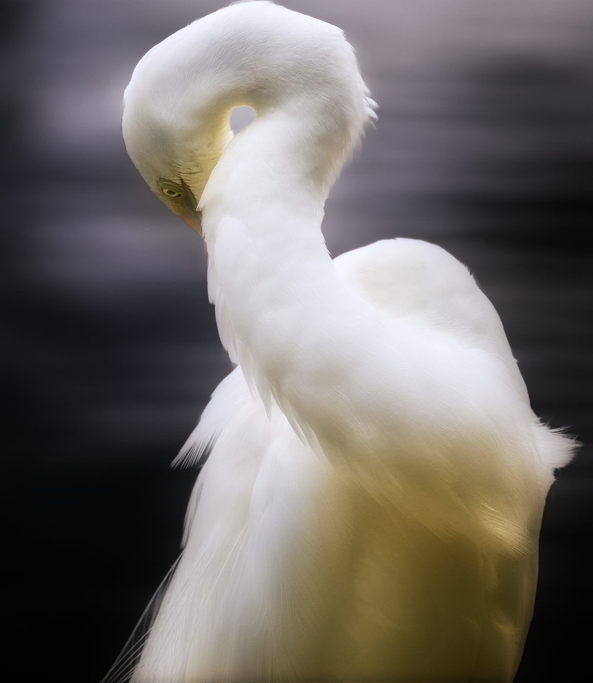
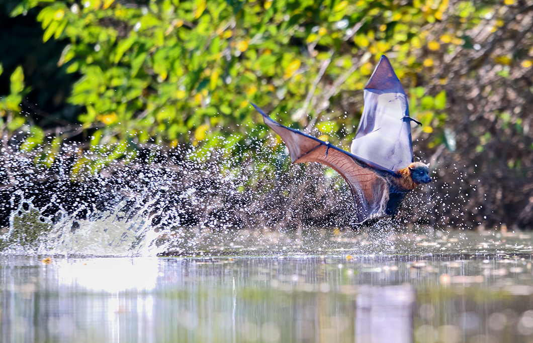
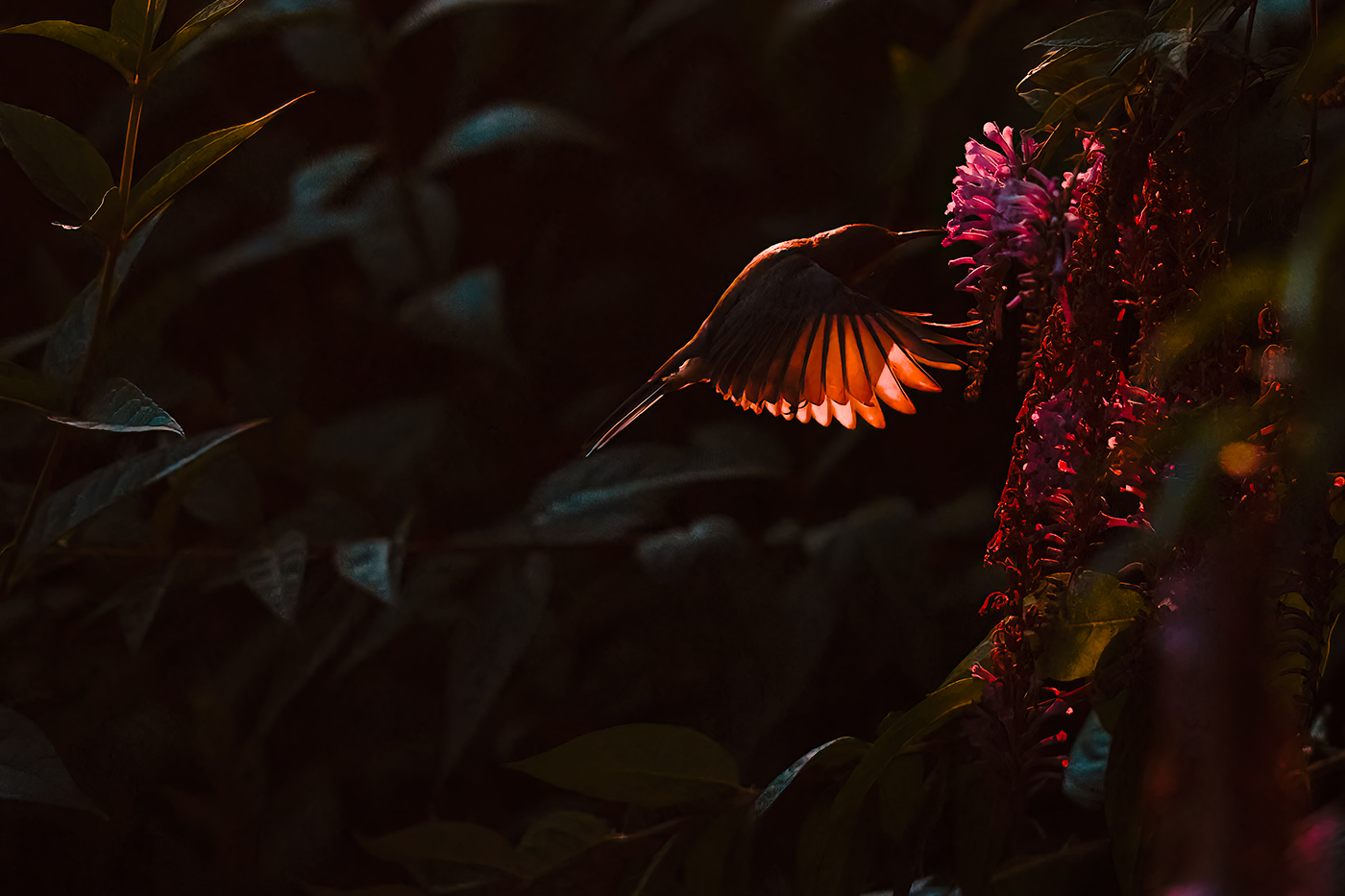
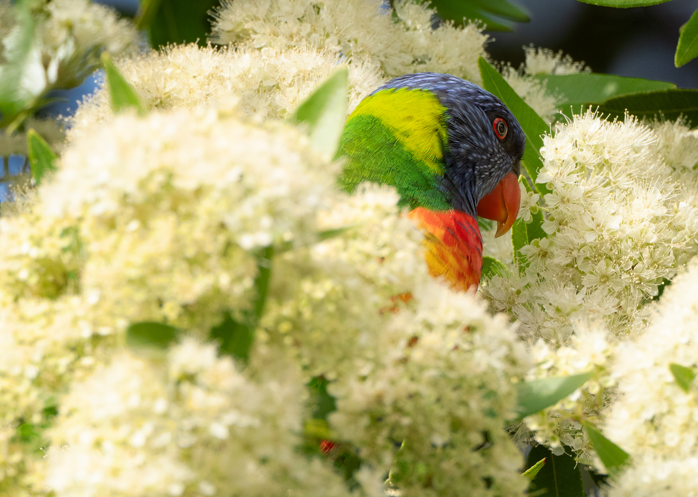
Hi Xiao
Well captured image, the pose of the bird creates a dramatic look, with the eye sharp enough to draw attention to that initially. Detail in the bird is very good with individual feathers being easily seen.
The square format works well for this image with the background blurred as not to be a distraction.
A very minor recommendation would be to perhaps crop in just slightly to give more prominence to the bird itself.
All in all the well captured and presented image and caught at the right moment. |
Mar 6th |
6 comments - 4 replies for Group 14
|
6 comments - 4 replies Total
|