|
| Group |
Round |
C/R |
Comment |
Date |
Image |
| 14 |
Nov 22 |
Reply |
Thank you Ingrid, I appreciate your input, |
Nov 20th |
| 14 |
Nov 22 |
Reply |
thank you Greg, I appreciate your comment |
Nov 20th |
| 14 |
Nov 22 |
Reply |
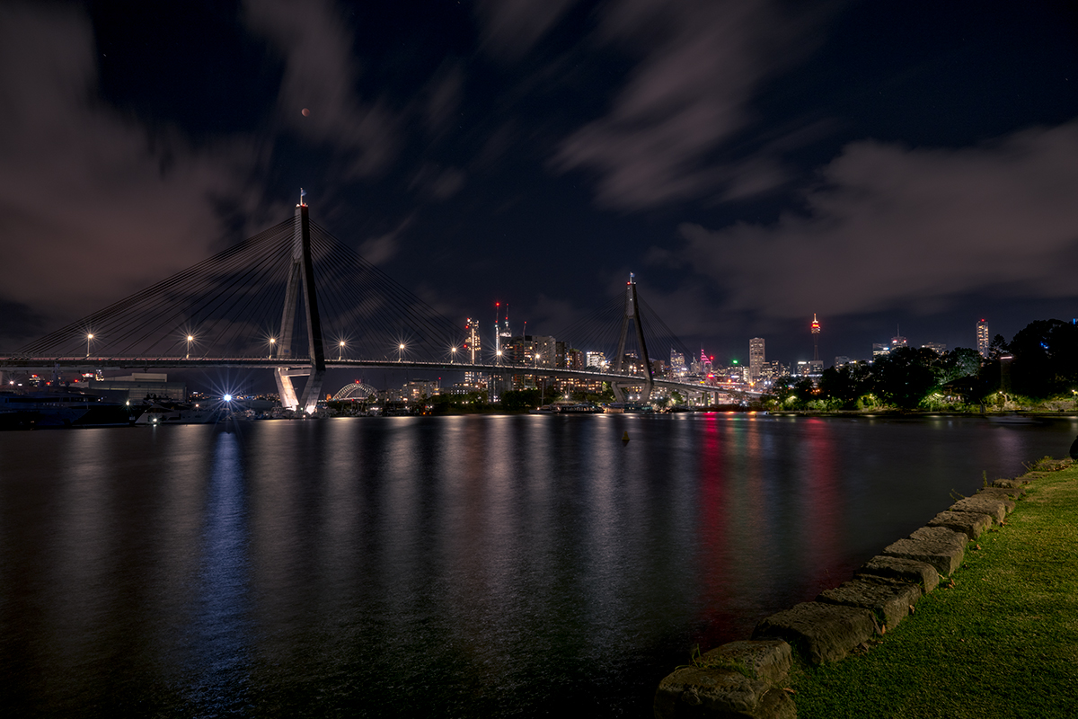
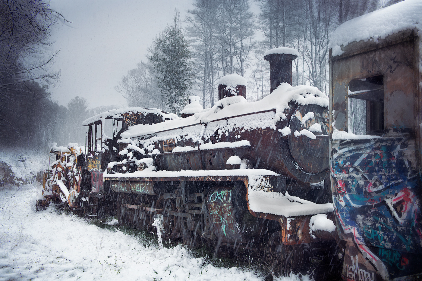
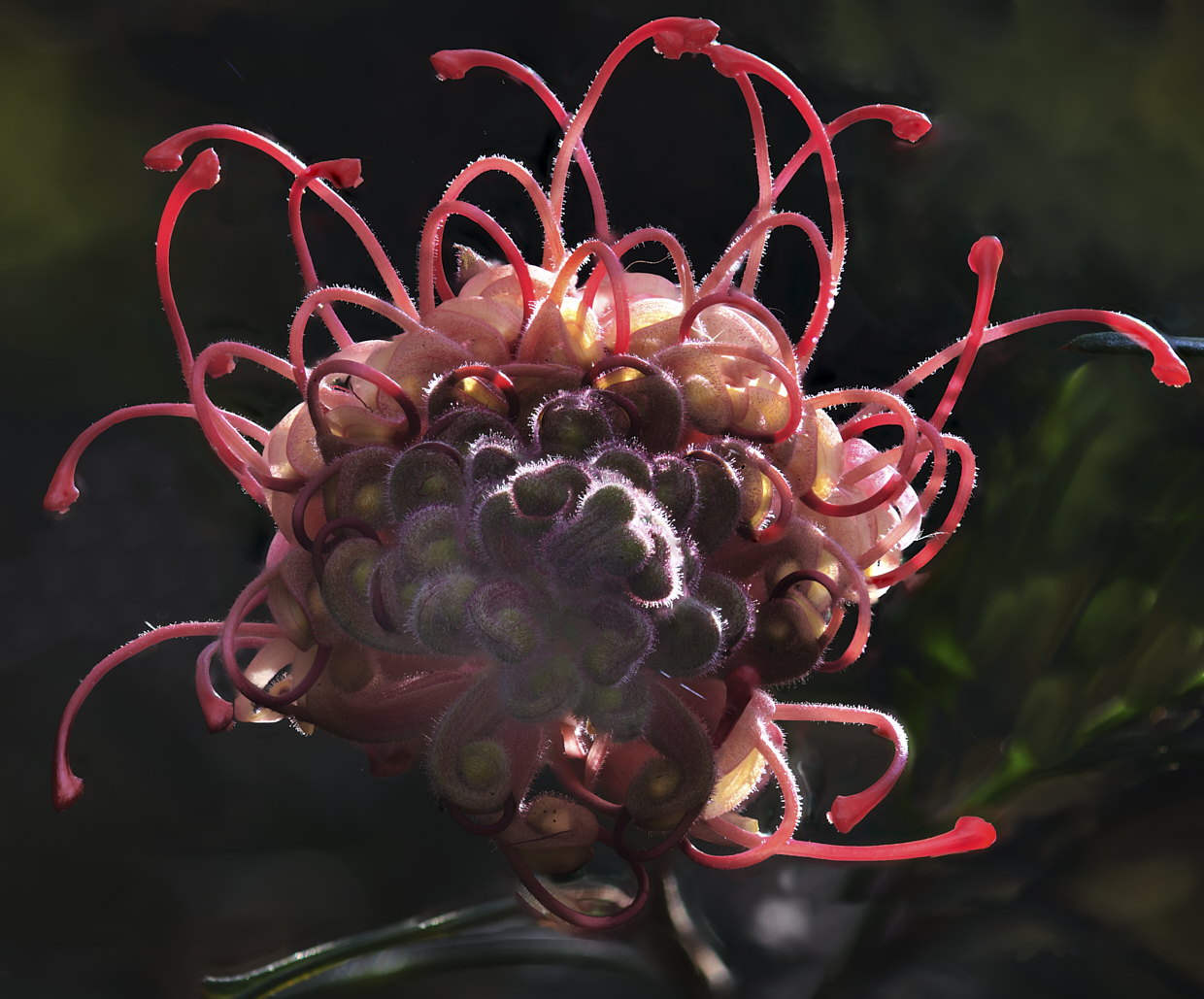
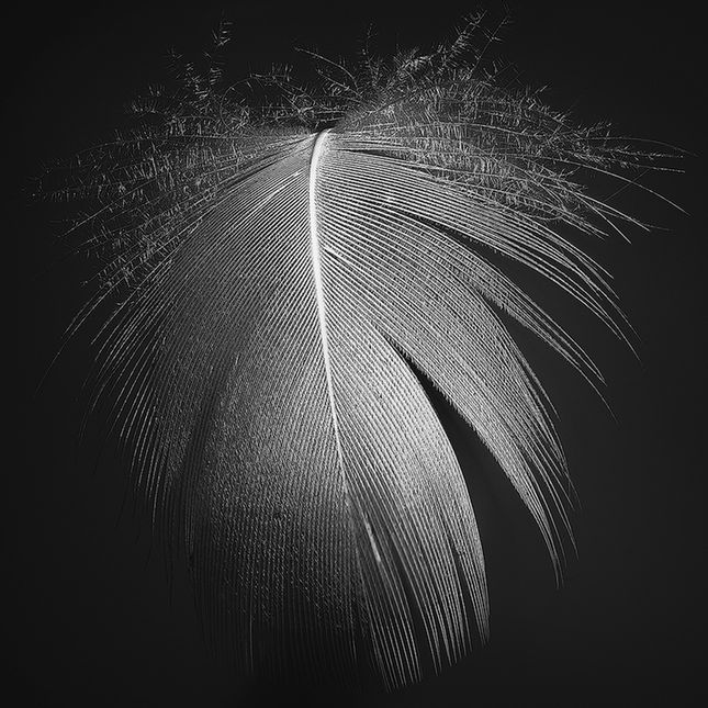
Thank you Karen I appreciate that comment. Regarding your and Darcy's comment on the ironwork, I have been debating with myself on the need for all the Ironwork and graffiti, nice to have a supporting view |
Nov 20th |
| 14 |
Nov 22 |
Reply |
Thanks Darcy, I have been debating with myself on the need for all the Ironwork and graffiti, nice to have a supporting view |
Nov 20th |
| 14 |
Nov 22 |
Comment |
Hi Kamal,
Nice image, I like the geometric representation you have captured, the dark pattern between the nets is a replication of the ripples on the water's surface all framed by the 4 circles of nets. While it's tempting to suggest cropping from the top, in this case, I believe that your submission stands ok as it is without a crop.
Well seen and thanks for sharing |
Nov 12th |
| 14 |
Nov 22 |
Comment |
Hi Greg
Great capture and I'm sure it will be a long-term memory for your grandson's first touchdown, and massive luck to be in the right spot at the right time.
The vignette and edit place emphasis on your grandson, making him stand out. There is still a number of halos from your masking of the players which you could easily remove with a cloning brush in Photoshop.
Great capture and memory, thanks for sharing. |
Nov 7th |
| 14 |
Nov 22 |
Comment |
HIm Xiao
You have handled the recovery of the original well. The tone and texture of the dress are apparent in your edit.
I like the pose and the wistful look on the model with the rails leading the viewer into the image.
My only suggestion would be to crop to place more emphasis on the model,
Thanks for sharing |
Nov 7th |
| 14 |
Nov 22 |
Comment |
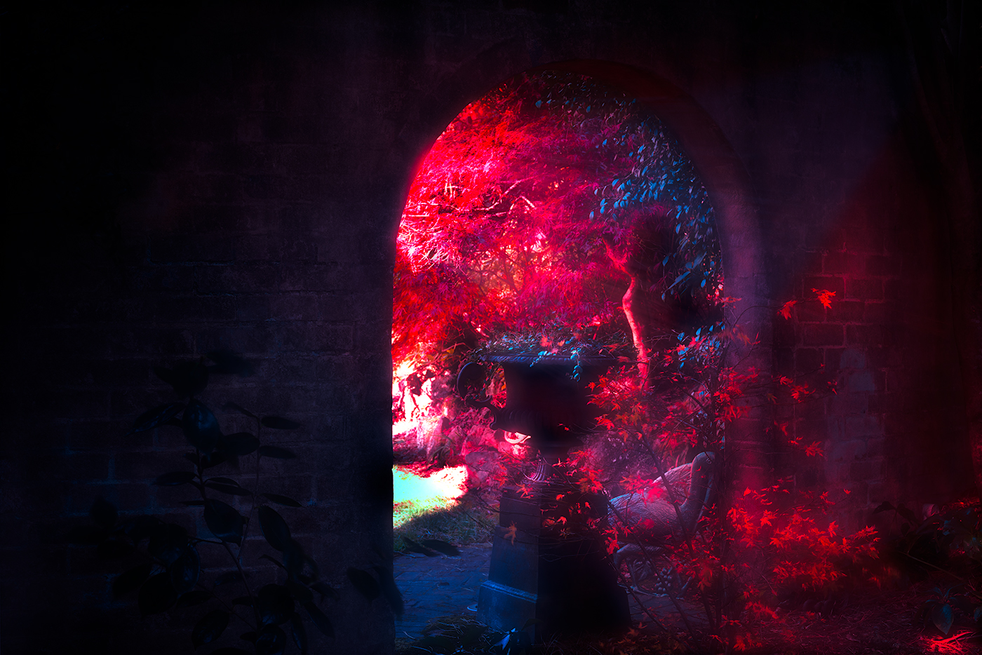
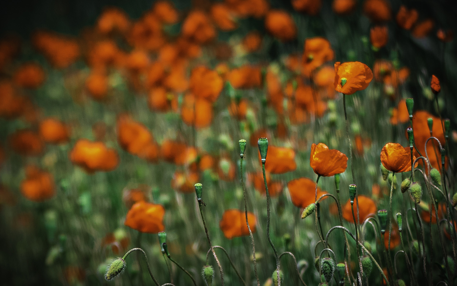
Hi Darcy.
Wow, an explosion of colour.
I think you have handled this quite well with the sharpness of the foreground leading to an indistinct background with the colour balance also working well.
I believe I can see your choice of putting the sharpness at the lower left of the frame and leading the eye into the blur of the background using sharpness to introduce the image, however, might I suggest just a horizontal rotation of this image, so that the eye has to enter the image and then search for the main centre of interest. I have attached a sample of this.
I think it's a personal choice however for my eye having the sharpness on the right of the frame seems to work better.
Lovely vibrant image thanks for sharing. |
Nov 7th |
 |
| 14 |
Nov 22 |
Comment |
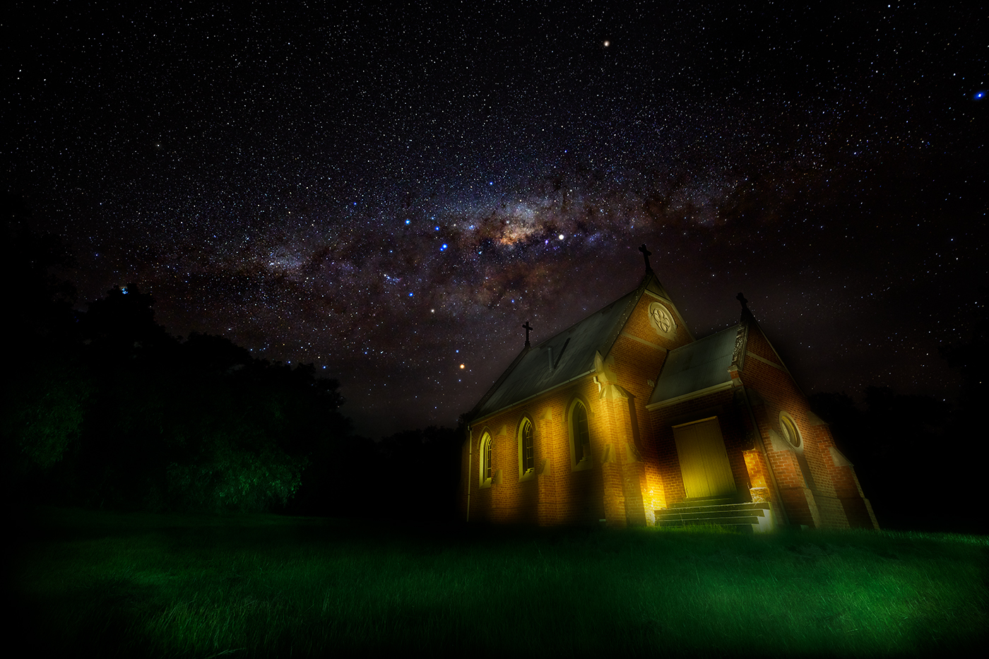
Hi Ingrid.
A lovely autumnal scene created, I particularly like the fence line separating the foreground from the background.
It did take me a while to identify the HI.
The colours in the trees stand out quite well and the sharpness of the fence line and the foreground foliage is well handled. For my eye I think this sky is a bit too heavy and overpowering for this scene, can I suggest you soften the sky a degree as an experiment and see if that improves or detracts from the image.
Nice image thanks for sharing. |
Nov 7th |
5 comments - 4 replies for Group 14
|
5 comments - 4 replies Total
|