|
| Group |
Round |
C/R |
Comment |
Date |
Image |
| 14 |
Mar 22 |
Reply |
Hi Xiao thank you for the comments with the suggestions worth considering |
Mar 16th |
| 14 |
Mar 22 |
Reply |
Thank you Kamal |
Mar 15th |
| 14 |
Mar 22 |
Reply |
Thank you Karen for those suggestions, both are worth a try, thank you. |
Mar 15th |
| 14 |
Mar 22 |
Reply |
Hi Darcy thank you for the input and as per my comment to Ingrid I have played around with the repositioning and it is an effective outcome. Thank you for that input and comments muchly appreciated. |
Mar 13th |
| 14 |
Mar 22 |
Reply |
Hi Ingrid. Thank you for that comment and I have played around with the cropping to reposition the flower off centre thank you for that good suggestion, I also like your suggestion of the series again thank you for those comments and input |
Mar 13th |
| 14 |
Mar 22 |
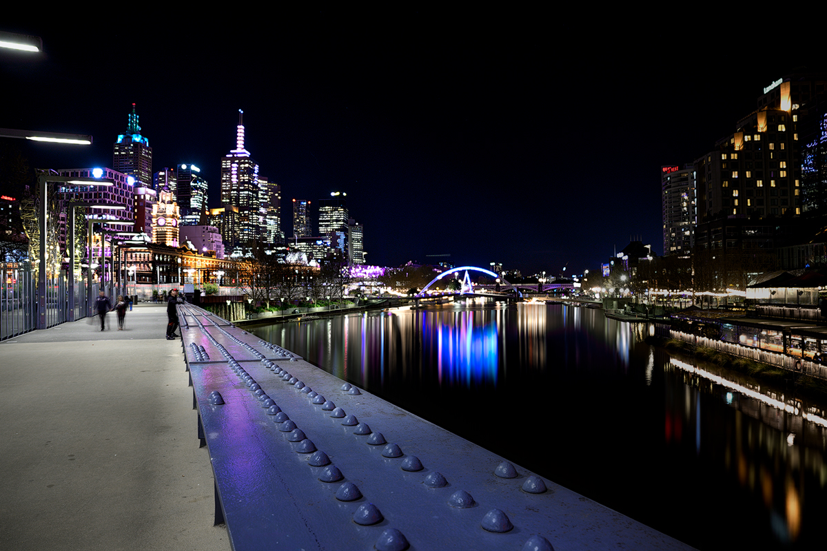
Comment |
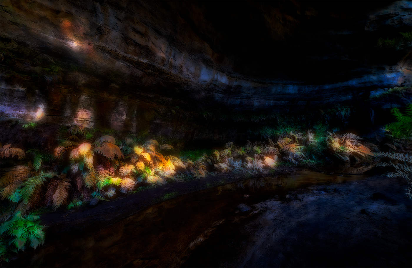
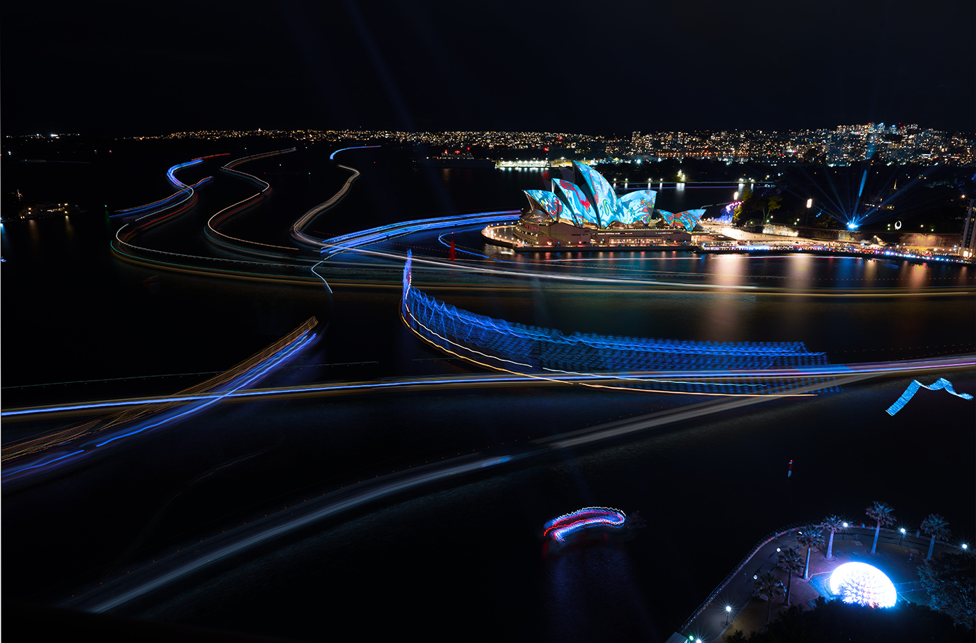
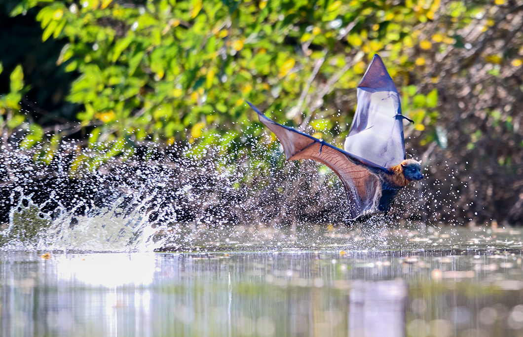
Hi Kamal well spotted and captured image. Processing works well particular giving the gradient from bottom left to top right, giving a sense of depth to the water supported by the texture of what looks like the bottom of the lake. There is enough detail in the image to make it quite clear what is going on.
My eye keeps on getting drawn to the bright spots on the nets adjacent to the middle section boat, you might wish to try cloning another section of the net into this area and perhaps change the blending option just to tone down that bright area. Again lovely image well spotted and captured and I'm sure in a very very minimal amount of time you had available. |
Mar 10th |
| 14 |
Mar 22 |
Comment |
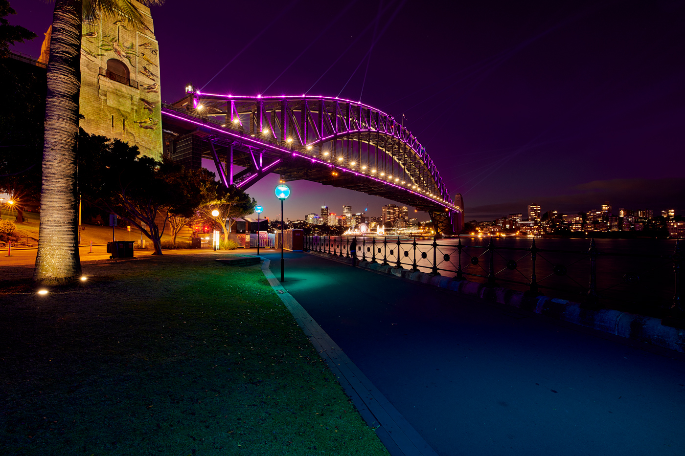
Hi Darcy.
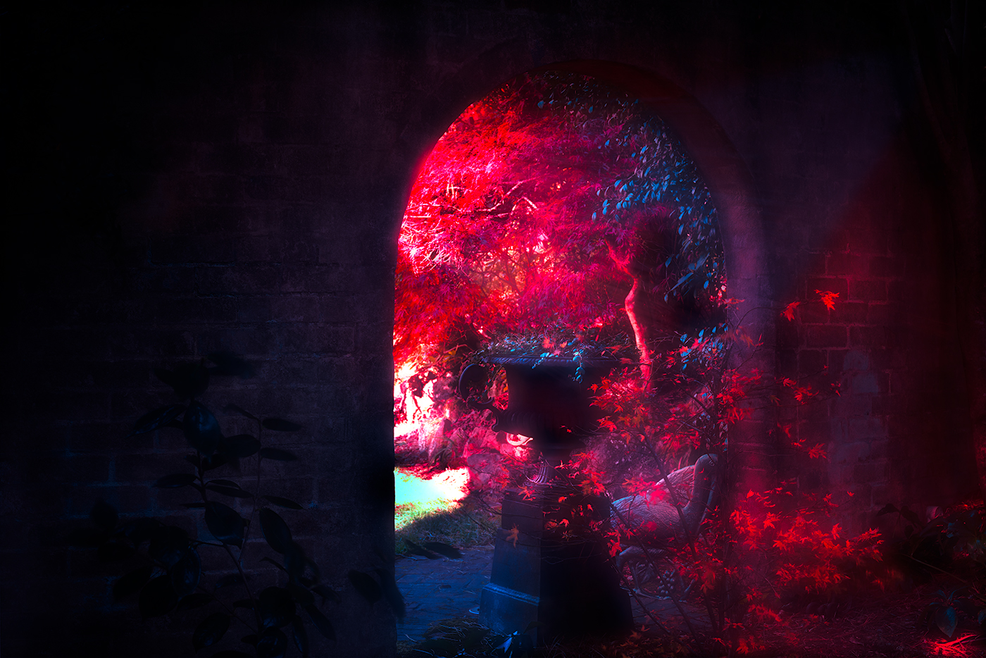
Lovely minimalist image and the triadic colour scheme really works well making it very pleasing to the eye. I love the textures in the wall the ripple effect and the cracking together with the peeling paint of the window, all supported by the flowerpots and the greenery. I agree with Ingrid that the bright spots behind the flowers detract and drag the eye there, I also would clone that out. Overall lovely image well seen and captured. |
Mar 10th |
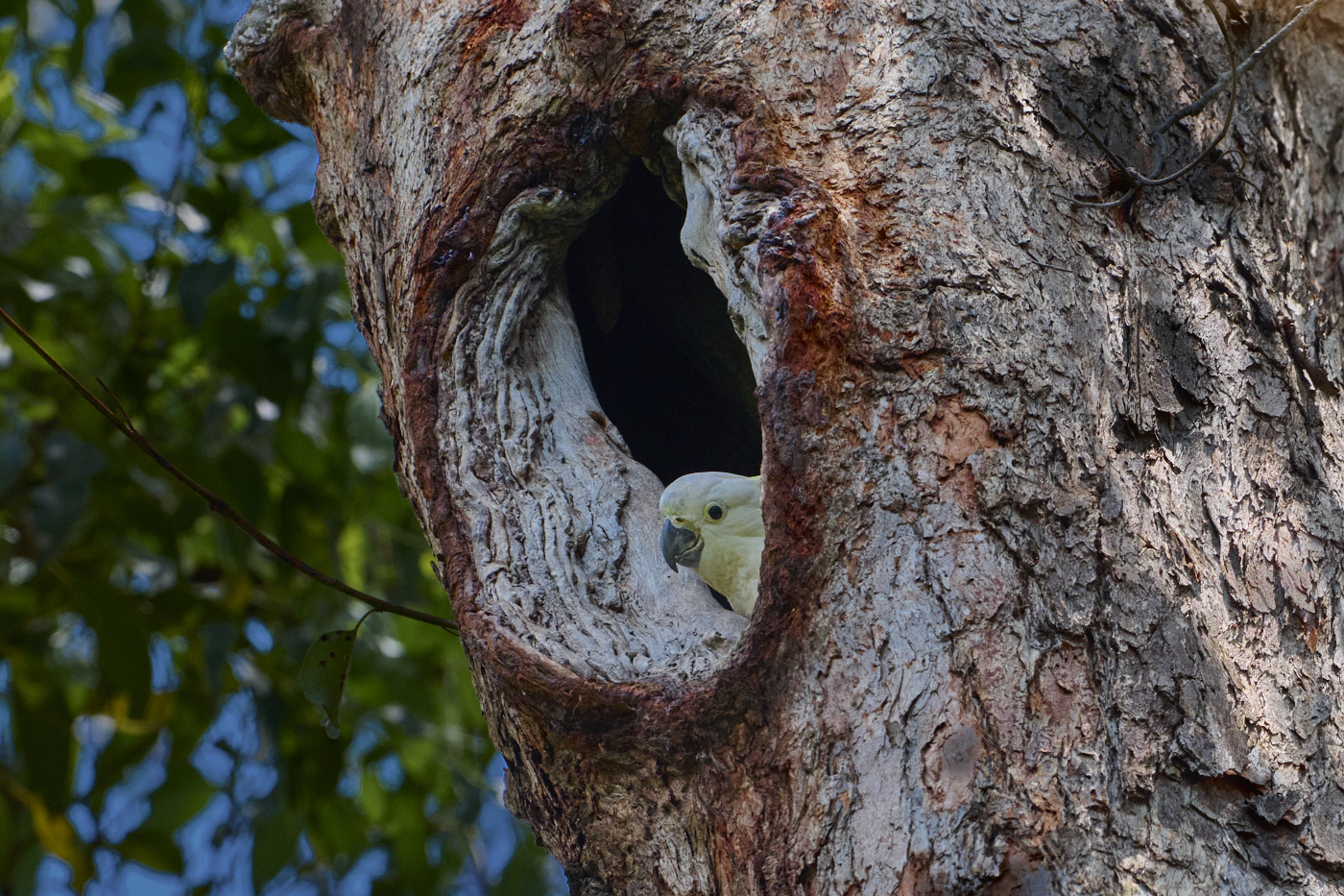
| 14 |
Mar 22 |
Comment |
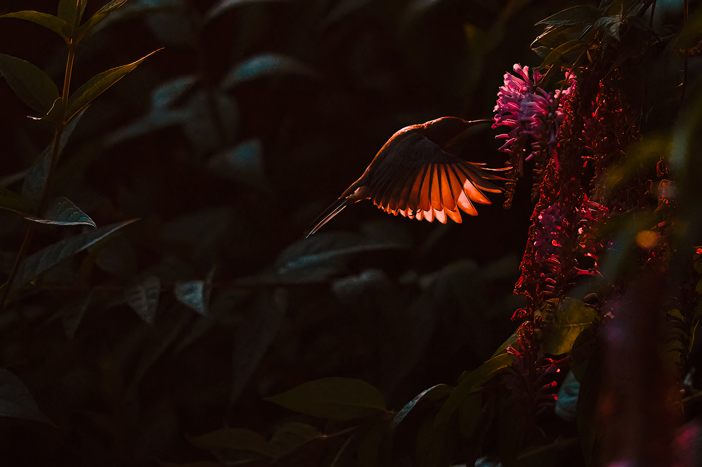
Hi Xiao another well thought through and posed image.
The poset to me depicts a powerful woman definitely concentrating on the business at hand with her looking to the right gives a sense of anticipation.
The texture and illumination of the business suit works well and is typically hard to achieve given the dark colours against the bright lit environment.
On my first look I wasn't comfortable with the look on her face, but having viewed the image I do think it's much more a look of anticipation and questioning not as I first thought squinting into the glare of the light. My only minor comment and this is being picky, is on the extreme left of the image there seems to be an illuminated section of rock that you could clone or crop out. Well composed and captured |
Mar 5th |
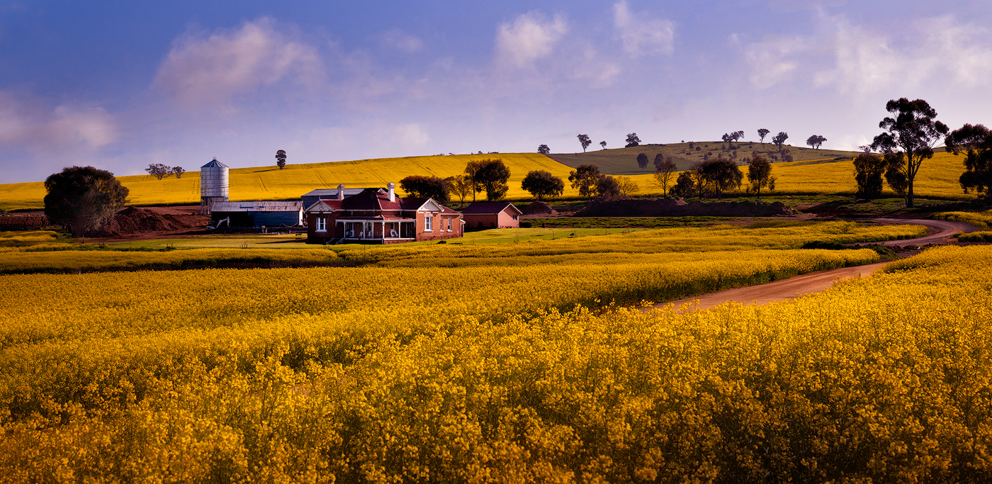
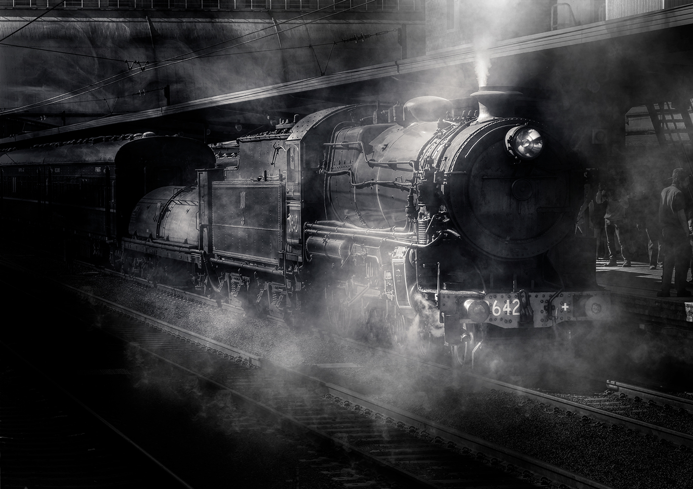
| 14 |
Mar 22 |
Comment |
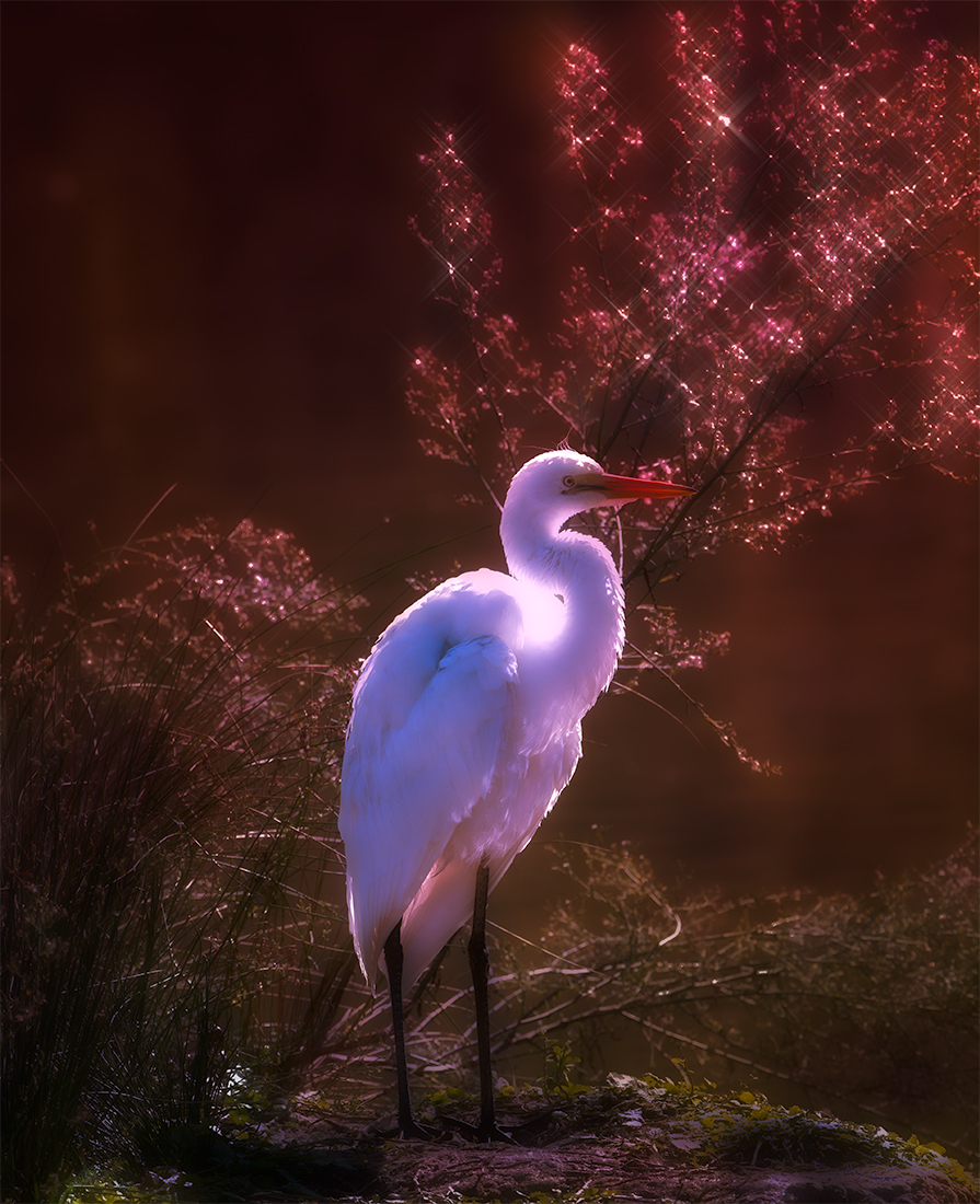
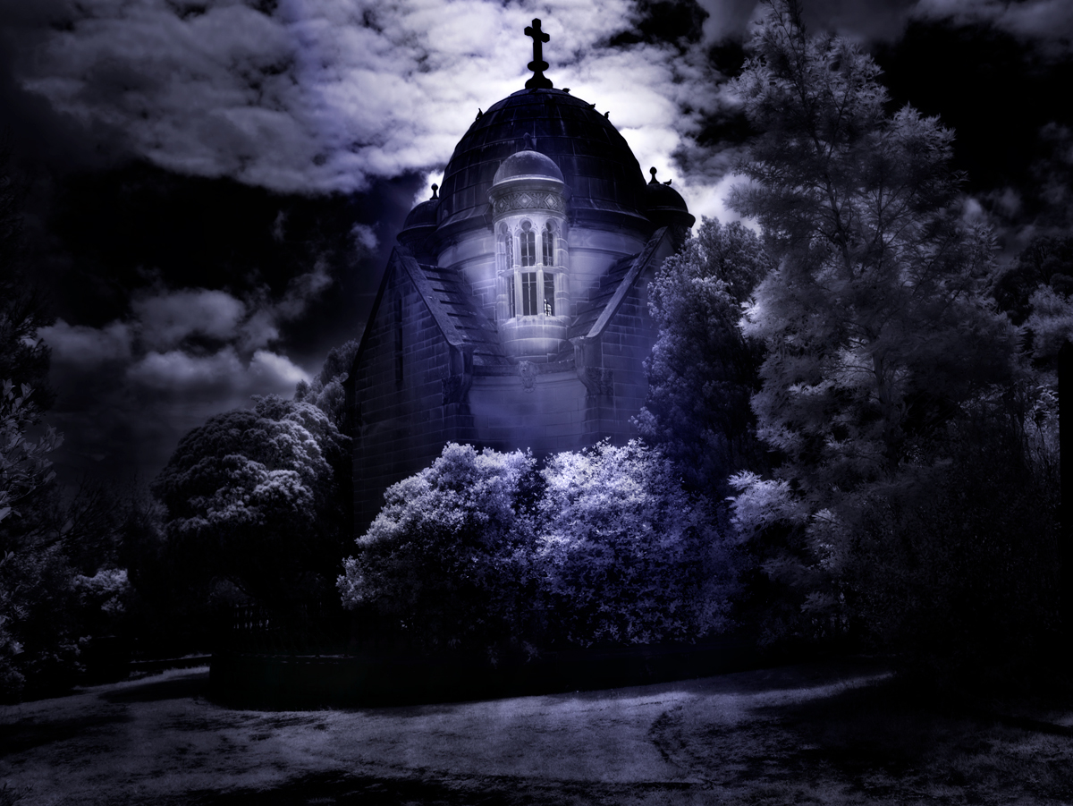
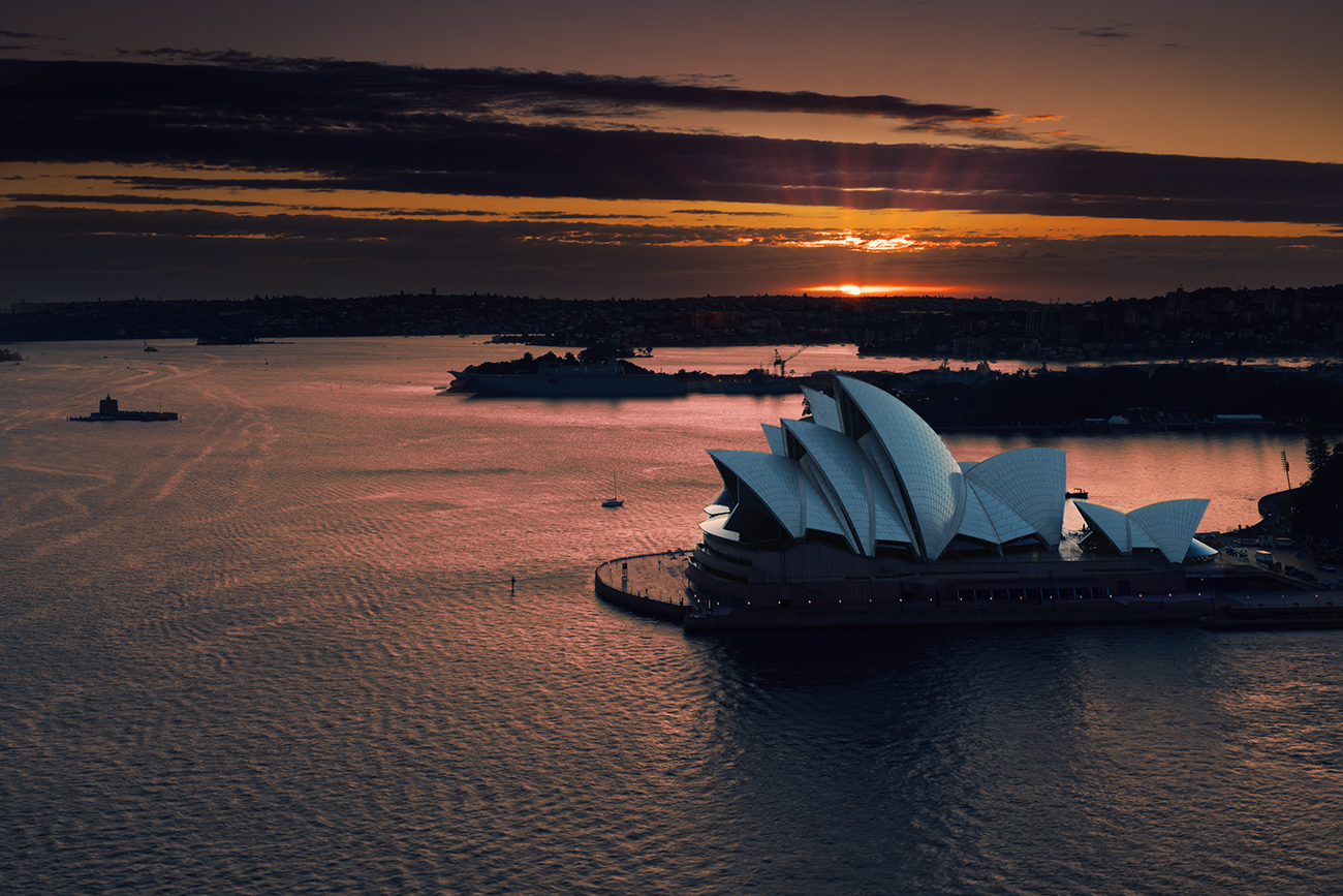
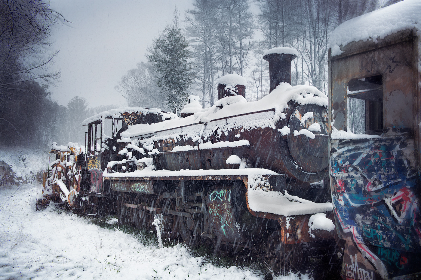
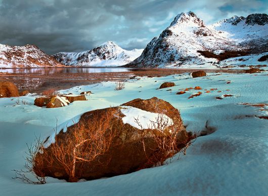
Hi Greg lovely spectacular strong image with the inclusion of the foreground plants giving a sense of scale. Processed well from the original together with the snow on the top of the rocks adds to the depth and texture of the rockface itself.
A minor comment and is not 100% clear to my eye from the image, is the rock structure is seen through the arch separate to the main structure itself or extremely close, you may wish to consider changing this, a minor blur or a minor colour change so that it does stand out as something in the distance if it truly was. Also on my screen, the saturation of the orange on the rockface is a little bit overpowering I might turn that down a bit if it was my image.
Great capture and was seen and I'm extremely jealous as this area looks like a superb place to visit. |
Mar 5th |
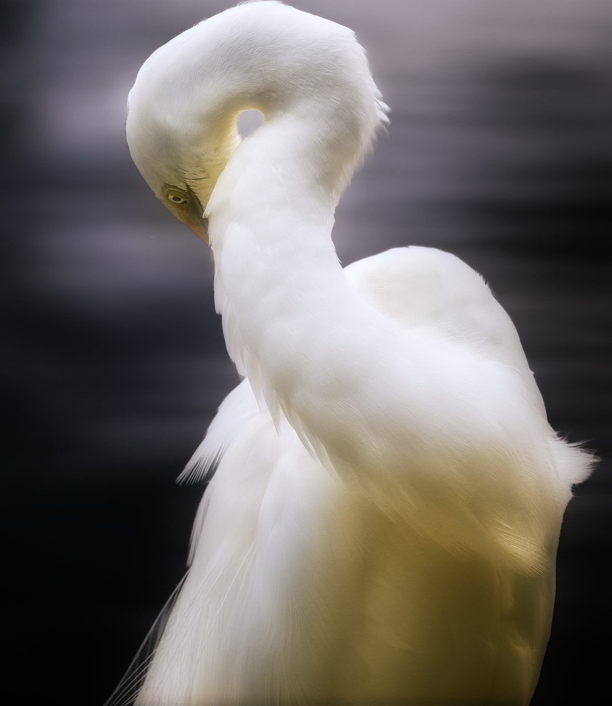
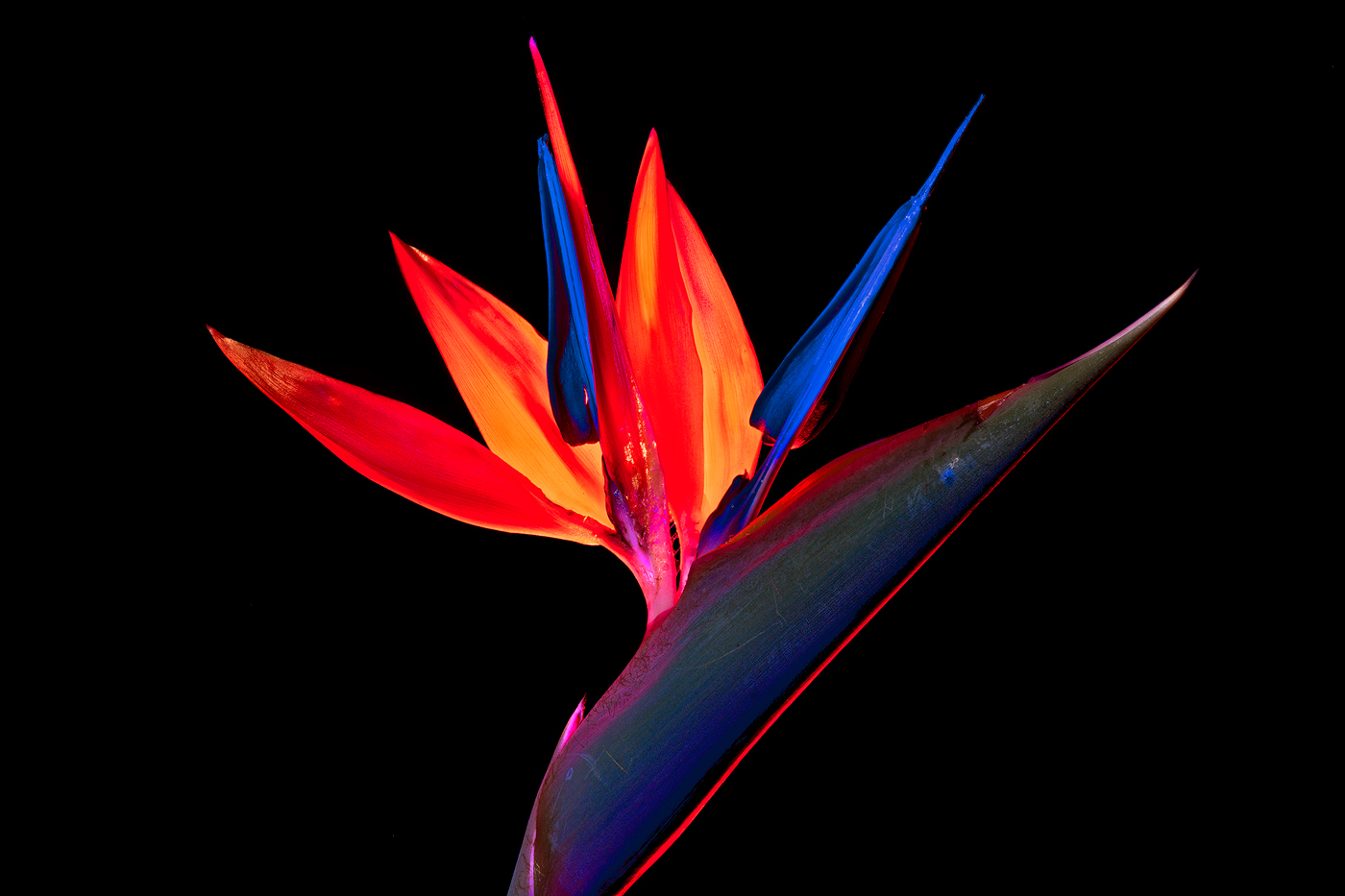
| 14 |
Mar 22 |
Comment |
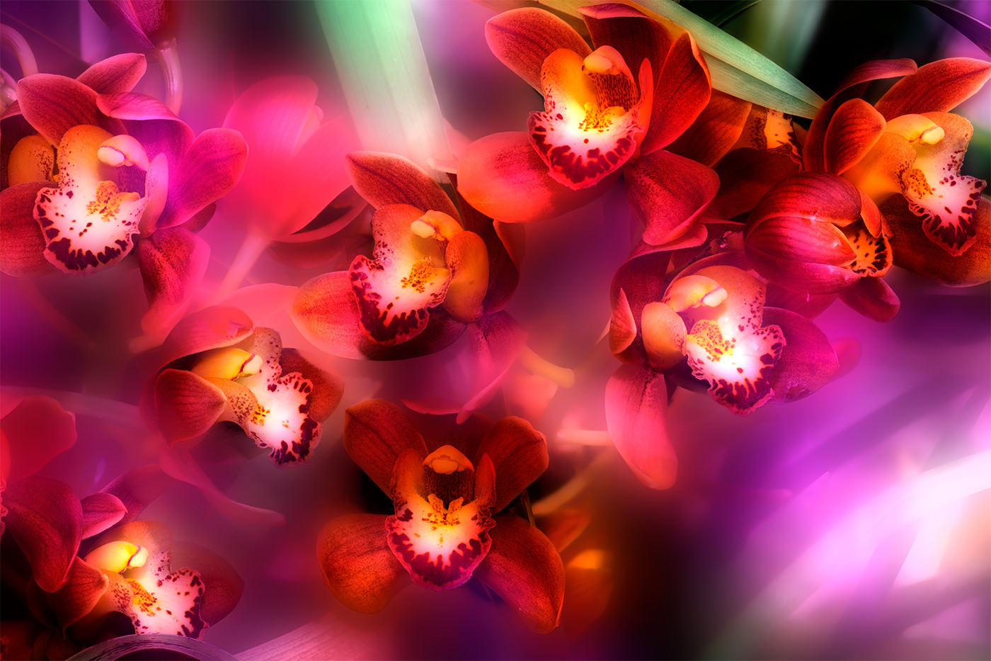
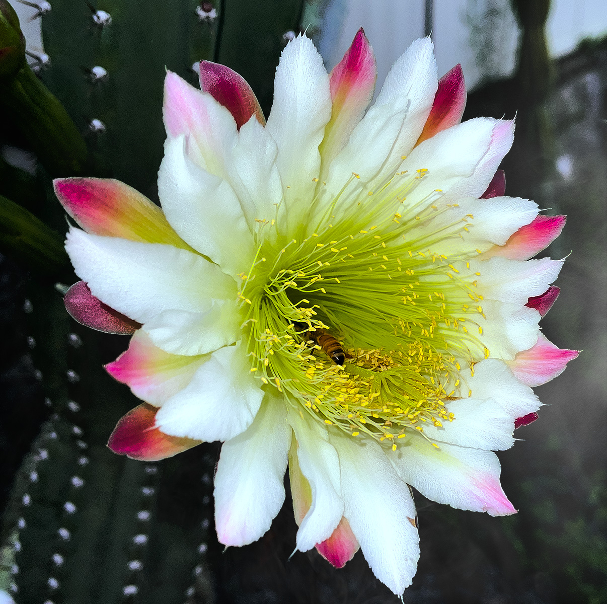
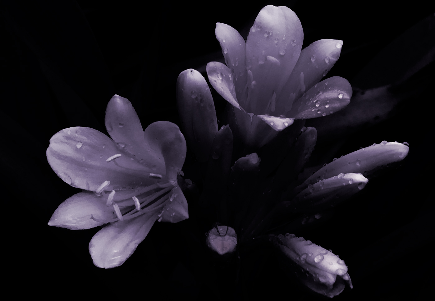
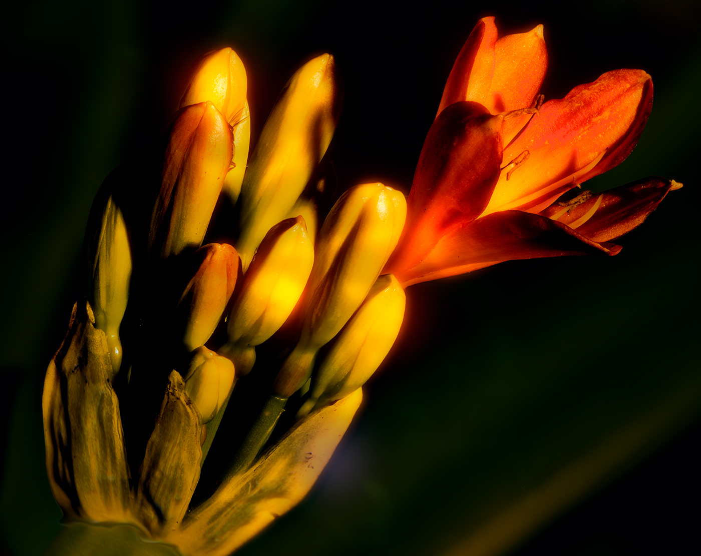
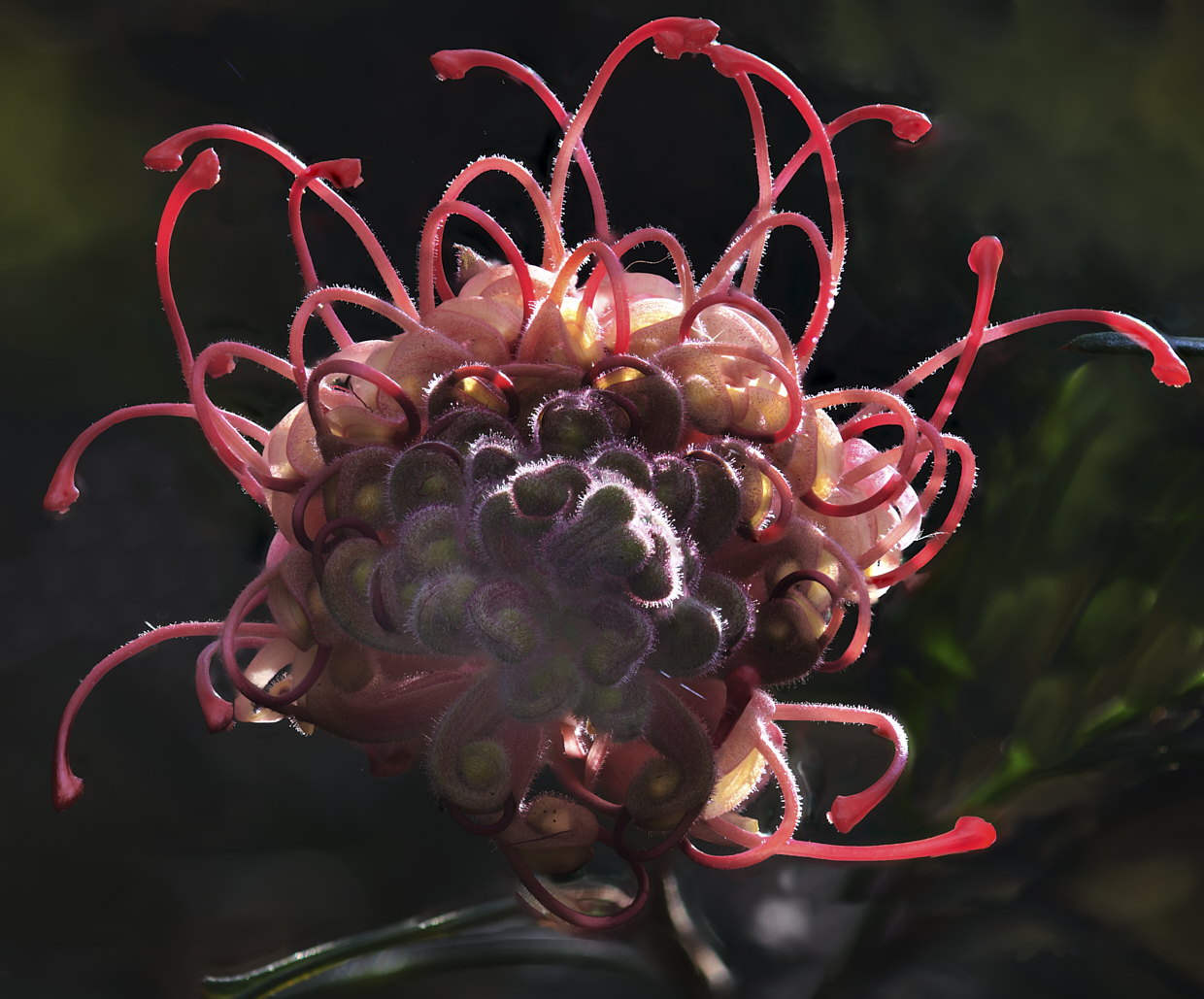
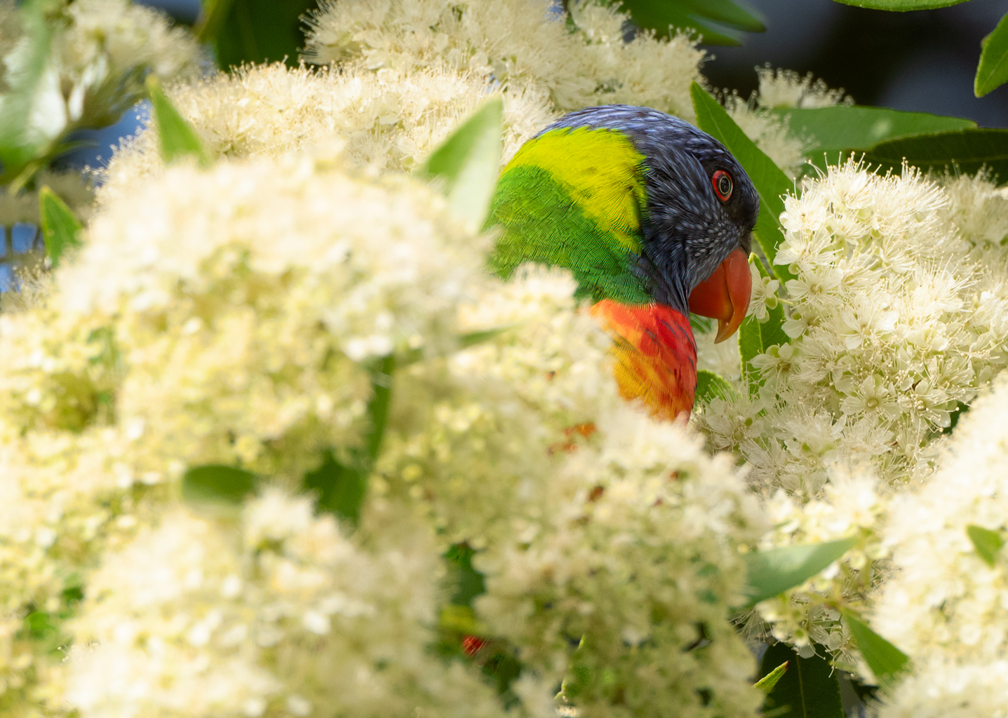
Hi Ingrid lovely image. I do like your choice of using three flowers as the main subject with the bottom left flower featuring the inside section (not quite a botanical term) placed off centre. The background works well and is diffused and/or out of focus enough to be supportive and not distracting from the image itself. I do like the purple and orange tones they mix very well together, I suppose mother nature knows what she's doing. My only comment on improving the image and this is being very picky is the turquoise look in the far background of the image is a little bit distracting, perhaps a fine selection of these areas and a tonal adjustment to bring it more in line with the background petals tones might improve, again I'm been picky.
Thanks for including your processing steps, personally I don't find the back petals of the main image falling outside the frame at all distracting as to me they are still supportive elements with the main element being the tones and texture of the three central flowers. Having said that if it was put in a contest a judge may be picky enough to comment on this, again my personal choice is I like it.
Lovely image well seen and created. |
Mar 5th |
| 14 |
Mar 22 |
Reply |
Thanks for that Greg, I appreciate your comments. |
Mar 5th |
| 14 |
Mar 22 |
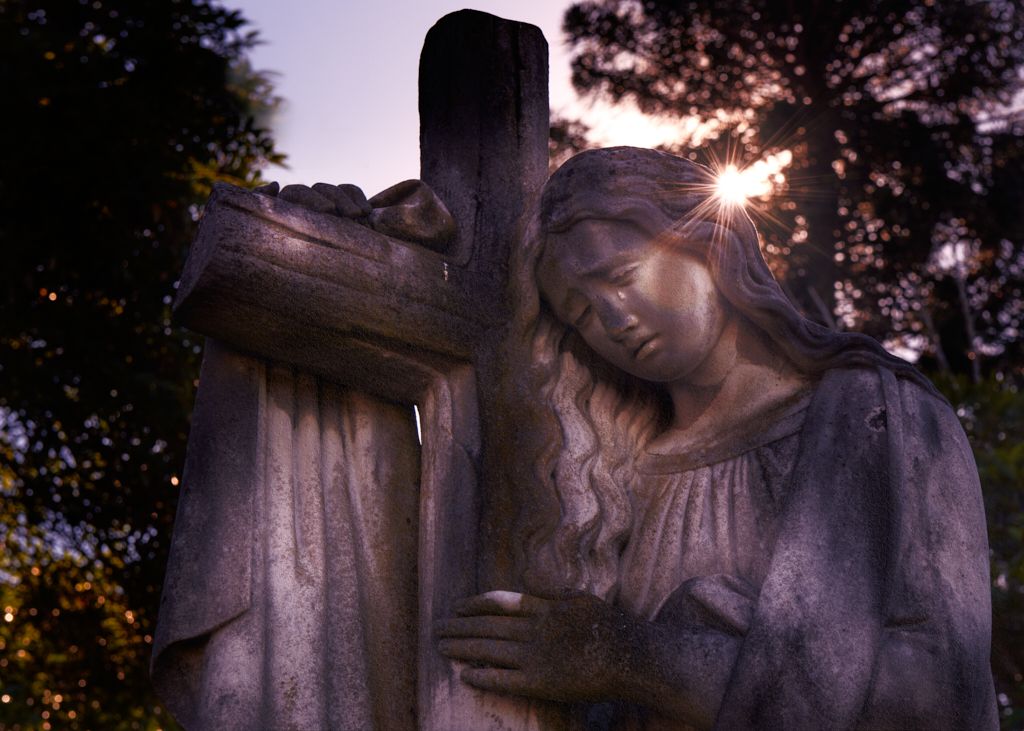
Comment |
Hi Karen I like the image and the work you have achieved on this.
I do like these sorts of restorations from old images in my preference is to leave them as close as possible to the image created in that era and I think you have achieved that. Your restoration work getting rid of all the artefacts from the damage to the print itself has worked well.
The face detail has more than enough information for anybody familiar with this couple to identify them together with the clothes they are wearing having enough information to depict the era.
My only comment on improving would be on the areas of the lower frame and top left, top right where your restoration work has left textures that once I have seen them keep drawing my eye back to them. To me it looks like these were outside of the original framed area, as such you may wish to either flatten these areas remove what looks like the texture and place a vignette or tightly cropped them out. There is also a wavy pattern on the gentleman's right face, it is only apparent when hundred per cent zoomed in and to me is not an issue. I would personally leave them in as opposed to trying to match the skin tones on the other side of the face, I believe that would be more problematic than improving the image.
As stated I love these restoration works from that era and I think you have done an excellent job to be applauded. |
Mar 5th |
6 comments - 6 replies for Group 14
|
6 comments - 6 replies Total
|