|
| Group |
Round |
C/R |
Comment |
Date |
Image |
| 14 |
Feb 22 |
Reply |
Hi Ingrid, coincidentally just opened email from adobe creative cloud, they have about 41 free brushes available for download, as part of your Photoshop subscription. Have a look at your subscription or creativecloud.adobe.com and search Martin Palm free retouching brush pack. I hope that helps. I have not downloaded yet but will do and play with them |
Feb 18th |
| 14 |
Feb 22 |
Reply |
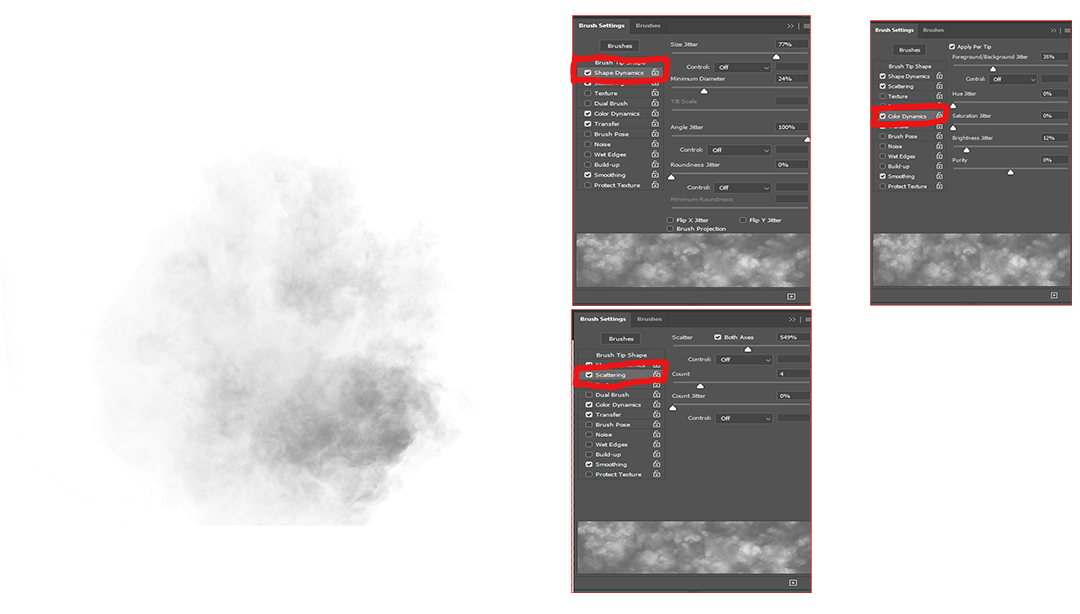
Hi Ingred thank you for that and very willing to share the brush. although I am a player in photoshop, not a strict process person, the attached is similar to the brush I used if not exactly the same. I can send the brush via Darcy and ask her to forward it to you or see attached image. The white square is the brush and there are many youtube instructions on how to create a brush, albeit it took me a while to get my head around it. However, the settings are more important. On the attached image I have copied the settings I used, playing with the various sliders will produce different results in the preview screen. also, the size and opacity of the brush are factors. I do hope that helps and if you want a better description or the actual brush let me know. I can send it via Darcy or you if you provide an email. my email brassil@optusnet.com.au |
Feb 17th |
 |
| 14 |
Feb 22 |
Reply |
Thank you Xiao, I appreciate that |
Feb 17th |
| 14 |
Feb 22 |
Reply |
Thank you Kamal, and indeed the reference to that song brought a smile to my face, a lovely tune. |
Feb 17th |
| 14 |
Feb 22 |
Reply |
Karen thank you very much for those comments |
Feb 17th |
| 14 |
Feb 22 |
Reply |
Thank you Darcy, |
Feb 17th |
| 14 |
Feb 22 |
Comment |
Hi Kamal. Lovely image captured well and indeed the story you have related is definitely depicted in the scene captured. The three open windows give a triptych effect further enhancing the scene. While I like both images to my eye in the black-and-white version the white lower portion detracts from the image, as it does not have any texture or contrast it looks out of place in the image. As a suggestion, you may wish to copy the green section and fill or paste a section into that area. I think the image works well in the fact that the three people are lost in their own thought, as you have suggested, and would lose impact if they were looking at you the photographer. Well captured and presented thanks for sharing. |
Feb 17th |
| 14 |
Feb 22 |
Comment |
Hi Xiao, a well-composed image that would not be out of place in any fashion magazine. I do like the models pose and the connection he makes with the viewer, the background elements work well and seem to strengthen the image itself. You have handled the blacks extremely well with the texture in the pants coming through what is often hard to achieve. The only minor suggestion would be to place the model further to the image left just slightly away from the centre again a very minor consideration. Well captured and processed |
Feb 9th |
| 14 |
Feb 22 |
Comment |
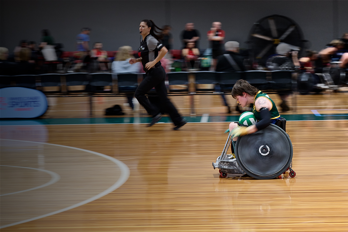
Hi Karen, well-composed image. the composition definitely meets your goal with the strength of the portrait supported with the chosen props of the volleyball. I generally agree with Greg's suggestion however would be cautious of adjustments to the ball and shirt as these are supportive elements and should not (in my view) detract from the headshot. Well composed and captured image. |
Feb 9th |
| 14 |
Feb 22 |
Comment |
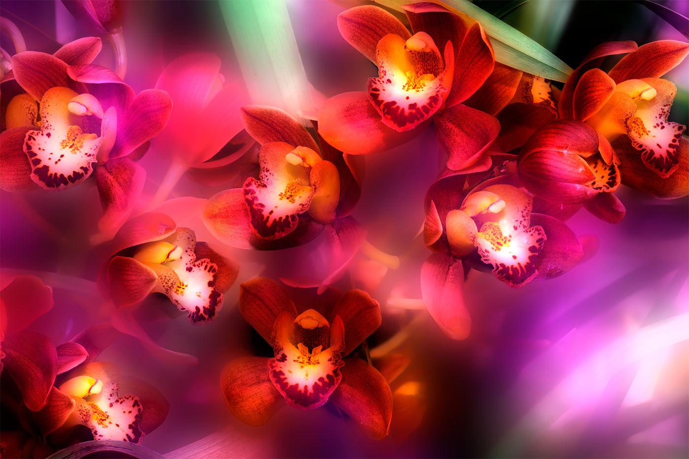
Hi Darcy loverly graphic image. Niece how you have created apparent depth through the image. Colour tones are pleasing and give a sense of coolness, with the central jellyfish being prominent with the detail compared to the others. Lovely image well captured and processed |
Feb 9th |
| 14 |
Feb 22 |
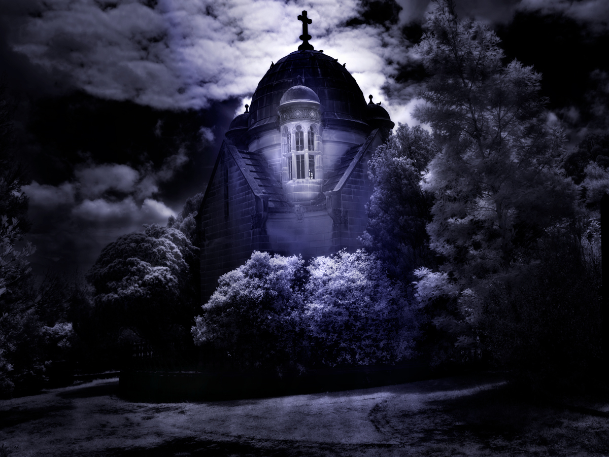
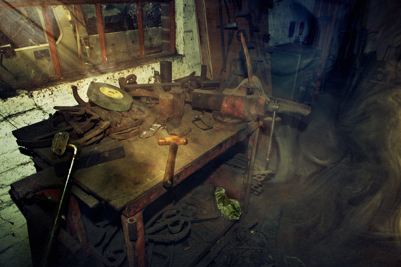
Comment |
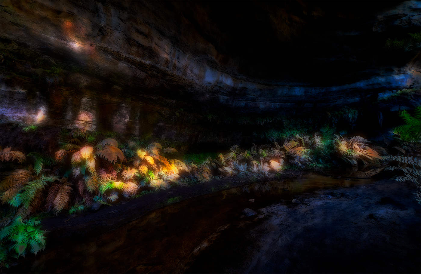
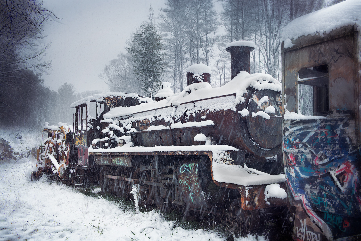
Hi Ingrid Very interesting image together with the story behind it, you have achieved very realistic textures throughout and the grunge and decayed look works well definitely complementing the story you have told. The vignette works well and directs the eye toward the chair with the hanging light (I'm assuming it's light) giving a feel of an interior illuminated area. Congratulations well captured and processed image. |
Feb 4th |
| 14 |
Feb 22 |
Reply |
Than you for those Comments Greg |
Feb 4th |
| 14 |
Feb 22 |
Comment |
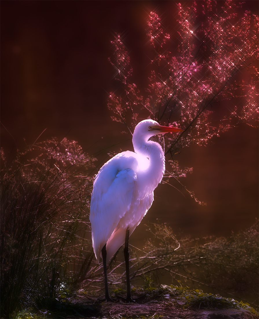
Hi Greg. Nice image and a great choice to stack two images achieving realistic exposure throughout. The choice to use the arch as a frame, works very well and really directs the eye onto the close platform pointing to the three stacks. Very effective composition. While the distant mountains lose their focus it is still apparent what is there, depicting what the eye normally sees with long vistas, distant objects not being sharp. My only suggestion would be for the stacks to be sharpened a bit more giving the stacks the main point of the image. Lovely image I would have loved to have been there to capture this scene. |
Feb 4th |
6 comments - 7 replies for Group 14
|
6 comments - 7 replies Total
|