|
| Group |
Round |
C/R |
Comment |
Date |
Image |
| 14 |
Jun 21 |
Comment |
Hi Syed apologies for the very late response
A very enjoyable image to view and I do enjoy aerial images. You have done well to capture this, particularly from a helicopter at that altitude and at those speeds. And I imagine the vibration is something else that needs to be addressed. Well done.
Others have commented on the bright area of the image and I'm sure addressing that would add to the image itself, for my eye I am not troubled by the lack of definition of the boat as I find the image is pleasing to view as it is and I don't mind the abstract nature of this photograph. |
Jun 29th |
| 14 |
Jun 21 |
Reply |
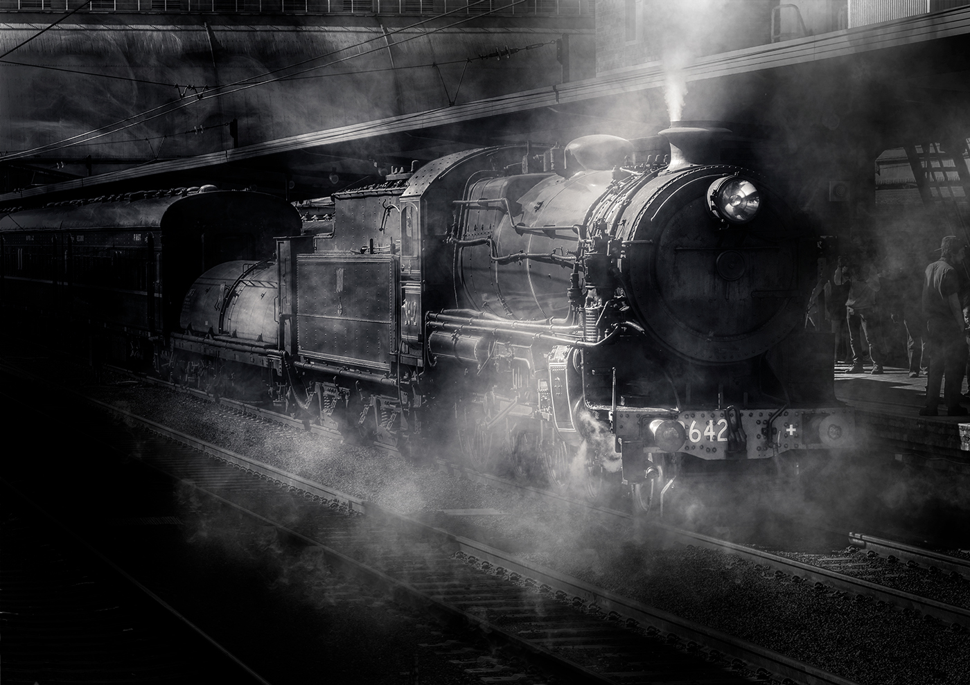
Hi Darcy thanks for that input, the apparent ghosting is perhaps due to the selection I used to darken the top left corner, vignette, thanks for pointing this out. I believe I can address that by graduating the area, dark to light, a bit softer. I could probably address the sharpness of the rider with the dehaze adjustment. Thanks for viewing and commenting |
Jun 4th |
| 14 |
Jun 21 |
Reply |
Hi Gregory thanks for that input, the apparent ghosting is perhaps due to the selection I used to darken the top left corner, vignette, thanks for pointing this out. I believe I can address that by graduating the area, dark to light, a bit softer. Thanks for viewing and commenting |
Jun 4th |
| 14 |
Jun 21 |
Reply |
Thanks Xiao thanks for that input, the apparent ghosting is perhaps due to the selection I used to darken the top left corner, vignette, thanks for pointing this out. The darkness on the reigns and saddle front I believe is natural due to the higher contract in the shadow area. thanks for viewing and commenting |
Jun 4th |
| 14 |
Jun 21 |
Comment |
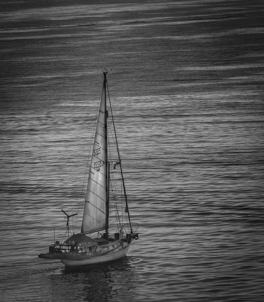
Hi Darcy
Looks like you enjoyed the trip and had plenty of opportunities to use a camera would have been quite rewarding.
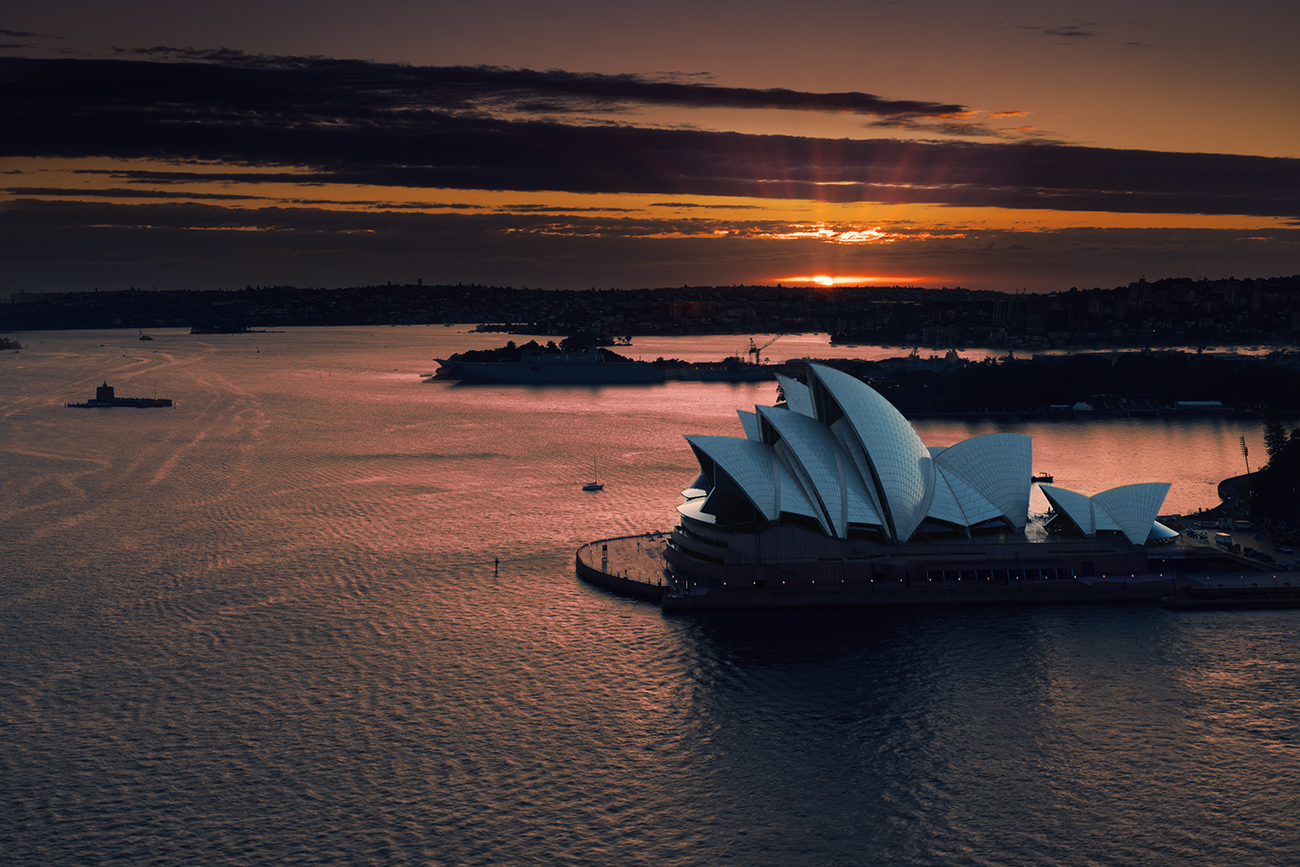
With this image, I agree that black-and-white was probably the stronger choice, as you say the original was close to monochrome to start with and there is detail in the boat itself. If it was my image I would have tried to feature the boat as the brighter object and tone down the background ocean, to my eye the current tonal balance looks neutral. I took the liberty and had a play with this image thinking it had high potential for a lovely black-and-white shot. My attached image is a quick attempt at trying to depict my thoughts and there is still a fair bit of work to bring the detail of the boat out. I particularly like the contrasting lines of the wind generator and the lines and rigging on the boat itself and there is also probably work that could be done on the shadowed reflection as well, maybe slightly contrasting that a bit more. I've attached my image as I stated it is only a first attempt to depict my thoughts on what could happen. Well captured image |
Jun 4th |
 |
| 14 |
Jun 21 |
Comment |
Hi Karen.
Well composed image with the model presenting a strong environmental image. Also well handled with a reluctant model.
Processing of the alignments and background works well with your choice of depth of field concentrating the image on the model himself with the background only adding to the environment in this situation. I like your crop and your correction of the alignment in the background removing distracting elements from the image. I think the image is let down by your recovery of the models face. The body and the ropes are handled very well and while the model has a very splotchy face, I believe you could improve the image b addressing the contrast in the face itself the highlights stand out way too much creating, in my view distracting elements, By the way you have handled the rest of the photograph I think you would easily be able to make another layer and try and normalise the highlights on the models face to match the colour tones of the darker area. If it was my image I would also add a vignette just to further reduce the background a bit and concentrate on the model.
Nice image congratulations |
Jun 4th |
| 14 |
Jun 21 |
Comment |
Hi Greg very colourful image with the model definitely giving a jovial feel to this image, the model looking directly at the camera immediately drawing your eye to him makes it a very strong image.
Colour balance works well with no over-saturation. I do agree with Xiao that placing the model a bit right of centre eliminating the mannequin on image right would, in my view, make it a more powerful image, together with filling in the bright white triangle adjacent to the model's head. To me, the mannequin on the image left is not a distraction but adds to the story, without the cropping across the breast.
Overall a bright and cheery image which I like. |
Jun 4th |
| 14 |
Jun 21 |
Comment |
Hi Xiao
very powerful image captured and processed well, I like your cropping to eliminate the unnecessary foreground and your processing to eliminate the distracting hole in the wall above the model's head and the way you have handled the other distraction just above his shoulder works well. The model has a strong pose and a direct gaze at the camera immediately engaging the viewer to his eyes, the position of the model in the frame also works very well. The supporting bolt and ring matches well with the models colour scheme and look. While the white grouting on the wall is a bit distracting to me it is not a major distraction. Overall a very well presented image. |
Jun 4th |
| 14 |
Jun 21 |
Comment |
Hi Ingrid, welcome to the group and I look forward to seeing your upcoming images.
Lovely image well captured and processed, I like the progression from the warm hues to the cooler look on the left. The top light creating shadow on the stone work, works well defining the stone work. the cropping works well with the stairs leading up leaving the viewer to ponder what else is above the stairs. I disagree with the improvement having a person in the shot would make, for my eye there is enough detail in the interior of the rooms to leave it to the viewers imagination, but that, as always, is subjective. Overall a lovely image I would be proud to have as one of mine. |
Jun 4th |
6 comments - 3 replies for Group 14
|
6 comments - 3 replies Total
|