|
| Group |
Round |
C/R |
Comment |
Date |
Image |
| 14 |
May 21 |
Reply |
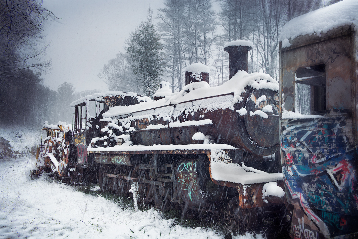
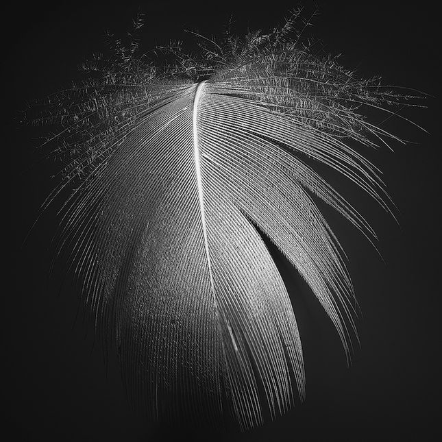
Thank you for that comment Karen, the texture is a bit of experimenting on my part. |
May 28th |
| 14 |
May 21 |
Reply |
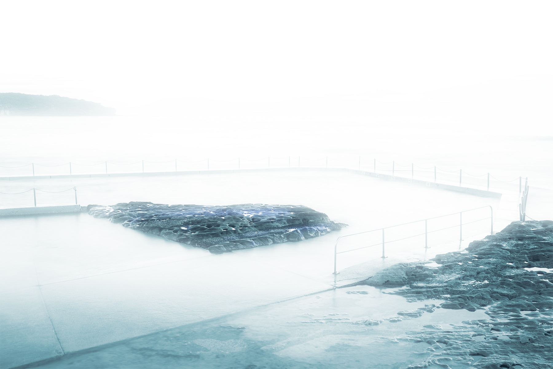
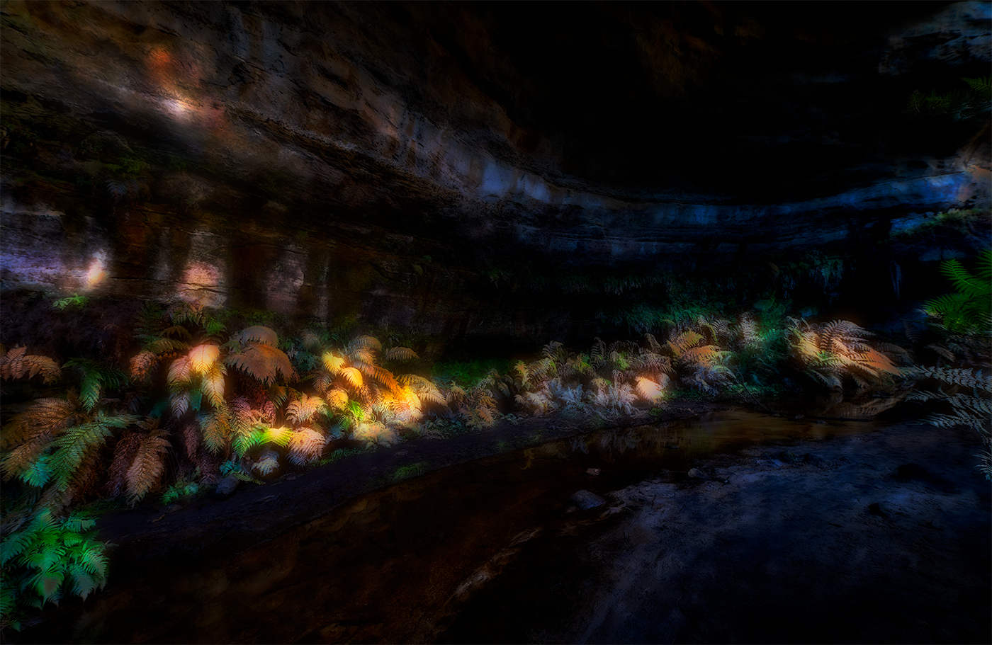
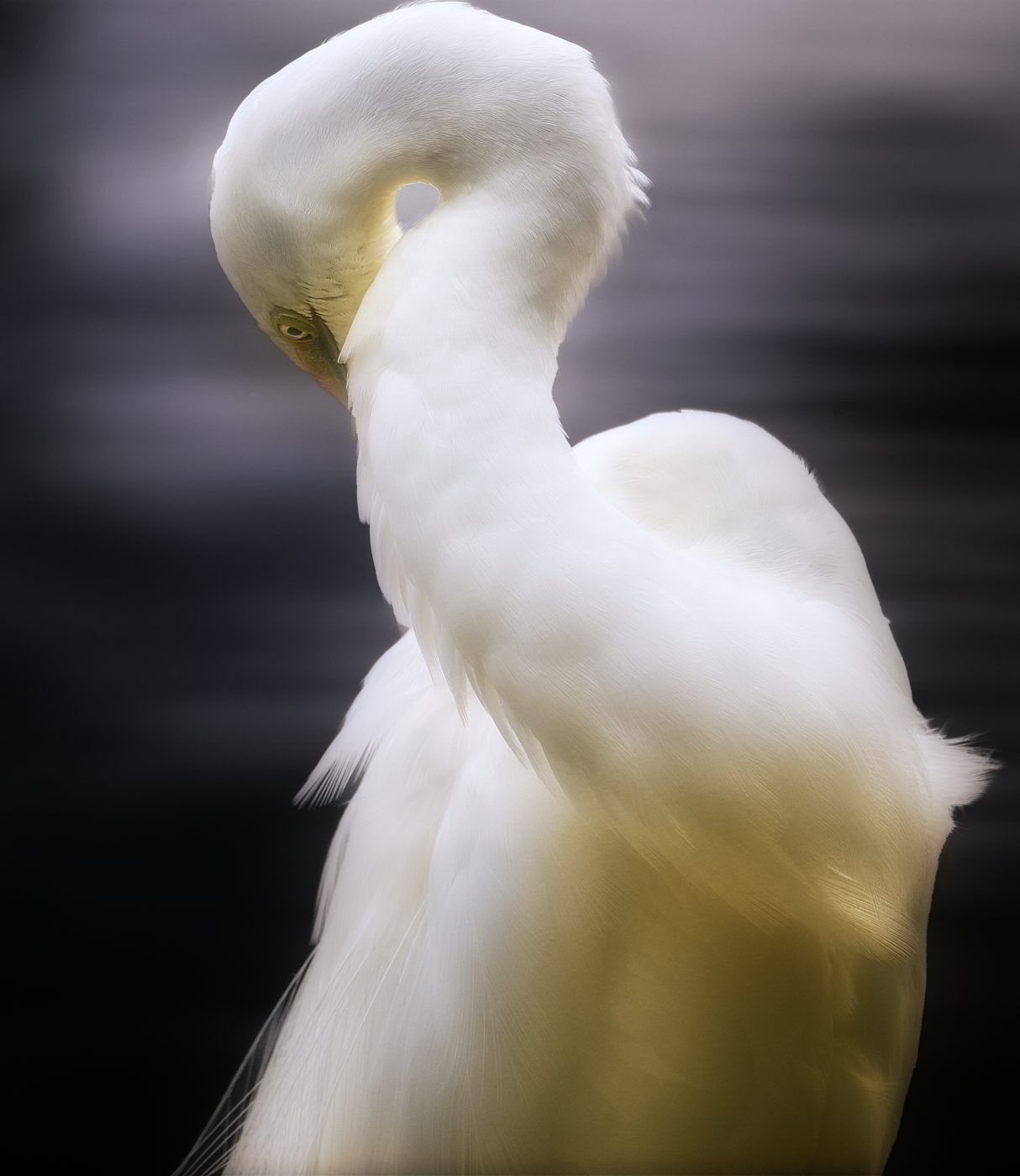
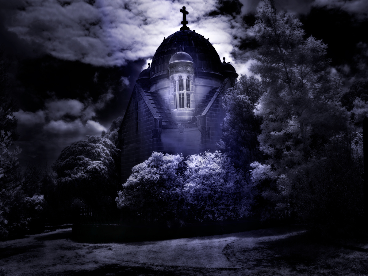
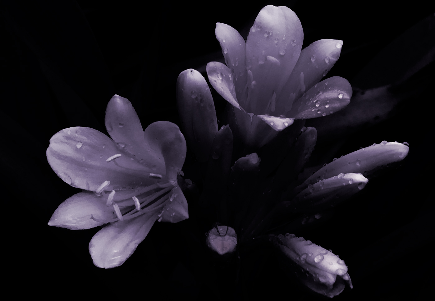
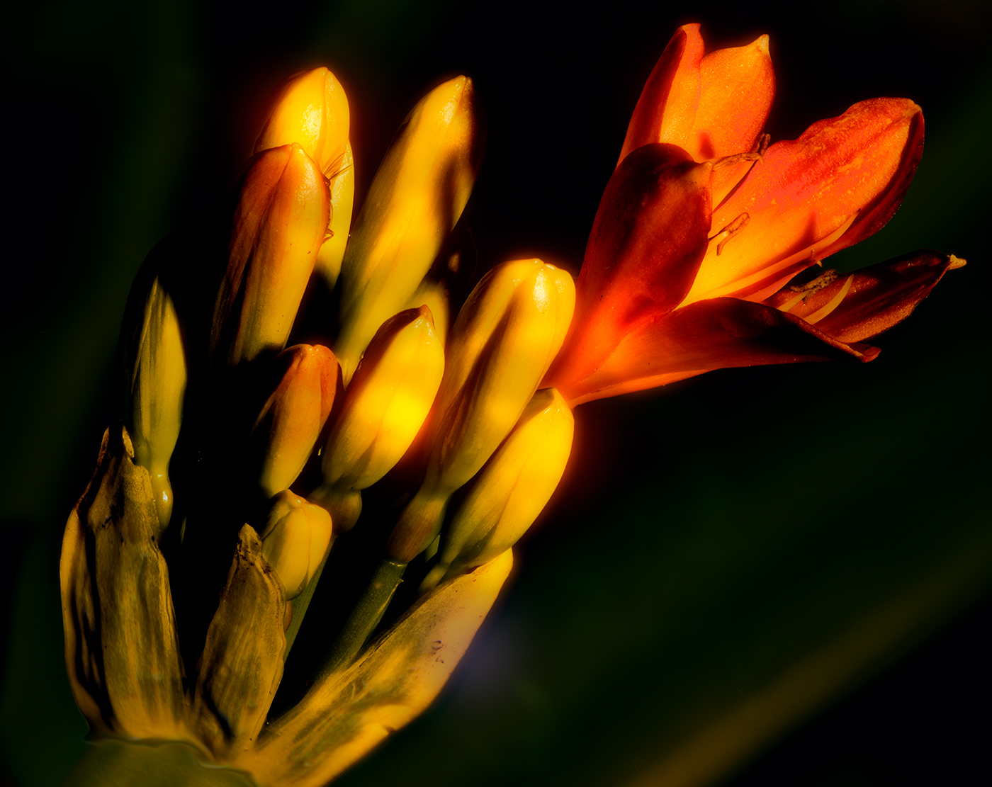
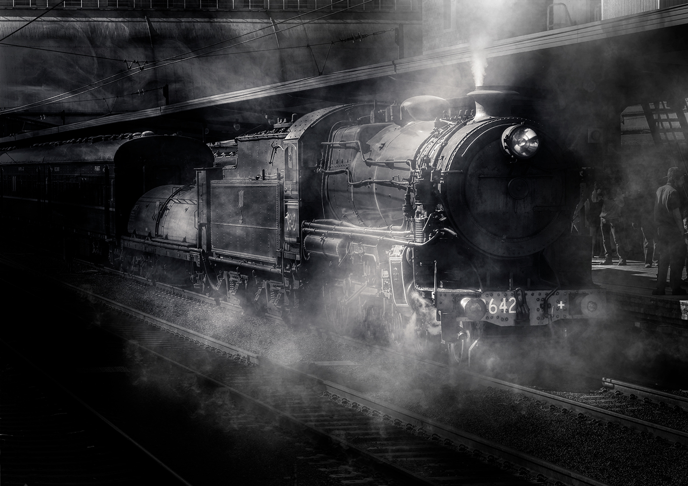
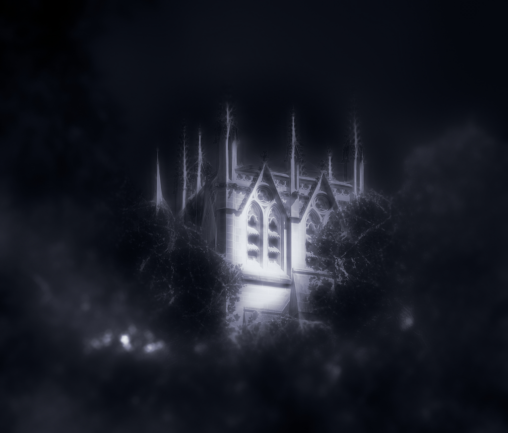
Hi Xiao, This being an experiment in creating a mood of dark and foreboding with a hope generated by the light area, made me move away from a classical well-balanced image, the noise is probably an overlay I used to soften the whole image. Thank you for the input and well picked up points. |
May 15th |
| 14 |
May 21 |
Reply |
Thank you Gregory, |
May 15th |
| 14 |
May 21 |
Reply |
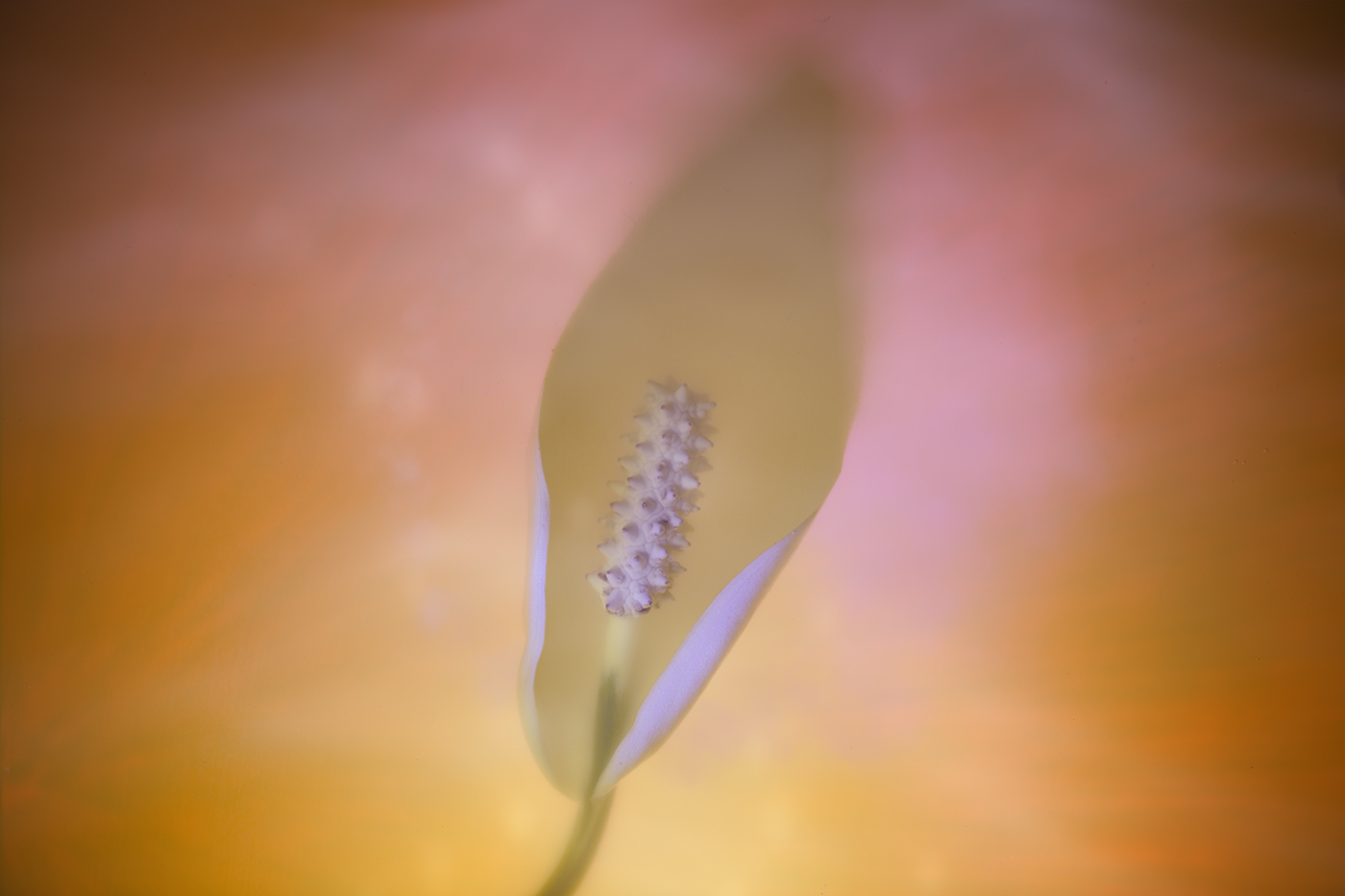
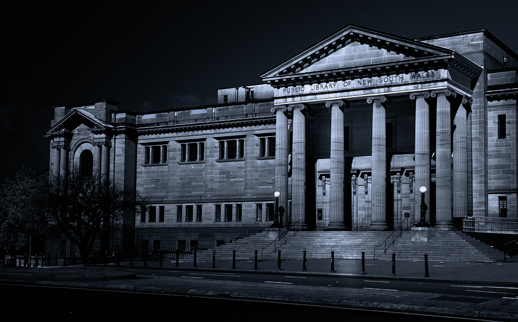
Thank you Darcy, there is a texture overlay on the image, well spotted. it was an interesting experiment in processing this image. |
May 15th |
| 14 |
May 21 |
Comment |
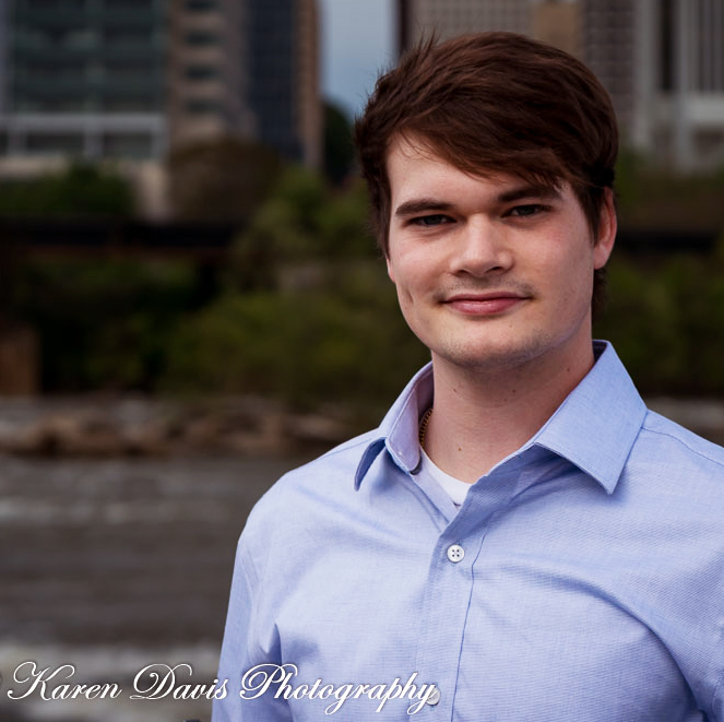
Hi Karen Nice portrait, composition and choice of DOF is handled well giving plenty of scope to post-process. I agree with Gregory's comments as I find the image a bit flat, adjusting the lighting on Daniel and a tighter crop would in my opinion improve the image. I carried out a reprocess similar to Gregory, a different crop, cropping is always subjective, with a bit more room at the top so that he is not so cramped in the space and I also adjusted with white balance to warm it up just a bit. |
May 15th |
 |
| 14 |
May 21 |
Comment |
Hi Syed, nice composition, the central character is obvious with the other two not being a distraction, just adding to the scene. The eyes are handled well which immediately draws the viewer, sharpness of the central figure is good with the others not seeming to have the same level of sharpness which strengthen the central character. Two minor suggestion, there is a very bright area top right, which is a bit distracting, I suggest that the central figure is too centred, perhaps a crop to move him to the right a fraction. Nice image well handled. |
May 15th |
| 14 |
May 21 |
Comment |
Very nice image Xiao, positioning of model against the sky with the city scape in the background gives a sense of environment and depicts a young professional working. You have done well to process this from the original. Colour balance is good with the focus on the model working well.The only minor suggestion would be to clone out the crane gantry from the top of the computer screen, also there is a greenish colour shift around the models hair. |
May 4th |
| 14 |
May 21 |
Comment |
Hi Greg , image works well, you are immediately drawn to the ladies eye and when you notice the pigeon you get a smile. Colour works well and positioning of model works well. |
May 4th |
| 14 |
May 21 |
Comment |
hi Darcey, loverly image and the red lanterns definitely draw the eye, the reduced saturation of the background pivots the eye to the main subject, strengthening the main subject. One minor suggestion the yellow tassels seem to get lost, perhaps a selective colour adjustment in the colour mixer tab in Lightroom may bring them out a bit more, you will need to keep an eye on the background as there will be similar tones in the background as well. |
May 4th |
5 comments - 4 replies for Group 14
|
5 comments - 4 replies Total
|