|
| Group |
Round |
C/R |
Comment |
Date |
Image |
| 14 |
Apr 21 |
Reply |
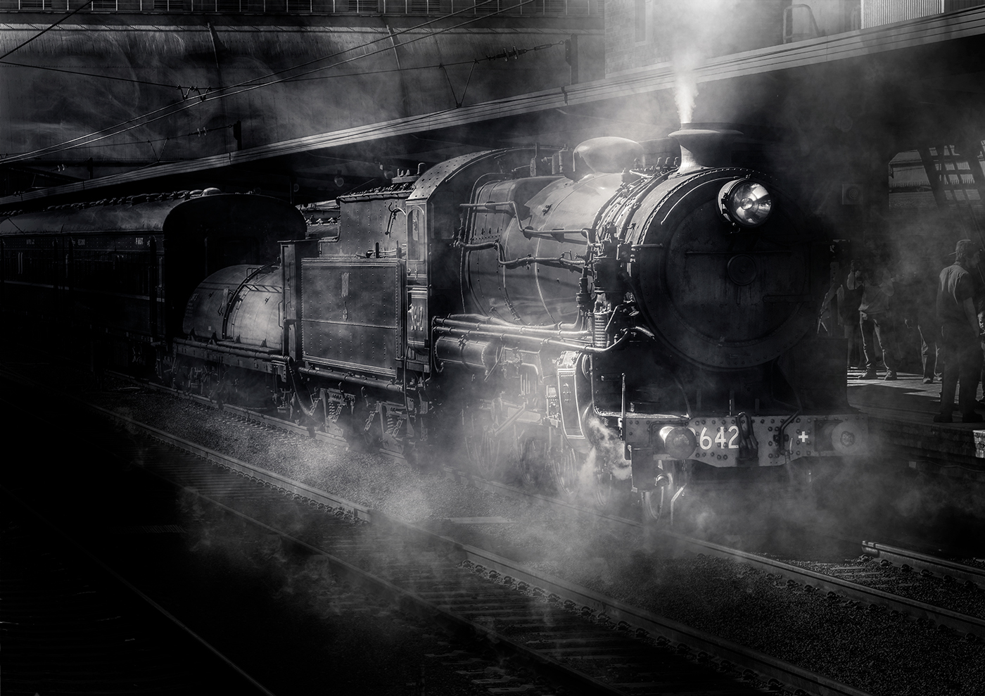
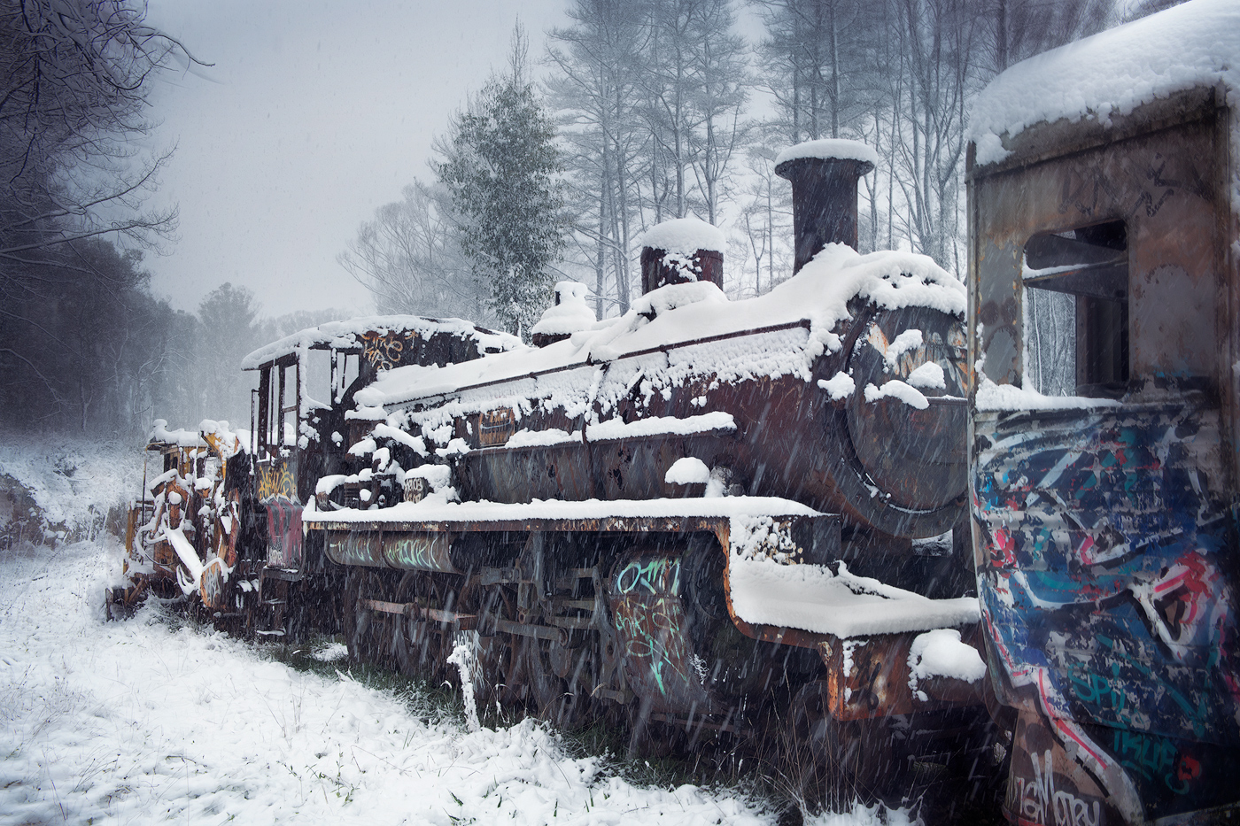
Thanks Darcy, the treatment of the trees close to the tower does look a bit out of place in hindsight, I will play with this area a bit more, was trying to define them without losing them to black. Thanks for pointing that out |
Apr 6th |
| 14 |
Apr 21 |
Reply |
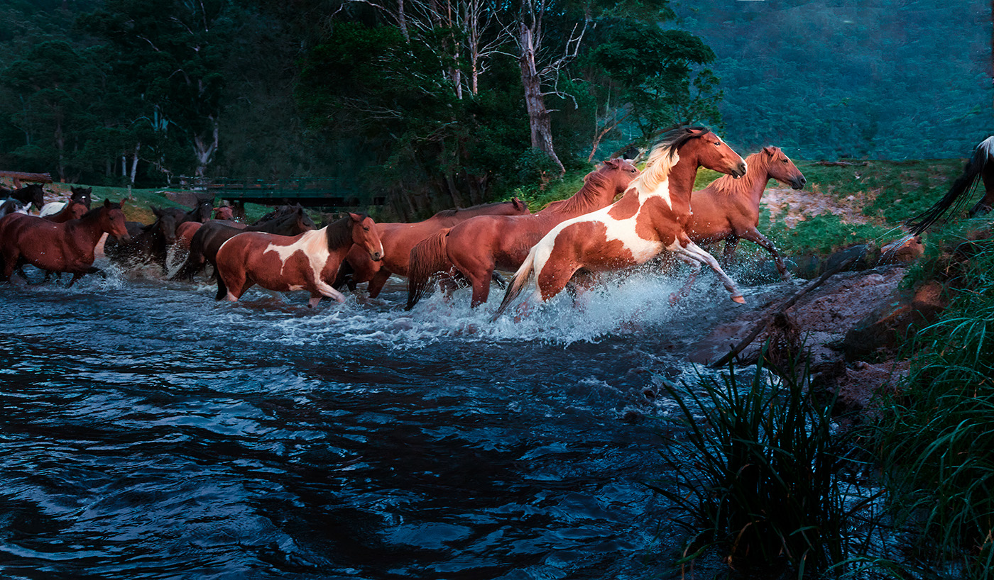
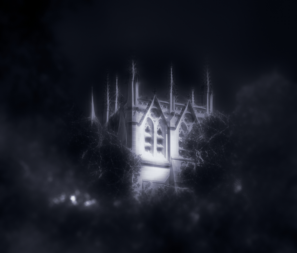
Thanks Greg, didn't see the hot spot before posting, thanks for pointing this out |
Apr 6th |
| 14 |
Apr 21 |
Comment |
Tried to attached a Photoshop document, didn't work. OH Well here is a JPEG |
Apr 6th |
 |
| 14 |
Apr 21 |
Comment |
Hi Darcy
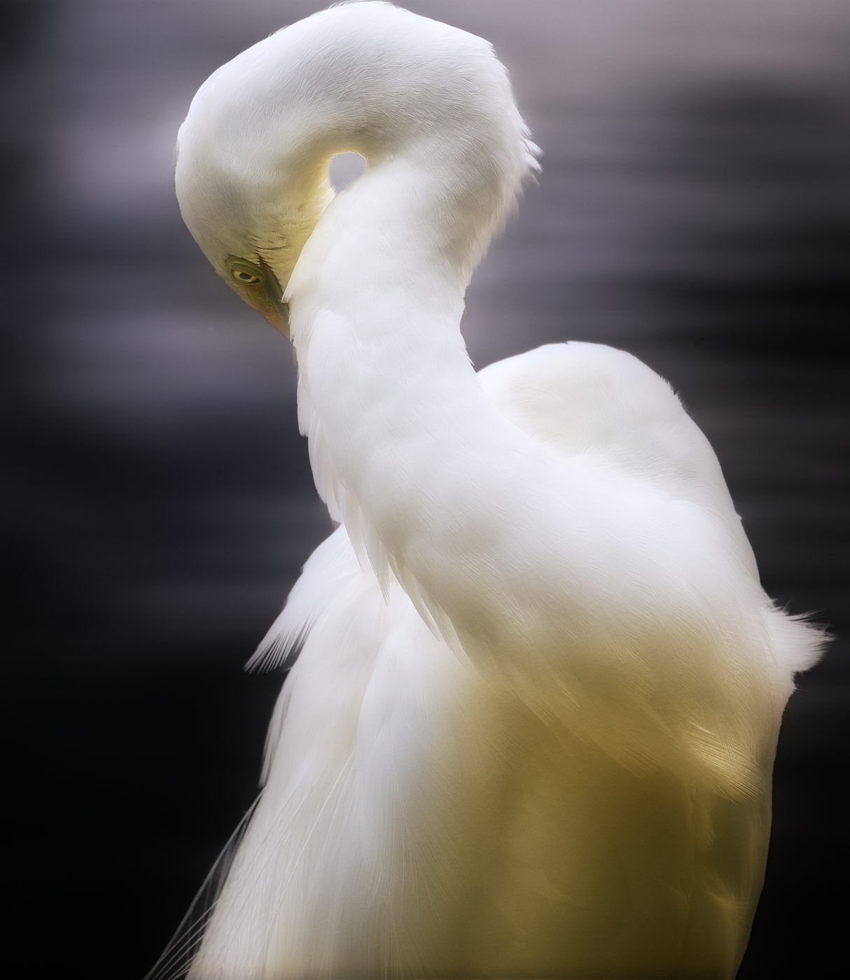
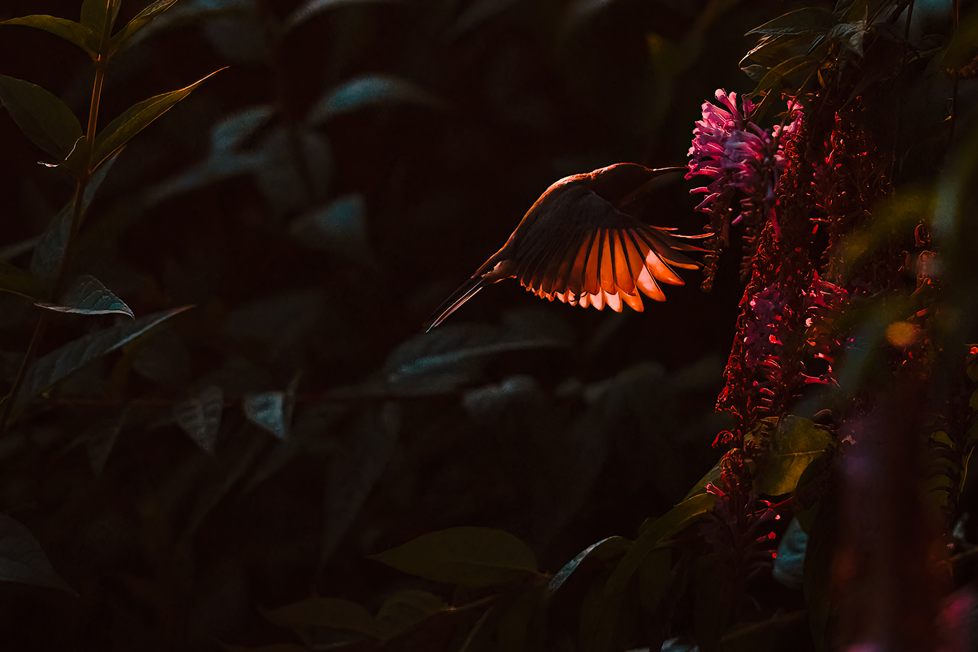
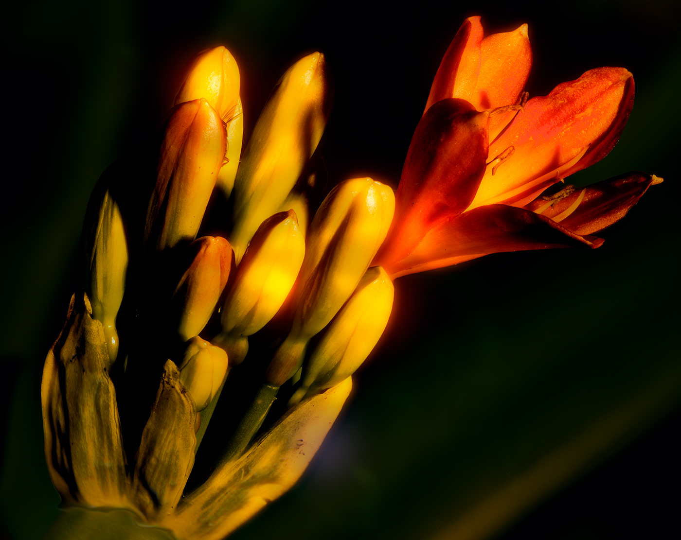
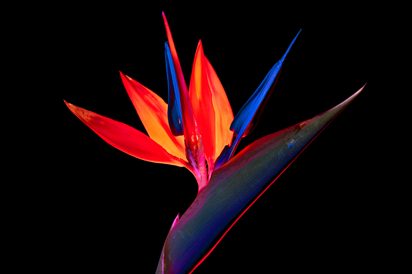
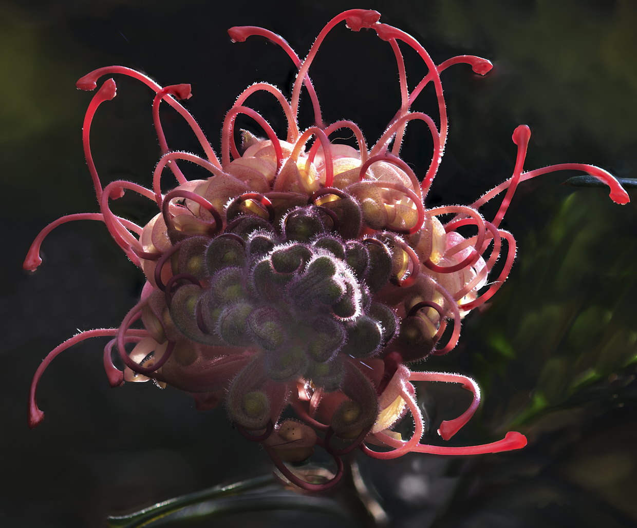
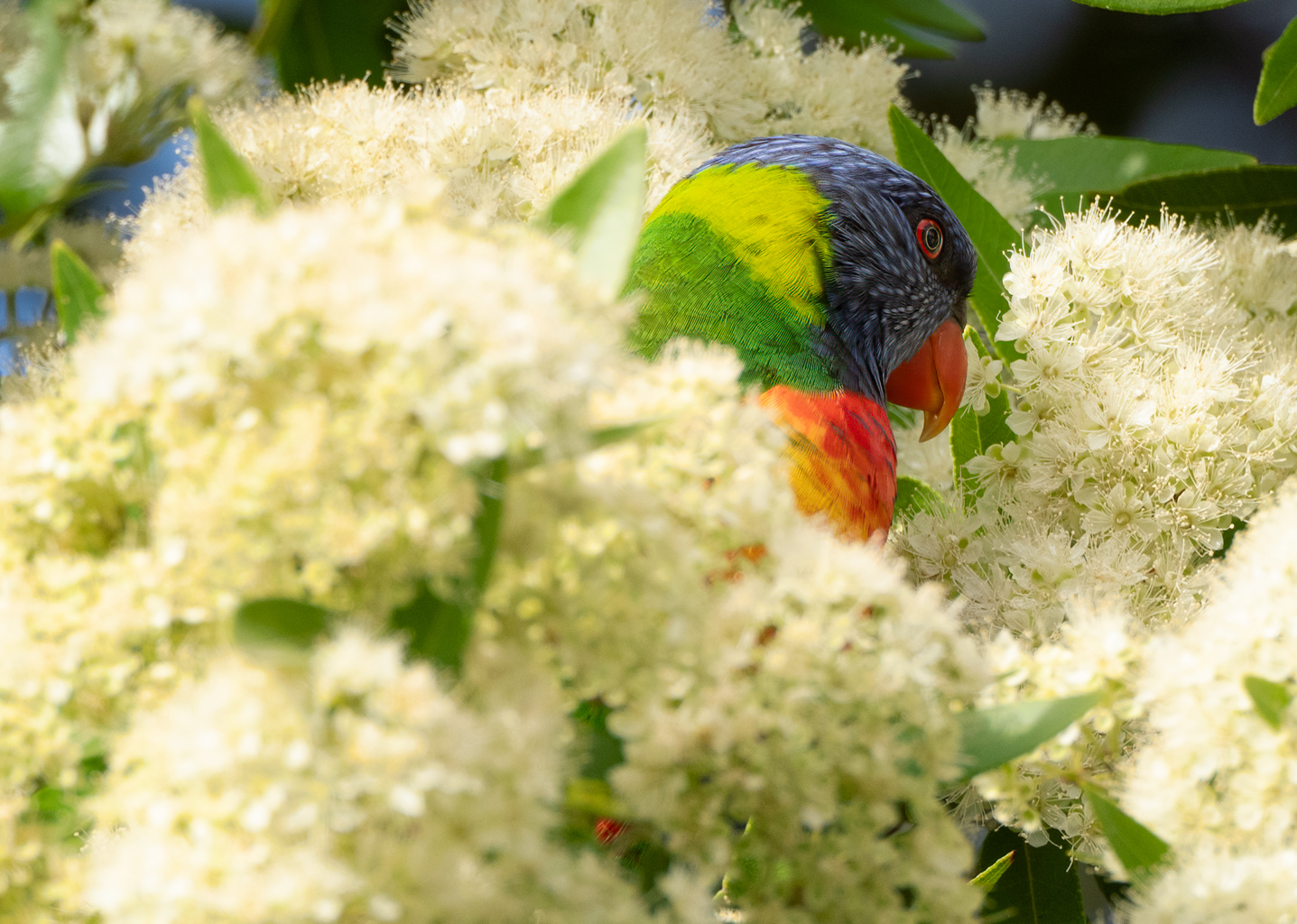
A nice image in the black-and-white conversion works well contrast in luminous levels on the leaves is very pleasing the darkness of the stem coming in from the left is a nice contrast to the flower itself and I agree with the diagonal presentation top left to bottom right is a great way to present it. There is a softness about the stem itself but I don't believe this is a focus issue, not sure if it's something that occurred in processing but it seems to be a form of halo around parts of the little bugs on the stem, (copied image and zoomed in). I actually believe that this adds to the image not detracts. as a suggestion, I placed a levels adjustment layer in photoshop on your image and using a mirrored gradient filter from photoshop on your image I darkened the extremities which gave a more pronounced look to your stem, purely a suggestion if you care to try. image attached and very subtle change hope you can see it. |
Apr 6th |
| 14 |
Apr 21 |
Comment |
Hi Greg
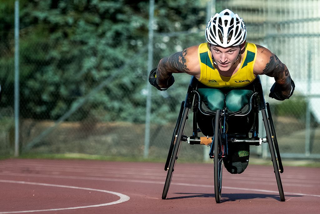
Your presentation of this image works very well there are no distracting elements and it is very clear what the subject is and what the subject is doing. I am immediately drawn to the subject eyes which works well, colour balance is good. As much as I love black-and-white images my preference with this one is for your submitted version, the black-and-white for me appears flat and the subject does not dominate. All in all a very well handled and presented image |
Apr 6th |
| 14 |
Apr 21 |
Comment |
Hu Xiao
a nicely posed street portrait the lighting works well with plenty of detail in the sitter and the surrounding area, all handled very well in your post-processing. I agree with Darcy that the sitter not appearing comfortable and her comments on the tensions within the image. I also find the cover of the red book a bit distracting and it would be easy for you to change the colour in the postprocessing. Comparing your original image and your reworked image it is obvious that your skills have improved dramatically over the time |
Apr 6th |
4 comments - 2 replies for Group 14
|
4 comments - 2 replies Total
|