|
| Group |
Round |
C/R |
Comment |
Date |
Image |
| 14 |
Mar 21 |
Reply |
Thanks Greg, I appreciate your input and will have a play with that suggestion. Tom |
Mar 1st |
| 14 |
Mar 21 |
Comment |
Hi Xiao, another well-posed model image from your portfolio, well created.
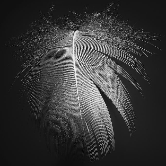
The young man being the centre of attention is distracted by the difference in then reflection, I note the change in hue and saturation in the reflection would be apparent, I believe that it is just gone a little too far. Perhaps slightly brighter may move it closer to reality and not so such a distraction from the model himself. While you have the column reflected on top of the model's head, I don't necessarily find that a distraction. A well-constructed posed image. regards
|
Mar 1st |
| 14 |
Mar 21 |
Comment |
Hi Greg. Street photography and people photography are not an area I am comfortable in and I applaud your efforts. The second image definitely is an improvement over the original and shows the interaction between the couple. The positioning of the girl and the pink/red dress draws my eye and is the centre of attention, not the tattoos. Perhaps a different angle moving to your right may present an opportunity to make the tattoos more prominence in the image. I see you have had a play with a few painterly type filters which is an area I believe can be used to great effect, I would remove this effect of the couples skin area if it was my image. I applaud your courage in venturing into this type of photography and I need to follow your lead. Regards |
Mar 1st |
| 14 |
Mar 21 |
Comment |
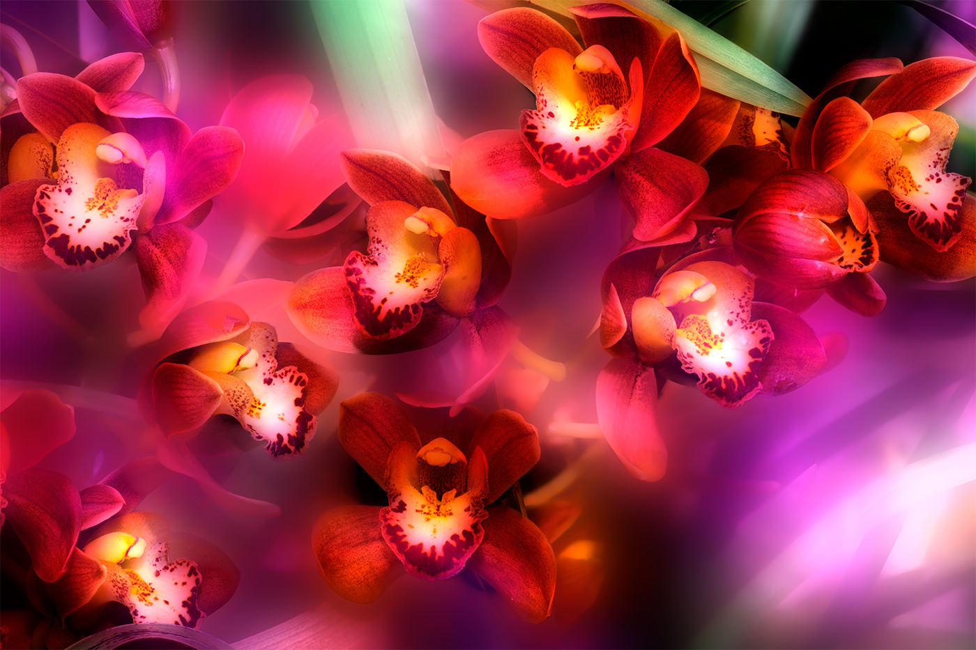
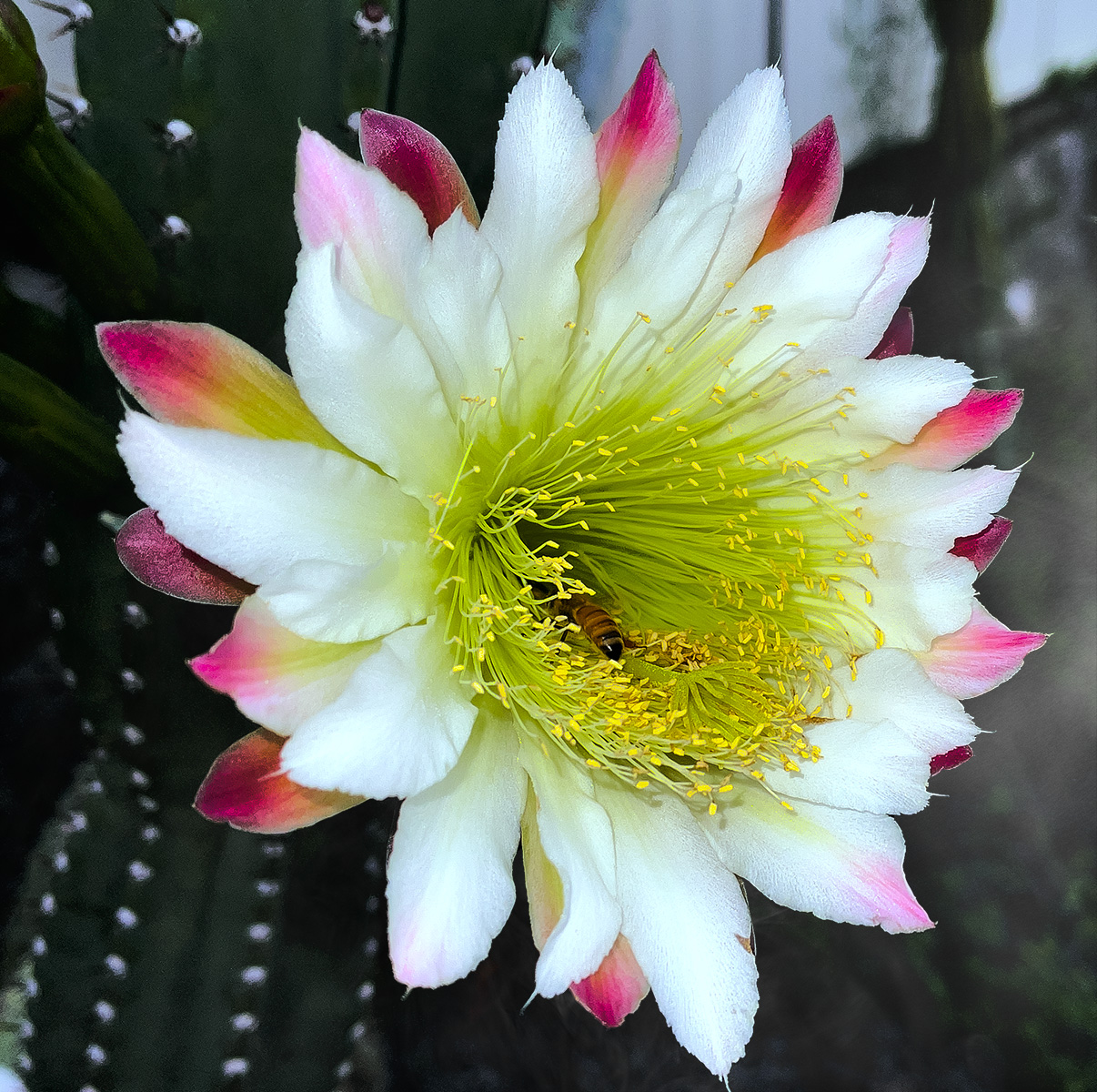
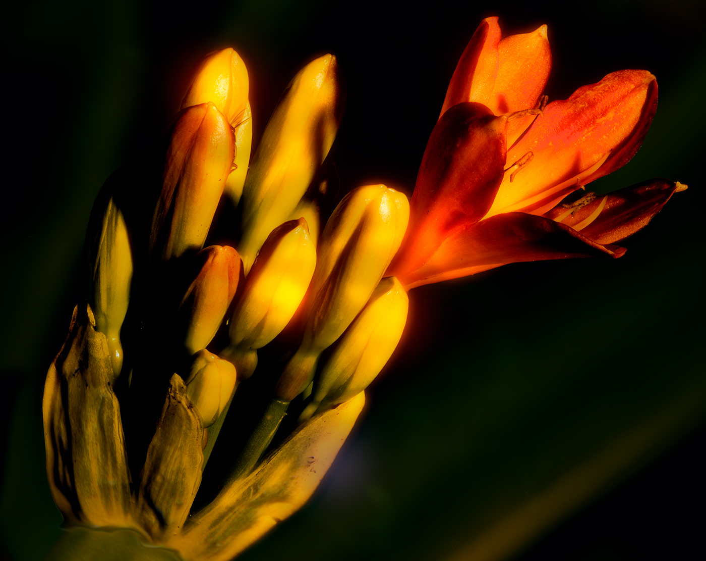
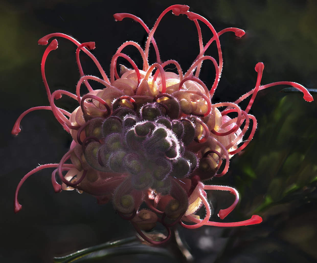
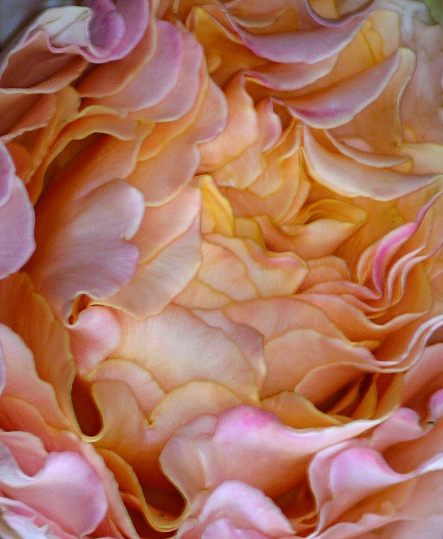
Hi Darcy. Notice that you received the rose as part of an arrangement I'm sure the arrangement was well-deserved and appreciated. From your description, it seems like a lovely rose particularly with that many many petals. The image is a lovely graphic and very pleasing to the eye with the mix of the Hues beautifully represented, (mother nature definitely has a way with colour coordination). I agree with both Greg and Xiao about defining a place for the eye to settle and have taken the liberty to do an edit on your image. The image I presented is simply a rough selection with the lasso tool, set to multiply and then put a gaussian blur on the selection. Additionally, I used a luminosity mask for the pinks and just added a slight saturation to them. Both these changes I believe are very subtle and I hope you can see the change. It would probably be a lovely graphic image blown up and placed on the wall somewhere. Regards |
Mar 1st |
 |
3 comments - 1 reply for Group 14
|
3 comments - 1 reply Total
|