|
| Group |
Round |
C/R |
Comment |
Date |
Image |
| 14 |
Jan 21 |
Comment |
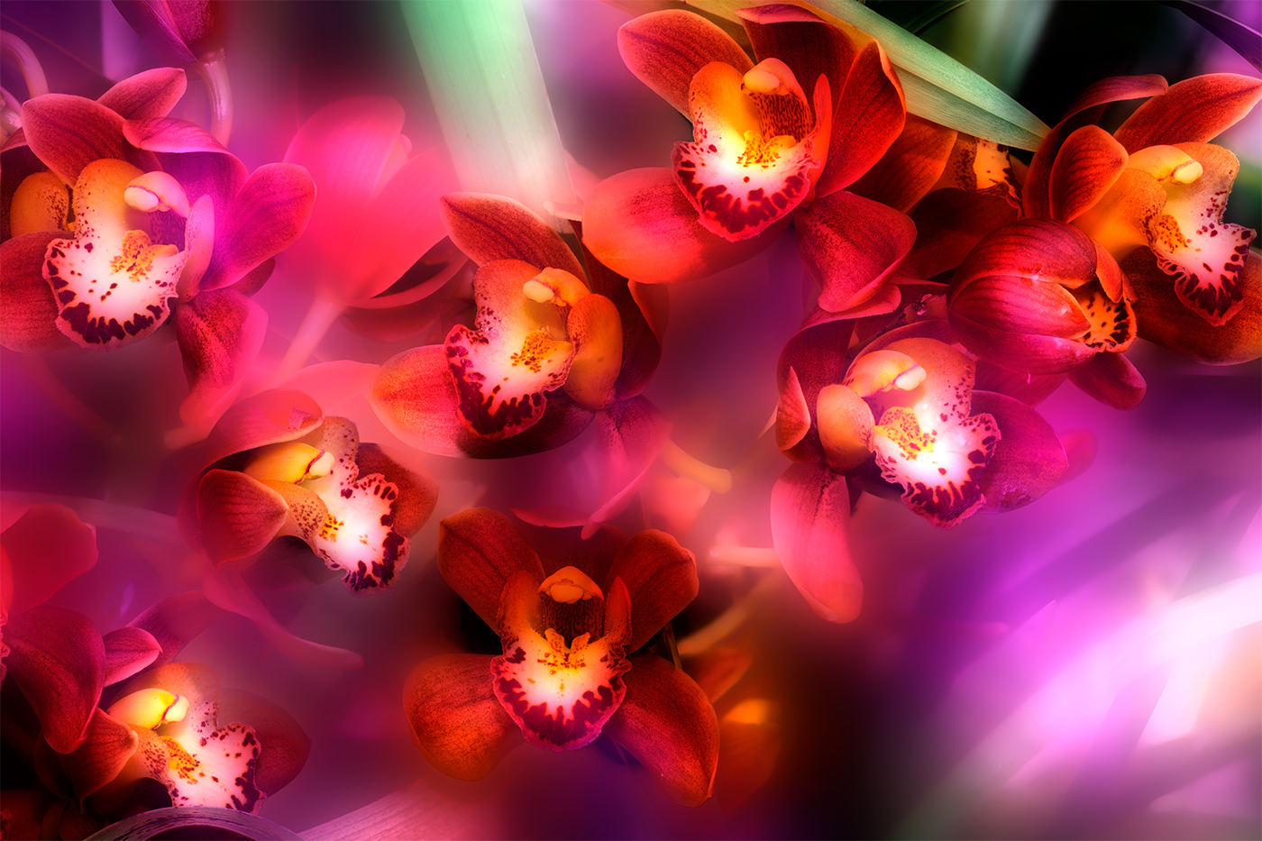
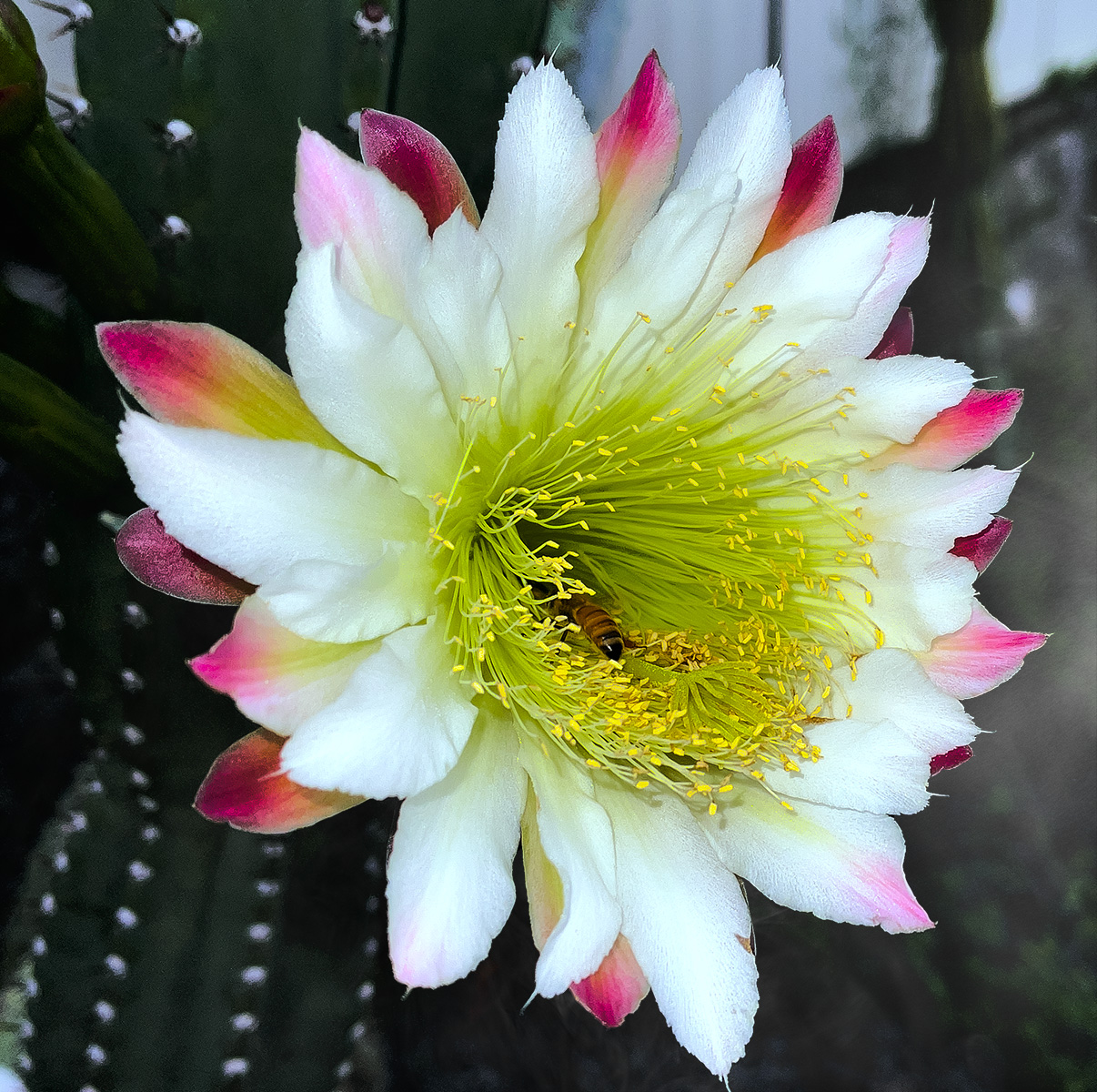
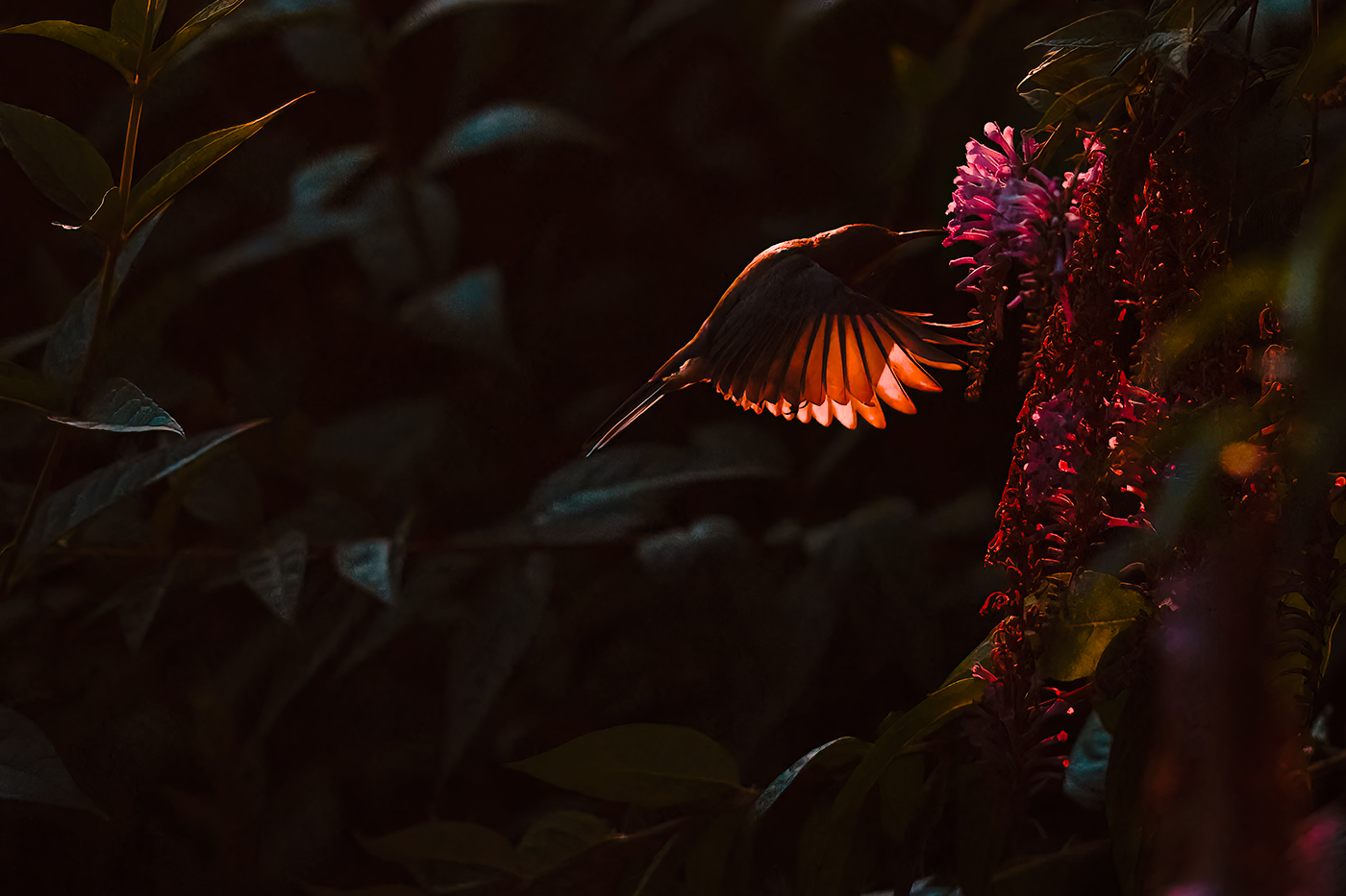
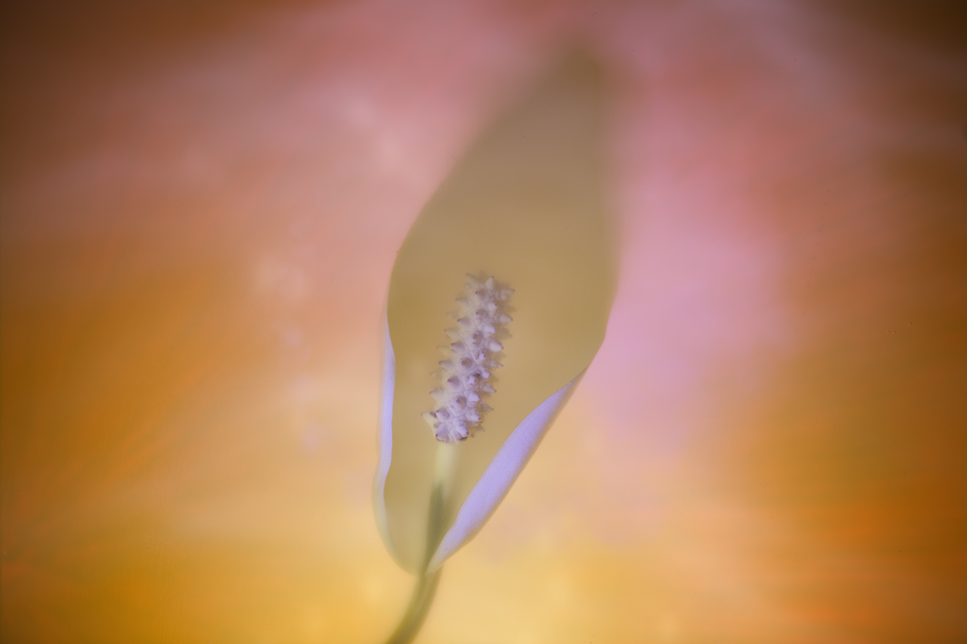
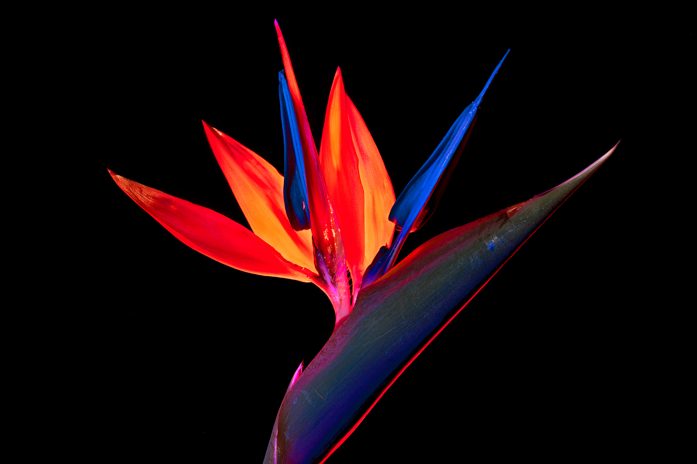
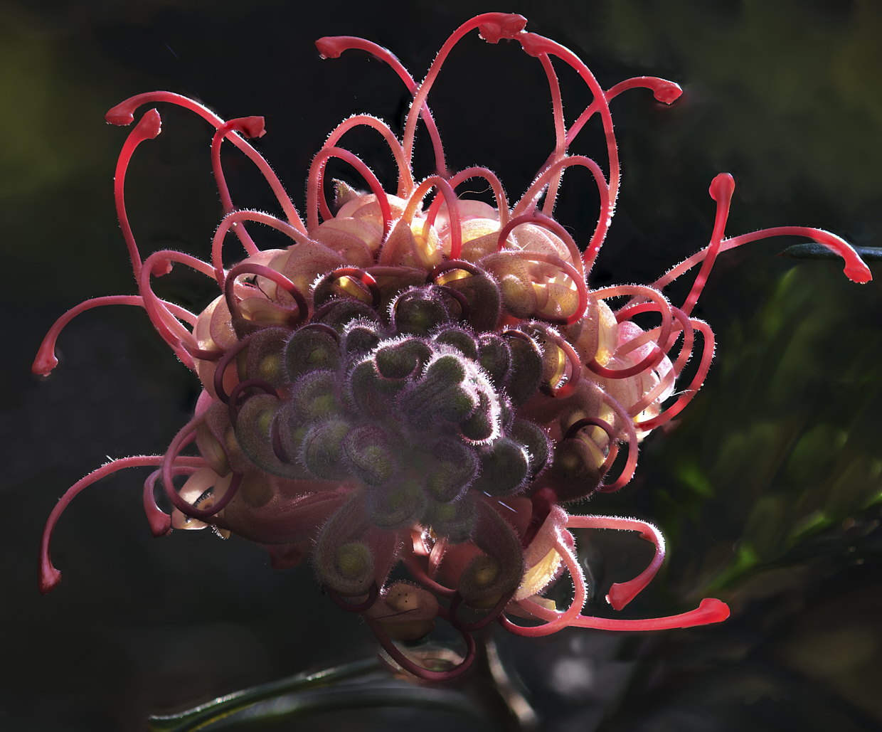
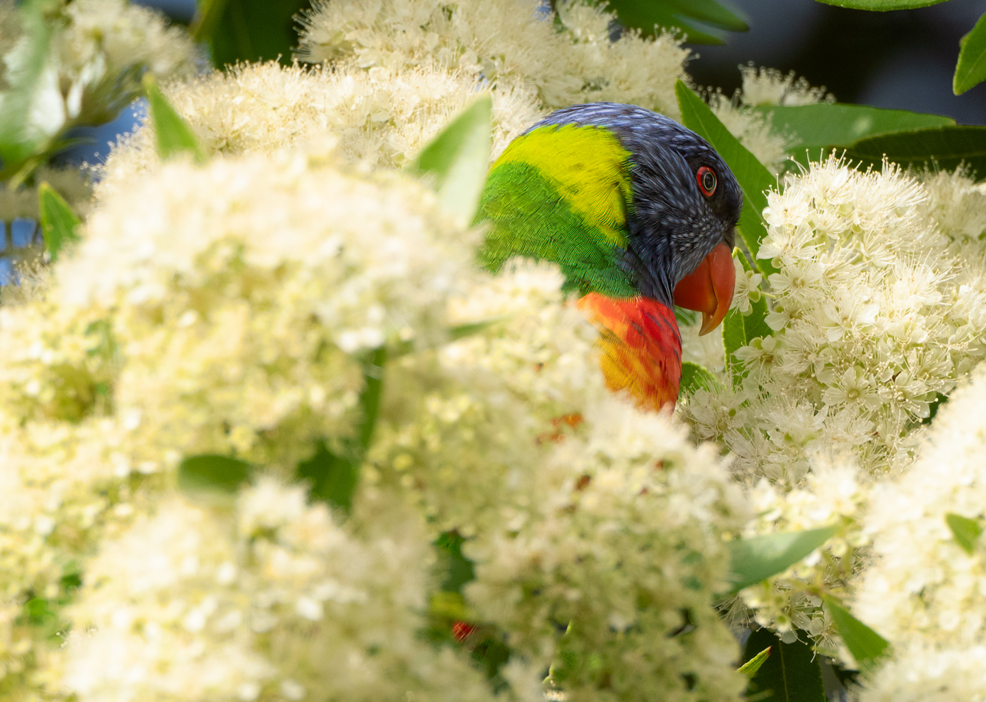
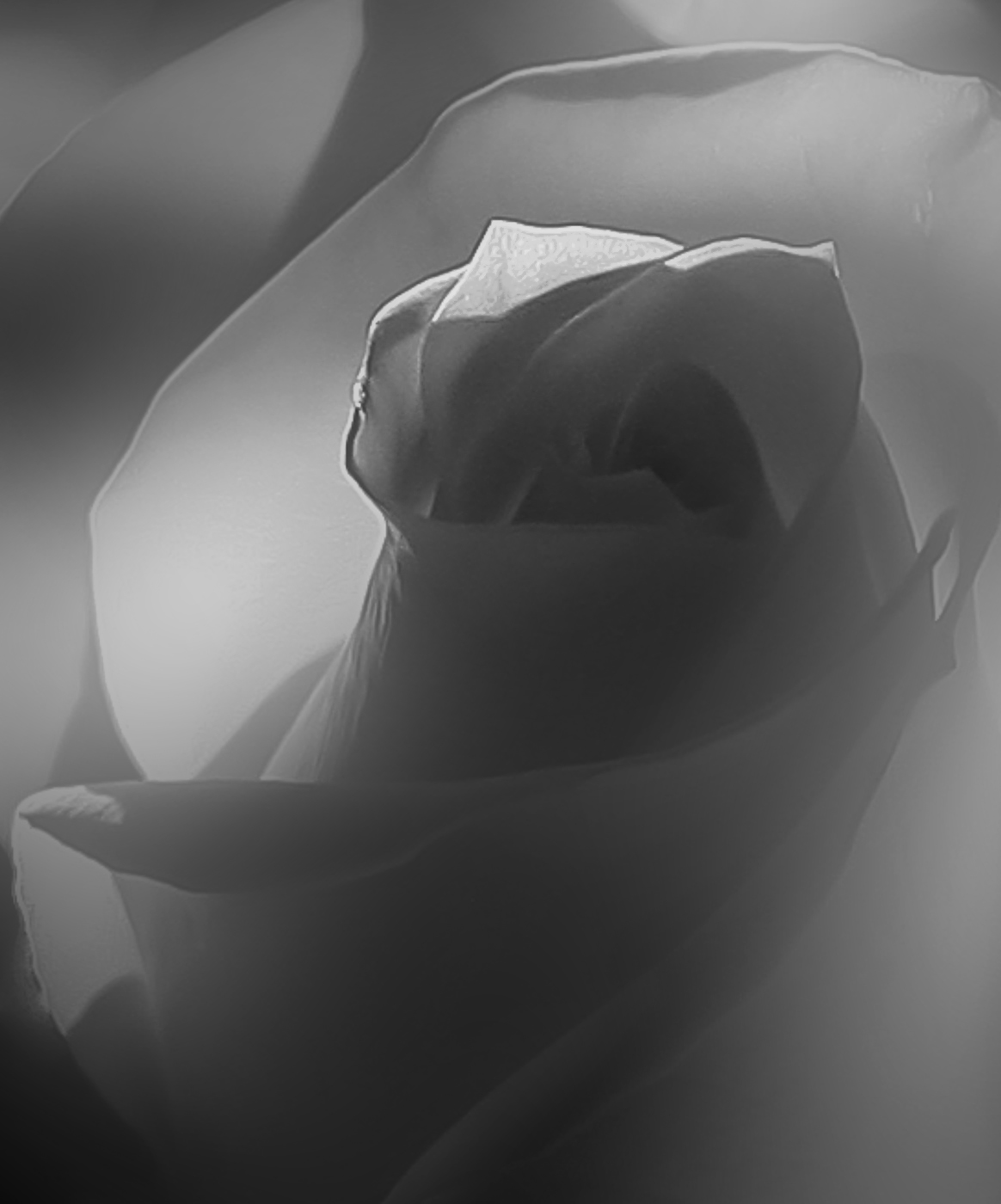
Hi Darcy, I like this image and enjoy images of flowers that are soft and diffused. If I were attempting this shot I would consider the widest aperture I had (say 2.8) and get in close and concentrate on the centre of the flower for both exposure and sharpness. in post, I would consider sharpening the point the of interest only, then apply a low blur to the rest of the image maybe using a circular gradient to have a progressive blur from the POI to the outside. in the attached I have attempted to achieve this however the original I was working on did not have enough information to allow me to achieve what I was a suggestion, so this is just an example of what I was attempting. |
Jan 9th |
 |
| 14 |
Jan 21 |
Comment |
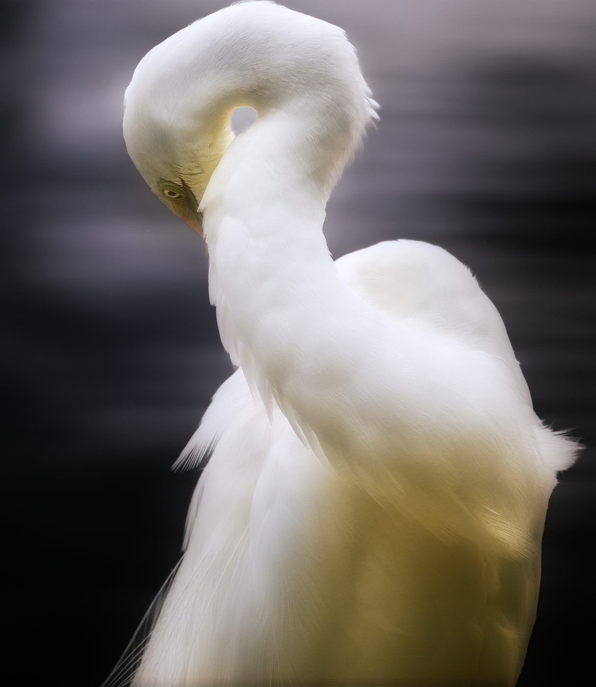
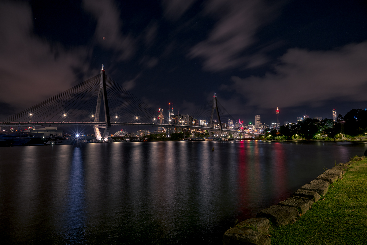
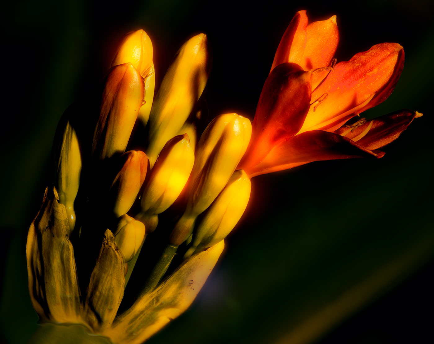
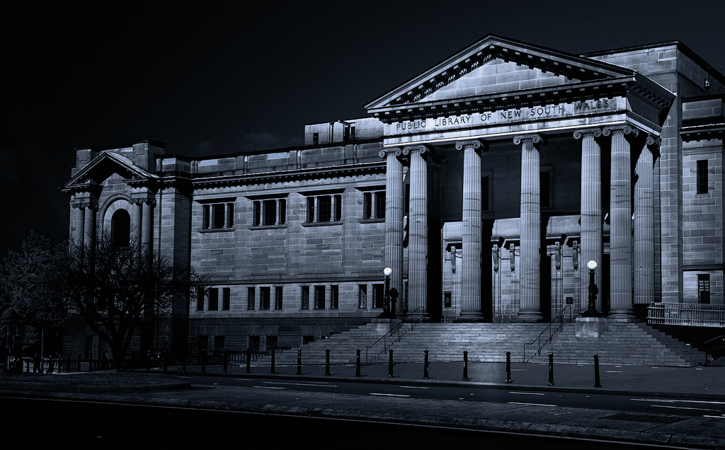
Xiao, well-constructed image, you have handled the colour and white balance well, together with your choice of tight portrait enhances the image. Other than the rail, that John has addressed, nice image |
Jan 9th |
| 14 |
Jan 21 |
Comment |
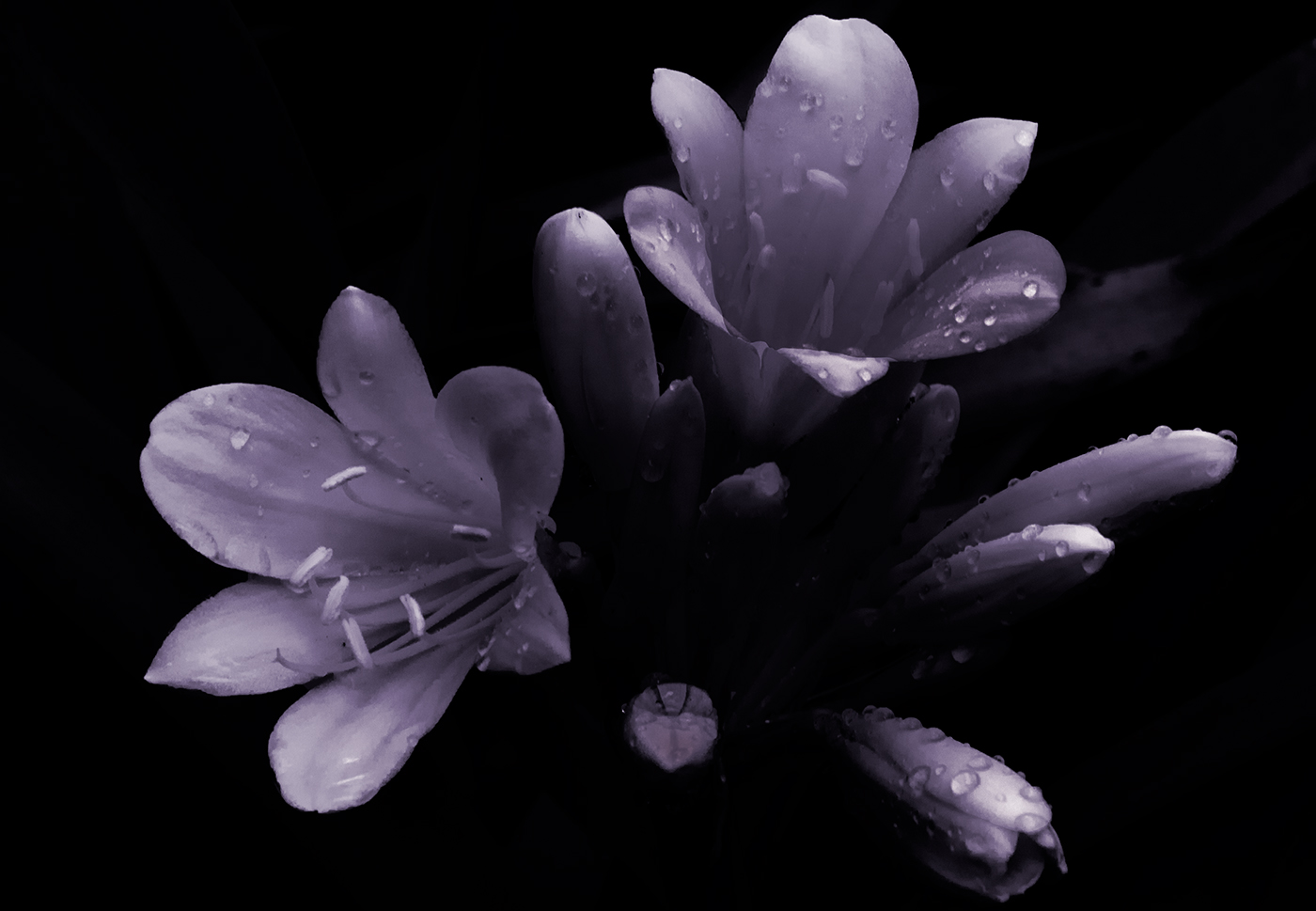
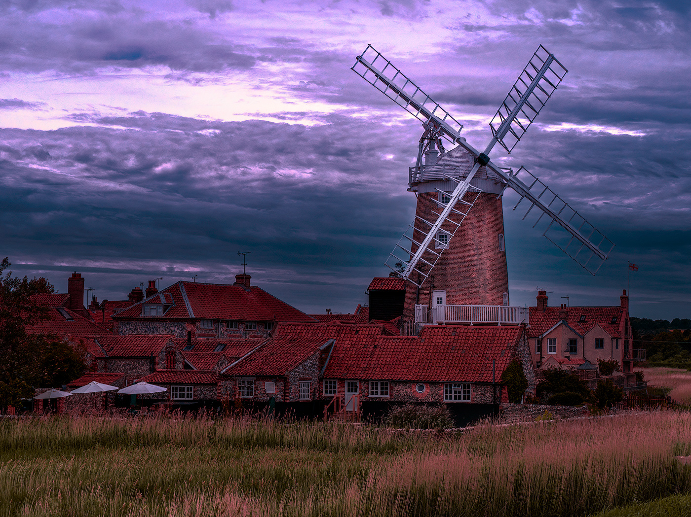
John, great image and well presented. Colour hues and saturations work well, definition looks good. a minor suggestion as the white are a bit overpowering (on my screen) suggest toning down a slight amount the darks on the white petals |
Jan 9th |
| 14 |
Jan 21 |
Reply |
John, Thank you very much for that comment, I am always worried about going to far with saturations, haoebver Thanks for the input and I have had a play with the image and agree that a tweak of saturation would not go astray. Wishing you good shooting in 2021 |
Jan 9th |
| 14 |
Jan 21 |
Reply |
Darcy, Thank you very much for that comment, wishing you good shooting in 2021 |
Jan 9th |
| 14 |
Jan 21 |
Reply |
Greg Thank you very much for that comment, wishing you good shooting in 2021 |
Jan 9th |
| 14 |
Jan 21 |
Comment |
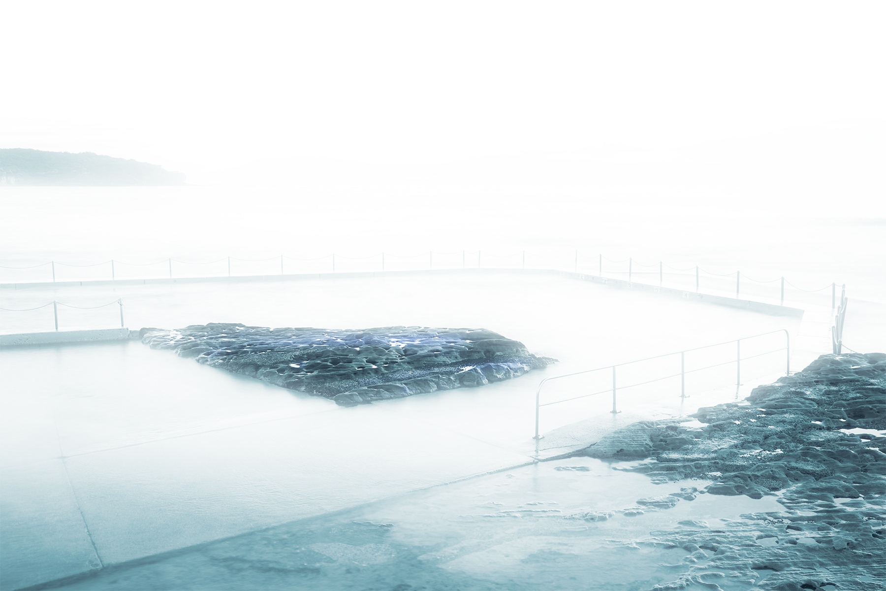
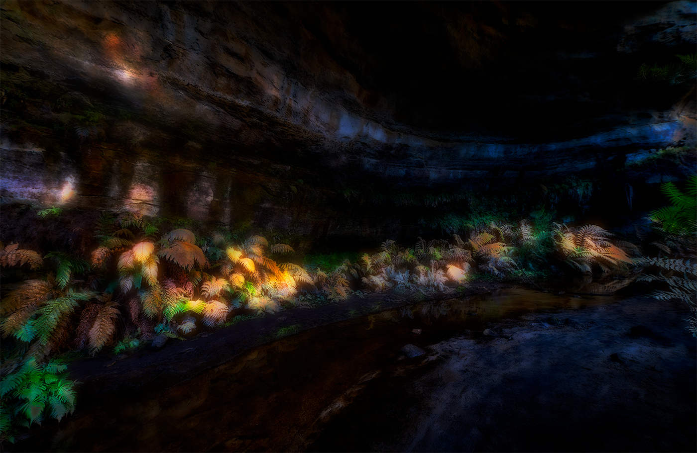
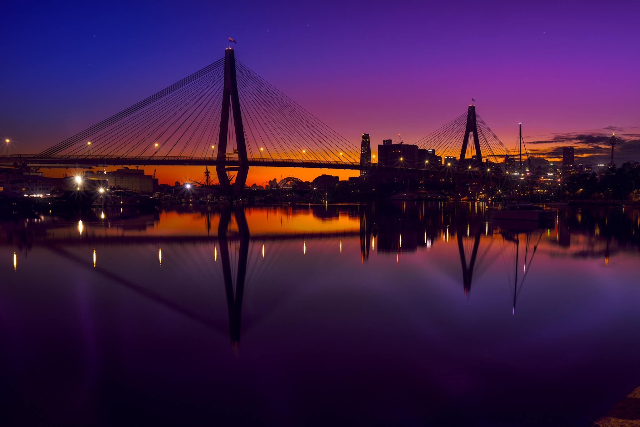
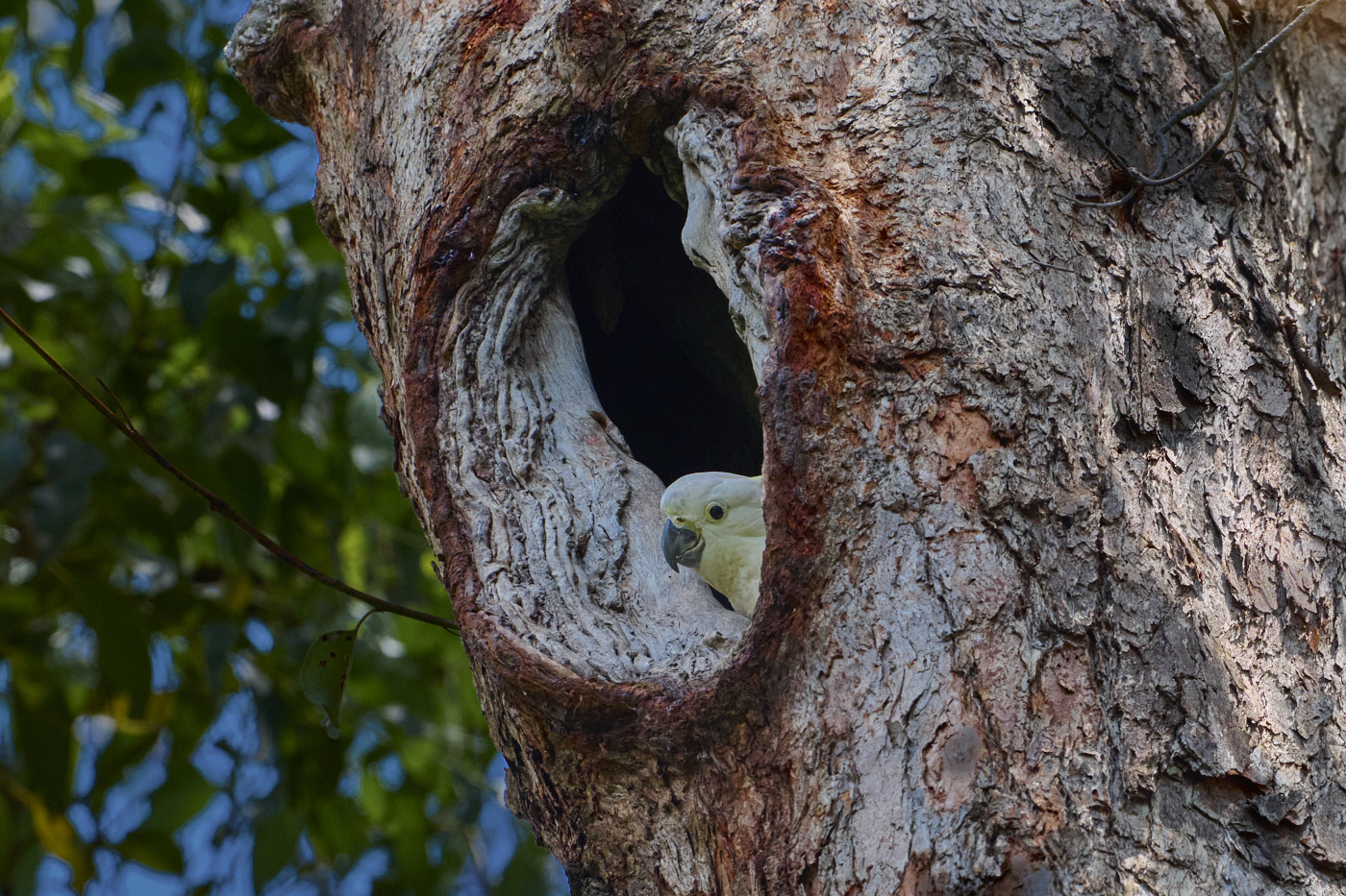
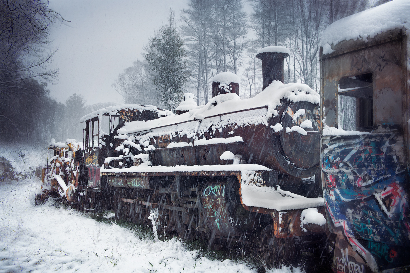
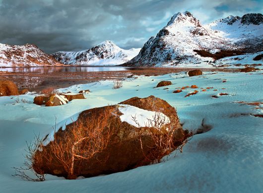
Quang, well handled image, not over processed with shadows, midtones and highlights all handled well and balanced. Detail in the foreground is good. A suggestion would be to flip the image horizontally. The five rocks, image left foreground seem to lead the eye and point into the image, taking advantage of pointing to the right. Might balance the image. Only a suggestion |
Jan 9th |
| 14 |
Jan 21 |
Comment |
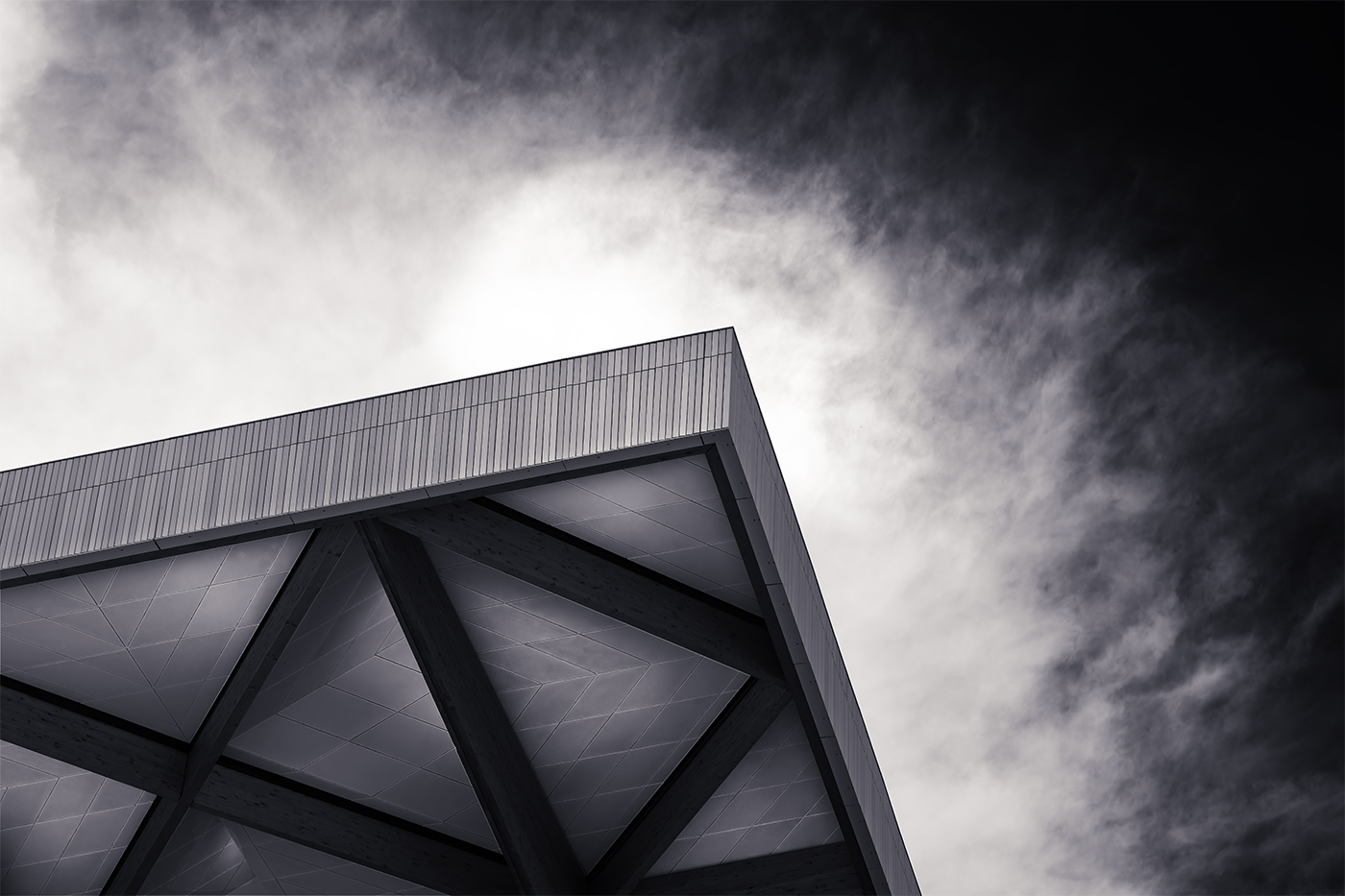
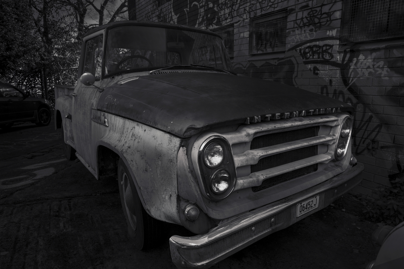
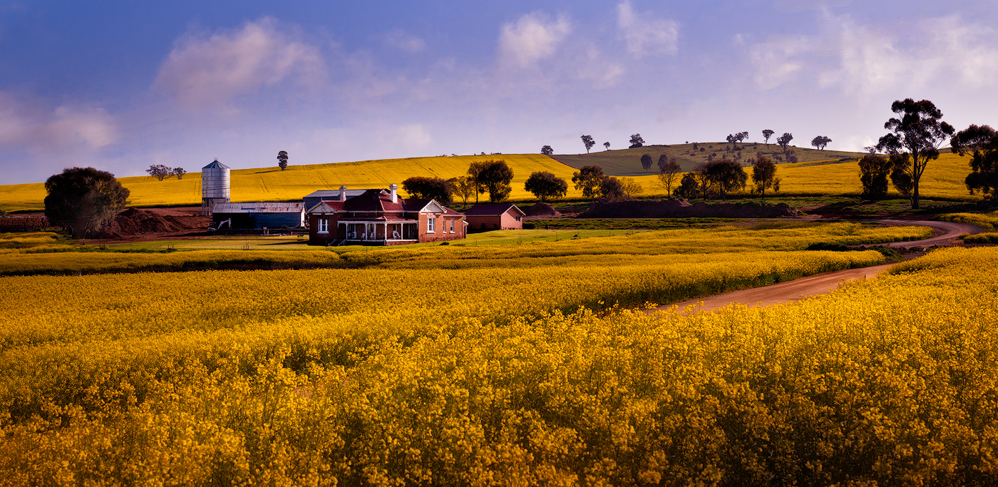
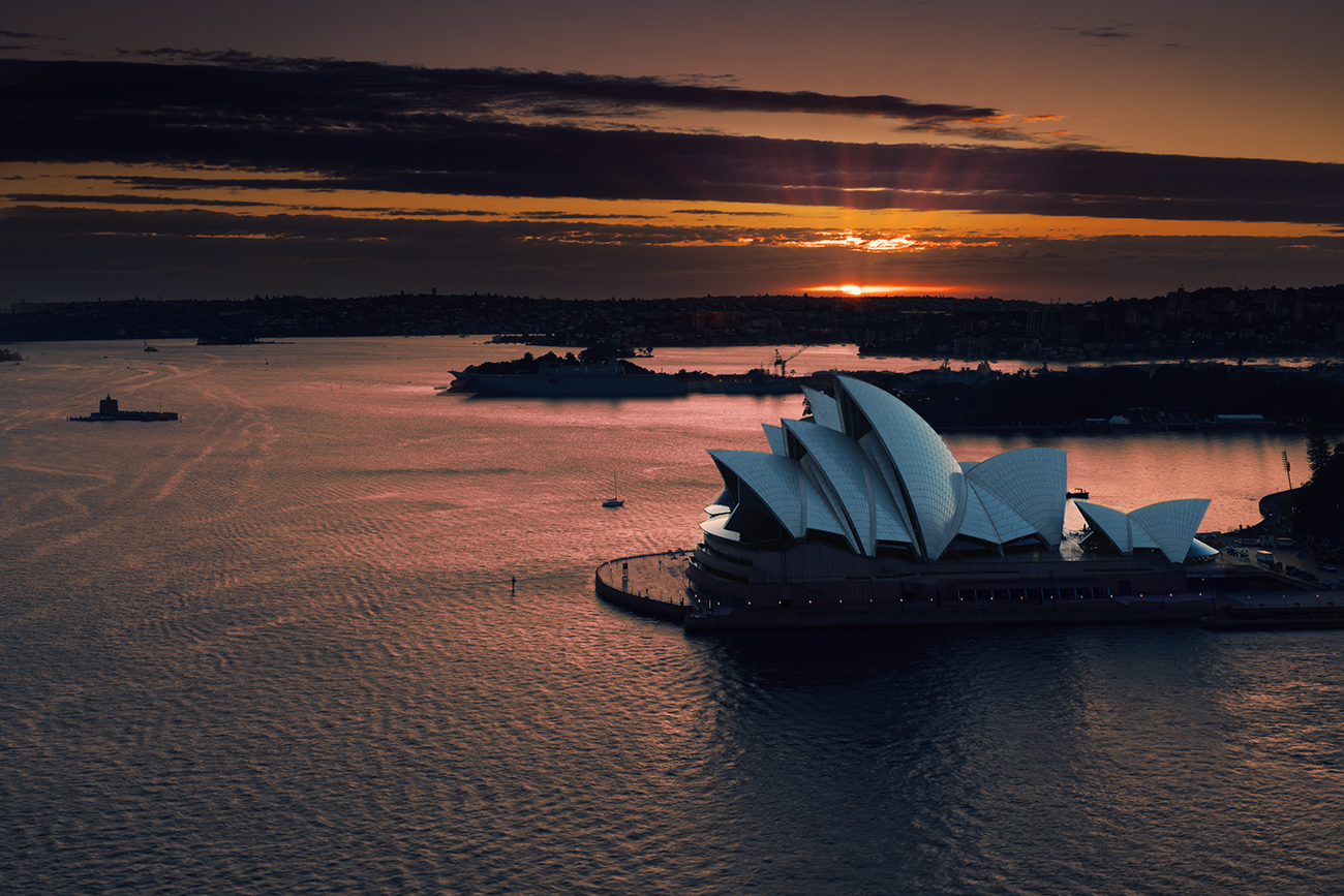
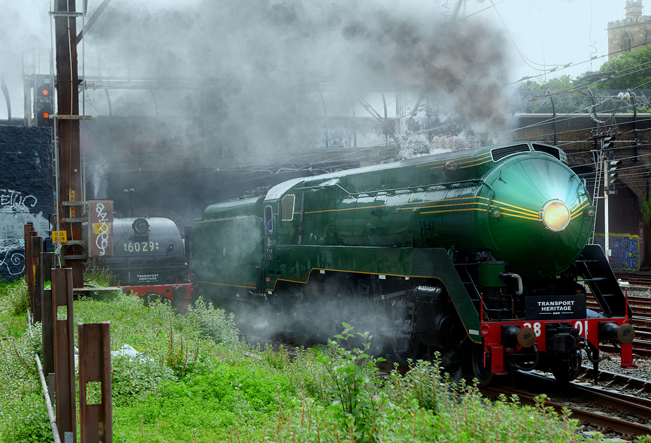
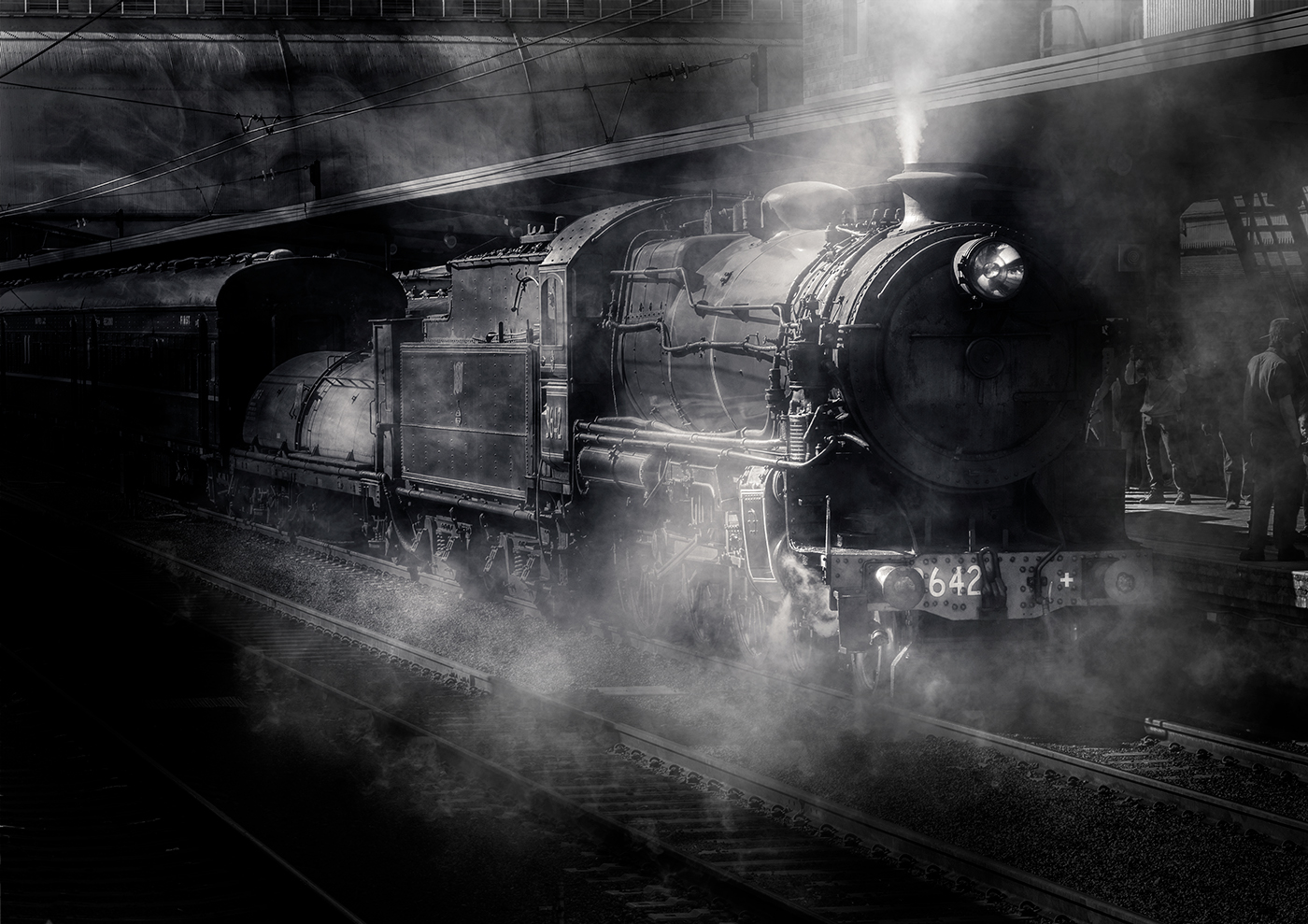
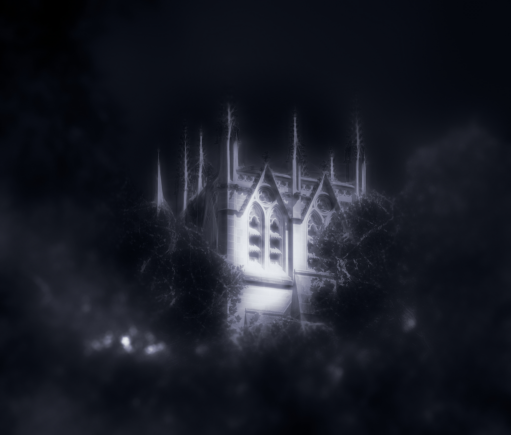
Hi Greg well processed image from the original, you have brought out the detail in the texture and shadows giving a realistic image with depth. Tonal range is good and your handling of the sky works. Only negative is the scaffolding on the right front tower, suggesting it would be easy to remove. Well handled image |
Jan 9th |
5 comments - 3 replies for Group 14
|
5 comments - 3 replies Total
|