|
| Group |
Round |
C/R |
Comment |
Date |
Image |
| 14 |
Dec 20 |
Comment |
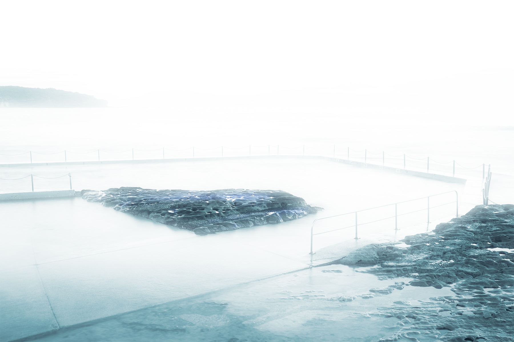
Nice vibrant image Syed and portraying the story and the occasion very well, my eye is drawn to the lighter area, which is the main centre of the action. I initially thought the background was a mirror, my current thought is that it is a divide to another room, which adds to the depth of the image. I agree with John on the colour cast and brightness particularly on the screen left of the image. nice image well captured |
Dec 20th |
| 14 |
Dec 20 |
Reply |
Thank you for the input Darcy |
Dec 6th |
| 14 |
Dec 20 |
Reply |
Thanks John, I do like the aggressive crop and agree that the foreground in the original lends nothing to the image your hard crop definitely improves the image. I'm not a 100% on the total desaturation (background) but did play with a lesser desaturation which did give the bird a stronger presence in the image
Thanks for that input.:) |
Dec 3rd |
 |
| 14 |
Dec 20 |
Comment |
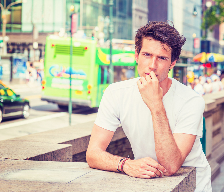
Hi Xiao, you obviously have an affinity for people portraits, which I need to improve on in my photography. Nice model and looking directly at the camera giving engagement with the viewer, the pose is good giving a thoughtful intent to the model. I am not a lover of saturated colours and the background is a distraction to me with this level of saturation, (a personal choice). As a suggestion crop the image to place the model on the image right a bit more. |
Dec 3rd |
 |
| 14 |
Dec 20 |
Comment |
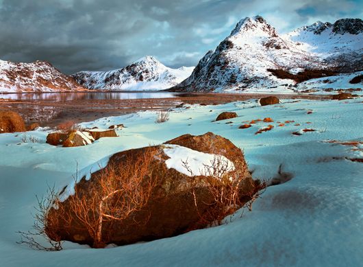
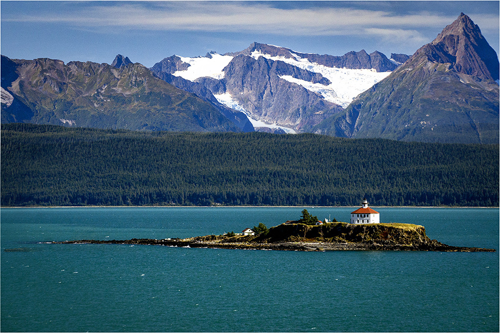
Hi Greg, nice job of processing from the original, detail and tones in the mountain and forest make the image come to life. I agree with Xia on the noise issue particularly in the sky, which may have come in with your sky replacement image. For me I have a problem with the balance of this image, the focal point of the island and white building opposing the huge mountain in the image right to me seems to be unbalanced. I did a simple repositioning of your image which takes it away from the original scene (which some think this type of manipulation should not be undertaken) I think the image is a bit more balanced, of course, a personal choice. |
Dec 3rd |
 |
| 14 |
Dec 20 |
Comment |
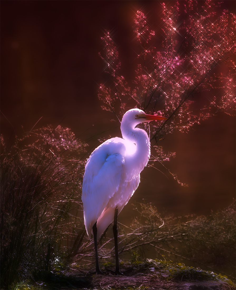
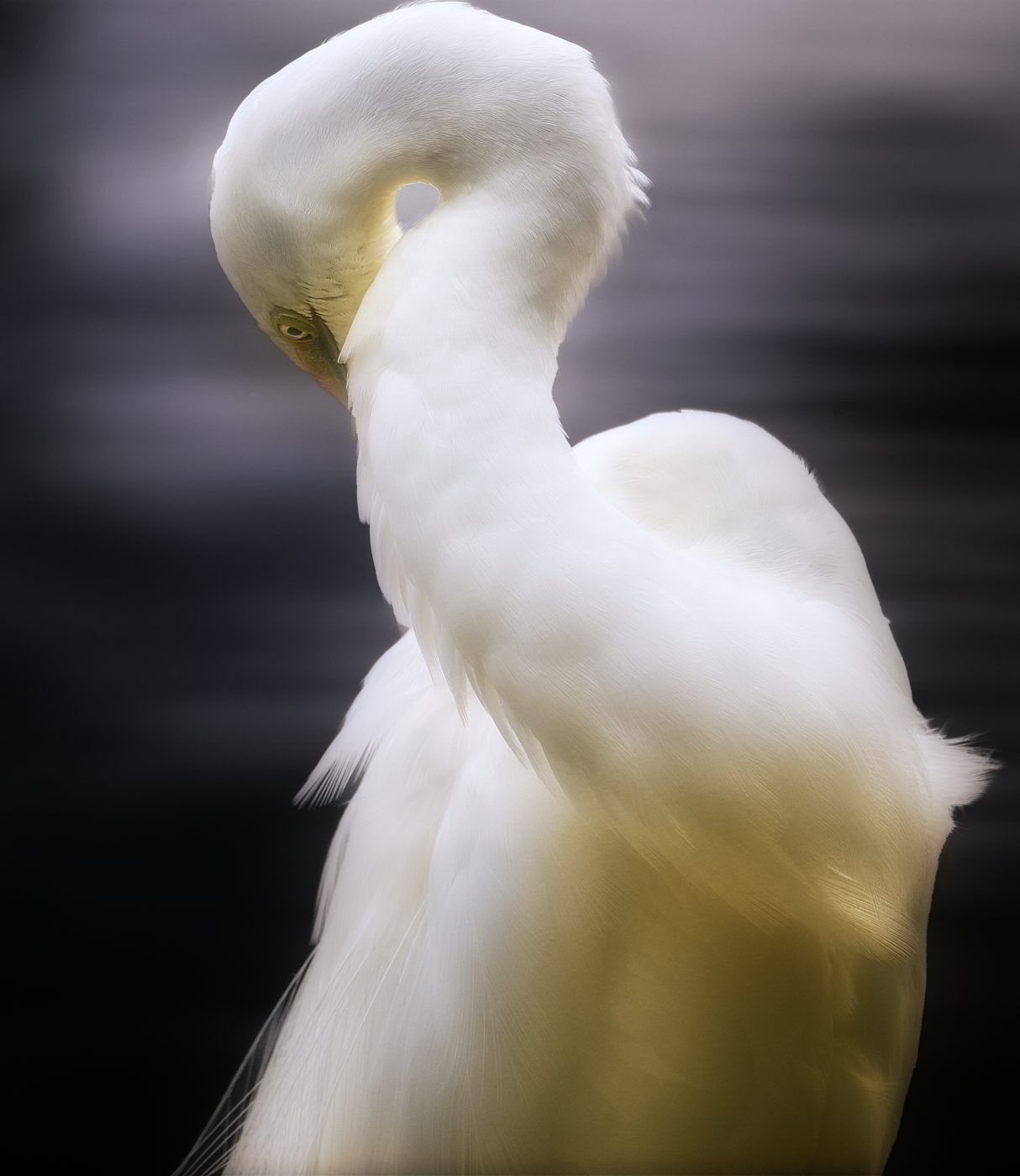
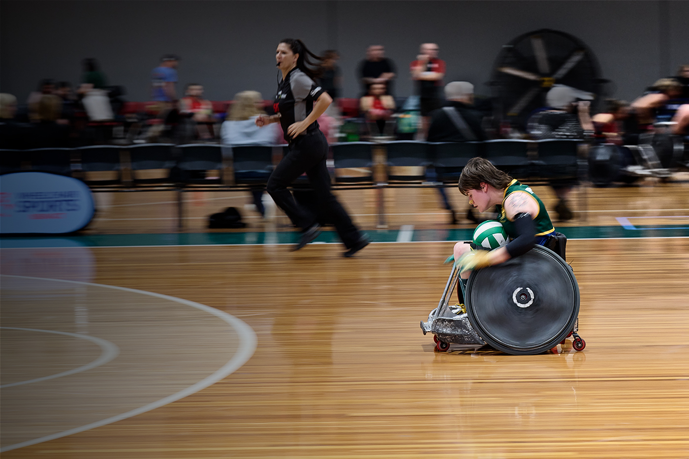
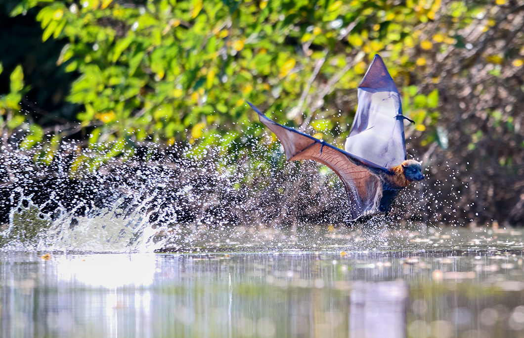
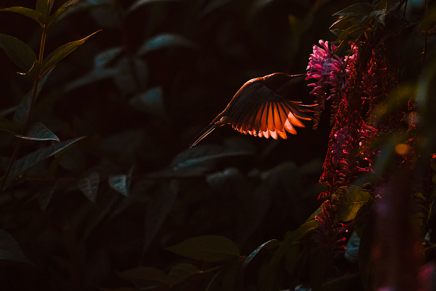
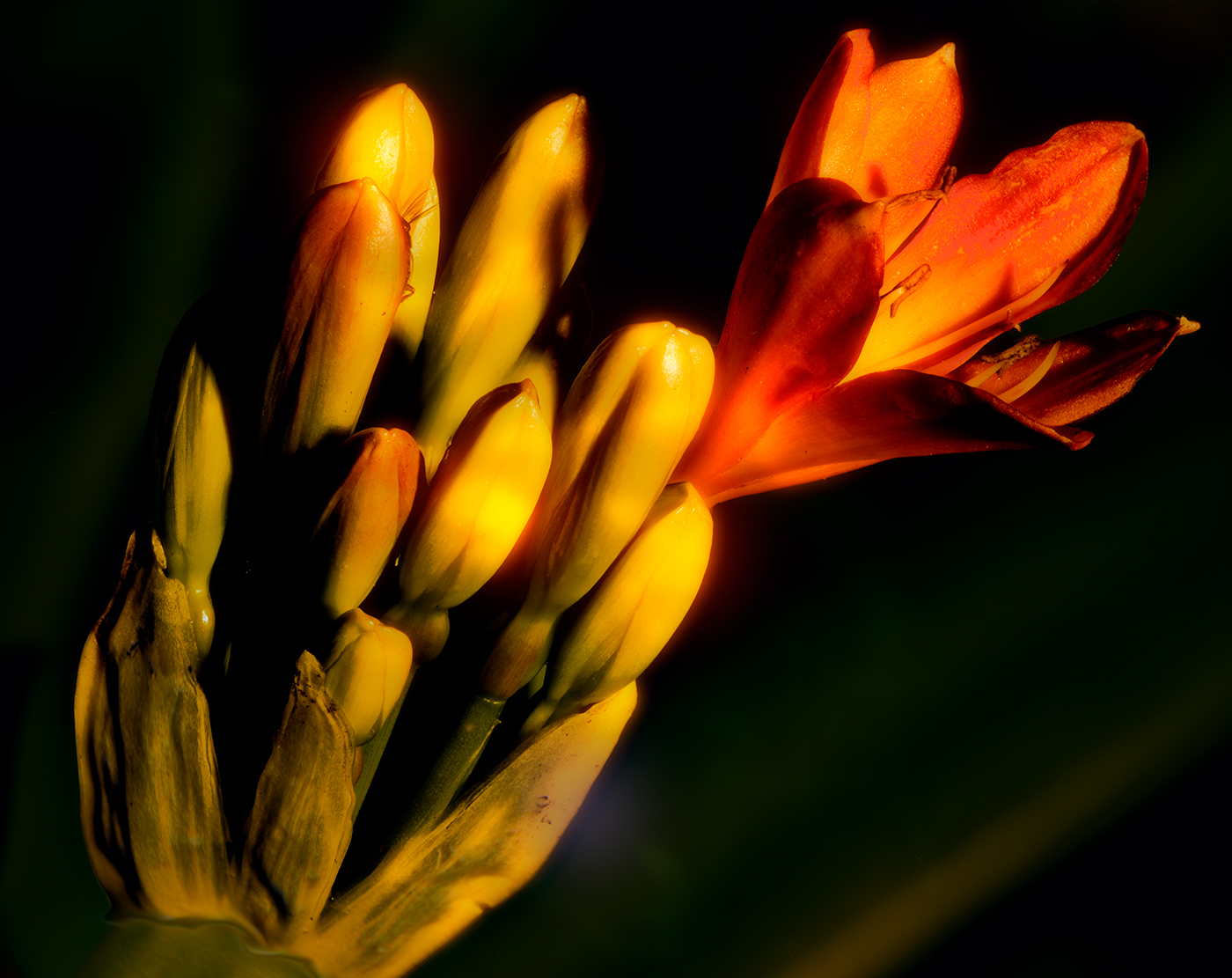
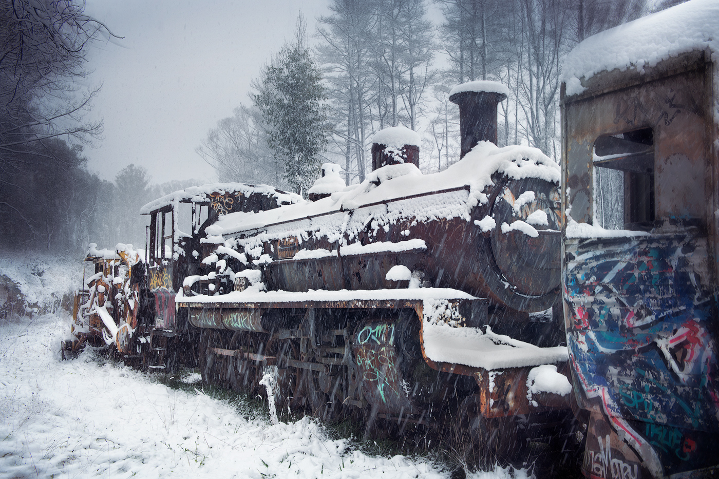
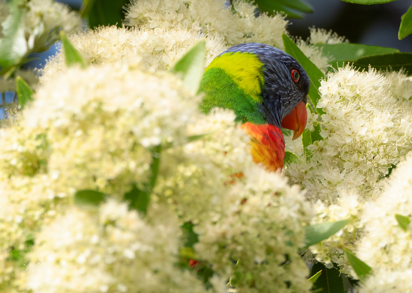
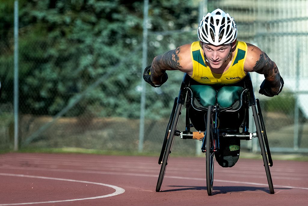
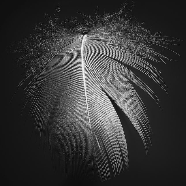
Hi Darcy great capture it's really nice when a model cooperates with you. Well captured with the dof being perfect for this image. Feathers are just right, not to sharp which is often a temptation with bird images. Exposure if good with no lost detail in areas where detail may have easily been lost. My only suggestion would be to tone down the background to eliminate the suggestion of the house in the background a bit more, a minor distraction for my eyes. |
Dec 3rd |
| 14 |
Dec 20 |
Reply |
Hi Greg thanks for that input, I see what you mean by the blown out sections, definitely need toning down.
Tom |
Dec 3rd |
| 14 |
Dec 20 |
Comment |
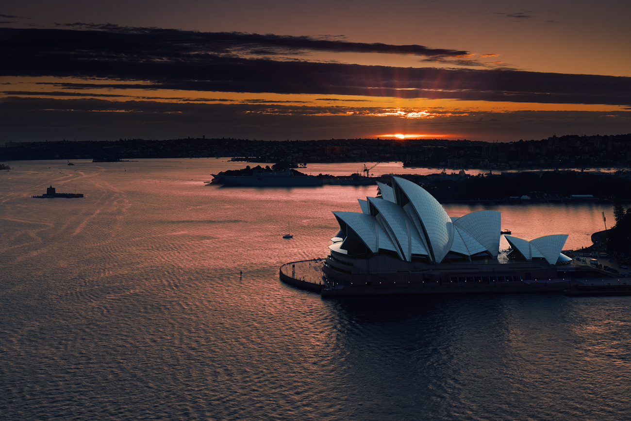
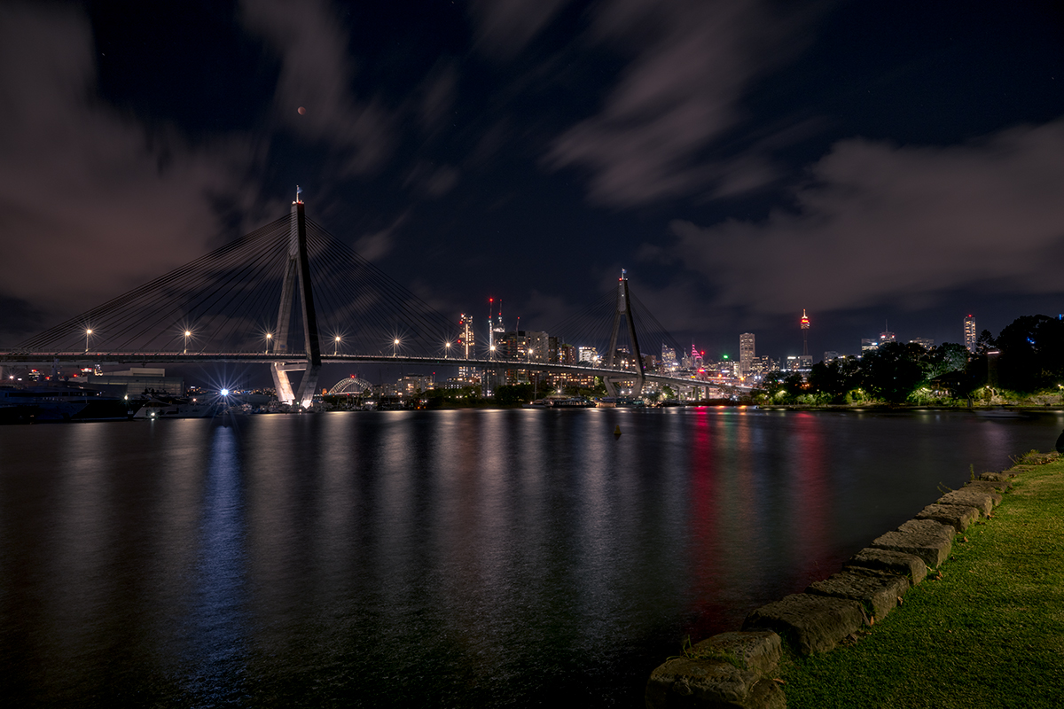
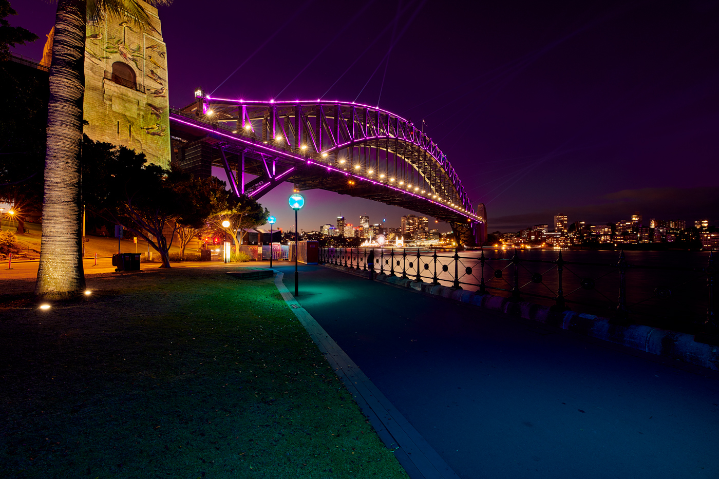
Hi John nice image great tonal range and contrast gives depth to the image and the elevated viewpoint contributes to making this a pleasing image. The hint of sky adds to the sense of scale to the location. While my eye is drawn to the lighter white colouring on the rock towers in the top right third, ( which I think is your intent with the composition) if I was to be really picky I might suggest leading the eye there by a soft informal vignette. Nice image |
Dec 3rd |
| 14 |
Dec 20 |
Comment |
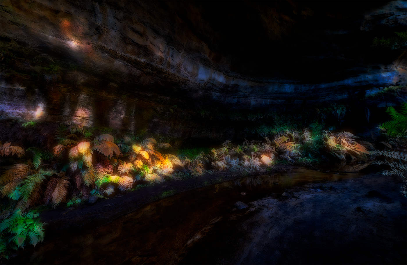
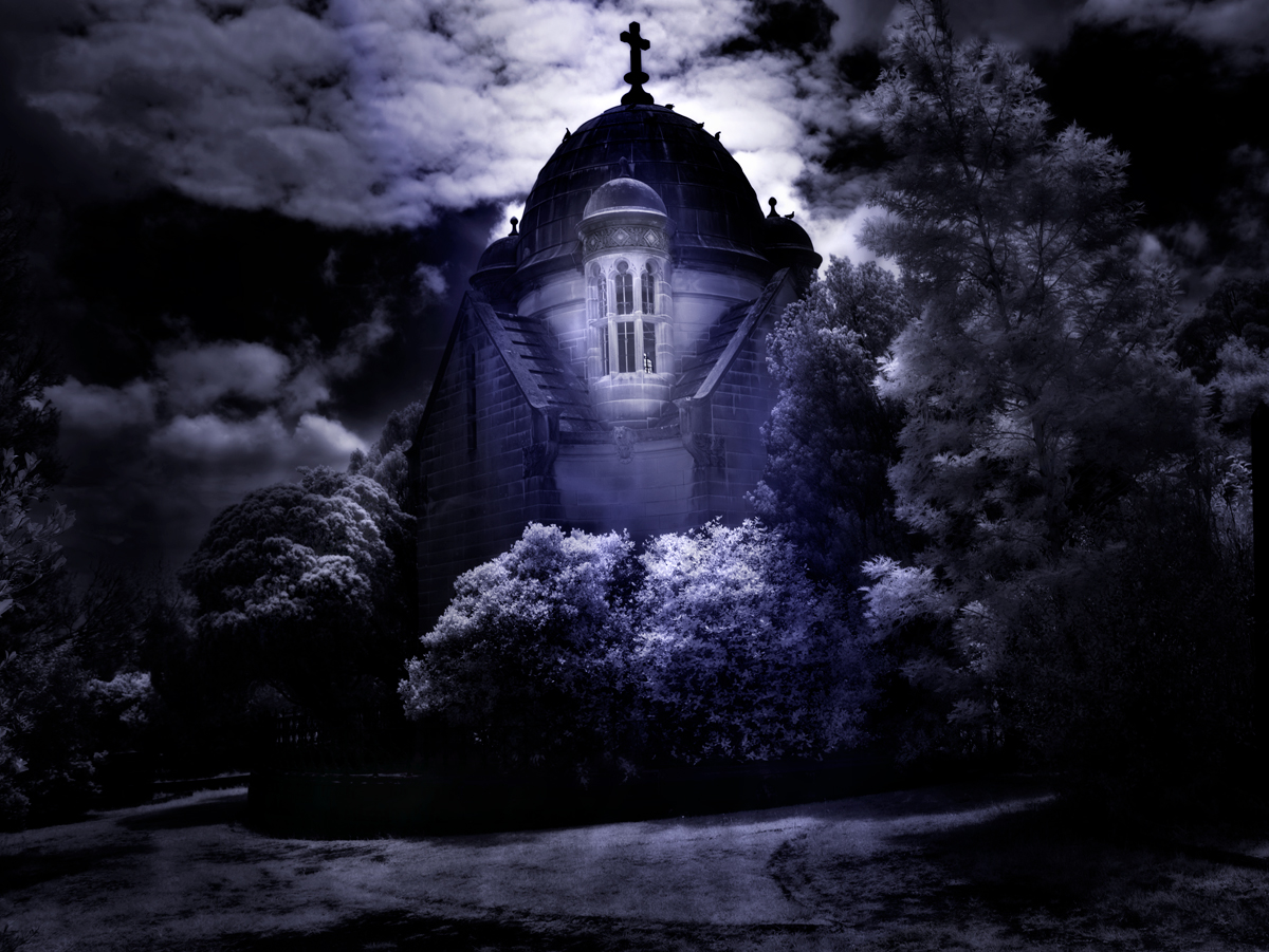
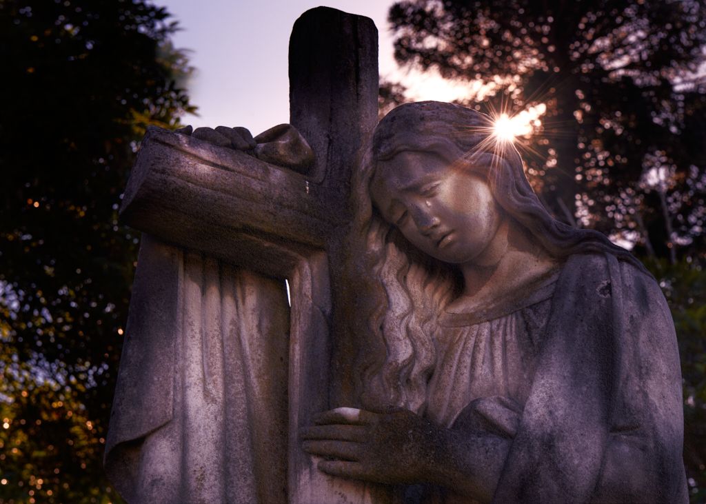
Hi Quang, great bit of light painting and use of the PixelStick. I think the semi circle being non formal adds to the image, with the model being slightly illuminated adding to the mystique of the image. The foreground illumination on the pathway is well captured. While I like the light painting I think you have to many elements in the image. For my eye I would have concentrated in just the model and light painting, other than suggesting the location I don't believe the memorial in the back ground adds to the image.
Nice image and well executed and processed. Inspires me to do some light painting |
Dec 3rd |
6 comments - 3 replies for Group 14
|
6 comments - 3 replies Total
|