|
| Group |
Round |
C/R |
Comment |
Date |
Image |
| 14 |
Nov 20 |
Reply |
Thanks Greg I appreciate the input |
Nov 4th |
| 14 |
Nov 20 |
Reply |
Thanks for that input Quang, I will have an attempt to balace that a bit more |
Nov 4th |
| 14 |
Nov 20 |
Reply |
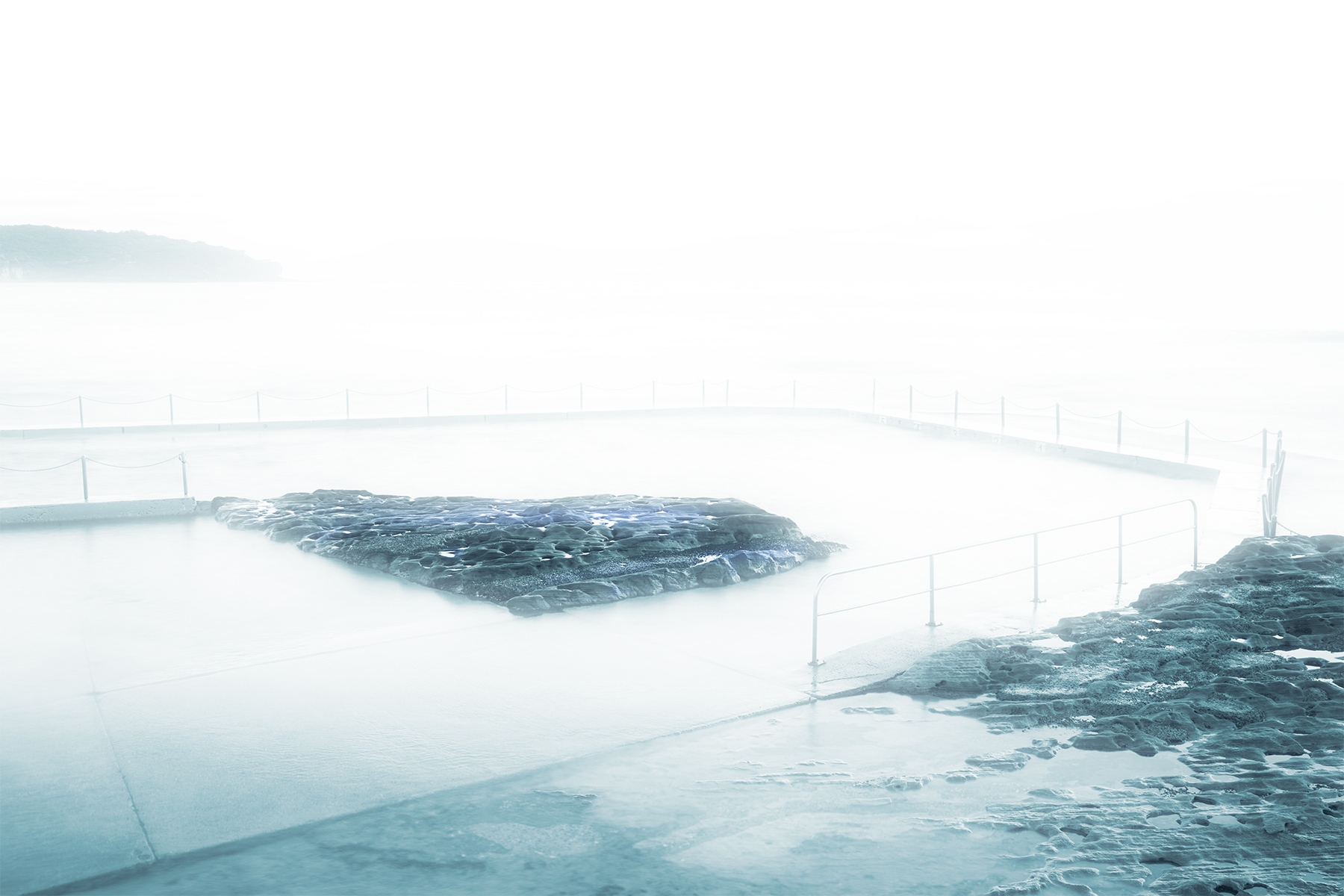
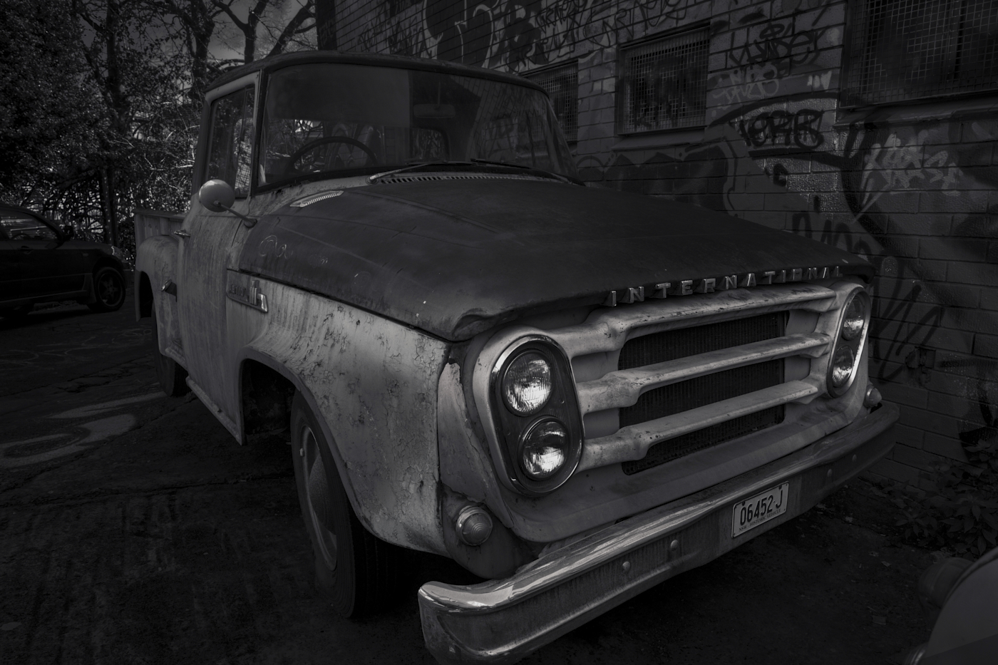
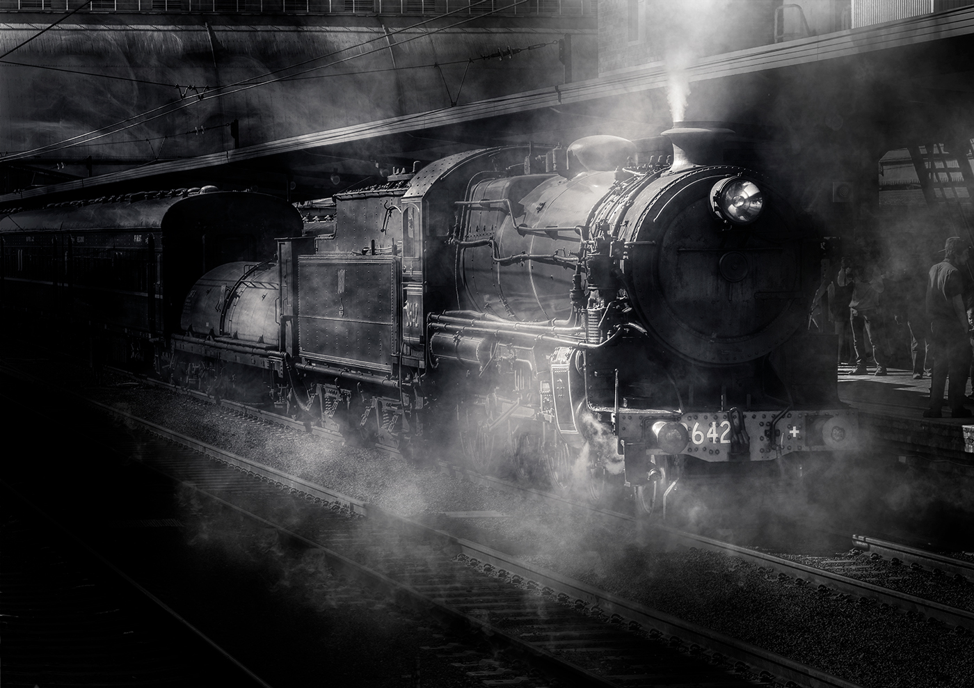
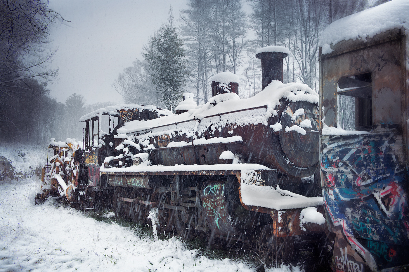
Thanks John, the foreground was an attempt yo provide a leading line into the image (light and dark) also to provide a sense of elevation. Unless the viewer sees it, it obviously was not achieved. we learn by trying, Thanks for the input |
Nov 4th |
| 14 |
Nov 20 |
Comment |
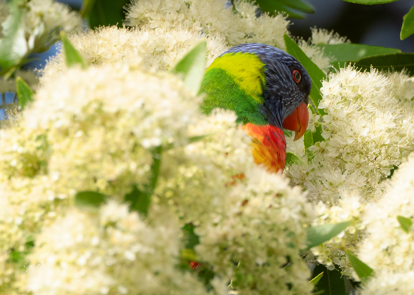
Hi Xiao, your choice of f-stop and your processing blurring the vehicles definitely separates the model from the background and makes her the centrepiece of the image. I like the reflection picked up in the sunglasses as well for some reason to me it gives a point of interest. My eye seems to be drawn to the green traffic lights which don't appear natural and detract from the image, might I suggest cloning them out they are not in my view necessary to the image. I also suggest you work on the models top right-hand side, hair and shoulder there is detail in your original which seems to be lost by the high key approach in the submitted image. You have definitely done a good job of separating the model from the very busy background thanks for posting. |
Nov 1st |
| 14 |
Nov 20 |
Comment |
Hi John welcome to the group looking forward to seeing your images in the future. This one beautifully presented product shot, well-balanced light brilliantly achieved with a single speed light. I like your background balance of dark to light definitely centres your eye on the bottle. On my screen the red of the label appears a bit oversaturated to my eye, I placed it in photoshop and it using a Hue saturation layer reduced the red only -24, again that's on my screen and I don't have the bottle to compare it to, although if I did have I would have drunk it by now. I also have a quandary with the bottom reflection, adding more of it I think would detract from the image and getting rid is totally I don't think is the answer either (puzzling to my eye) I will be interested to see if others comment on that as well. Well-balanced image thank you very much for posting |
Nov 1st |
| 14 |
Nov 20 |
Comment |
Hi Quang, welcome to the group I'm looking forward to seeing your images. A well-balanced image with a great range of autumnal colours, to me the image is balanced with the waterfall taking prominence in the frame, the various steps make a quite a spectacular fall. I like the inclusion of the people, gives a sense of scale to the image together with the long exposure effect just enough to give the swirl of the water in the foreground that sense of motion. A minor point but depending on your photoshop skills you may want to tone down the red garment on the person in the foreground the red really draw your eye detracting from the image. Unfortunately, the sky is a problem, cropping the image down to remove most of it I don't believe works the only thing I can suggest is a sky replacement in photoshop or whatever processing tools you use. Looks like quite a spectacular area you have found and sounds like, from your description, you have a choice of many waterfalls to capture. Thank you for posting your image |
Nov 1st |
| 14 |
Nov 20 |
Comment |
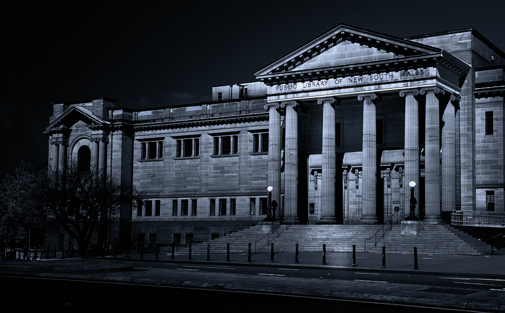
Hi Darcy, nice composition, The workers in the small boat definitely draw your eye initially and then lead you into the rest of the image with the wharf and flag post drawing the eye into the image further on up the street behind the wharf, well seen and composed. Good colour balance and you can definitely see the light of the early morning reflected in the buildings, the colour range is handled well with a huge diversity of colour without any being particularly overpowering. Not too sure if the bird the top of the screen adds much to my eye it is a bit distracting. I might suggest that you have a look at a crop, cropping out a lot of the right-hand side to give the flagpoles on the wharf more central position in the image, may make it look a bit more balanced, but again a personal choice but I would have undertaken thanks for posting |
Nov 1st |
| 14 |
Nov 20 |
Comment |
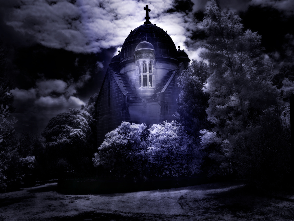
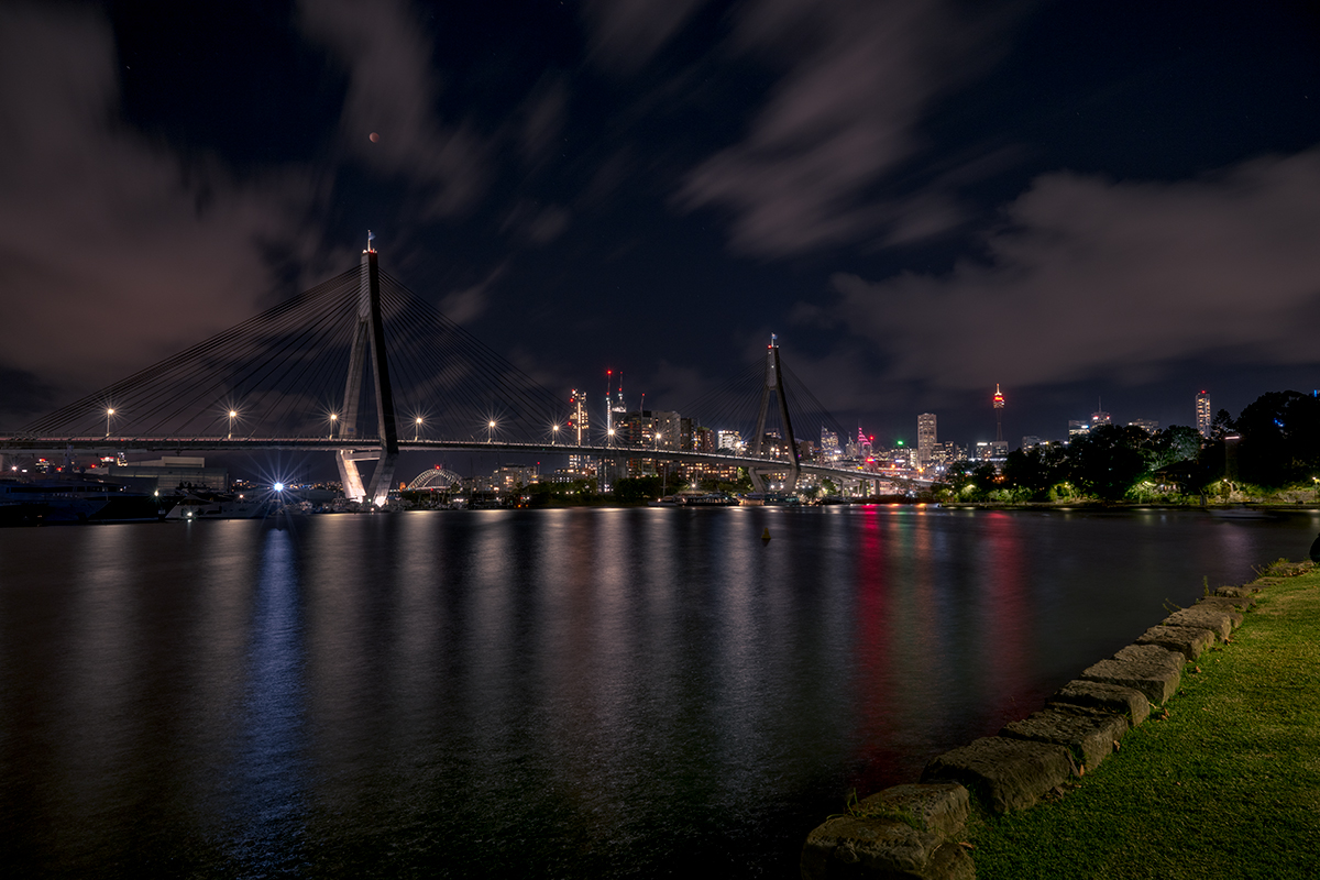
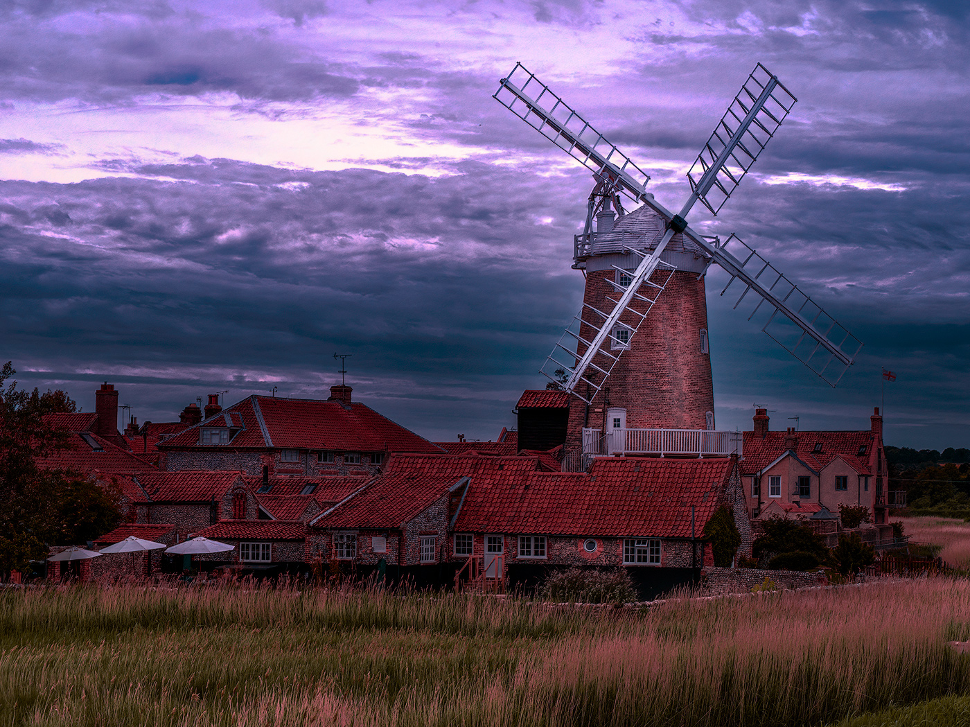
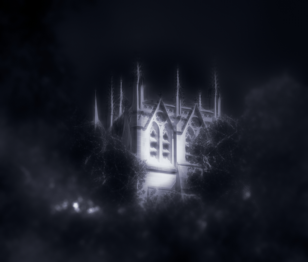
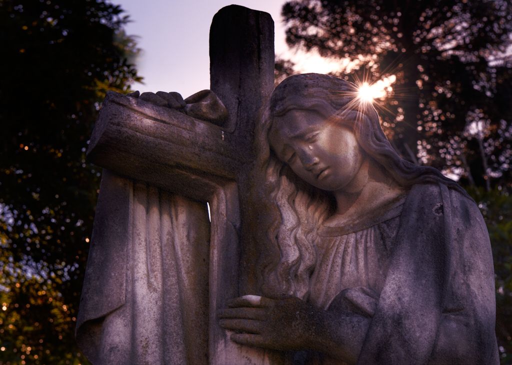
Hi Greg great image and well-handled sky replacement particularly around the trees and the cross on top of the tower, I cannot see any artefacts on the screen at all. Framing is nice with the trees on either side draws the eye into the image, together with the water and the reflections handled well. Nice colour balance and overall well taken and processed image. Very minor considerations perhaps the empty bit of ground adjacent to the river if it was mine I probably would have cloned out as it offers nothing to the image and perhaps small vignette on the top two corners, again minor considerations |
Nov 1st |
5 comments - 3 replies for Group 14
|
5 comments - 3 replies Total
|