|
| Group |
Round |
C/R |
Comment |
Date |
Image |
| 14 |
Sep 20 |
Comment |
Nice capture Xiao, the flags and street sign definitely set the scene of commerce and the model intent on the computer completes the story. Two things I would address are the bright red coat of the person on the street, just desaturate a bit, the red immediately draws my eye. Also the utility box behind the model seem a bit out of place for this image. I like you choice of depth of field, works well. |
Sep 13th |
| 14 |
Sep 20 |
Comment |
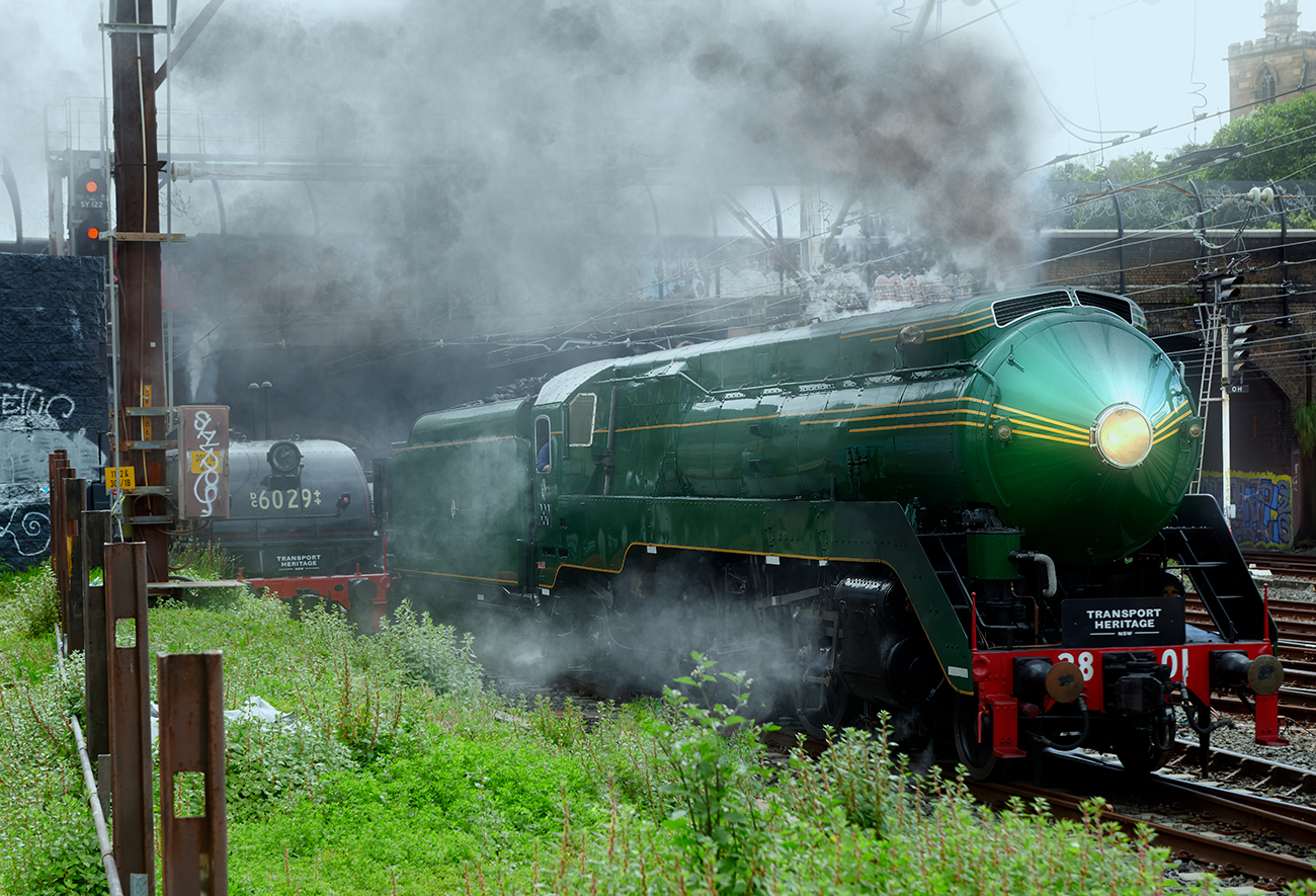
Hi Syed, you have certainly done a good job converting this from the original. For my eye I think the crop is to close to the right edge, planes don't seem to have anywhere to go, I would place the middle plane on the left third area leaving the space at the front. The smoke is interesting however I don't believe you need that much to tell the story. On my screen the red smoke seem over saturated. Nice capture hand held. |
Sep 13th |
| 14 |
Sep 20 |
Reply |
Thank you for that Darcy I see what you mean with the lighting, I may tone it down in a number of areas |
Sep 5th |
| 14 |
Sep 20 |
Reply |
Thank you for that Darcy I see what you mean with the lighting, I may tone it down in a number of areas |
Sep 5th |
| 14 |
Sep 20 |
Comment |
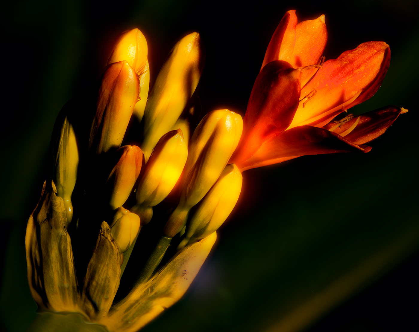
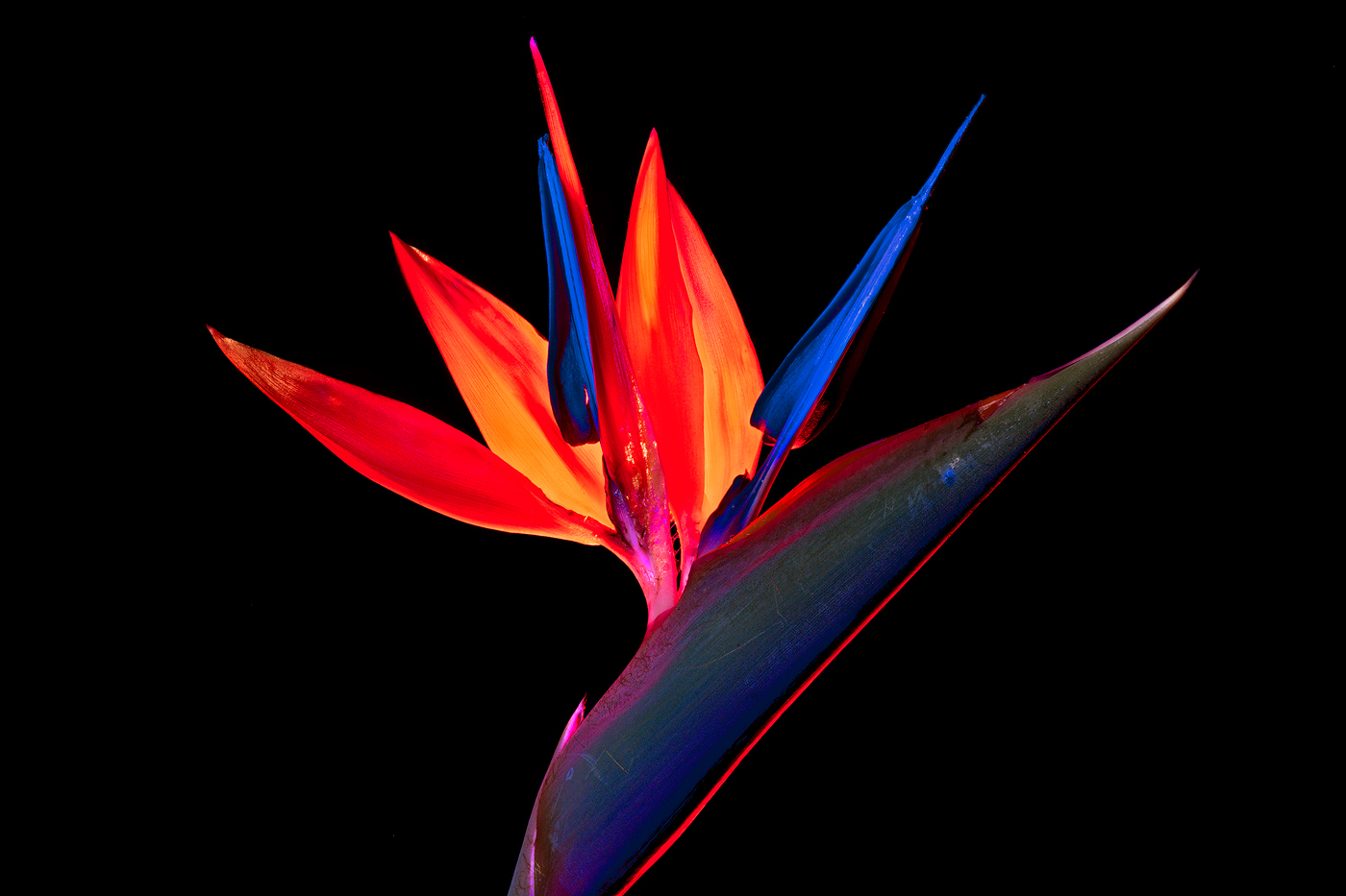
Nice image with very vibrant strong yellow. You have captured the light well and I like your framing you have chosen, most would be tempted to include the whole flower, this framing for me works very well. I did have a play with your image and by a simple horizontal rotation (to me) it looks a bit more balanced I also darkened the background a touch to place more emphasis on the flower. I agree a visit next season would be a worthwhile exercise |
Sep 4th |
 |
| 14 |
Sep 20 |
Reply |
Thank you for that input Arun, I will play further with the image |
Sep 4th |
| 14 |
Sep 20 |
Comment |
Nice image, I like the textures and the range of textures you have been able to achieve, good idea to have one of the cans in opposition to the other two, my eye is drawn immediately to this V formed by the two cans. The lighting on the can is handled well and except for a minor loss of detail on the center cans highlight, it works well. While I have not seen the original if possible I would have cropped a bit wider giving a bit of breathing space on the the left of the image but that is personal preference. Other than that a well handled image and good B&W treatment
tom |
Sep 4th |
4 comments - 3 replies for Group 14
|
4 comments - 3 replies Total
|