|
| Group |
Round |
C/R |
Comment |
Date |
Image |
| 14 |
Jul 20 |
Comment |
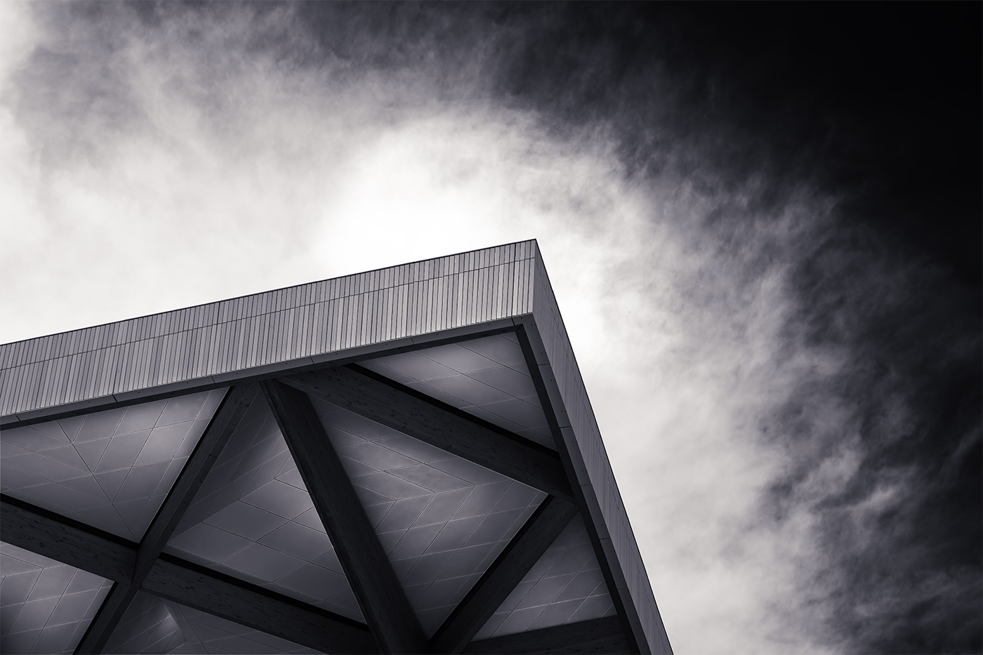
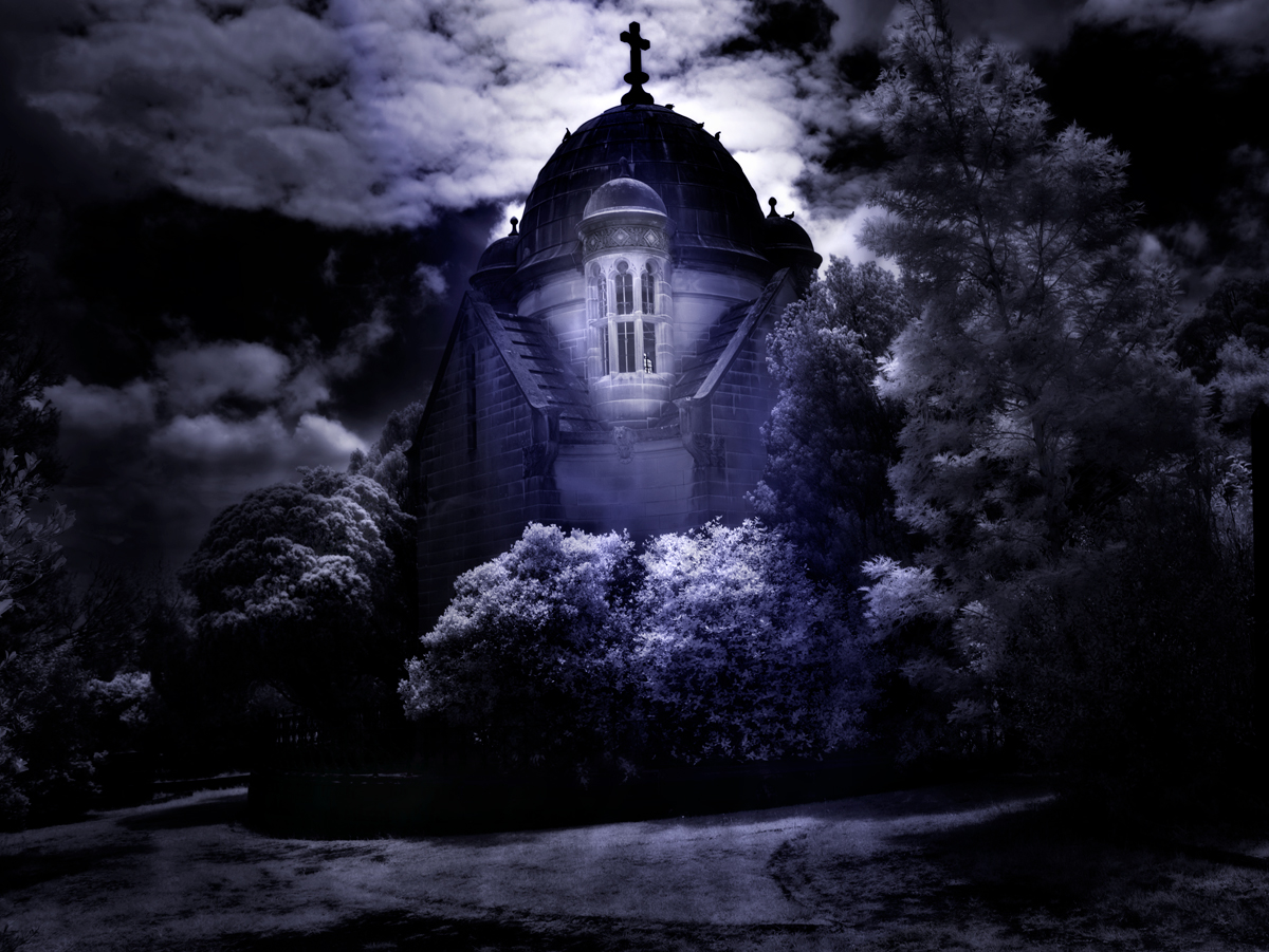
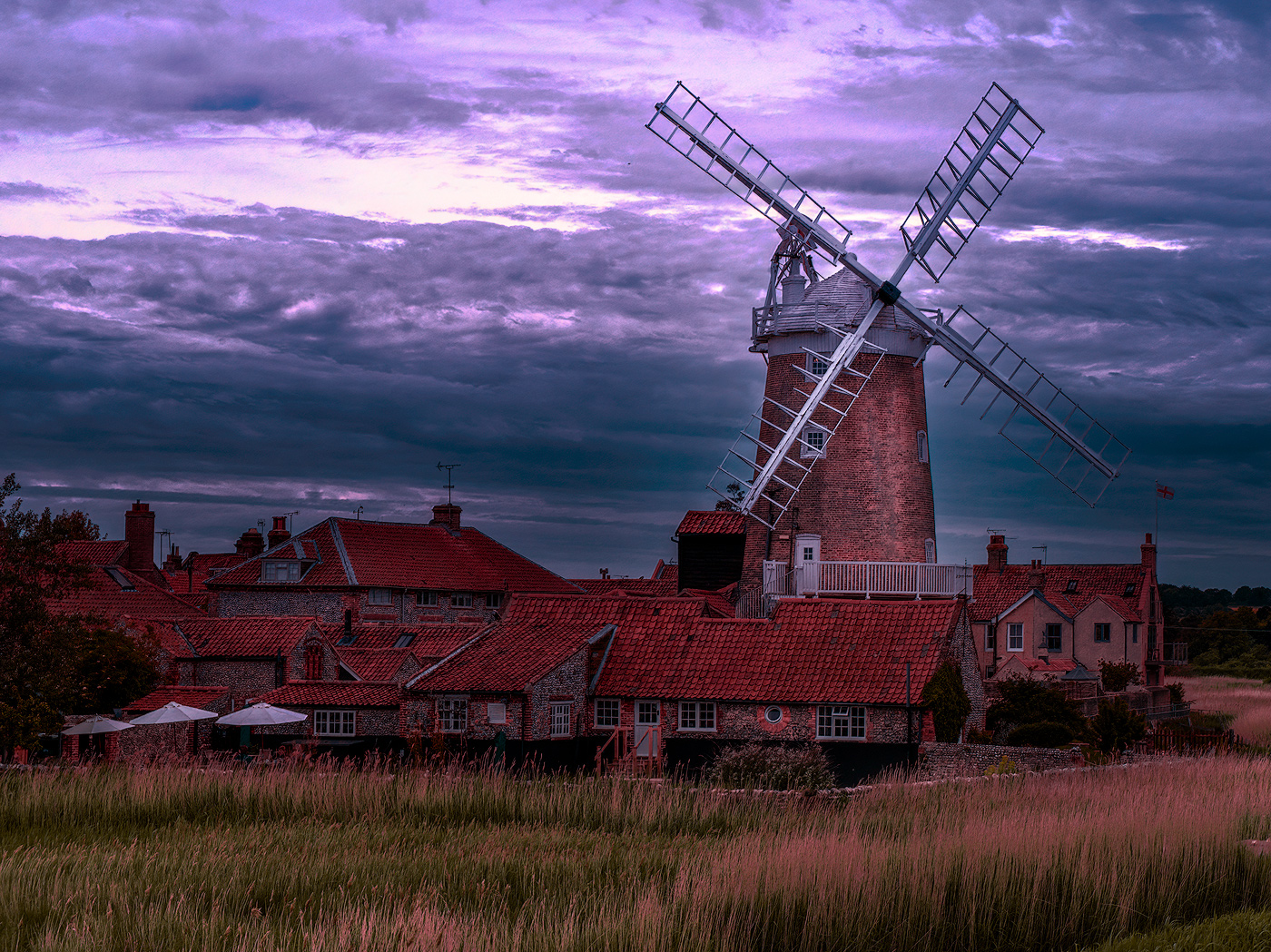
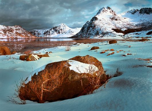
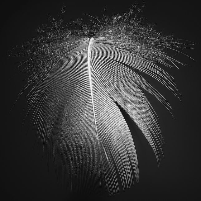
Good choice to go black and white with this, strengthens the image without any distracting elements. Sky is handled well My choice would have been to darken it a little (very little) more to add contrast and perhaps to brighten the clouds just at the peak (again very little)to highlight with contrast the peak. I am with the others on the trees at bottom left, while I think it grounds the image and is necessary, I question if there was a way to add a bit of detail to the blackness.
nice image |
Jul 28th |
| 14 |
Jul 20 |
Comment |
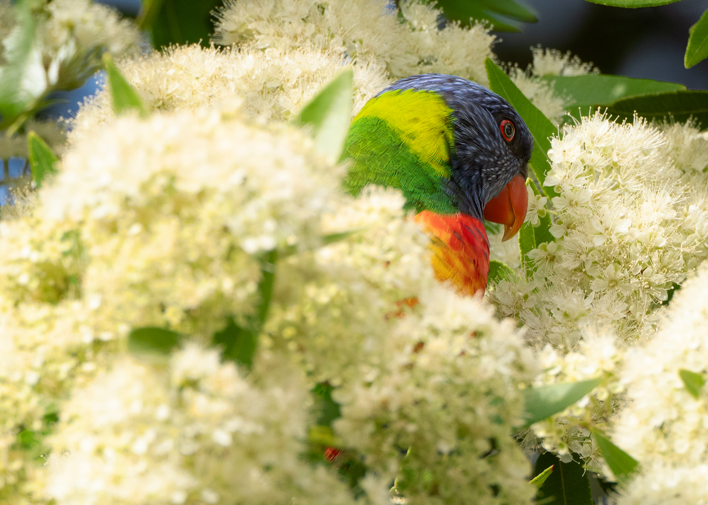
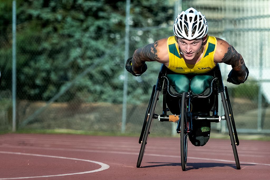
Wow the vibrant colors really stand out with the positioning of the main body framed well makes for a striking image. the converging lines into the distance adds to the effect and gives a sense of distance, Nice image I really like it. |
Jul 28th |
| 14 |
Jul 20 |
Reply |
Thank you for that Xiao, from your and other comments I will need to work on the sizing of the images I submit. Thank you and stay safe |
Jul 7th |
| 14 |
Jul 20 |
Comment |
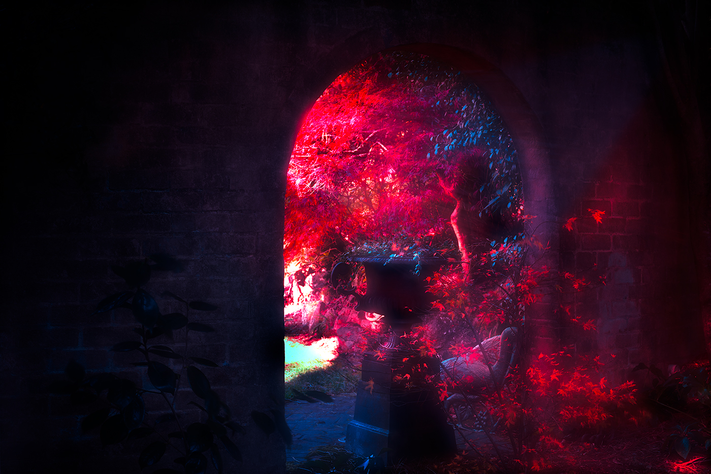
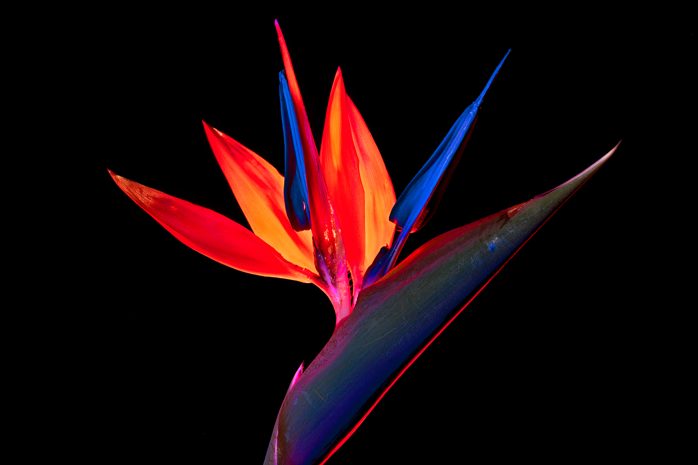
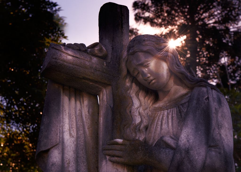
Hi Xiao Strong image and the model isolated against the background, with no distracting influences makes the image intent obvious. Red being a very strong color, for my eye I would have toned that down a little leaving the model with the strong lighting. I think that would make the model stand out from the background a bit more, very subjective of course. |
Jul 7th |
| 14 |
Jul 20 |
Reply |
Worked well a much better balance across the image. |
Jul 5th |
| 14 |
Jul 20 |
Comment |
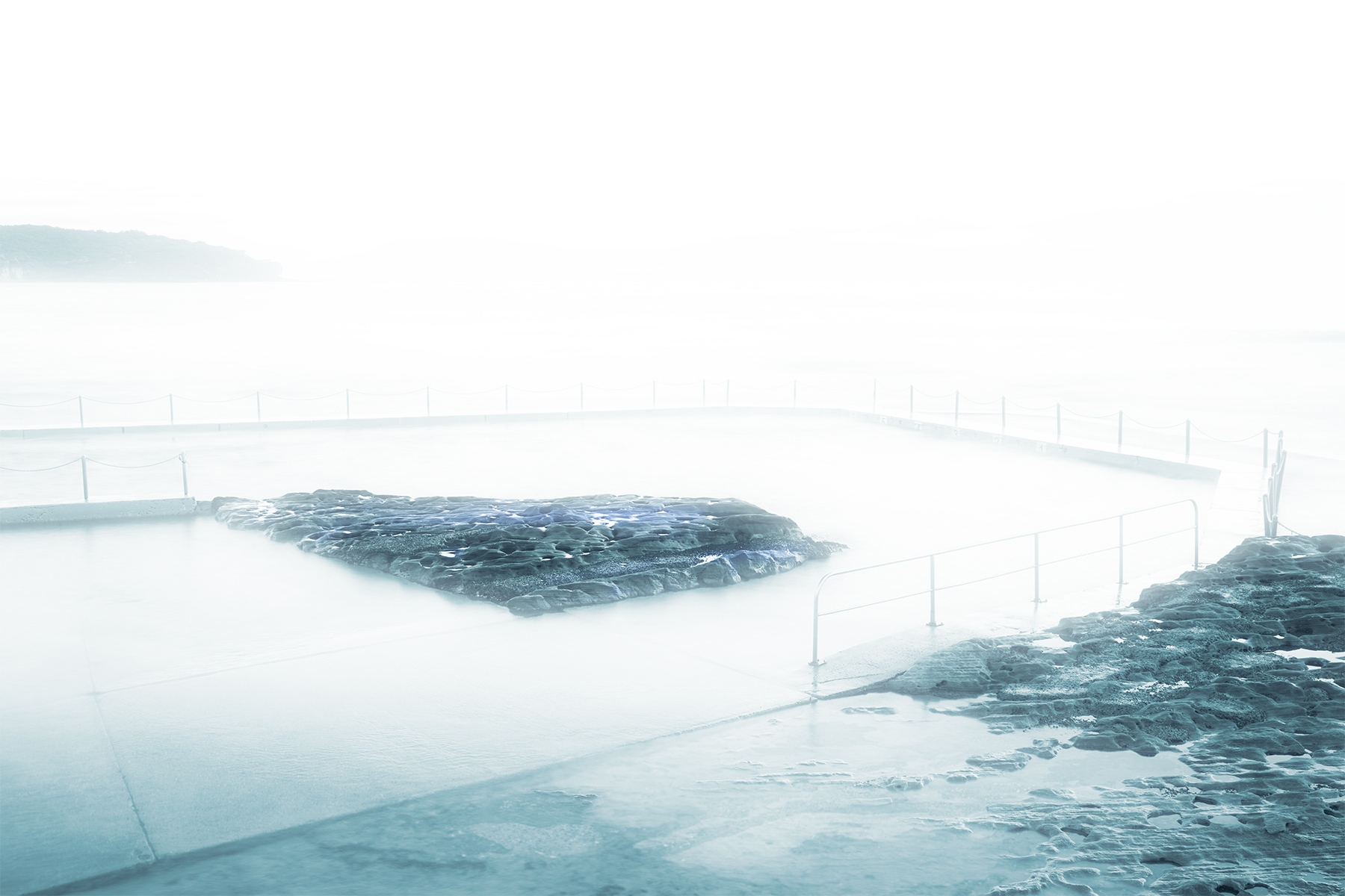
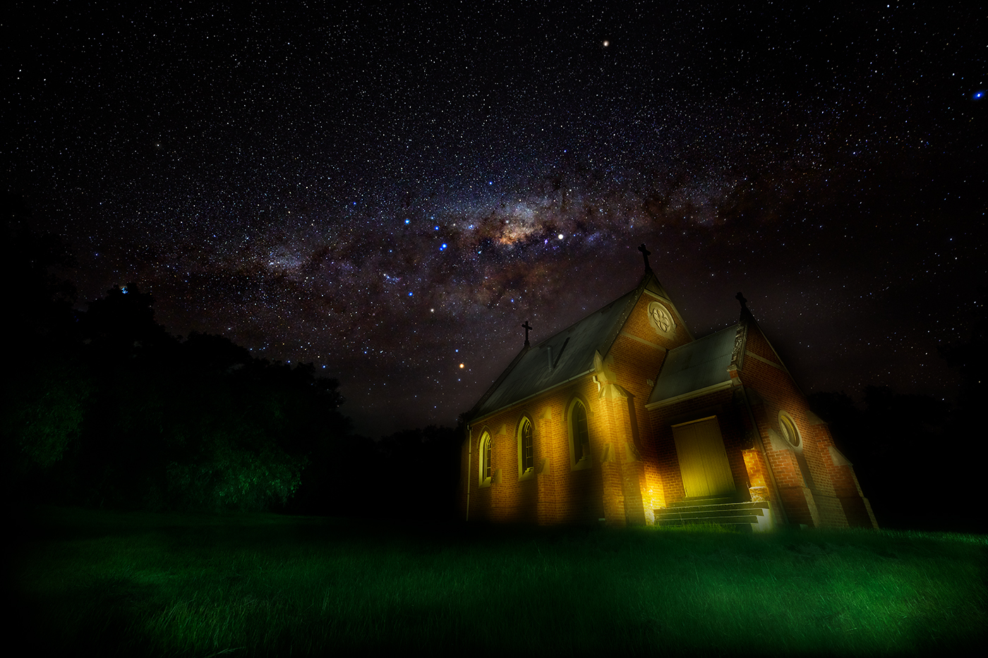
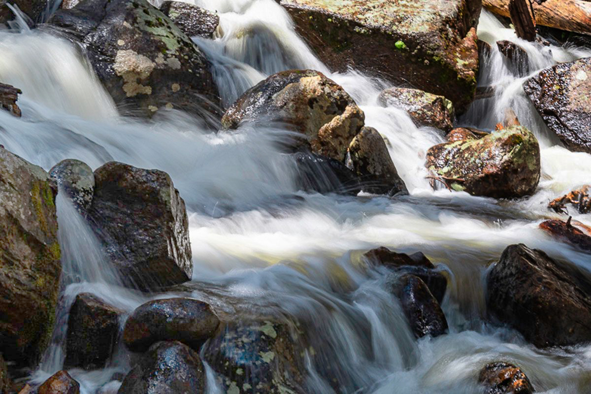
Hi Darcey nice image and creative to zone in on a particular small area of an environment as opposed to a wide shot of the whole environment as we normally do. I agree that the top right corner needs to be adjusted but as it does not have any major blown out zones, I would adjust the lower left. The lower left is pushing the black close to losing detail. I hope you dont mind but I applies a gradient to you image as I discussed (attached). Off course this is based on what I like , as we no know there multiple ways to adjust an image. Stay safe |
Jul 4th |
 |
| 14 |
Jul 20 |
Reply |
Thank you Darcy |
Jul 4th |
| 14 |
Jul 20 |
Reply |
Thank you for that Arun, appreciate your comments and agree with your comments on image size. Stay safe |
Jul 4th |
| 14 |
Jul 20 |
Reply |
Thanks Greg, on a second view I agree that the red is prominent, I will re visit and play with the colour balance , Thank you |
Jul 2nd |
| 14 |
Jul 20 |
Comment |
Hi Arun
lovely image and composition,I particularly like the way the road draws your eye to the tower mountain. The monolith itself is handled well with the contrast between sky and the mountain separating the two elements and making the mountain the prominent element in the image. Your handling of the detail between the original and the final image colour and the contrast particular in the sky is handled well. There is one minor consideration with your editing, the monolith itself has a small amount of halo around the full area with it being quite evident at the right-hand base of the mountain and around the trees, I would suggest with your obvious ability to handle photoshop you could easily get rid of these as well. Lovely image thank you for sharing Tom |
Jul 2nd |
| 14 |
Jul 20 |
Comment |
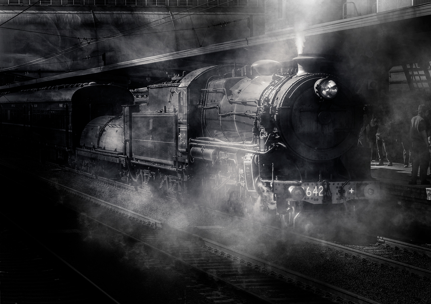
I agree with your decisions on the framing choices and extending the frame on the left, giving the surfer somewhere to go. I also notice you were able to recover the face of the surfer Which appears to be lost in the colour image. Minor critique is the waves behind the surfer seem to be blown out ( on my screen) Can I suggest as its B&W Toning down the image and highlighting the area around the surfer to draw you eye directly to him. Nice capture |
Jul 1st |
6 comments - 5 replies for Group 14
|
6 comments - 5 replies Total
|