|
| Group |
Round |
C/R |
Comment |
Date |
Image |
| 32 |
Aug 20 |
Comment |
Thanks everyone for so much feedback! Really appreciated. I have just submitted this image to a couple of competitions, and look forward to get some judges' evaluation as well.
Yes, it is unfortunate that the plastic container was there, but colorful plastic stuff is so much more used in poorer countries, and is a typical part of the scenery. In an Open Mono contest I may darken the container and make it disappear. So far I have kept it there. Will be interesting to try various versions, in categories where one is allowed to delete things from the scene. Thanks all! |
Aug 18th |
| 32 |
Aug 20 |
Reply |
Thanks Jennifer, for an expert explanation. And now I have looked at the image both ways, and understand what you say. |
Aug 18th |
| 32 |
Aug 20 |
Comment |
A nice candid shot documenting an important historic event. I also noticed first the partial face, which made the image itself more attractive. Perhaps what a pro street photographer would have done to add impact? |
Aug 18th |
| 32 |
Aug 20 |
Reply |
It is a nice image that Lynne made of this old church. I agree with most comments that the sky needs to be darker, to take advantage of the nice clouds and have them stand out and improve the image. Tom, I ended up with a result mostly like yours, but with a mono door. I feel the other alternative with the darker church building (sorry Diana), gives a too sombre impression. |
Aug 18th |
| 32 |
Aug 20 |
Comment |
Jennifer, I love this image. I agree with Diana and Stephen in that it needs to be a little darker. I worked on it by simply darkening the mid-tones, and then lightening it up a little, to my liking. It ended up quite similar to Stephen's version. The image is great, and you inspired me to dig into my small library of photo books to find the one I have of Ansel Adams' images of mountains and trees.... Great, I have not opened this book for many years. I would have tried it in a competition, but a darker version. |
Aug 18th |
| 32 |
Aug 20 |
Reply |
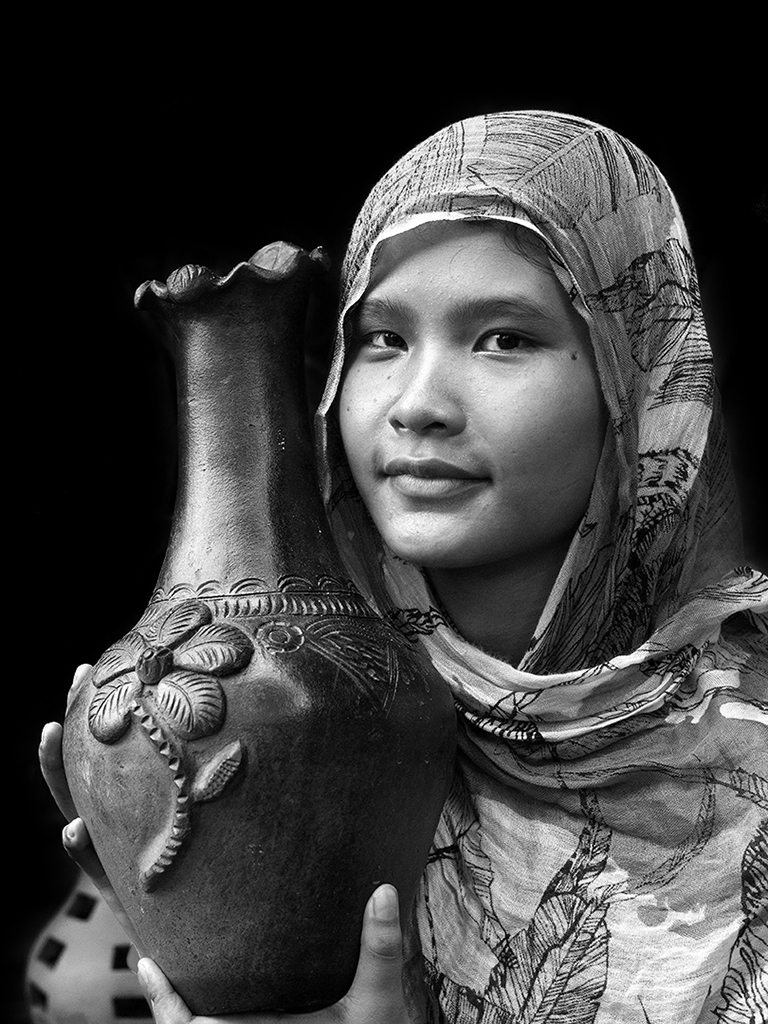
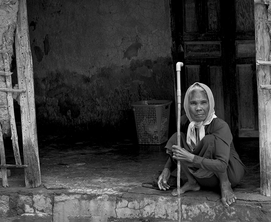
You are right, in the original image the headscarf attracts much attention. And the first thing I did when starting editing, was to get rid of her bright shoes.
In the mono image, I have now tried to lighten the background. Do you think it helps, or is the dark background still a show-stopper for the mono image? What do others think. See attached new version. |
Aug 6th |
 |
| 32 |
Aug 20 |
Comment |
Tom, the mono version is much better than the color one. And I fully agree that the branches over the barn makes a very nice, and important impact. But, sorry for my ignorance - why did you reverse the image? (I read your comments, but still there is something I did not get?) |
Aug 6th |
| 32 |
Aug 20 |
Reply |
I think your tweets added even more drama to the image, it worked well for me. And the lightening up of the grass made the image stand out more. |
Aug 6th |
| 32 |
Aug 20 |
Comment |
I think the result was pretty good, original idea (no balancing eggs...) and expertly done. Using the dehaze button here I would not have thought of. It shows another area where this function is useful. Also, the reflections on the glazing plate worked very well. I would surely have tried this image in some PID-M sections and see what some judges say... If you do, keep us info'd.
|
Aug 6th |
5 comments - 4 replies for Group 32
|
5 comments - 4 replies Total
|