|
| Group |
Round |
C/R |
Comment |
Date |
Image |
| 32 |
Jun 20 |
Reply |
Thanks. Now I see what you did, and you went much further in darkening the blue and cyan. To me it feels too dark, but the exercise with dodge and burn was worth it. I would normally have used other tools, so now I have tried dodge/burn. It's funny, my photographic experience all started in a darkroom, where dodge and burn were important functions, using paper cuts or just the hands to cover or open areas of the photo paper in the tray. Now in the digital age I have avoided these tools. Until today...
|
Jun 14th |
| 32 |
Jun 20 |
Comment |
Stephen - I agree the narrower crop makes the image stand out. And the b&w version is more interesting that the color one. Nice. |
Jun 13th |
| 32 |
Jun 20 |
Comment |
Lynne - some times I take close up shots like this as well, In particular now, when our movements are so restricted. When I take my ship photos in the port areas, I also shoot ropes, shore lines, buoys, rusty anchors, etc. Never intended to hang on my walls, or submit to a contest - just playing with contrasts, cropping, lines, various monochrome, and so on. Well, if I have time |
Jun 13th |
| 32 |
Jun 20 |
Comment |
I tend to agree that the top half is the interesting part of the image. The lines in the lower part, with the balcony (I think it is), confuse me, and perhaps make me loose interest in the full frame. Diana's suggested crop gives a much cleaner impression, and attracted me to look again.Could perhaps be interesting if you revisited this building, and found other angels. There are so many lines... |
Jun 13th |
| 32 |
Jun 20 |
Reply |
Thanks Gloria - I hope you can put Norway into your travel plans. Too bad now that none of us, or most other people for that matter, can move too much around. We were supposed to be in California right now, visiting our youngest daughter and her young family for our grandson's one year birthday. |
Jun 13th |
| 32 |
Jun 20 |
Reply |
Thanks Diana - can you attach the version you made? Would be interesting to see your tweaks in practice. Looking forward to seeing it. I followed all your alterations, and I increased the R/Y/G by 20, and reduced Blue/Cyan by 20. For the clouds i used dodging by 30% and no hardness.I cropped top and bottom a little bit. The cropping was great I think.But the end result became a little too dark, so I felt I had to lighten the whole image by increasing Exposure by 0.4 steps. But, I am not enough experienced using all the goodies in PShop, mainly using the various alternatives under ''Layers'', and then some of the tools. Still a lot to learn... |
Jun 13th |
| 32 |
Jun 20 |
Reply |
Thanks Lynne - like I said to Stephen, I am sorry to be a bit late responding. I am glad you enjoyed the photo. |
Jun 13th |
| 32 |
Jun 20 |
Reply |
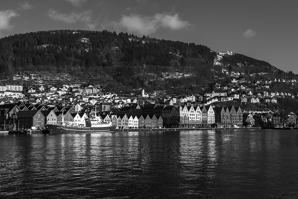
Thanks Stephen - Sorry for somewhat late response, I've been away from the pc all week. Coincidentally, I made a print of this image for an exhibition we had with the local camera club, where the theme was ''downtown Bergen'', and all photos were supposed to be square (60x60cm). The crop was a bit like yours, with some more space taken away from the left side. The consensus was that this image did not fit well into a square shape. Probably because all viewers knew the motif too well and felt they missed something when looking at the image...
Anyone not familiar with the place can much more easy crop and leave out things. Your crop gives a bit more balance in the image. |
Jun 13th |
| 32 |
Jun 20 |
Reply |
This is a tough one. When I saw the first image, I found the entry point quite natural.Then I saw the second version, where you moved it slightly away from the corner - I looked, and I looked again. For this image I will say that it looks slightly more natural that the stem comes into the frame from the ''bottom'', the horizontal side. But I am probably not too fuzzy about it. |
Jun 6th |
| 32 |
Jun 20 |
Comment |
Hi Diana - I really like the conversion. It now looks like a nice and soft pencil drawing, well positioned on the sheet. I must admit I very seldom think about flipping an image, but here it worked well. |
Jun 3rd |
| 32 |
Jun 20 |
Comment |
Hi Gloria - beautiful rose, and a nice close up shot. But for me, I think I would have kept the colors, and tried to push the contrast between yellow in the center, and all the white. I think it was a good idea to leave the leaf there. |
Jun 3rd |
| 32 |
Jun 20 |
Comment |
Hi Tom - to me, it was an excellent choice to make this image tinted.The color version is pretty straight, bleak colors and perhaps not drawing too much attention. The minute you switched it to monochrome, and in particular the choice of sepia, rose it from a bit ordinary to really catching my eye. It added atmosphere, and could have been taken fifty years ago...
In my book, well done! |
Jun 3rd |
6 comments - 6 replies for Group 32
|
6 comments - 6 replies Total
|
