|
| Group |
Round |
C/R |
Comment |
Date |
Image |
| 21 |
May 20 |
Reply |
Joan, I appreciate your comments. The main photographic images in any of my artistic photos are my own originals. I use others stock photos only with permission, either from the website or the individual, when I want to convey something with the photo that I don't have access to with my own in camera work. Please let me know if I should refrain from using all stock photos in this group. I am more than happy to follow the groups guidelines. |
May 17th |
| 21 |
May 20 |
Reply |
Larry, I usually work somewhere between five and 10 hours on a particular picture over the course of several days. I have an image in my mind when I start but it very rarely looks the same when I finish. Thanks for asking. |
May 17th |
| 21 |
May 20 |
Reply |
Brian, thanks for your welcome and your thoughtful comments. Part of what I was trying to convey in the photo is the conflict that we often experience when we try to reconcile diverse images or ideas. When I say stock photos I mean photos that either came as downloads with a learning unit I purchased for from a royalty-free/free copyright website like Pexels or Pixabay. |
May 17th |
| 21 |
May 20 |
Reply |
Peter, thanks for your thoughtful comments. I agree with your perspective when it comes to using photos or pieces of photos that are not your originals. |
May 17th |
| 21 |
May 20 |
Comment |
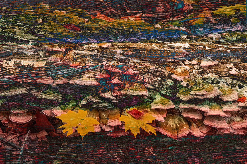
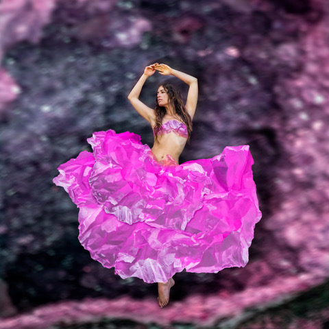
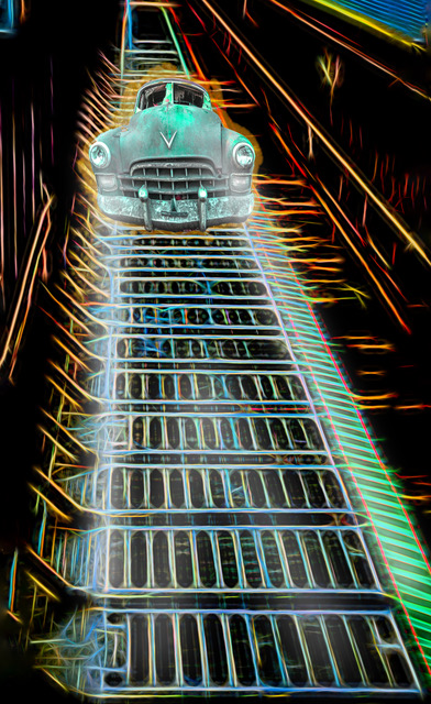
Amazing Peter, even though you explained how you did it I would have to see it done to be able to comprehend. The bottom part of the picture reminds me of a wildflower garden and the top part like a parade. In the very top, green, I see a cartoon figure with eyes and mouth and their hair combed off to the right. Well done, very creative. |
May 16th |
| 21 |
May 20 |
Comment |
|
May 16th |
 |
| 21 |
May 20 |
Comment |
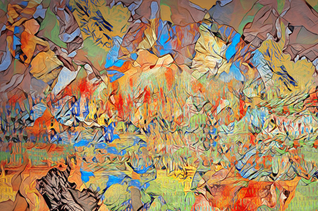
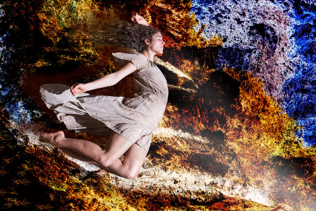
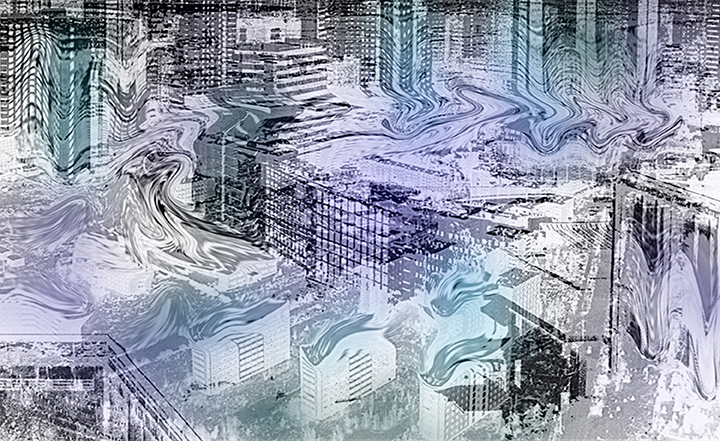
Brian, I particularly like the way you blurred just the tops of the building at the bottom of the picture, it makes it look like they are in flames. It seems like the liquify tool was a great choice for the emotion you are trying to portray. I missed some color, because I am a color kind of guy, so I added some to see what it would look like. I think the color helps bring out some of the contrast but I like your original better. |
May 16th |
3 comments - 4 replies for Group 21
|
3 comments - 4 replies Total
|