|
| Group |
Round |
C/R |
Comment |
Date |
Image |
| 26 |
Apr 26 |
Reply |
Thank you, Bob! I'll try that! |
Apr 18th |
| 26 |
Apr 26 |
Comment |
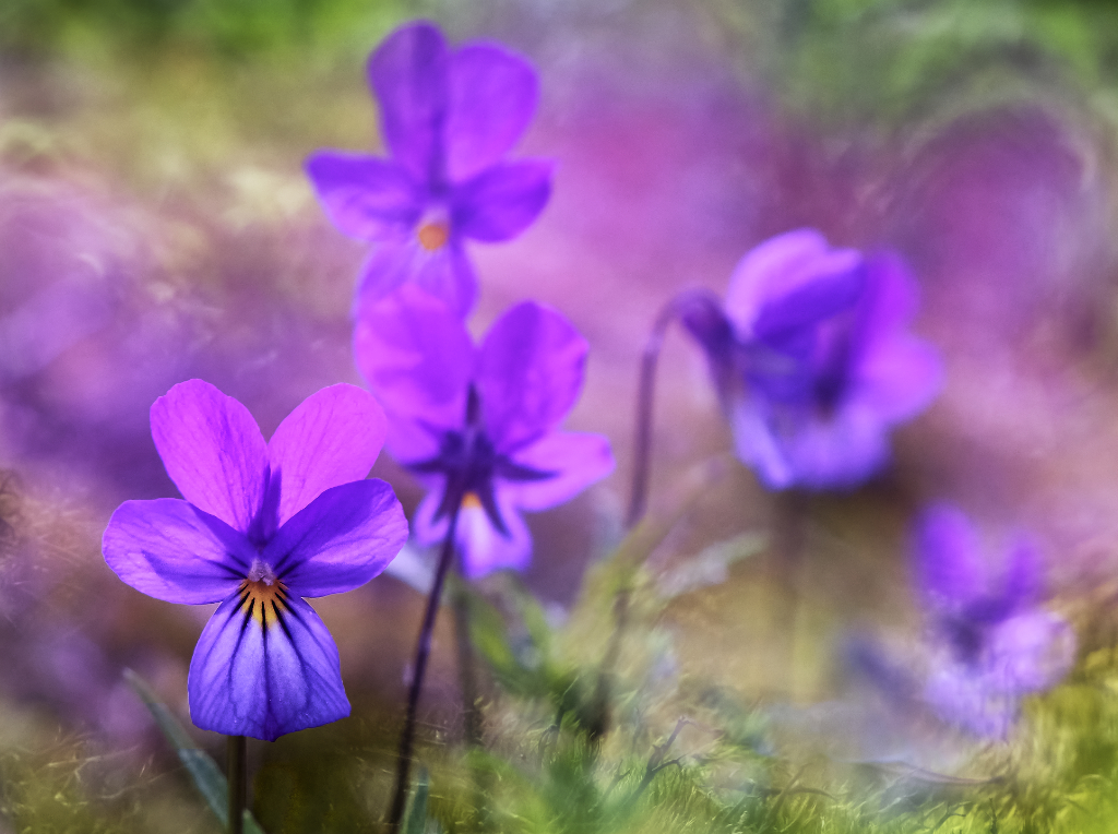
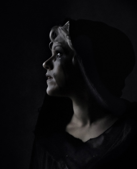
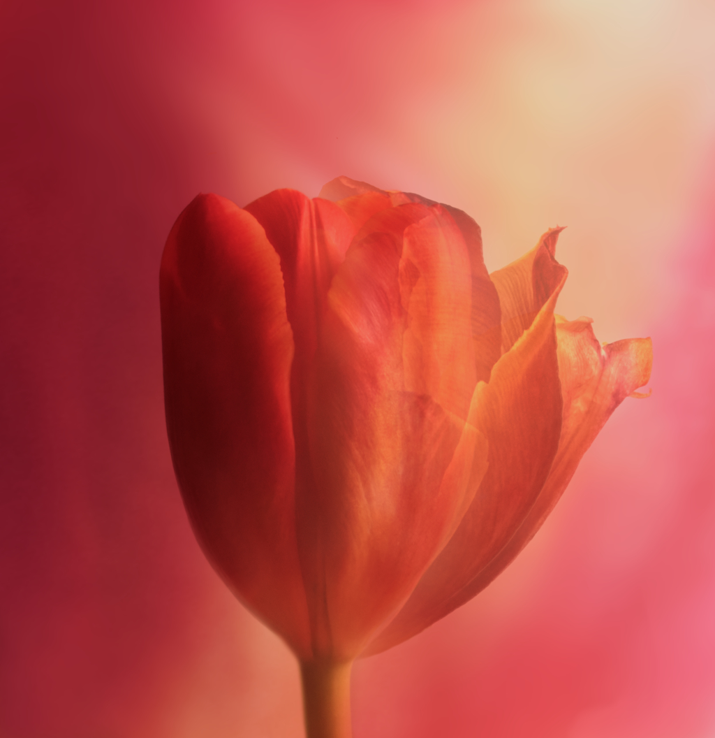
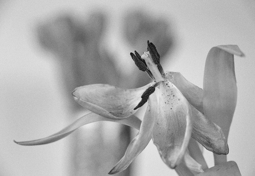
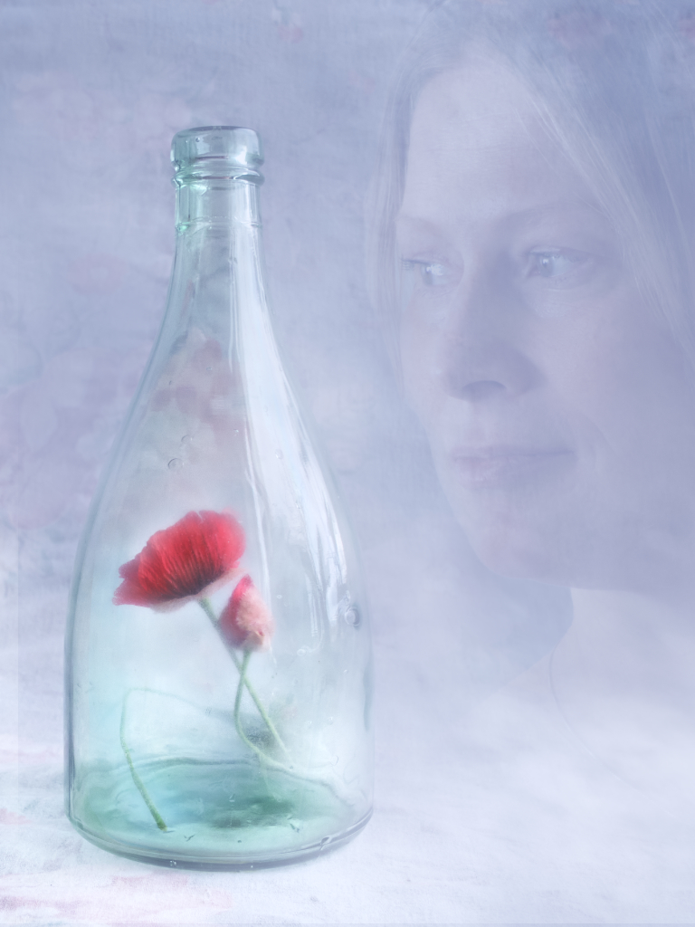
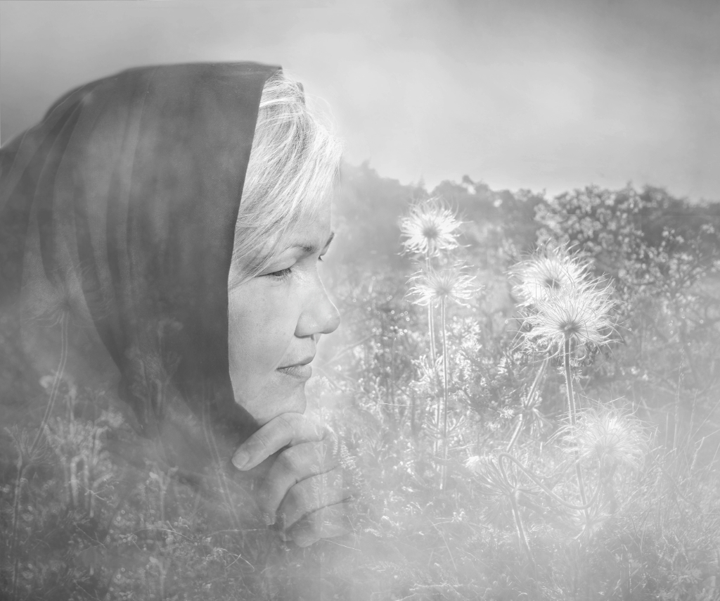
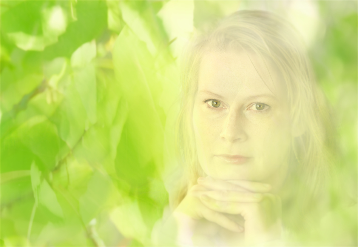
Thank you, George! What a lovely thing to say! - You are right about the brightness! I actually flipped the image with the idea that the flower might seem to open towards light while the half in shadow remains the same. I'll try to darken the right upper corner and see how it looks - maybe a slight vignette? |
Apr 15th |
| 26 |
Apr 26 |
Reply |
Thank you, Mark, you are right about the contrast, but I think the softer approach fits the mood I was after. I'll try that with the next attempt! |
Apr 13th |
| 26 |
Apr 26 |
Comment |
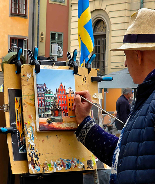
Hi George,
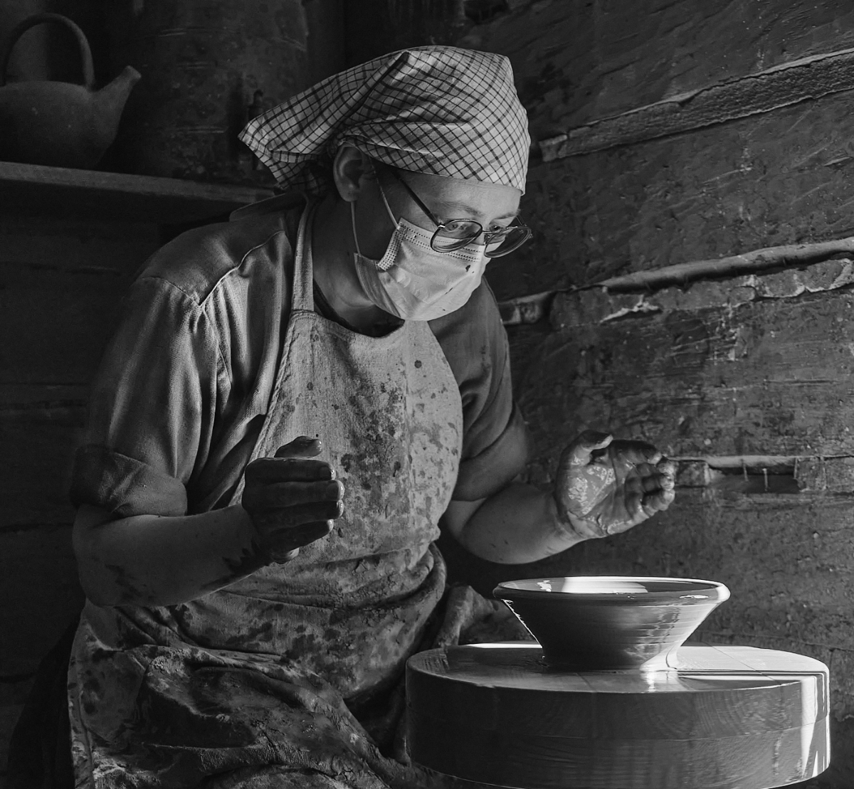
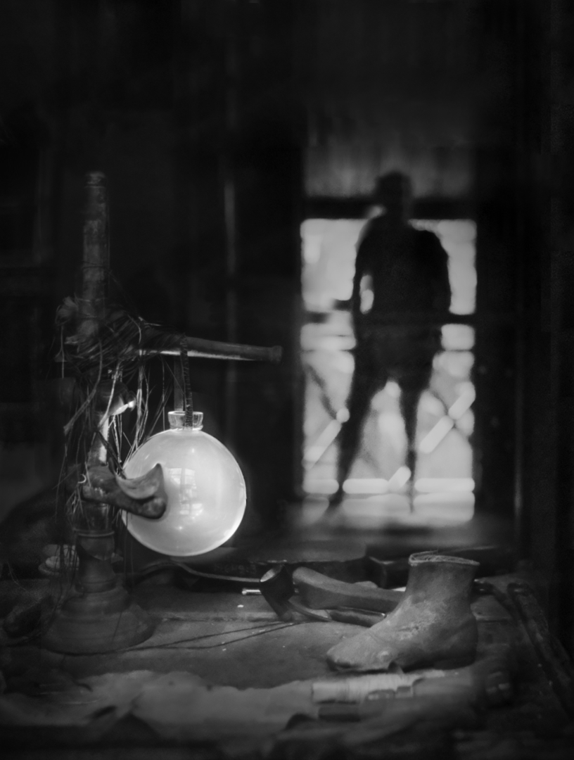
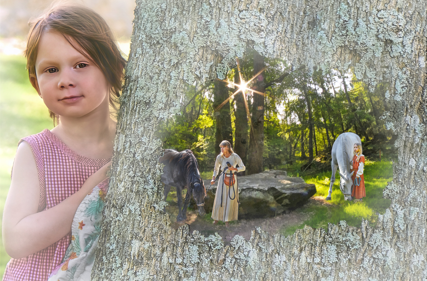
what a nice travel photo - it makes the painting you bought extra special to have its history documented in this way. The background anchors it to time and place, and I love the way you show the artist absorbed in his work. I think that an alternative crop might direct attention even more to the creative process, still retaining enough of the surroundings, although you would lose the pallet, the tin and the brushes? |
Apr 11th |
 |
| 26 |
Apr 26 |
Comment |
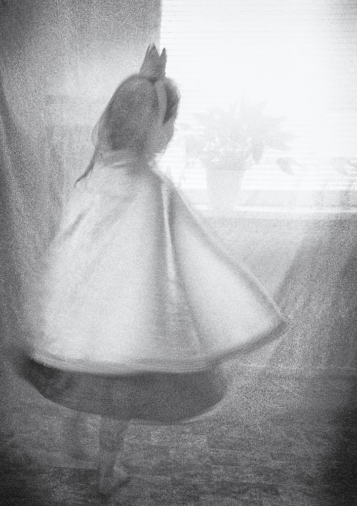
Hi Mark, no, I would not touch the flower but maybe try some soft color instead of the black? |
Apr 11th |
| 26 |
Apr 26 |
Comment |
Hi Mark, it is beautiful - I especially like the droplets on the petals. I think that technically very well executed. The black background is effective but I think that also a softer hue one might work well? |
Apr 11th |
| 26 |
Apr 26 |
Comment |
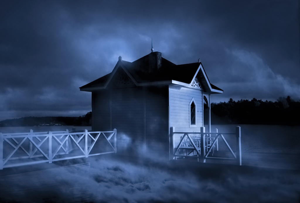
Hi Tony, I think that the image shows the "WOW architecture" of the bridge in all its glory, filling the frame, against the bright blue sky, in a balanced composition. I agree with Jose and Terry about the perspective of the houses. I think that it would also make a fine B&W image, maybe further emphasizing the graphic elements? |
Apr 11th |
| 26 |
Apr 26 |
Comment |
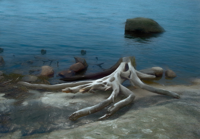
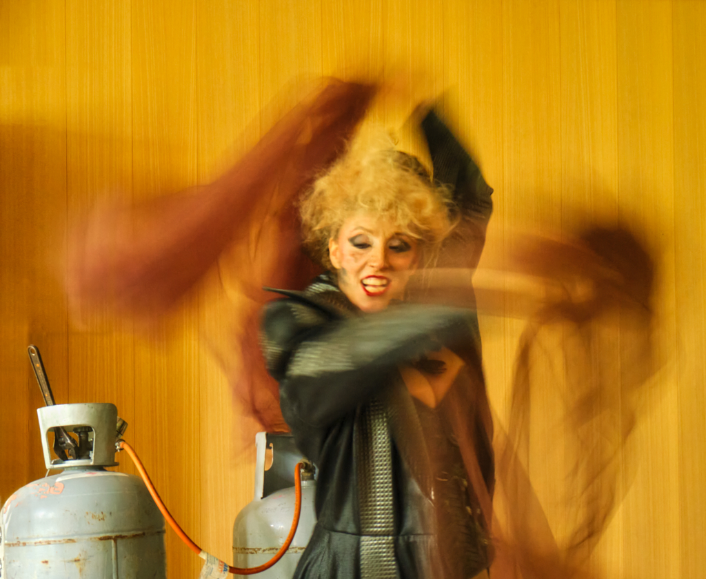
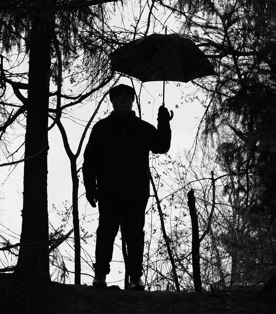
Hi Bob! You really used well the unexpected opportunity, and all the processing gave a lovely image. I might also darken the stem a little, or maybe crop off a centimeter from the bottom - I think that this would not reduce the diagonal effect too much? |
Apr 10th |
| 26 |
Apr 26 |
Comment |
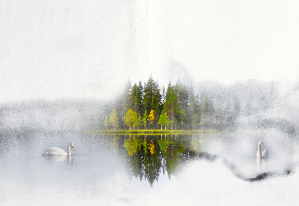
Hi Terry, what a lovely spot! The centered composition makes the image very inviting. I think that the IR technique really brings all those details out. The special luminosity of the leaves is perfect for the image, but the very dark sky may make a rather harsh contrast with the trees? If you have a color version, it would be nice to see if color helps to separate the trees from the water with their reflections? |
Apr 10th |
| 26 |
Apr 26 |
Comment |
Hi Jose, a panorama is probably the only way to show the splendor! I like the way the valley leads the viewer into the image. I agree with Terry about the sky although the darkening does bring the clouds out beautifully. |
Apr 10th |
| 26 |
Apr 26 |
Reply |
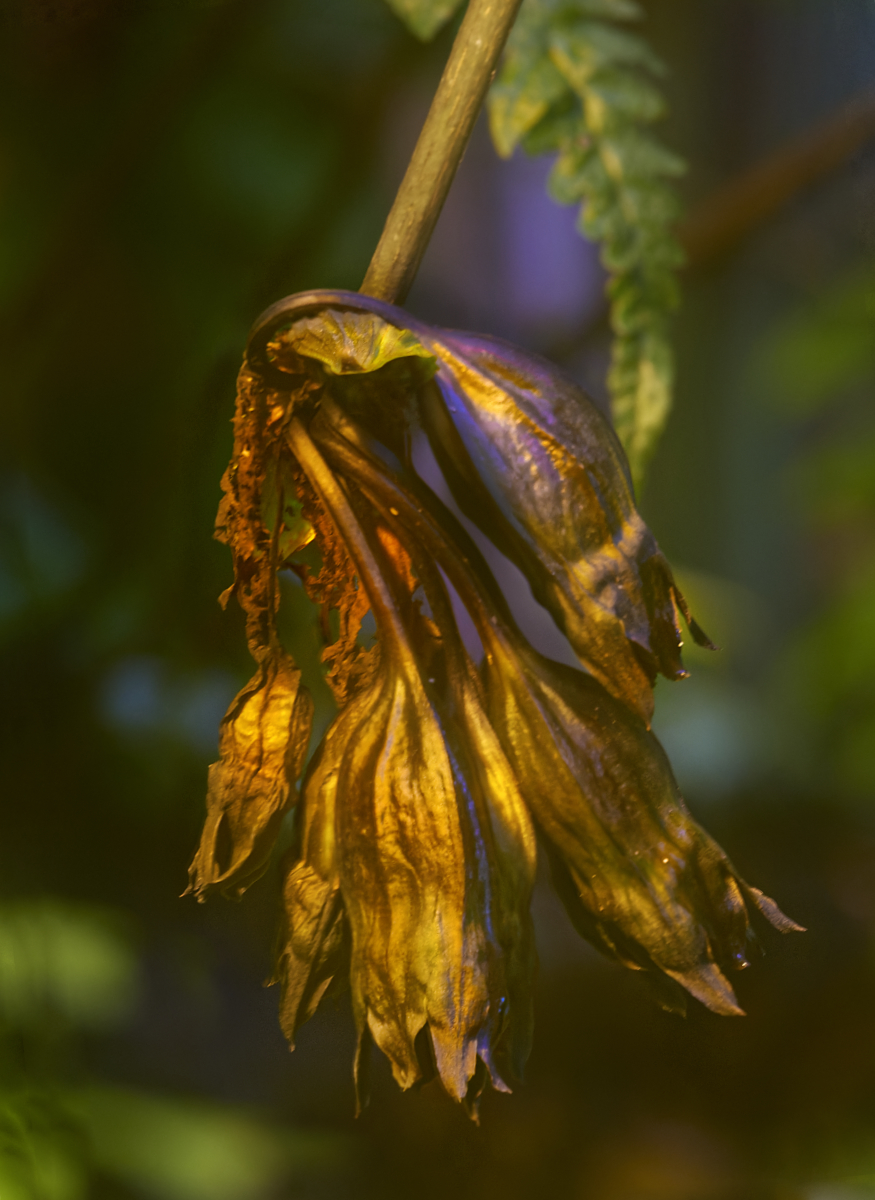
Hi Terry, as I explained to Jose, I blame the tulips! I tried to use the oldest one like you suggested but I could not fit it in very well, and the result had a rather lopsided look. - Thank you very much for the tip! I took a quick look already: absolutely lovely images. |
Apr 10th |
| 26 |
Apr 26 |
Reply |
Thank you, Jose! I know - one of the many problems in the project was that my tulips did not flare open but just dried up and started to drop their petals, so the the range of changes remained rather limited. I think I'll try to repeat the process some day with another brand of tulips and hopefully better luck. |
Apr 10th |
| 26 |
Apr 26 |
Comment |
Thank you so much, Bev! Your lovely comment made my day! |
Apr 9th |
9 comments - 4 replies for Group 26
|
| 47 |
Apr 26 |
Reply |
Thank you so much, Robert! I can see the praying mantis now, too! It adds Yes another level to the image! |
Apr 18th |
| 47 |
Apr 26 |
Reply |
Thanks, Al - it works! |
Apr 15th |
| 47 |
Apr 26 |
Reply |
Thank you, Steve! I tested a variety of grain. This sort looked best to me and seemed to fit the mood - and I think that it does not hurt either that it may somewhat disguise what is lacking in sharpness? |
Apr 13th |
| 47 |
Apr 26 |
Reply |
Thank you, Ed! I worried about the lack of contrast but when I tried to increase it, the image seemed to lose the nostalgic mood. I am glad if it works. |
Apr 13th |
| 47 |
Apr 26 |
Comment |
Hi Barbara, a lovely title for a fine image! You have captured the solemn feeling and serenity in the old fortress under the stars in a balanced composition. I can see why you made it black-and-white.
|
Apr 12th |
| 47 |
Apr 26 |
Comment |
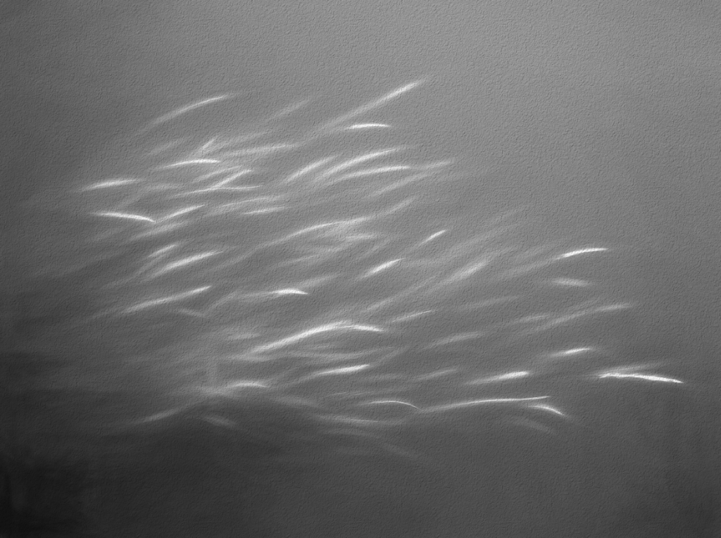
Hi Al! There is such contrast between the calm water in your image and the raging waves in Steve�s. I love the IR effect in the luminous whites in the trees, the dramatic sky and the fine sharp details. - I wonder if it might be possible to open the blacks in the rocks in the shadow a little? |
Apr 12th |
| 47 |
Apr 26 |
Comment |
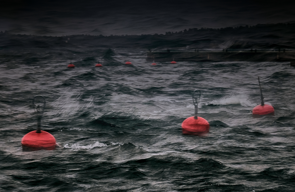
Hi Steve, and welcome to the group! No wonder that the image found a new owner immediately. Your risky vantage point makes the force of the storm palpable as the waves seem to flow out of the frame and over the viewer. |
Apr 12th |
| 47 |
Apr 26 |
Comment |
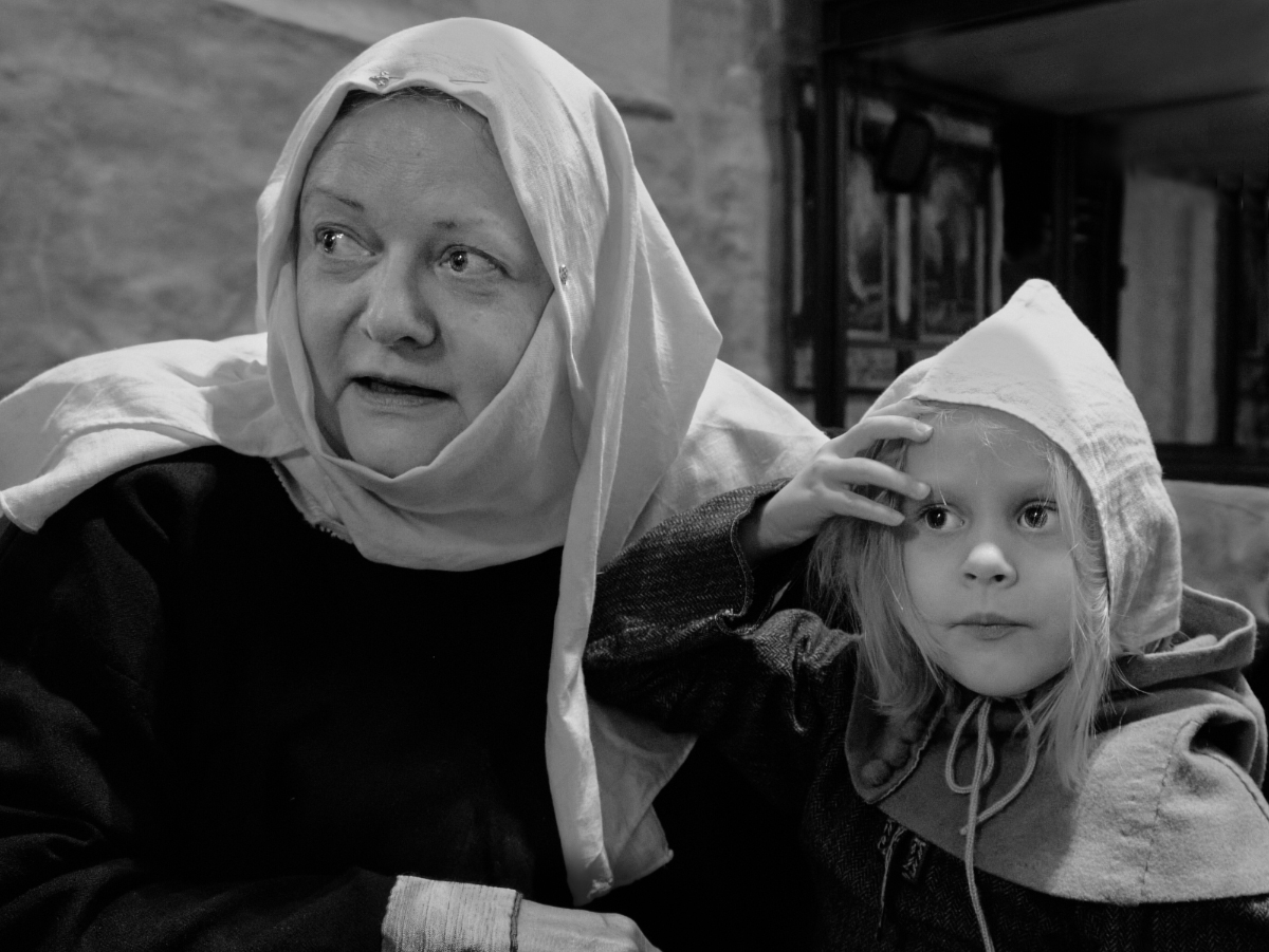
Hi Ed, I love the image, too. I think that it is a very fine street photo that captures an intimate moment with gentle humor. I think that everything works together: the intensive contact between the two ladies, the poster on the wall, the coffee mug and the purse on the table, all in a balanced composition. Like Robert says, the image works in so many levels. |
Apr 12th |
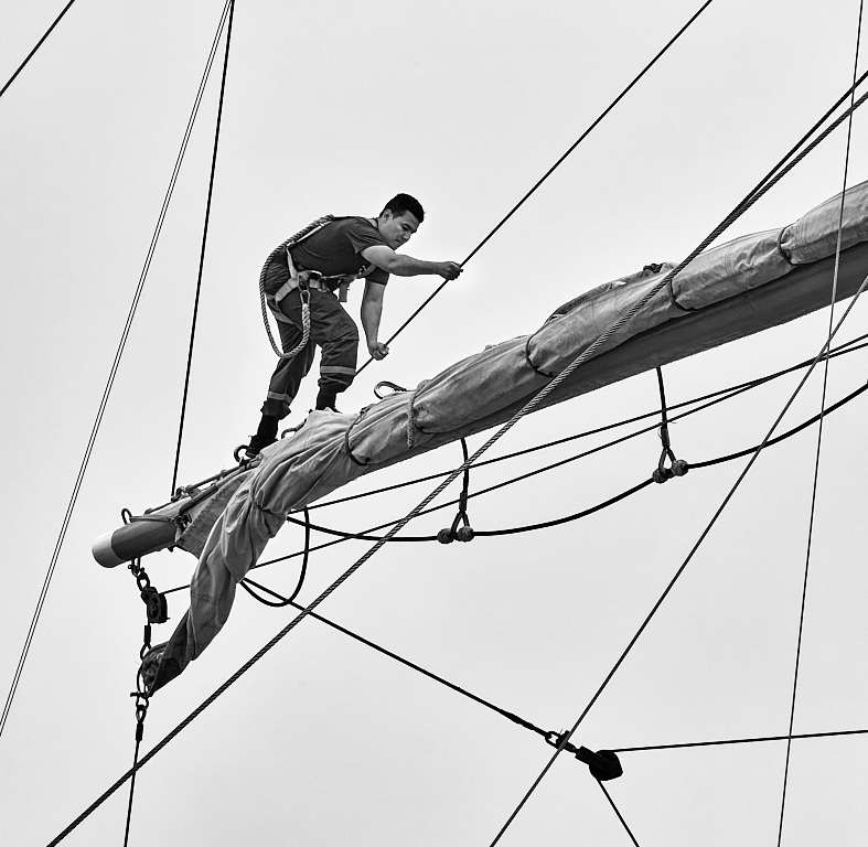
| 47 |
Apr 26 |
Comment |
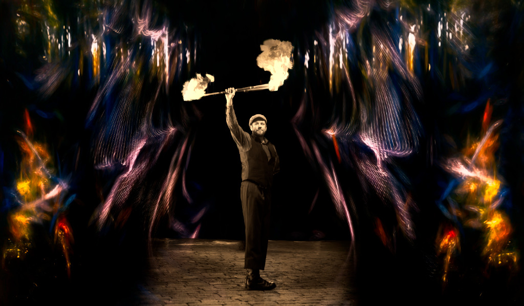
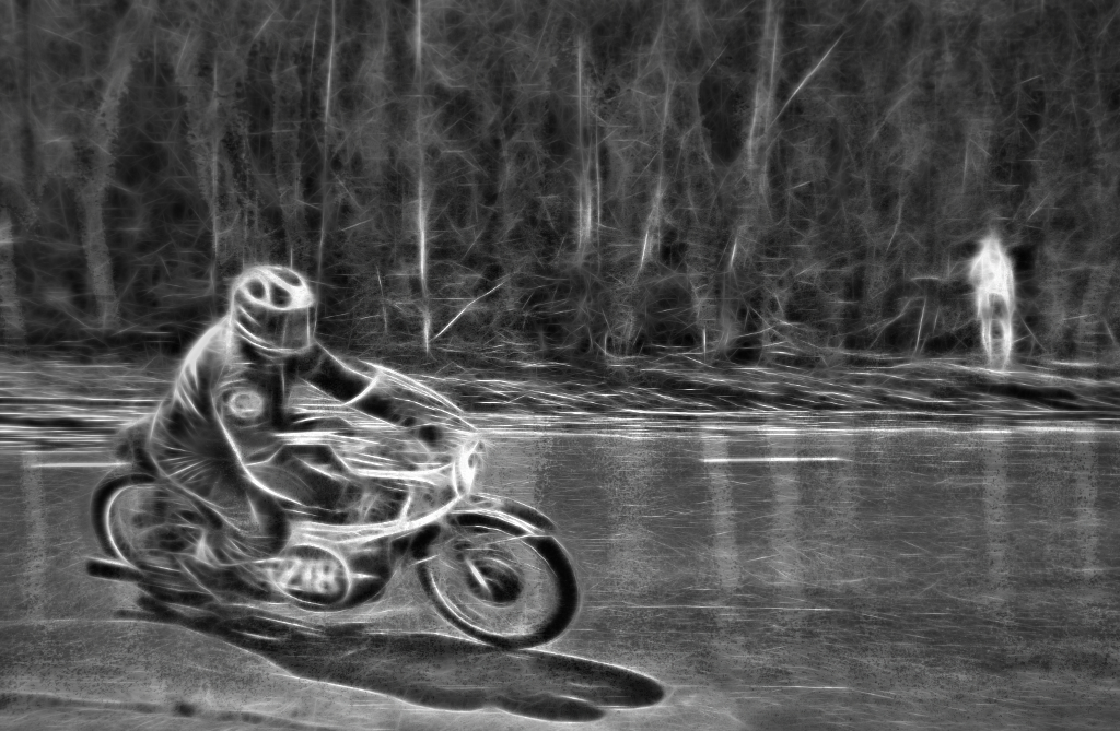
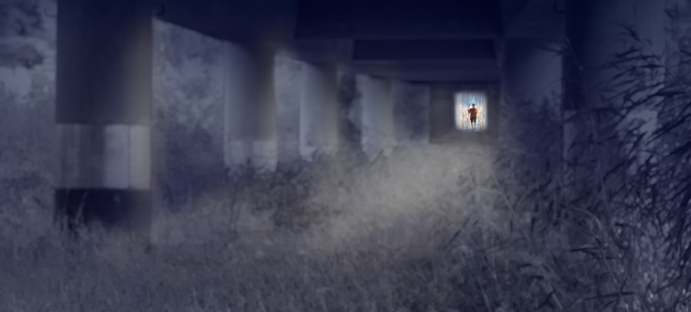
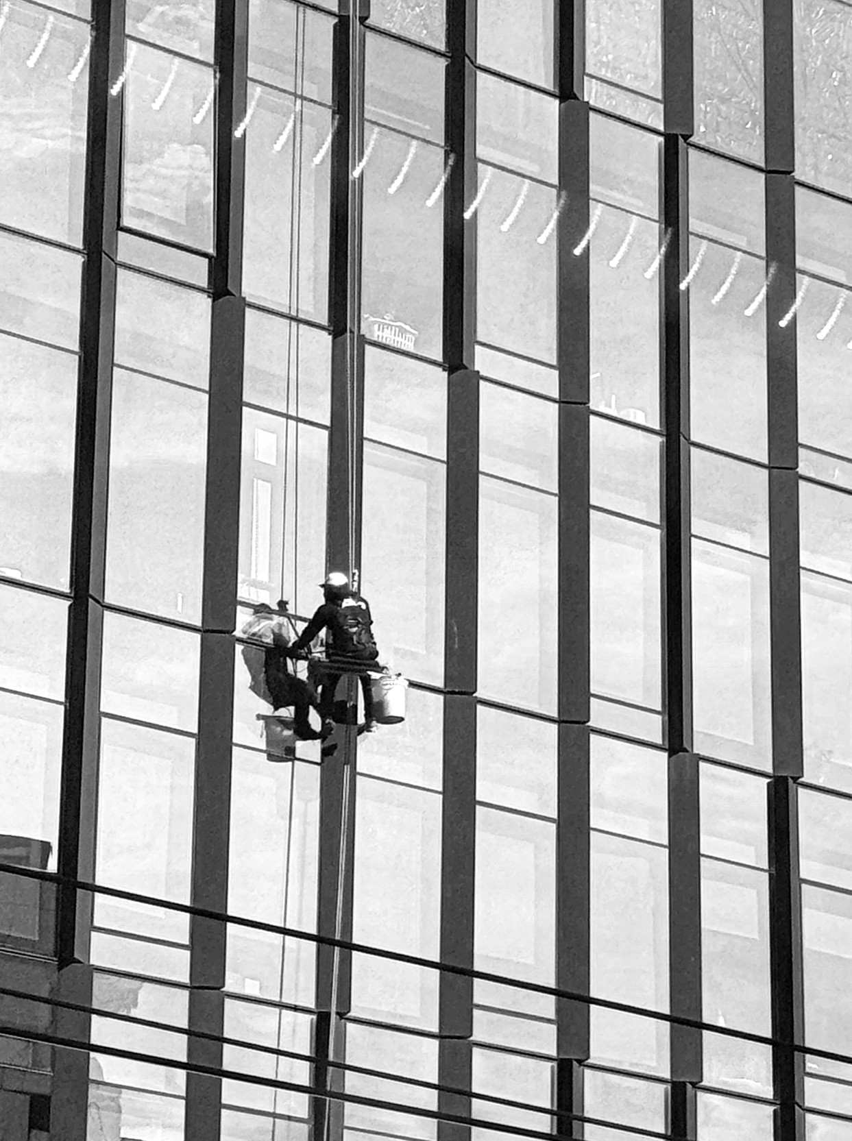
Hi Robert, what a lucky capture! I think that the many diagonals and the chain of reflected lights (?) as well as the slightly tilted perspective add an exciting sense of motion to the image. - I wonder if placing the brave worker a little bit below half-way and making the image narrower might enhance the feeling of height? I'll attach a suggestion of an alternative crop. What do you think? |
Apr 12th |
 |
5 comments - 4 replies for Group 47
|
| 54 |
Apr 26 |
Reply |
I think the the uniformity of the inhabitants is actually an important element in set story! |
Apr 15th |
| 54 |
Apr 26 |
Reply |
Alan, I take the opportunity to thank you for bringing up "The Shadow of the Wind" last month. After intensive hunting in second-hand bookstores I now own all the four books in Finnish and can only now fully appreciate the power and beauty of the text that creates such visions and images, and the wisdom. |
Apr 11th |
| 54 |
Apr 26 |
Comment |
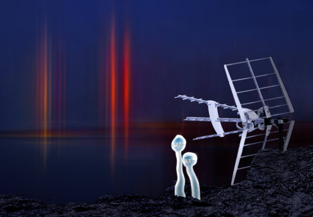
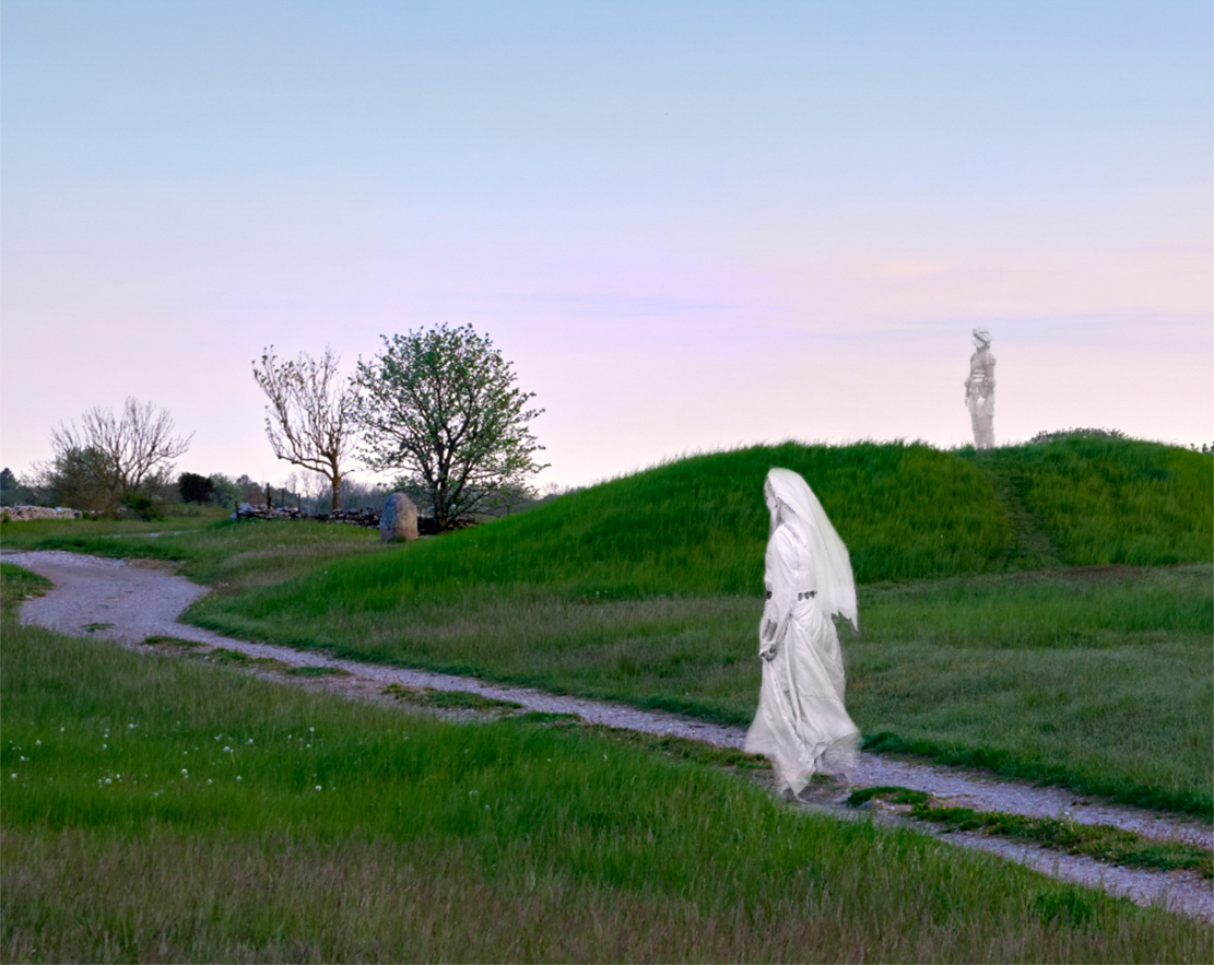
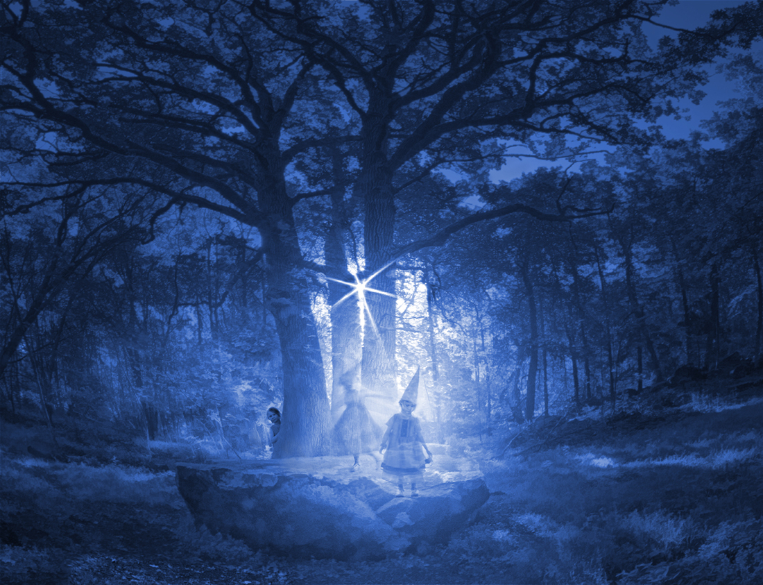
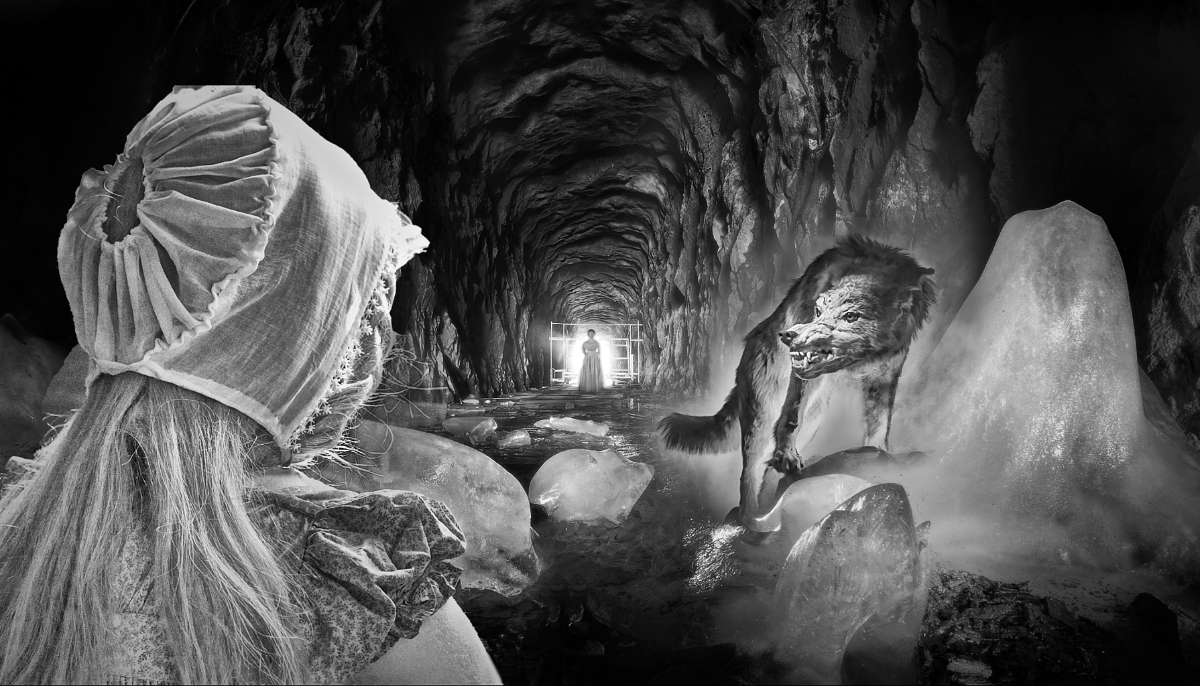
Hi Maria, this is like the opening scene of a scifi movie. A traveller enters through falling snow to this eerie little village with its wary watchful inhabitants. I love the way their stiff erect postures and round eyes resemble their buildings, or the other way round. There is such tension hanging over the encounter: will they fight or flee or start to communicate. The color scheme is just perfect for the atmosphere, |
Apr 11th |
| 54 |
Apr 26 |
Comment |
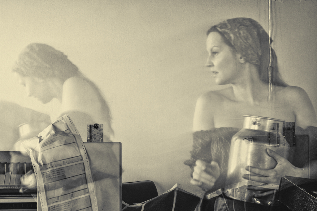
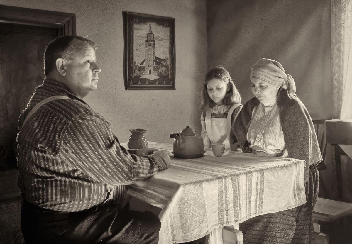
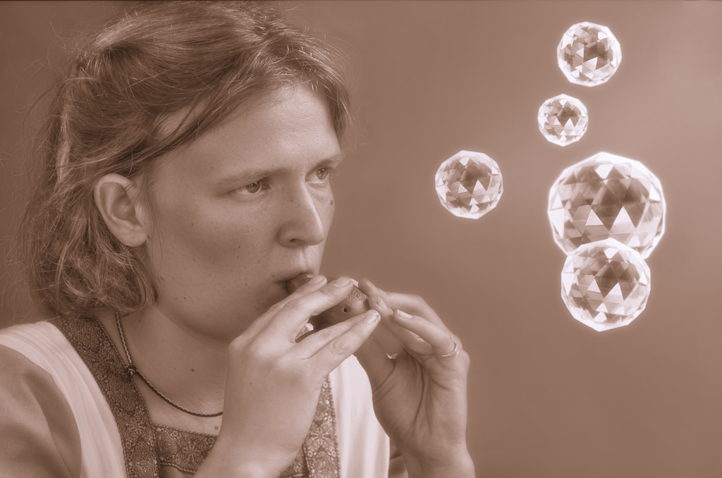
Hi Alan, thank you for sharing the dream! I love the way you constructed a three-dimensional world out of thin air with the masterful use of perspective. I think that this is a happy dream - maybe it is the expression and posture of the woman who looks so at ease, confident and interested, and the lovely warm and restful tones of the background, and the bubbling music in the air. |
Apr 11th |
| 54 |
Apr 26 |
Comment |
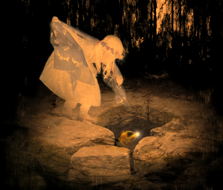
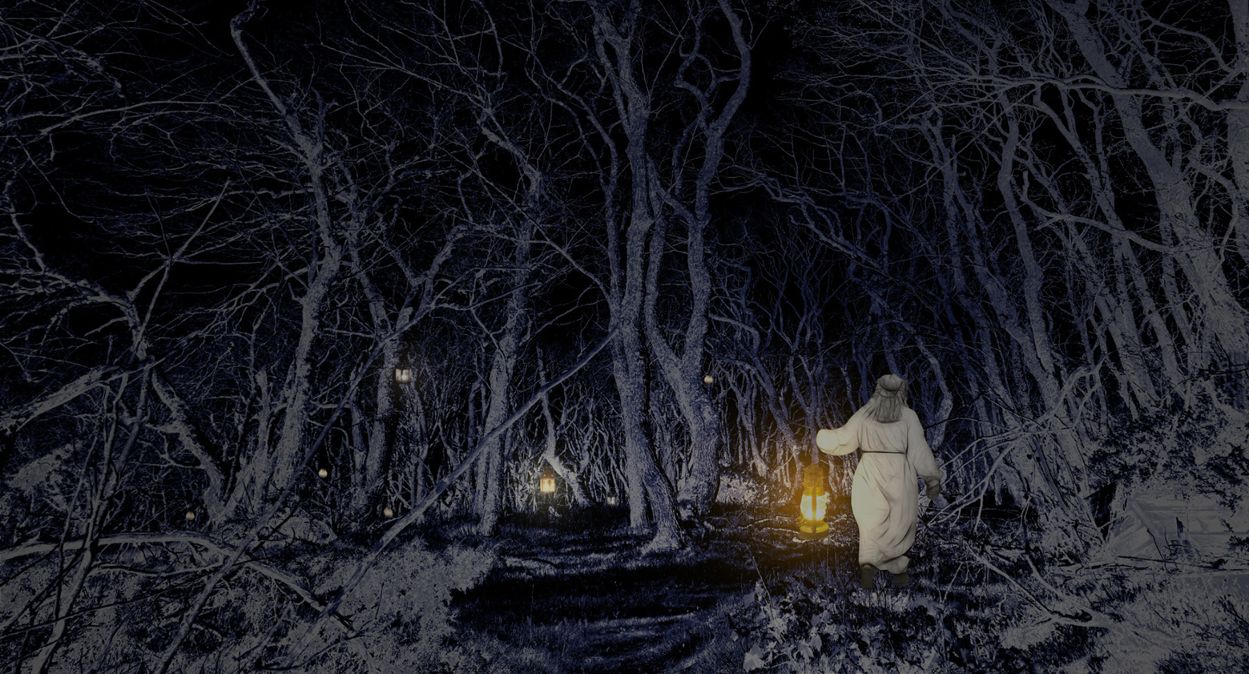
Hi Brad, thank you for another scene to travel in my dreams! The luminous waterfall is just full of magic. - I like the moon up in the corner but I wonder if the halo round it might be a little wider and fade slightly more gradually so that it might blend into the lighter sky and illuminate the waterfall. I think that decreasing the black in the sky would have a similar effect? |
Apr 11th |
| 54 |
Apr 26 |
Comment |
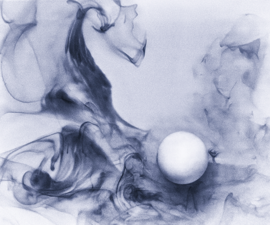
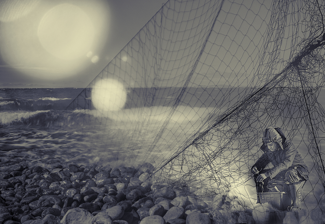
Hi Peggy, the threat in last month's image has come true in an awe-inspiring way. I think that the absence of the crew not only keeps focus on the boat in the storm but the empty boat makes one wonder about their fate: have they been washed over and did they survive? In a way they are powerfully present in the image just because they are not shown. - I cannot get enough of the colors and textures - is it the Emboss filter that makes this three-dimensional effect on the waves? |
Apr 7th |
| 54 |
Apr 26 |
Reply |
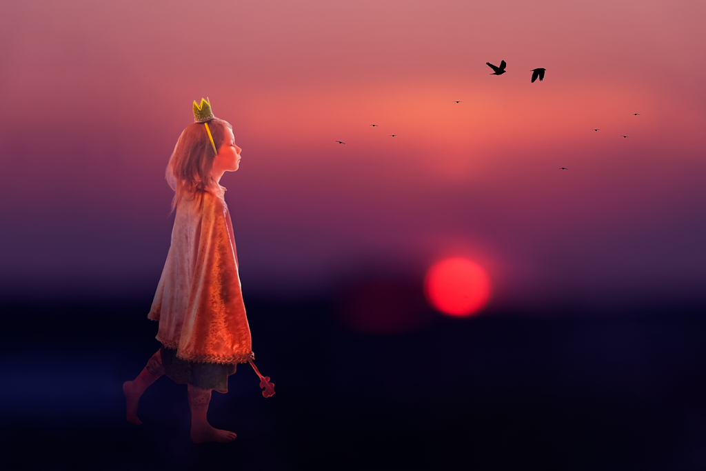
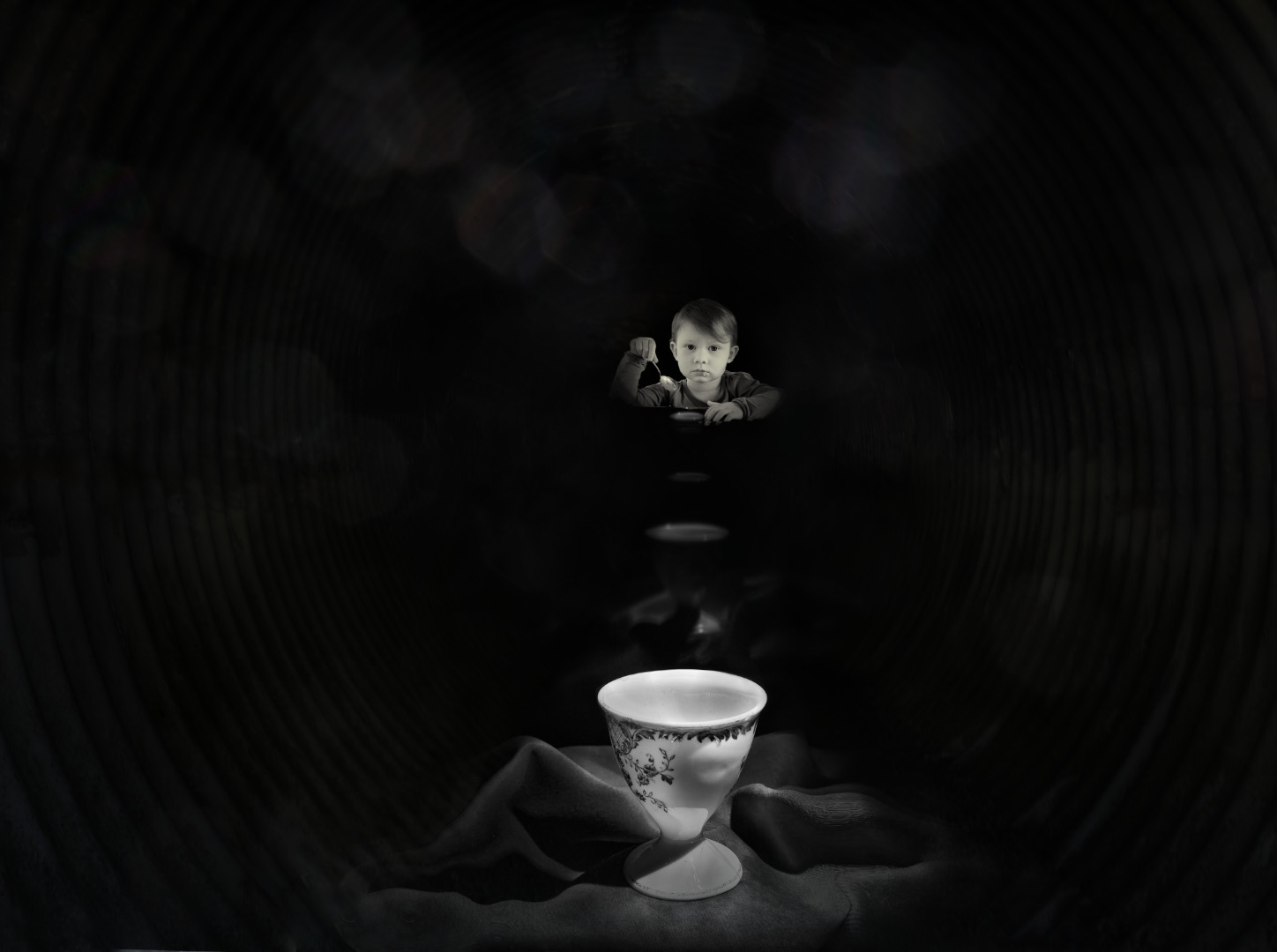
Thank you, Alan! - I didn�t realize the expressive power of a tulip, but I think that there are so many stories they can tell! |
Apr 7th |
| 54 |
Apr 26 |
Comment |
Thank you, Peggy! The lovely comments about the background and tones mean very much to me, coming from master blenders like you and Brad. I love the way you see the interplay of the flowers, and I'll already see the new story evolving! |
Apr 6th |
| 54 |
Apr 26 |
Reply |
Thank you, Brad! Family portrait is a lovely interpretation. - I'll try the shadow and see how it works. |
Apr 6th |
5 comments - 4 replies for Group 54
|
19 comments - 12 replies Total
|