|
| Group |
Round |
C/R |
Comment |
Date |
Image |
| 26 |
Feb 26 |
Reply |
Thank you very much, George! That is just what I hoped might happen! |
Feb 8th |
| 26 |
Feb 26 |
Reply |
Thank you, Bob! I'll definitely try the crop! |
Feb 7th |
| 26 |
Feb 26 |
Reply |
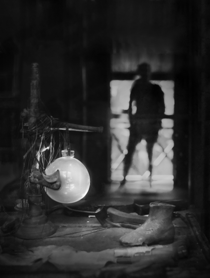
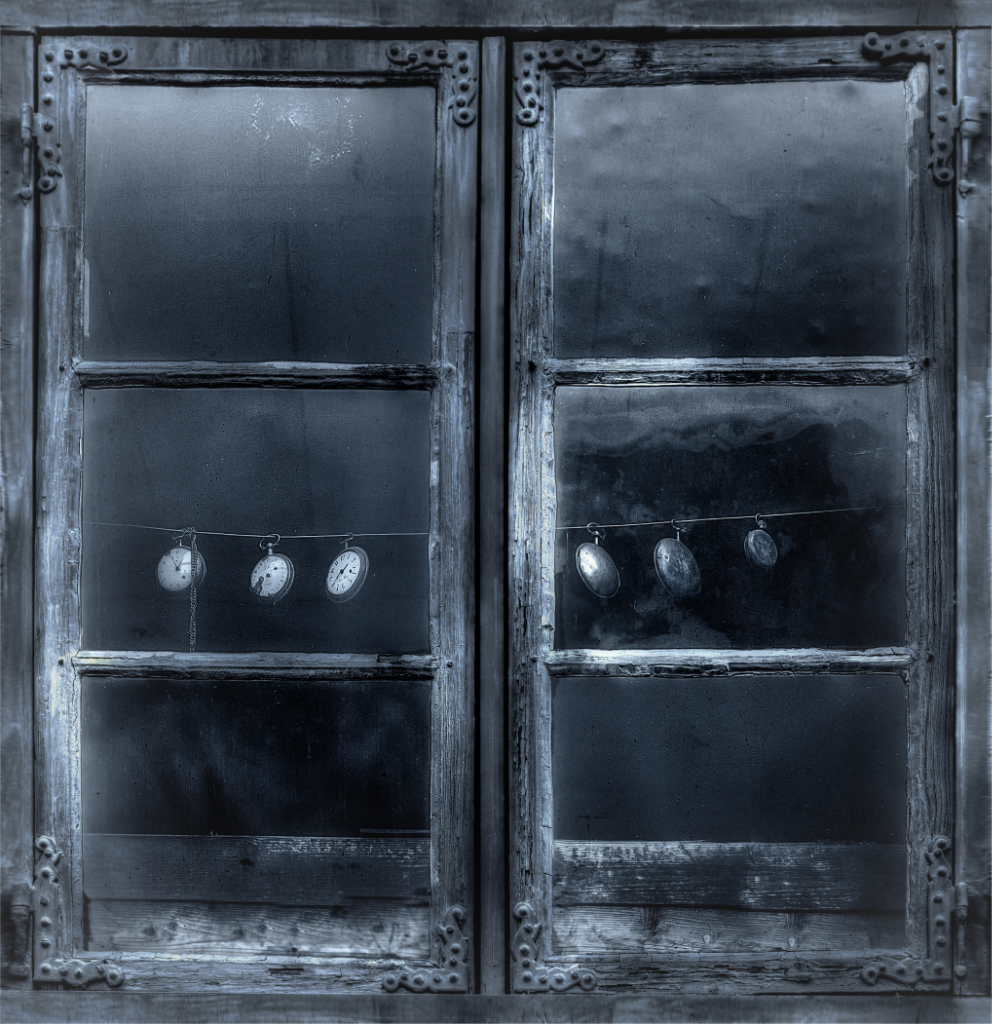
Hi Jose, thank you! - I am sorry, should have explained the joke: it is from the book "The Hitchhiker�s Guide to the Galaxy" by Douglas Adams. This may be more a European thing - originally a BBC radio broadcast in 1978-1980, then a series of delightful sci-fantasy novels, comic books, tv series, a movie and video games. It is about the adventures of the last Earth man who survived after the planet was demolished to make way for a hyperspace bypass. He was rescued by an alien hitchhiker, the writer of the electronic travel guide. "42" is "answer to the Ultimate Question of Life, the Universe and Everything" calculated by the supercomputer Deep Thought over 7.5 million years. - I think you might enjoy the stories. |
Feb 7th |
| 26 |
Feb 26 |
Comment |
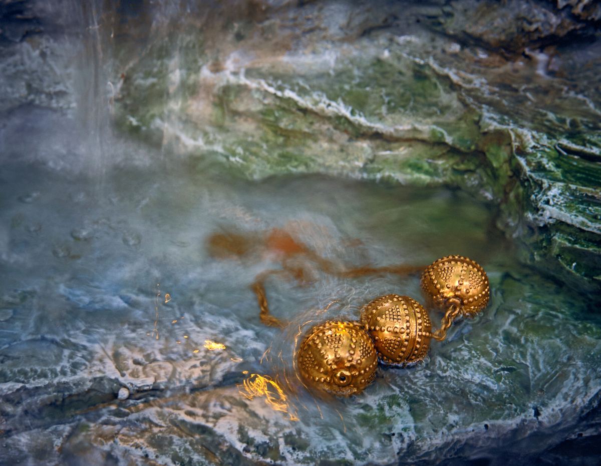
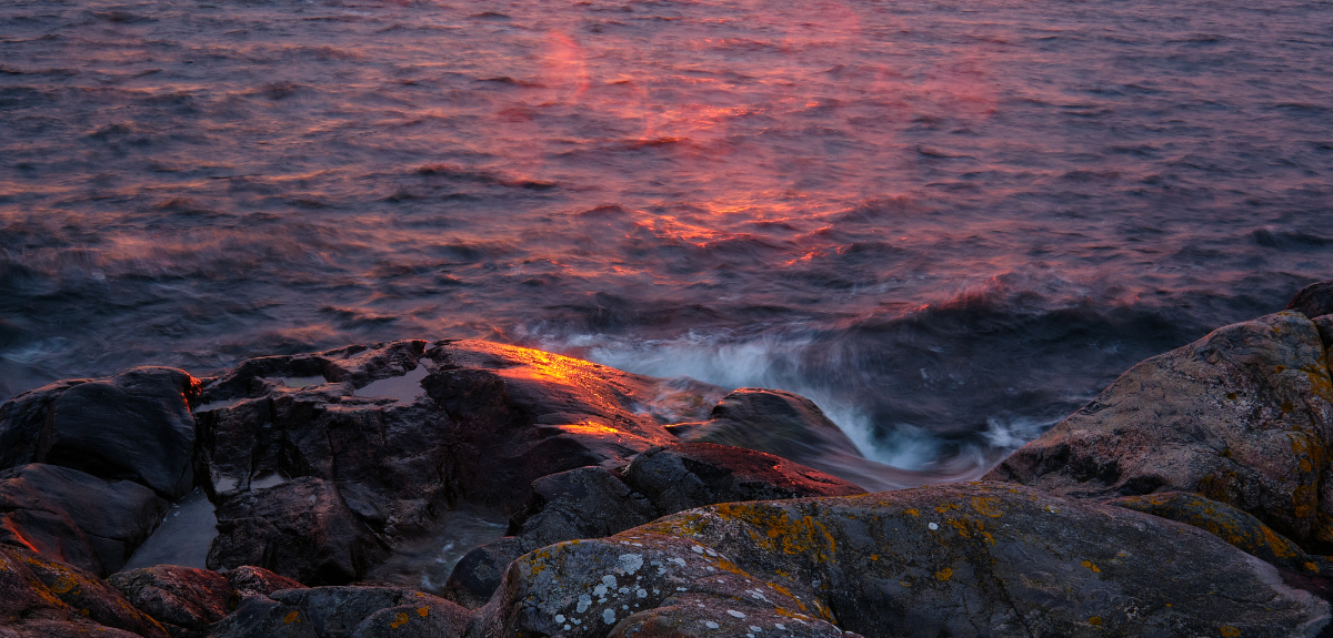
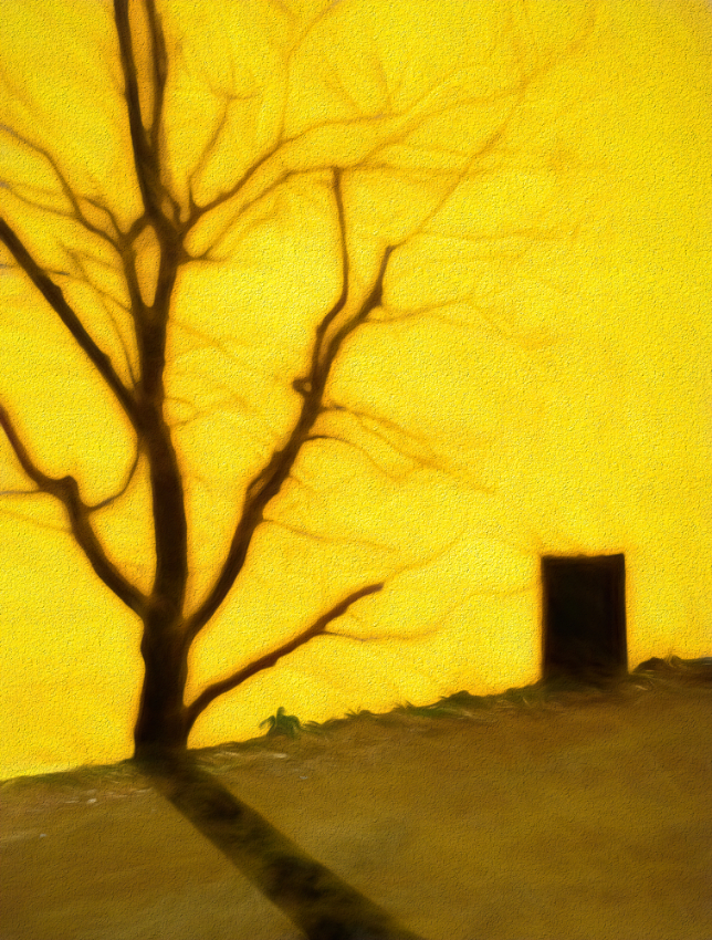
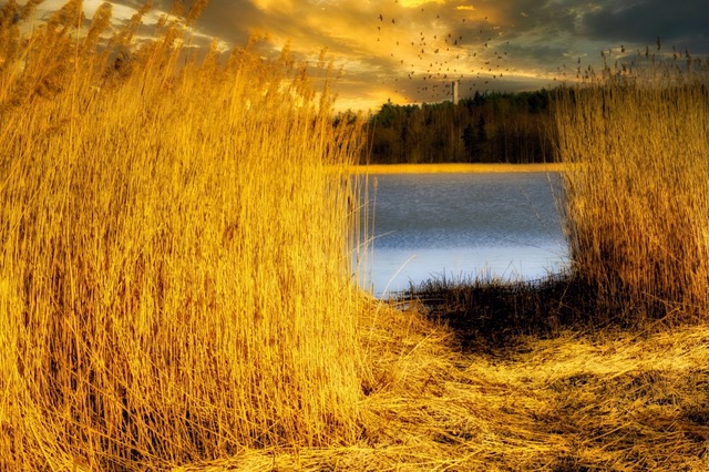
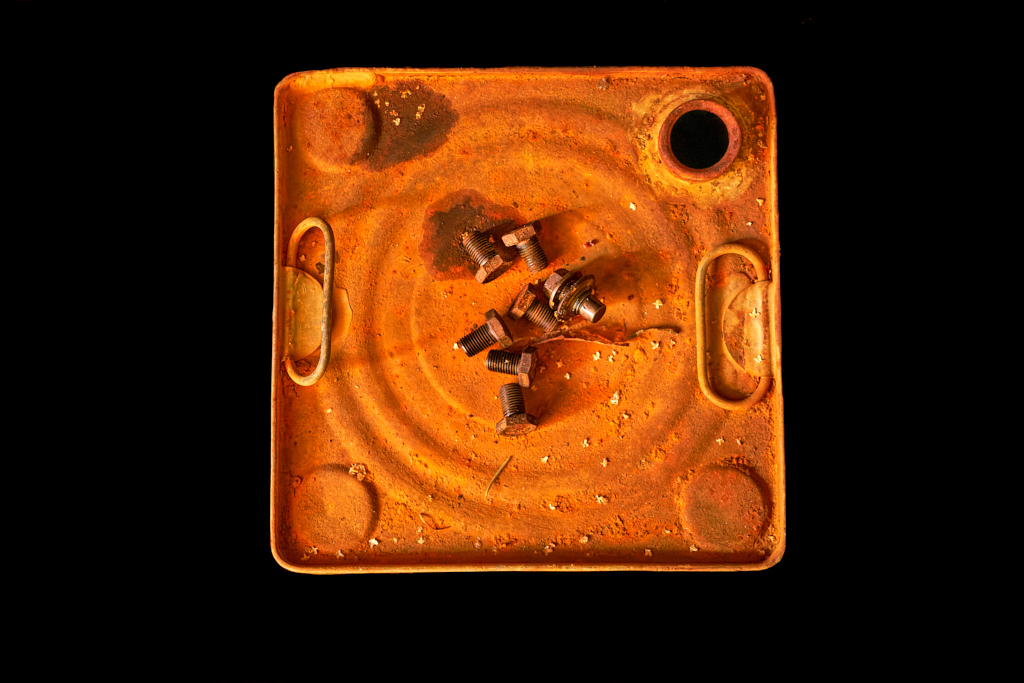
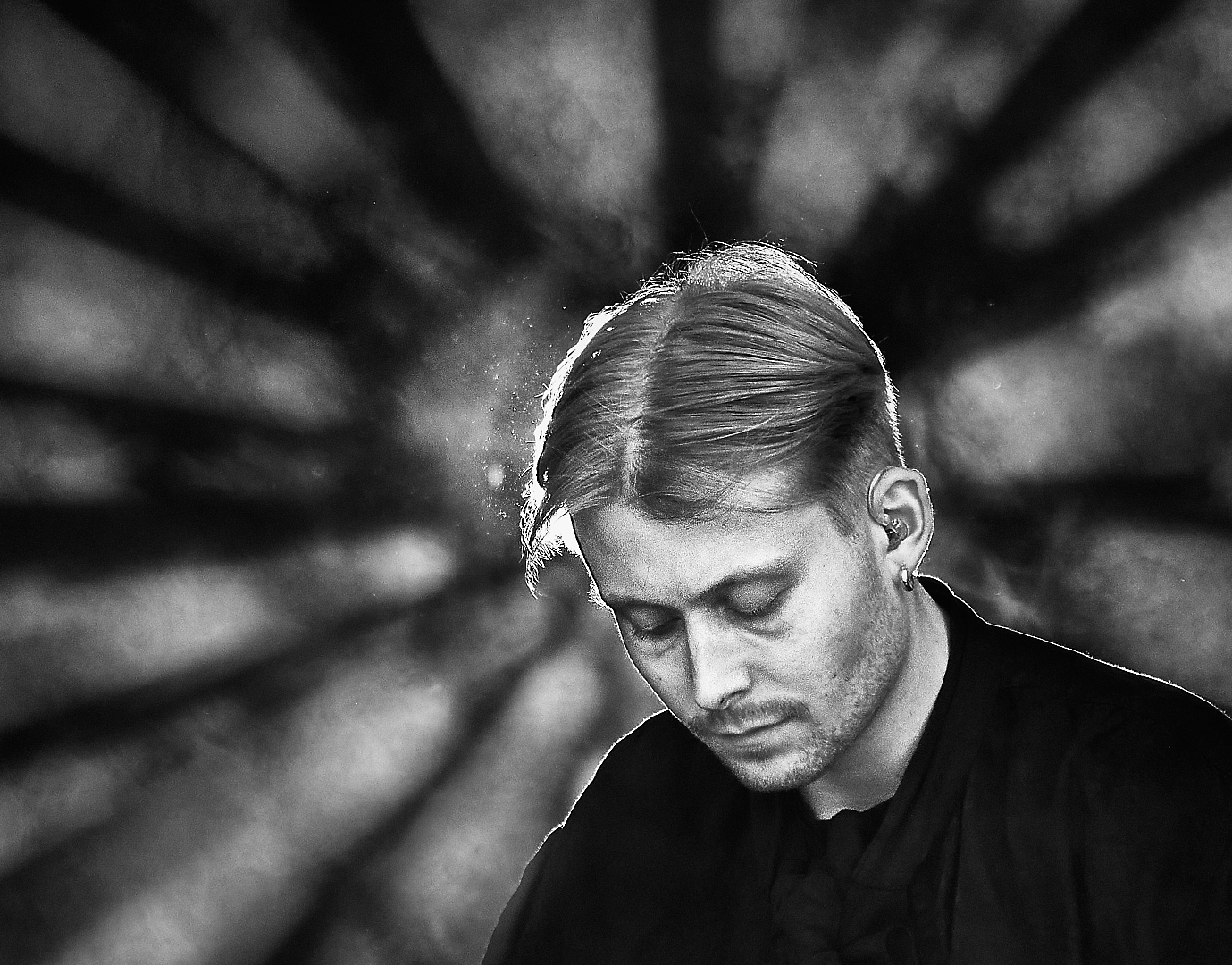
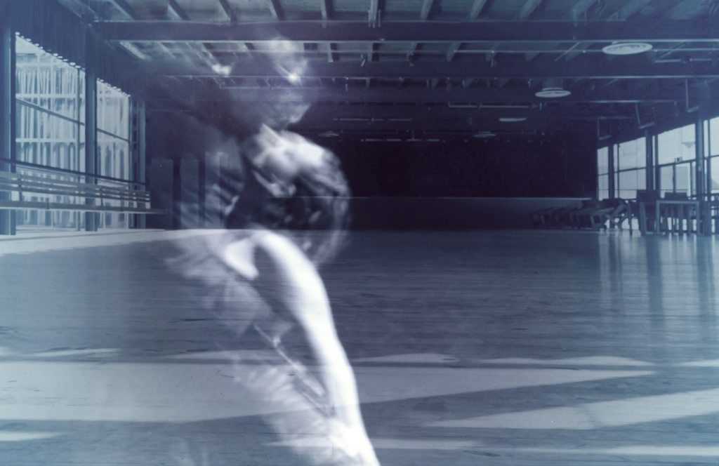
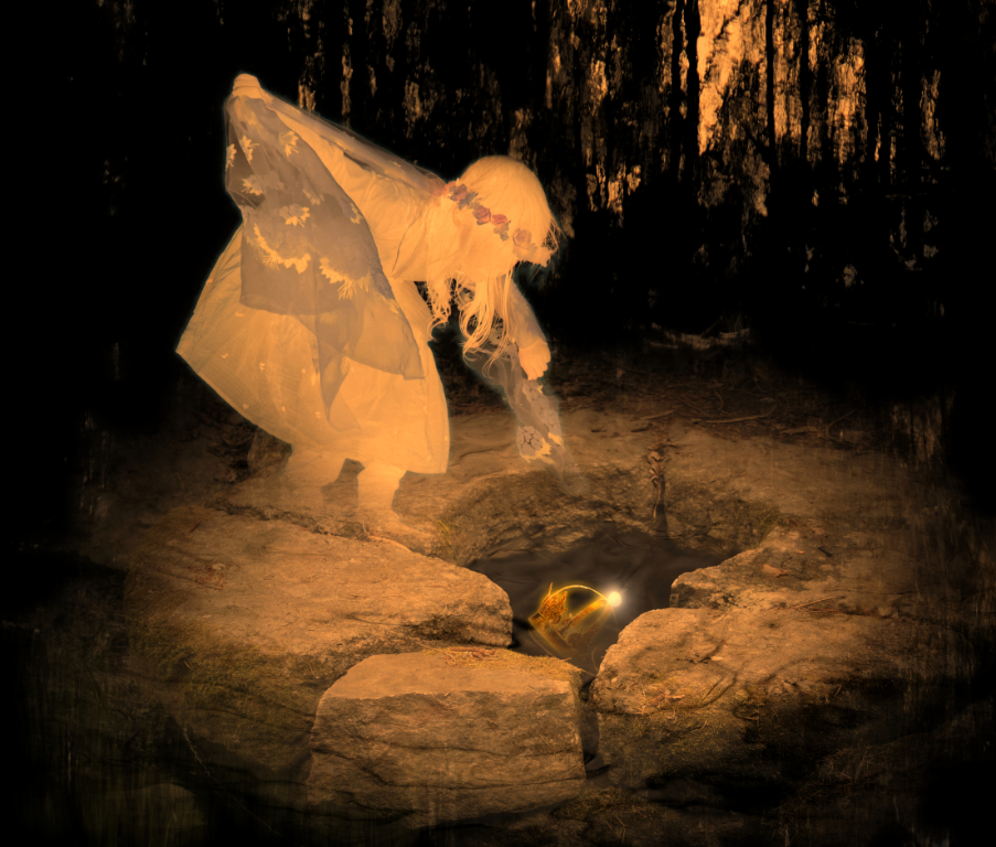
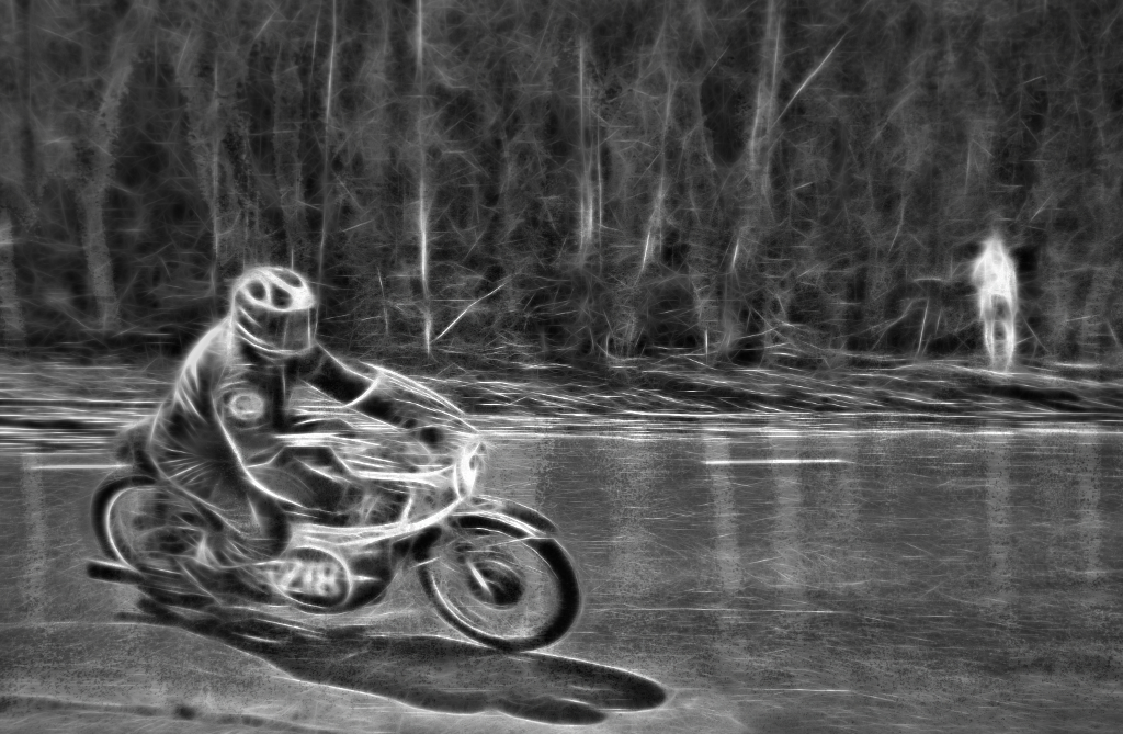
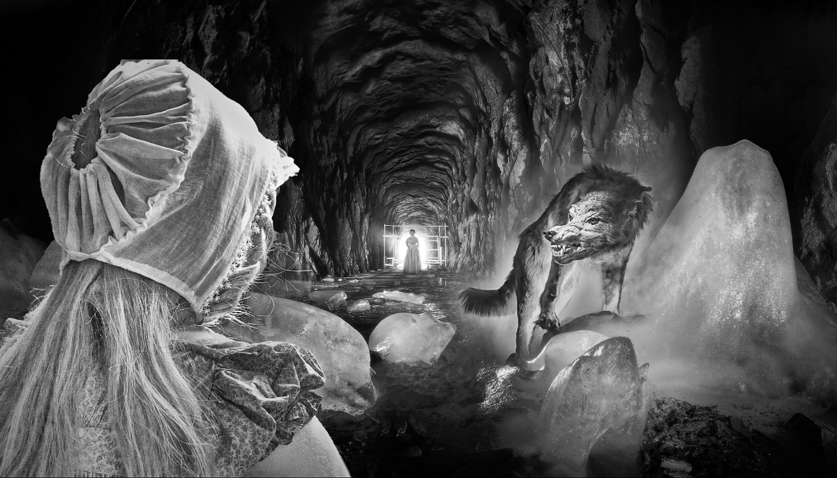
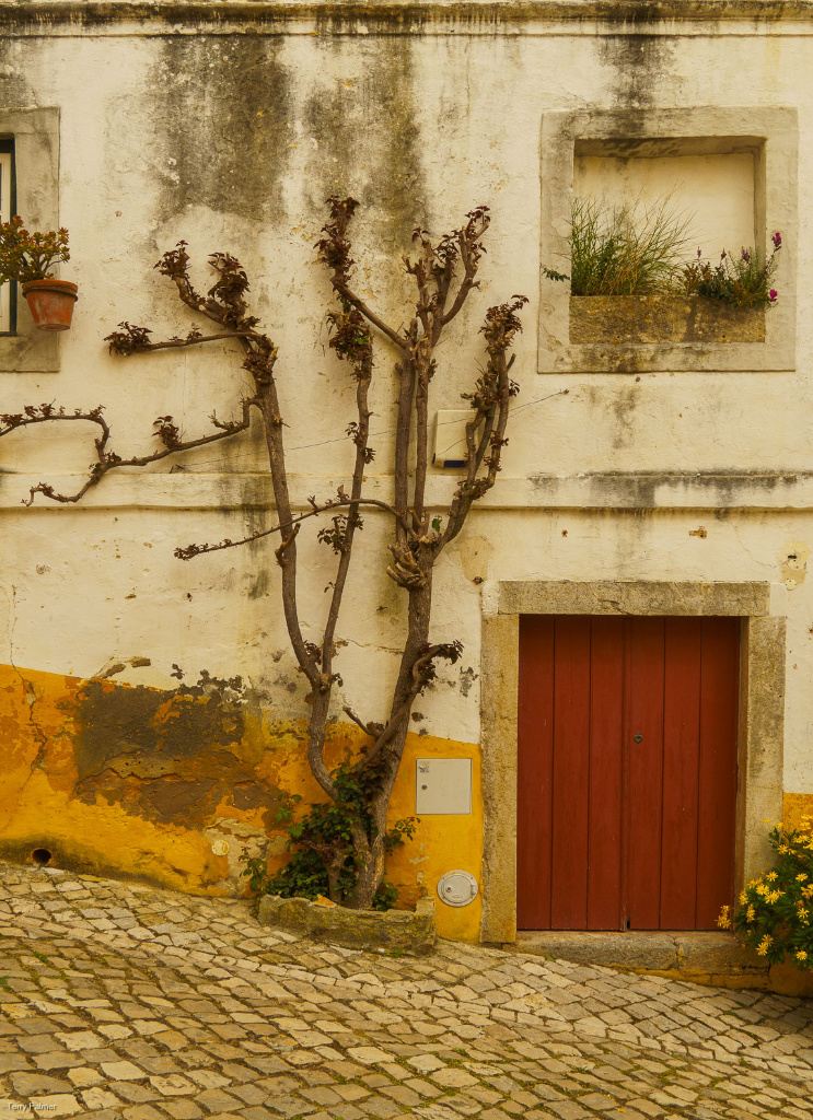
Hi Terry, this is a most inviting little door. I love the warm mellow colors and the textures of the wall, and the little tree that completes the scene. There are so many interesting details to see. - I wonder if an alternative crop that leaves out the diamond-shaped patterns at the top might calm the image down slightly and maybe direct attention more clearlybto the door? That would be a hard decision as the yellow of the bottom part of the wall that is repeated in the diamonds is also a lovely element. |
Feb 5th |
 |
| 26 |
Feb 26 |
Comment |
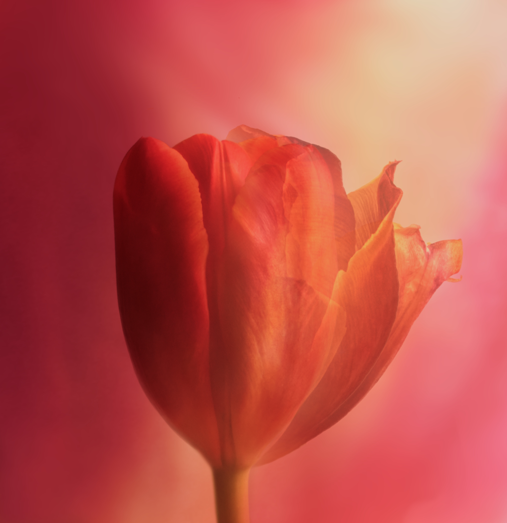
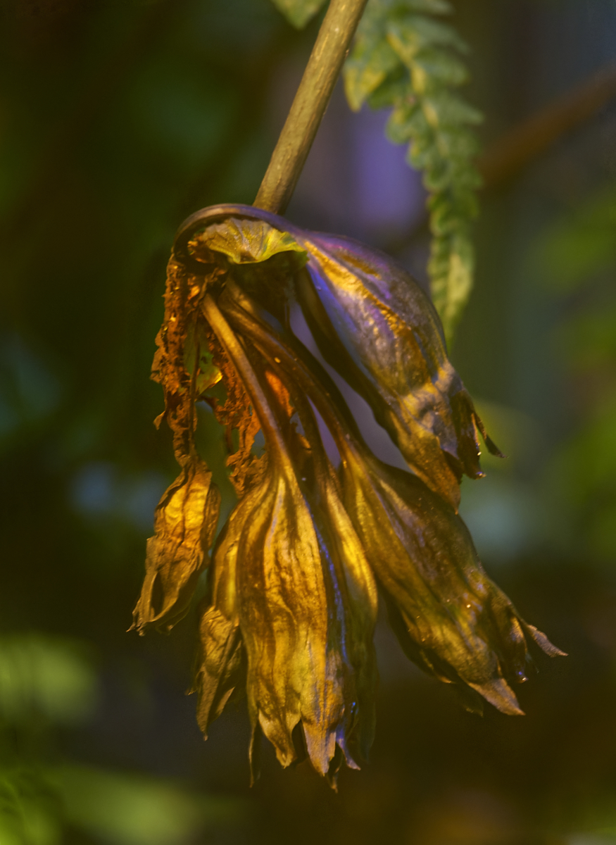
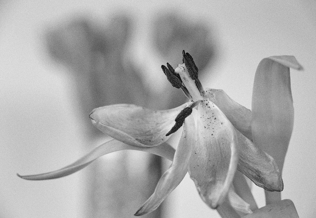
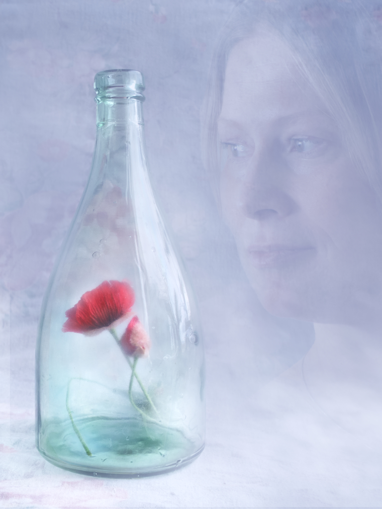
Hi Bob, it takes an artist�s eye to spot a composition like this, with so much hidden emotion. I love the way the ailing flower leans on the healthy bright green leaf, and the dew drop like a single tear it has shed. The buds on the stem complete the Nature story that your processing brings out just beautifully. |
Feb 5th |
| 26 |
Feb 26 |
Comment |
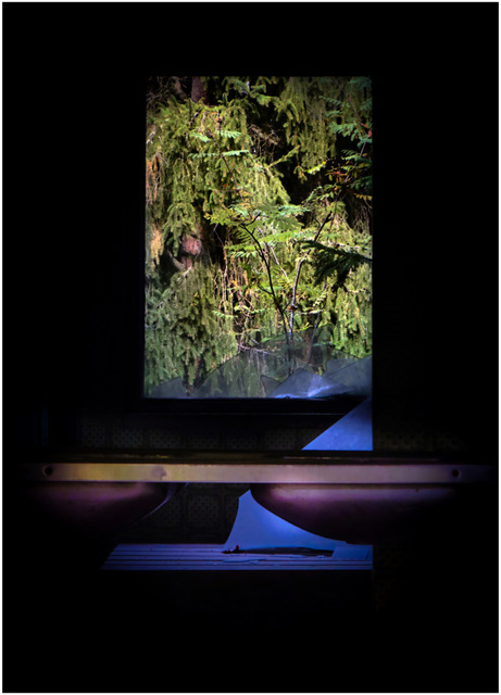
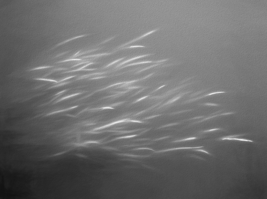
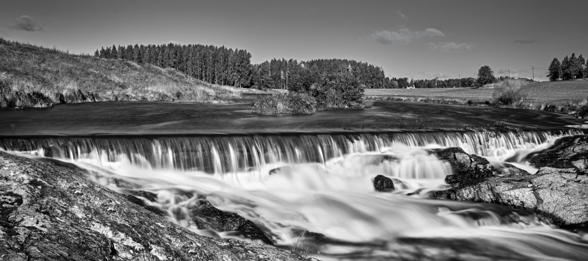
Hi George, I think that the saturation and contrast make the kayaks look like petals of a vibrant flower against the dark water. I also like the way the wooden structures continue from the diagonal dock to the arch that frames the scene. - I wonder if cloning some of the water upon the window sill might be an option? |
Feb 5th |
| 26 |
Feb 26 |
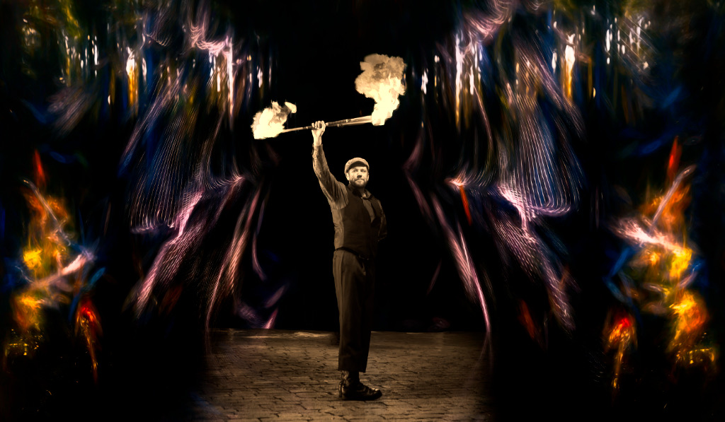
Comment |
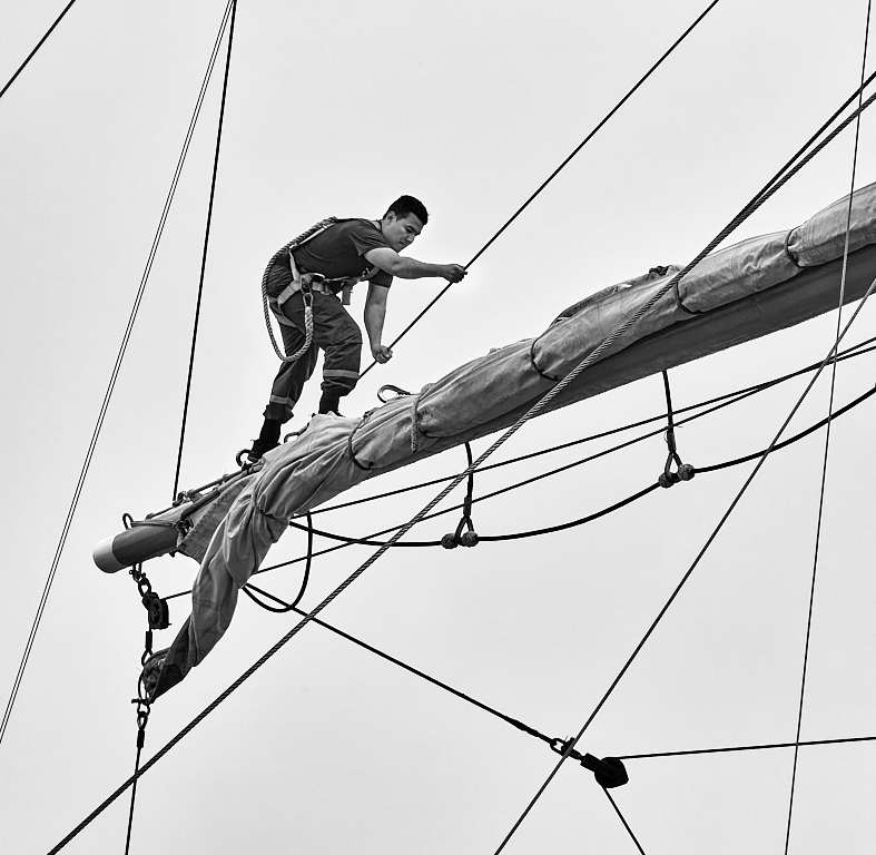
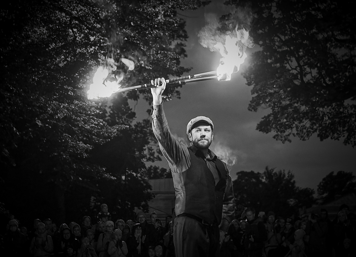
Hi Jose, I think that the message of high altitude comes through effectively. I love the upward diagonal lines that make the image very dynamic, and the empty space at the right edge that gives room for the crew. The sharp reflections of the men add an almost surreal touch - it looks like a shadow crew were working on the other side of the glass. |
Feb 5th |
| 26 |
Feb 26 |
Comment |
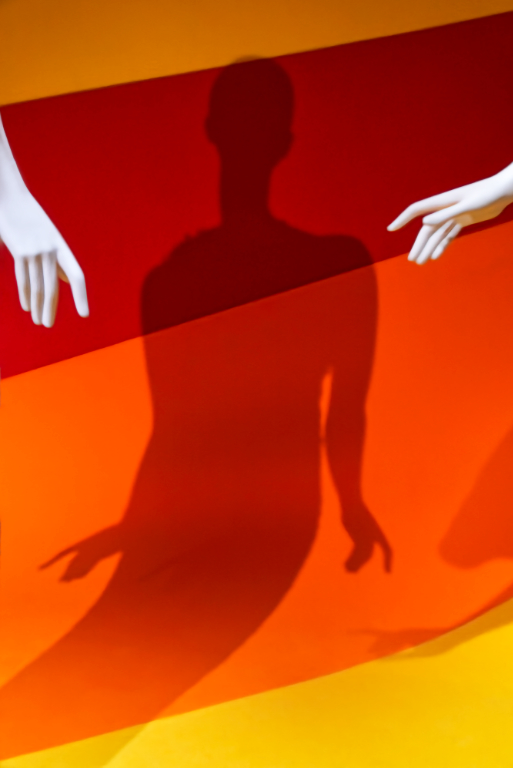
Thank you, Terry! You may be right about the reds. The buses are originally a warm yellow-orange in color, and I adjusted white balance with that in mind, masking only the cold "stars" out. That and the high contrast gave the bold reds. I'll see hav it looks if I tune it down a bit, or change the hue towards yellow. |
Feb 4th |
5 comments - 3 replies for Group 26
|
| 47 |
Feb 26 |
Reply |
Thank you so much, Barbara, for the lovely and wise comment! |
Feb 15th |
| 47 |
Feb 26 |
Reply |
Thank you very much, Barbara! I like your idea for the crop, I'll definitively try it out. - I am glad you like the original. I deeply respect pure classic traditional photography, but what I really enjoy is to try to make visible what I see in my mind's eye, whatever unorthodox method or manipulation seems to convey the idea. The result may often work only for myself, and it is always such a pleasure when it resonates with a watcher. |
Feb 14th |
| 47 |
Feb 26 |
Reply |
Thank you, Robert! I am so glad that the atmosphere comes through. I'll try tuning the brown-outs down. |
Feb 13th |
| 47 |
Feb 26 |
Reply |
Thank you, Ed! That is a good idea! |
Feb 10th |
| 47 |
Feb 26 |
Comment |
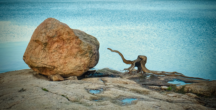
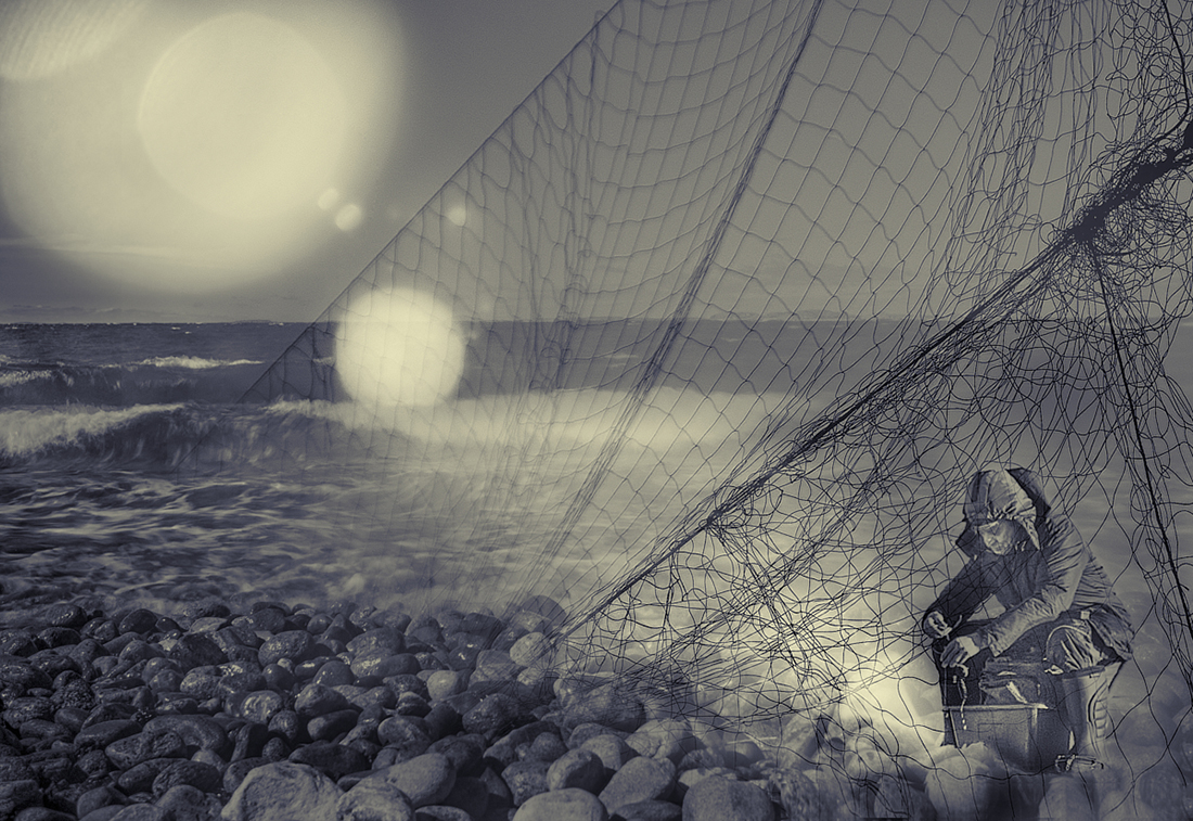
Thank you, Doug! I really like this version with the intense blues, and the new crop. I think that the original composition was maybe too static, as if the little trees locked the fisherman in place. |
Feb 9th |
| 47 |
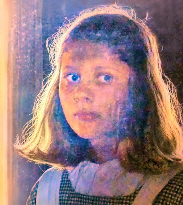
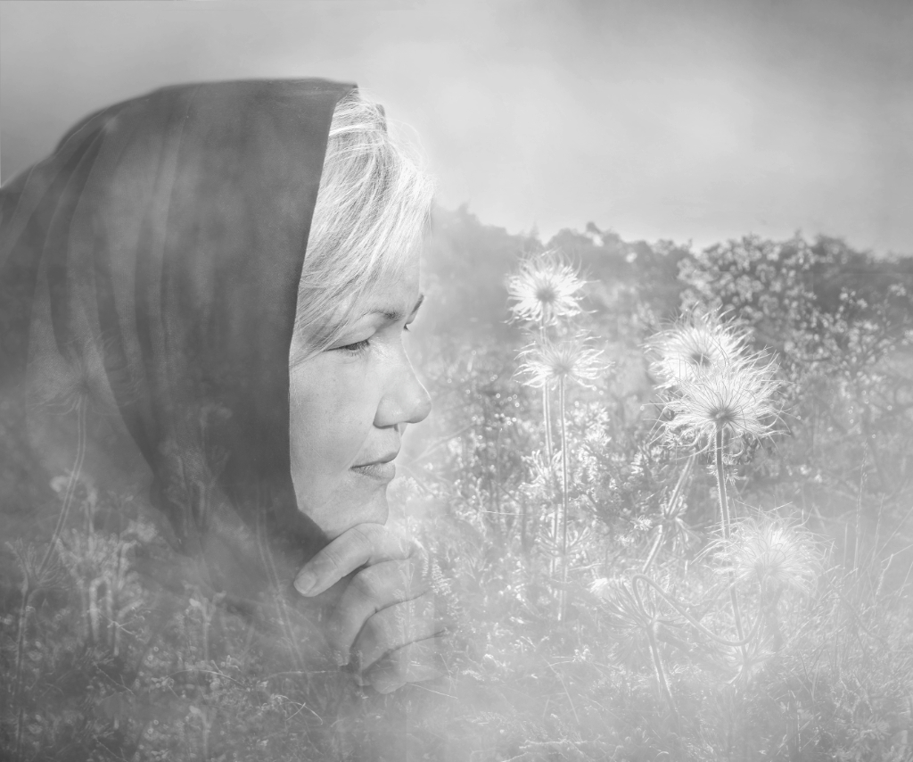
Feb 26 |
Comment |
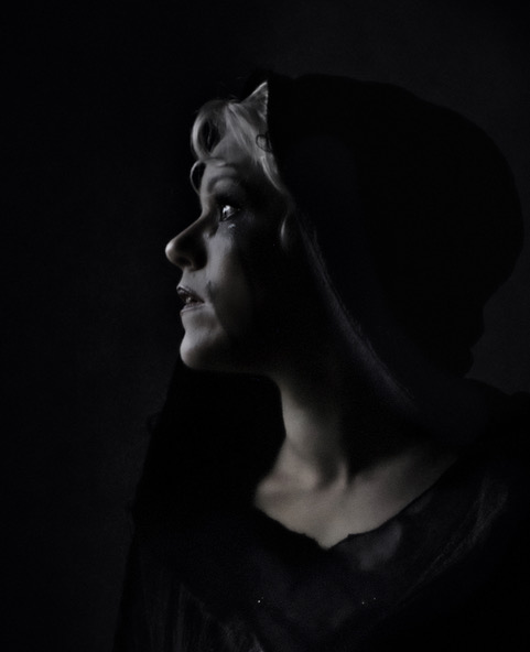
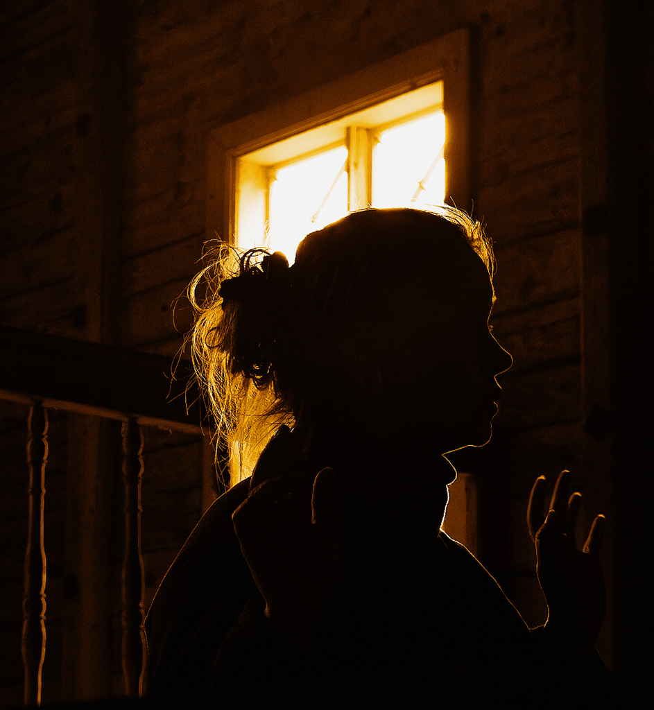
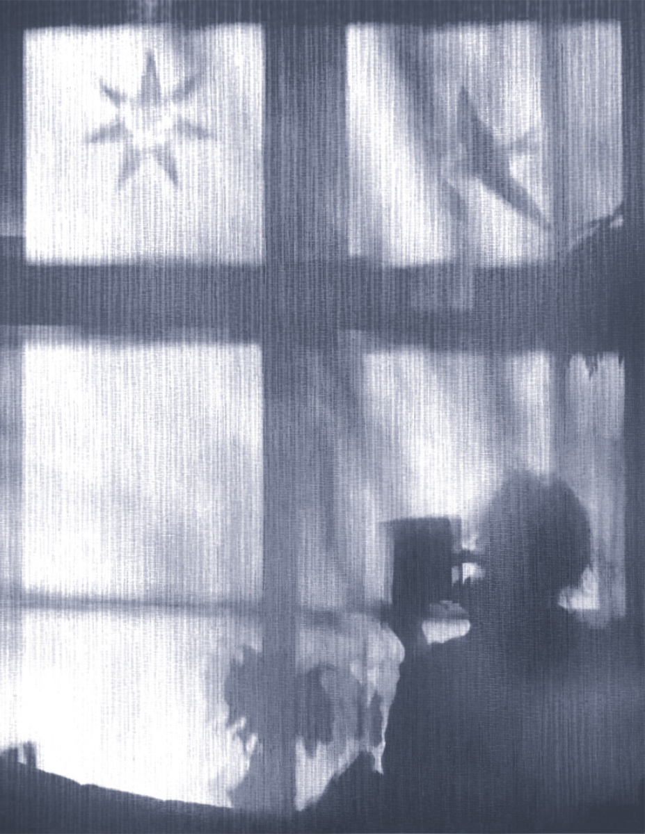
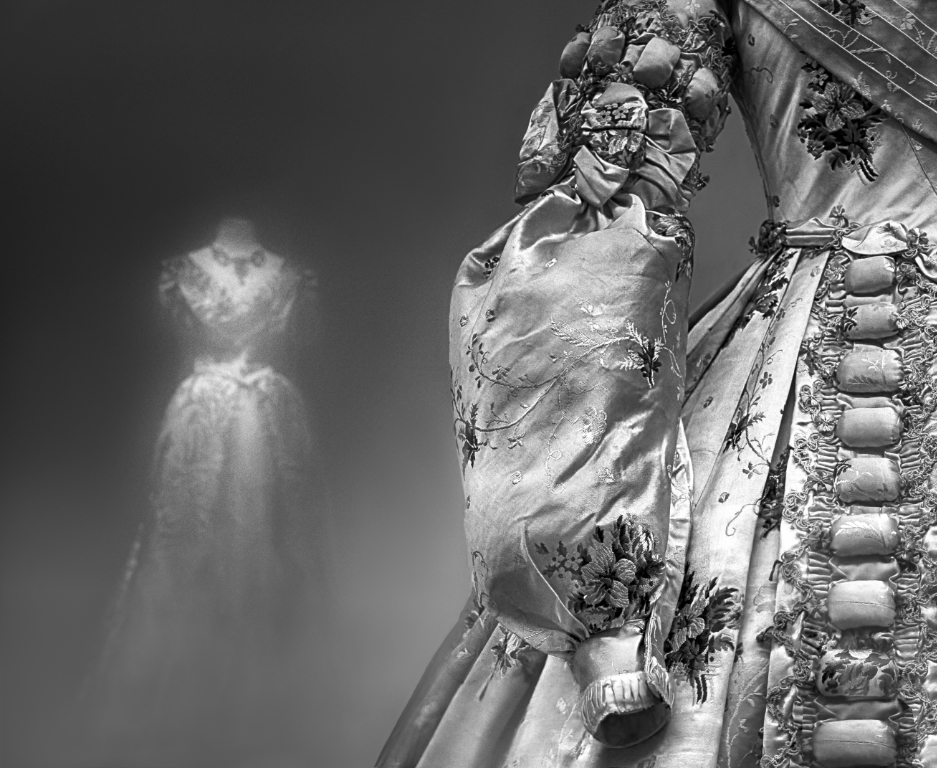
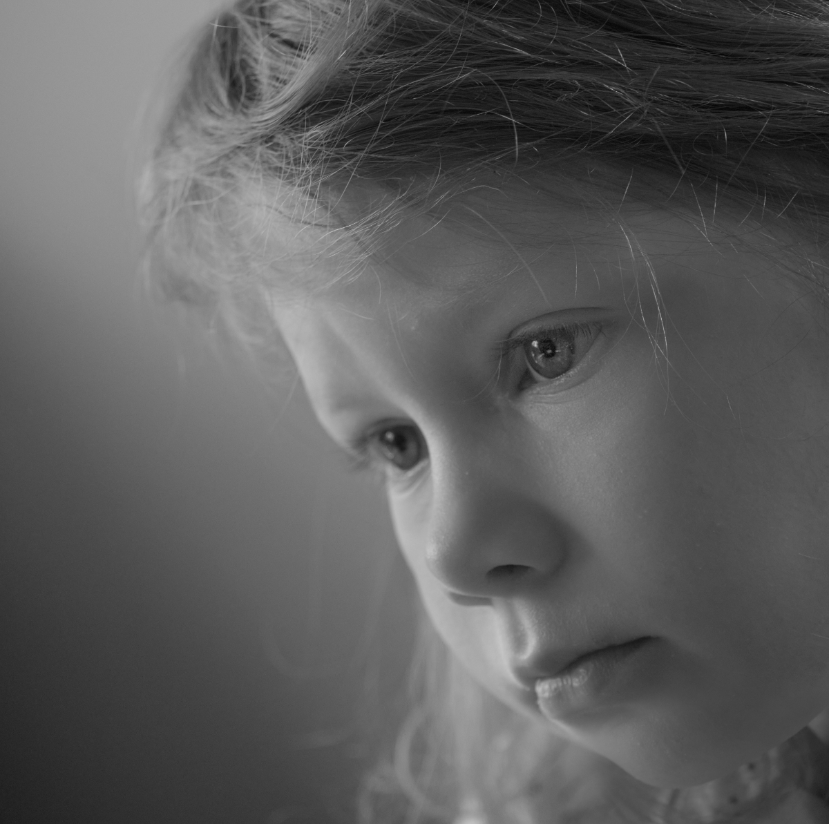
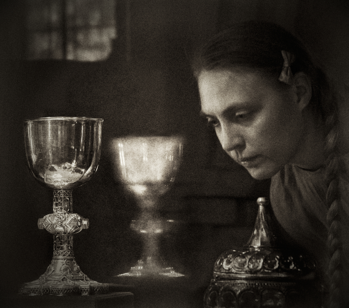
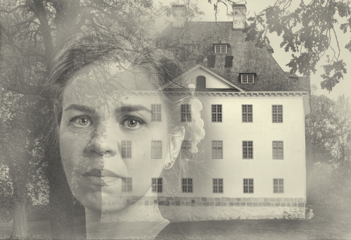
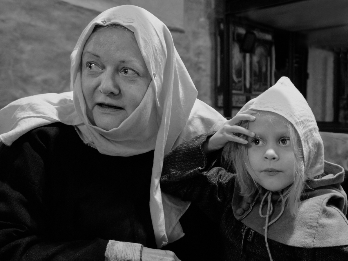
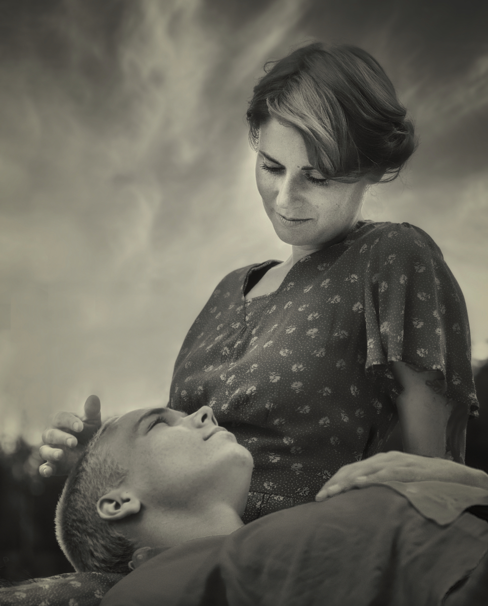
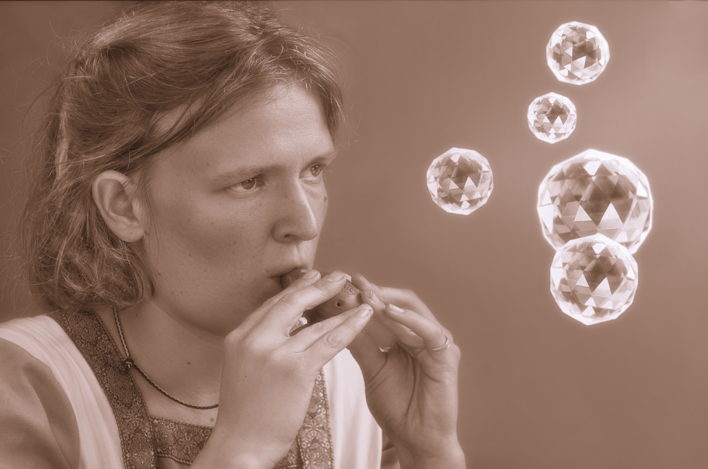
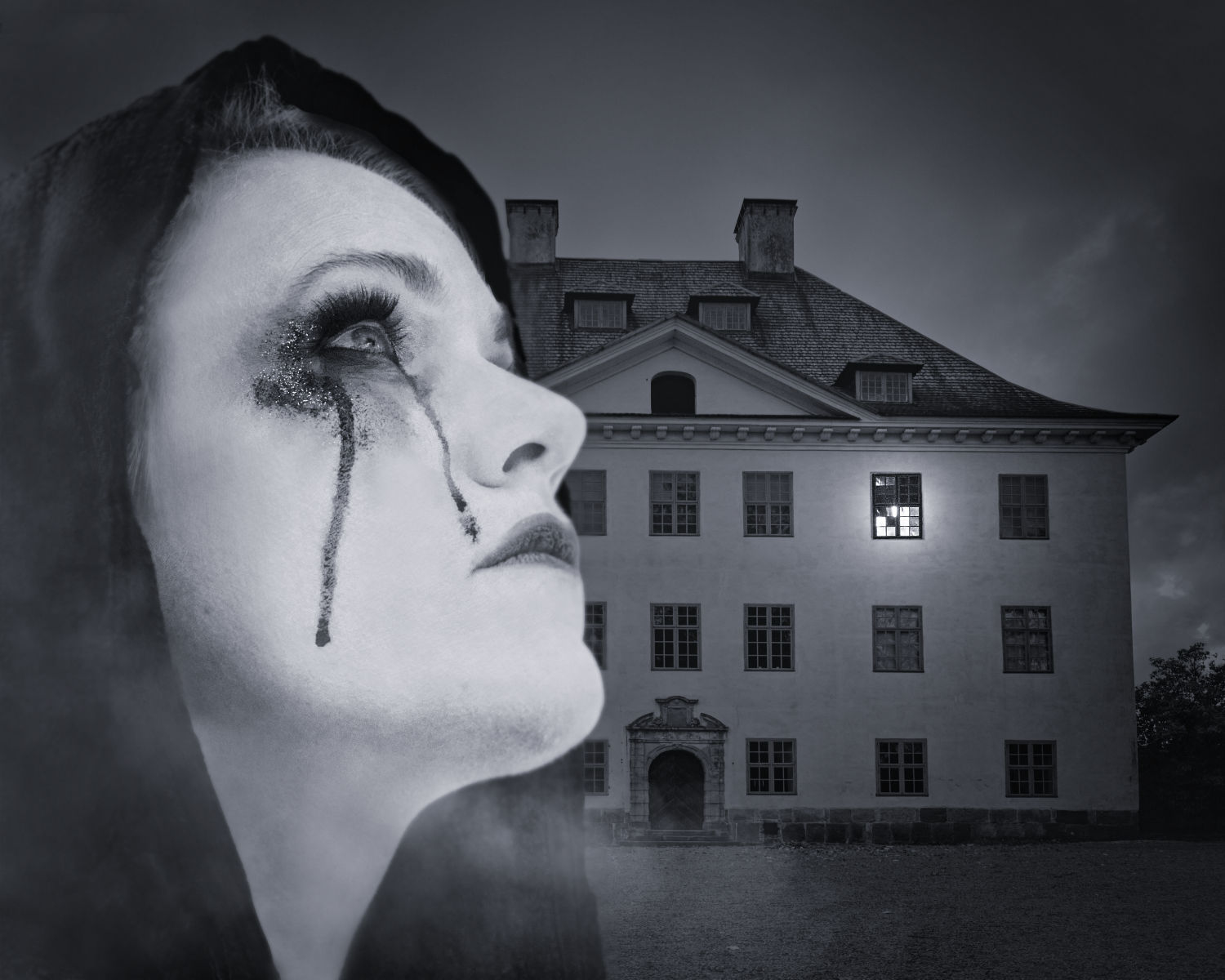
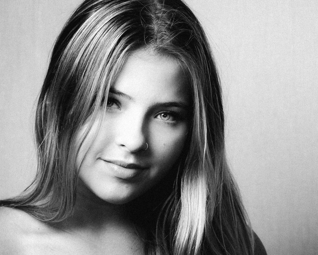
Hi Barbara, I share the attraction for the genre, too! I like very much the way the shadows give form to her face and bring in an element of mystery and drama. - I wonder if slightly more contrast (by adjusting White Level) might do her good? And I might be tempted to experiment with a vignette, too. |
Feb 8th |
 |
| 47 |
Feb 26 |
Comment |
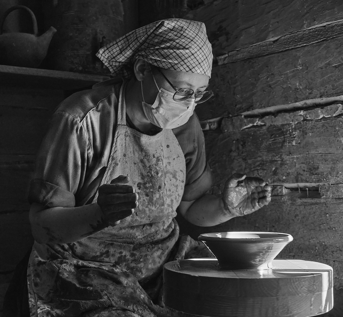
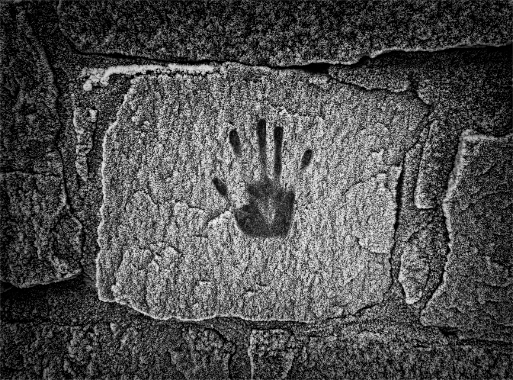
Hi Al, I get an irresistible urge to touch his skin where every detail is so sharply defined. I think that in black-and-white, the feel of a prehistoric creature crawling to fill the frame is emphasized. At first look I was not sure about the sharp grain effect in the background, but then I decided that it adds a special nice touch, and also fits in the texture theme. |
Feb 8th |
| 47 |
Feb 26 |
Comment |
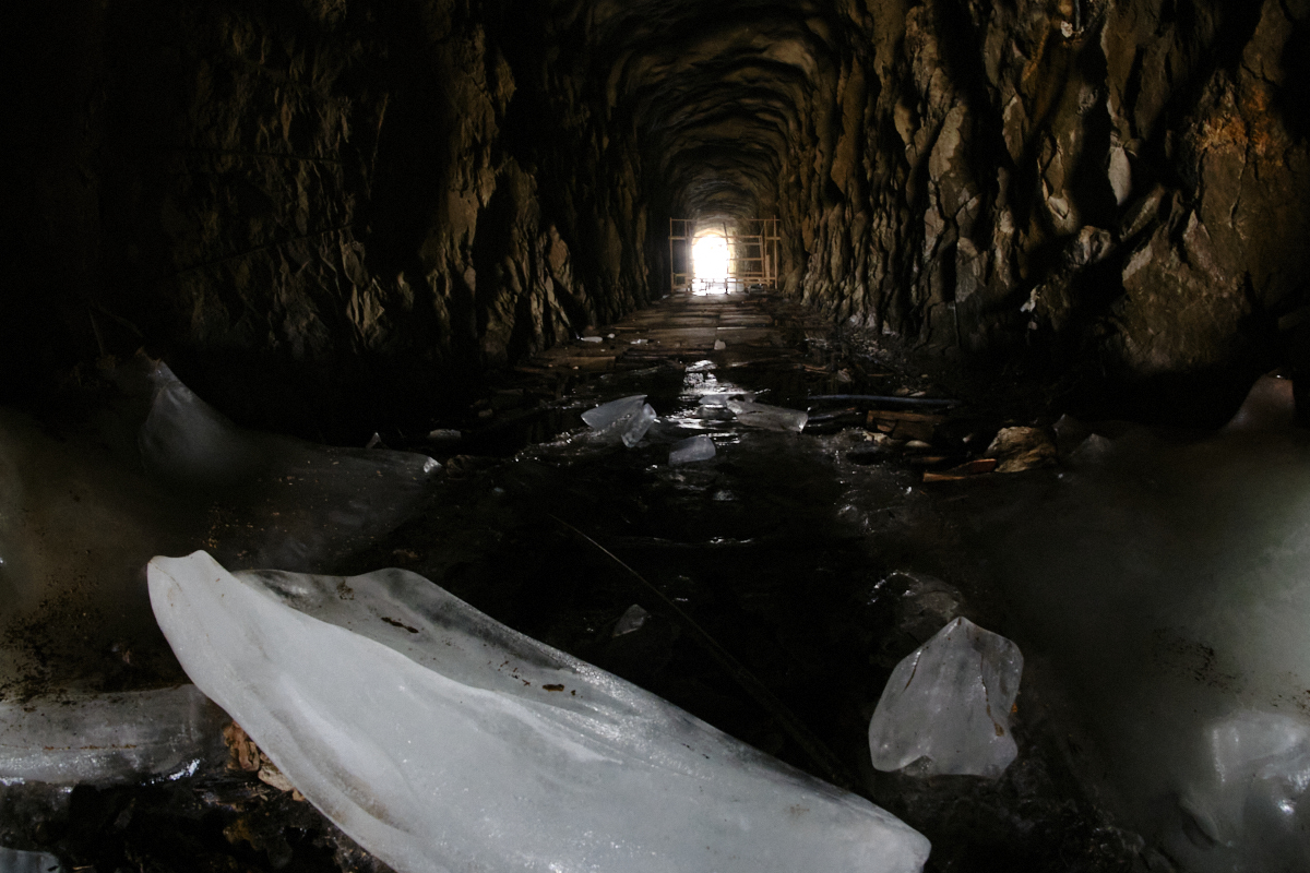
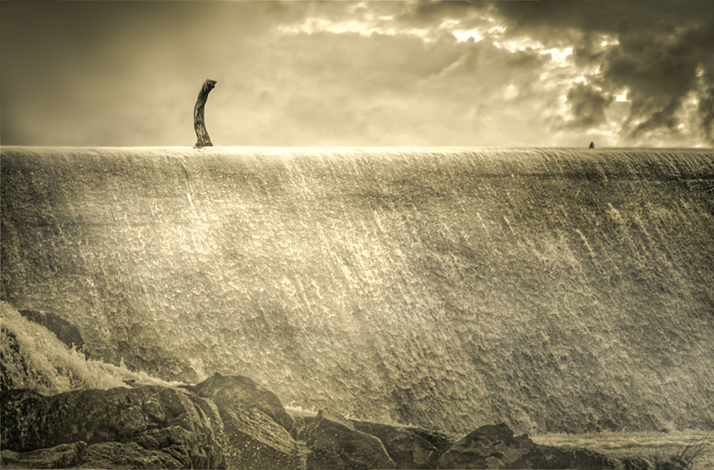
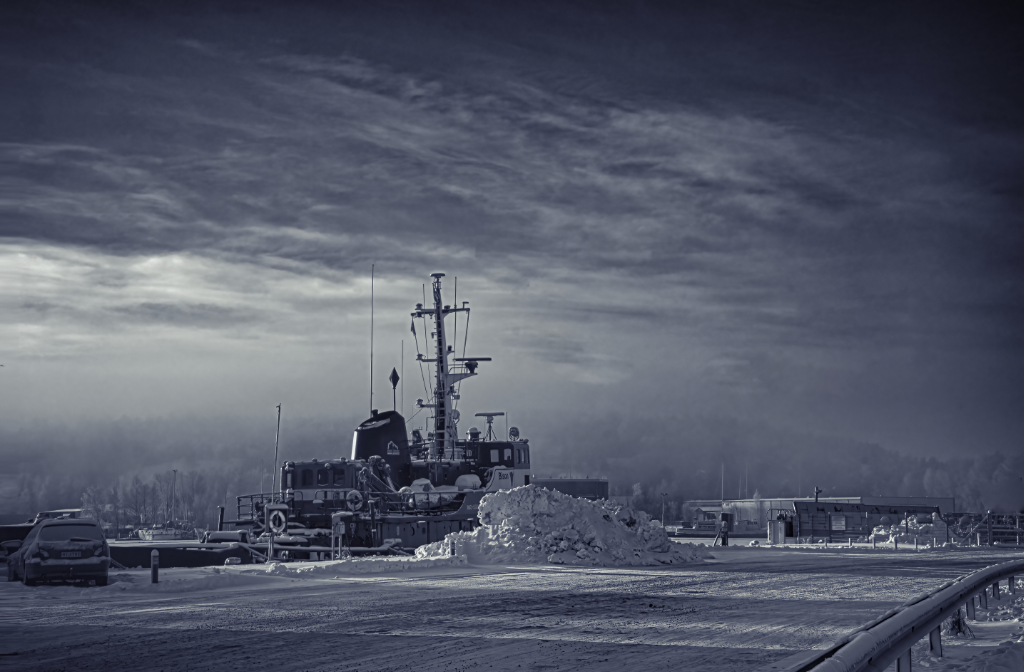
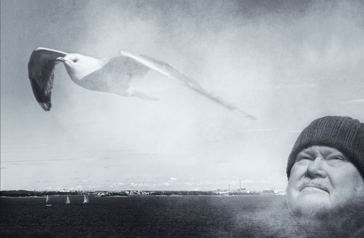
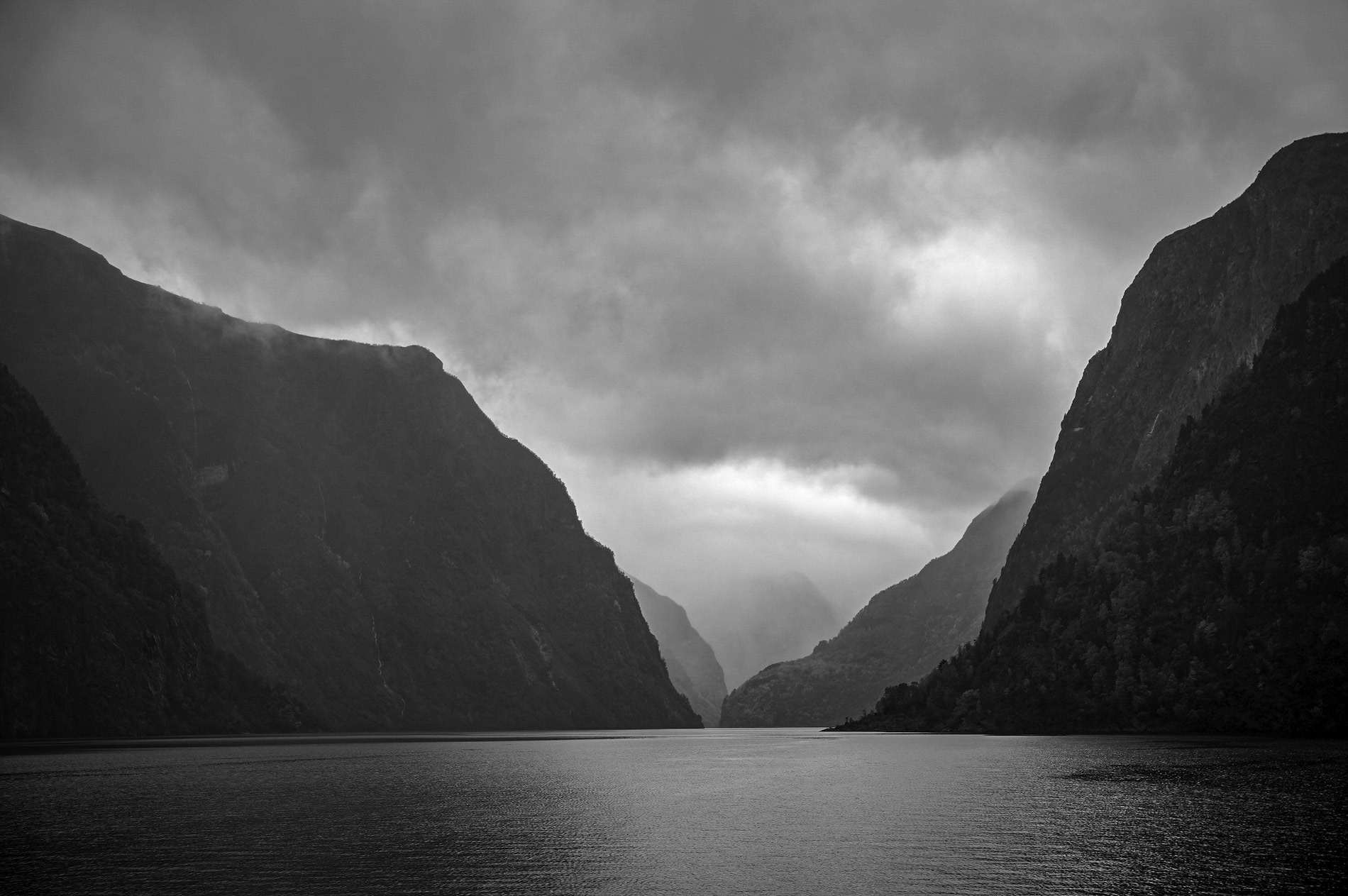
Hi Robert, it feels like sailing along the narrow fjord through the moody landscape towards the mountains the disappear into the mist in the horizon. I love the layers of the landscape that are revealed gradually during the journey. The foreground balances the sky with the lovely light coming through the clouds. - I wonder if there could be a little more light and contrast without affecting the mood? I tried adjusting White Level slightly -what do you think? |
Feb 8th |
 |
| 47 |
Feb 26 |
Comment |
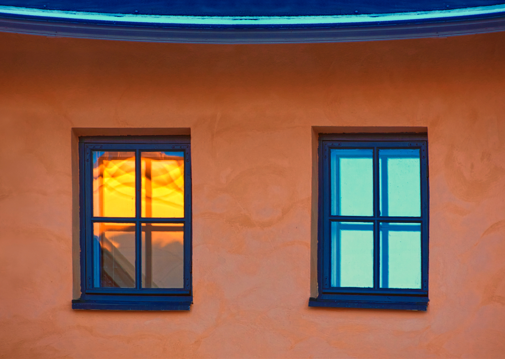
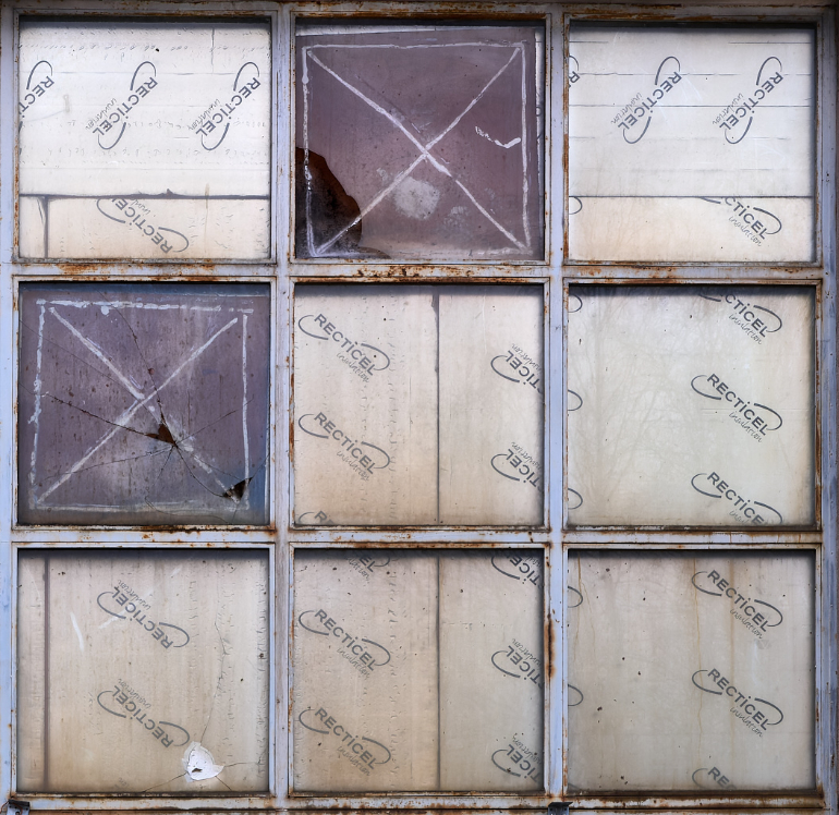
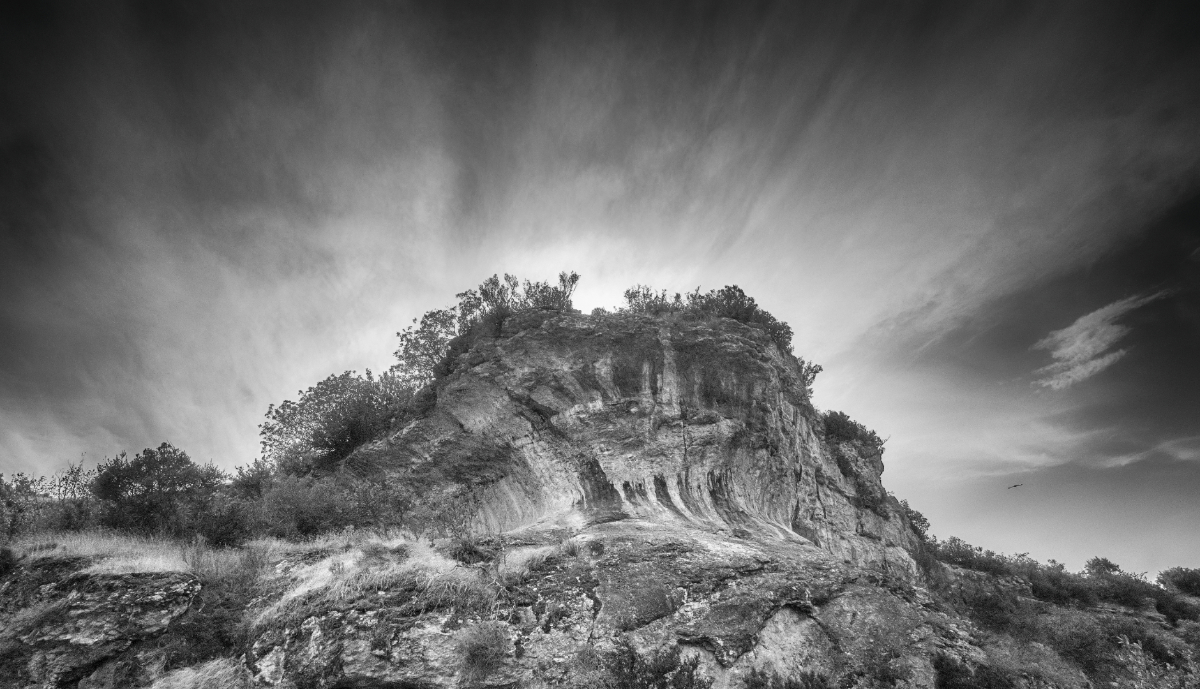
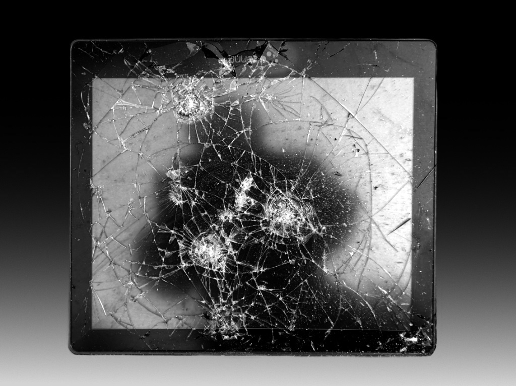
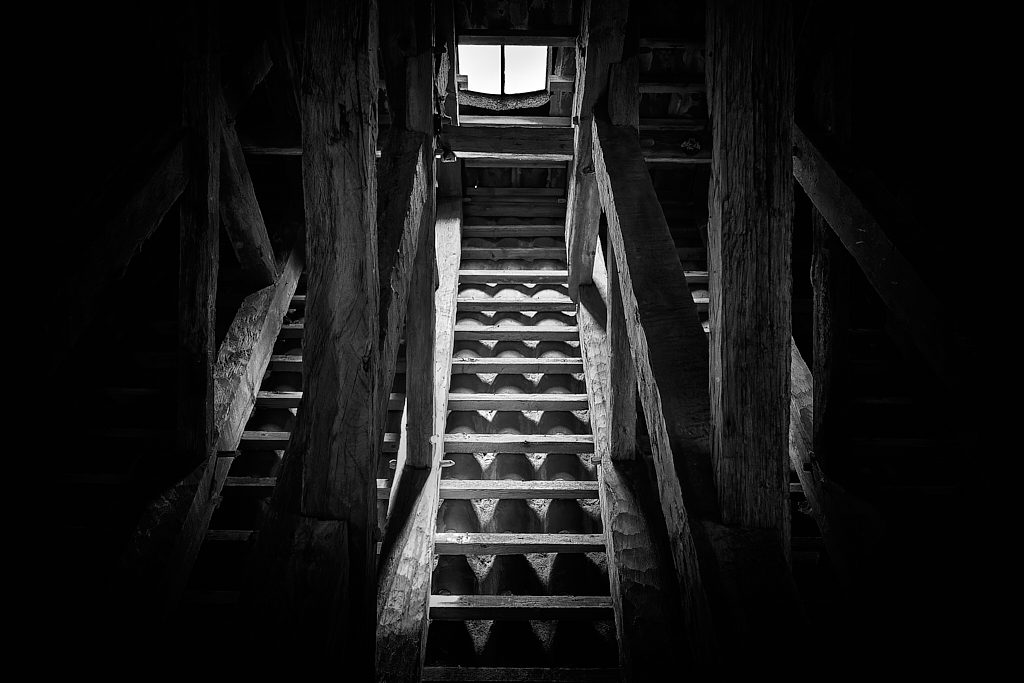
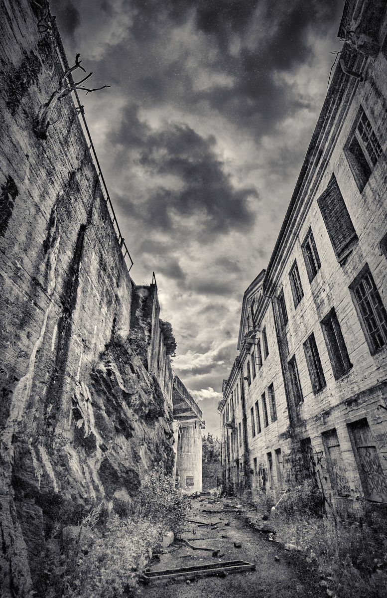
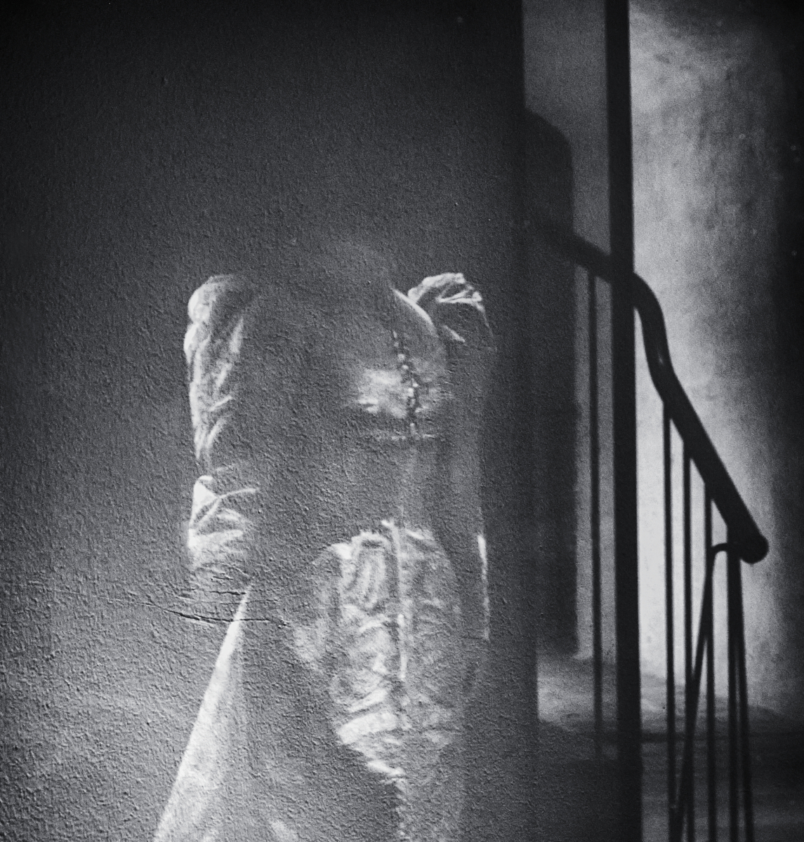
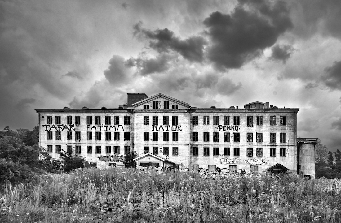
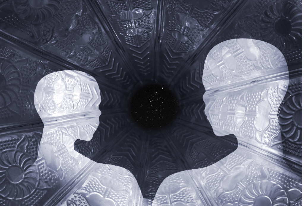
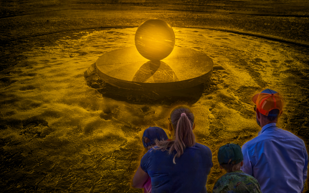
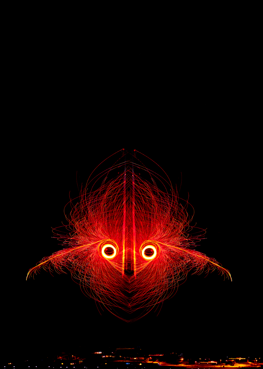
Hi Douglas, I think that this is an extremely interesting image, both as an architectural study and as an abstract. The strict symmetry is very effective, and I think that you got sound advice about the textures. - What fascinates me most is the changing illusion of depth: I can see either a light relief rising from a dark background, or a light area dropped below a dark surface. It is a bit like the figure-ground relationship of the famous Rubin�s vase where you can see either two dark profiles facing each other, or a white vase in the empty space between them. Do anybody else�s eyes play this kind of tricks? |
Feb 8th |
5 comments - 4 replies for Group 47
|
| 54 |
Feb 26 |
Reply |
Alan, that is a beautiful idea! - I loved "The cemetery of forgotten books", too - thank you for reminding me to dig it up again! |
Feb 15th |
| 54 |
Feb 26 |
Reply |
Thank you, Alan! That really is an interesting issue. - Our current teacher has the creative class wading in deep waters about image analysis. I have been thinking of the Roland Barthes concepts of "studium" and "punctum": is it really so that whatever messages we try to construct, the thing that most deeply touches the viewer is between him and the image, out of control of the photographer? |
Feb 15th |
| 54 |
Feb 26 |
Reply |
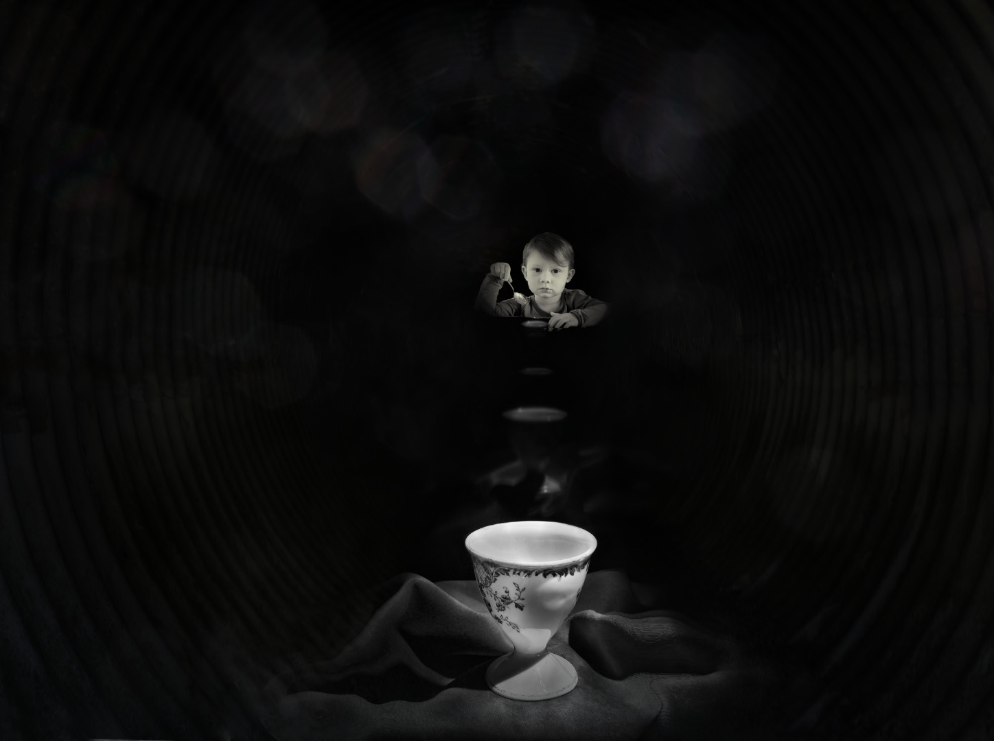
Thank you, Maria - I think, too, that Peggy brought out the very essence of the idea beautifully. - The egg project has taught me a lot about visual language: our teacher is a fan of the Gestalt Principles, and week after week of making the eggs look sad or happy or lonely by the use of composition and color begins to make sense. |
Feb 13th |
| 54 |
Feb 26 |
Reply |
Thank you so much, Peggy! I love your version - it also makes the mast and the spars look a lot more like scaffolding. - Good luck with the eggs! My tip is that it is a good idea to do the cracking over a bowl although success rate seems to improve with practice. |
Feb 13th |
| 54 |
Feb 26 |
Comment |
Thank you, Brad! I'll start experimenting with that - I have another egg that cracked a bit differently - I'll see how it works. |
Feb 11th |
| 54 |
Feb 26 |
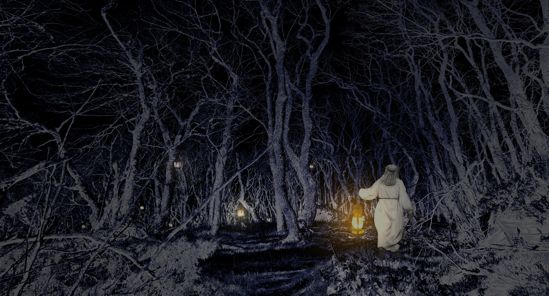
Comment |
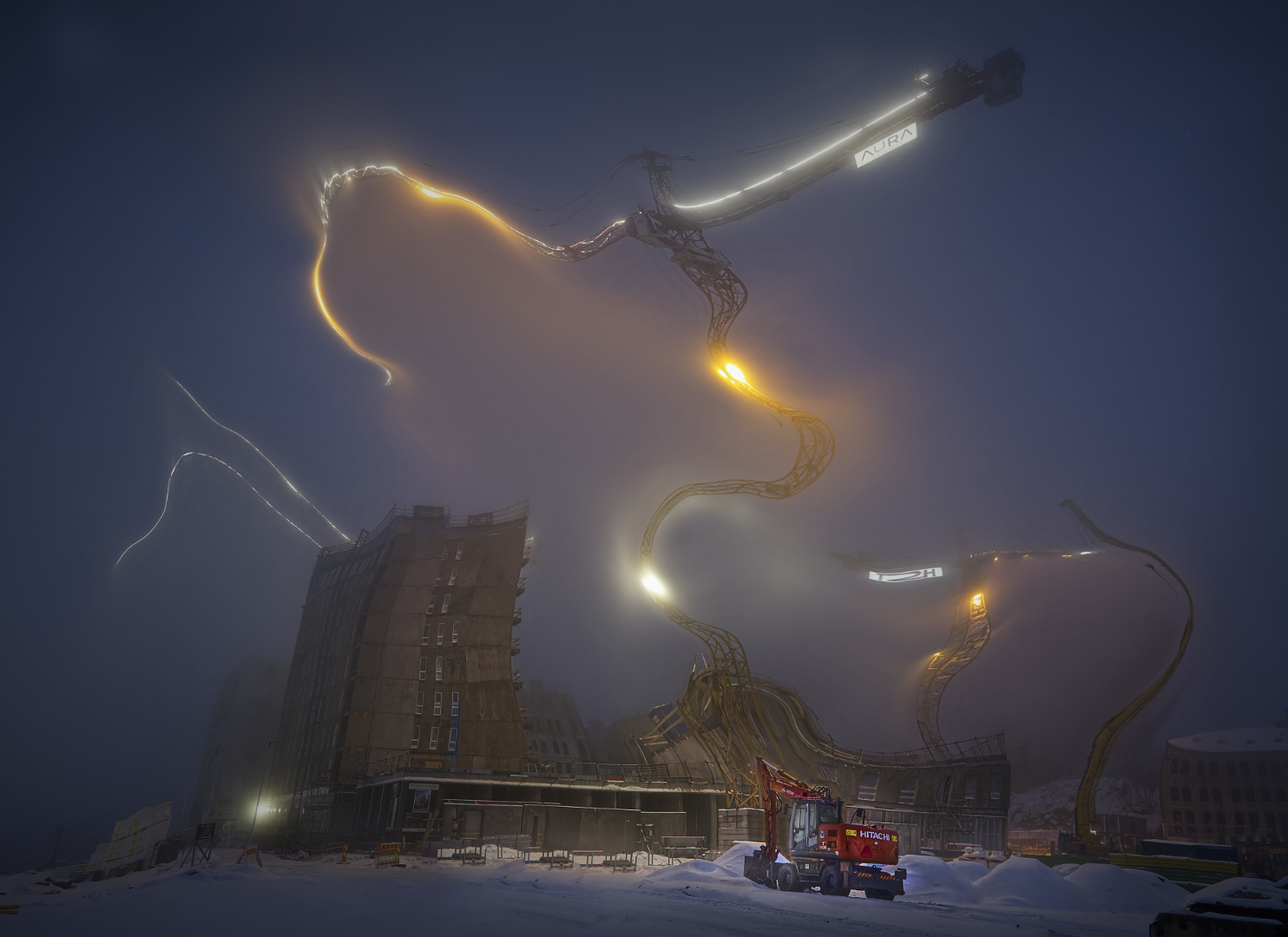
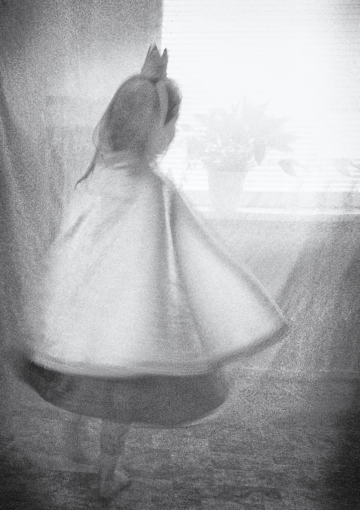
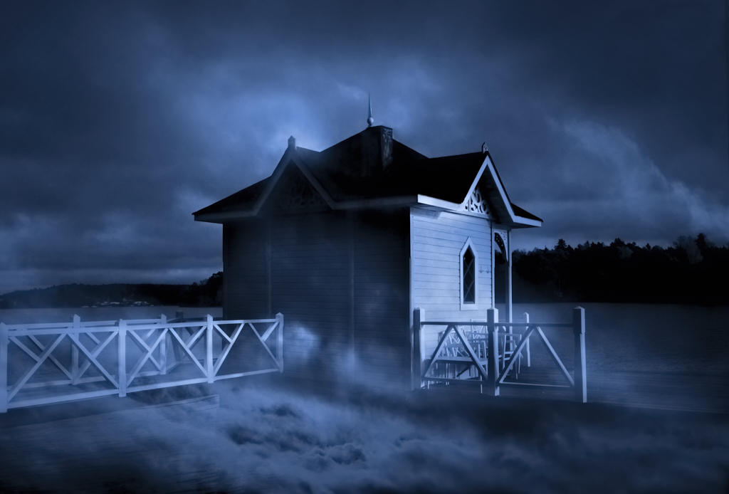
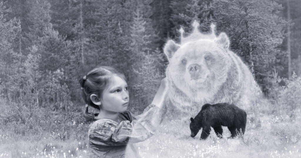
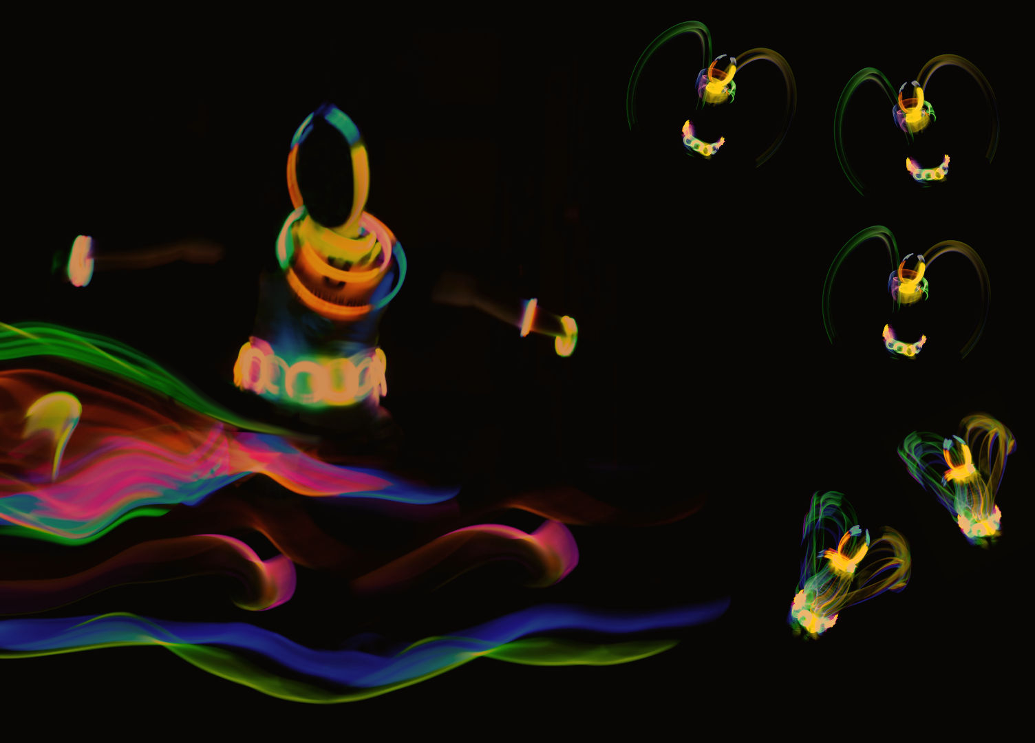
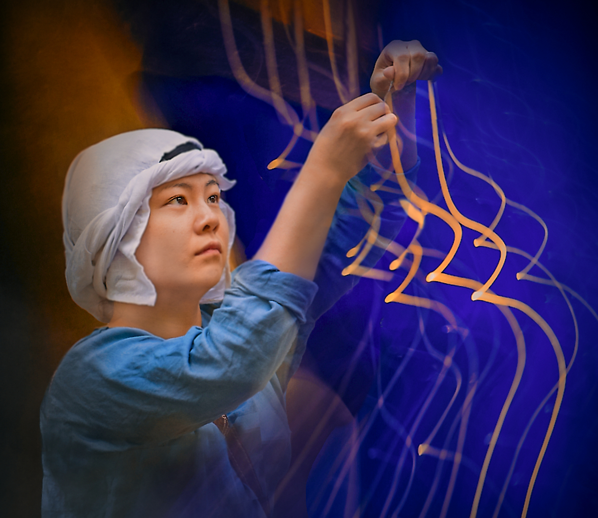
Hi Alan, I loved the original Wizard's windows, and I think that the concept works here maybe even better. I think that the choice to give color only to the instruments and the music underlines the significance of Art and the experience. After contemplating Maria's stairway to heaven, I cannot help thinking that this may be a performance by spirits of musicians on the road. - I like the composition with the melody chains winding round the floating disc stage, and the last note of the trombone player that escapes from the frame is a lovely touch. |
Feb 8th |
| 54 |
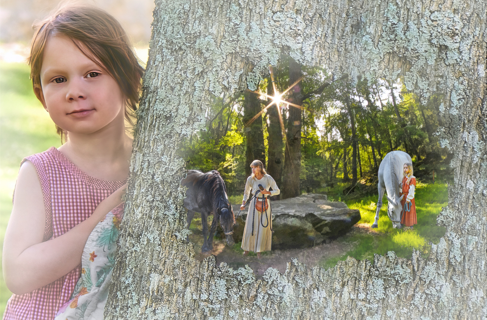
Feb 26 |
Comment |
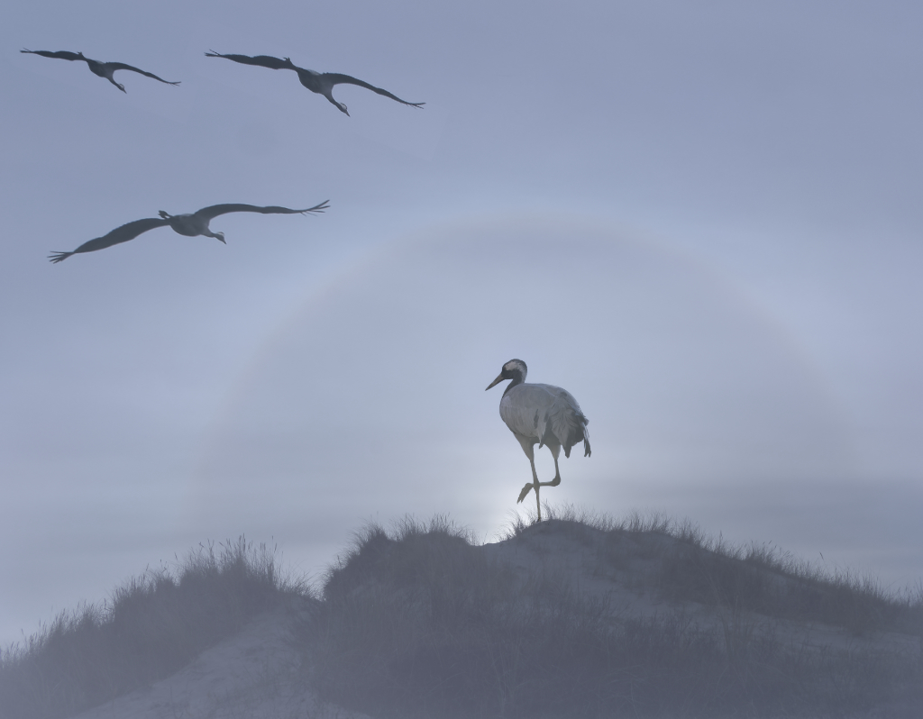
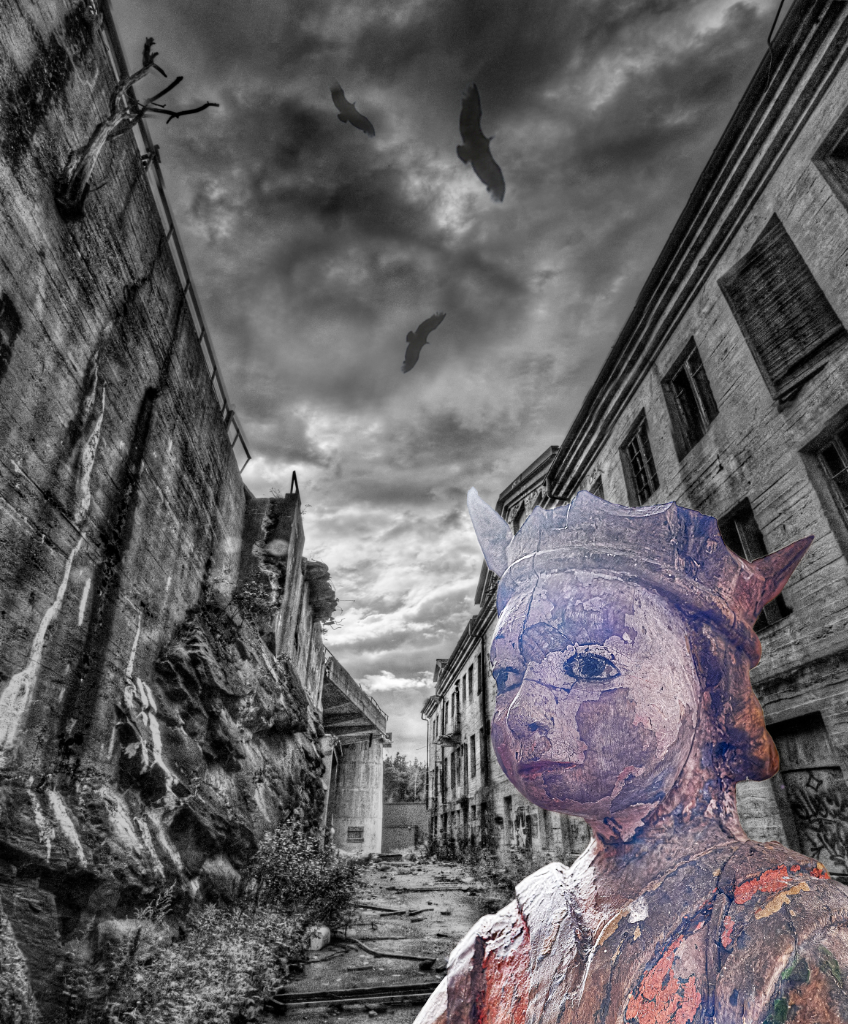
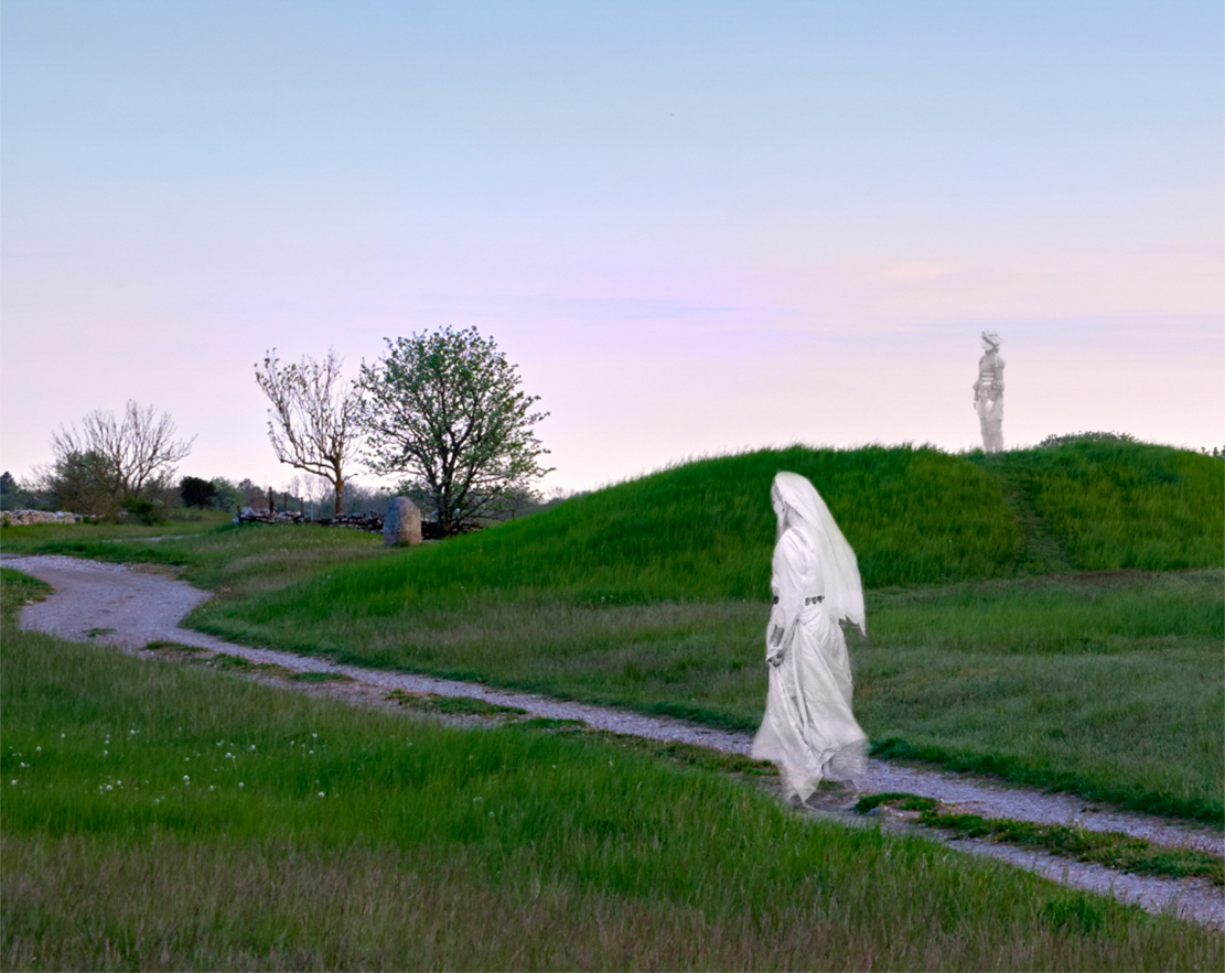
Hi Maria, I think that the symmetric setup of the road climbing up to Heaven through the clouds is very impressive and beautifully executed. I love the idea of little angels resting on the slope, but I wonder if reducing their number might make the image more clear and still carry the message? On the other hand, the Guardians with the hollow eyes are so awe-inspiring and scary that a whole herd of angels is probably needed for balance. |
Feb 8th |
| 54 |
Feb 26 |
Comment |
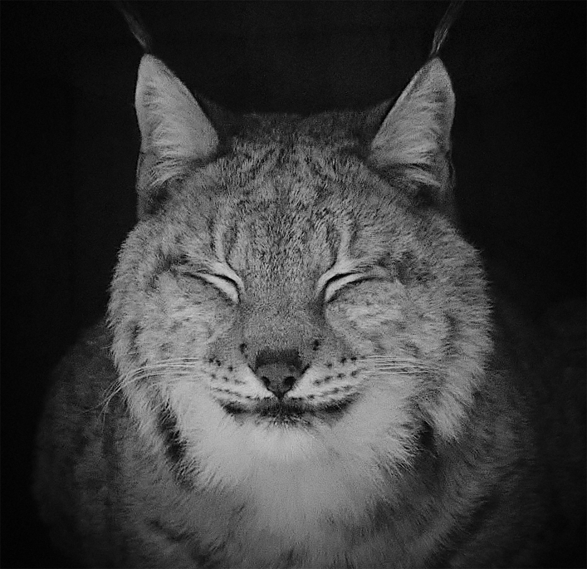
Hi Brad, this is a happy image through and through. We have a saying about three things man never gets tired to watch: flowing water, burning fire and sleeping child; the last one can certainly be exchanged for smiling deer. You have combined all the elements in a deeply satisfying way in the serene landscape. I think that the deer is placed perfectly in perspective, and her expression, of course, is just precious. |
Feb 8th |
| 54 |
Feb 26 |
Comment |
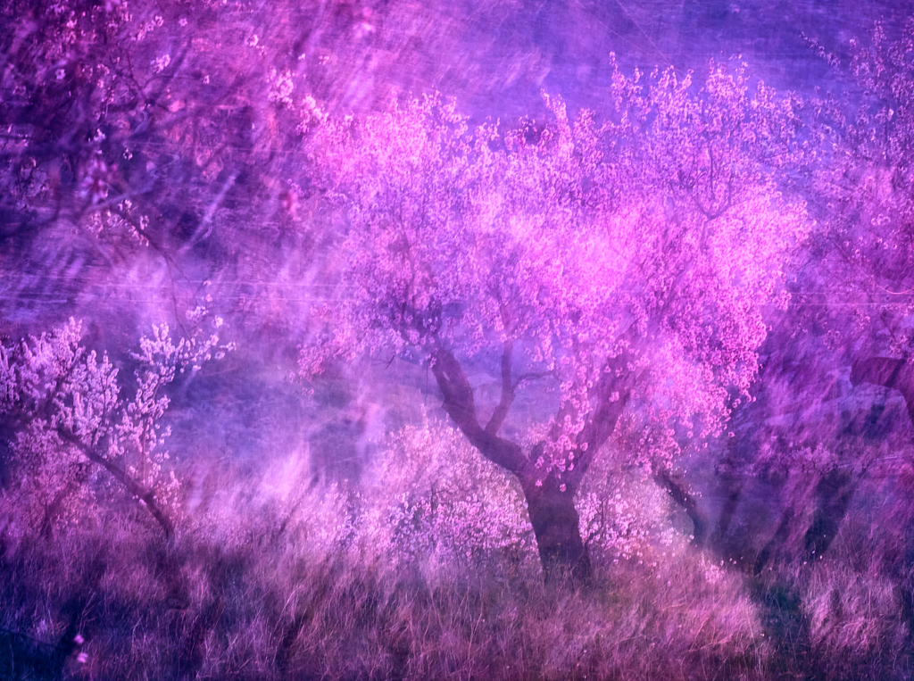
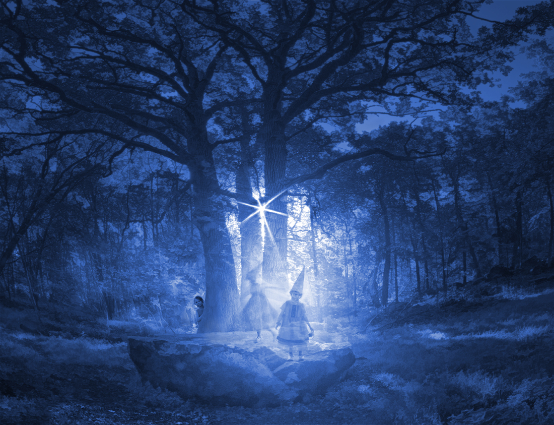
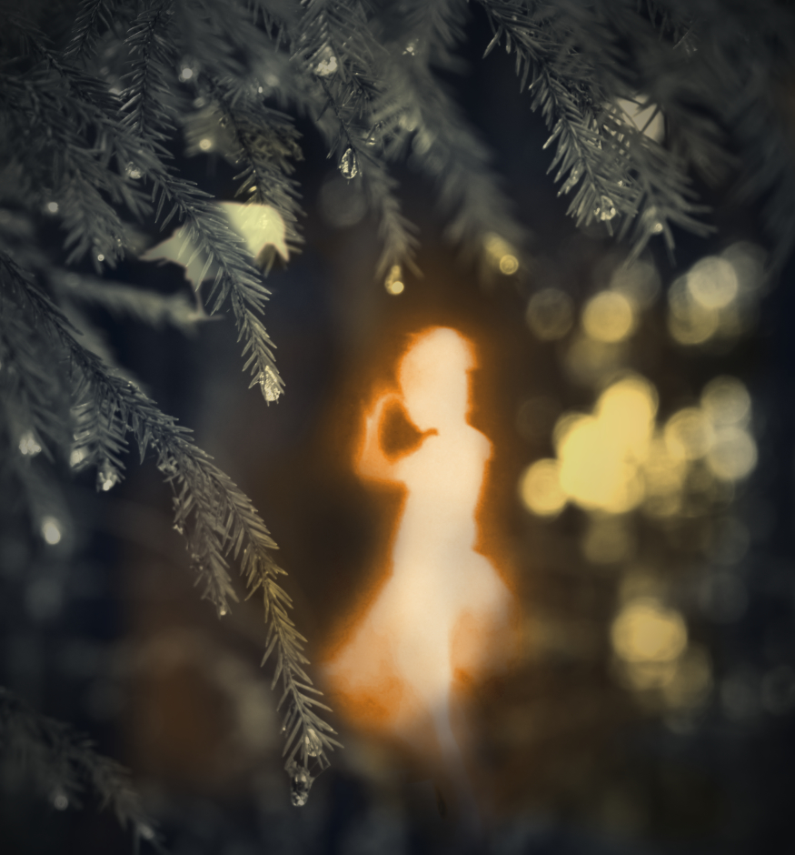
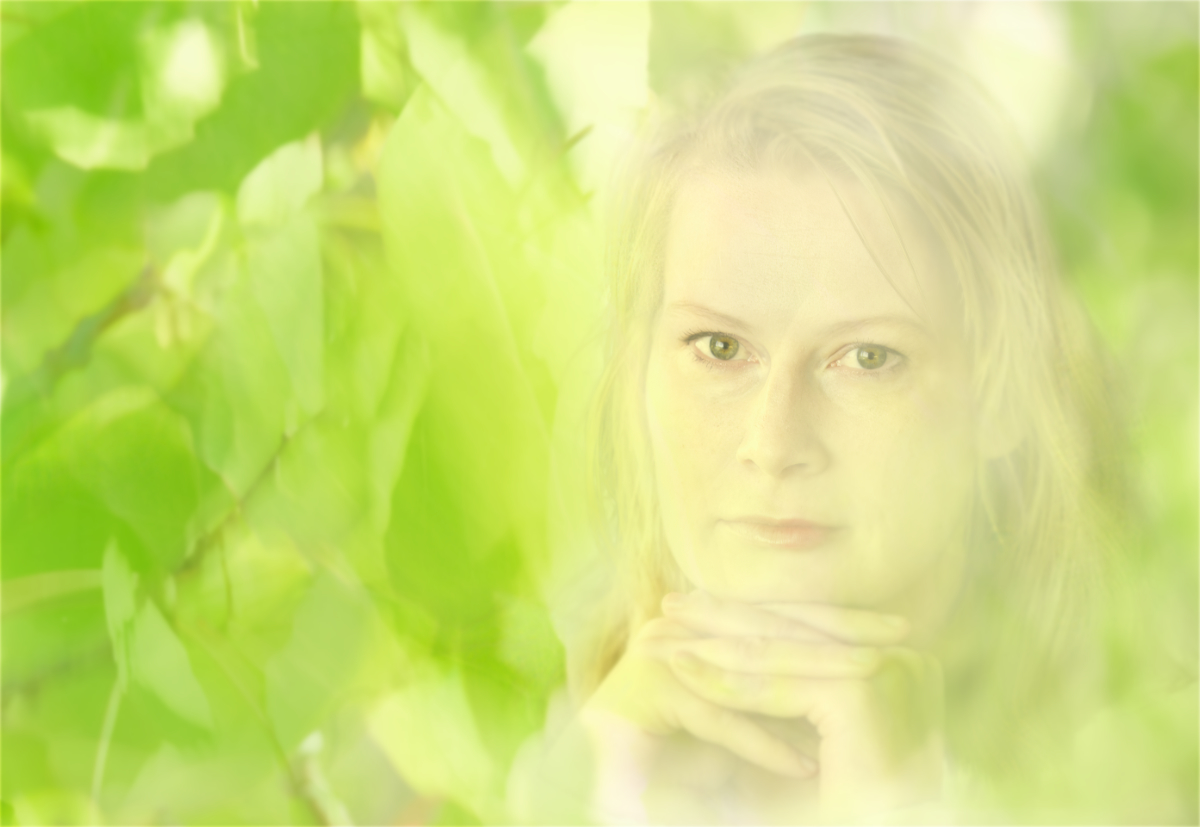
Hi Peggy, this is another of your dream landscapes one wants to step in. I love the subtle colors and the flowing textures that make wind visible. - I wonder if the border of the "wind" layer in the grass just in front of the tree might be just a little more transparent and gradual, like in the upper parts of the image?
Thank you for sharing the process in detail - I would never have thought of using a B&W layer for desaturation. |
Feb 8th |
5 comments - 4 replies for Group 54
|
15 comments - 11 replies Total
|