|
| Group |
Round |
C/R |
Comment |
Date |
Image |
| 26 |
Sep 25 |
Reply |
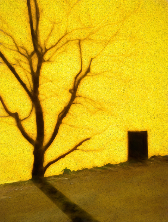
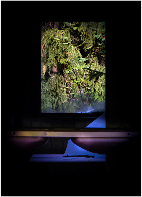
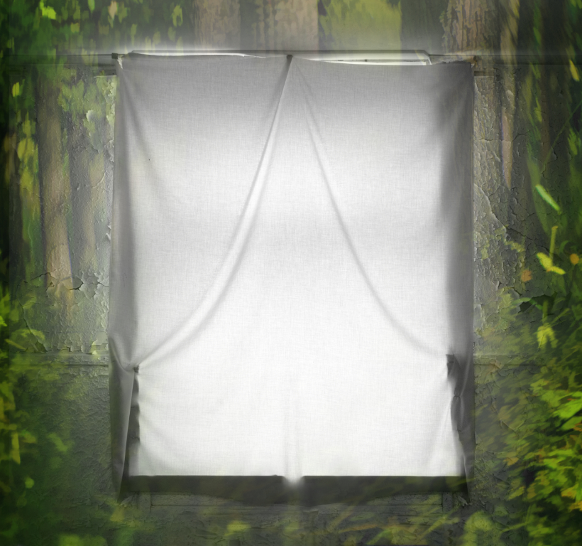
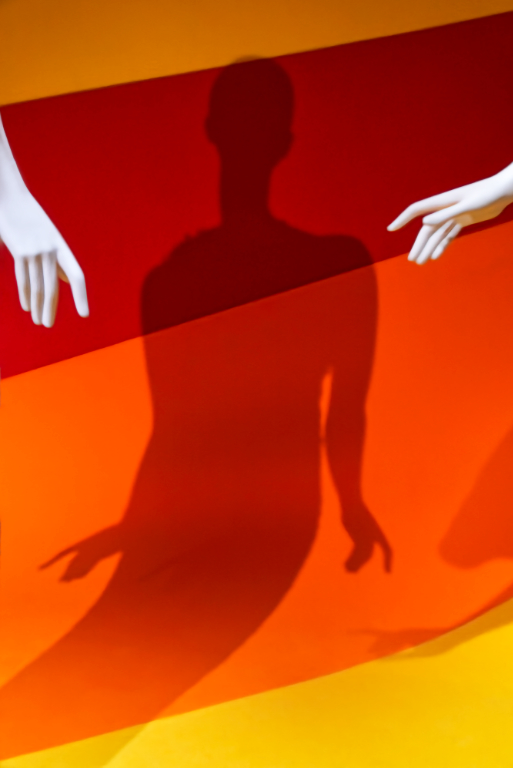
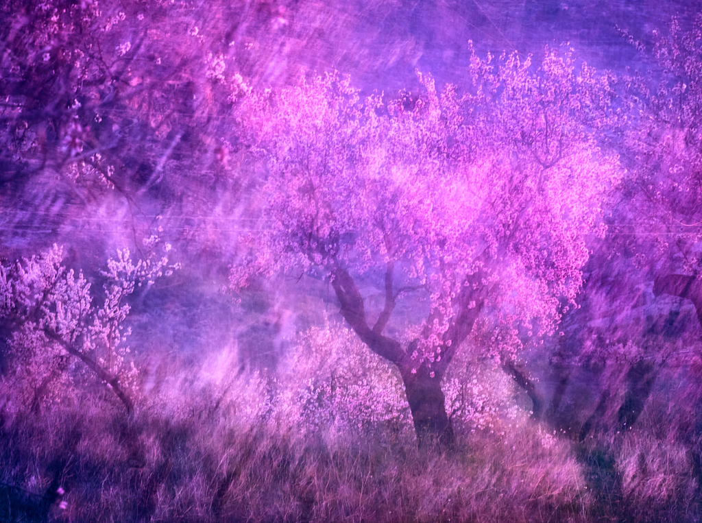
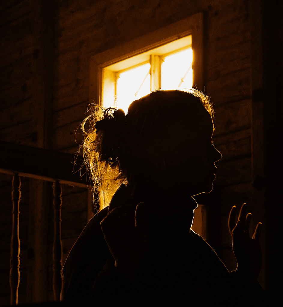
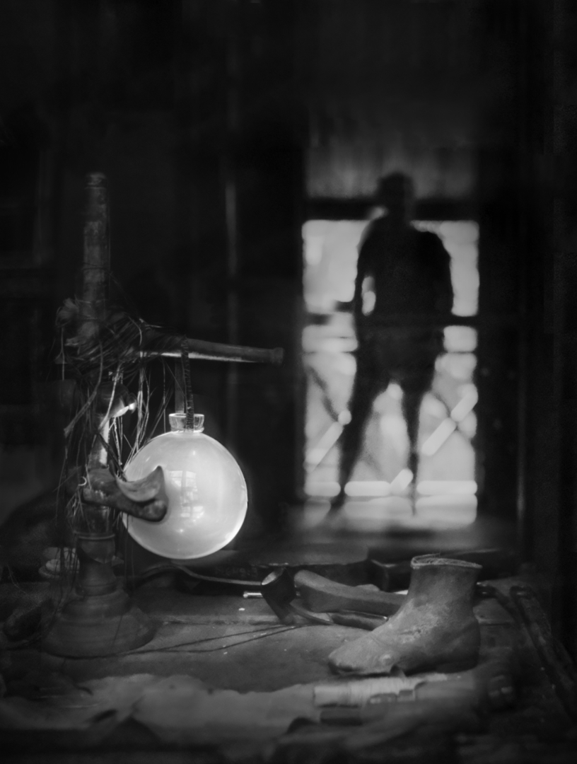
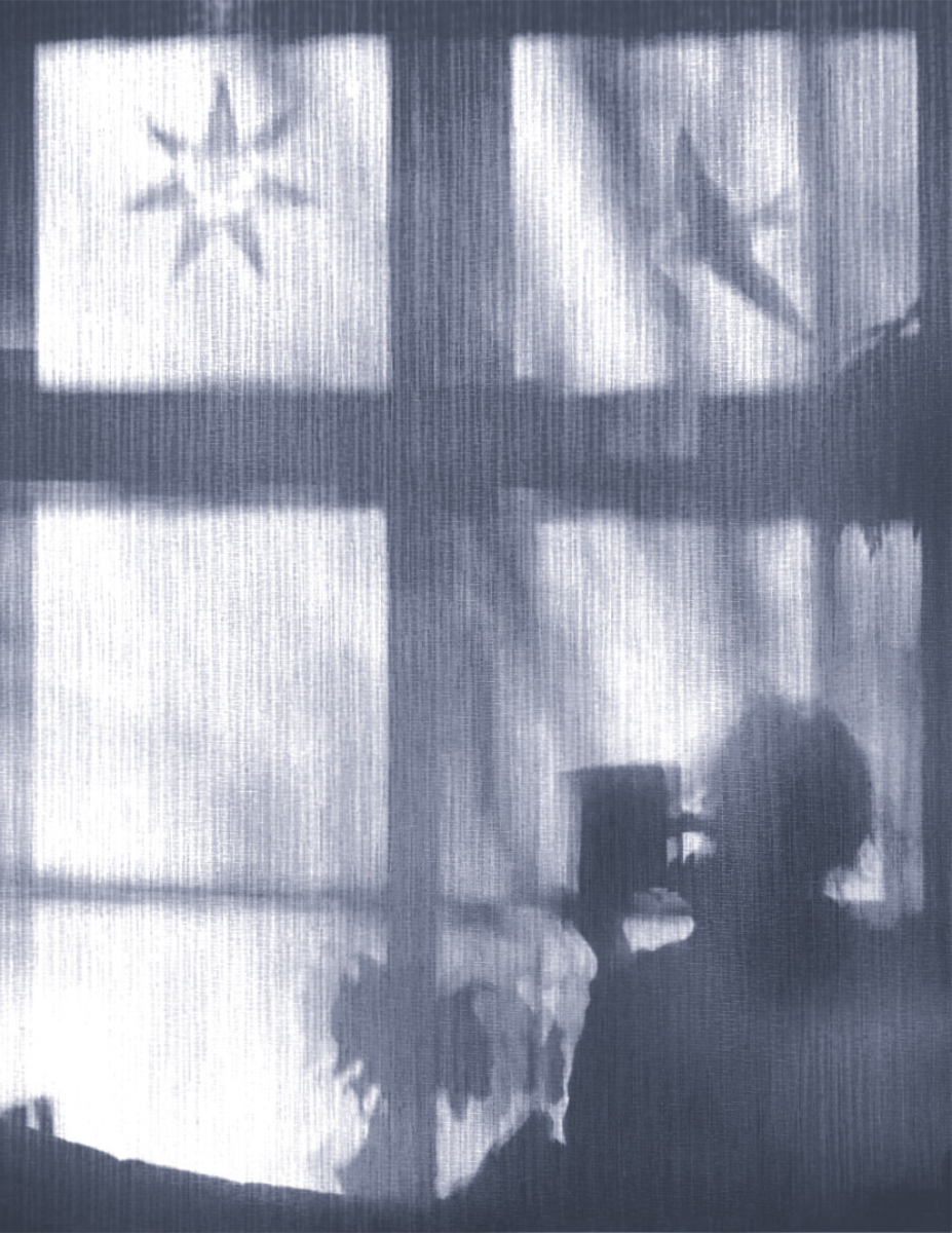
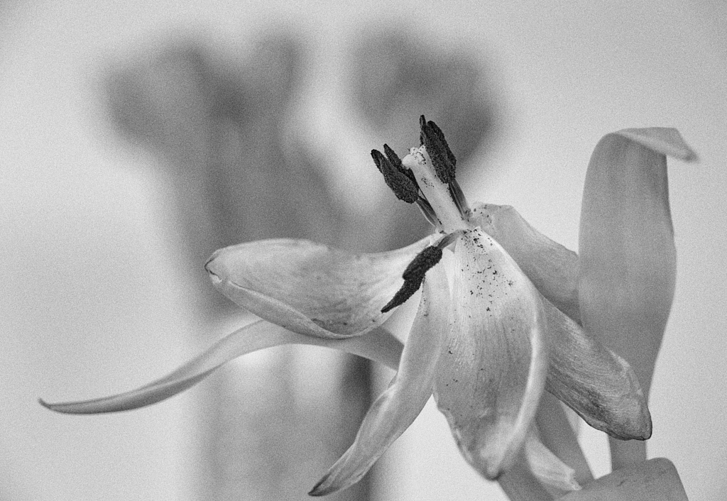
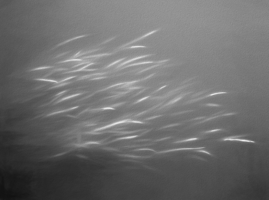
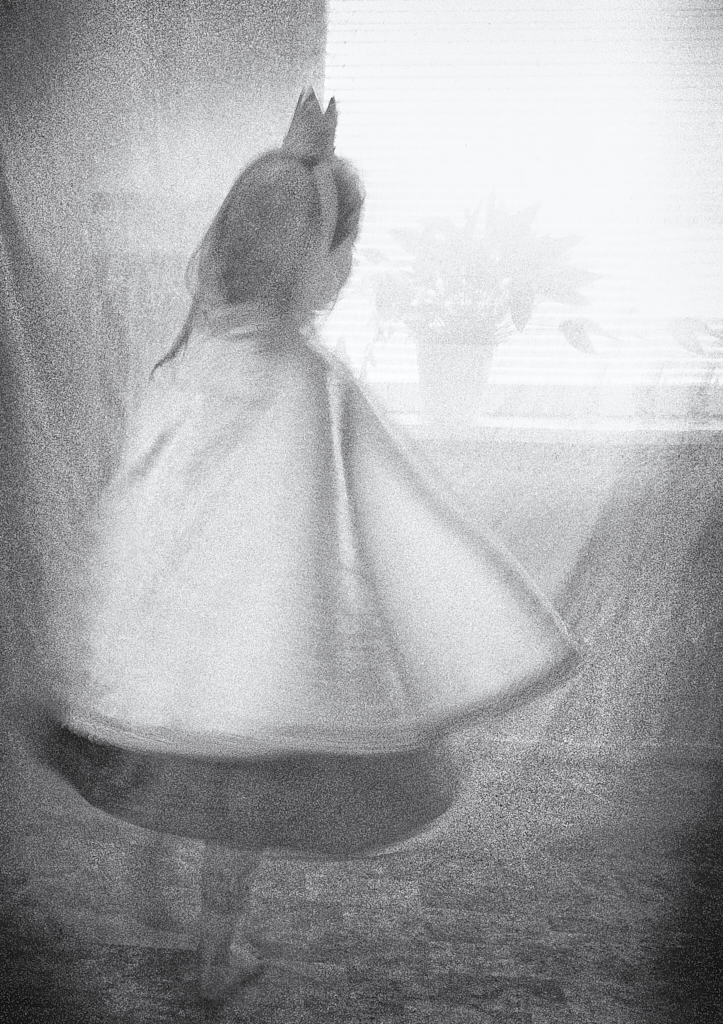
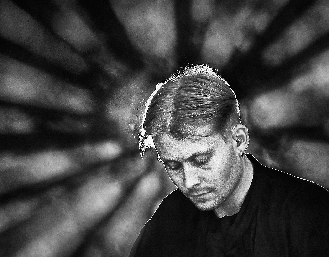
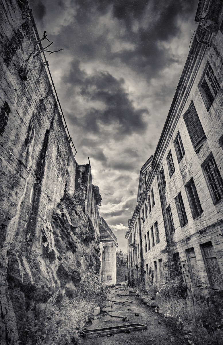
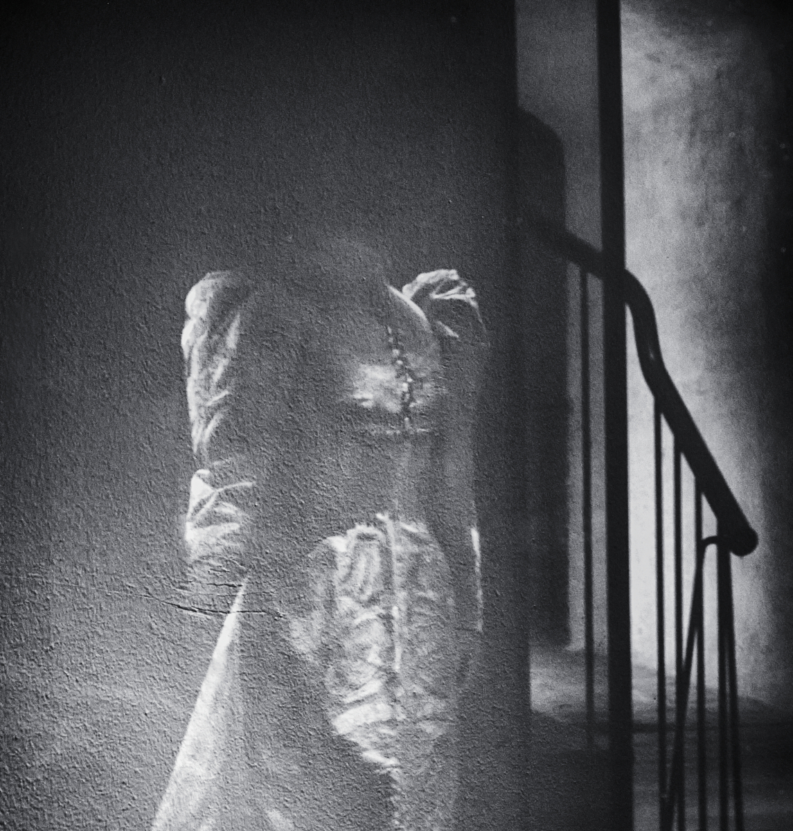
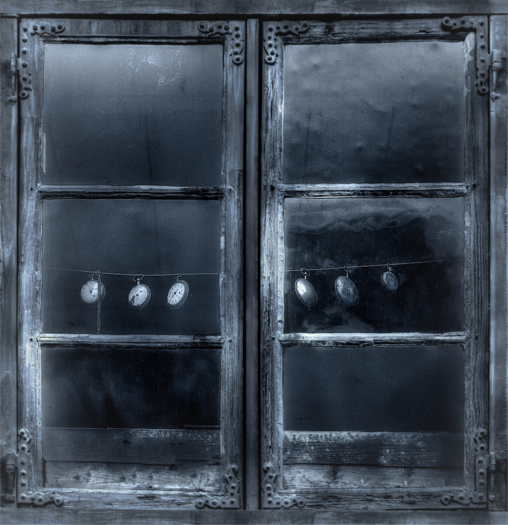
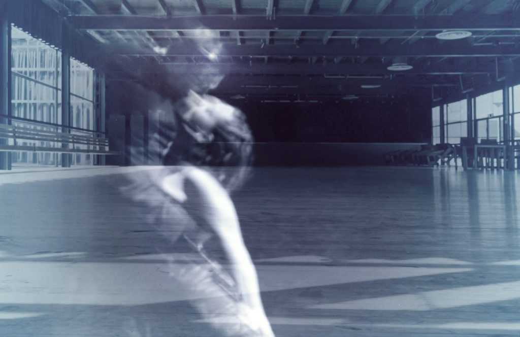
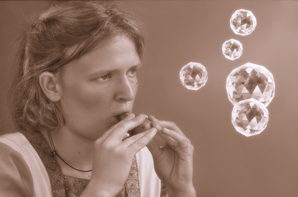
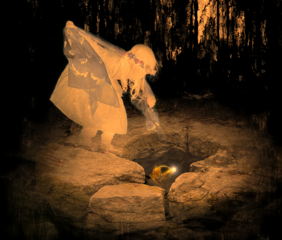
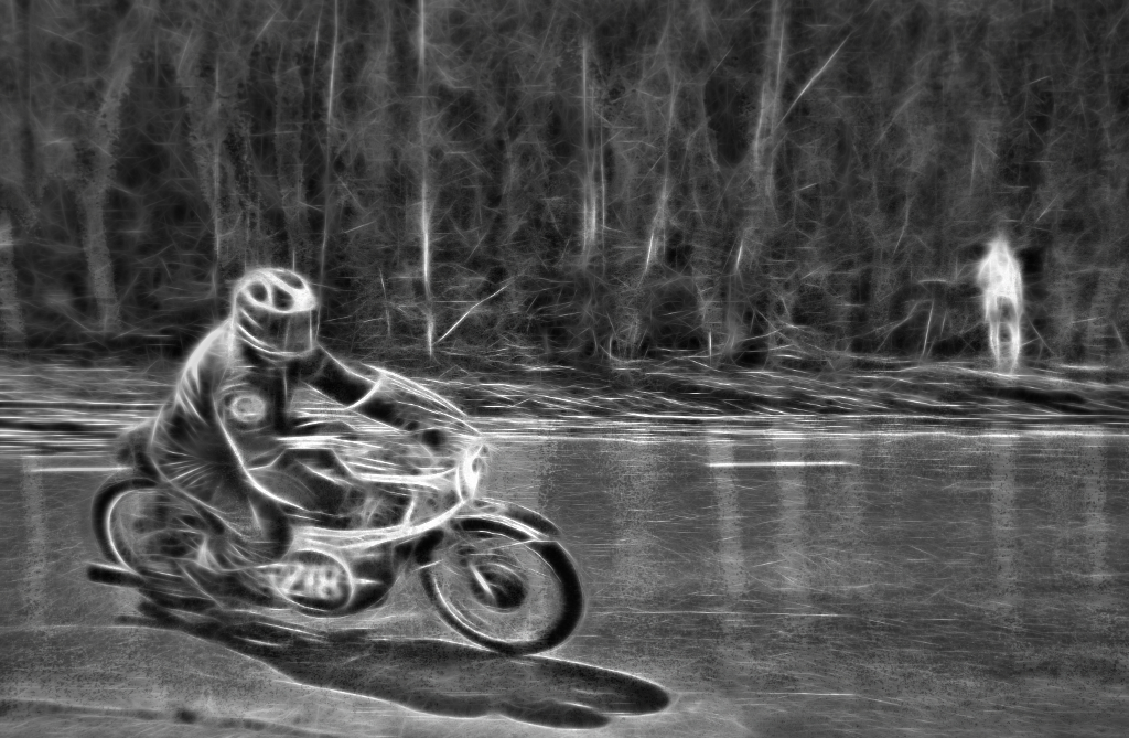
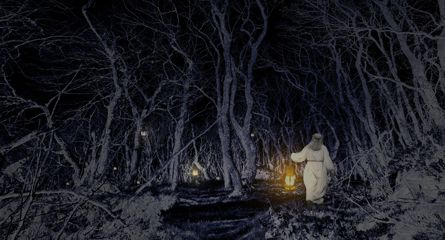
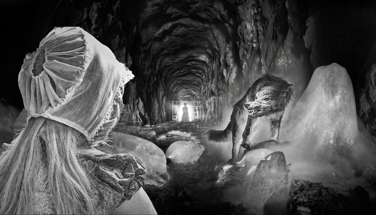
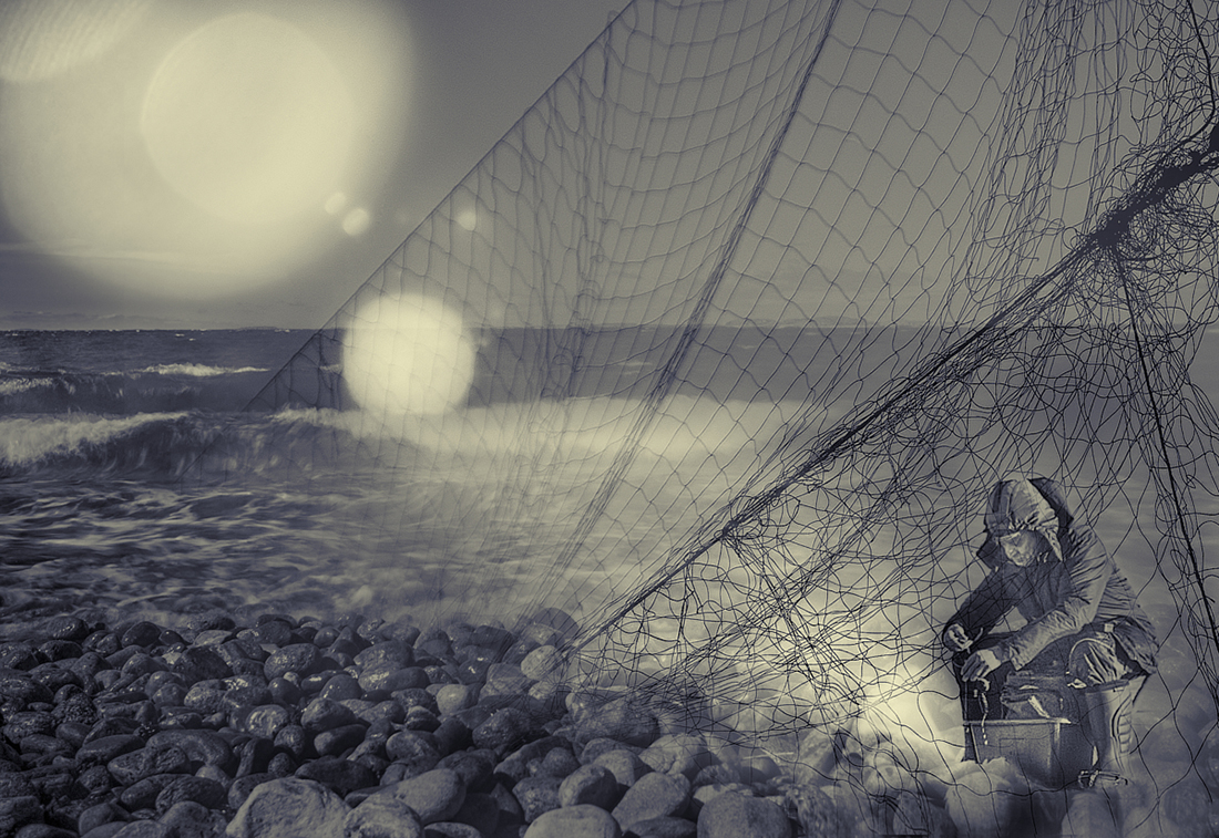
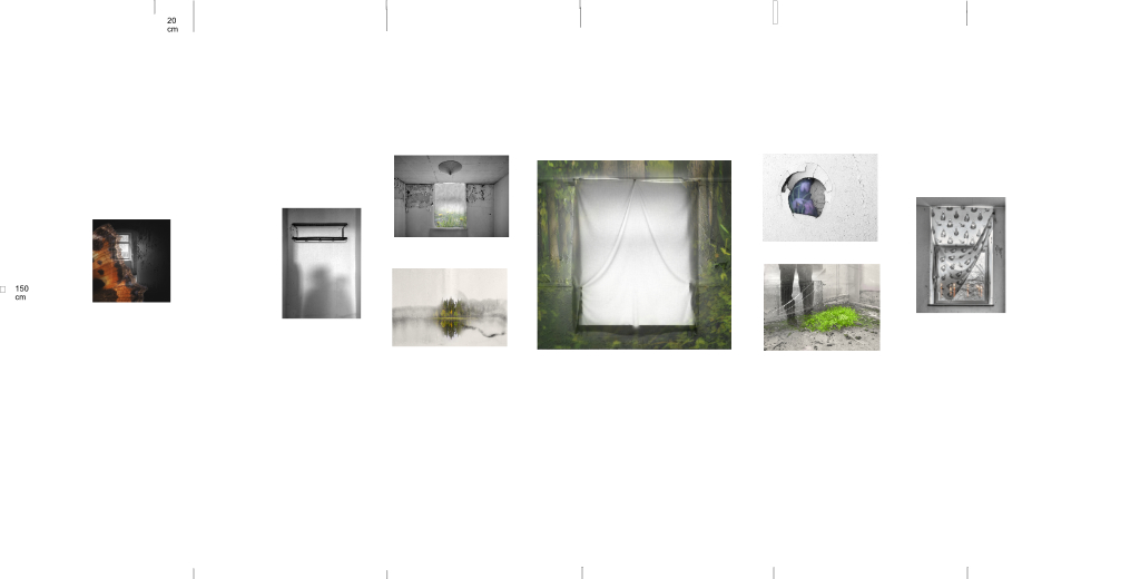
Thank you, Mervyn! You are probably right with the white lines. - I can imagine myself lying in a bed in the bare bleak room, staring at the soft light that leaks into the room from behind the curtain, and little by little, conjures a forest on the walls from my memories. It will be interesting to see if anybody else can catch the feeling, and I do hope that it helps to see it as part of the entity: here is my display plan for the exhibition. |
Sep 26th |
 |
| 26 |
Sep 25 |
Comment |
Thank you, Tony - I guess that this is one of the many occasions when my own intense feelings complete the image with things that are not there for the viewer to see. I think that it may, hopefully, function somewhat better as part of the series. |
Sep 26th |
| 26 |
Sep 25 |
Comment |
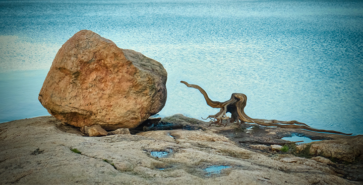
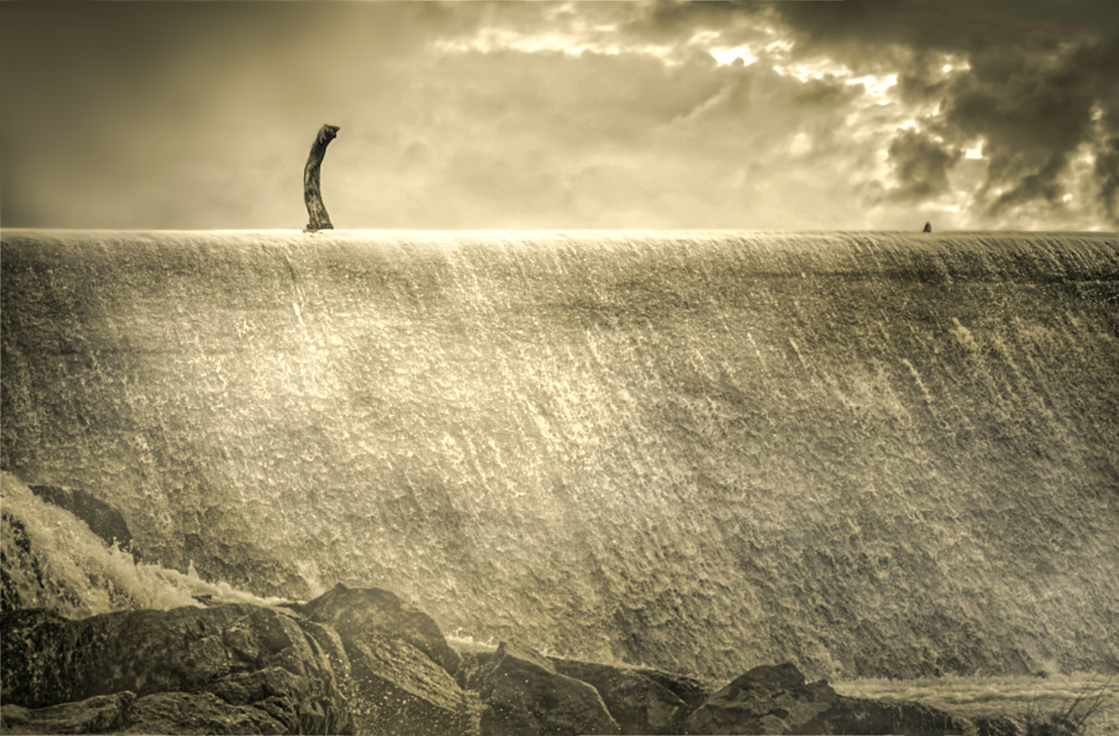
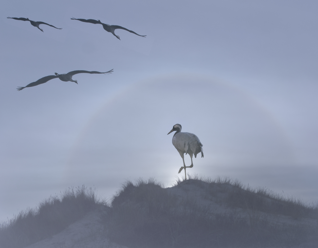
Hi Arabella, a lovely graphical minimalistic image with the subtle sepia tones. I love the hint of the waves on the water. It is easy to find symbolism in the lonely boat on the shore that is fading into the whiteness of the negative vignette. |
Sep 14th |
| 26 |
Sep 25 |
Comment |
Thank you, Jose, for the thoughtful comments and the new ideas. I'll keep thinking about the two concepts, but I think that I'll go to the exhibition with the original. I hope that it would make more sense as part of the series of eight that I am going to hang up. - What I think is the best part of the image is the light leaking into the room at the edges of the curtain, and that, I think, shows in both versions. |
Sep 7th |
| 26 |
Sep 25 |
Comment |
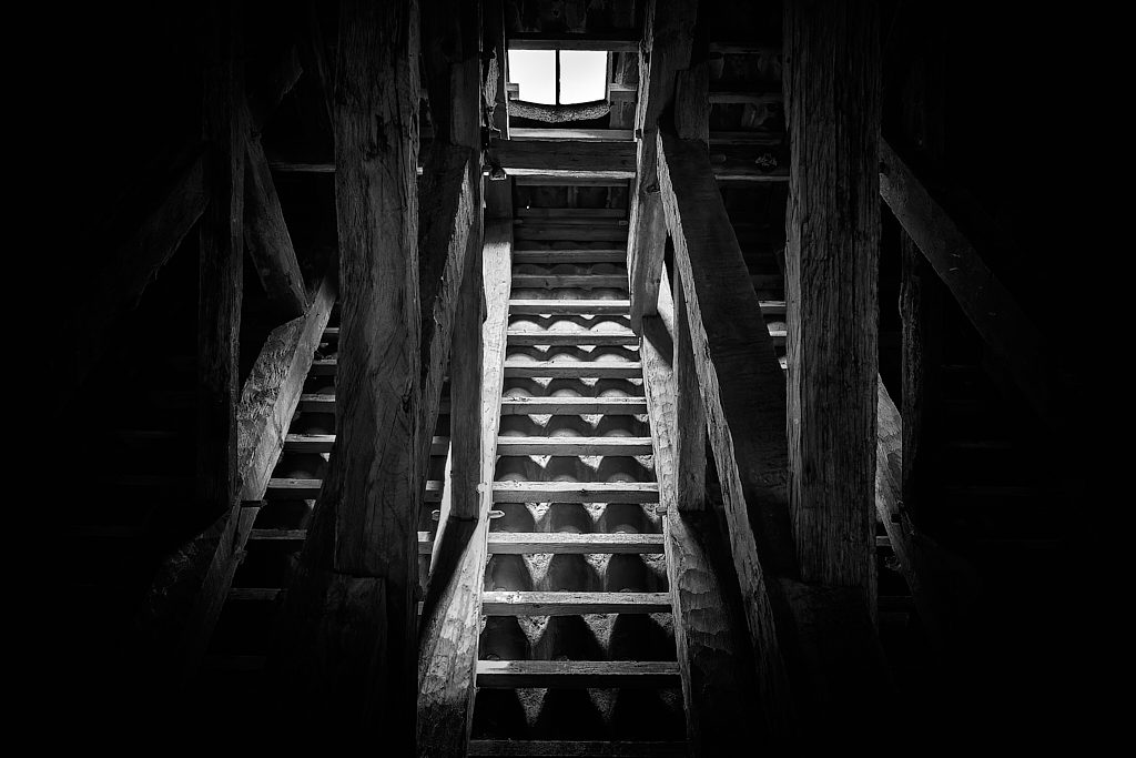
Hi Bob, a beautiful job on a challenging target! I think that the image shows the dynamic elegance of the famous staircase in its full glory, with all the fine details in focus. - As symmetry is maybe the strongest element in the image, I wonder if it would be possible to reduce the brightness of the left bottom corner even a little more, and tweak the perspective a tiny bit more to get the column at the left edge perfectly perpendicular? |
Sep 7th |
| 26 |
Sep 25 |
Comment |
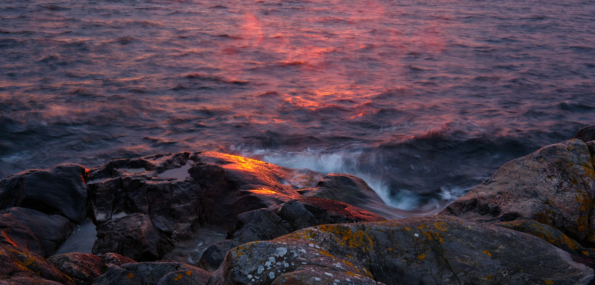
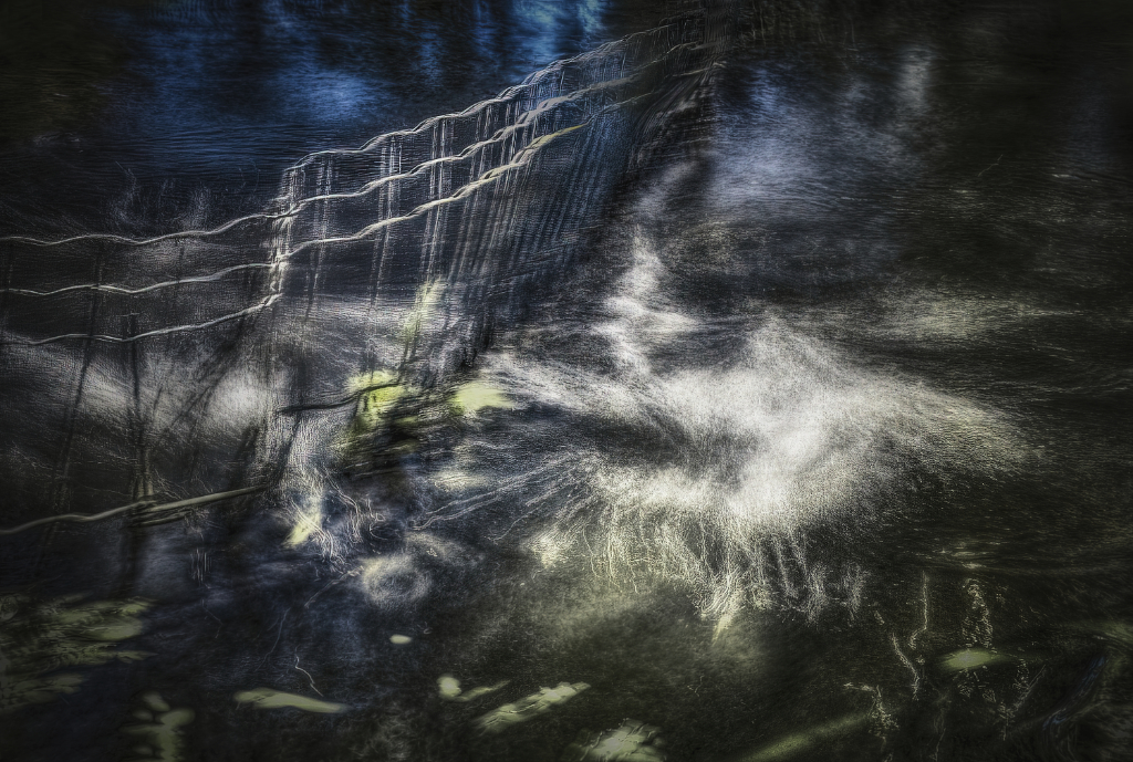
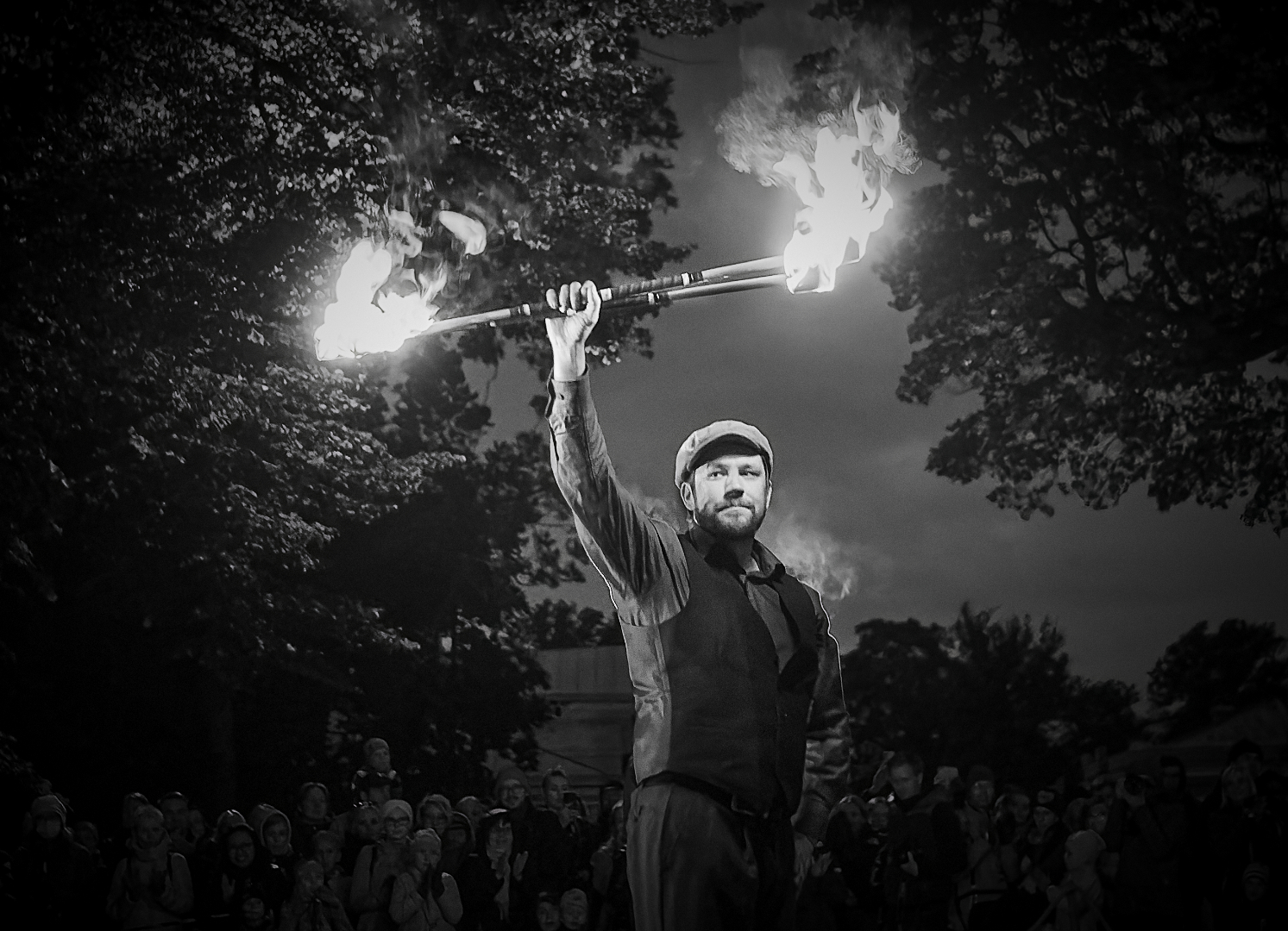
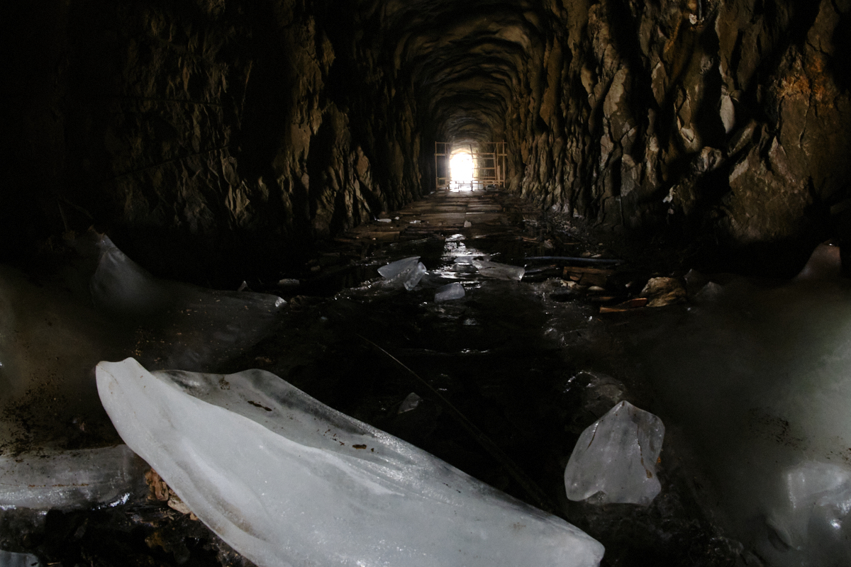
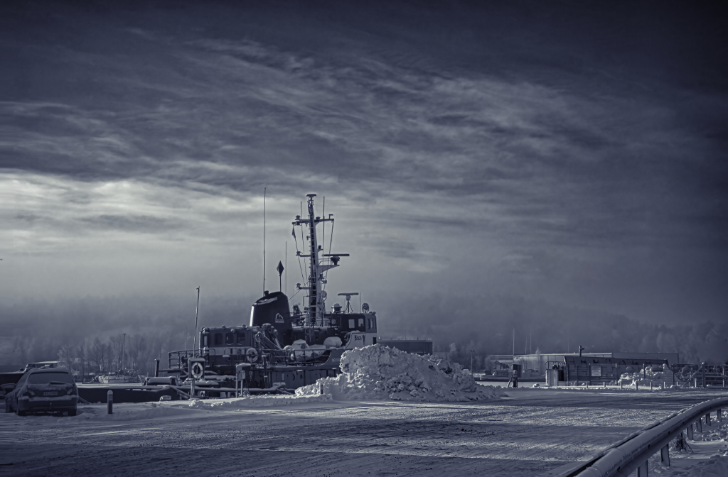
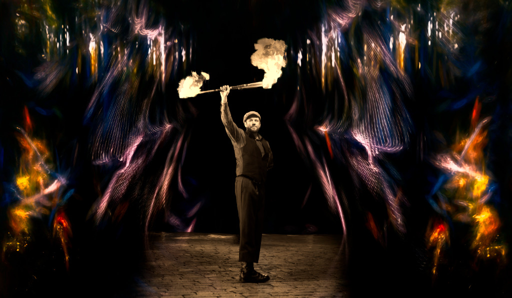
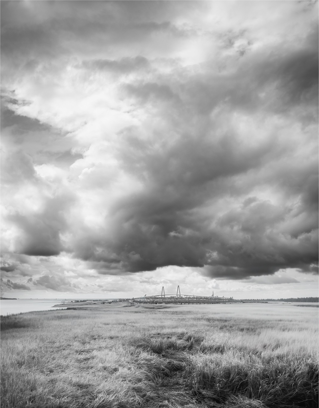
Hi Mervyn, I think, too, that you have constructed an impressive image. It looks like the lighthouse sends wild flames up to the sky. It is even more effective because your camera angle shows the building itself against the uniform part of the cloud bank. - I wonder if cropping off some of the grass at the bottom would give more room for the sky? I think that would leave enough of the fence to keep the nice leading line effect? - And maybe remove the power line, but that is of course personal choice? |
Sep 7th |
 |
| 26 |
Sep 25 |
Comment |
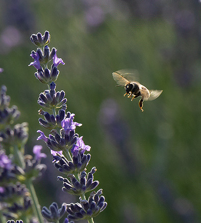
Hi Tony, to me it is the motion of the wing of the tack sharp bee that makes the image special. I wonder if a tight crop that would show only one or two of those lovely backlit lavender sprigs, and the bee against the blurred background would show him off better - I realize that it would make a more conventional composition? |
Sep 7th |
 |
| 26 |
Sep 25 |
Comment |
Hi Jose, talk about impact! The centered composition, strong symmetry, vibrant colors and the color contrast just fill the frame with power. I think that it is a perfect crop, and the play of light and shadow on the sides of the boat give it depth and dimensions. |
Sep 7th |
7 comments - 1 reply for Group 26
|
| 47 |
Sep 25 |
Reply |
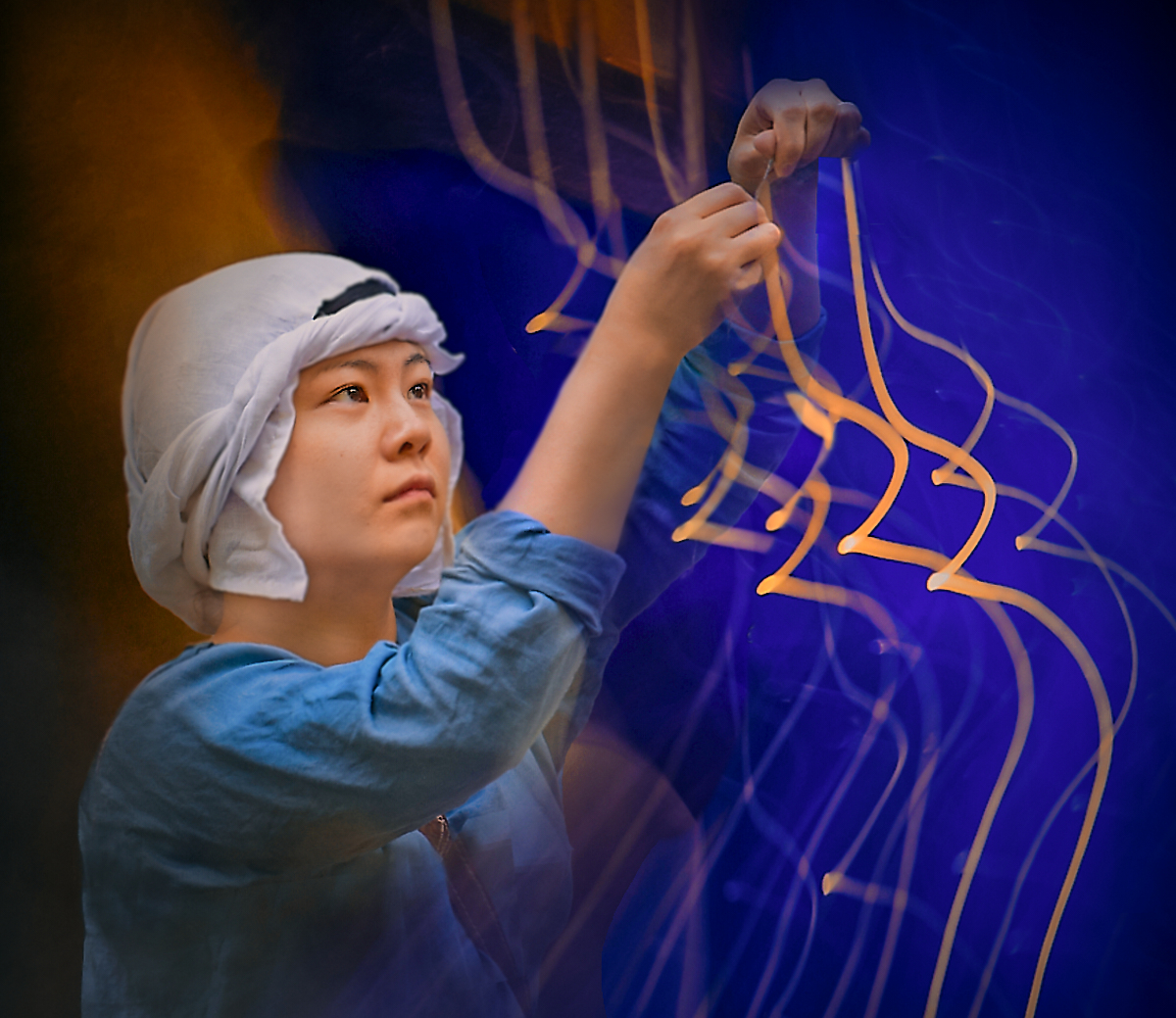
Thanks, Robert! I am looking forward to seeing your images! Isn't the element of a fourth dimension that the technique brings into the image just fascinating! |
Sep 24th |
| 47 |
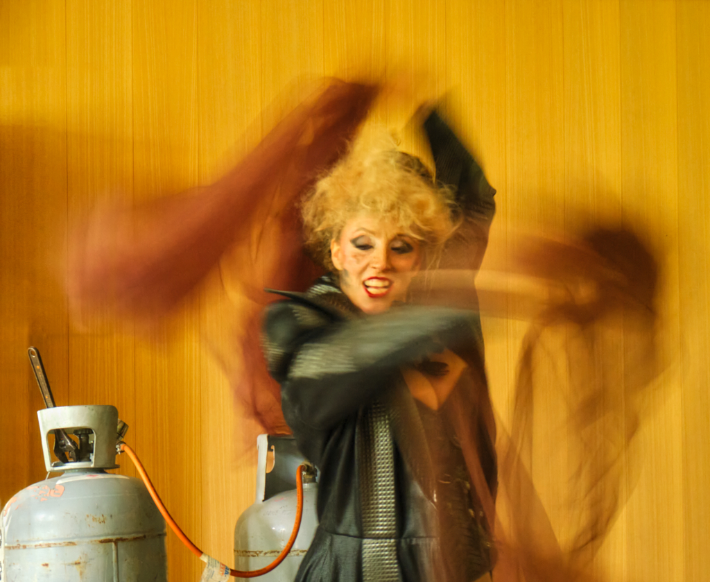
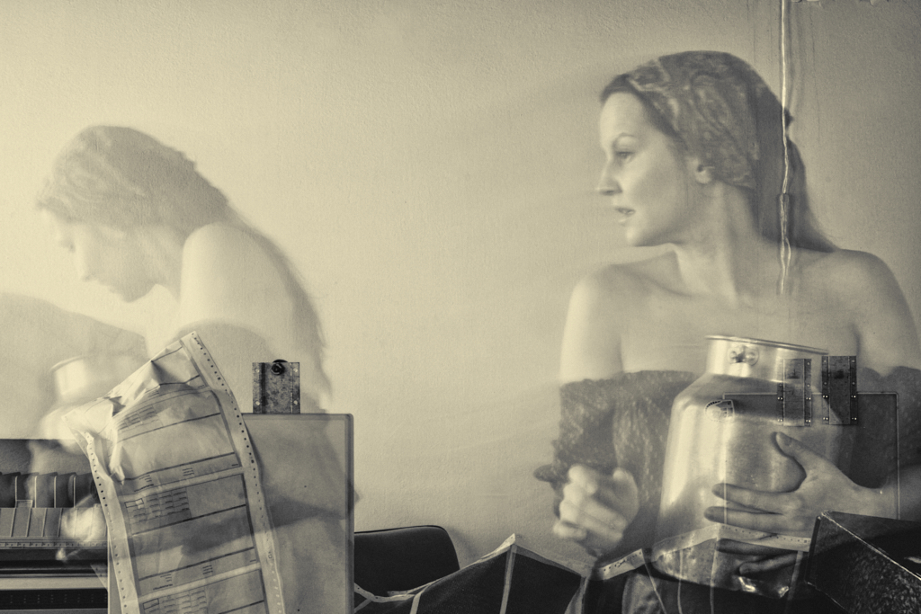
Sep 25 |
Reply |
Thank you, Ed! I know - the background was hastily put together with the existing elements in a cramped space, and the place of the window and direction of the light further restricted the affair. I have other frames where the fax machine looked more clear and futuristic but the movement of the model did not go as well. - It seems to be a draw in the vote about removing the cord or not! |
Sep 24th |
| 47 |
Sep 25 |
Reply |
Thank you, Barbara, playing with the motion effect is definitely a good idea ! |
Sep 24th |
| 47 |
Sep 25 |
Comment |
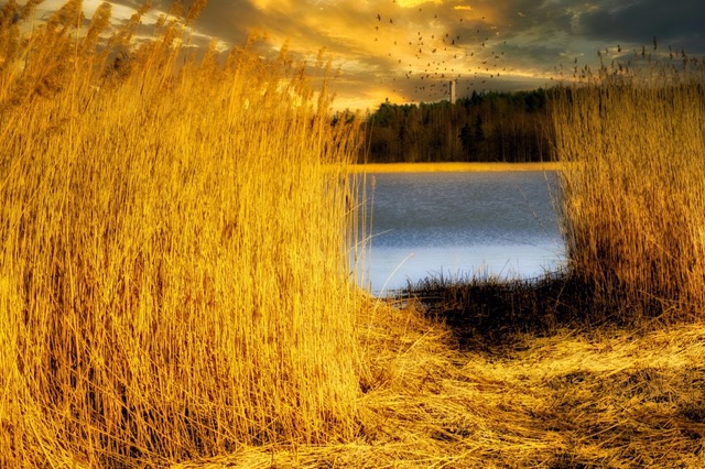
Hi Barbara, what a fine image! About the crop: I think that I would go for landscape format, like Doug, or keep the original square. I can see the temptation of the portrait format, though, and I think that one option would be to go all the way and let the clouds rule, and sacrifice most of the flattened reeds with the fine textures at the bottom. |
Sep 14th |
 |
| 47 |
Sep 25 |
Comment |
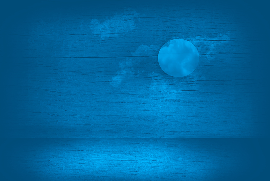
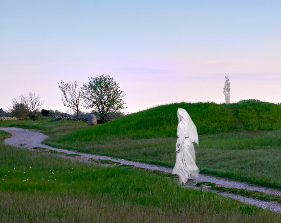
Hi Al, I feel the dark mysterious mood, too. I think that those pinprick lights on the shore are an important element that gives an extra depth to the image. - I would keep the moon, to explain the eerie lighting on the clouds. |
Sep 14th |
| 47 |
Sep 25 |
Comment |
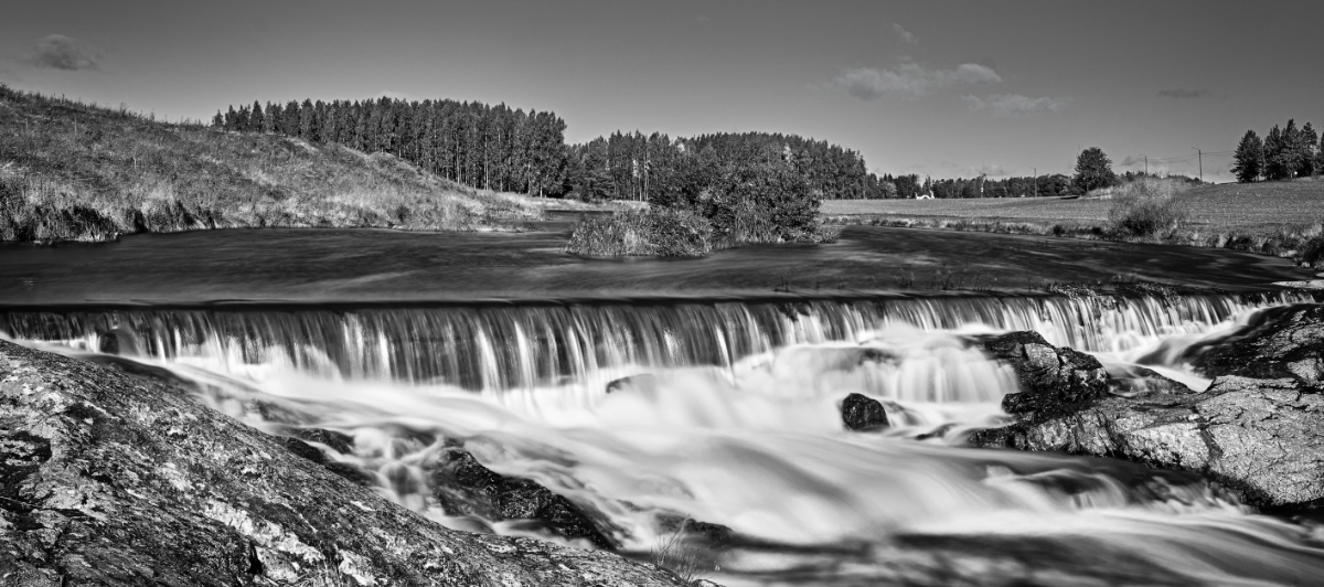
Hi Jeff, I think that high key was a brilliant idea for this image that is now full of light and delicate details. Especially I love the way the stream and the waterfall turned out. The only spot that I think could use a tad more contrast is that tall tree in the foreground. - I would love to see the histogram -that would be a good learning opportunity! |
Sep 14th |
| 47 |
Sep 25 |
Comment |
Hi Ed, the site is certainly among the most interesting in the present world, and you have provided us with a fine documentary of the scene alive with people. I wonder if it looks the same today? - I think that the edits lightening the blacks were an improvement. |
Sep 14th |
| 47 |
Sep 25 |
Comment |
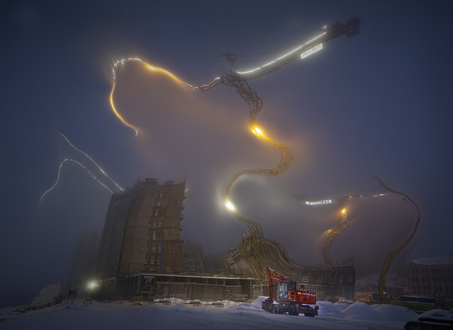
Hi Douglas, a great story in a fine package: I like the crop that makes the most of the angular structures of the crane. The reader is nested in the corner so that the angles of her back and her legs match with the diagonal part of the machine making a lovely rhythm. I think that Jeff�s edits worked really well. |
Sep 14th |
| 47 |
Sep 25 |
Reply |
Thanks, Douglas! I think that it may be the slight transparency of the moving subjects that gives this special feeling? |
Sep 14th |
| 47 |
Sep 25 |
Reply |
Thank you, Jeff - I guess that you are right about the cord! I have some ideas that I think might develop into something interesting - it will only take a lot of trials and errors and a very patient model. |
Sep 14th |
| 47 |
Sep 25 |
Comment |
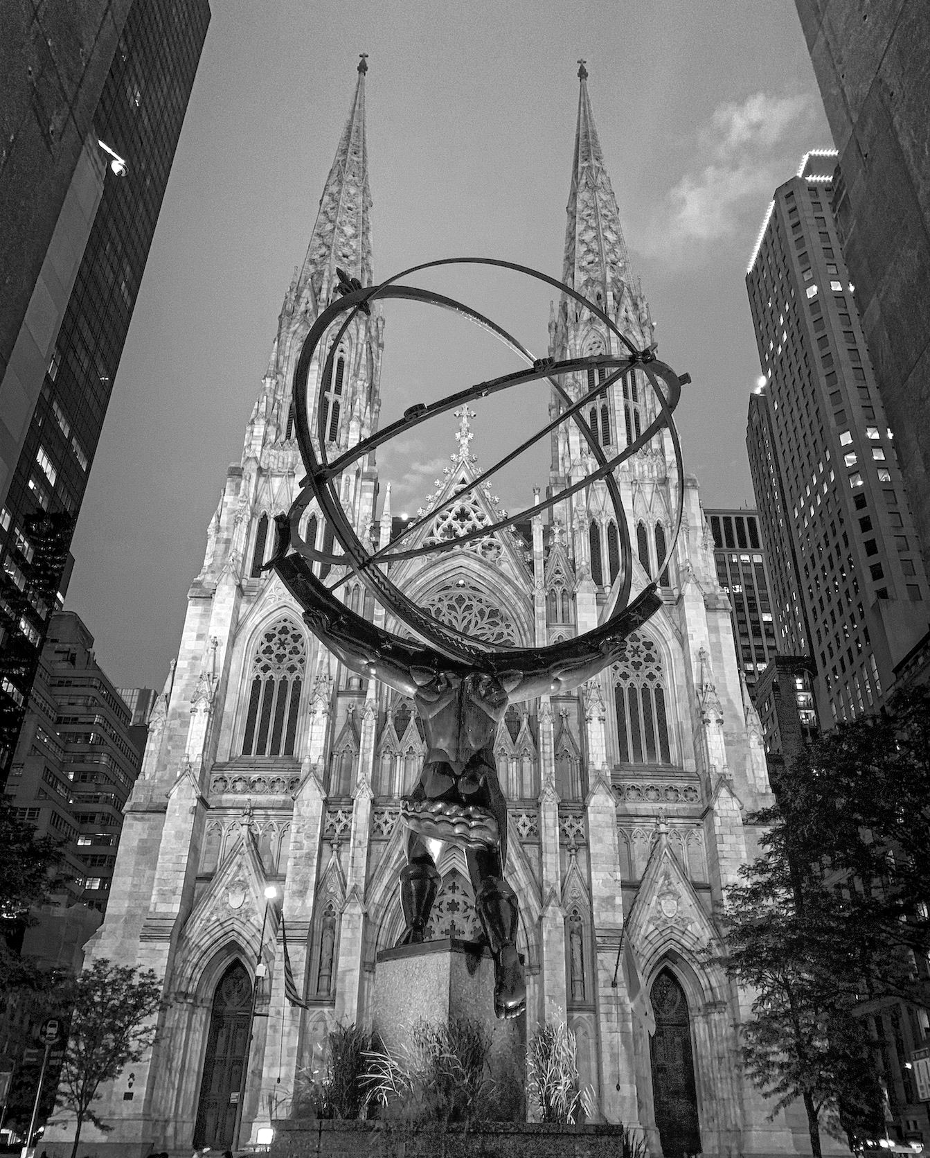
Hi Robert, I admire the way you see the humor and the drama around you and transfer them into compelling images. - About processing, I think that I would check the black point and try to open up the darkest areas a little. Or, I experimented with the NIK Color Efex Dark Contrast filter that I think did a nice job? - I wonder if cropping off a bit from the rather busy bottom part might direct the attention to the statue better and calm the image down: maybe cut off most the bottom of the pedestal? And if you are in a daring mood, it might be fun to try a crop at his waist level, as after all, the most interesting things happen above that. |
Sep 7th |
 |
6 comments - 5 replies for Group 47
|
| 54 |
Sep 25 |
Reply |
Thank you, Maria, for the lovely comment! - I have had a special feeling about the image that I might be almost within reach for something meaningful, and I am so glad that you can feel the touch! |
Sep 26th |
| 54 |
Sep 25 |
Reply |
Thank you very much, Brad! What lovely ideas to work on! |
Sep 26th |
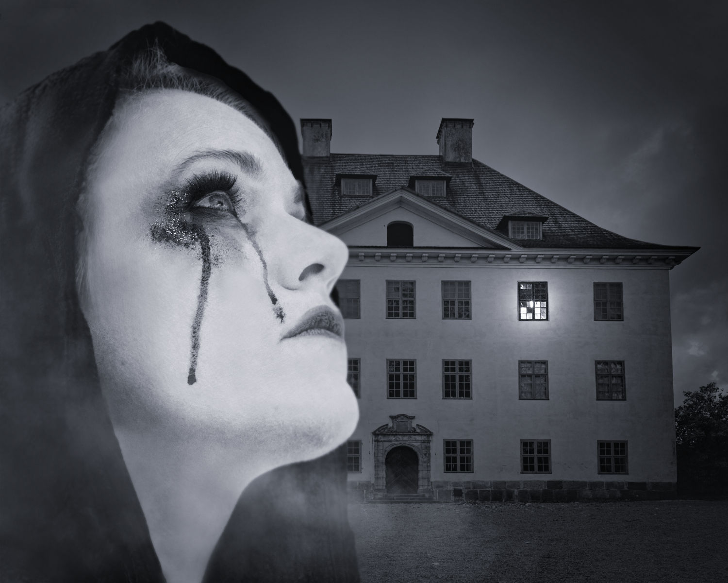
| 54 |
Sep 25 |
Reply |
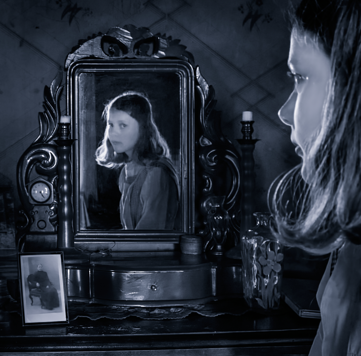
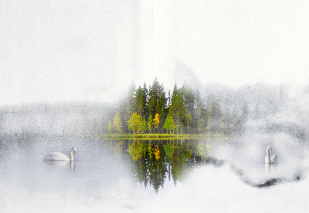
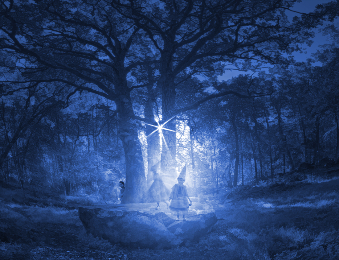
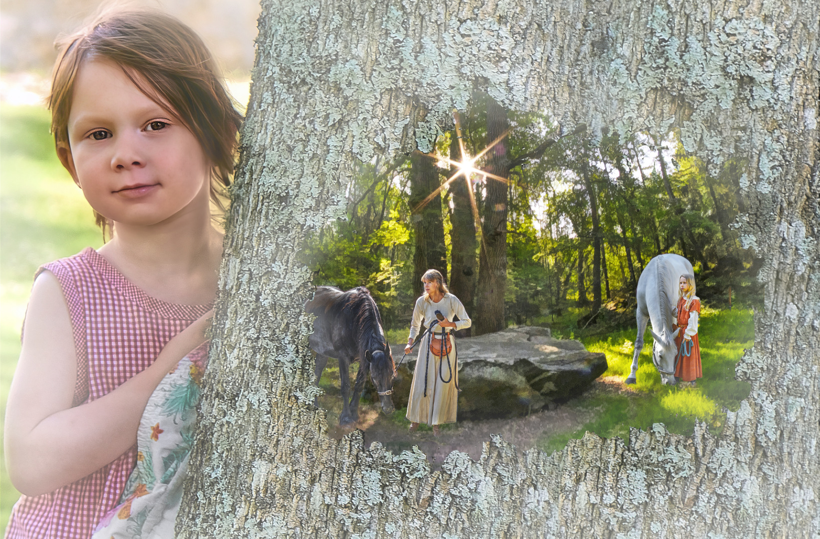
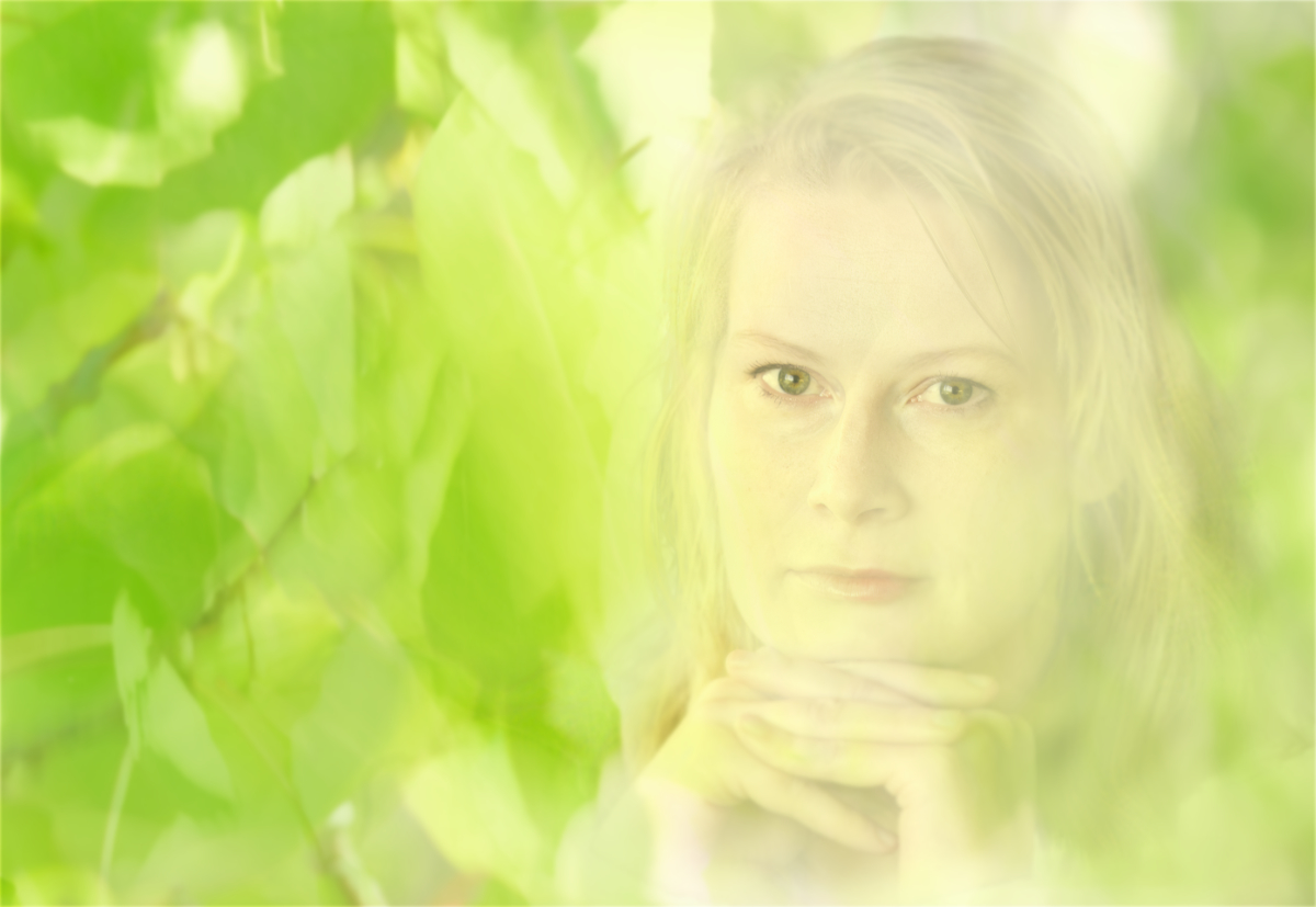
Thank you so much, Alan! You are absolutely right about the swan, I'll correct it right away. I did not realize that the tree would look dead - I just wanted a splash of bright color in the place where the dream most clearly took over the bleak reality, but I'll think it over. |
Sep 14th |
| 54 |
Sep 25 |
Reply |
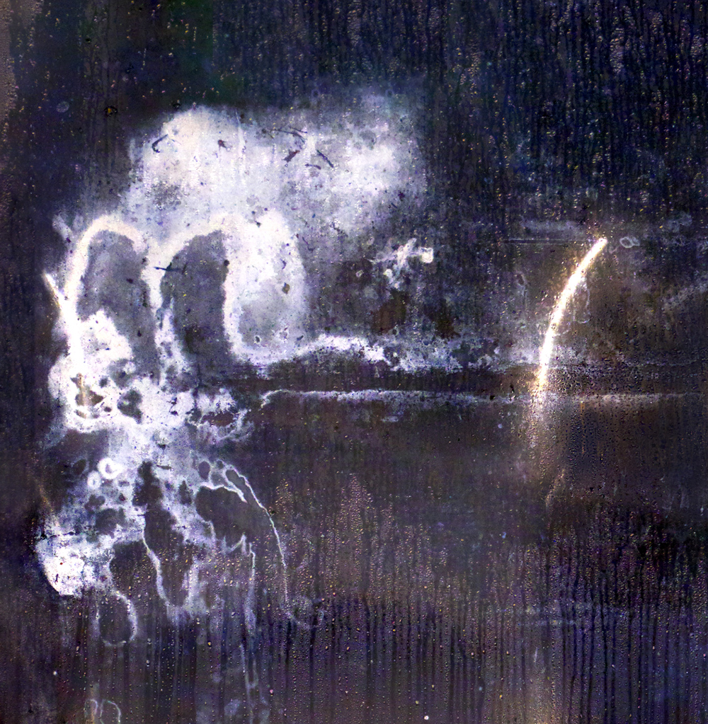
Thank you so much, Peggy - You are right about the dark line and the vertical line. They are part of the mildew stain, and the seam in the wallpaper. My idea was to leave them in sight so that it would look like the dream lake grew visible from their forms. I'll work on the textures! |
Sep 14th |
| 54 |
Sep 25 |
Comment |
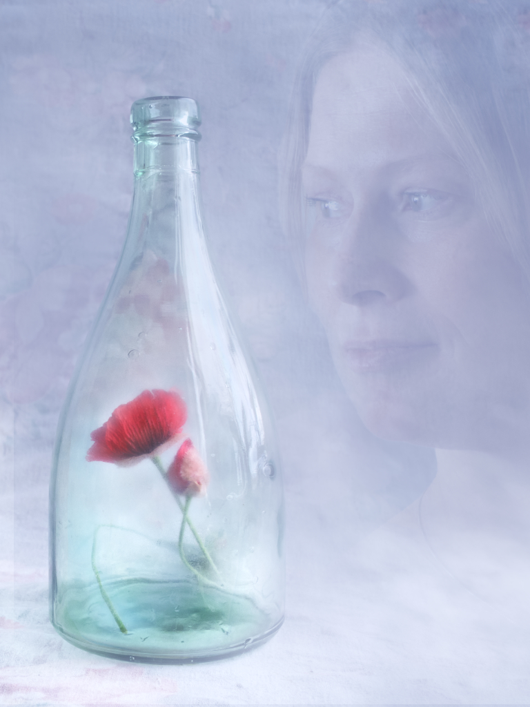
Hi Brad, as always, the results of your play with the images are enjoyable! At first, I was wondering about the harsh contrast between the warm saturated colors of the foreground and the black-and-white bottle and sky, but then ideas of environmental symbolism clicked on me and I realized that this is just the way it must be. I also love the partly blurred lower petals of the exotic flower that give an impression that it is in the middle of of the process of opening. |
Sep 7th |
| 54 |
Sep 25 |
Comment |
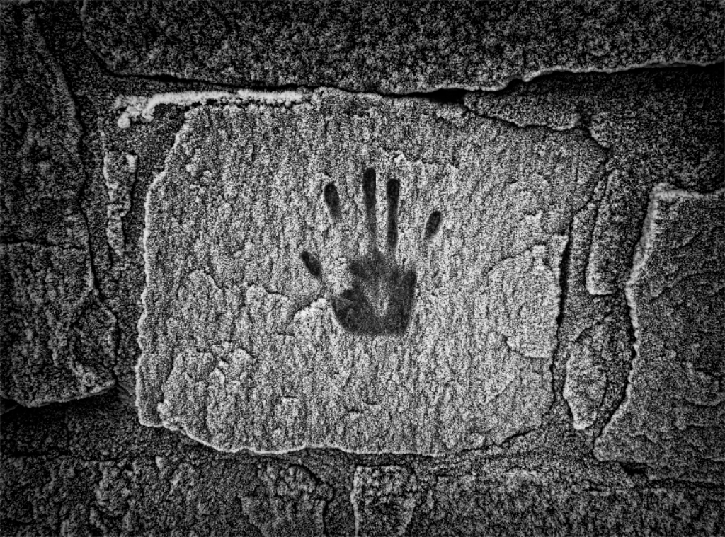
Hi Alan, you are so lucky to live in such a neighborhood - it must be full of treasures for someone like you! I love the way the scene seems to be growing out of the stone: it is like if you sit and stare at the blank tile long enough, you start to see glimpses of the history the stone has witnessed during its existence. I think, like Matt, that the characters might benefit from some added saturation? |
Sep 7th |
| 54 |
Sep 25 |
Reply |
Thank you very much, Matt! I can see the abrupt change now when you pointed it out - I'll still have time to fix it! |
Sep 7th |
| 54 |
Sep 25 |
Comment |
Hi Maria, you have a special talent of finding fantastic characters for the images and giving them a new life and adventures! I join Matt in admiring the lighting and shadows that blend them into a totally credible three-dimensional scene of speed and danger. I can hear the driver screaming! |
Sep 7th |
| 54 |
Sep 25 |
Comment |
Hi Matt, I bet this one would have been their favorite wedding photo - hope you shared it with the couple! You combined everything into a lovely mellow golden hour atmosphere with lighting and colors that really are in harmony. I love the feeling of spontaneity that the uncorrected perspective adds to the window that frames the couple. - I don�t know if, in theory, the bushes close to the window should be more in focus, but to me, the lovely blurred leaves just add to the dreamy feeling. I would like to crop off the light triangle at the right bottom corner, and remove the metal handle from the shutter? |
Sep 7th |
| 54 |
Sep 25 |
Comment |
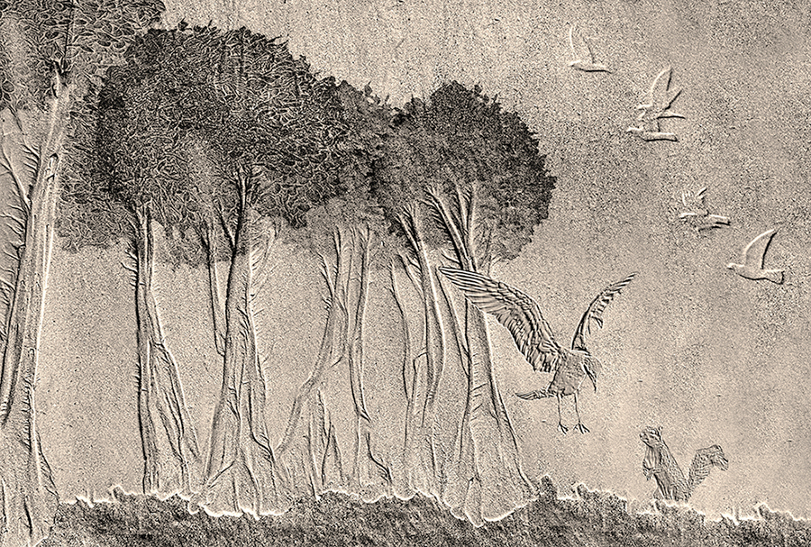
Hi Peggy, I can feel the moment when the images in the sand came alive for you. I love the way you continued the relief look started by Nature with the embossed elements that fit in seamlessly. The postures and placing of the squirrel and the landing bird create such an intense moment that I cannot wait the bird get close enough to start talking. The tangled trees and the foreground with that bright rim give a lovely depth to the scene. - I think that monochrome is a perfect choice, and I like the warm tone. I wonder if reducing the saturation just a little bit, or lifting the darker tones just slightly would give it more air? - but that is but a matter of taste. |
Sep 7th |
 |
5 comments - 5 replies for Group 54
|
18 comments - 11 replies Total
|