|
| Group |
Round |
C/R |
Comment |
Date |
Image |
| 26 |
Jun 25 |
Comment |
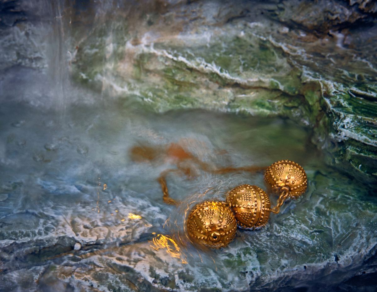
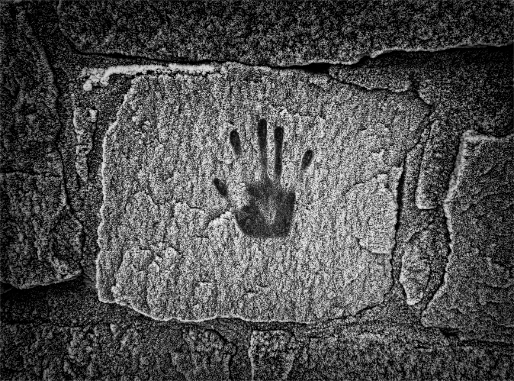
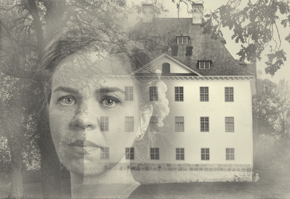
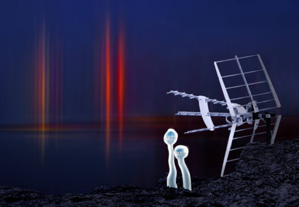
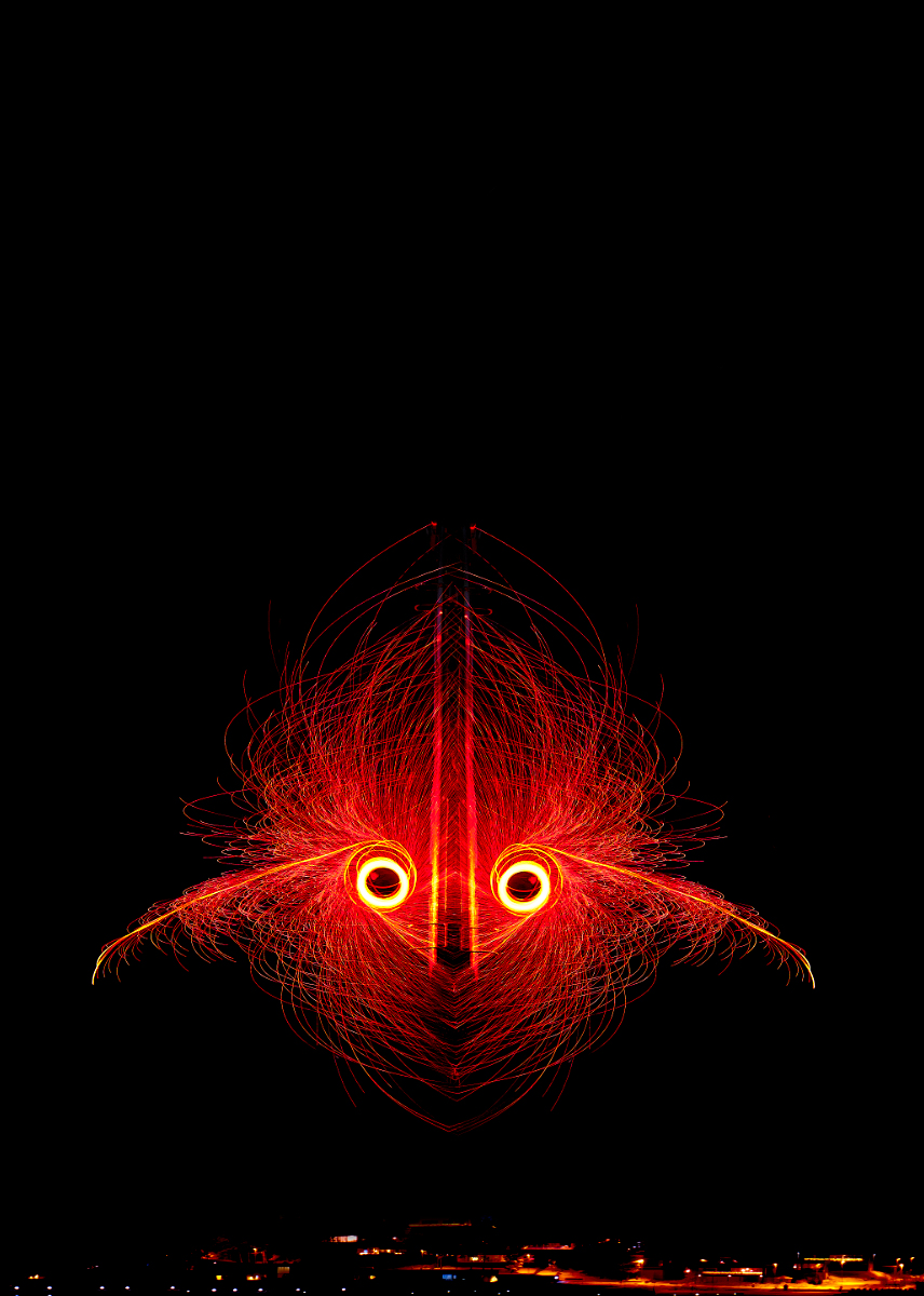
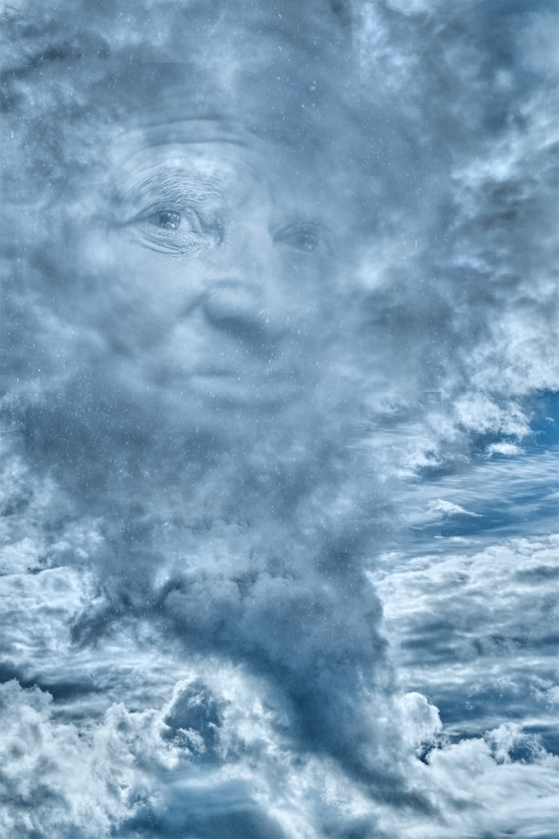
Thank you very much, Tony! I have a poster of a Mark Rothko painting on my wall - essentially just two rectangles in shades of red - that somehow feels absolutely right and produces enjoyment. I think this image may give me an echo of a similar feeling. |
Jun 28th |
| 26 |
Jun 25 |
Comment |
Thank you, Arabella! I really enjoyed playing with the image - I think that I usually get too busy with the stories to concentrate on the elements as such, but this was great fun. |
Jun 23rd |
| 26 |
Jun 25 |
Reply |
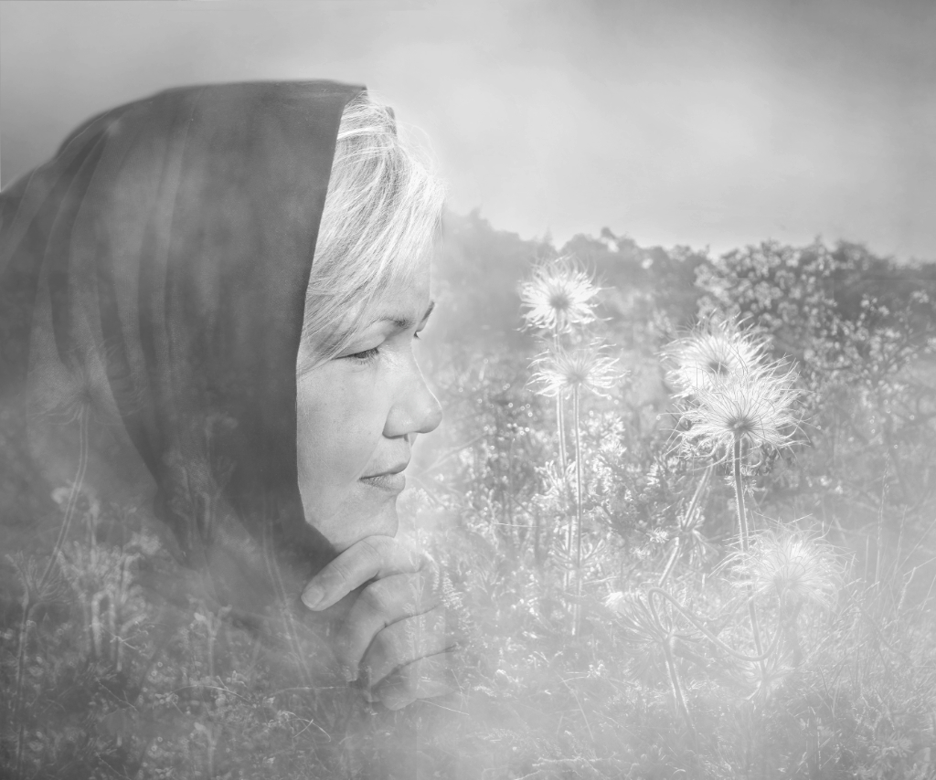
Thank you, Arabella! I really enjoyed playing with the image - I think I am usually too busy with the stories to concentrate on the elements as such. |
Jun 23rd |
| 26 |
Jun 25 |
Reply |
Thank you, Mervyn, for the lovely comment! |
Jun 23rd |
| 26 |
Jun 25 |
Reply |
Thank you, Bob, a good idea! I tried just some quick strokes with the Dodge brush to begin with, and I think that even that made a difference! |
Jun 17th |
 |
| 26 |
Jun 25 |
Reply |
Thank you, Terry! - I think that seeing the forms and rhythms that way is a special gift. |
Jun 17th |
| 26 |
Jun 25 |
Comment |
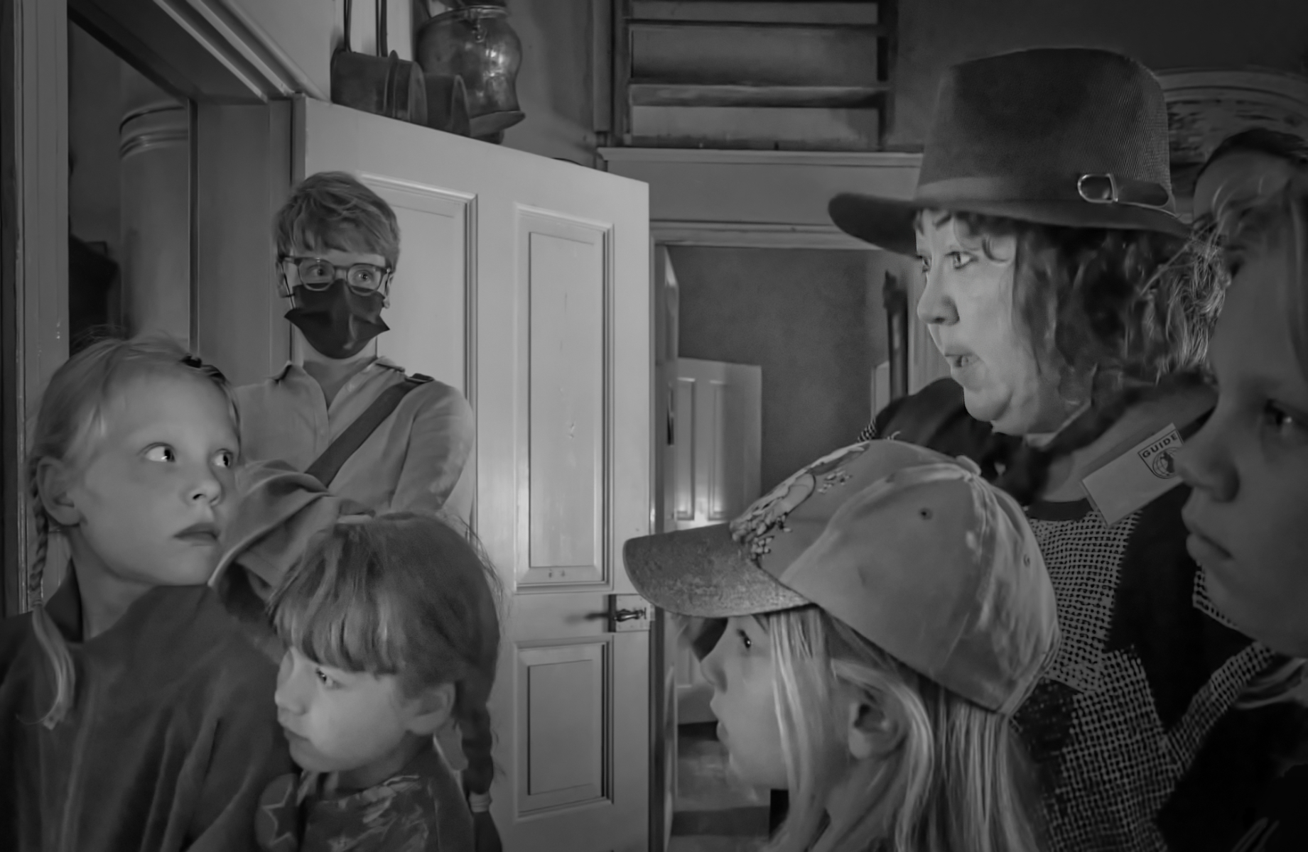
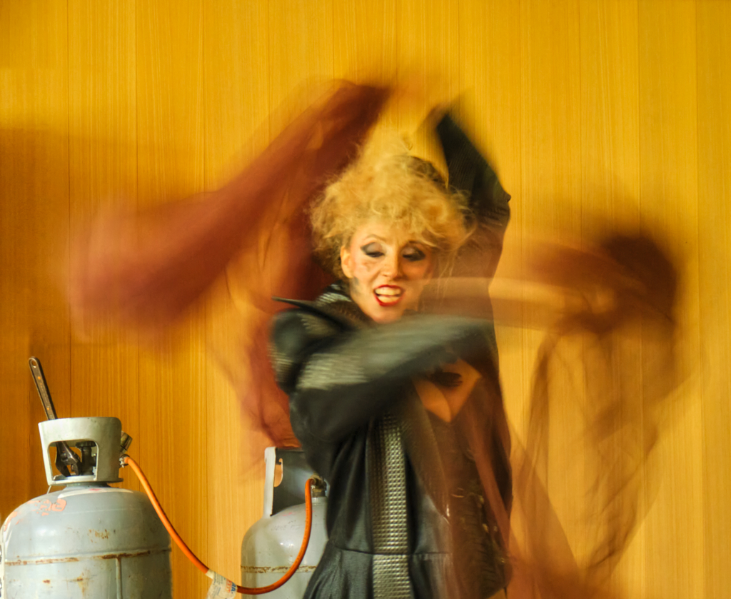
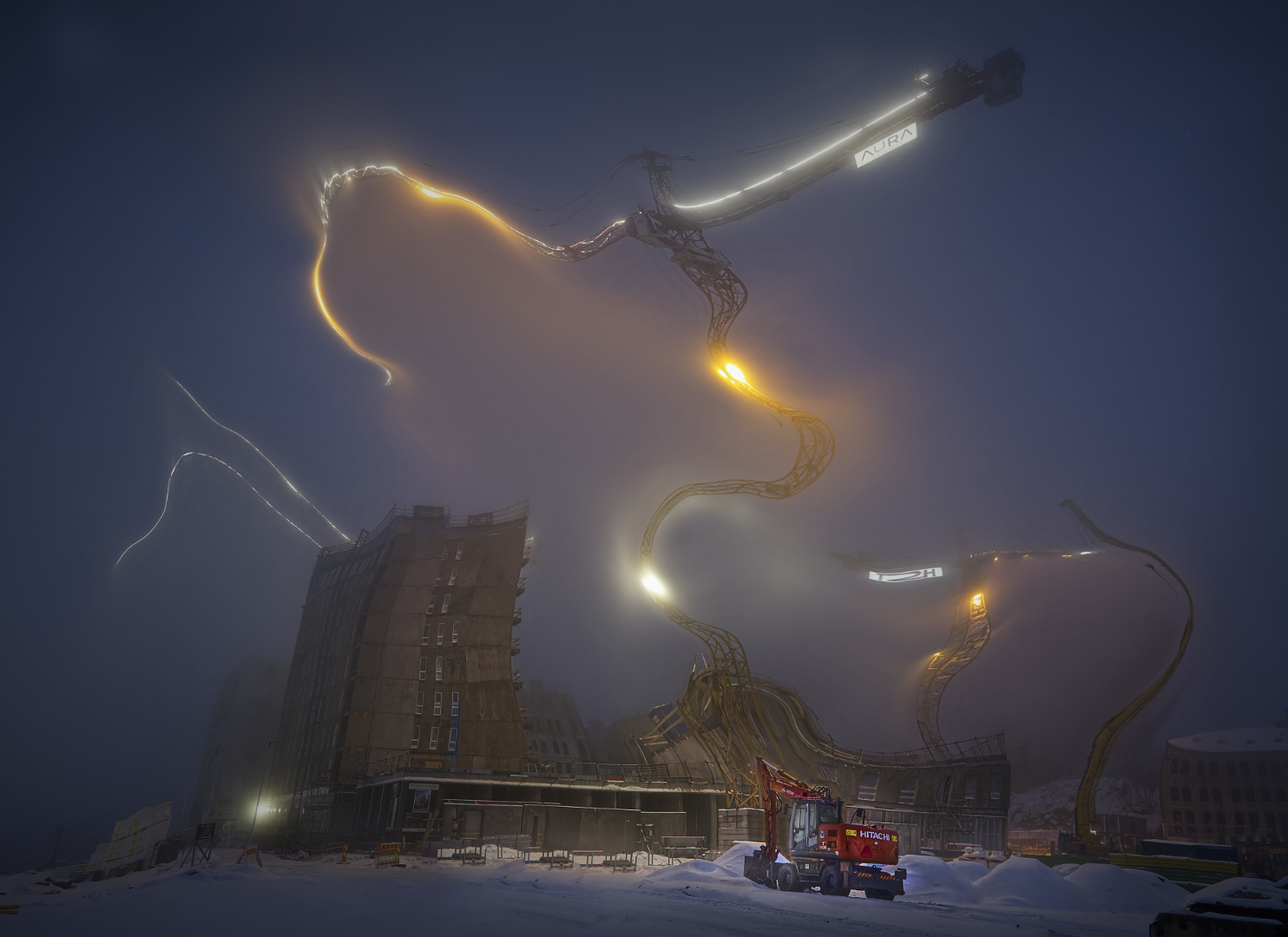
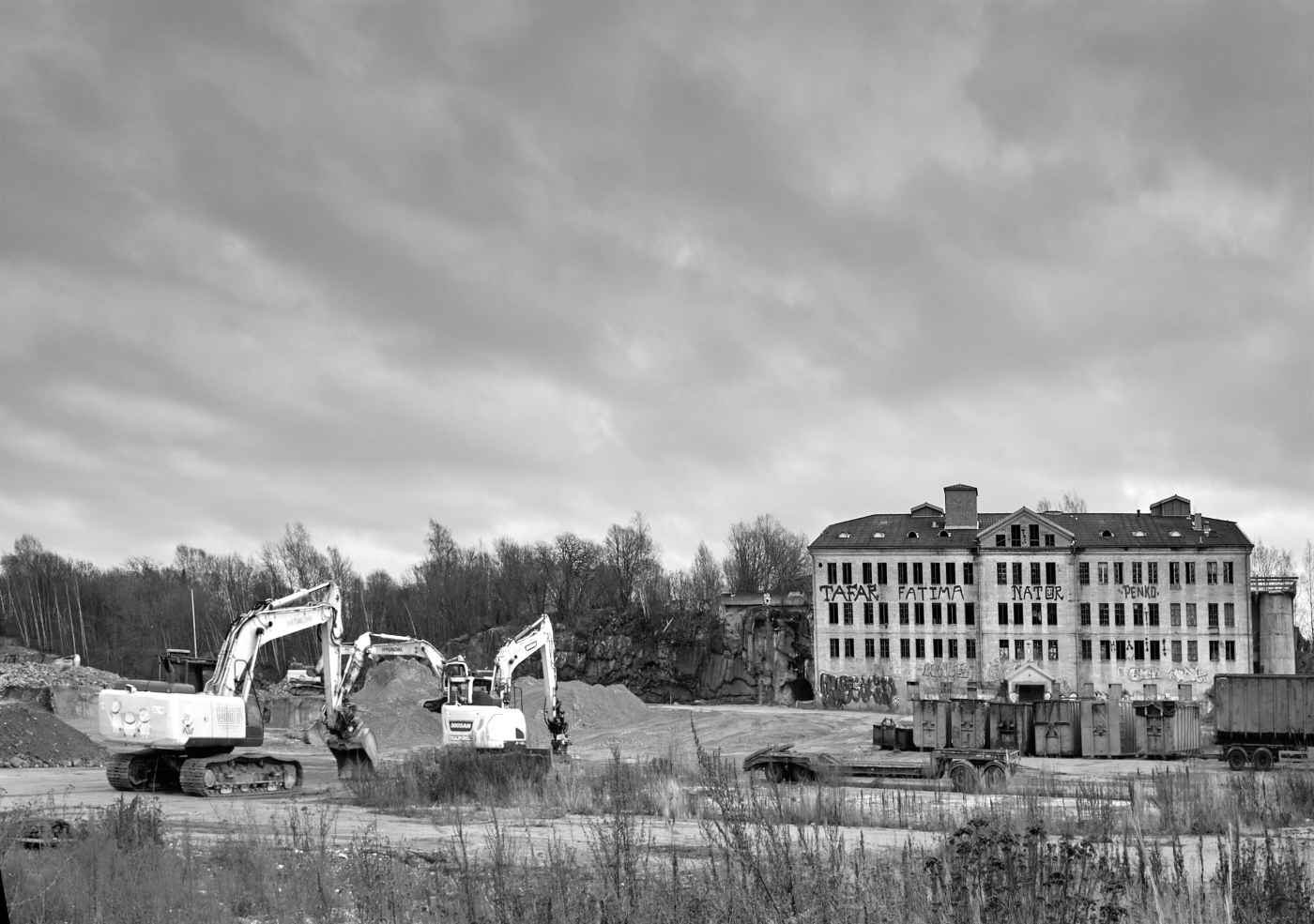
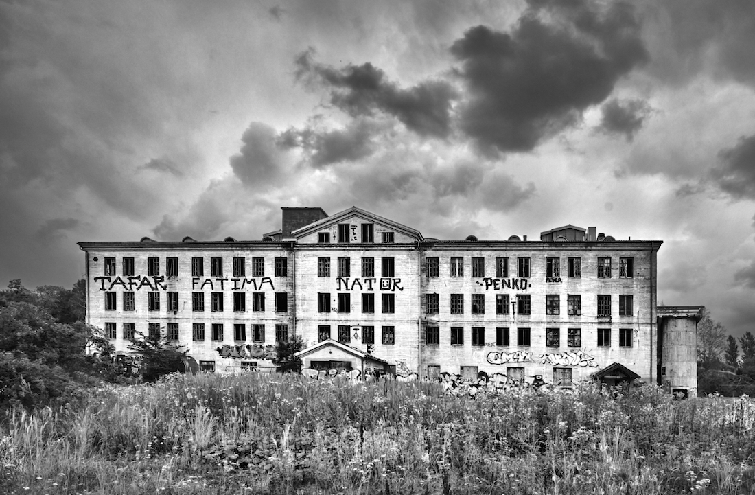
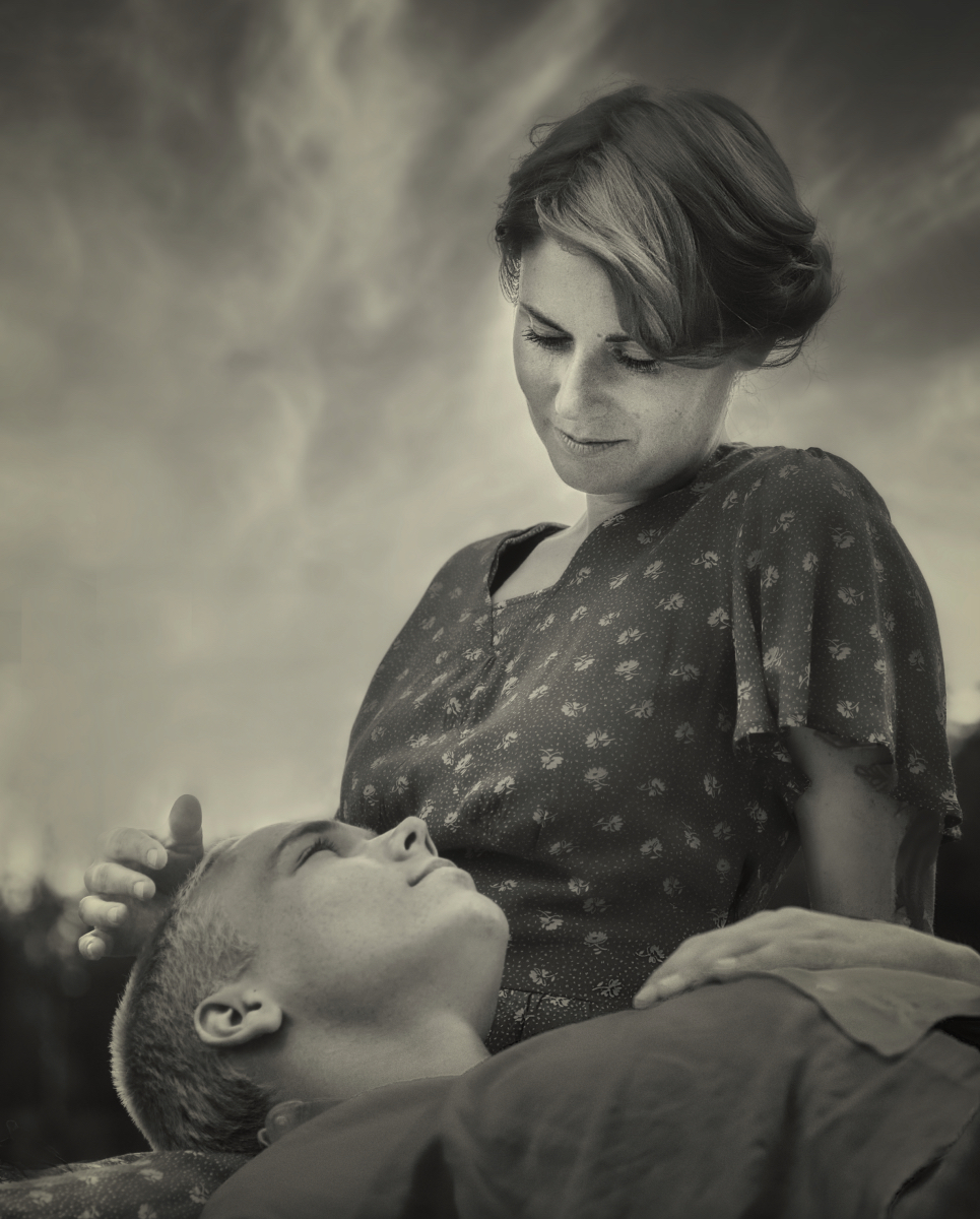
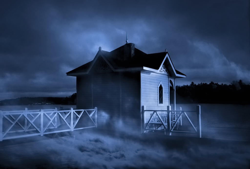
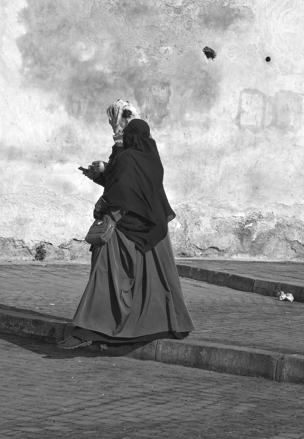
Hi Terry, the transformation is like a trip in a time machine. I think that you have used the potential of the old building beautifully, and the car with its shadow looks very much in place. The sepia toning is a perfect touch, and the image border completes the old photo effect. - My only suggestion would be to leave just a bit more room between the bottom border and the car so that the tires would not stand right at the edge - maybe by using a narrower frame, or enlarging the canvas just a few millimeters at the bottom? |
Jun 11th |
| 26 |
Jun 25 |
Comment |
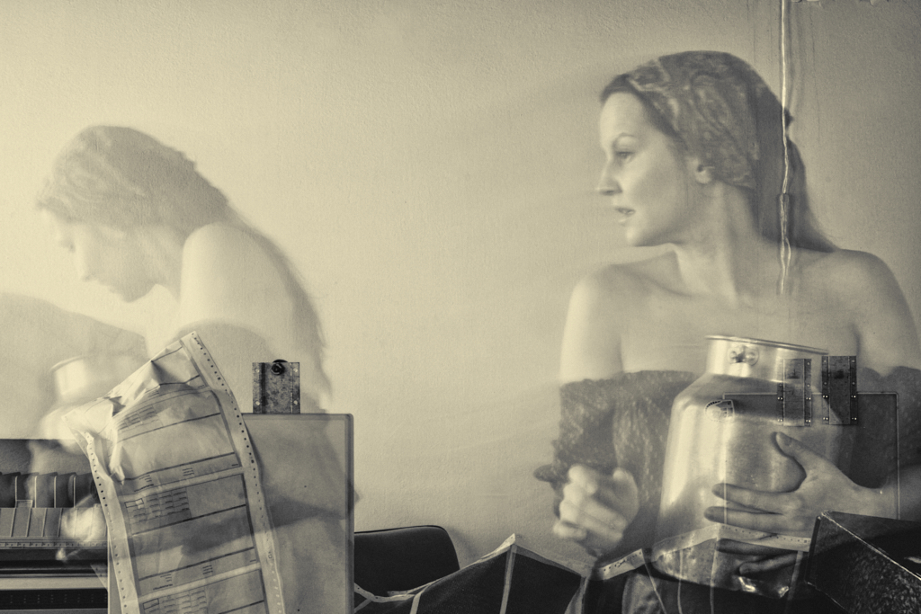
Hi Arabella, I think that you show the bee at work from an interesting and unusual angle. That also makes him part of a balanced composition in the lovely golden image. - It would of course be nice to have his head in focus, too, but I think that his perpendicular position makes that extra challenging. |
Jun 11th |
| 26 |
Jun 25 |
Comment |
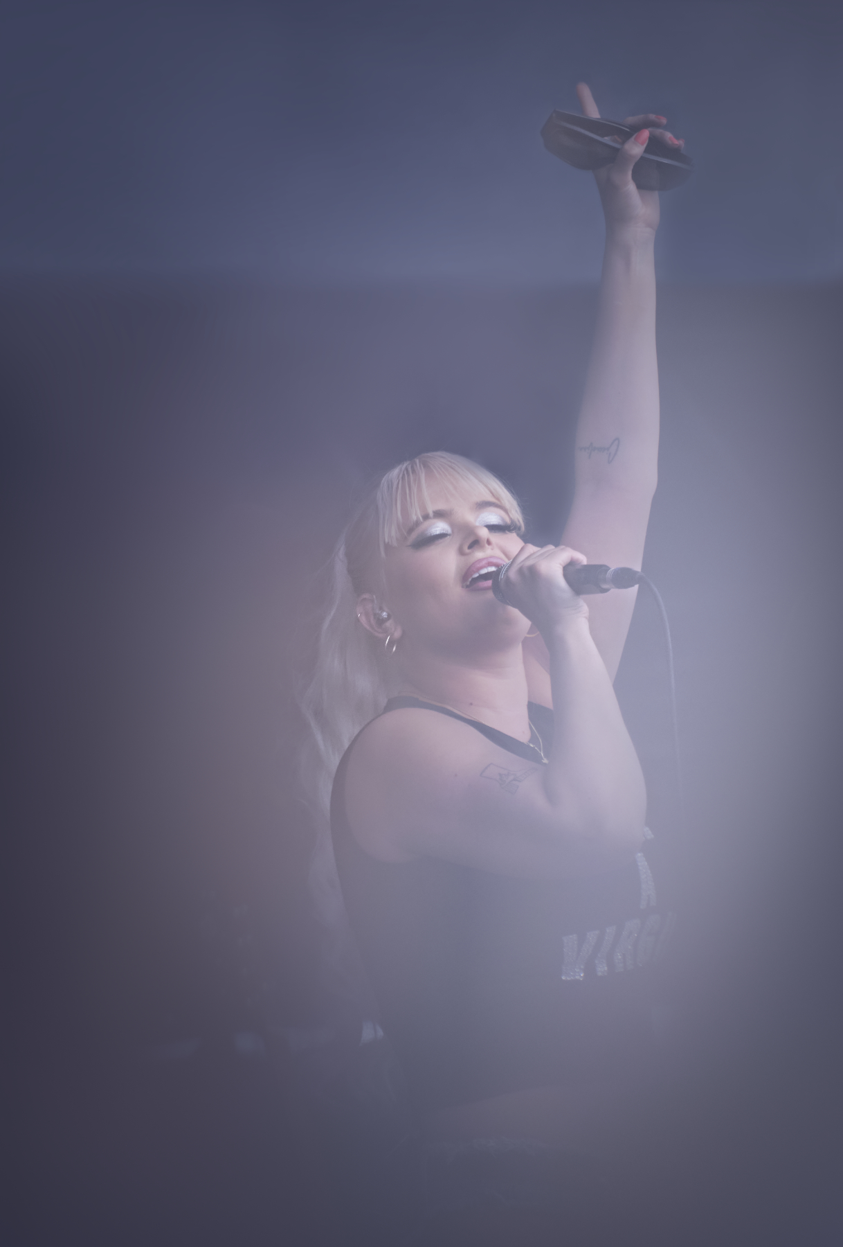
Hi Tony, I love the composition and the color scheme, too: the lime-green/yellow face of the bird against all the soft tones greens in the blurred background. To capture him sharp in mid-jump with the breakfast spider is a great catch. - I agree with Jose about the image quality issue. |
Jun 11th |
| 26 |
Jun 25 |
Comment |
Hi Bob! I think, too, that all the careful planning and preparations paid off beautifully in a perfectly executed touching Nature story. I think that the vignette adds a lovely feel of intimacy to the nest framed with the leaves. - I guess that you have images through the whole process from eggs to leaving the nest: they would make a fine series. |
Jun 11th |
| 26 |
Jun 25 |
Comment |
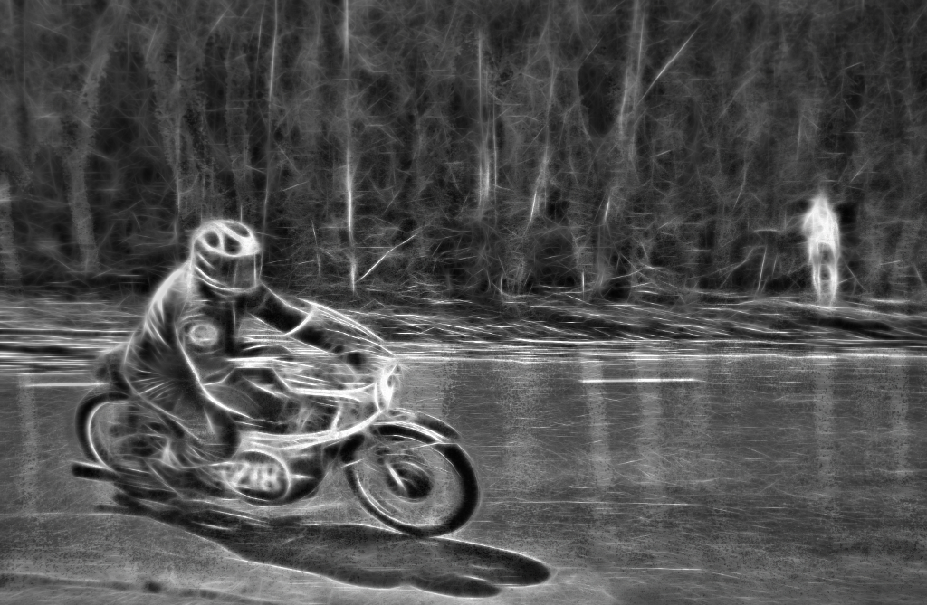
Hi Jose, I think that the result was worth the wait! The burst of energy in the accelerating bikes is palpable, and the range of movement through the frame from almost stand-still to full speed is very dynamic. It almost feels that they are speeding out of the image towards the viewer. I also like the way the markings of the lanes frame the image. - I might consider darkening the bright green screen and maybe also the blue sign at the right top corner so that they would not draw the eye from the flow of the traffic? |
Jun 11th |
| 26 |
Jun 25 |
Reply |
Thank you, Jose, I do agree - at least it certainly leaves room for one�s mind to roam about! |
Jun 11th |
7 comments - 5 replies for Group 26
|
| 47 |
Jun 25 |
Reply |
Thank you, Barbara! I'll lighten the corner, I can see the problem now that you pointed it out! |
Jun 30th |
| 47 |
Jun 25 |
Comment |
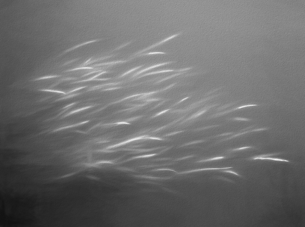
Thank you, Ed! I think that the it may be the fluorescent flashes in the greens that contribute a lot to the eel-like effect in the color version. |
Jun 13th |
| 47 |
Jun 25 |
Reply |
Thank you very much, Robert! |
Jun 12th |
| 47 |
Jun 25 |
Reply |
Thank you, Doug! I am fond of the Topaz Studio approach: they have broken all their "Looks" to individual elements that are each totally adjustable, so it is possible to create a whole lot of different individual effects from the makings. - I am now searching for a nice concrete surface to replace the Topaz texture with one of my own, to be able to submit the eels in a local camera club exhibition. The theme is "Together", and I think that they might fit in. |
Jun 11th |
| 47 |
Jun 25 |
Comment |
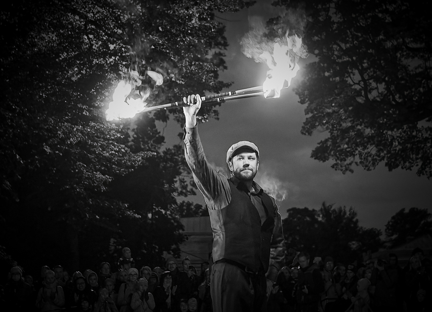
Hi Al, I agree with Douglas. - I have just learned how to use the NIK Color Efex Dark Contrasts filter to extract details from dark areas, and could not resist the temptation to try to see if it could help to show some texture in the black cape. I applied the filter with a luminosity mask for the darkest zones, and finally readjusted the Levels. I think that it worked as expected, but did it kill the original mood? |
Jun 11th |
 |
| 47 |
Jun 25 |
Comment |
Hi Ed, as you say, the image mediates the genuine joy and enjoyment of the performers. I so admire the way everything comes together in the image; the perfect moment, lighting, composition (I love the folds of the diagonal curtain in the background), depth of field and sharpness. - I think that the lightening did it good. |
Jun 11th |
| 47 |
Jun 25 |
Comment |
Hi Robert, I love the story of the two persons in their own bubbles, yet joined by the arch. You have caught them in just perfect positions and poses in the middle and at the end point of the arch, one in silhouette and the other facing the camera. The textures of the tile wall make an interesting canvas, and the tones separate the subjects from the background beautifully. - The crop Douglas suggested emphasizes the symmetry nicely, but I feel that it may get a bit too tight and affect the balance? |
Jun 11th |
| 47 |
Jun 25 |
Comment |
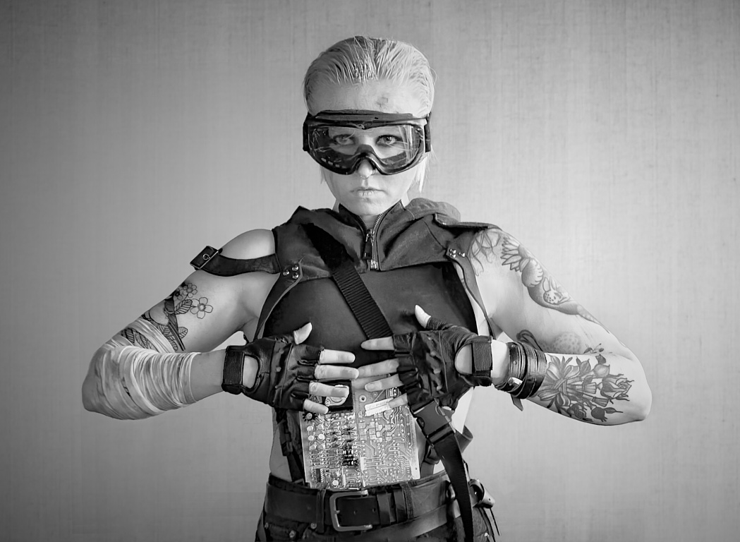
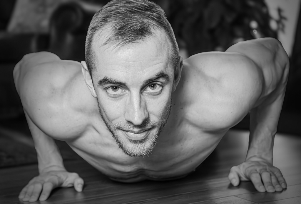
Hi Douglas, what a cool way to show off the impressive muscles! What I like best in the image, though, is the warm and intense contact it mediates. It is a tight crop, but I think that filling the frame suits very well for the idea. - I agree about the upper light corner: if you don�t want to darken the area ore clone it off, what about a light vignette? I think that it might also bring out more tones in the well-defined muscles? |
Jun 11th |
 |
5 comments - 3 replies for Group 47
|
| 54 |
Jun 25 |
Reply |
Thank you very much, Peggy, this looks great! I'll figure out how to repeat it in Affinity. I love the blues! |
Jun 19th |
| 54 |
Jun 25 |
Reply |
Thank you, Maria! I love it! The flames are so full of life and energy now, and tied to the illusion, and the crop is perfect! |
Jun 18th |
| 54 |
Jun 25 |
Reply |
Thank you very much Peggy! I am afraid that the attachment has dropped off at some point - could you add it once more? I have a hunch that it will be the answer to the problems. |
Jun 17th |
| 54 |
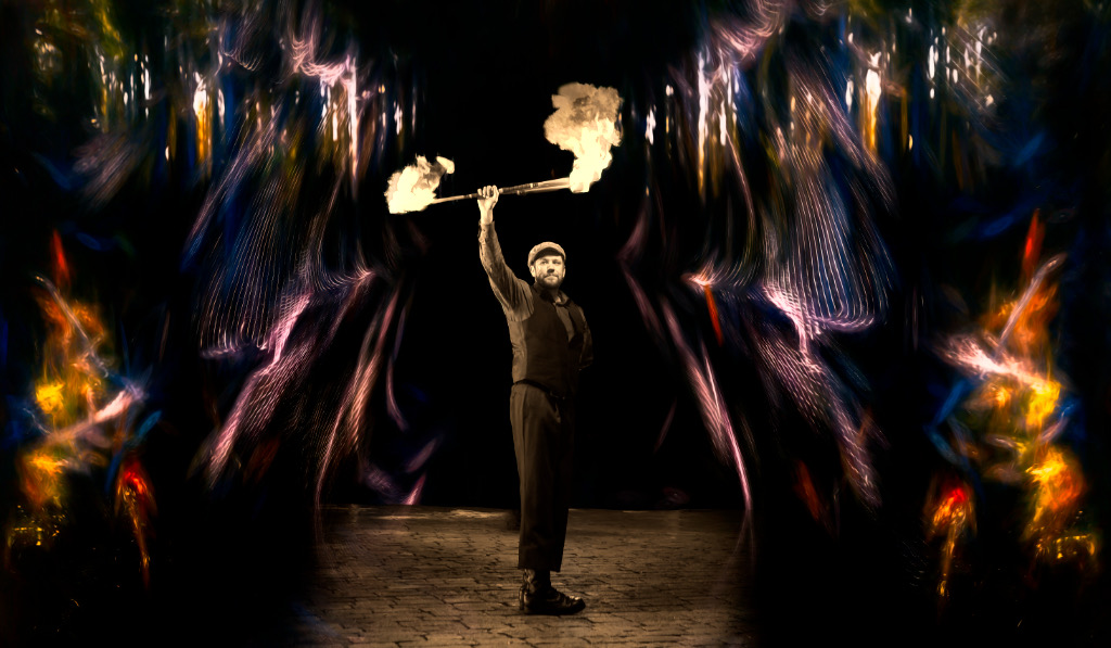
Jun 25 |
Reply |
Thank you, Brad! You are right about the color issue. My idea was that the man would keep himself in the background while the illusions he created would blaze around him, but when I look at the image now I can see that it doesn't work at all. I'll begin with a new version with the original in color as the starting point. |
Jun 17th |
| 54 |
Jun 25 |
Comment |
Hi Brad, I like the concept, too. - At first glance, I thought that the scene was about normal-size men working by a high wall on wide steps covered with vegetation. I wonder if you might add an element of obvious size, like a burnt match or cigarette butt, to show the scale? |
Jun 11th |
| 54 |
Jun 25 |
Comment |
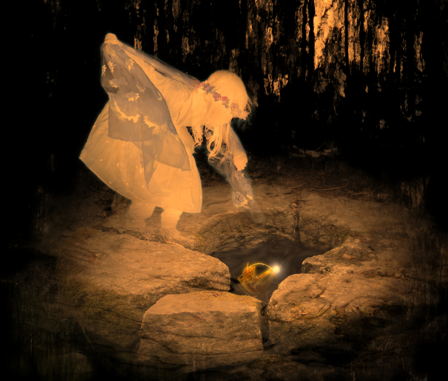
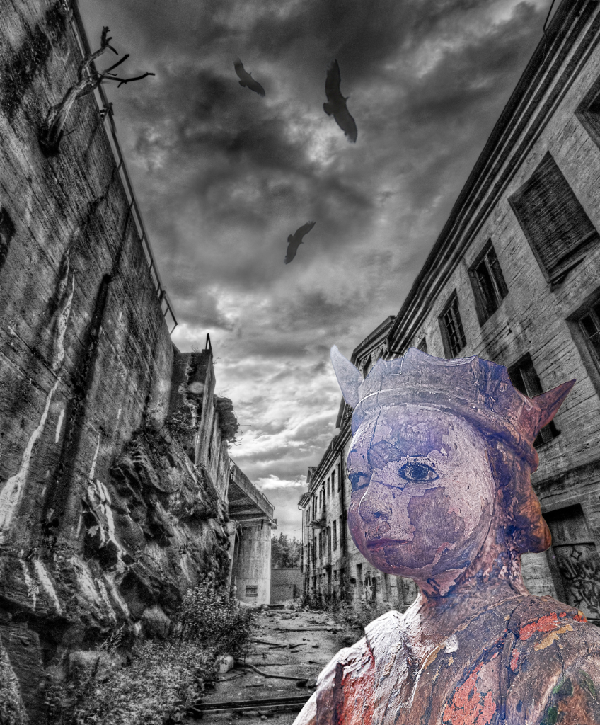
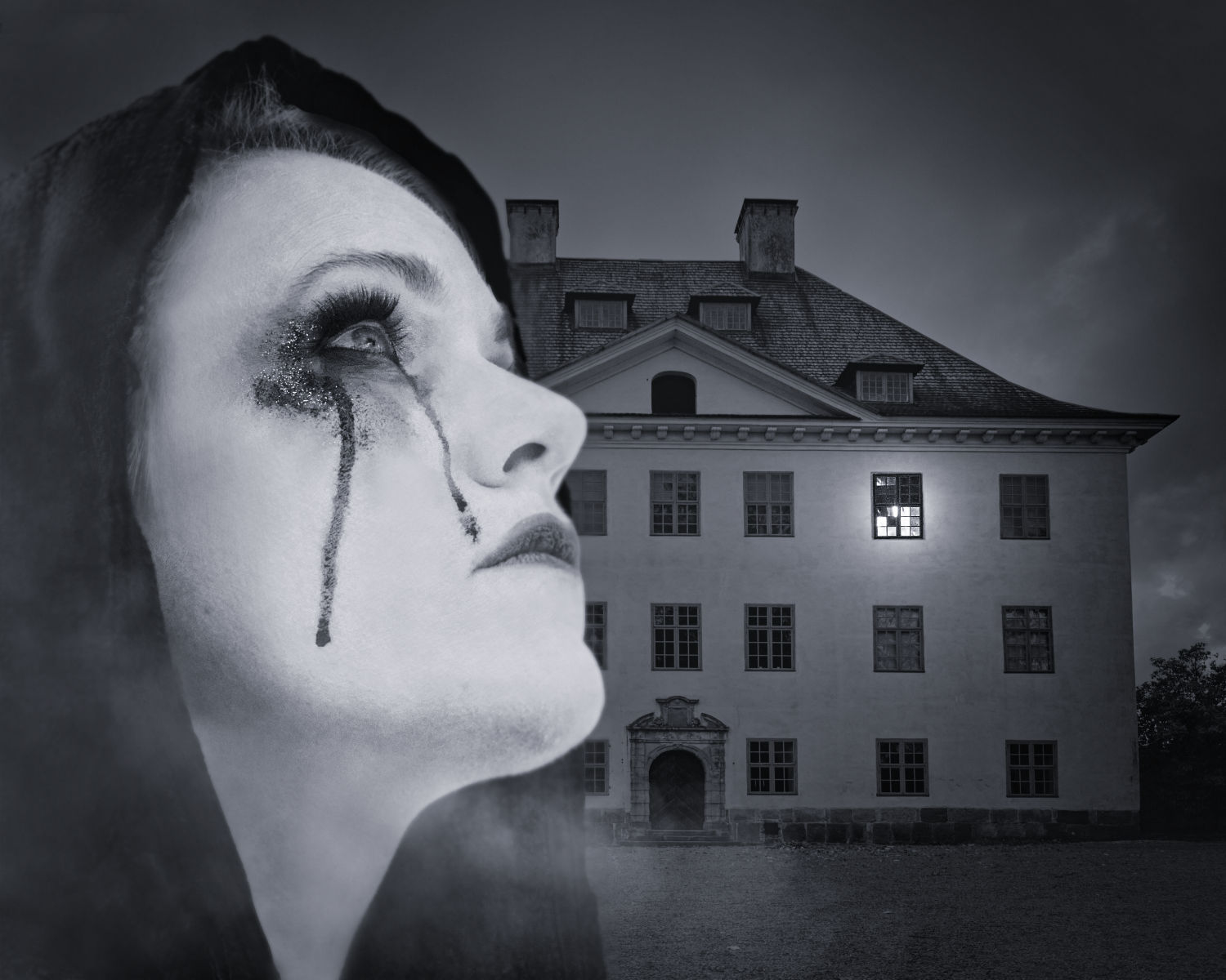
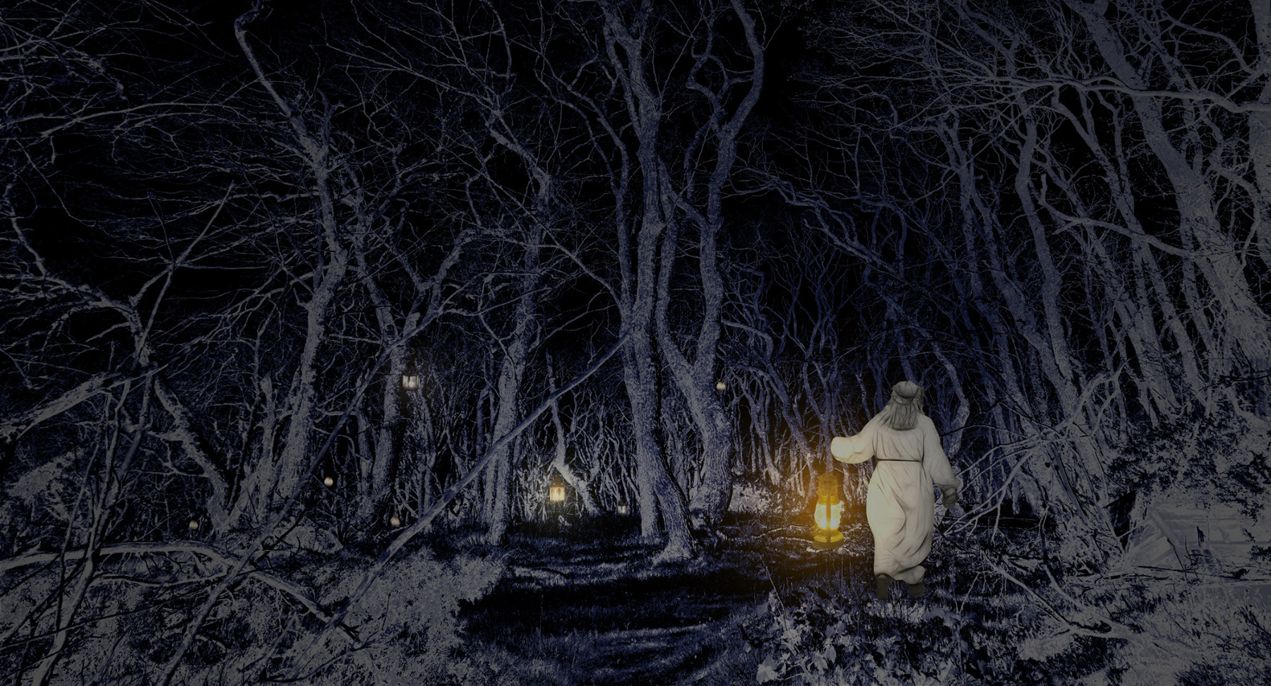
Alan, to me the foreboding mood is overwhelming. I think that only part of it comes from the toning of the image and the gloomy sky. The man is dragging his battered suitcase with rest of his possessions in the plastic bag that I find a particularly touching detail. There is this tension that grows with every step as he approaches the house that shows no signs of life. I am itching to learn what is waiting when he opens the door. |
Jun 11th |
| 54 |
Jun 25 |
Comment |
Hi Maria! Maybe it is the Lady's dress and the coloring that give the image something of a Baroque mood. There is such a delicious contrast between the cat who is very much alive, with the expressive tilt of this head, and the rigidly symmetric Lady and trees, and the smooth-looking surface they are moving on. I love the perspective effect of the background, and cannot get enough of your light and shadows. - About the number of elements: if you decide to omit something, I would vote for the tree on the right. |
Jun 11th |
| 54 |
Jun 25 |
Comment |
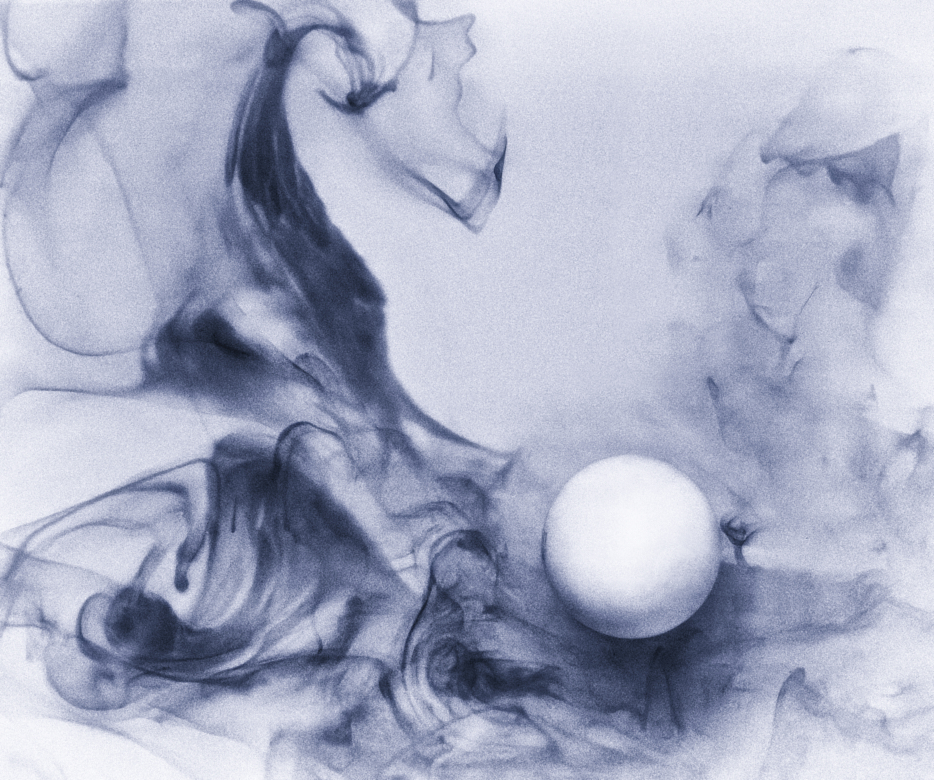
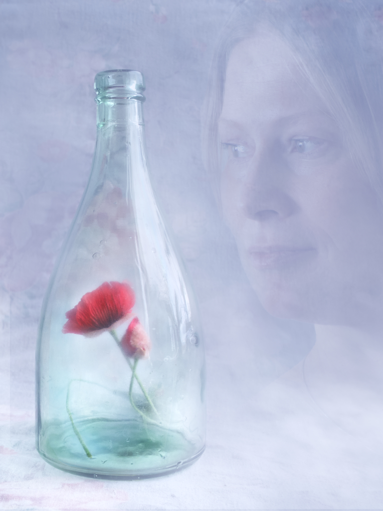
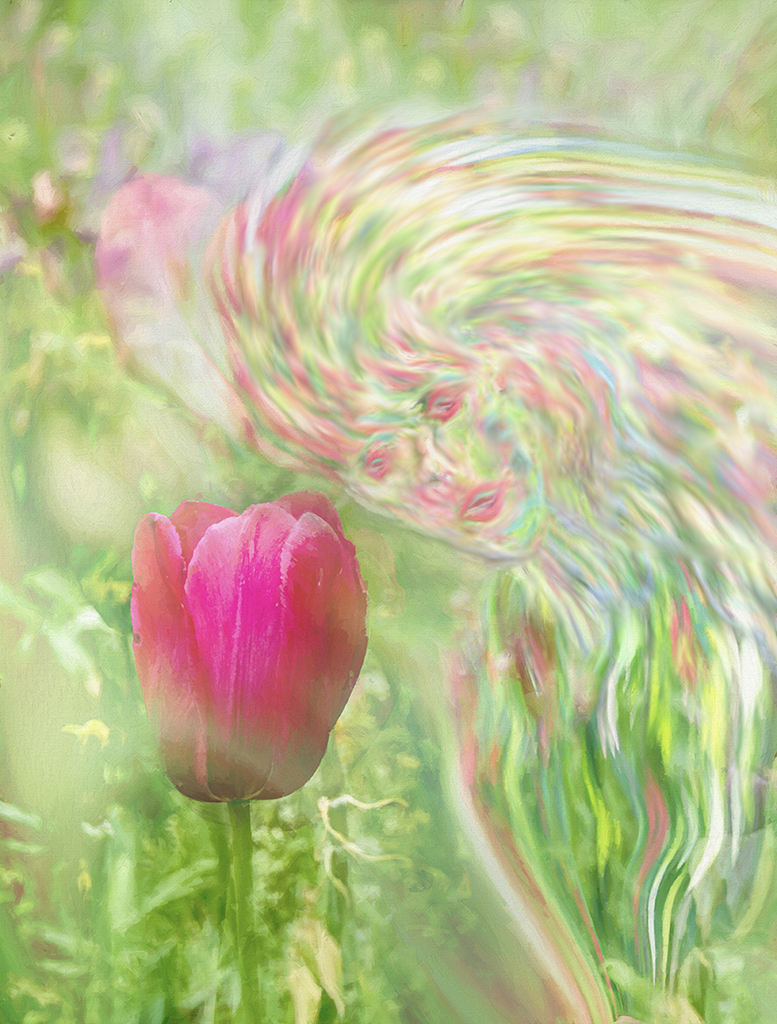
Hi Peggy, I love your Spirit and the way she was born from a burst of flowers and light. - The colors that blend so softly in her body made me think that the narrower lines that form her face and hair might perhaps meld into each other a little more softly, too, for a more ethereal quality. I tried to apply the Smudge tool in Affinity with a small brush and low strength to those parts to demonstrate the idea. What do you think? |
Jun 11th |
 |
| 54 |
Jun 25 |
Comment |
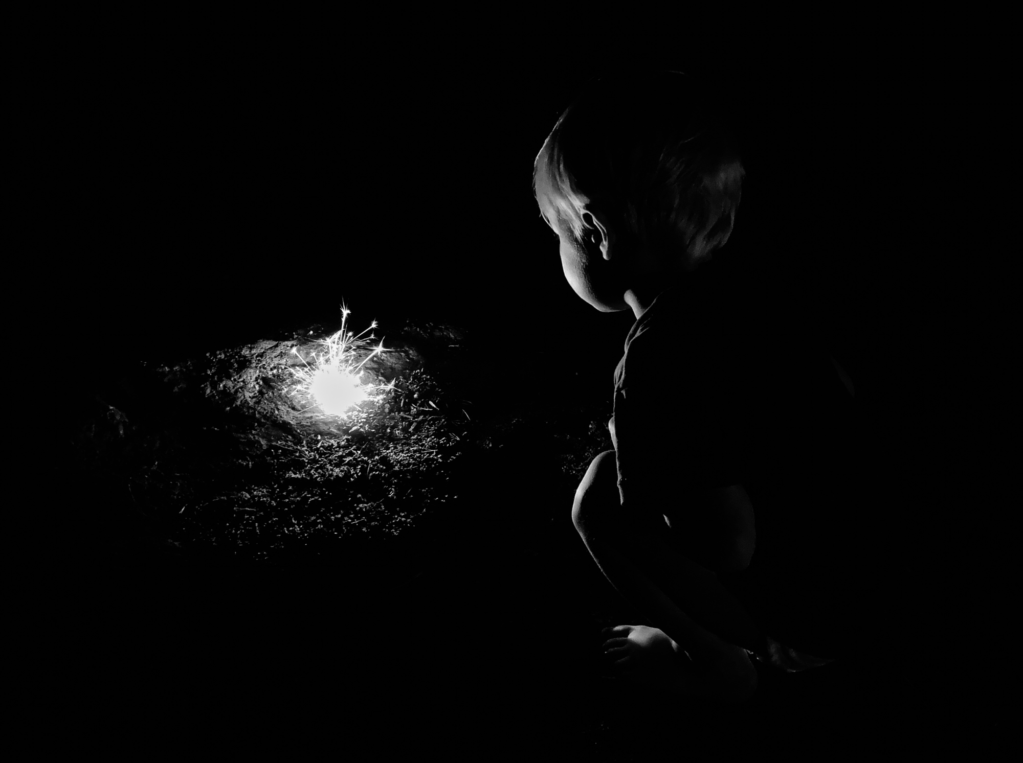
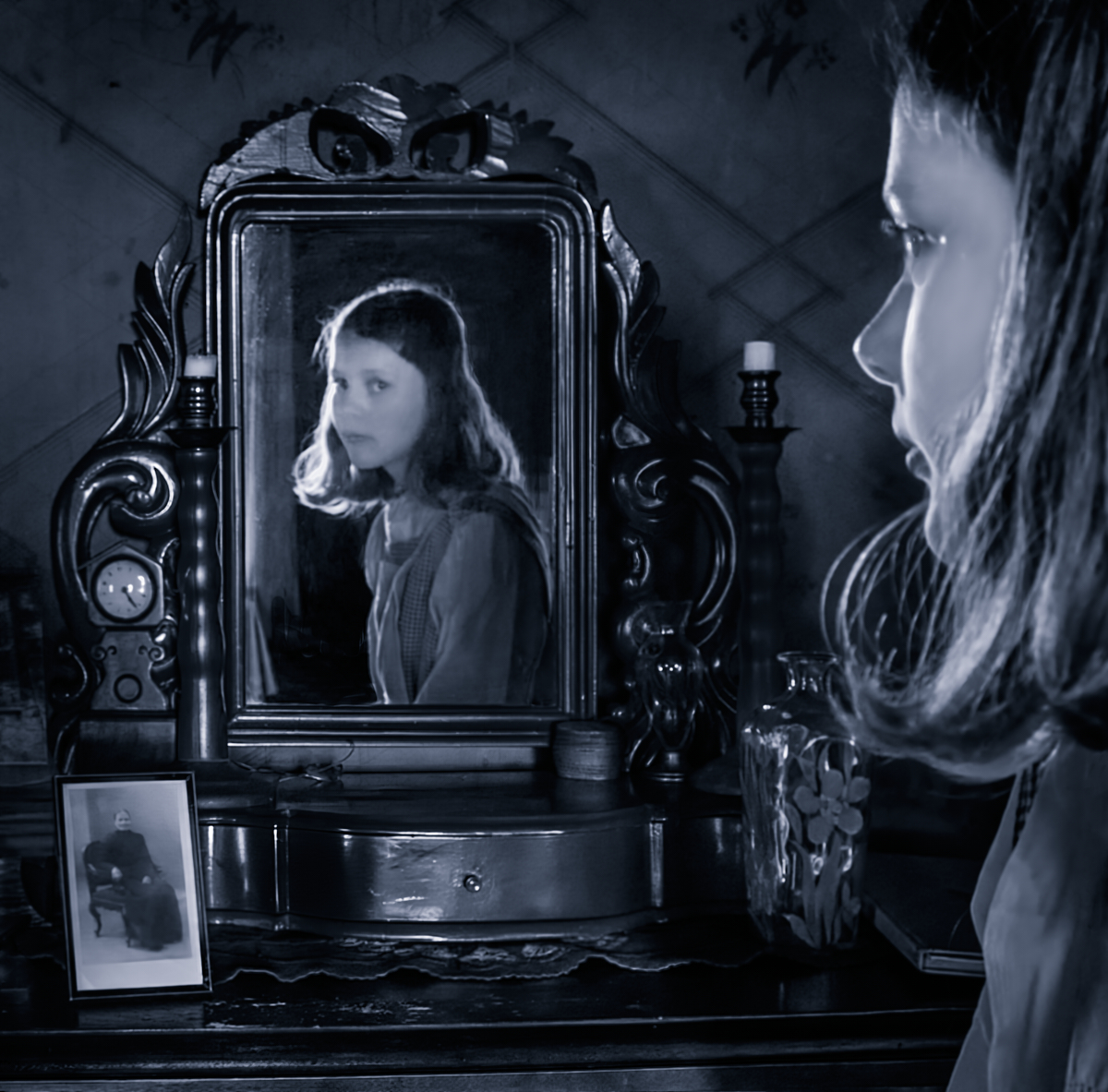
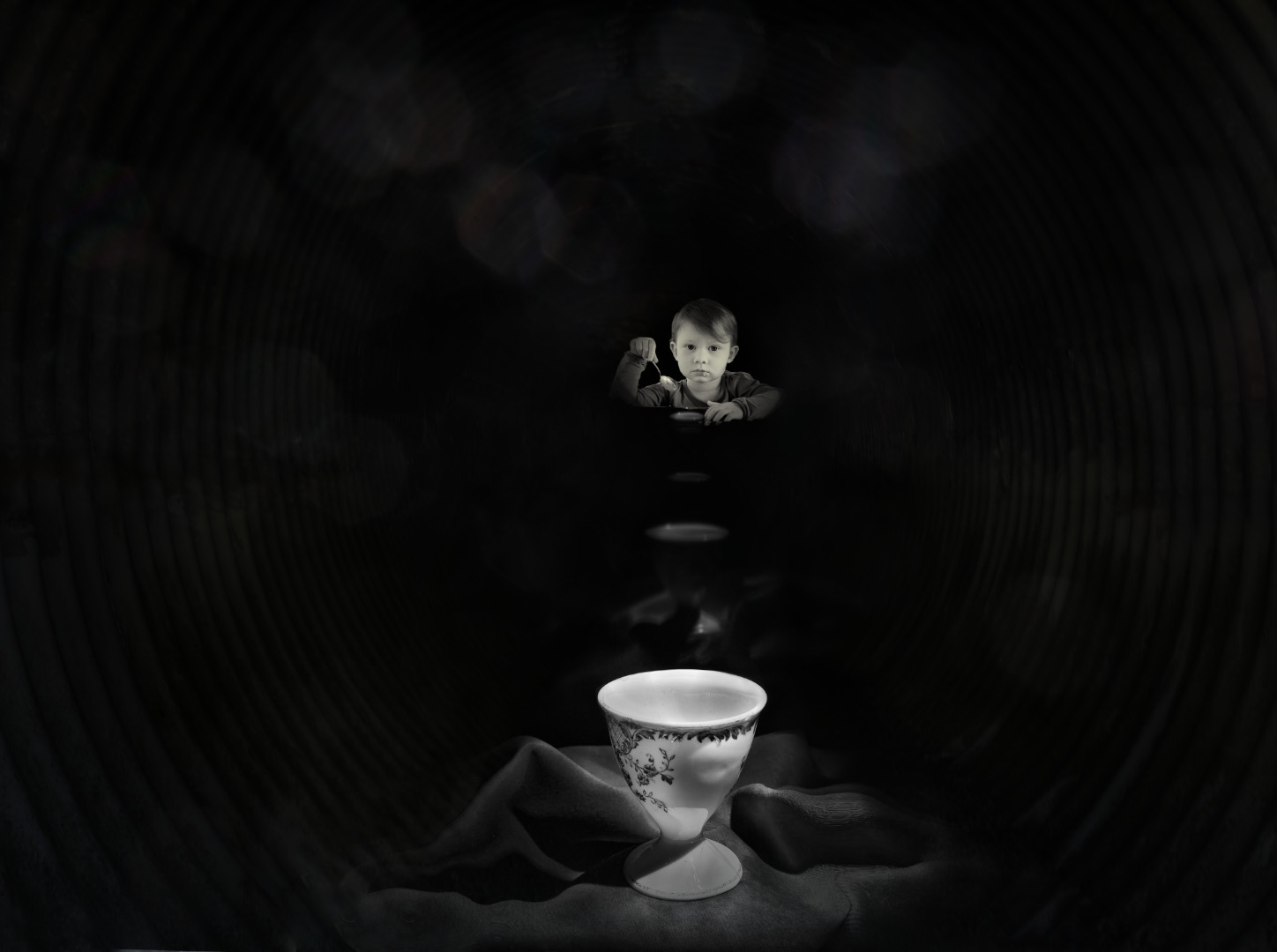
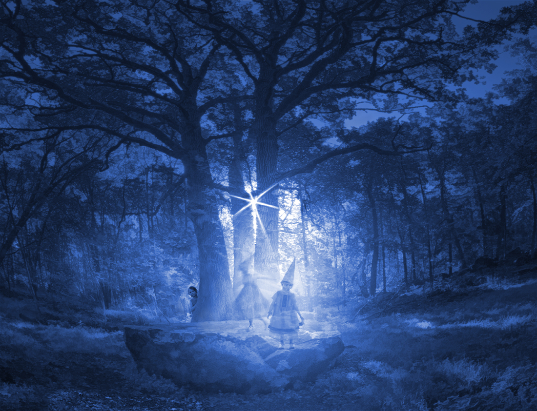
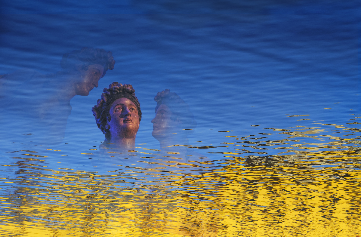
Thank you, Alan! I was seriously considering an audience from the beginning, either the blurred ring of people from the original, or a gaping child, but I felt that the image got too crowded. I'll make a new attempt. - I am so happy to make use of the net images: there is almost a memory card full of them, each just a bit different, and hard to discard. |
Jun 2nd |
5 comments - 4 replies for Group 54
|
17 comments - 12 replies Total
|